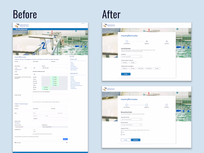
UX Review & Redesign Suggestion
Valeriia Hamzatova
UX Review & Redesign Suggestion for a Career Coach 💼
☝🏻Photos replaced and some details blurred with the client's permission
In this redesign I focused on two main issues: credibility and clarity.
Trust signals existed but were invisible. Logos from recognizable companies (Atlassian, TomTom, Booking.com) and client testimonials were buried below the fold thus invisible to most visitors. Moving them above the fold immediately signals legitimacy before a potential client decides whether to keep reading.
The target audience wasn't clear enough. The original headline spoke to a broad, emotionally frustrated audience without specifying who exactly the coach helps. The redesign suggestion narrowed the positioning so a potential client knows within the first scan: "this is for me."
Nothing new was added, I just reframed what was already there 👩🏻💻
Like this project
Posted Jun 4, 2026
UX Review & Redesign Suggestion for a Career Coach 💼 ☝🏻Photos replaced and some details blurred with the client's permission In this redesign I focuse...
Likes
0
Views
2