UX Redesign Suggestion — Swimming
Valeriia Hamzatova
UX Redesign Suggestion — Swimming Lesson Registration Form
Zwembad & Sportcentrum Wethouder Duran, Diemen
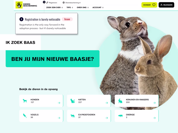
A municipal swimming centre's registration form was technically functional but created unnecessary friction for parents signing up their children a task that should take minutes but felt overwhelming.
Core problems identified ⬇️
1. Single long-scroll form with no sense of progress or completion time
2. All time slots pre-selected by default, forcing parents to manually deselect irrelevant options
3. Poor scannability: inline labels, inconsistent field widths, and section headers in colour rather than hierarchy made it hard to read at a glance and easy to miss fields entirely
Redesign approach:
Restructured into 3 logical steps: lesson preference first, personal details second, payment last. This order follows the parent's natural decision flow: does this work for us → here's who we are → here's how we pay.
The day selection was rebuilt from a confusing pre-checked grid into clear pill buttons grouped by ochtend/middag to reduce cognitive load and eliminating the default-selection error pattern.
No new content was needed, only reframing what was already there.
Speculative redesign based on a publicly accessible form, created to demonstrate UX audit and form design methodology
Like this project
Posted Jun 5, 2026
UX Redesign Suggestion — Swimming Lesson Registration Form Zwembad & Sportcentrum Wethouder Duran, Diemen A municipal swimming centre's registration form was...