Built with Framer
How to grab the attention in your hero section.
Bram Goossens
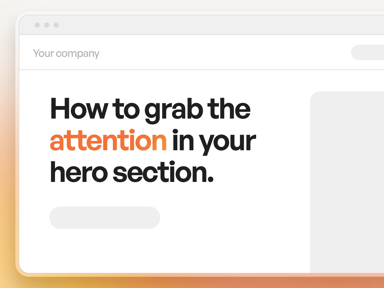
How to Grab Attention in the Hero Section of Your Website
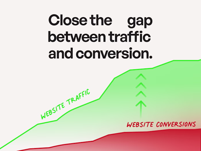
You have 3 seconds. That’s how long it takes for someone to decide whether to stay on your site or bounce.
Your hero section, what users see first when they land, isn’t just about looking good. It’s your digital elevator pitch. Done right, it captures attention, communicates value, and nudges the visitor toward action. Here’s how to make yours count:
1. Be the solution to your audience’s problem
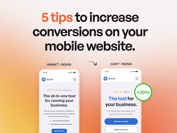
People don’t care (yet) who you are, they care what you can do for them. Use your headline and subtext to speak directly to a pain point your audience feels. Be clear, not clever. Lead with relevance, not jargon.
🗸 Bad: “Innovative digital solutions for modern businesses.”
✅ Better: “Struggling to turn visitors into customers? We design websites that convert.”
2. Add instant credibility
Why should someone trust you? Back up your promise with a quick dose of proof, think client logos, testimonials, results (“Trusted by 100+ startups”, “20% avg. conversion lift”). Place this near the headline, or subtly below the fold for support.
3. Use clear, focused calls-to-action
The hero is not the place for five buttons. Guide the user to take one action: “Book a demo,” “Get started,” “See how it works.” If needed, a softer secondary CTA can support it, like “Watch video” or “Learn more”, but keep the hierarchy clear.
4. Support with the right visual
People process visuals faster than text. Use an image that resonates with your target audience, ideally a person like them, in a situation that reflects the context of your solution. Avoid generic stock photos and meaningless illustrations.
5. Let your image guide attention
Where your image “looks” matters. Eye-tracking studies show users follow the gaze or direction in a photo. So if you’re using a person, have them look or gesture toward your CTA. This subtly draws the viewer’s eye where you want it to go.
Want a hero section that actually converts?
I help brands craft high-impact hero sections that combine message, visual, and strategy, all aimed at one thing: action. Because first impressions aren’t just visual, they’re emotional, and they’re fast.
hero section best practices, website hero design, above the fold optimization, clear CTA website, website visual hierarchy, improve website conversions, attention grabbing web design, website first impression, high-converting landing page, UX hero section, web design strategy, CTA placement tips, ux strategy, web strategy
Like this project
Posted Apr 7, 2025
Learn how to grab attention, build trust, and guide users to action with a powerful, conversion-focused hero design.
Likes
0
Views
9