Building a comprehensive trade finance management solution
Recently, I worked on TradeVu - a fintech platform designed for the flexibility and scale required by small and medium-sized businesses. A challenge that African banks are yet to solve.
My work ranged from getting buy-in for the product from the product owner to designing the information architecture, navigation and layout structure, making sketches, designing minor interactive actions and writing most of the UI text.
This was my first fintech project, but I handled it with grace.
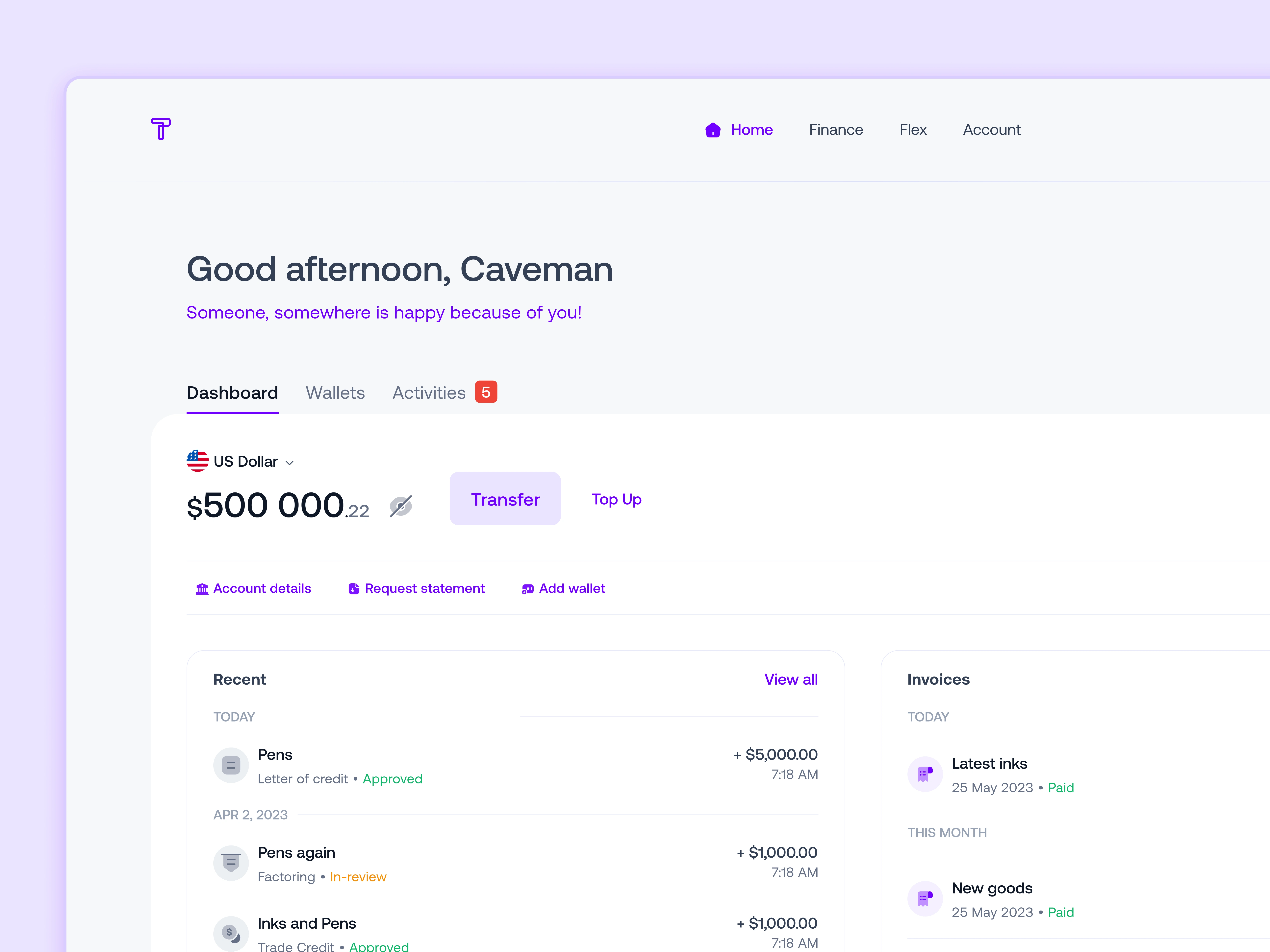
TradeVu's B2B Webapp
TradeVu has big dreams for Africa.
TradeVu provides one platform to access capital, make payments, and control all transactions in one place. It also provides features for payment, shipping, and document management, making it a comprehensive trade finance management solution.
Background
Trade can stimulate job creation and is estimated to contribute up to 30% of GDP growth in Africa. Nevertheless, we are far from fully appreciating the huge sustainable impact that African trade finance brings to the SME sector.
Goal
TradeVu aims to break the barriers to SME trade finance and nurture the SMEs of today by tackling sustainability and truly growing the African SMEs of tomorrow.
TradeVu’s solution
The first step is to provide an easy way for these companies to access affordable trade finance for their trade transactions and a digital method to collect, store and share data tied to these transactions. The primary focus is to provide these solutions to the underserved SMEs who contribute about 48% to Nigeria’s GDP.
learning about the trust issues among traders.
To gain a good understanding of international trade and financing in Africa, I combined desk research with user interviews. My goal was to learn about the current landscape of trade finance instruments and other means of trade financing within the continent.
Research Methods
To gain insights into cross-border trade financing, I used a combination of desk research, user interviews, and competitive analysis of close competitors.
I spoke with a few individuals involved in exporting agro-products from Nigeria to other African countries.
I conducted visual research on several financial products to learn about their flows of handling financing between different parties and currencies.
Finally, I conducted a comprehensive audit of TradeVu's closest competitors to gain insights about them.
Insights from Subject Matter Expert
Sellers get buyers through their physical networks and personal connections, rather than through digital platforms.
Buyers are gotten based on a number of factors most;
Currently, new buyers use a Letter of Credit to buy products from suppliers.
Letters of credit are issued and paid by the buyer's bank, which includes the product specifications.
This means that when a buyer purchases a product from a seller they do not know, the buyer's bank provides a letter of credit that outlines the product specifications and guarantees payment to the seller. The seller then uses the letter of credit to obtain payment from the buyer's bank. This process helps to mitigate the risk of fraud or non-payment in international trade transactions.
The banks that issue letters of credit provide guarantees for the suppliers.
Insights from the Competitive Analysis
I carried out a little study into existing trade finance applications to learn their features and functionality.
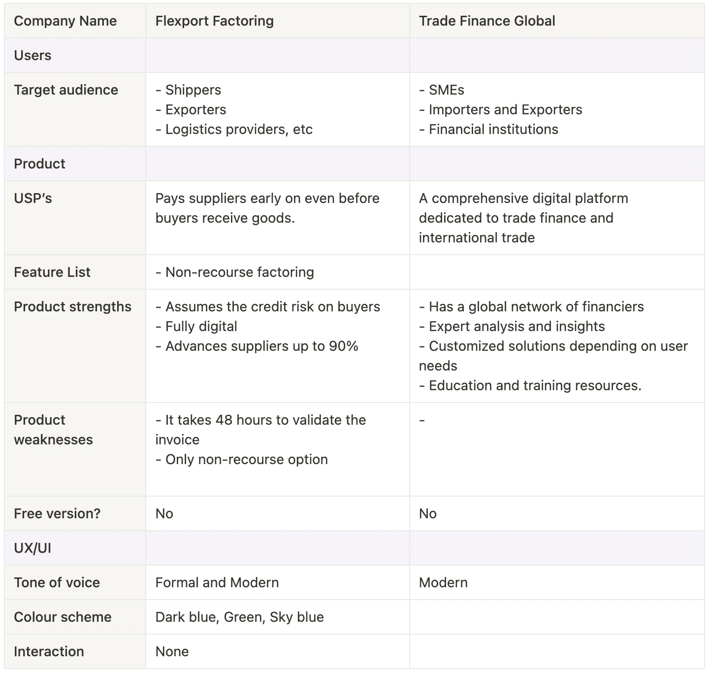
Competitive analysis of different Trade Finance products.
💡 my initial recommendations.
After some analysis of the research results, I made a couple of recommendations to the business stakeholders;
TradeVu should be supplier-focused first, for the MVP
Onboarding the network of third-party factors or funders should be done from an Admin platform.
Invoice generation and management would be done manually on TradeVu and sent to Funders.
Trade transactions should be possible with non-TradeVu users.
Unique selling proposition

USP
Feature recommendations

Features
the most important features of the MVP.
Users can have multiple accounts and switch between them.
Access to a single dashboard to monitor;
Transaction management tracker
Payments processing.
Access capital with different financing options.
Internal operations management.
a clean but familiar UI.
My goal was to design an easy and intuitive experience for traders who might not be used to digital platforms. Every style, component and microcopy I used followed modern UI conventions while applying my ingenuity to the African situation.
Early on, I identified common patterns and saved them as components for reuse. Others came in as the design progressed.
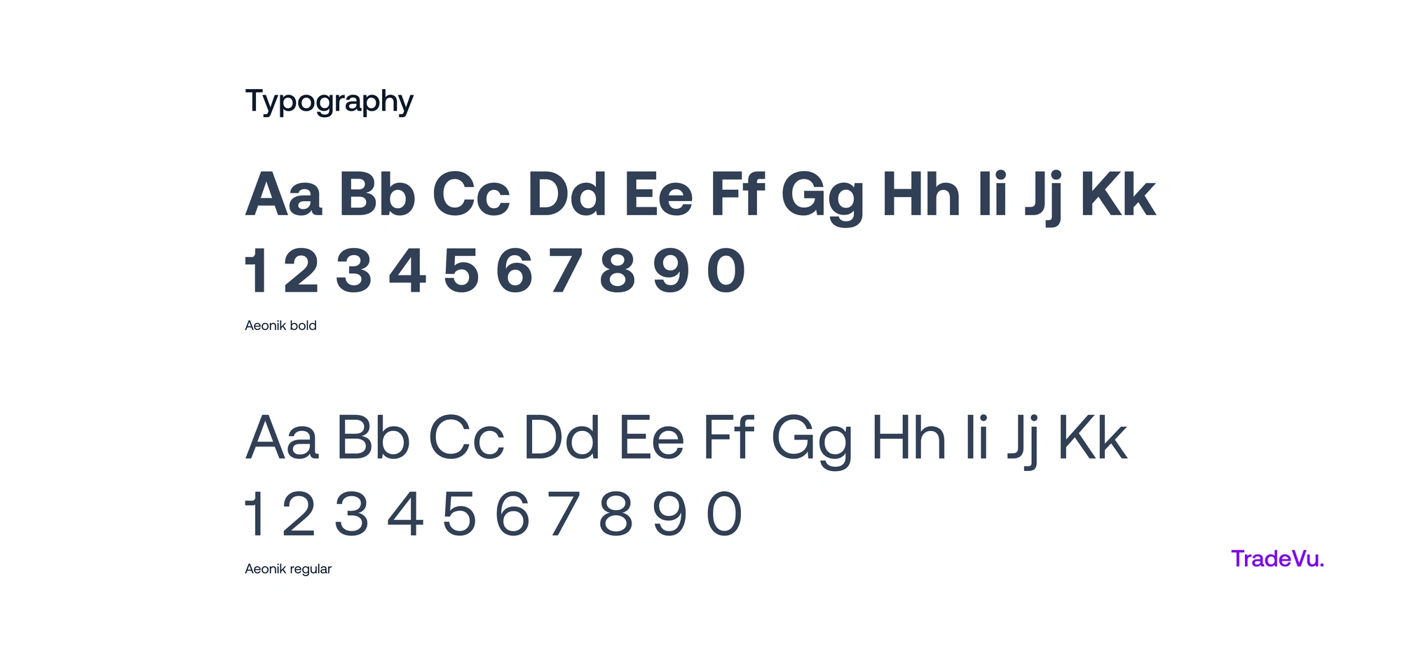
Typography
In choosing a typeface, I considered my target users, the look and feel of the typeface, variation in the contrast, weight and style of its fonts, and how the font handled numbers. This led me to Aeonik which supports all of these, including small caps. With its near-grotesque structure, it could support large text displays and body text with good legibility.
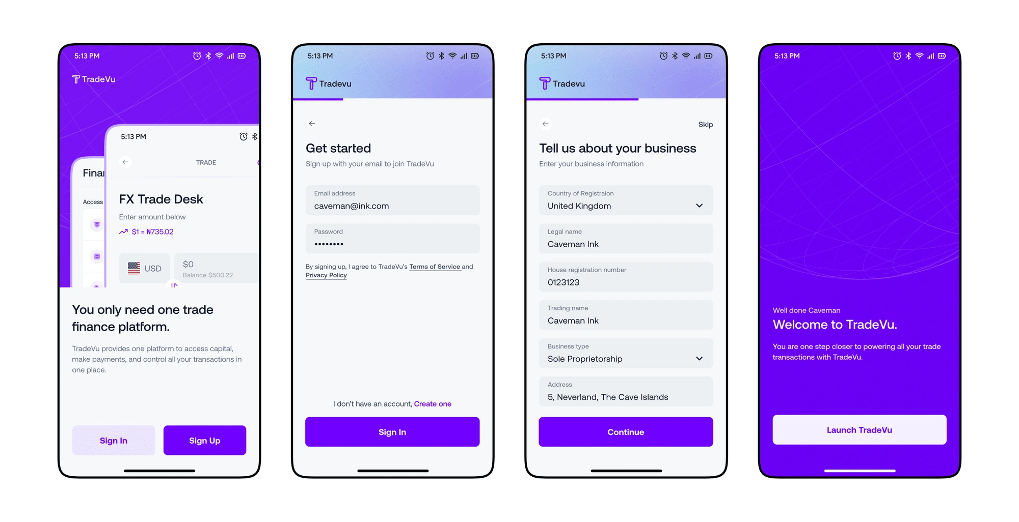
Onboarding
A simple and intuitive onboarding process for users so that they are aware of their progress at every point in time.
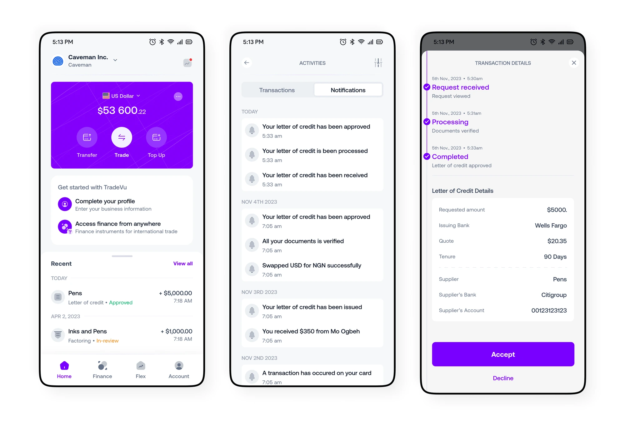
Dashboard and Activities
Users see a real-time overview of all their balances and recent transactions as they happen. Activities give a broad view of every activity and alerts that the users need to be aware of. It also includes a tracker to monitor the status of important activities like payment processing and accessing capital.
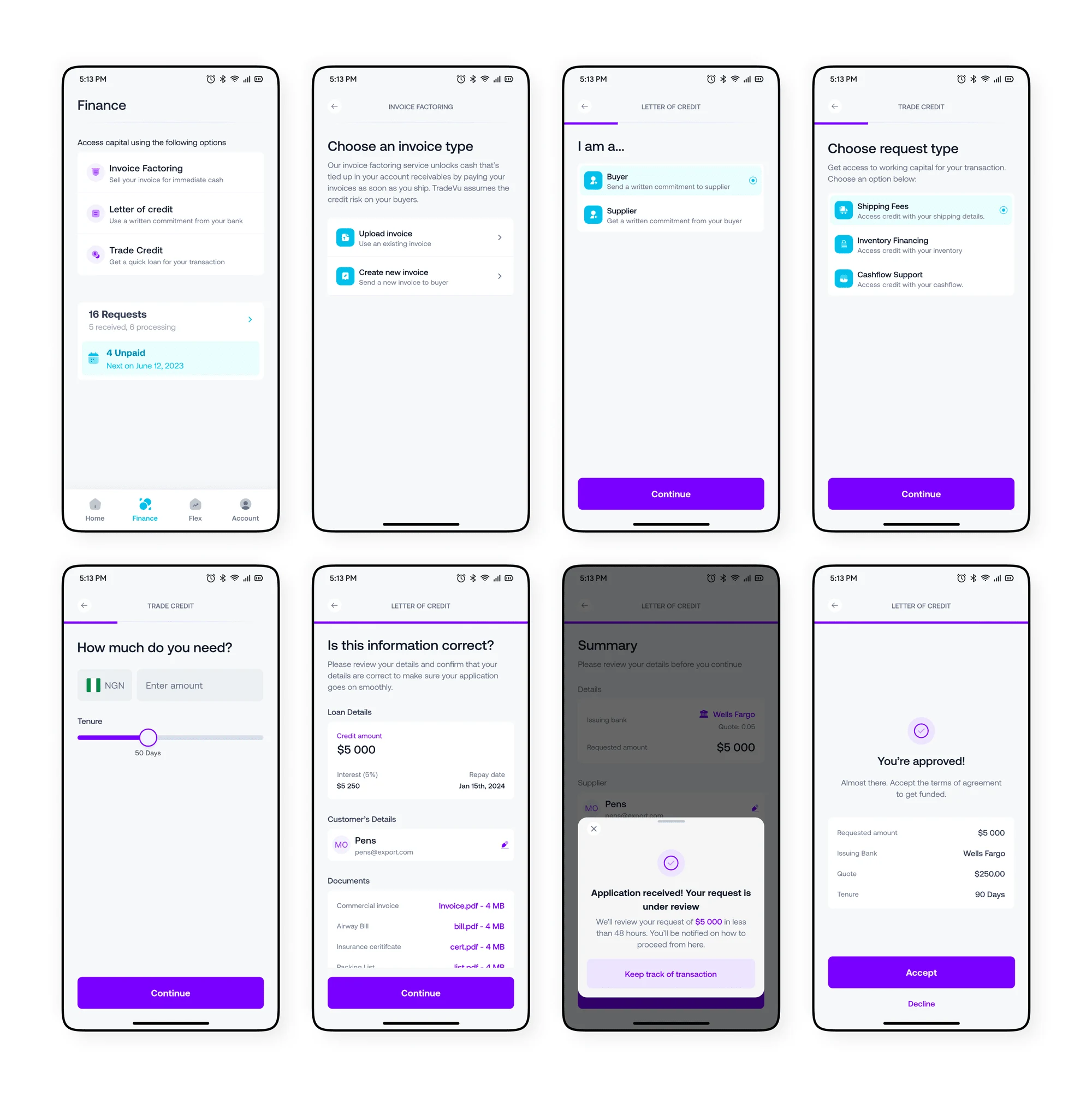
Trade Finance Instruments
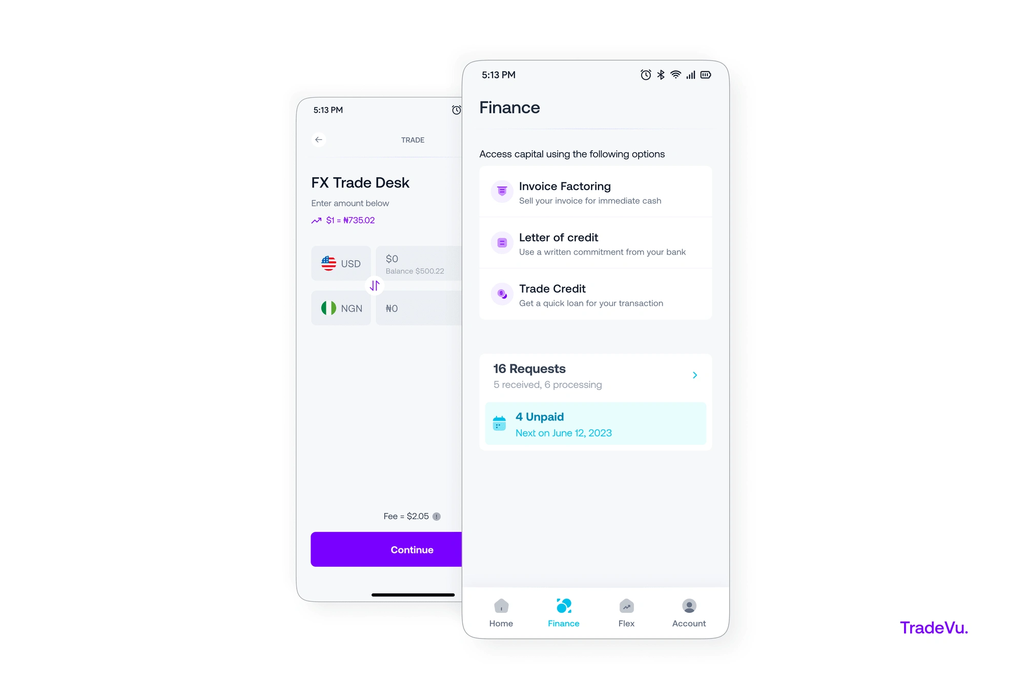
This allows customer access capital for their trade through receivables factoring, loans and letter of credit. The transaction history would be used to determine the customer’s financing rates and provided an auction-based marketplace that connects large sellers of trade receivables to a broad network of institutional buyers.
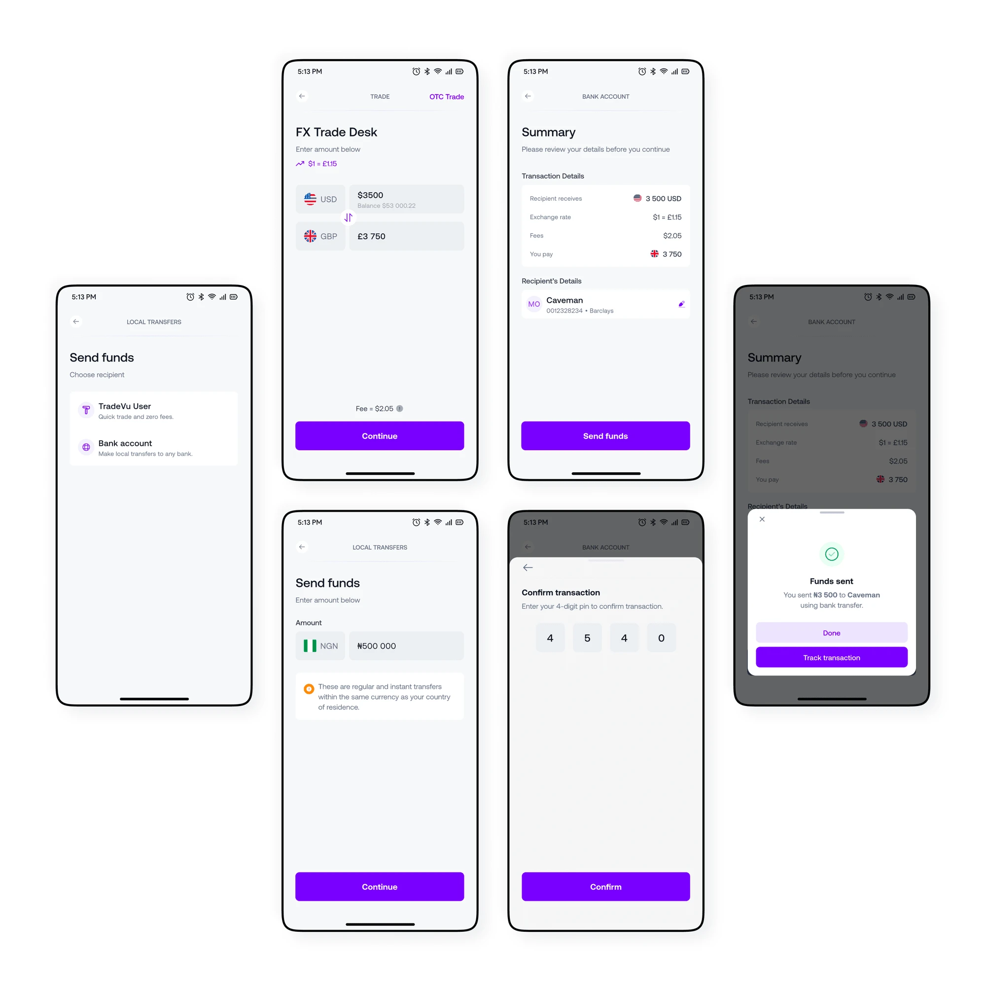
Payments processing
It is also easy to make and receive local and international payments through ACH, wires, and foreign exchange through the Trade feature.
Operations management
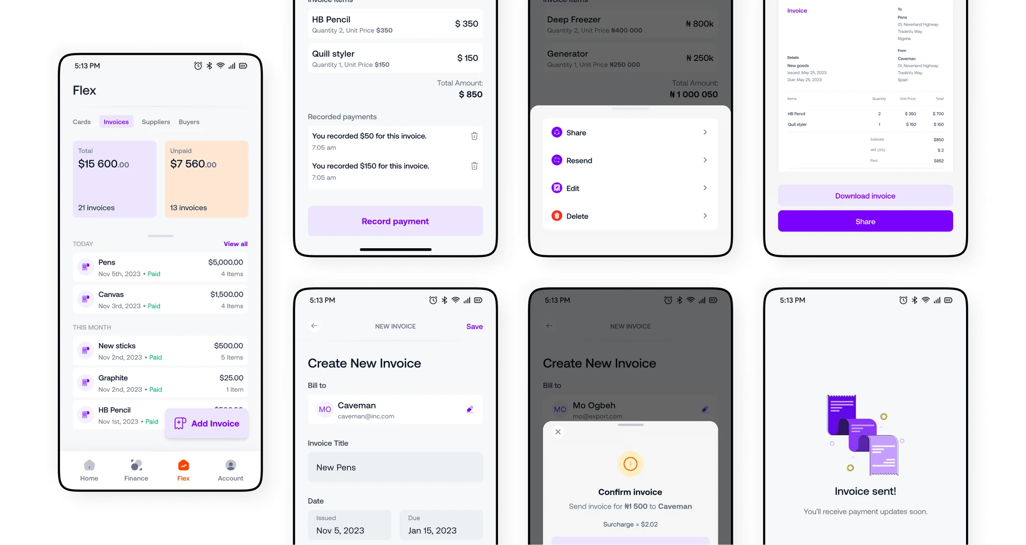
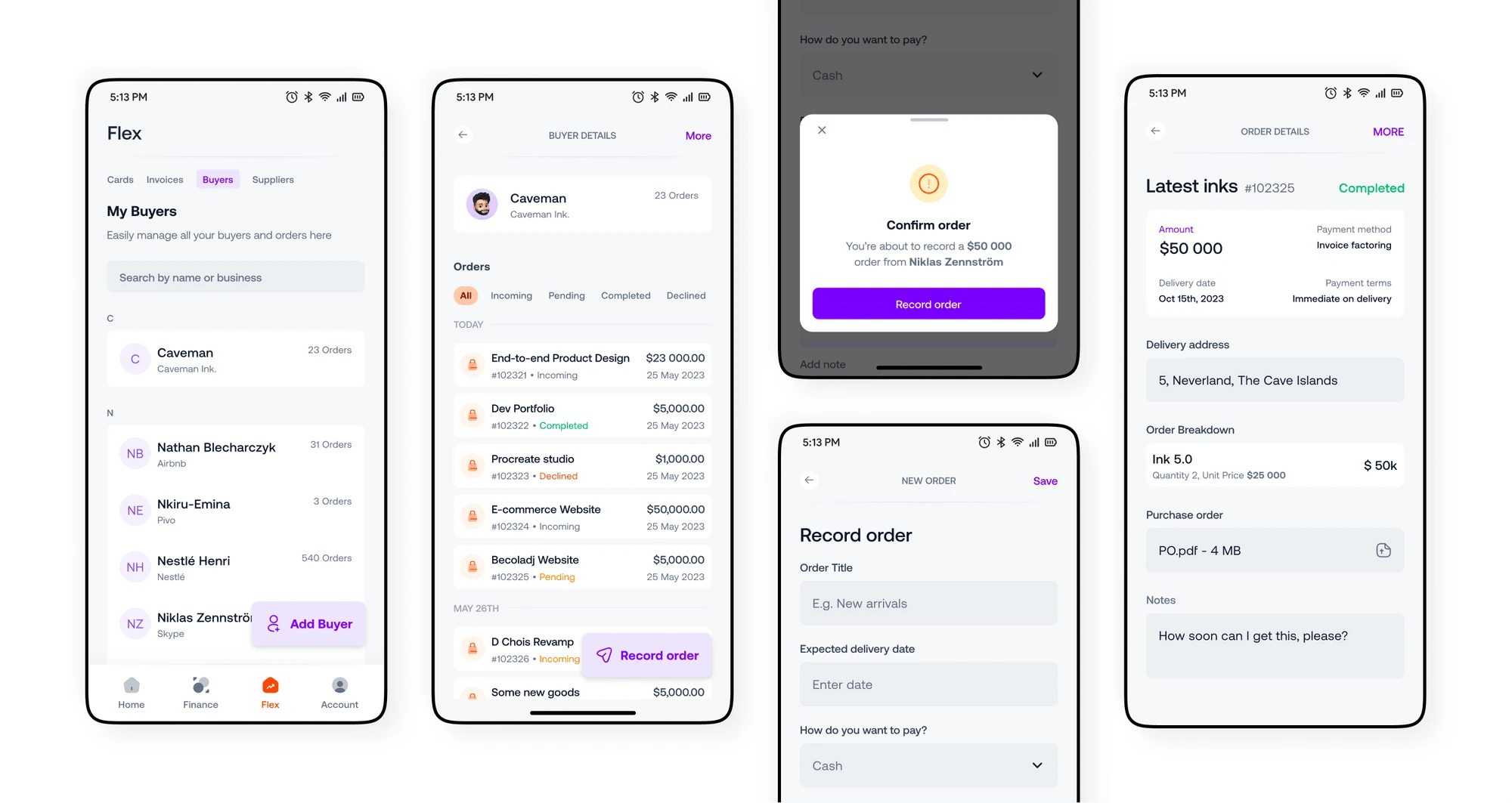
The unique flex feature allows a user to place orders with their suppliers and manage the order process from purchase to delivery within the app. By managing their invoices, orders, buyers and suppliers from one place, they can effectively manage the internal operations of their business.
Cards
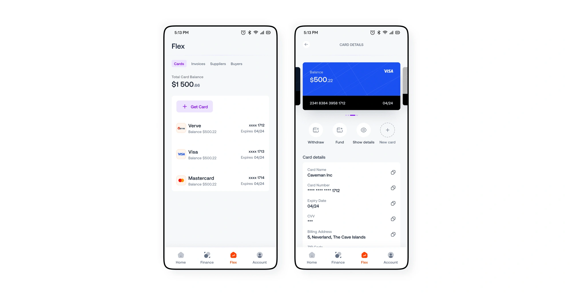
2. Invoices
3. Order management
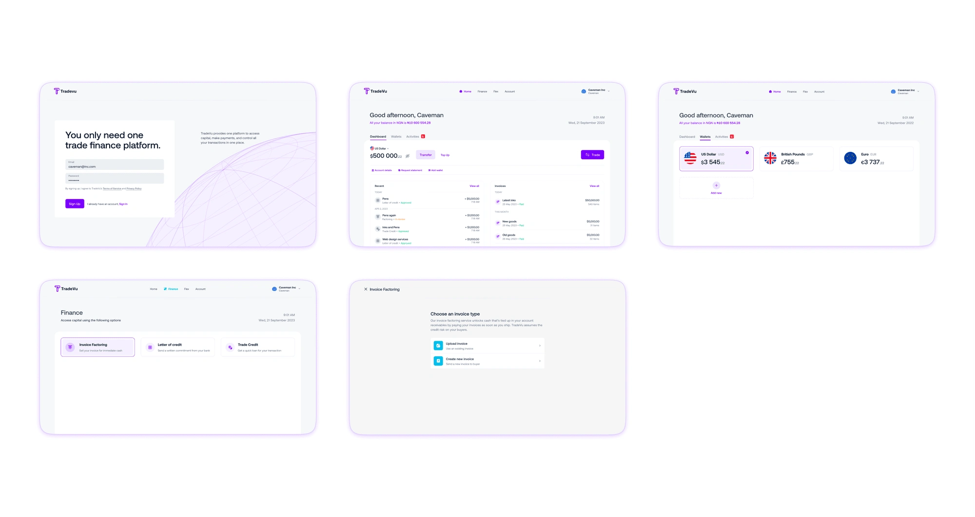
cracking the web responsive design.
Much later, I translated every single UI component and pattern to fit a web-responsive layout for desktop users.
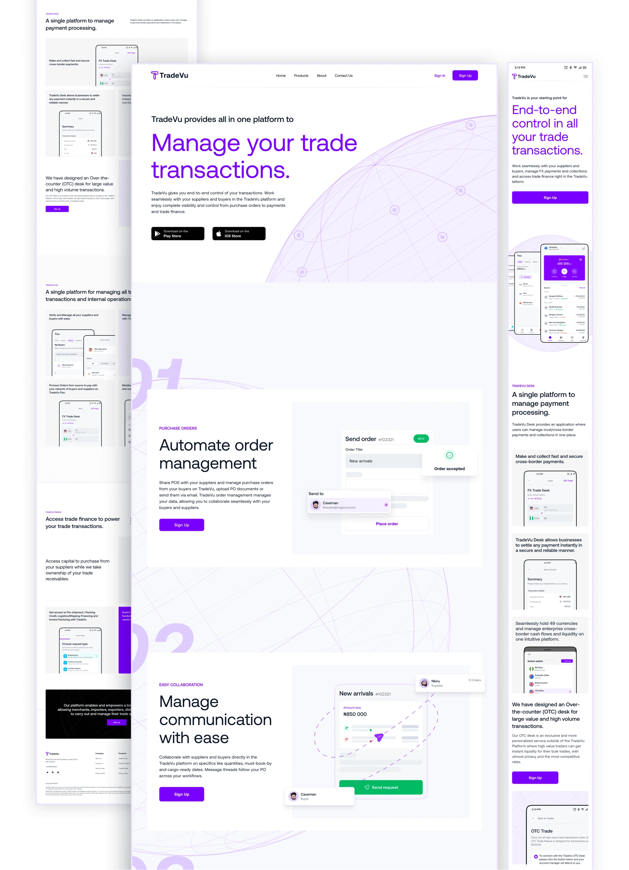
and what’s a product without a website?
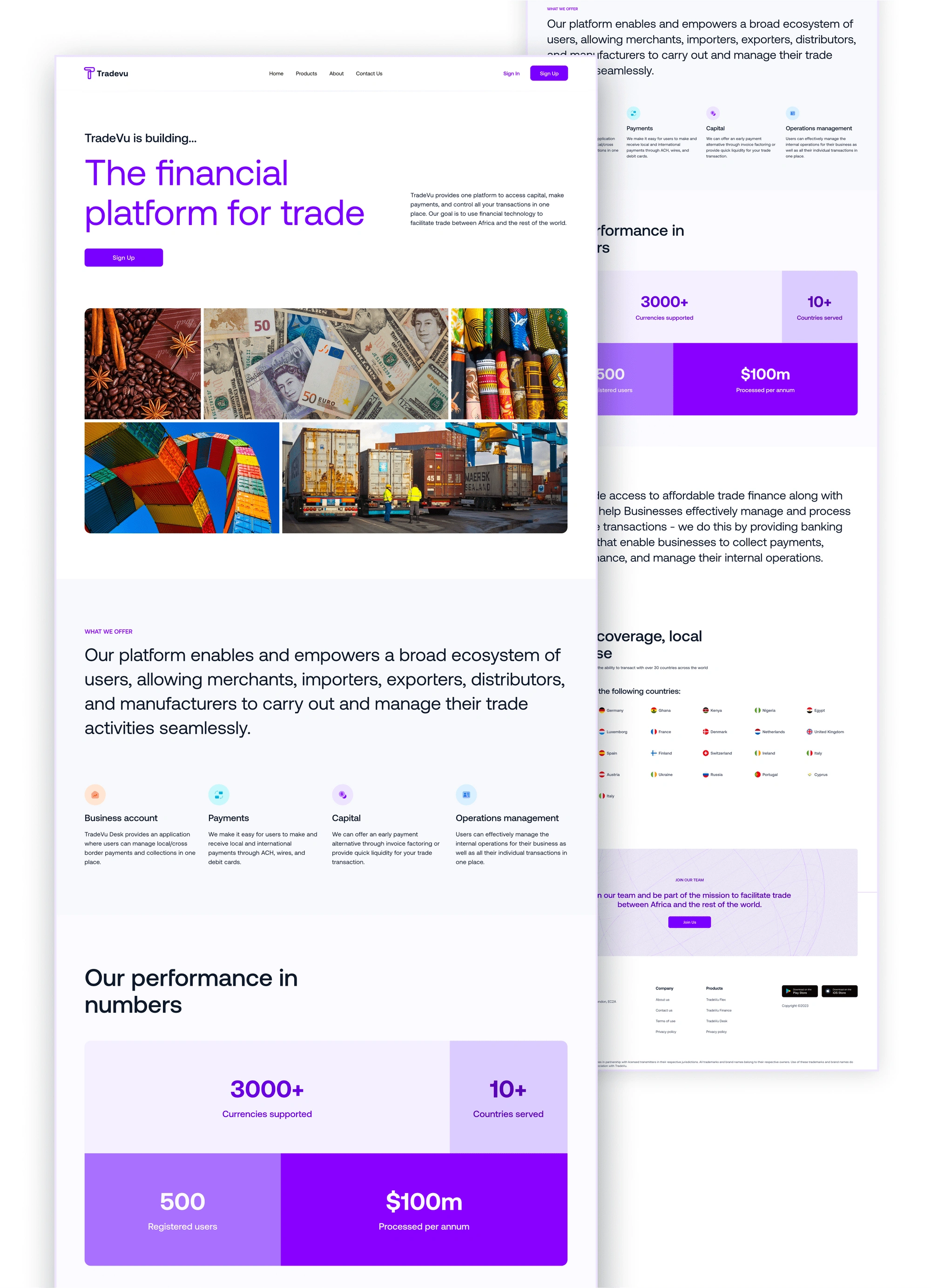
I designed a responsive and detailed website to market the product’s offerings.
Home & Products
About Us
I handled this project with grace 😌
We are hoping to service over 2,000 registered businesses and fund $1.5 billion to small and medium-sized businesses through the exchange in the coming months.
The success of TradeVu would be measured by the volume of activity processed on the payments platform.
Although fintech was new to me, TradeVu gave me a solid ground to explore new design ideas and helped me learn the intricate details necessary to build products in the fintech industry.
I also had a pretty awesome product owner.
¡Gracias!
Like this project
Posted Aug 18, 2023
Hoping to service over 2,000 registered businesses and fund $1.5 billion to small and medium-sized businesses through the exchange in the coming months. T
Likes
0
Views
49

