I design bold brands full of personality for small business

I design bold brands full of personality for small business
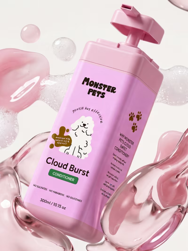
Brand in a day for Monster Pets, a German dog care brand bringing together honest ingredients, vibrant packaging, and a playful identity designed for modern dog owners that stands out on the shelf!
4
12
1.1K
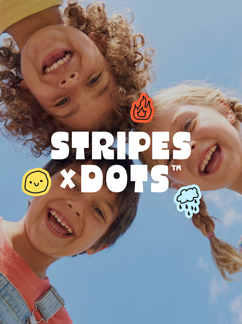
Brand in a week for Stripes x Dots - a children's brand that creates bold, simple tools to help little humans understand big feelings and navigate everyday moments with confidence.
The design challenge was building a visual world that could make emotions feel approachable and joyful - something toddlers are drawn to and parents actually want in their home. Bold type, expressive emotion icons, and a playful-but-purposeful aesthetic carried across every touchpoint - completed in just a week.
The full suite spans brand identity, emotion cards, and stickers - a cohesive system that makes big feelings feel a little less big.
9
11
1.3K
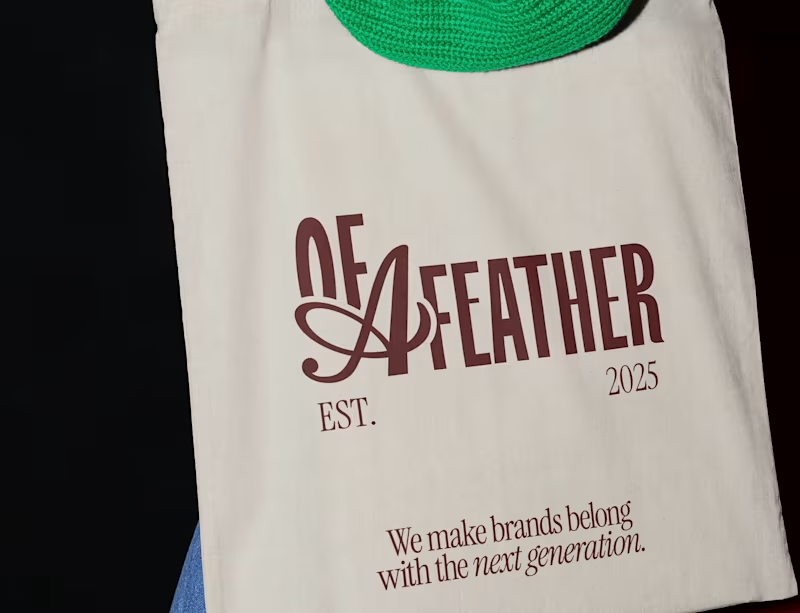
Of a Feather - Brand Identity & Visual World
Of a Feather is built around the idea that the right people always find each other - a poetic twist on "birds of a feather," where belonging and connection run through every element of the brand.
Strategy and tone of voice came first, then colour, typography, and the part that made this project unforgettable: custom Australian bird characters, full of personality and warmth, that brought the brand to life in a way no logo alone ever could.
From there, a full universe - logos, social media, credentials deck, merch, and website. When strategy and personality work together properly, the result speaks for itself.
1
2
1K

Brand in a Week - Children's Media Brand Identity
Iniminimo is a new generation of personalised children's media - a platform that places the child at the centre of the story. Instead of watching other characters, children become the main character in their own personalised animated music videos, built around real-life milestones and routines.
The challenge: bold and playful enough to delight toddlers, modern and thoughtful enough to earn parents' trust. Expressive illustration, vibrant colour, friendly-but-not-childish typography - exciting without being overwhelming. Nothing generic. Nothing toy-like.
Delivered in five focused days - from strategy to complete brand world - the result is an identity as joyful and full of heart as the platform it represents.
24
49
1.3K

Building brands that are understood, trusted & chosen.
- $5k+
- Earned
- 1x
- Hired
- 5.0
- Rating
- 75
- Followers
Building brands that are understood, trusted & chosen.

Blending human brand experiences with scalable growth.
Blending human brand experiences with scalable growth.

Website and brand design for creatives and small businesses
Website and brand design for creatives and small businesses
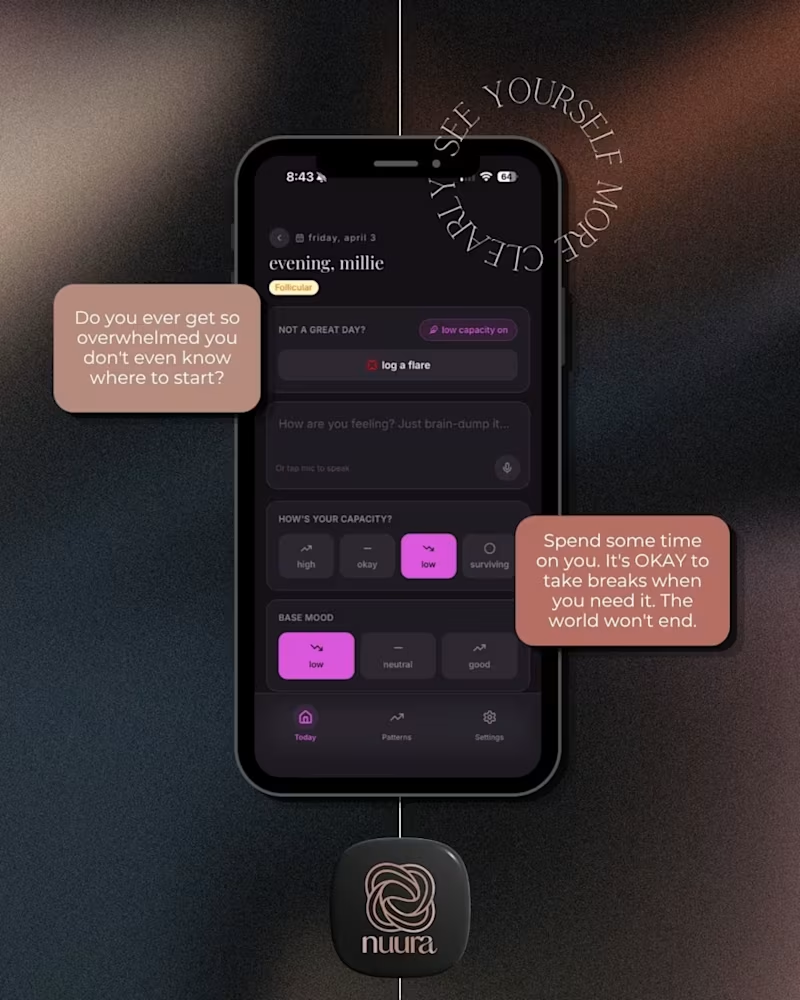
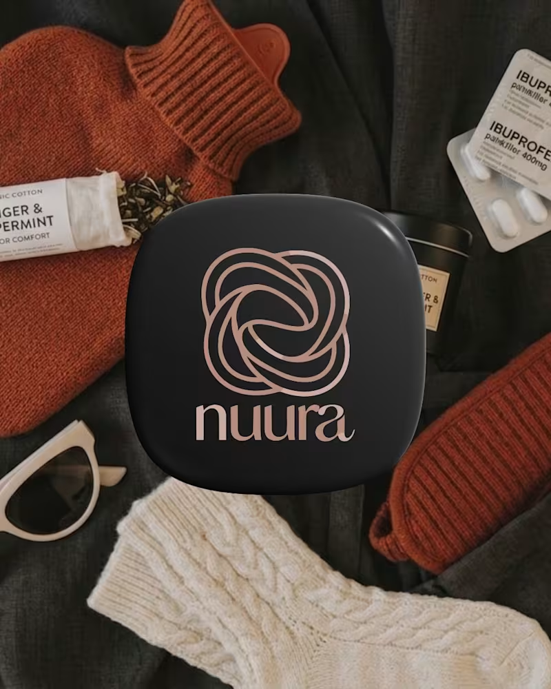
Nuura is a cycle-aware health companion designed to help users understand their bodies beyond surface-level tracking. The app brings together physical symptoms, emotional patterns, and daily experiences into one intuitive space, translating personal data into meaningful insights over time.
The brand identity reflects softness, trust, and clarity; moving away from clinical or overly feminine stereotypes often seen in health apps. Through a minimal and calming visual language, Nuura creates a sense of safety and self-connection, supporting users in building a more informed and compassionate relationship with their health.
The branding challenges traditional health-tech aesthetics by balancing minimalism with emotional depth. A soft, muted palette and refined typography system create a calm, non-clinical experience, while the overall tone prioritises trust, clarity, and self-awareness.
1
59

Brand & Graphic Designer
Brand & Graphic Designer
View more →

Brand Strategist crafting purpose-driven identities
Brand Strategist crafting purpose-driven identities


View more →


Creative lab for brand, product and growth.



Helping conscious brands create meaningful change