Nuura is a cycle-aware health
Millie Brooks
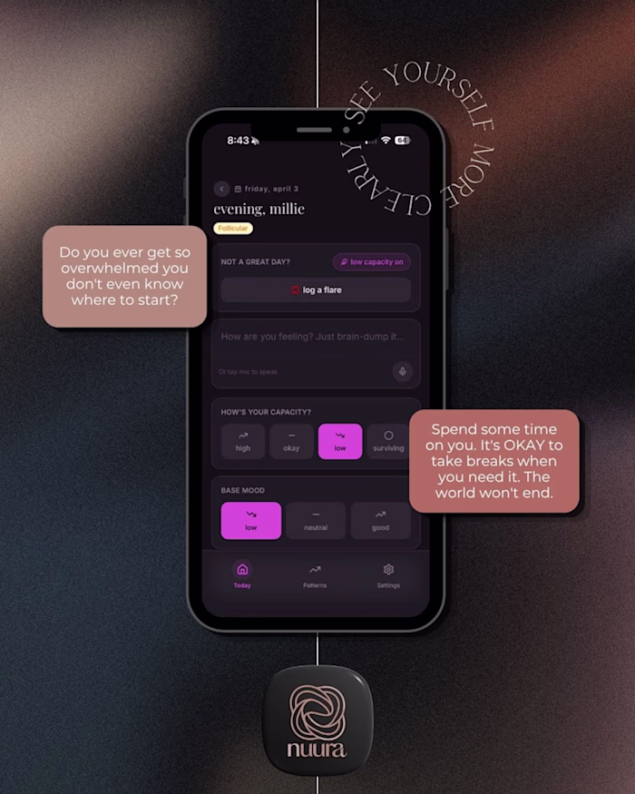
Nuura is a cycle-aware health companion designed to help users understand their bodies beyond surface-level tracking. The app brings together physical symptoms, emotional patterns, and daily experiences into one intuitive space, translating personal data into meaningful insights over time.
The brand identity reflects softness, trust, and clarity; moving away from clinical or overly feminine stereotypes often seen in health apps. Through a minimal and calming visual language, Nuura creates a sense of safety and self-connection, supporting users in building a more informed and compassionate relationship with their health.
The branding challenges traditional health-tech aesthetics by balancing minimalism with emotional depth. A soft, muted palette and refined typography system create a calm, non-clinical experience, while the overall tone prioritises trust, clarity, and self-awareness.
Like this project
Posted Apr 4, 2026
Nuura is a cycle-aware health companion designed to help users understand their bodies beyond surface-level tracking. The app brings together physical sympto...