A calming allied health visual identity
Cait Pearl
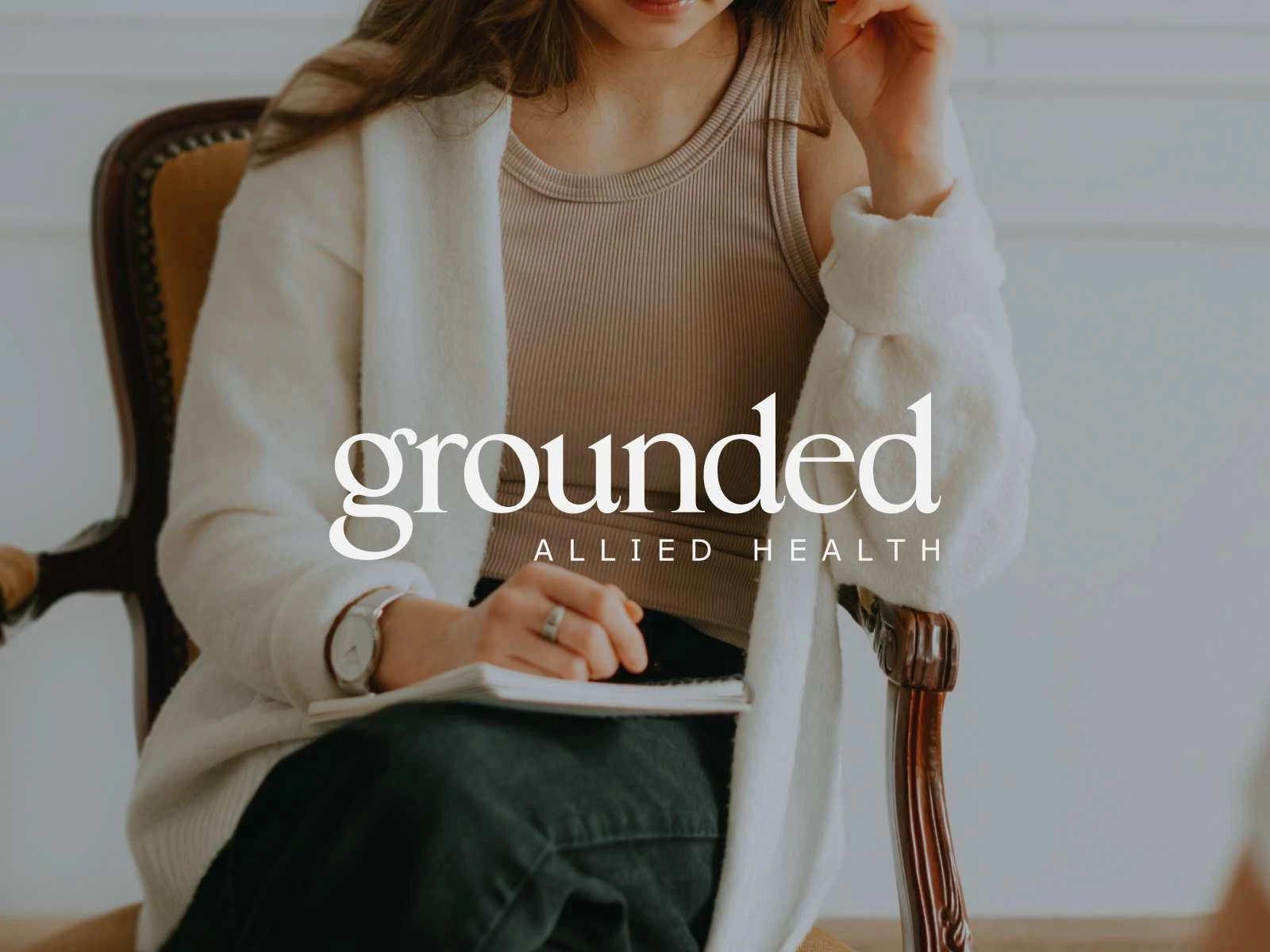
Grounded Allied Health is a new practice founded by senior psychologist, Emily Rodriguez. Emily sought a visual identity that reflected a calm and simple aesthetic. The goal was to establish a trustworthy and approachable brand for the allied health industry, while ensuring it could be developed quickly to support the launch of her business.
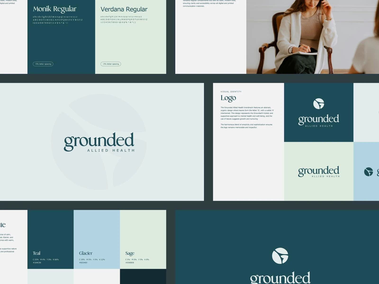
The Grounded Allied Health brand-mark features an abstract, organic design of leaves forming the letter ‘G’ with a subtle ‘A’ intertwined – representing Grounded’s holistic and supportive approach to mental health and wellbeing. We designed a colour palette of teal, glacier, and sage shades, evoking a sense of calm, stability, and trust. Verdana was chosen as the primary typeface to ensure readability and consistency across multiple professional touch-points, such as email, legal documents, and stationery, which are essential for allied health businesses.
Grounded Allied Health Visual Identity Guidelines

Grounded Allied Health Stacked Logo
Grounded Allied Health Imagery
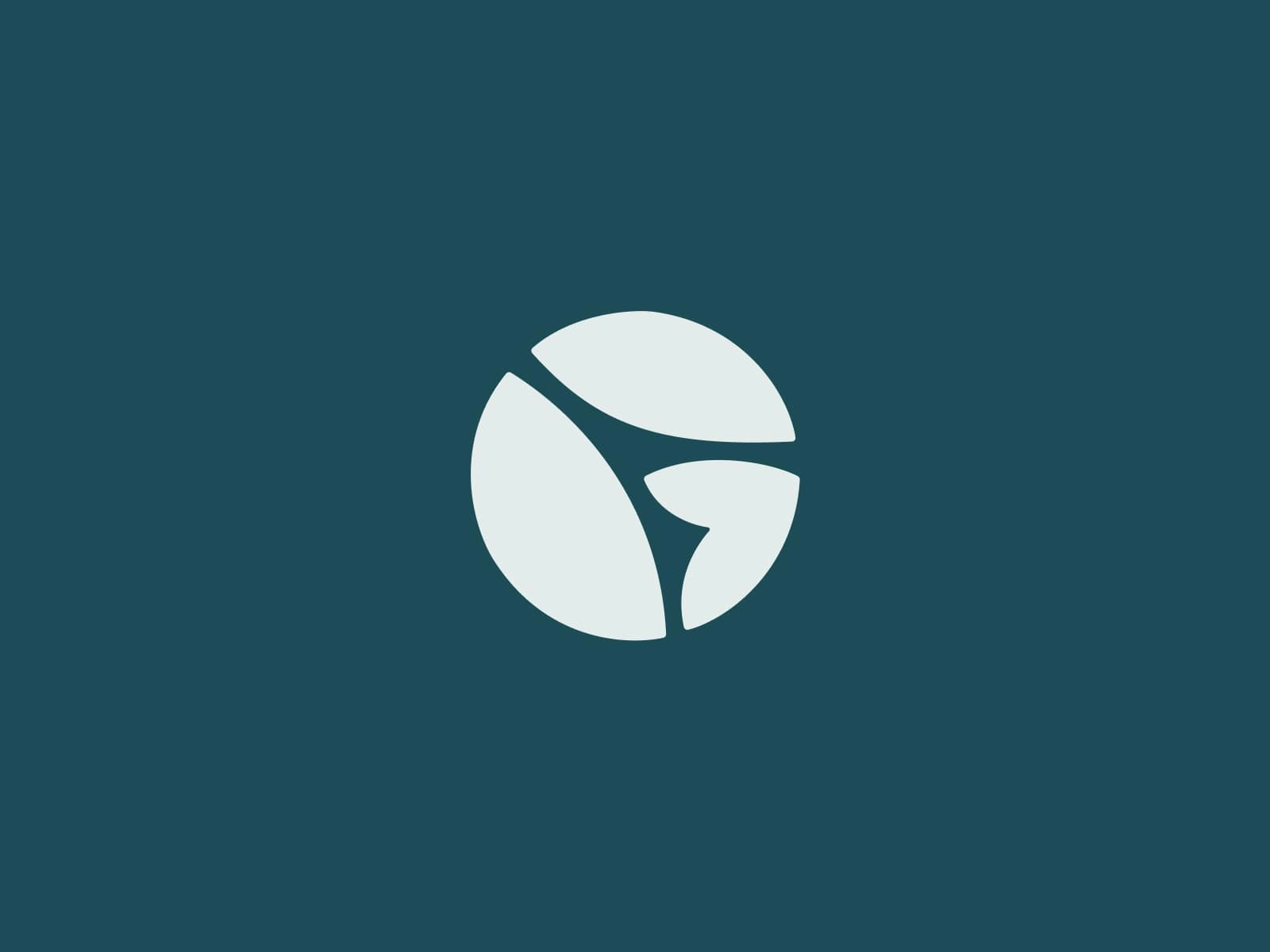
Grounded Allied Health Brandmark
Like this project
Posted Jan 30, 2025
Grounded Allied Health is a new practice founded by senior psychologist, Emily Rodriguez. Emily sought a visual identity that reflected a calm and simple aesth…
Likes
0
Views
5