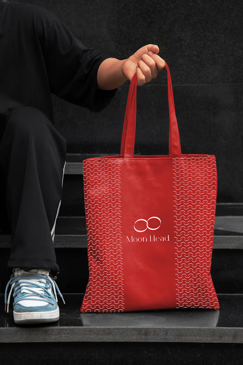
Brand Designer & Strategist



Senior Brand Designer for Product Brands & Startups
- $10k+
- Earned
- 7x
- Hired
- 5.0
- Rating
- 113
- Followers
Senior Brand Designer for Product Brands & Startups

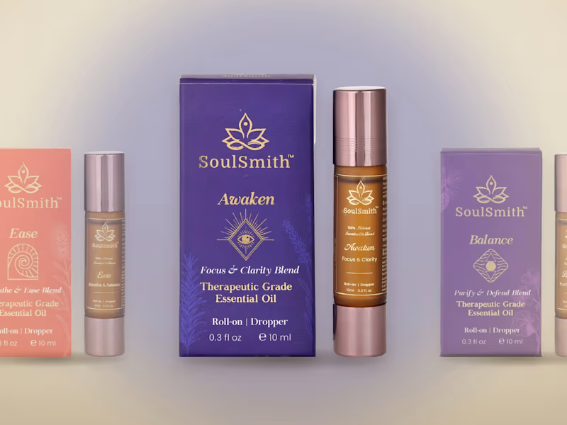
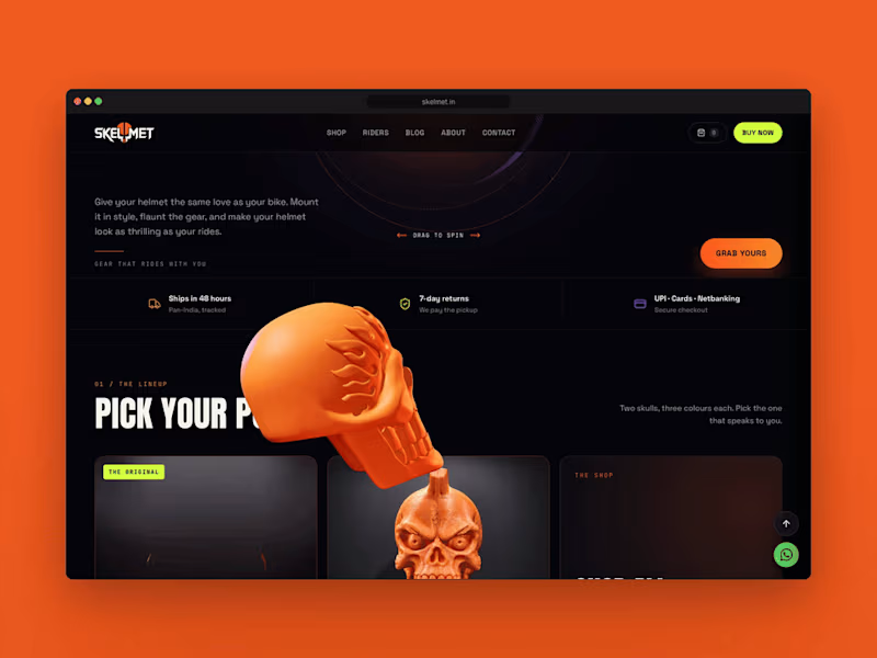

Crafting Strategic Brands That People Remember
- $1k+
- Earned
- 3x
- Hired
- 4.7
- Rating
- 12
- Followers
Crafting Strategic Brands That People Remember




Making brands look and function better.
- $5k+
- Earned
- 3x
- Hired
- 5.0
- Rating
- 31
- Followers
Making brands look and function better.


Turning your casual scrollers into obsessed buyers
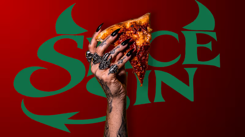
SLICE SIN® — Brand Identity & Packaging
SLICE SIN is a bold, rebellious pizzeria brand concept designed to challenge the ordinary pizza experience.
Inspired by gothic aesthetics, vintage American culture, dark humour and indulgent food experiences, the identity combines expressive typography, striking illustrations and a distinctive red, cream and black colour palette.
THE BRAND
The idea was to create a pizza brand that feels unapologetic, memorable and instantly recognizable. Every touchpoint reflects its rebellious personality while maintaining a premium visual language.
VISUAL IDENTITY
A distinctive visual system built around:
Custom expressive logo design
Gothic-inspired typography
Vintage engraving-style illustrations
Bold flame graphics and signature patterns
A striking red, cream and black colour palette
PACKAGING DESIGN
The packaging translates the brand's personality into a physical experience through custom pizza box concepts, illustrated surfaces, bold messaging and distinctive structural details.
MENU DESIGN
The menu follows the same visual language, introducing signature pizzas and creatively named cold drinks under the category POTIONS.
THE EXPERIENCE
From the pizza box to the drink cup, every detail is designed to make SLICE SIN more than just another pizza brand.
A little rebellion. A lot of flavour.
An independent conceptual branding and packaging design project.
0
15
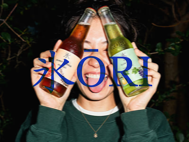
KŌRI 氷 - Premium Beverage Packaging & Brand Identity
KŌRI (氷) is a conceptual premium non-alcoholic beverage brand. The challenge was to create a visual identity and packaging system that bridges the gap between traditional Japanese botanicals and modern urban energy.
The Solution:
I designed a complete packaging system that feels both authentic and highly commercial. The design utilizes a clean, minimalist typography system paired with delicate botanical illustrations.
To showcase the brand's versatility, I developed a robust art direction strategy—placing the product in environments ranging..
What I Delivered:
Brand Identity & Logo Design
Label Design & Typography System
Color Palette Selection
Photorealistic 3D Mockups & Lifestyle Art Direction
Product Advertising Visuals
0
74
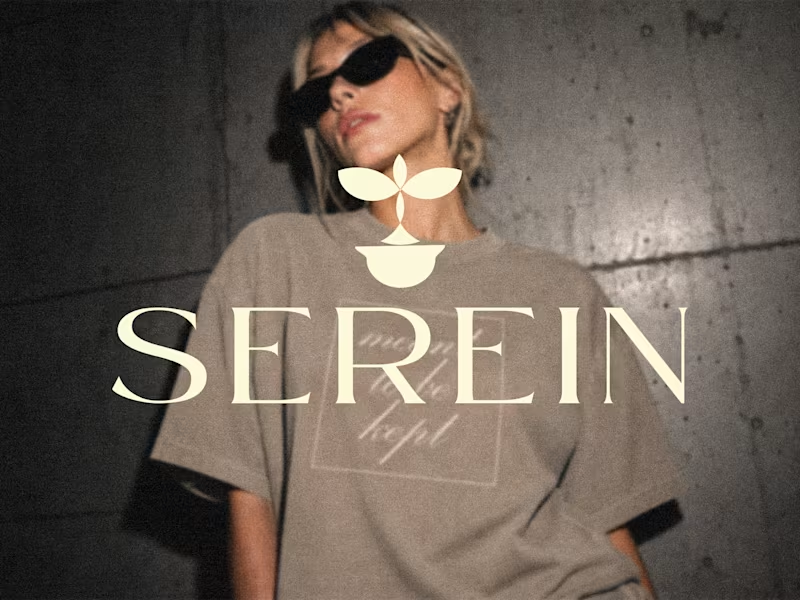
SEREIN — Fashion Branding & Packaging Design
A brand is more than just a logo. It's an experience built through every detail.
SEREIN is a fashion branding and packaging design project where I explored how thoughtful design can create a cohesive and memorable brand experience.
From the visual identity to the packaging details, every element was designed to feel connected, intentional, and refined.
Here's what I worked on:
• Brand identity and visual direction
• Mailer box packaging design
• Hang tags and garment labels
• Stickers and thank-you cards
• Apparel branding and mockups
The visual direction brings together deep brown, warm ivory, and bold red accents, paired with expressive typography and minimal botanical elements.
My goal was to create a visual identity that feels distinctive while keeping the overall experience clean and cohesive.
This project allowed me to explore how packaging can become an important part of a fashion brand's identity.
I'd love to hear your thoughts!
If you're building a fashion or lifestyle brand and looking for packaging design, feel free to connect or send me a message.
#PackagingDesign #BrandIdentity #FashionBranding #GraphicDesign #Packaging
0
82

Building brands with a soul worth the work
Building brands with a soul worth the work


Creative Graphic & UI/UX Designer