Lavoro - Cafe Branding
Dhruv Sachdeva
This project was done in collaboration with Skh.design.
Lavoro tries to build a composed environment. A physical space of isolation that promotes the culture of working in peace. The lifestyle of remote working has hit us all, and working from cafes is slowly becoming a crucial part of the work culture. The brand tries to express values of segregation and isolation to enhance the outcome of any customer by being in assisting surroundings. The word 'Lavoro' means 'to work' and imbibes qualities like calm and isolation. The same emotions are attempted to portray through the design aspects.
Why does the brand exist?
Lavoro is an intersection of a peerless cafe and a dynamic space to work and share new experiences. The brand is actively trying to offer flexible workspaces for businesses. From young startups to fast-growing companies, businesses of all sizes can call Lavoro their home. There are endless opportunities in this universe, and Lavoro's mission is to bridge, that gap between dreams and reality.
What future do they help create?
Co-working, a concept, relatively unknown just a few years ago, is now a new reality. Lavoro wants to help build communities with a right blend of a casual and professional workplace. Lavoro's team is creating a future of co-working spaces that empowers their customers with an opportunity to work, network, and build, while sipping a delicious cup of coffee.
What values help guide this?
With collaboration, community, and productivity at their core, Lavoro strives to make a relaxed and comfortable space a home, away from home. They believe people thrive in a supportive and nurturing environment where they are constructively challenged by each other and catalysing their growth and prosperity.
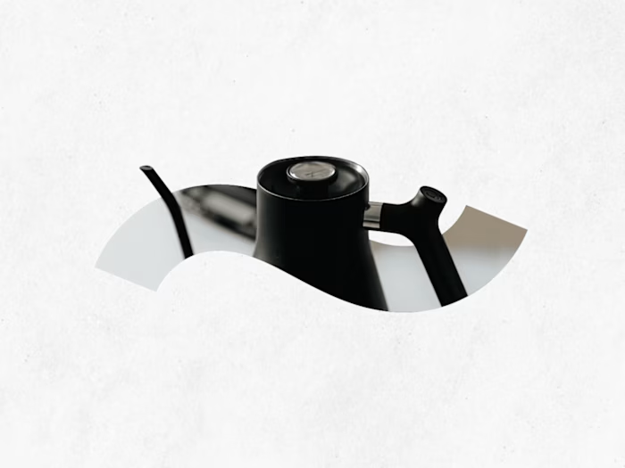
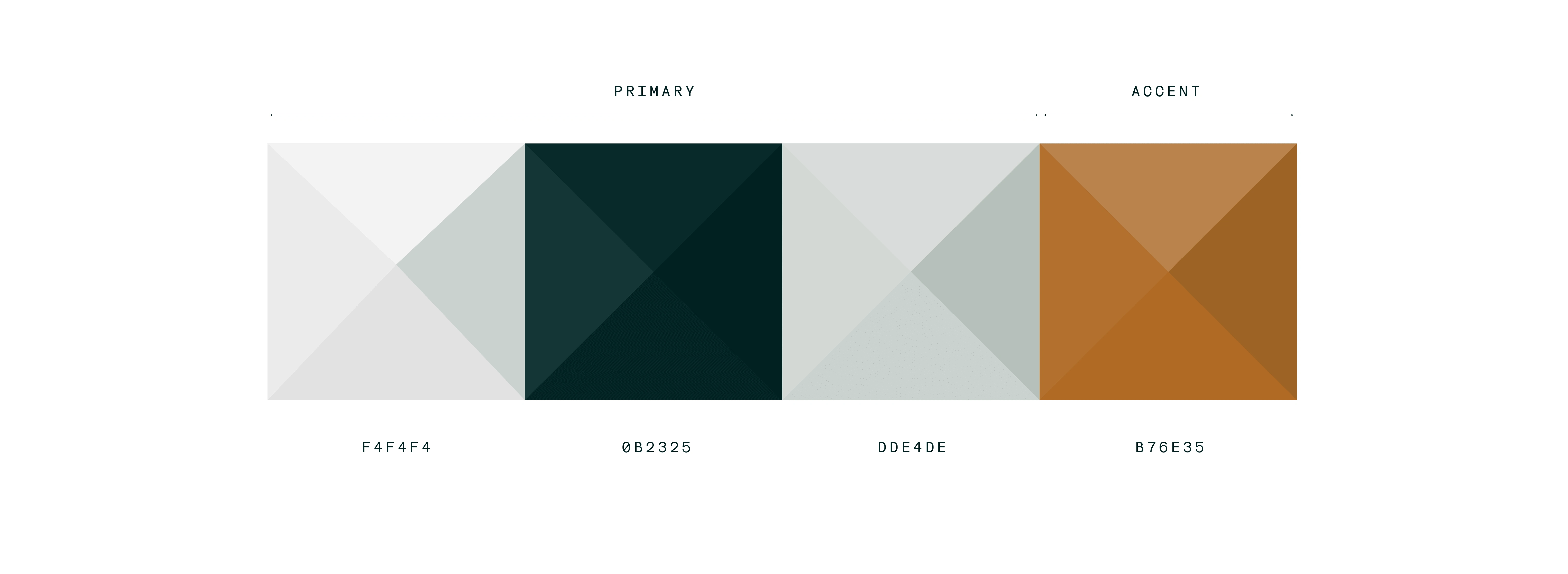
The palette
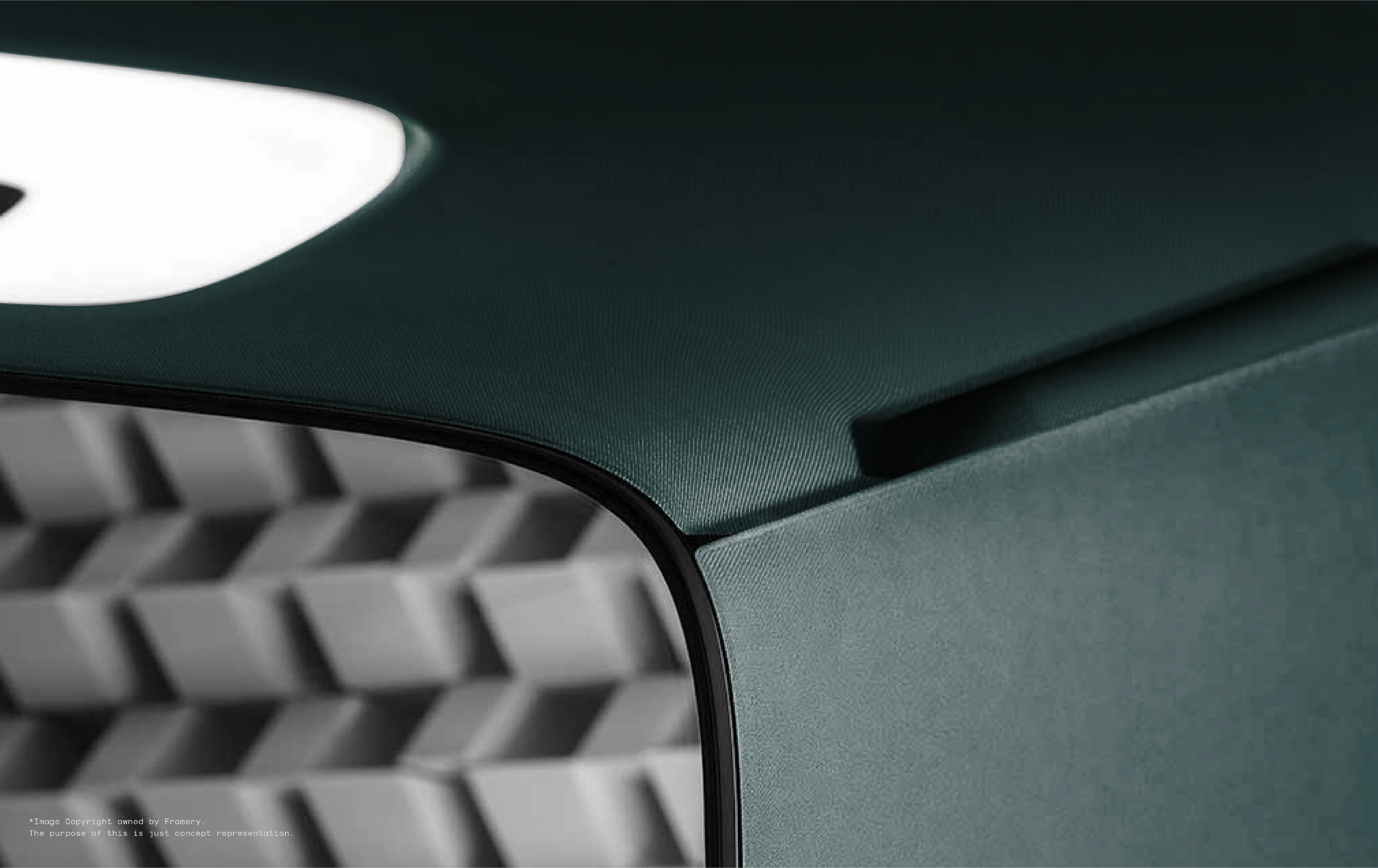
The aim was to represent calm and productivity with the palette. The colors used are subtle and energising. The accent colors are towards the shades of brown and grey, trying to compensate for textures within the cafe i.e. wood and walls. The grey also inspires the kind of cutlery that complements the entire palette. The textured raw look creates the synergy of the 'process'. The greens in the palette also represent fertility, freshness, and calm, complementing the productive process, and can act as an overall inspiration of the environment.
IMPLEMENTING THE PALETTE
The cutlery is a pivotal part of the entire brand. It is one of the many elements a customer interacts within a cafe. The goal was to portray homogeneity and the palette was used to achieve that. The tones of grey try to represent calm and rawness, whereas the shades of brown manifest creativity. The textures are kept raw as an inspiration to strive. The rawness also acts as a creative stimulus in the ambience.
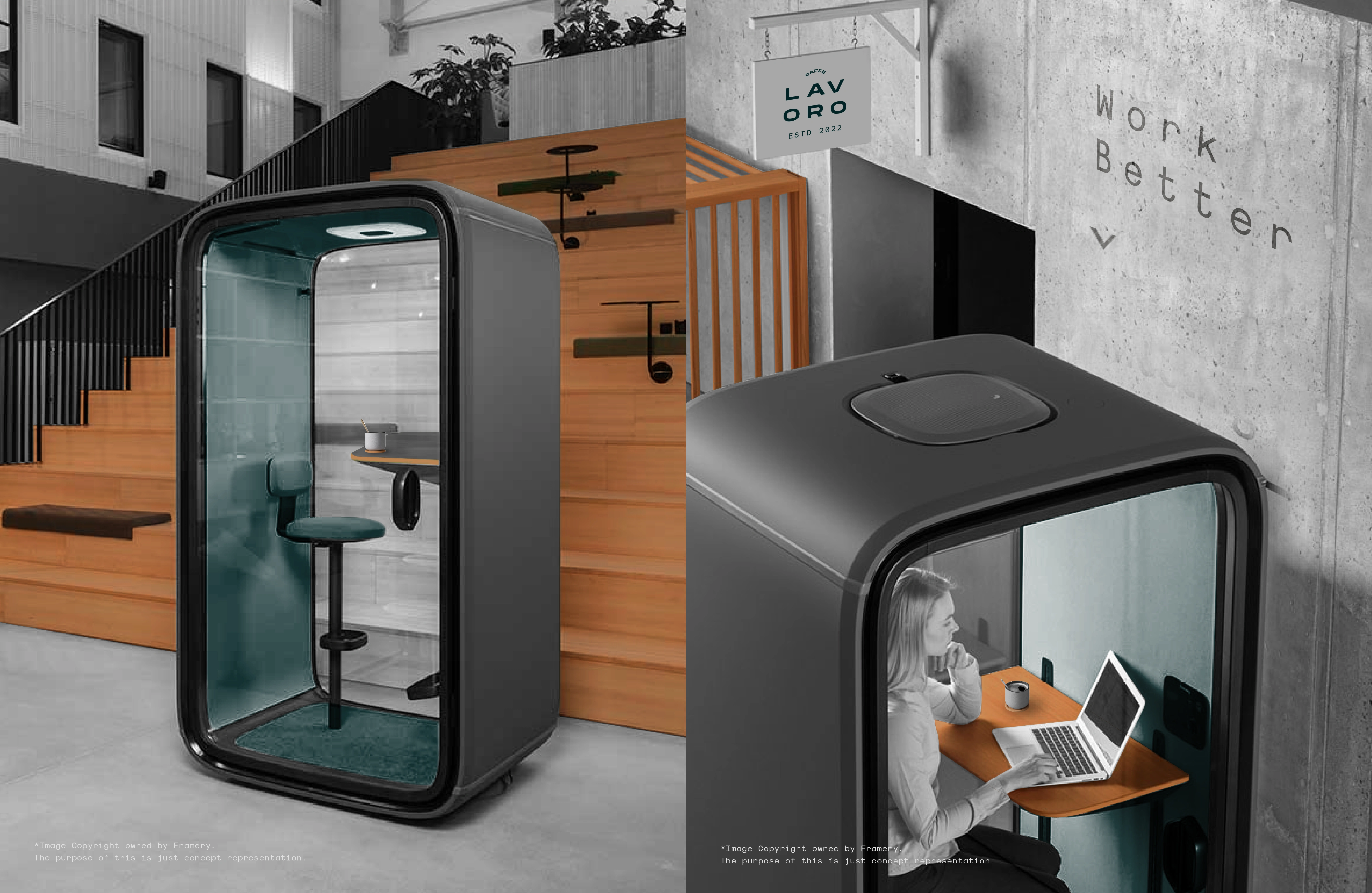
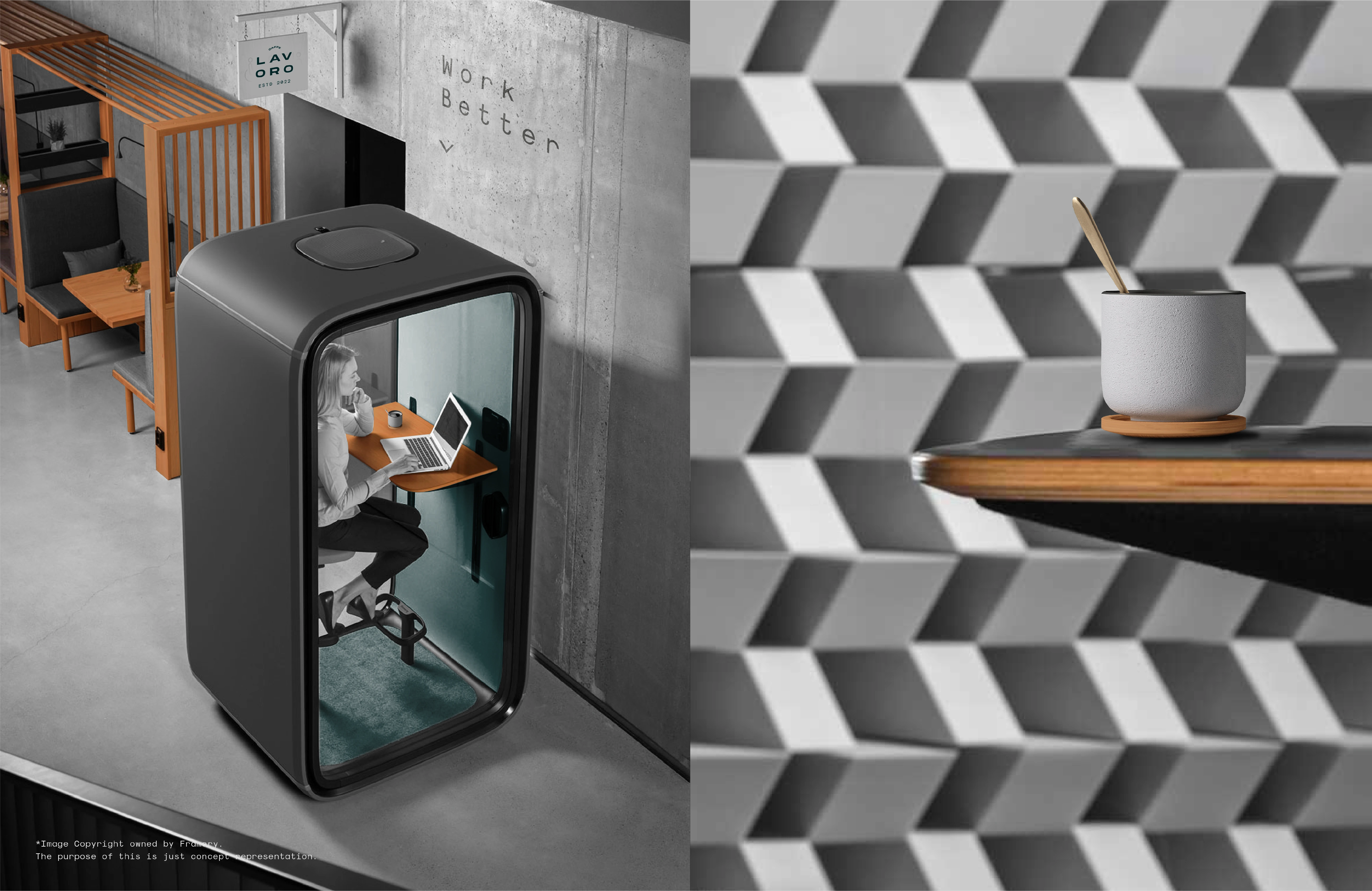
ISOLATION
Isolation is one of the most important values for the brand. It gives an opportunity to create an environment where you have the comfort of personal space inside a community driven ecosystem. They implement this vision with work pods. Work pods are multi -sized sound proof cabins, that can let instantly create a pseudo feeling of calm.
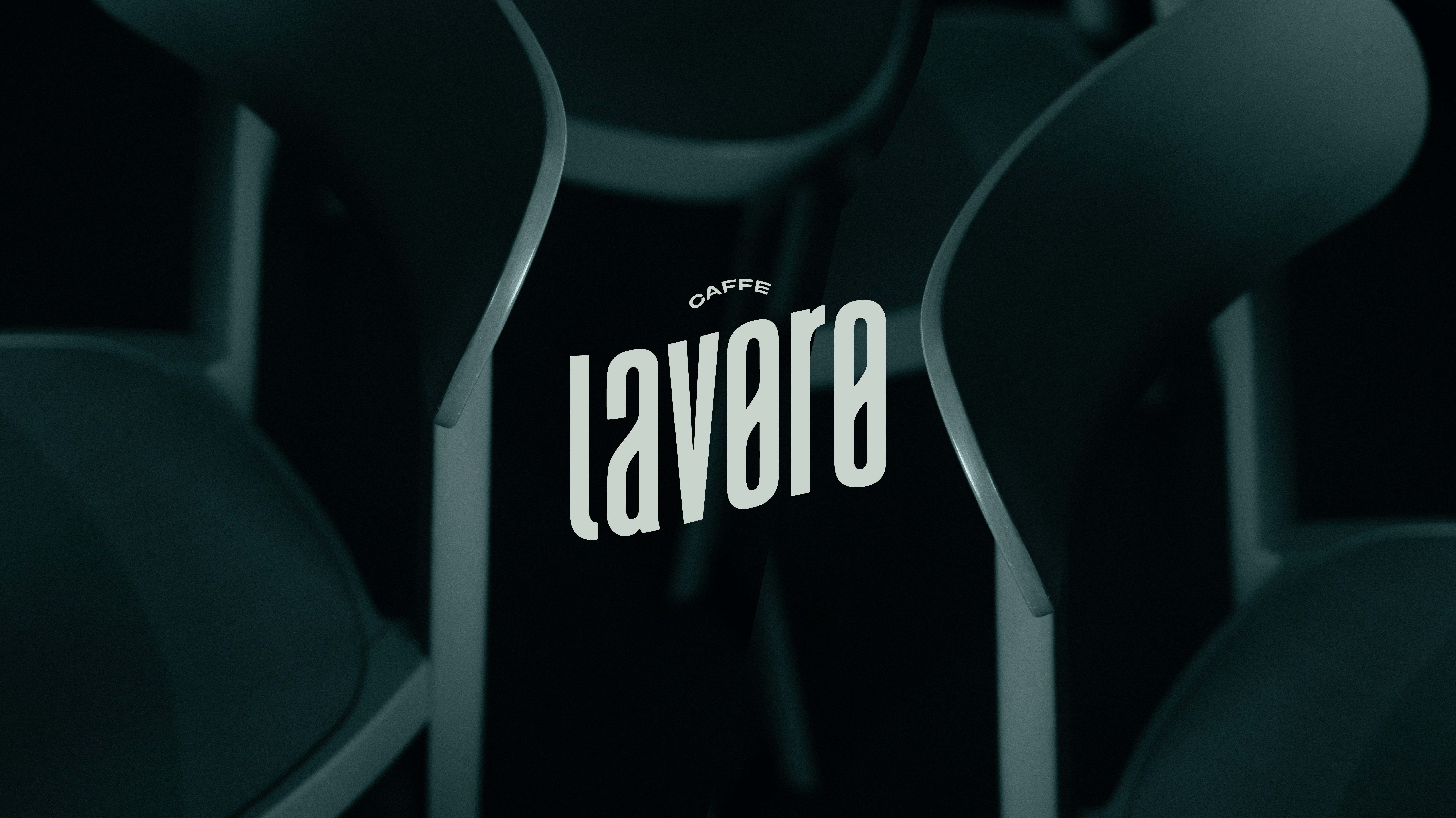
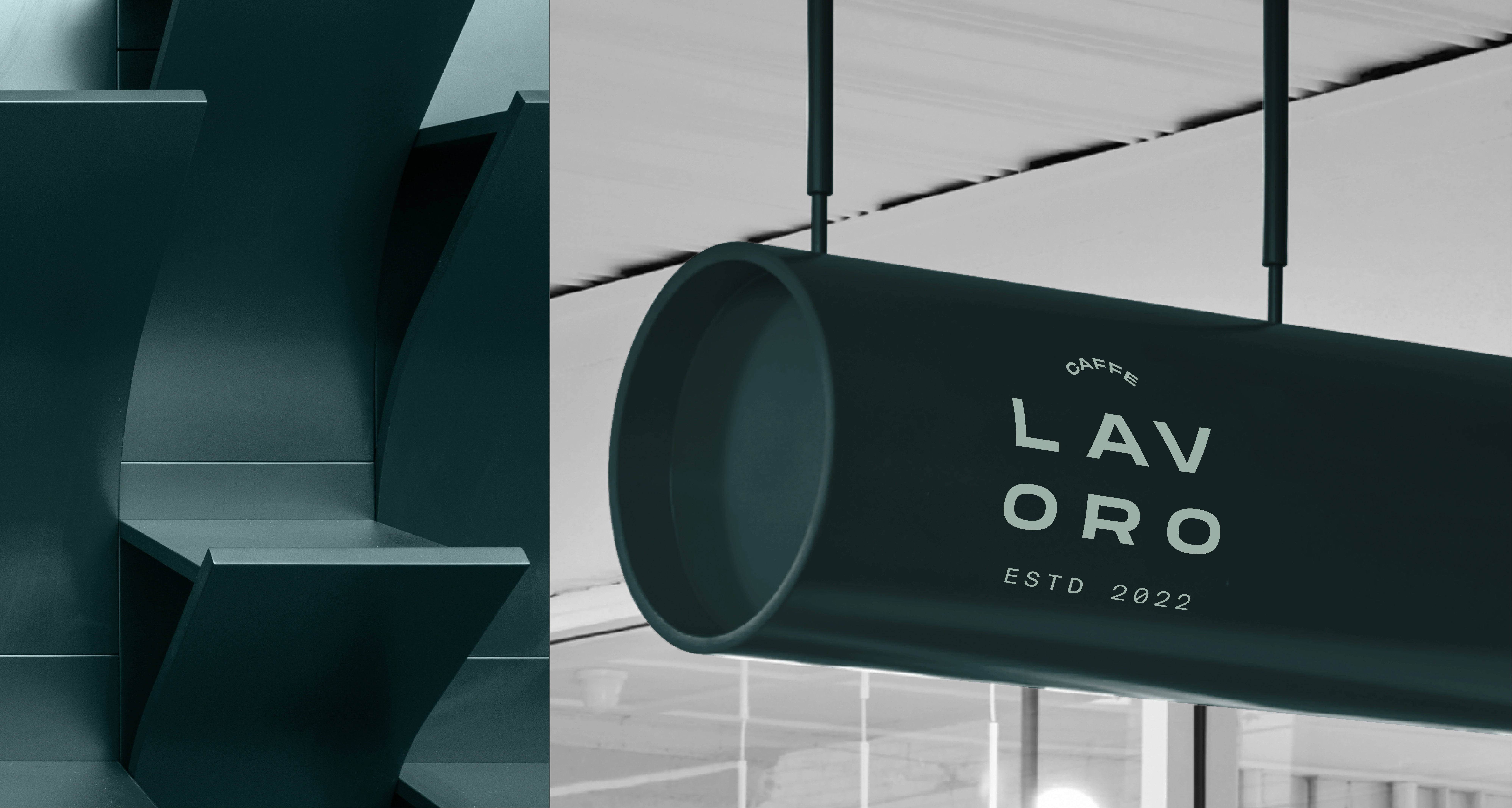
LOGO MARK & CONSTRUCTION
The wordmark acts as the primary logo. Wordmarks really help in higher recognisability and relatability. It is given a rise wave effect to represent growth. A wave generally also represents calm and relaxation. The type used in the logo is to be restricted for usage in just the logo and is not be used otherwise in overall branding, except in really special use cases. It makes the logo type stand out and more impactful.
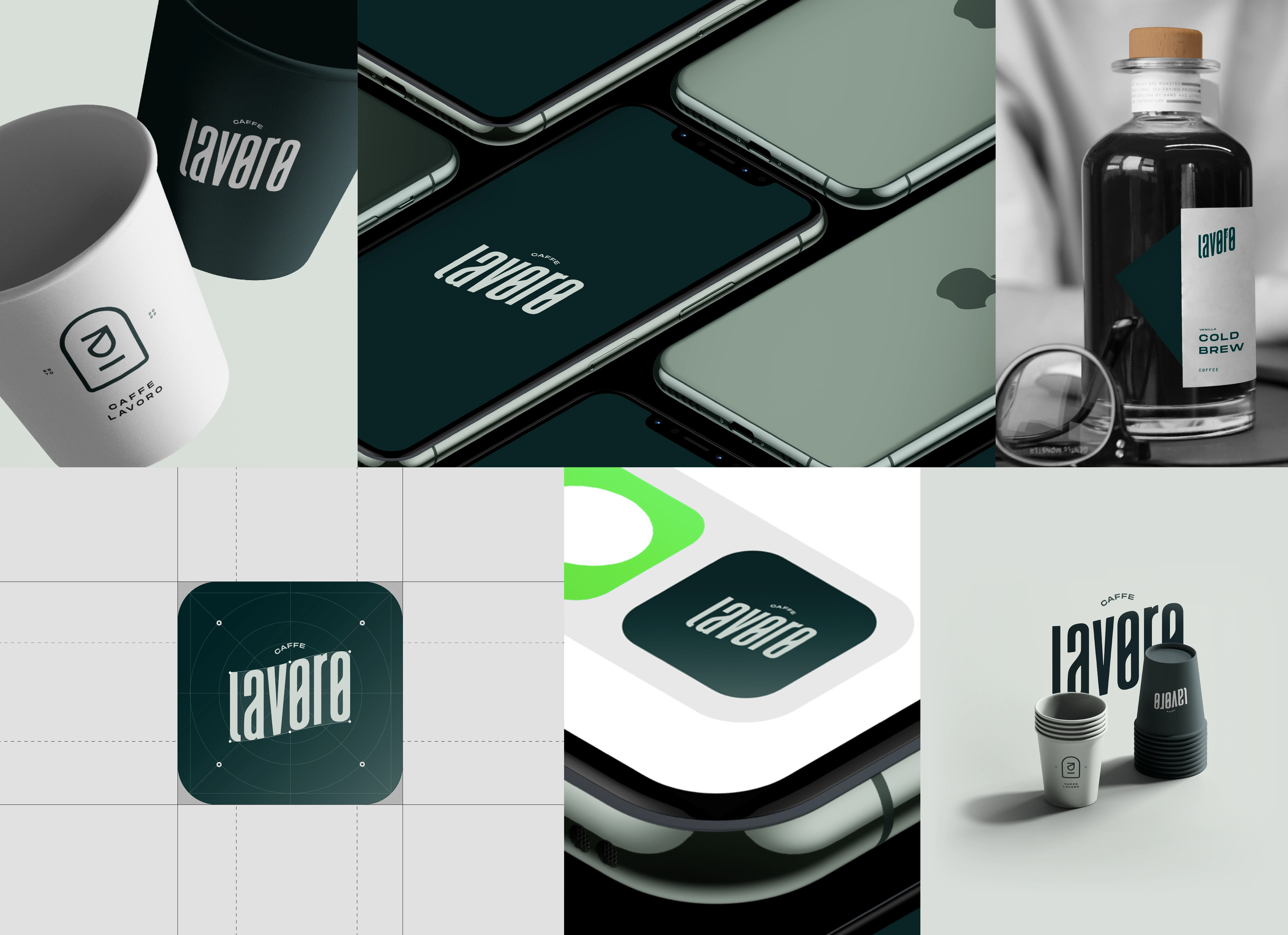
ALTERNATIVE MARKS
The 'Lavoro' word mark will act as the primary logo, and should be used around 50% across the branding. The pictorial and combination mark will act as the secondary logo for the brand and should be used around 30% of the times. The more simplistic option for the word mark is also included in the brand kit, to create a viable and a relatively more salient possibility.
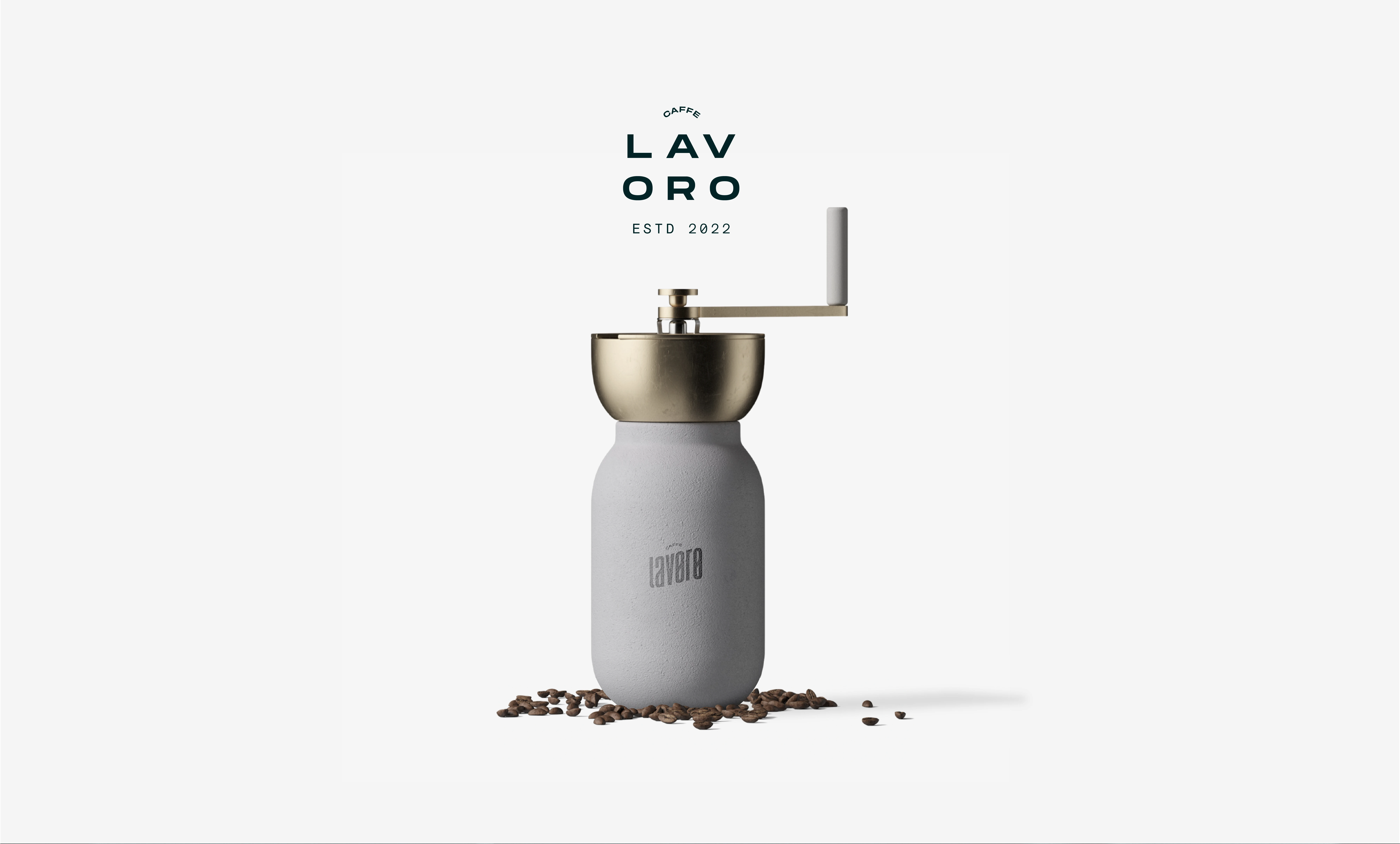
MOCKUPS & IMPLEMENTATION
The goal with mockups is to implement the design tokens, so the visual representation of how a product or design will look and function in the real world is clear and evident. Personally, the motive is to take a step further to come up with unique assets, which will be correctly represent the physical or virtual environment of the system.
Like this project
Posted Apr 6, 2023
Lavoro is a lifestyle driven cafe, promoting the modern needs of remote work. The project goal was to come up with the brand strategy and identity design.