EC·CO Brand Strategy & Design
Dhruv Sachdeva
'EC·CO' wanted to build a contemporary cafe experience with a modern blend of a bar. The use case was expanded to create a set of verbal and visual tokens to represent the brand. When working with cafes or any setup where the physical interaction of the customer is involved, it really increases the variables that would come into play. Likewise, when working with Ecco, the space was filled with greenery and had a grey modern aesthetic in flooring and outdoors. The goal was to complement that to bring out a pop of colour and at the same time blend together with the green in the indoors.
Started out by defining the brand keywords:
ELEGANT · MINIMAL · BOLD · PREMIUM · CREATIVE
Each of the adjectives represented a sense of expression that was incorporated in the design aesthetic as well. Each is explained briefly below:
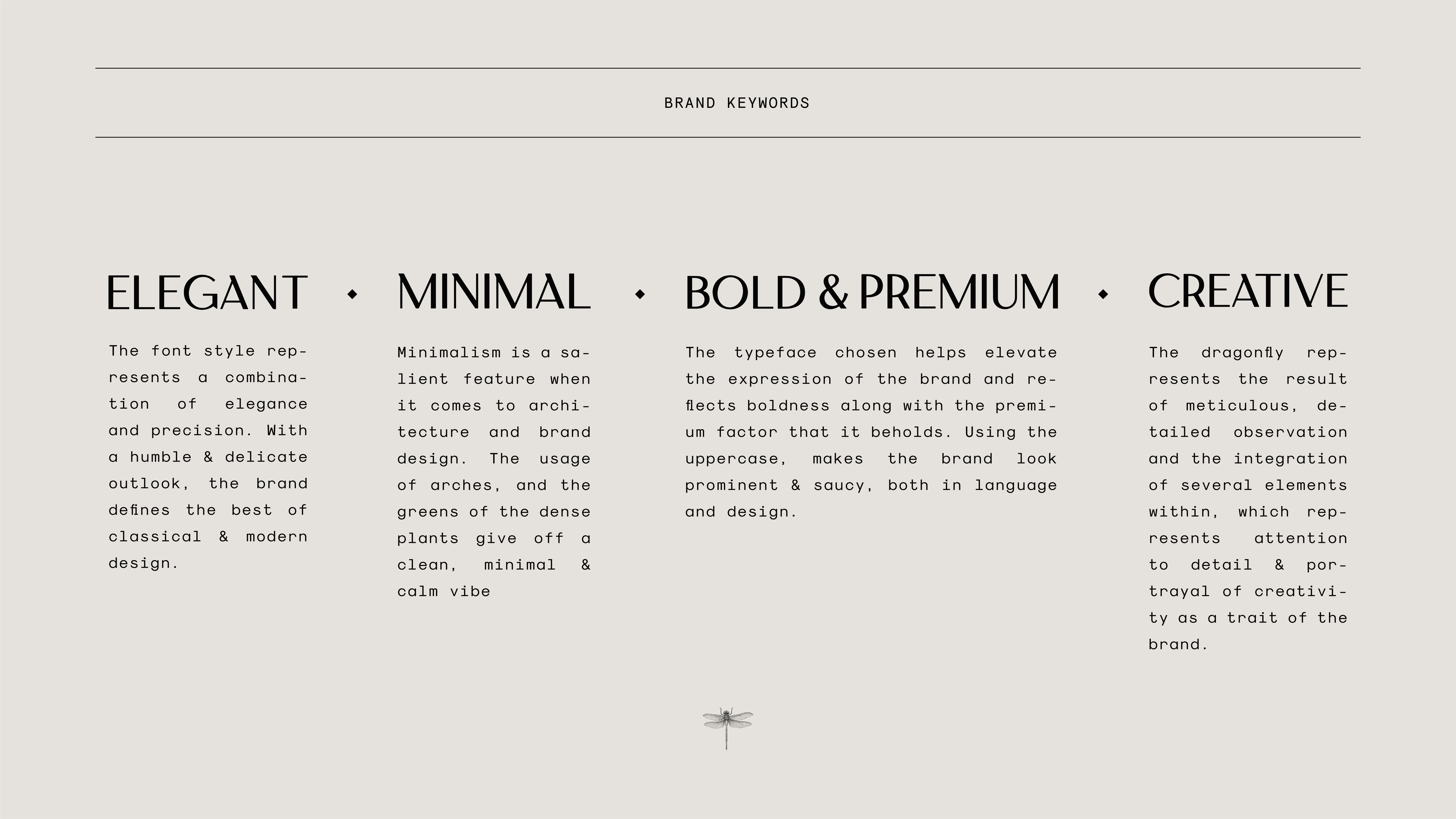
BRAND KEYWORDS
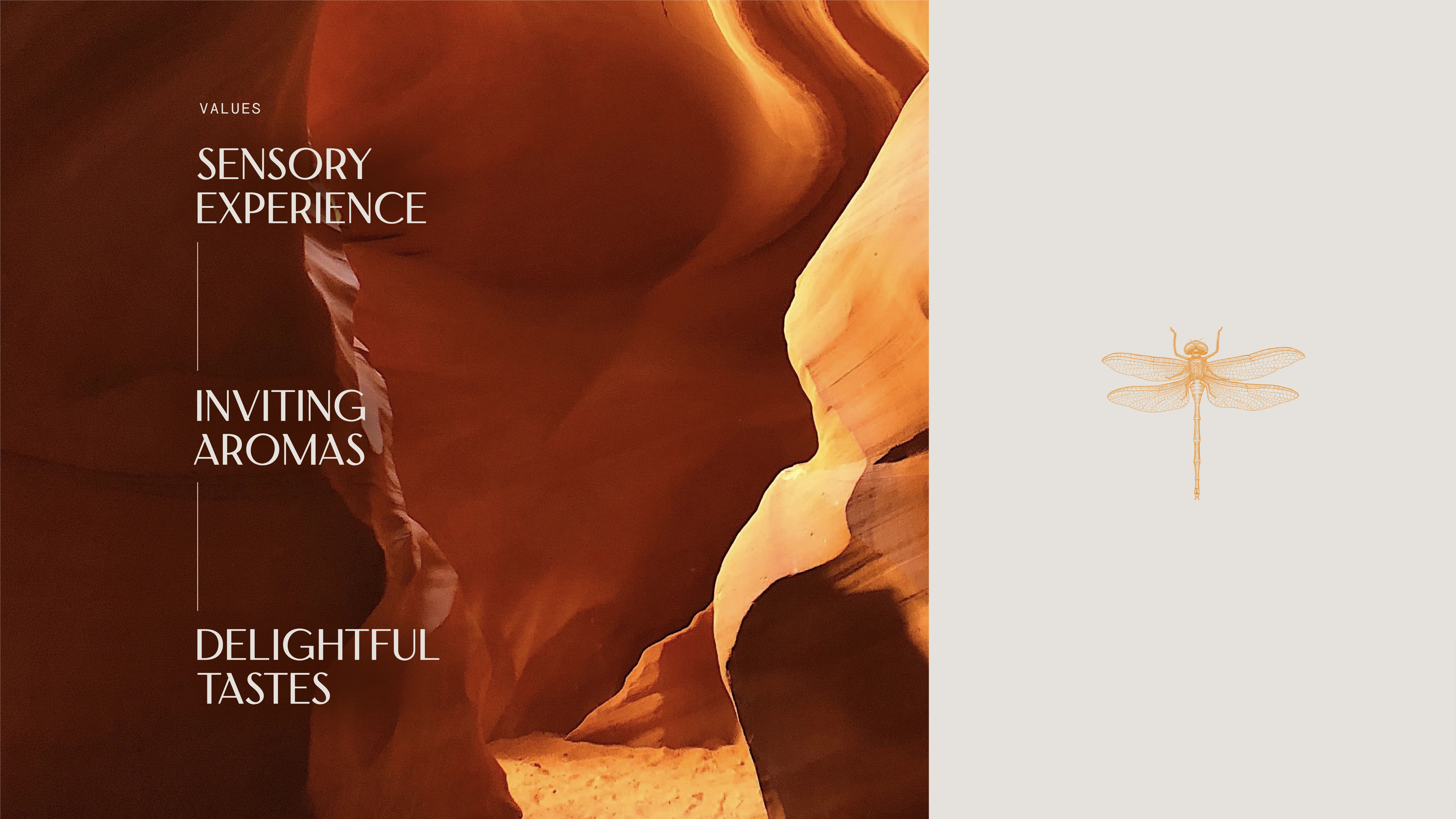
BRAND VALUES
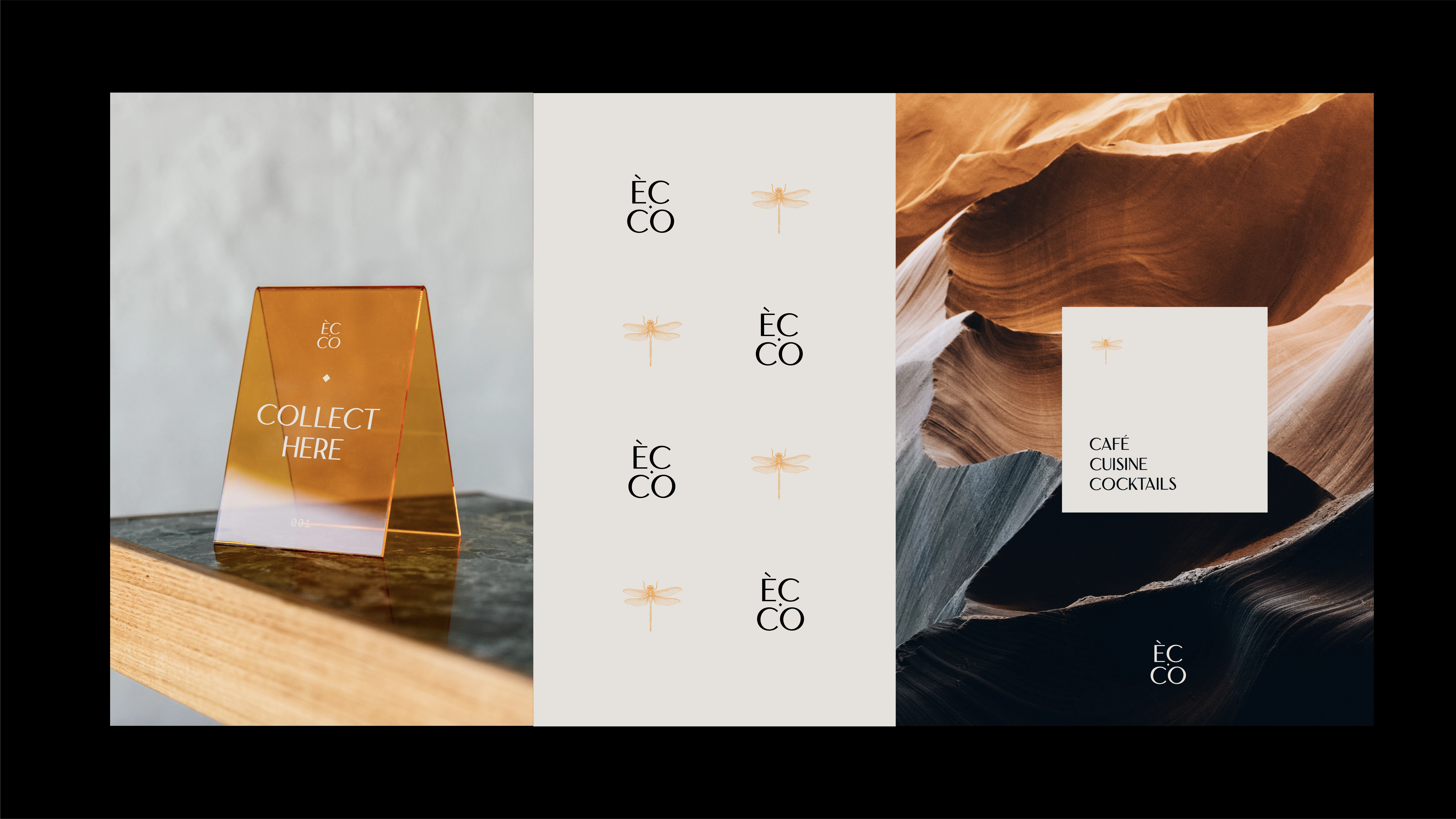
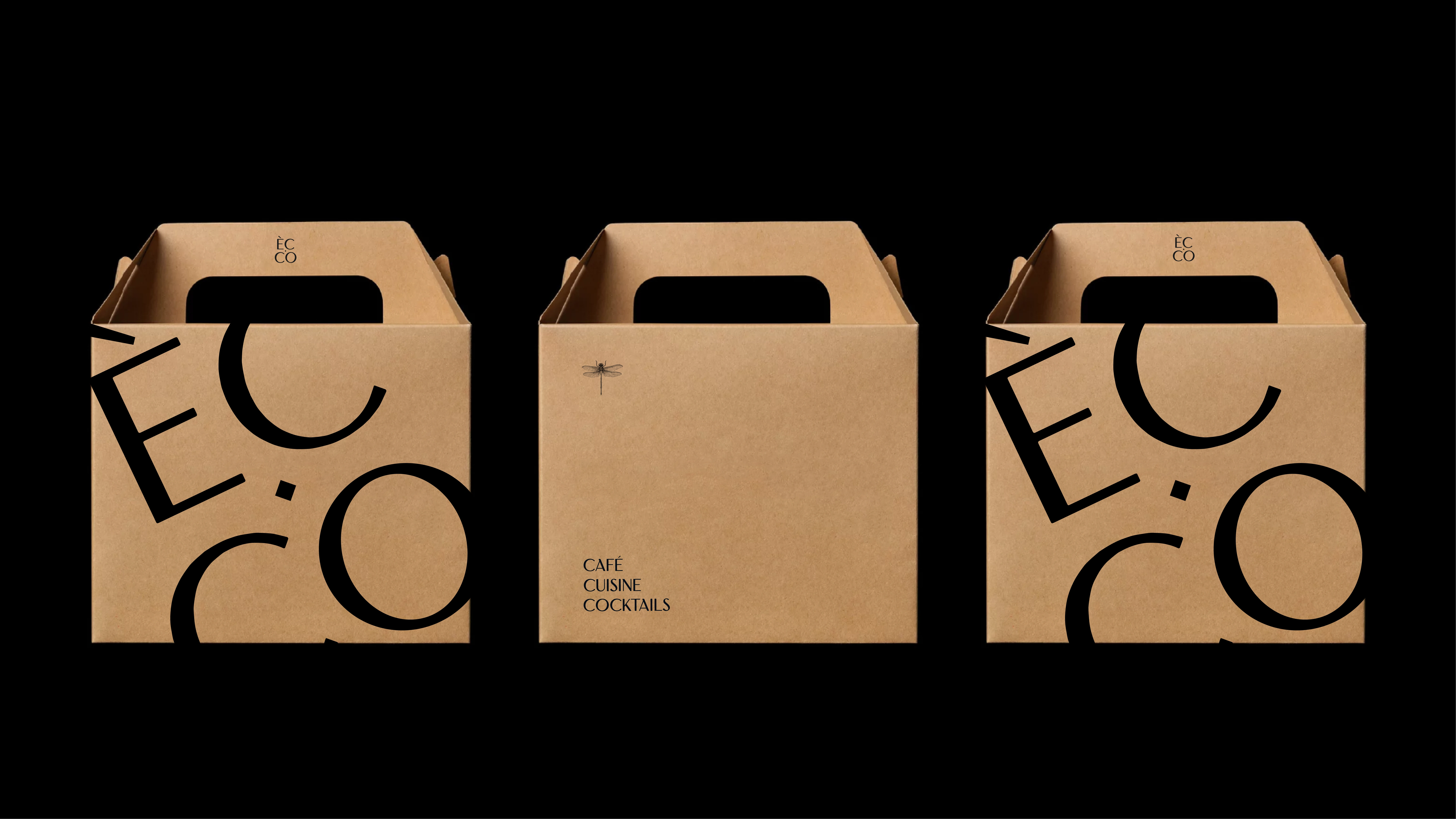
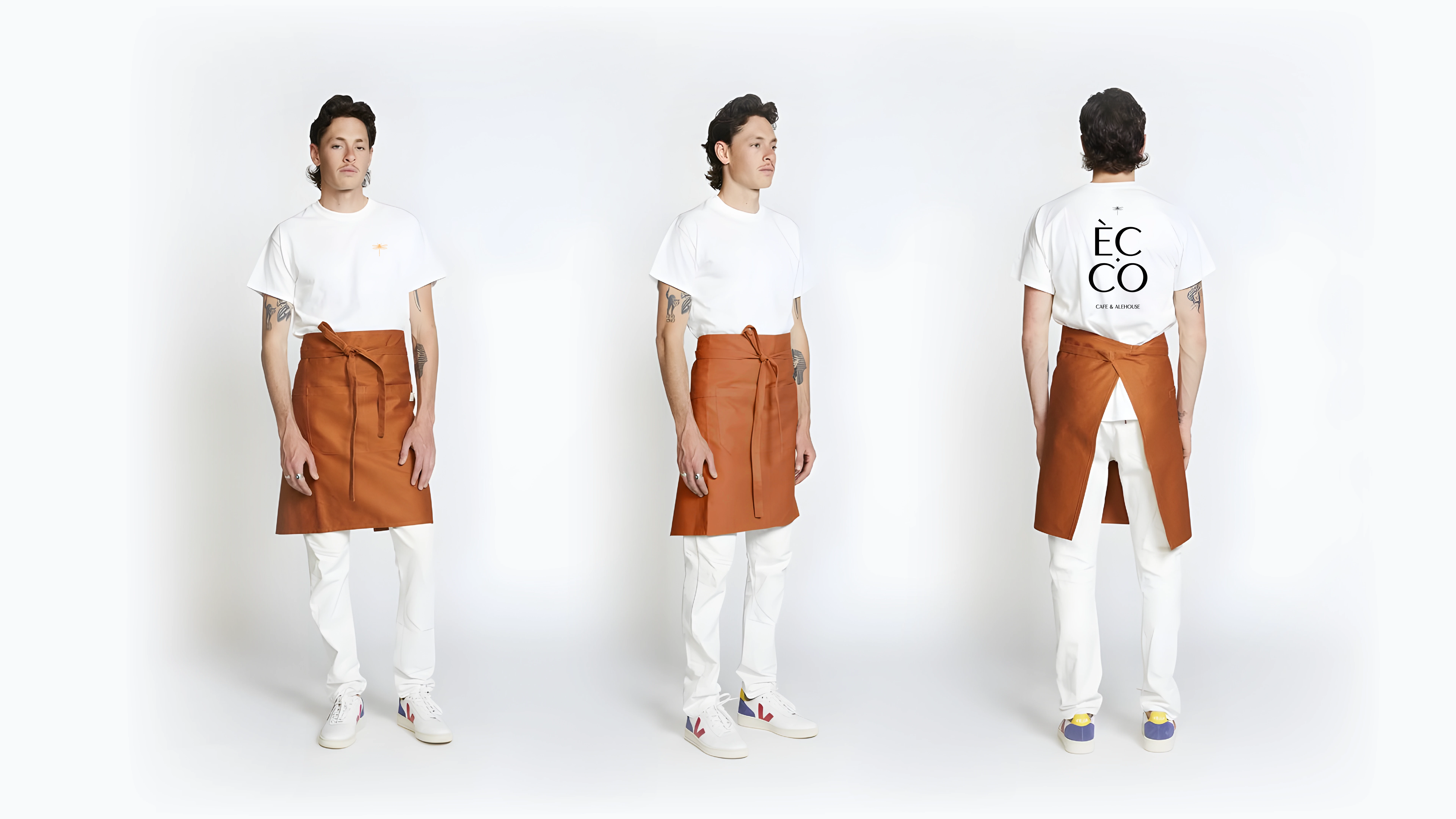
The menu was supposed to be multi-cuisine with an outlook of a cafe, so we divided the menu likewise and made it an obvious branding addition of Cafe, Cuisine and cocktails. This also gave us scope to play around with the menu design.
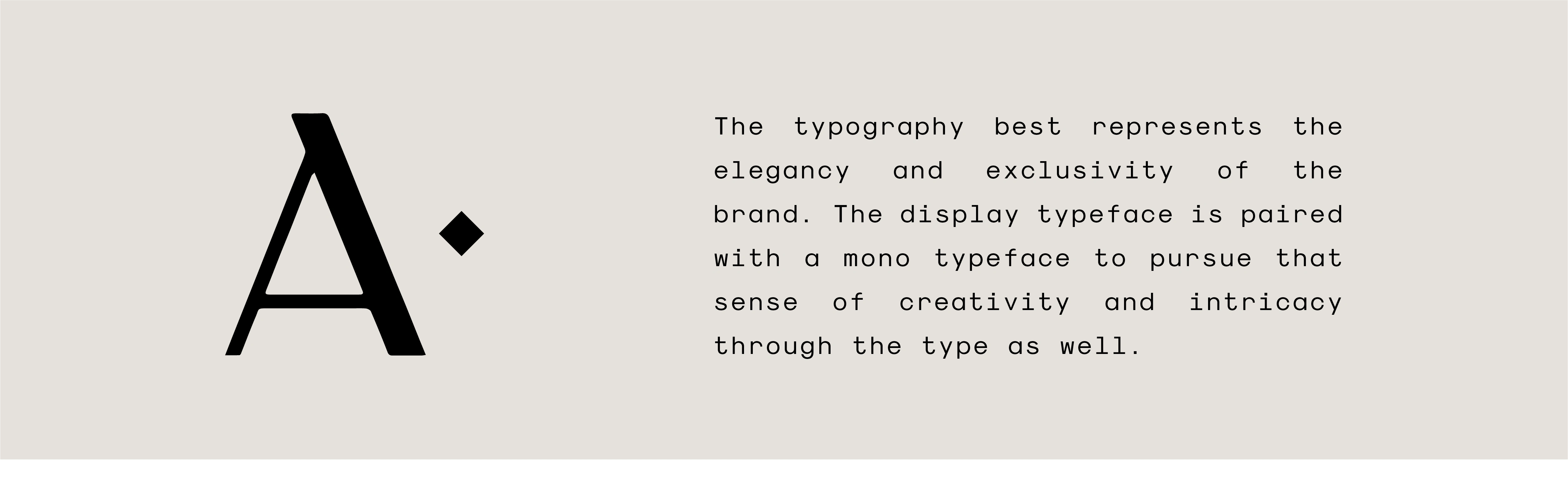
Typography
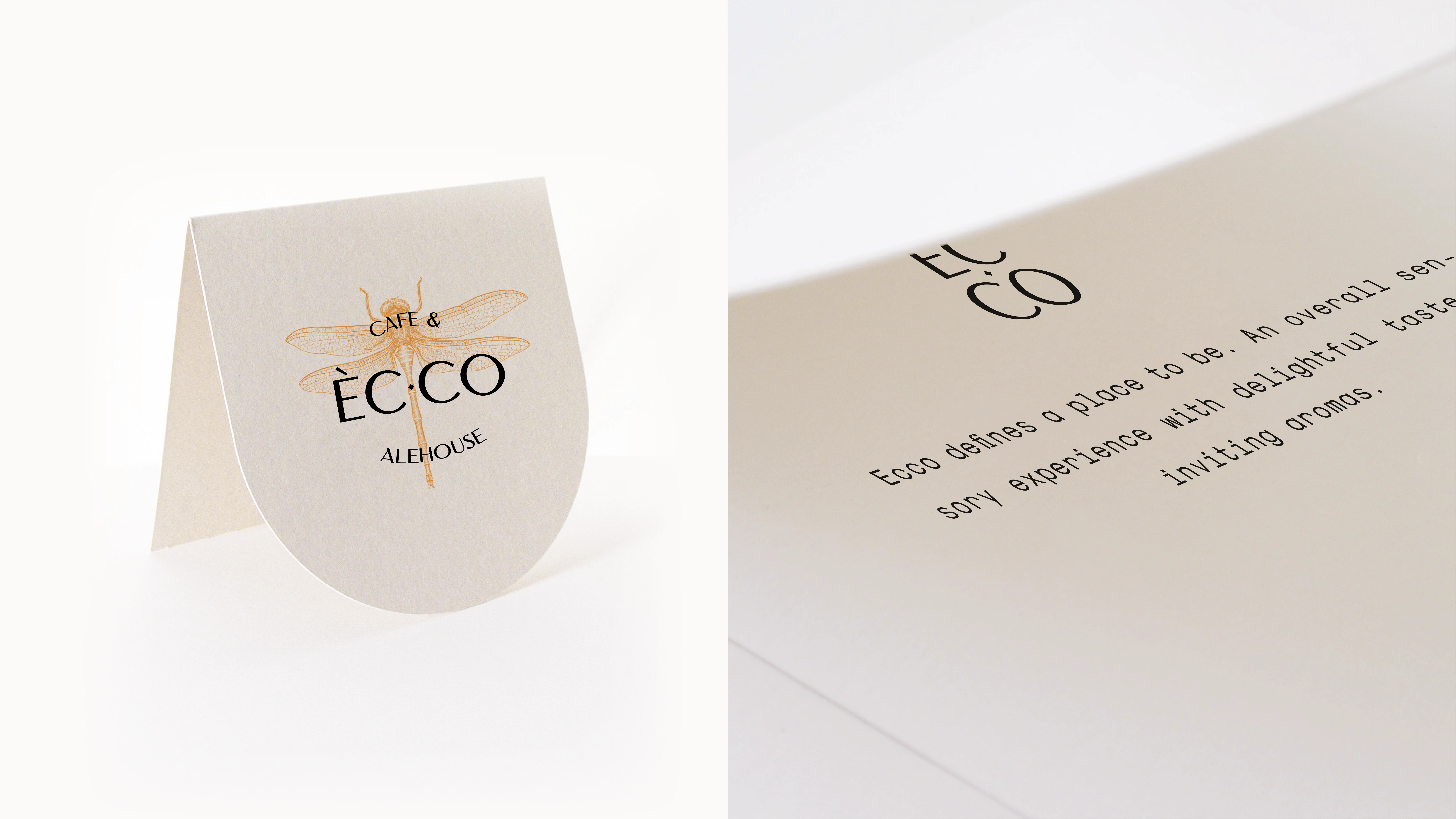
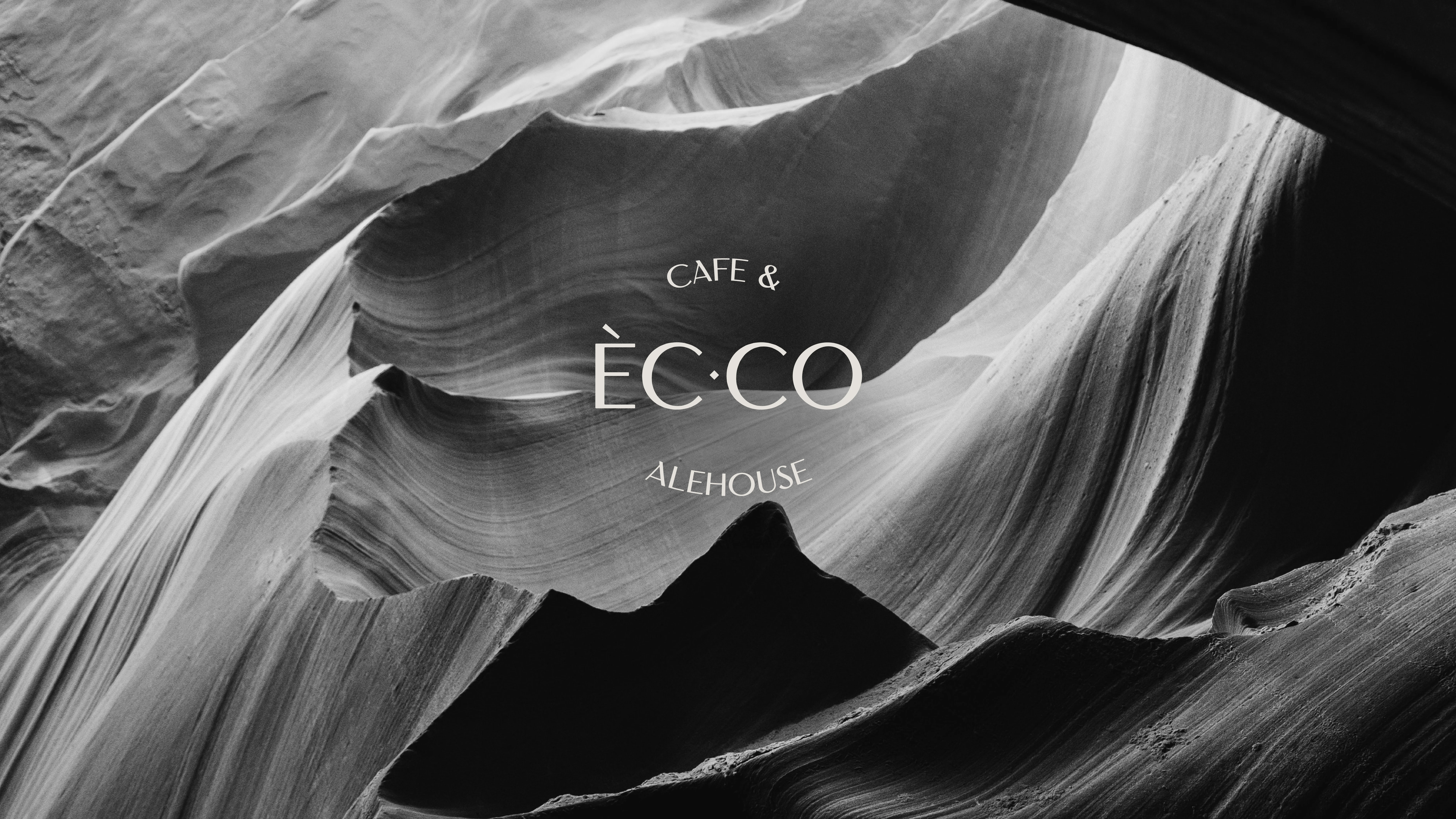
The typography is the primary part in the design. An interpunct ‘·’ is used as an essential part in the mark and the overall typography. The mark can be used as a consistent part across the branding. It can be used as a word divider, like used in the example:
Cafe · Cuisine · Cocktails
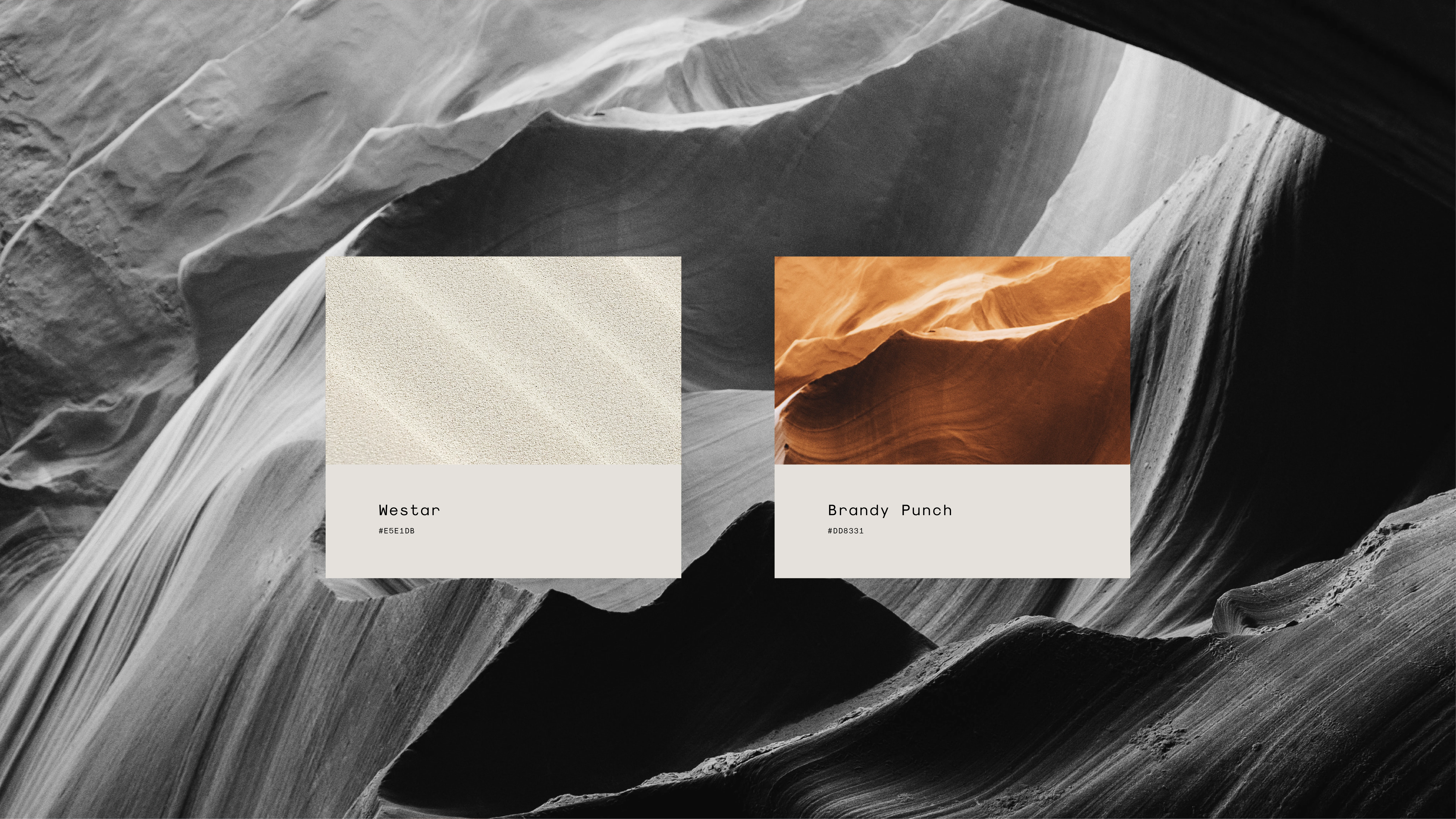
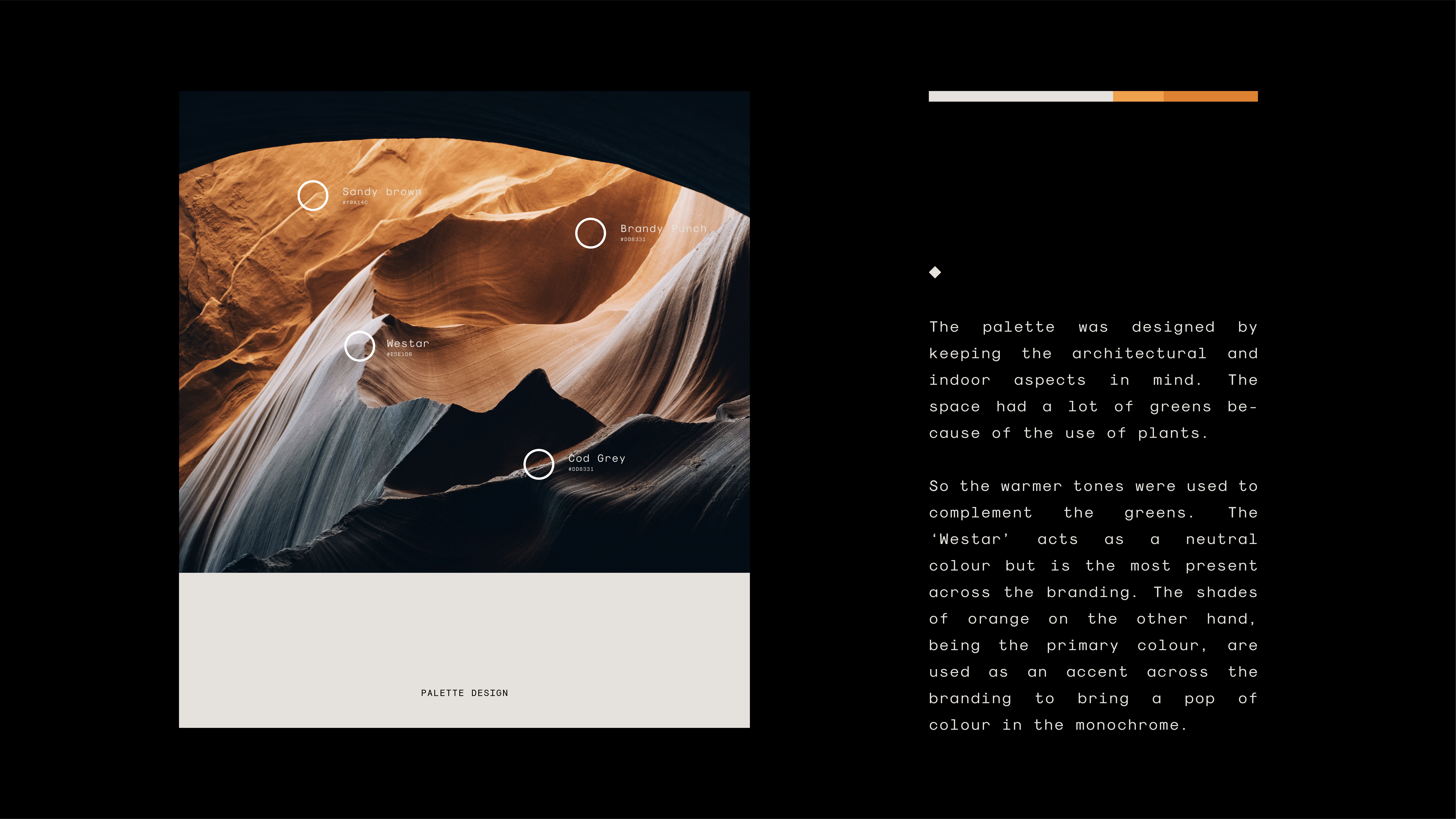
The palette
The palette was designed by keeping the architectural and indoor aspects in mind. The space had a lot of greens because of the use of plants.
So the warmer tones were used to complement the greens. The ‘Westar’ acts as a neutral colour but is the most present across the branding. The shades of orange on the other hand, being the primary colour, are used as an accent across the branding to bring a pop of colour in the monochrome.
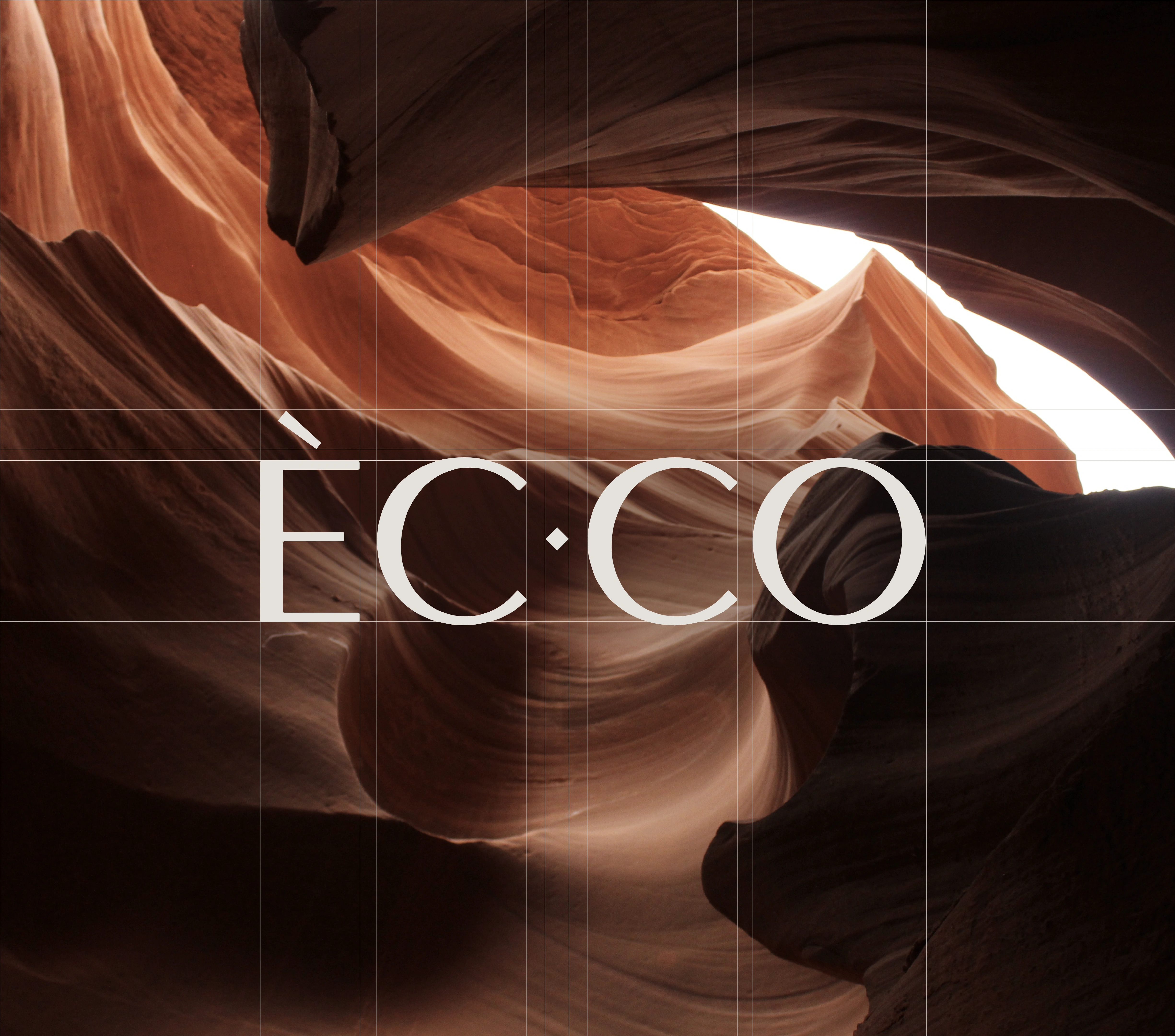
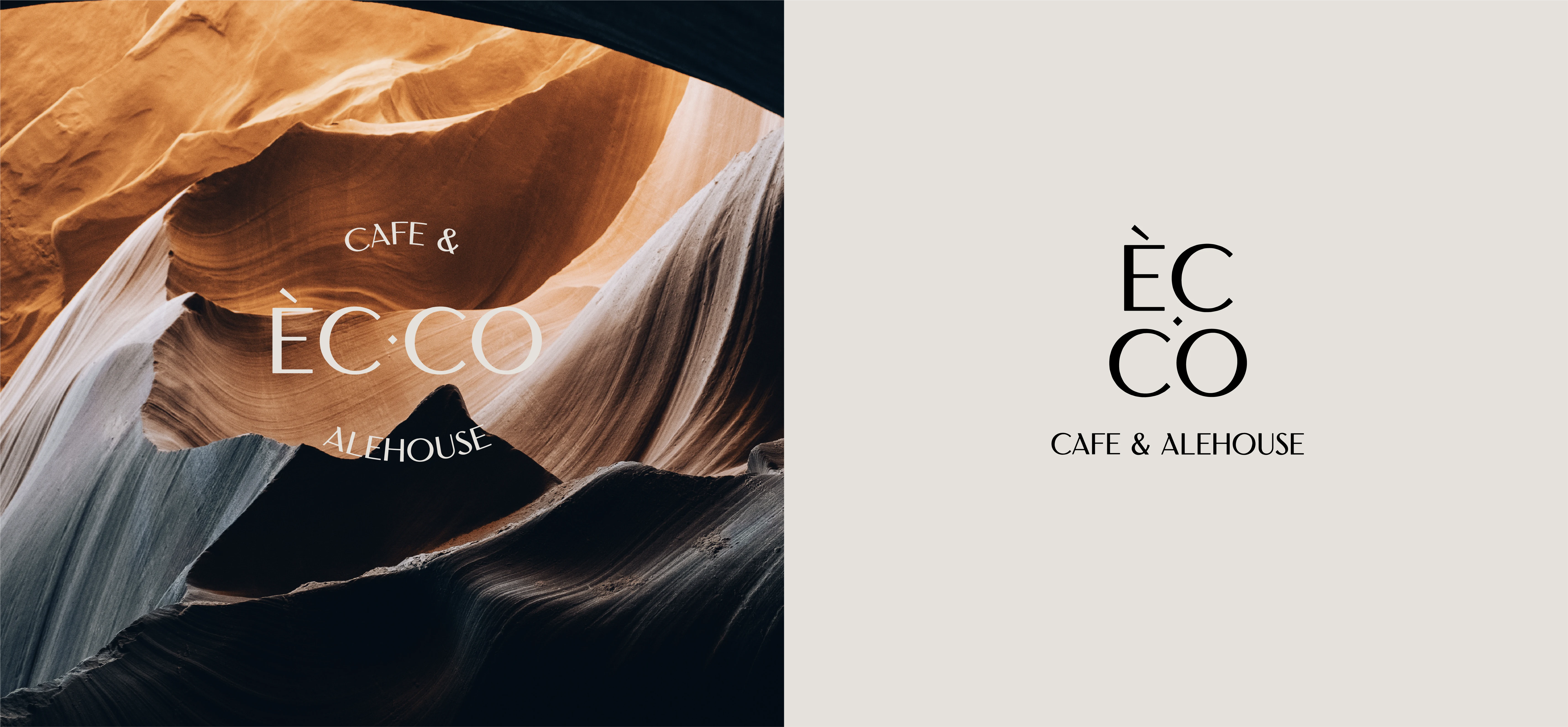
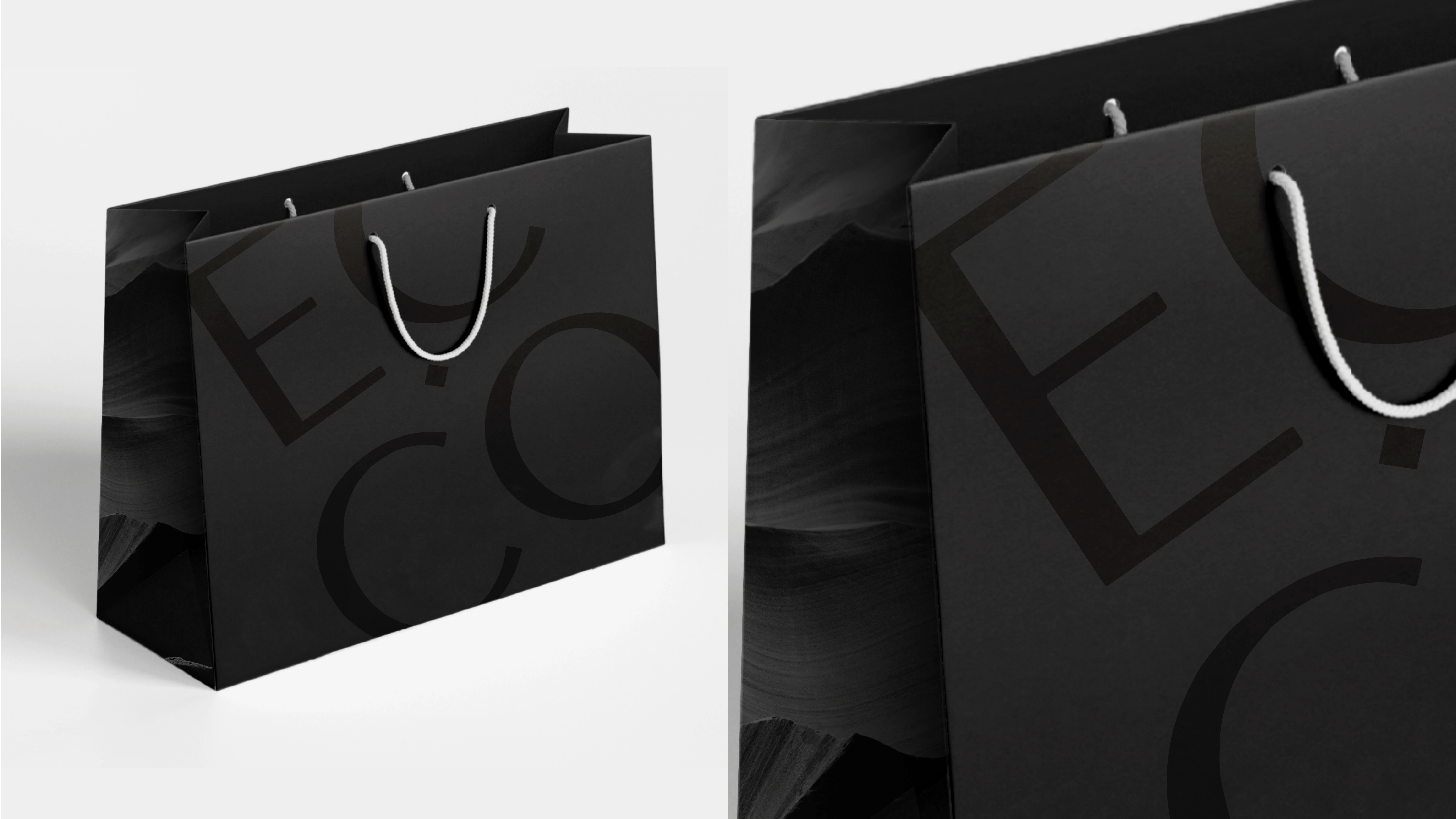
Wordmark
The primary logo is a more thorough wordmark, with a round formation vibe making it preferable to be used in larger areas. The tag line gives it a more enclosed and complete look. Whereas the secondary mark is a more modular and symmetrical approach to the primary one. This mark can be used without the tag as well, and looks better in smaller areas, that require some level of branding.
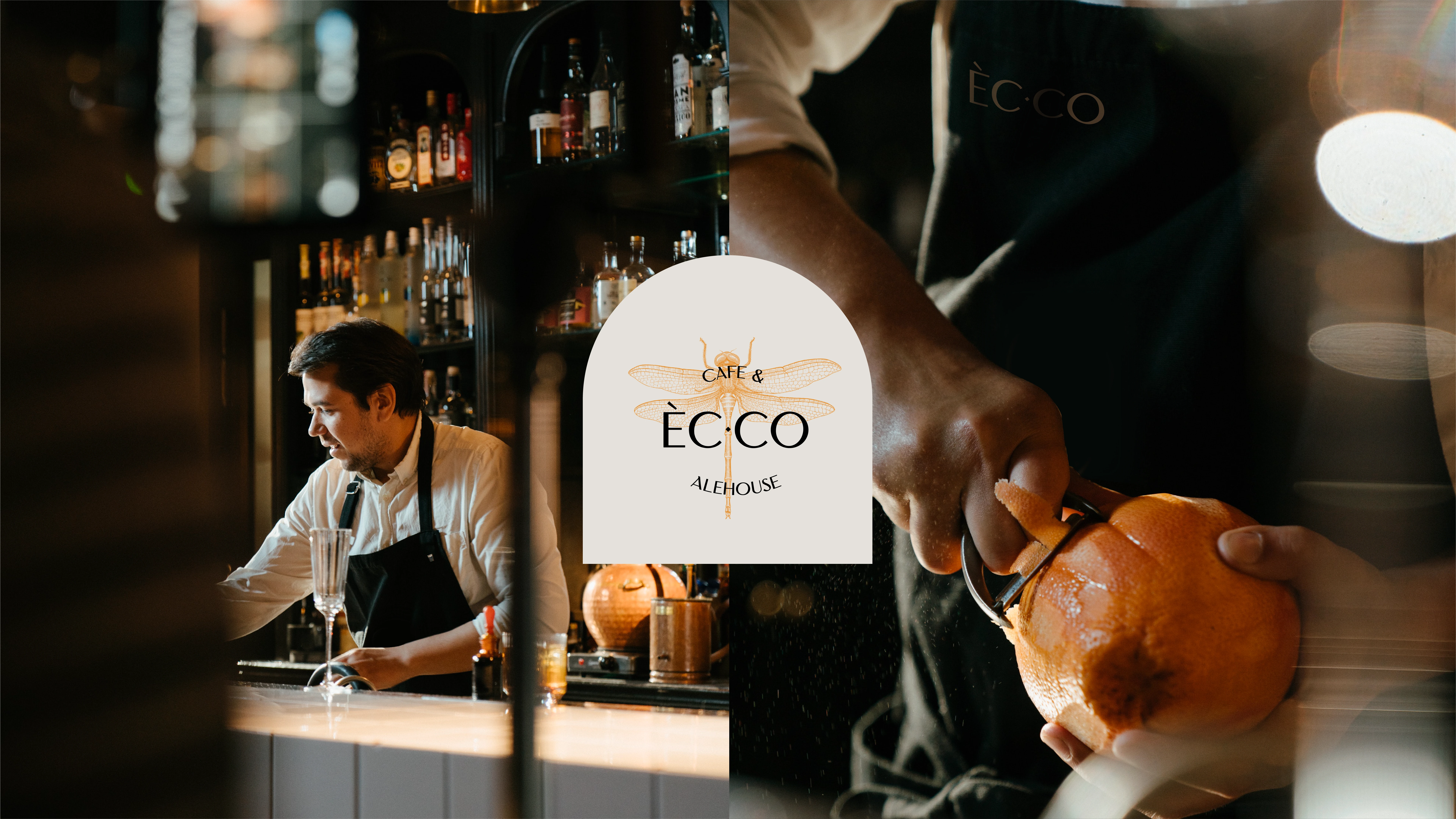
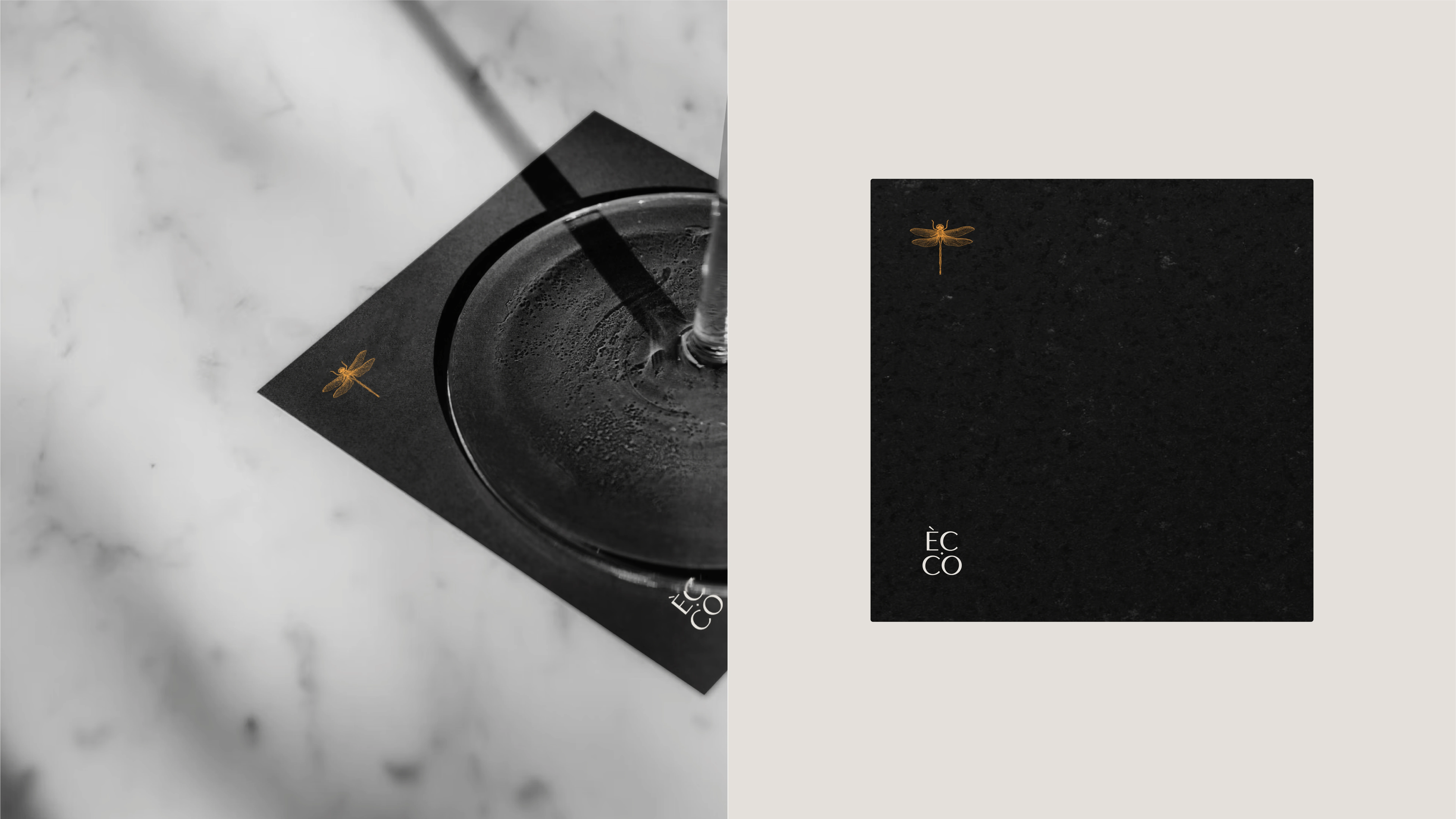
An unignorable part of the mark was the dragonfly. The intricate design of the illustration paired with a clean minimal typeface, sat as a perfect mix between the minimal and maximal outlook.
Like this project
Posted Apr 6, 2023
The goal of the project was to come up with the visual approach for a multi-cuisine bar called 'EC·CO' with a contemporary cafe outlook.