Oaten - Building a Quiet, Premium Oat Brand (FMCG)
Durgesh Anand
Posted Apr 24, 2026
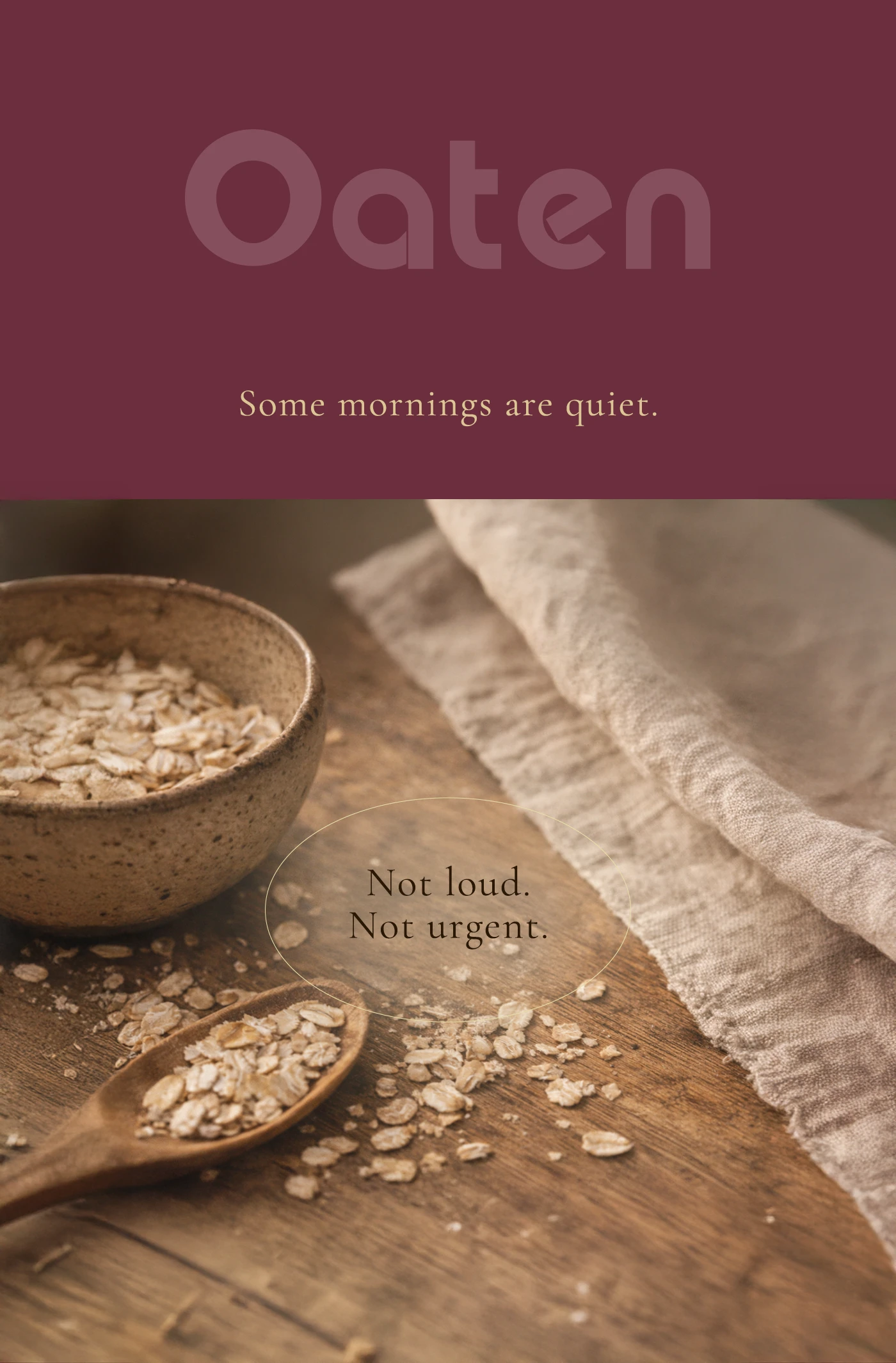
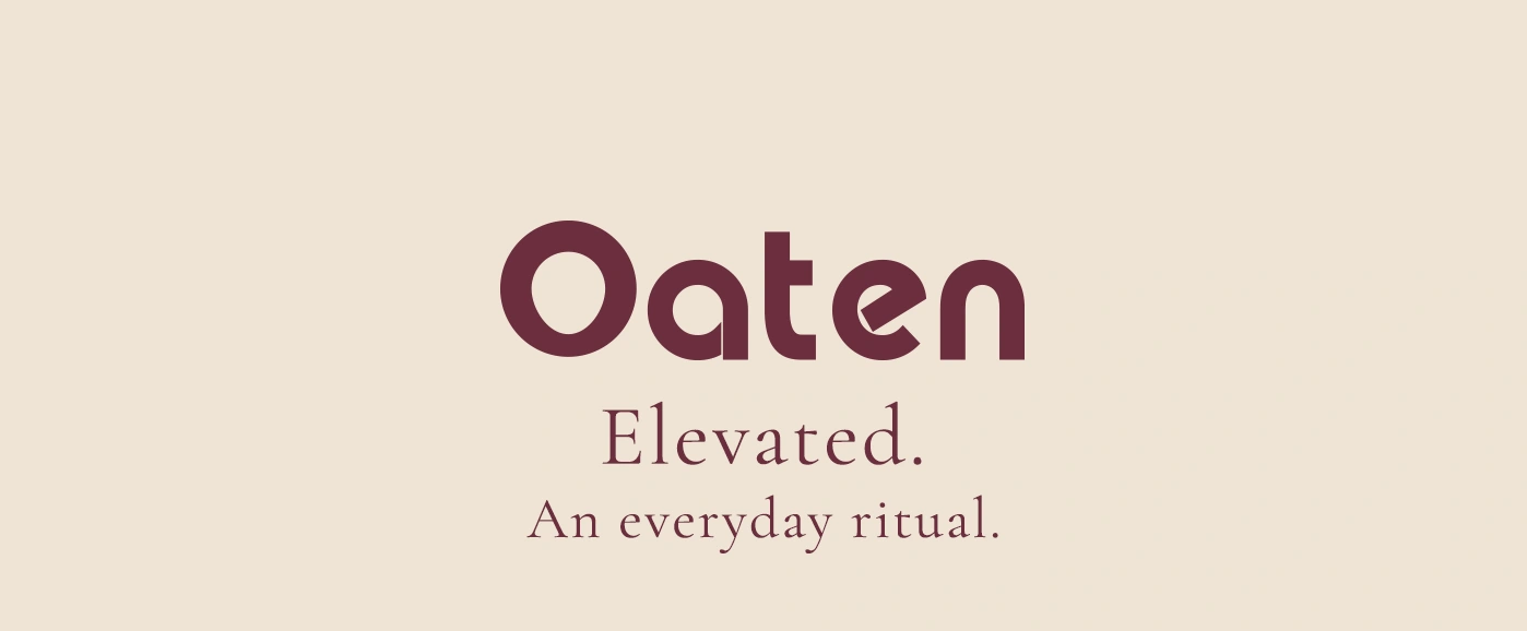
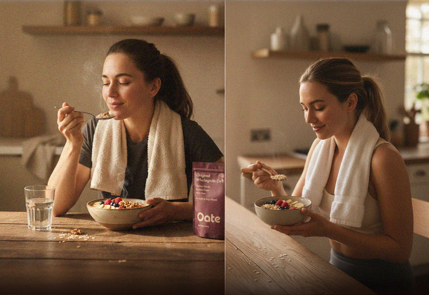
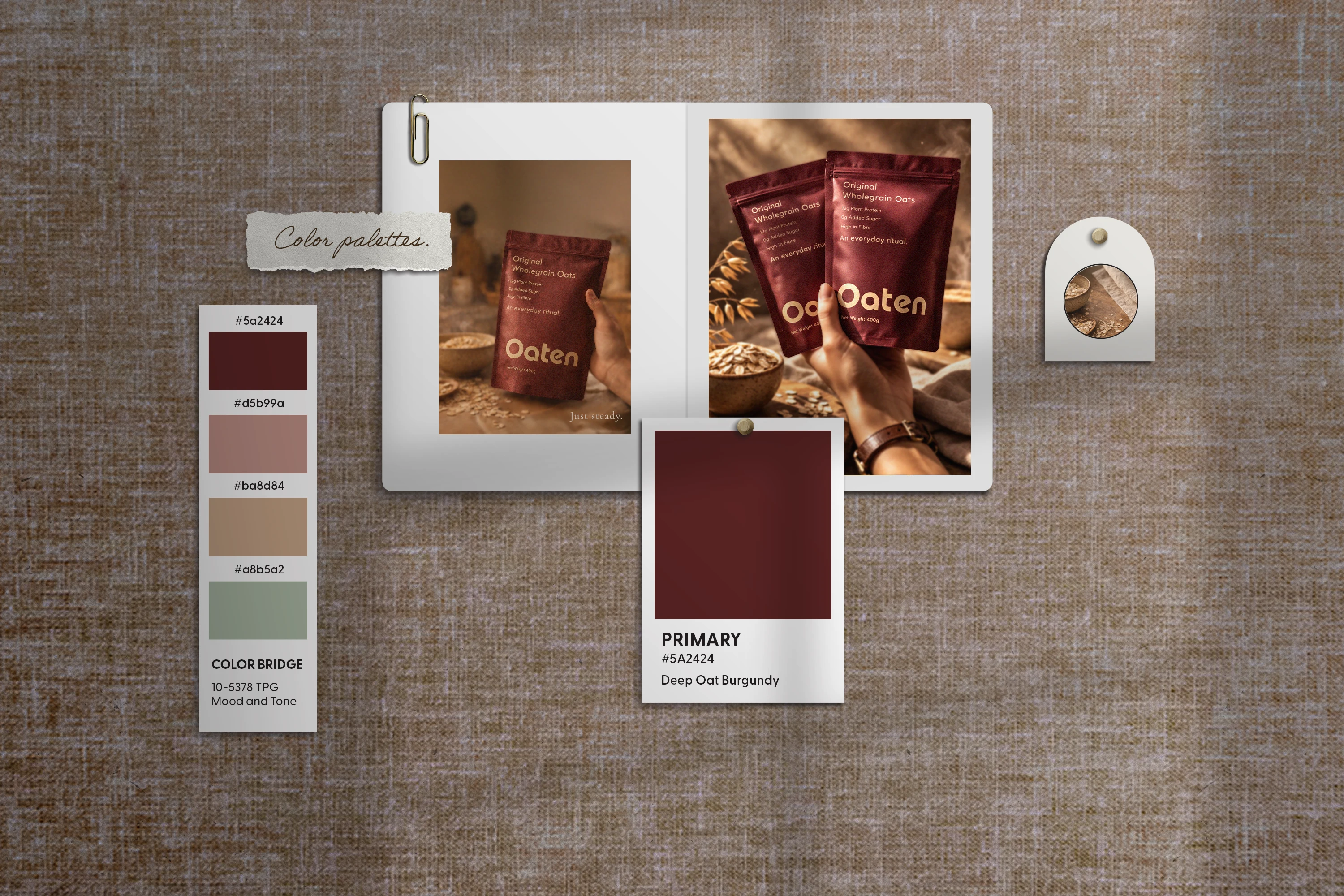
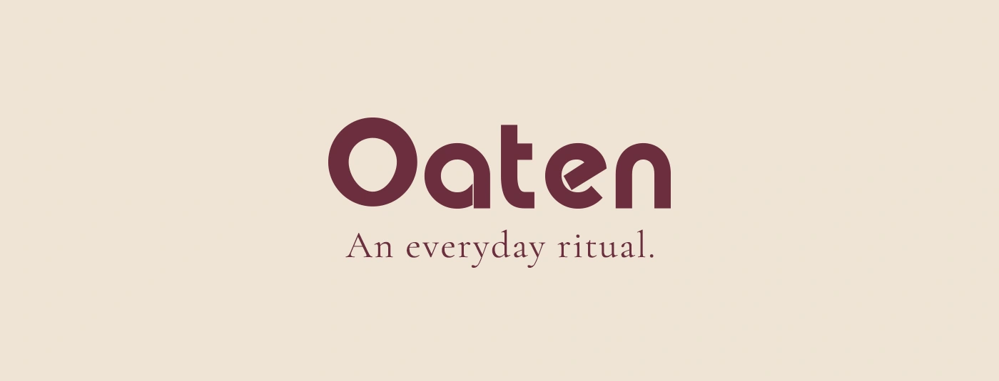
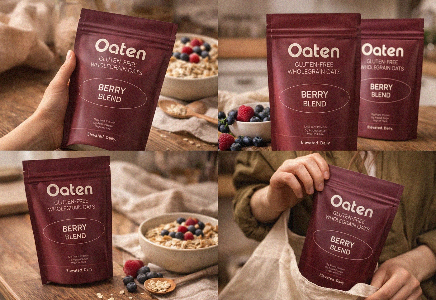
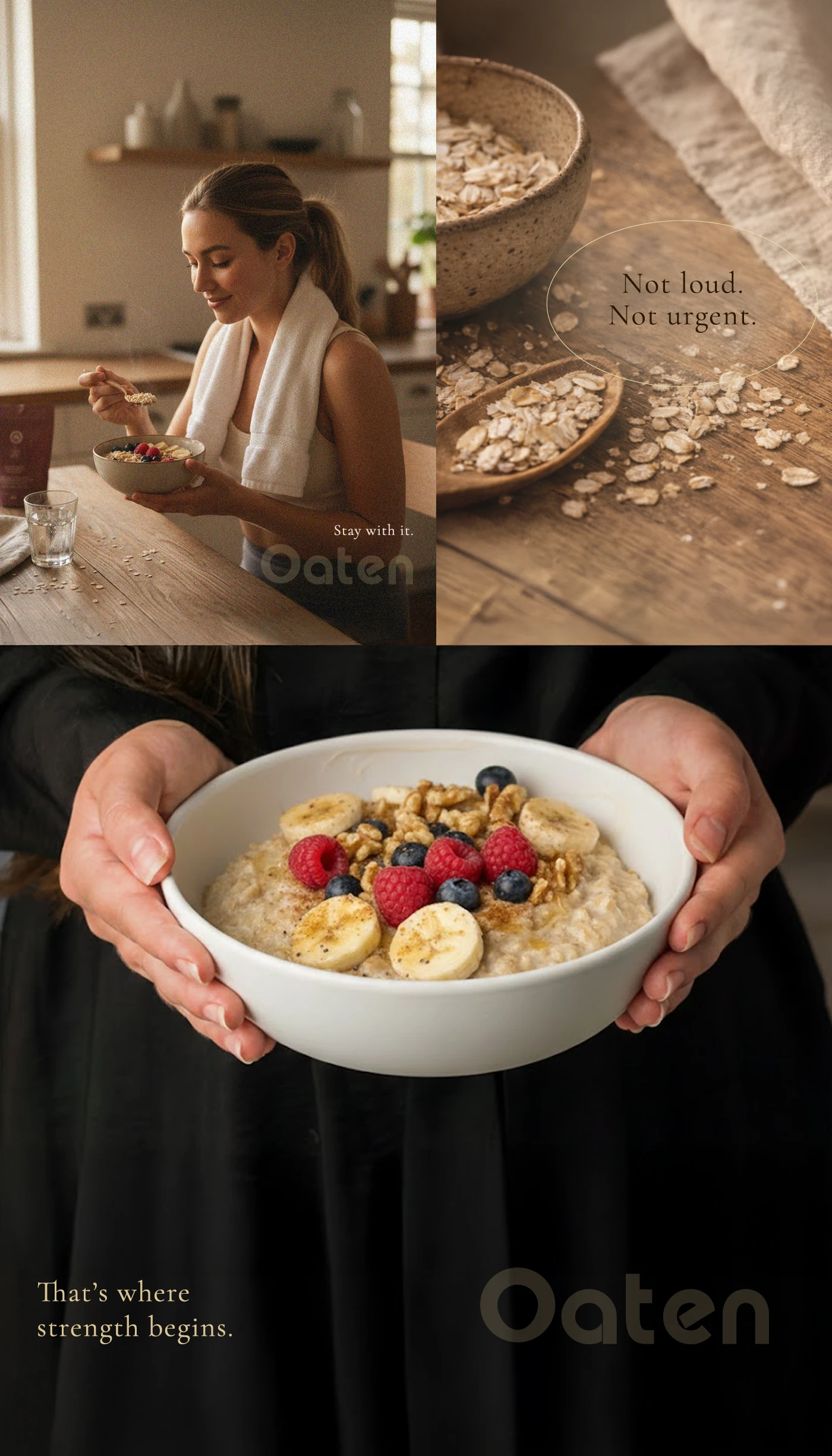
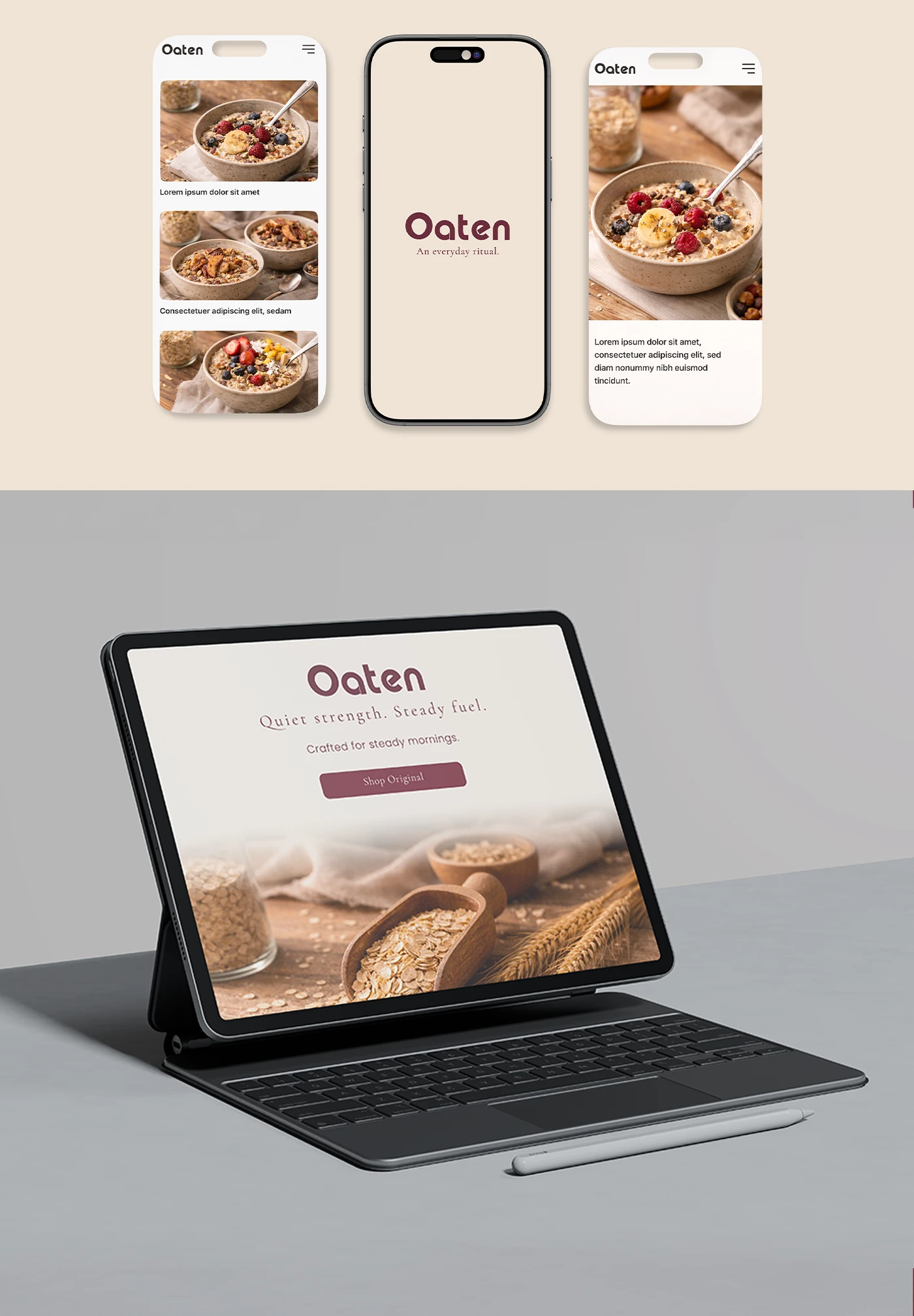
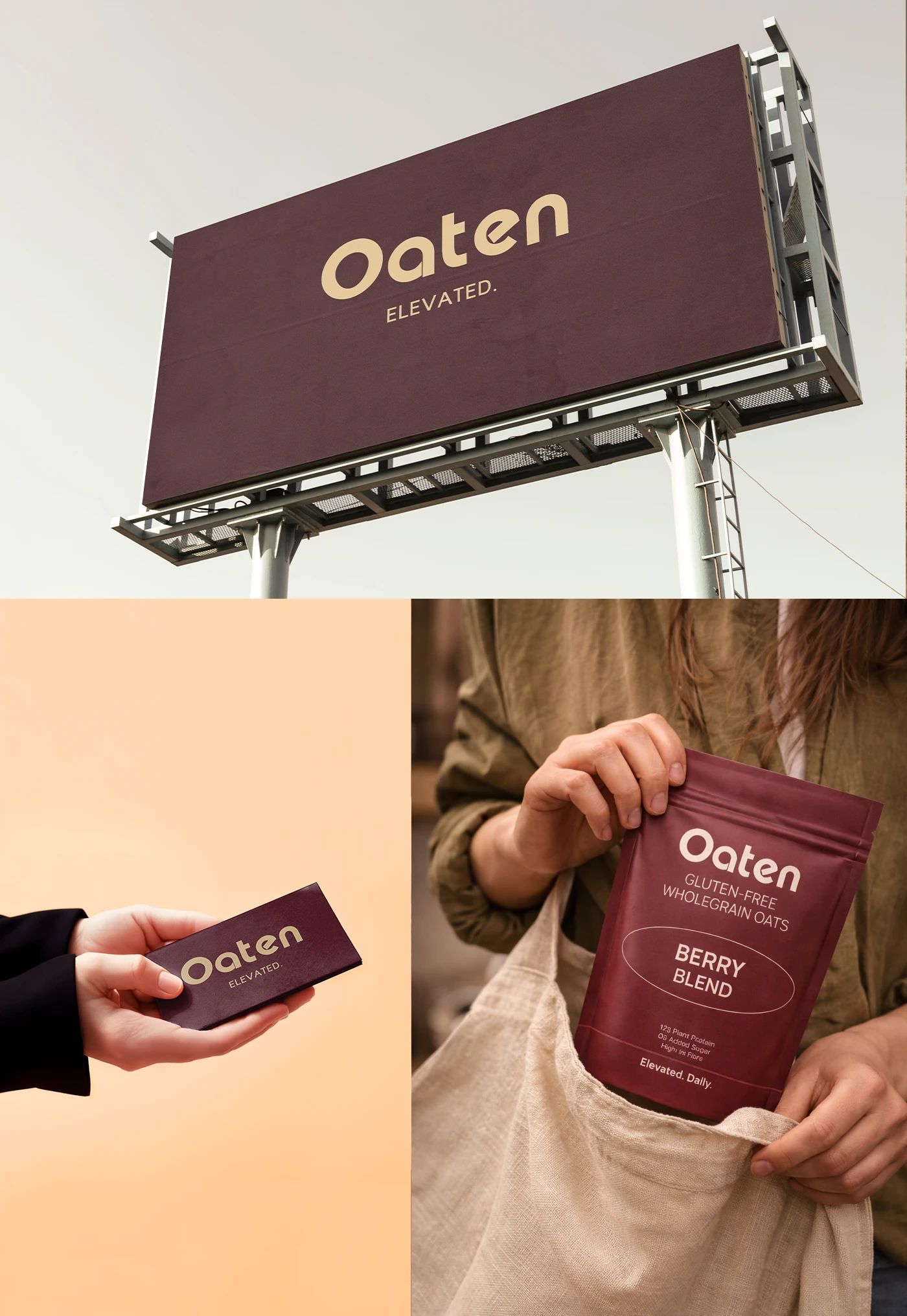
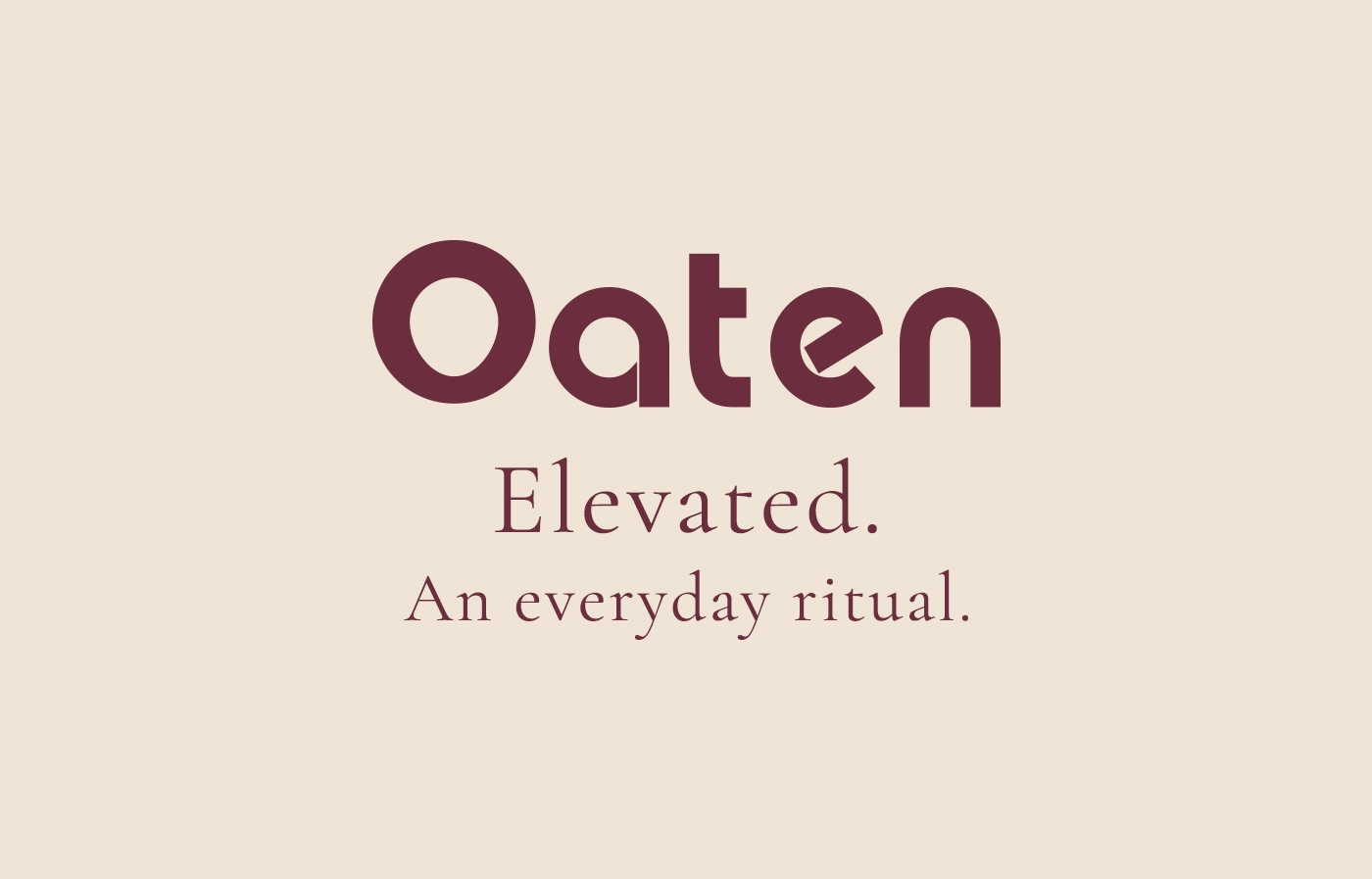
Oaten Elevated. An everyday ritual. In a world of loud wellness brands and exaggerated claims, Oaten was created to bring breakfast back to something grounded. This conceptual brand identity explores the idea of quiet strength - nourishment that doesn't shout, but shows up consistently. The project includes: • Brand positioning & visual direction • Logo & typography system • Earth-tone color palette • Packaging design • Lifestyle art direction • Digital application & web mockups • Brand world exploration The visual language draws from natural grains, warm wood textures, and early morning light - reinforcing a sense of calm, steadiness, and ritual. Oaten isn't about urgency. It's about consistency. Designed with intention. Built for steady mornings.