Pravaah | Luxury Wellness Identity
Durgesh Anand
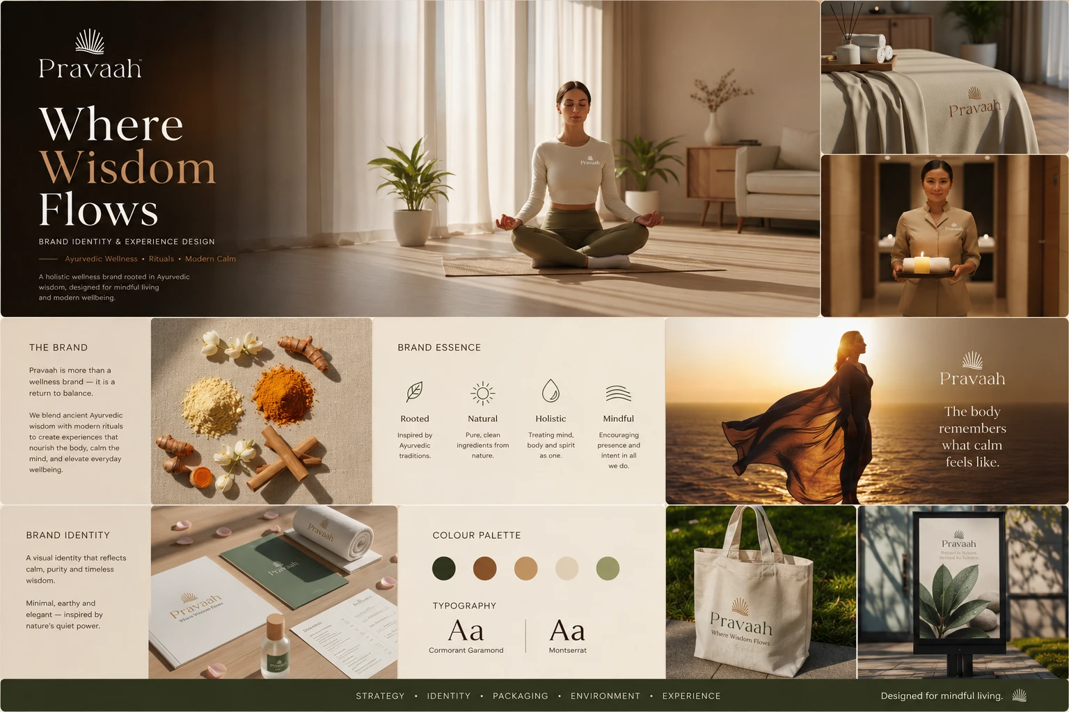
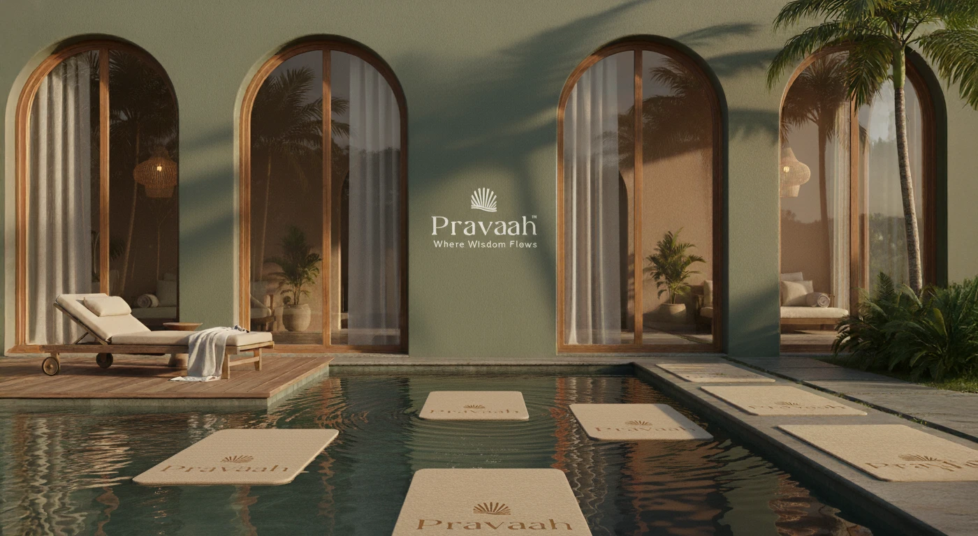
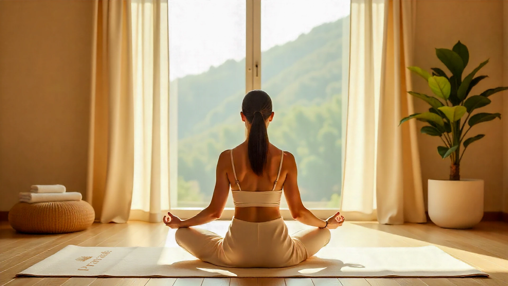
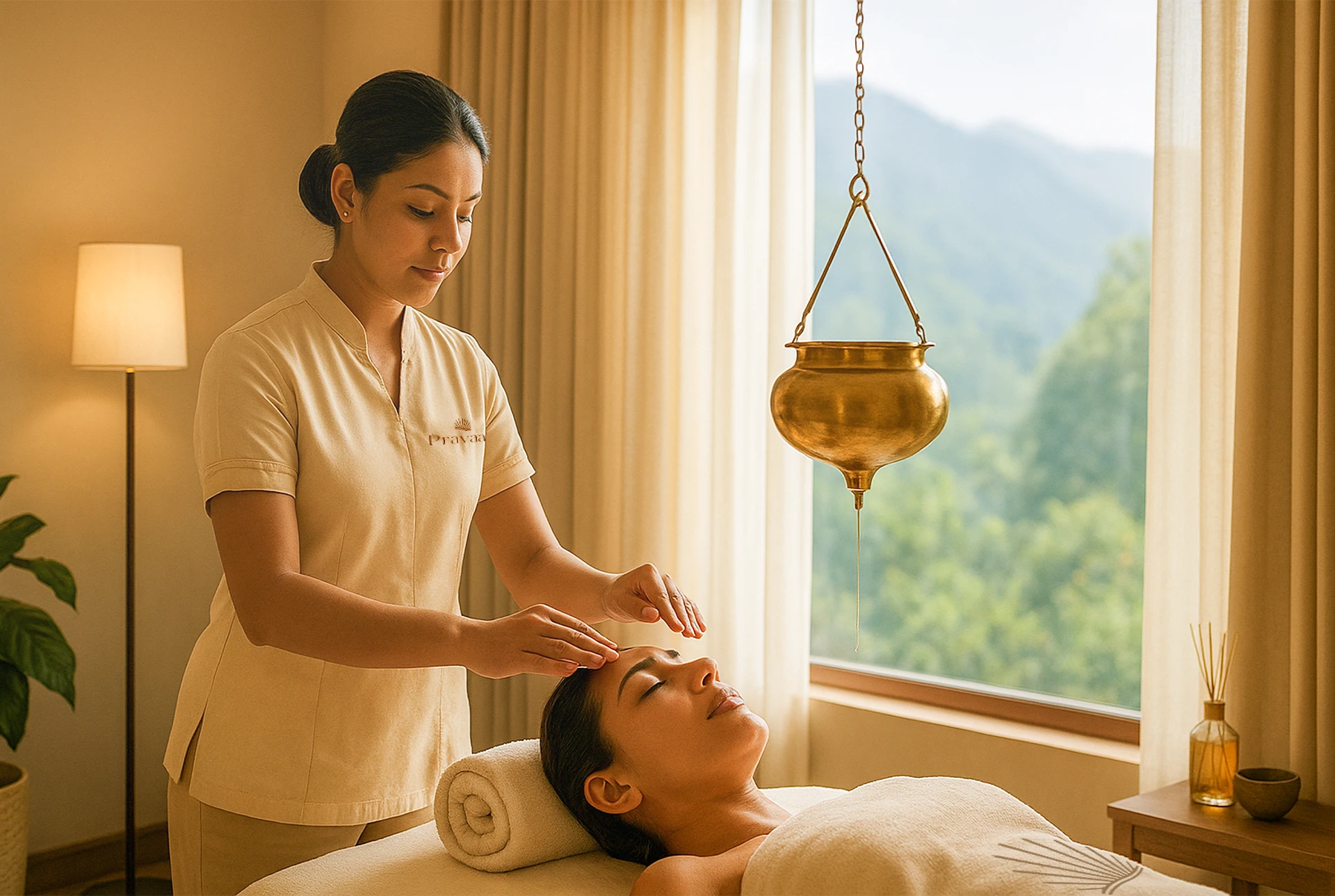
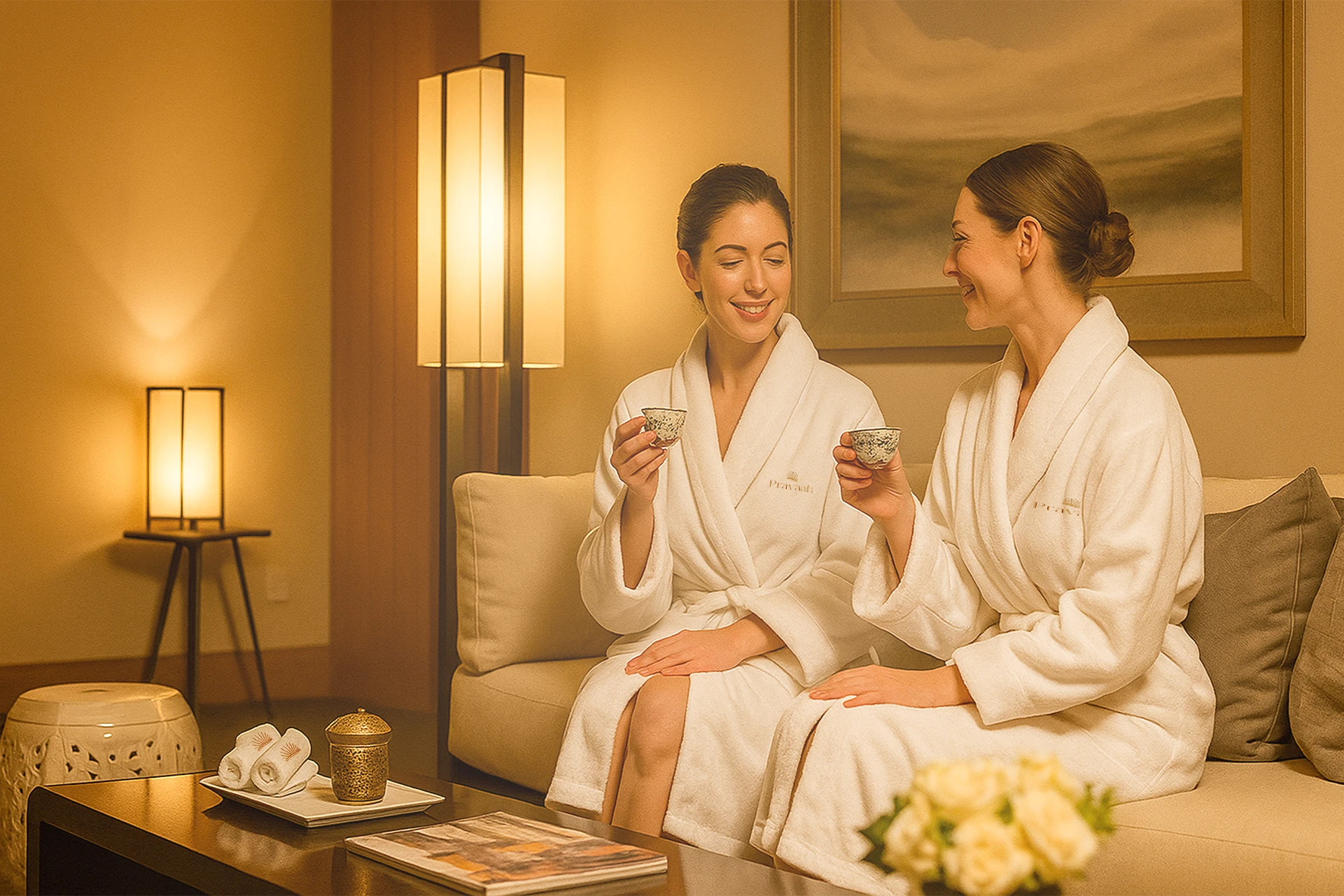
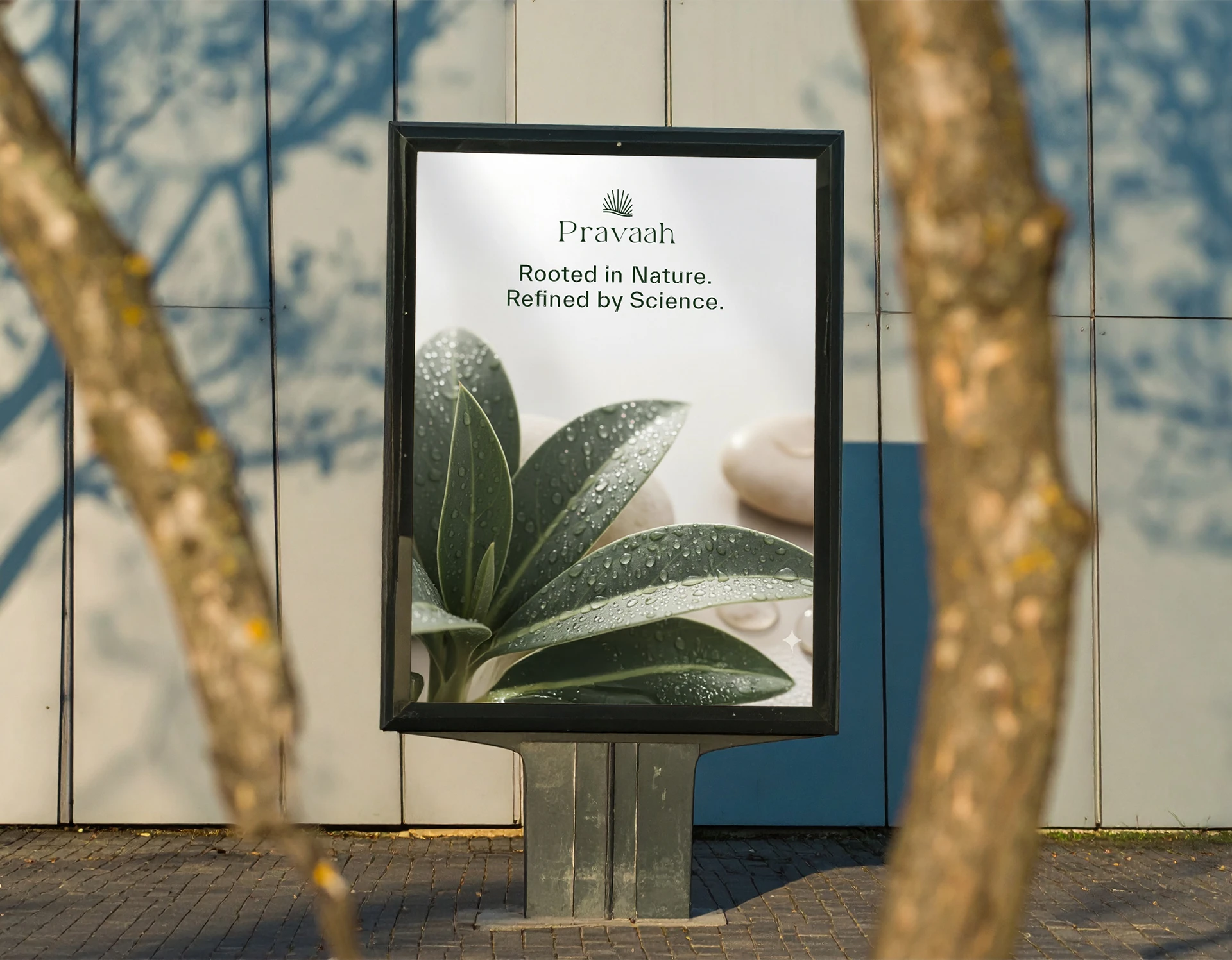
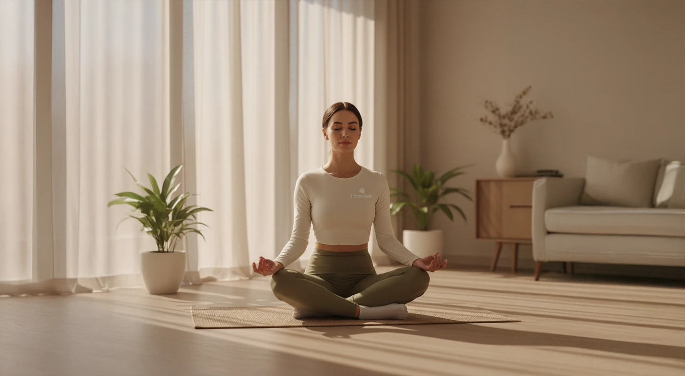
Pravaah is a luxury wellness brand inspired by the serene flow of the Himalayas where ancient Indian wisdom meets modern design. Crafted to embody balance, purity, and mindfulness, the brand invites individuals to reconnect with their inner calm through an experience that flows seamlessly across every touchpoint.

Pravaah is a luxury spa and wellness brand rooted in Himalayan calm and ancient Indian wisdom.
The brief was clear but challenging, build a premium wellness identity without falling into the usual spa clichés: generic lotuses, predictable gold, forgettable serenity.
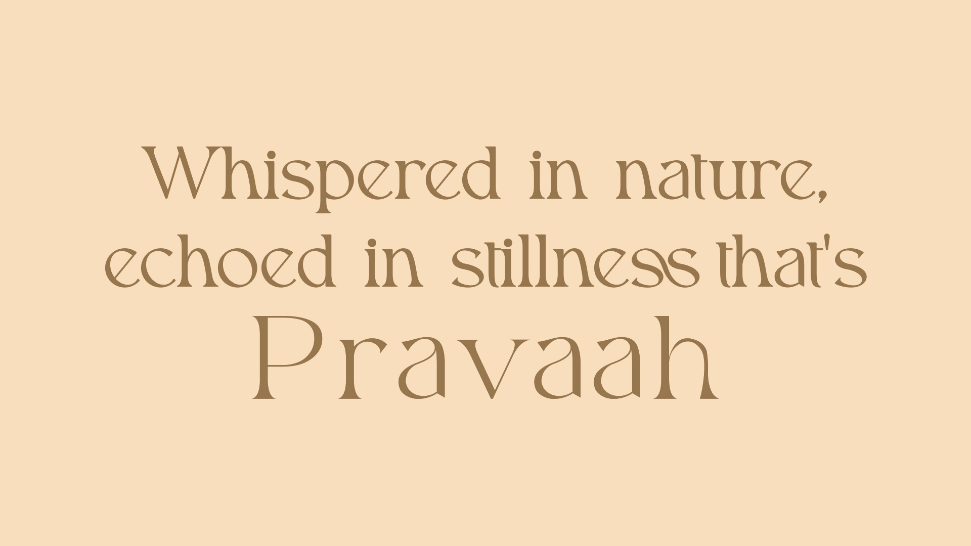
The concept was built around flow, continuous, quiet movement that connects body, mind, and space.
What this shaped:
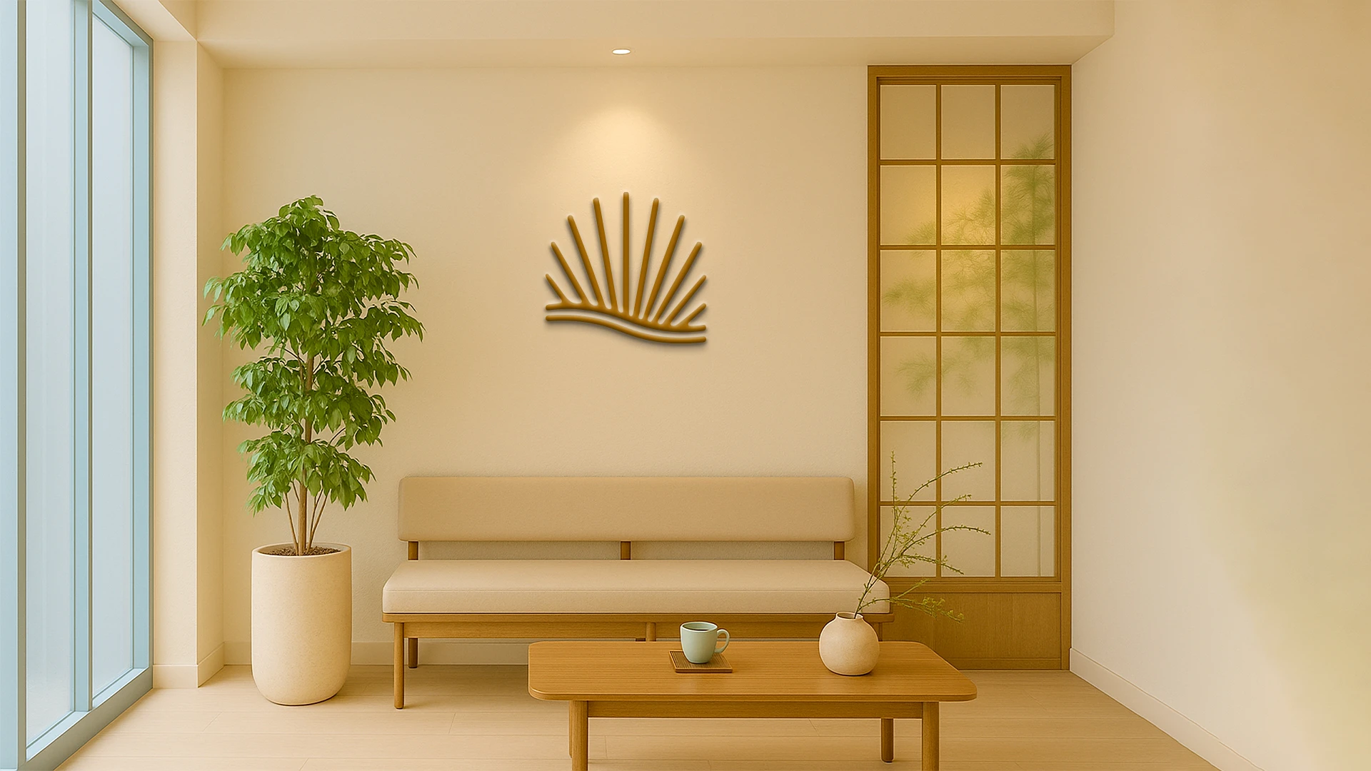
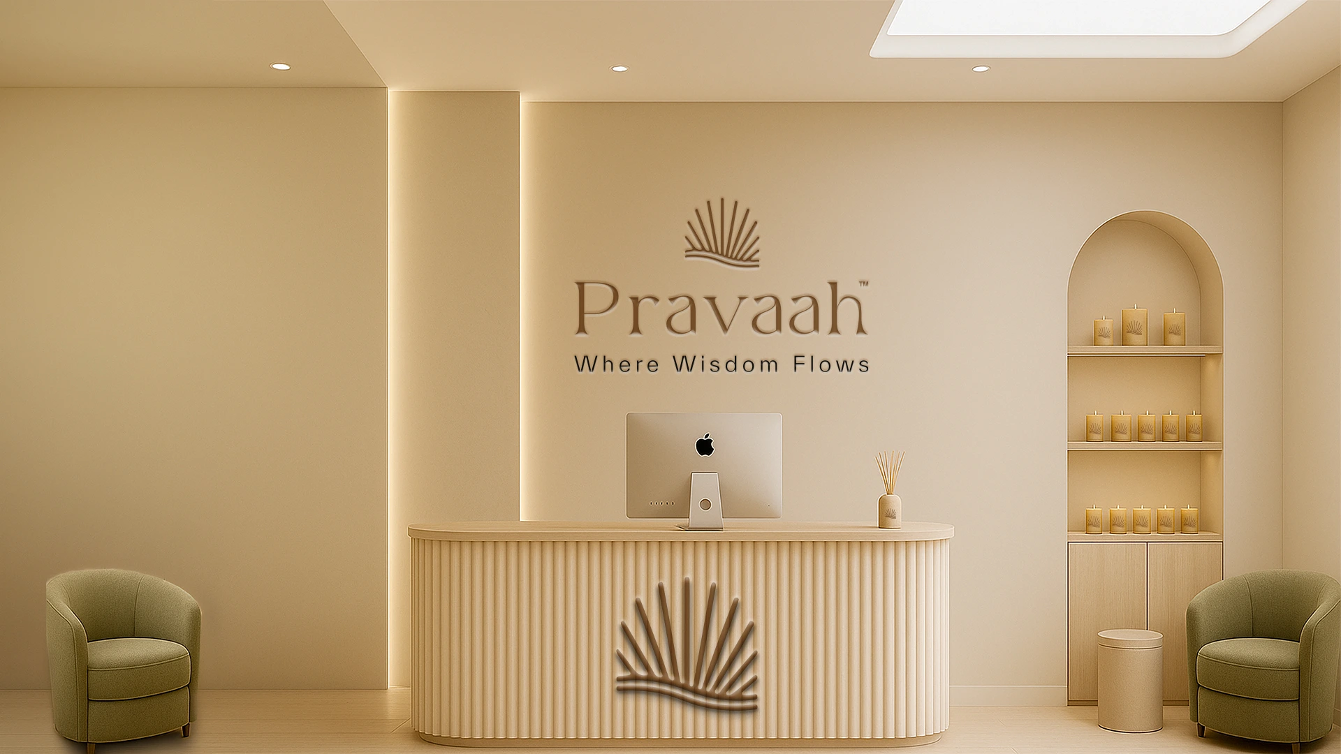
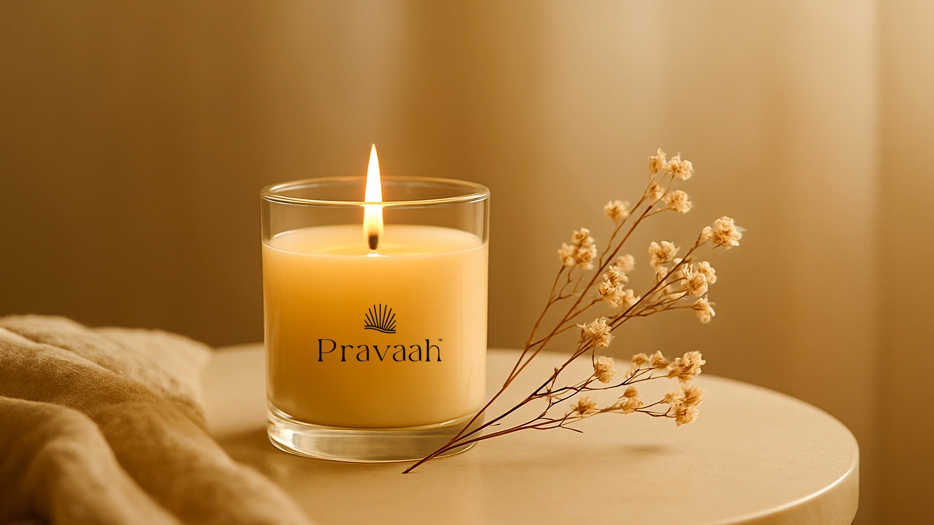
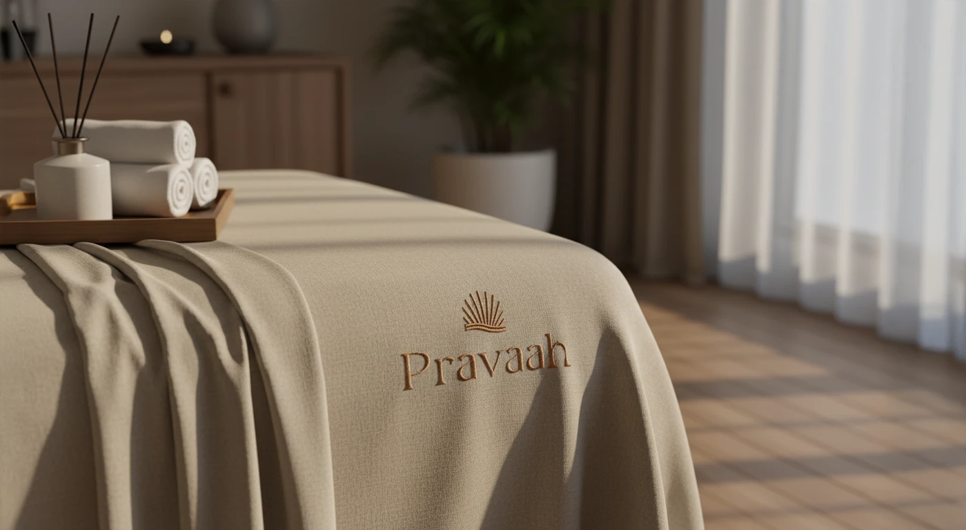
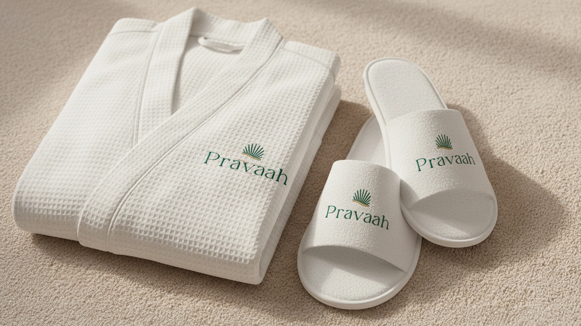
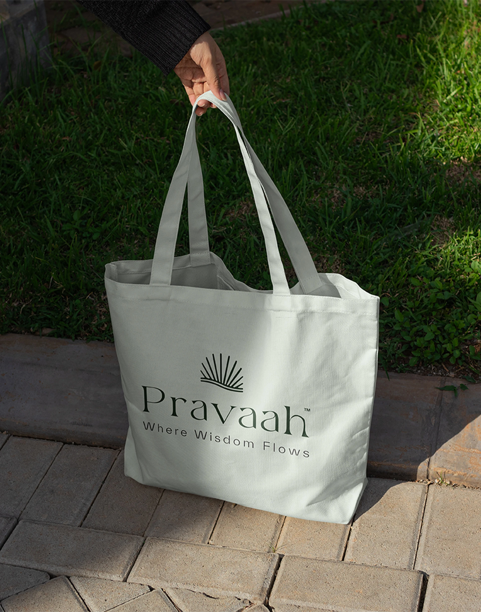
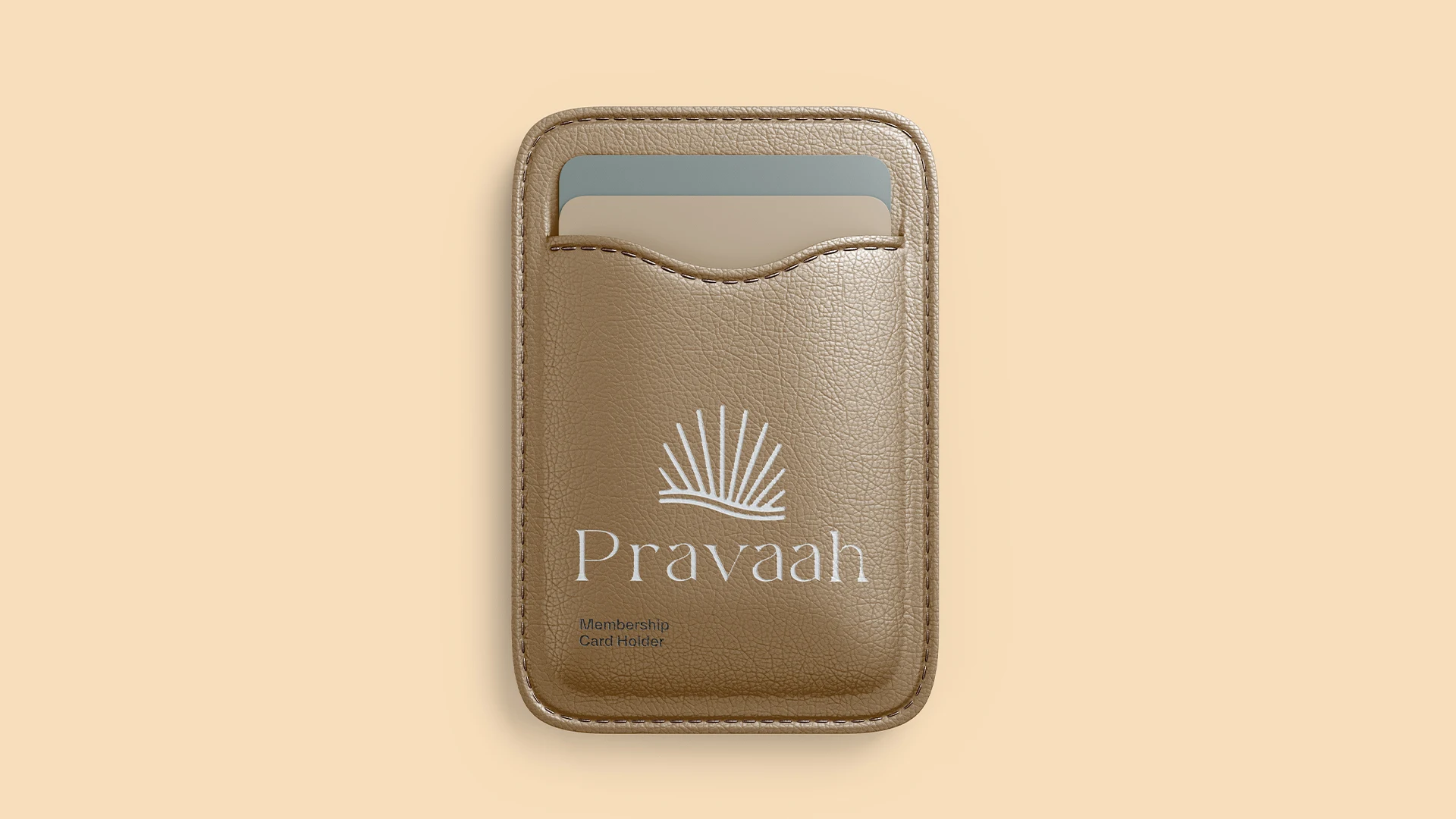
A fluid wordmark inspired by organic movement and sacred geometry
Typography pairing: Roxie Rossa for headlines, Everett for body, Larken for warmth
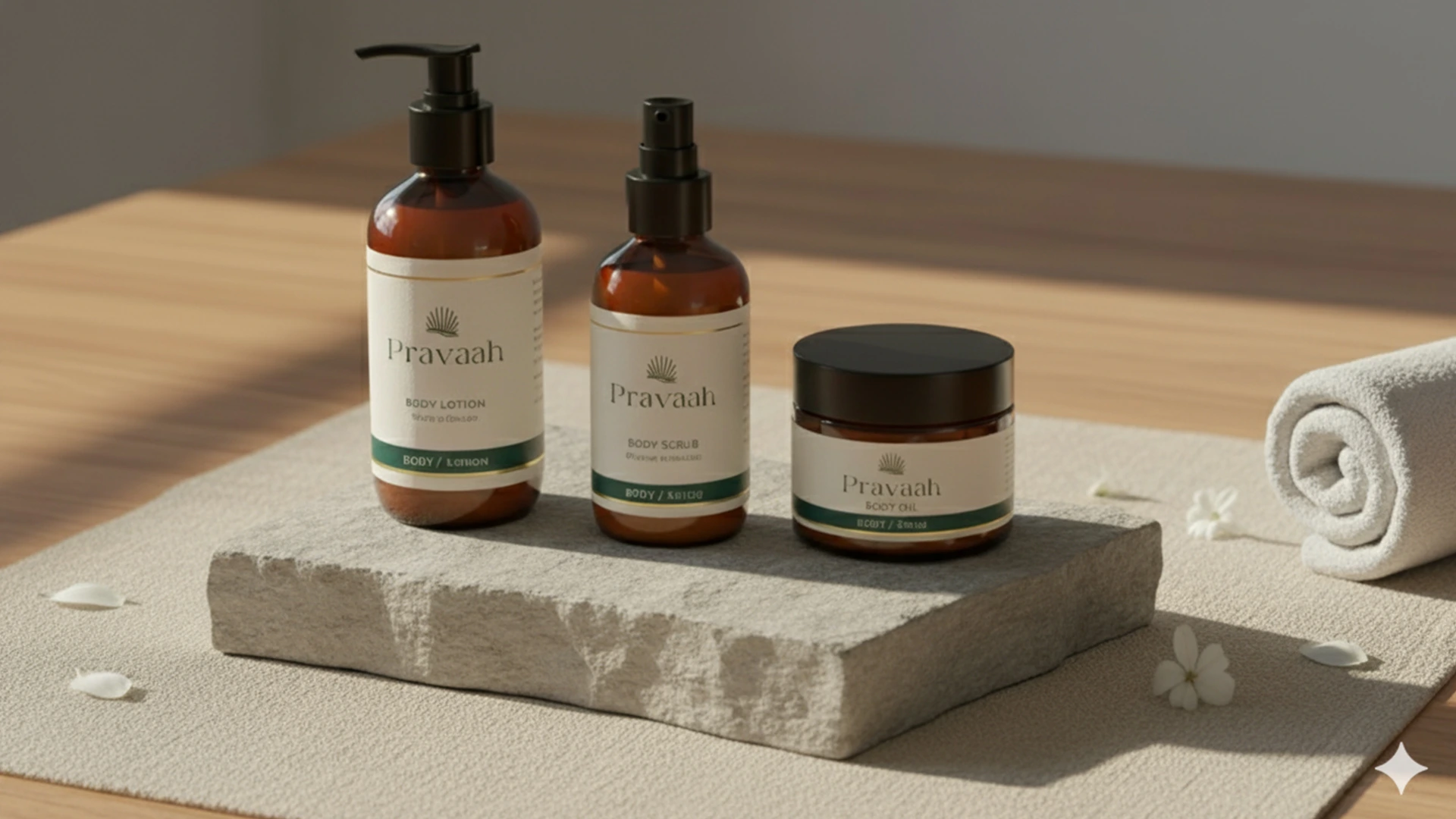
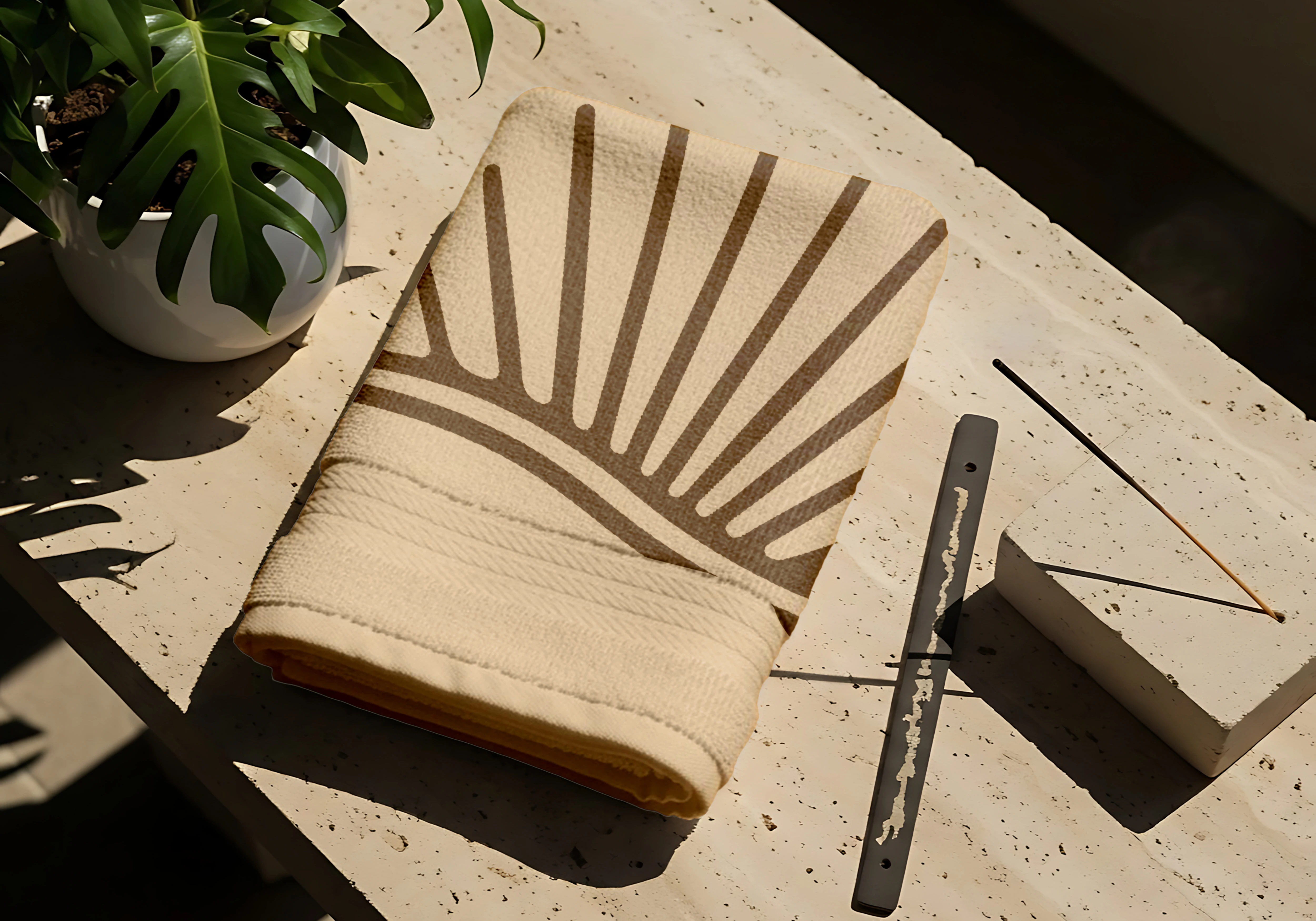
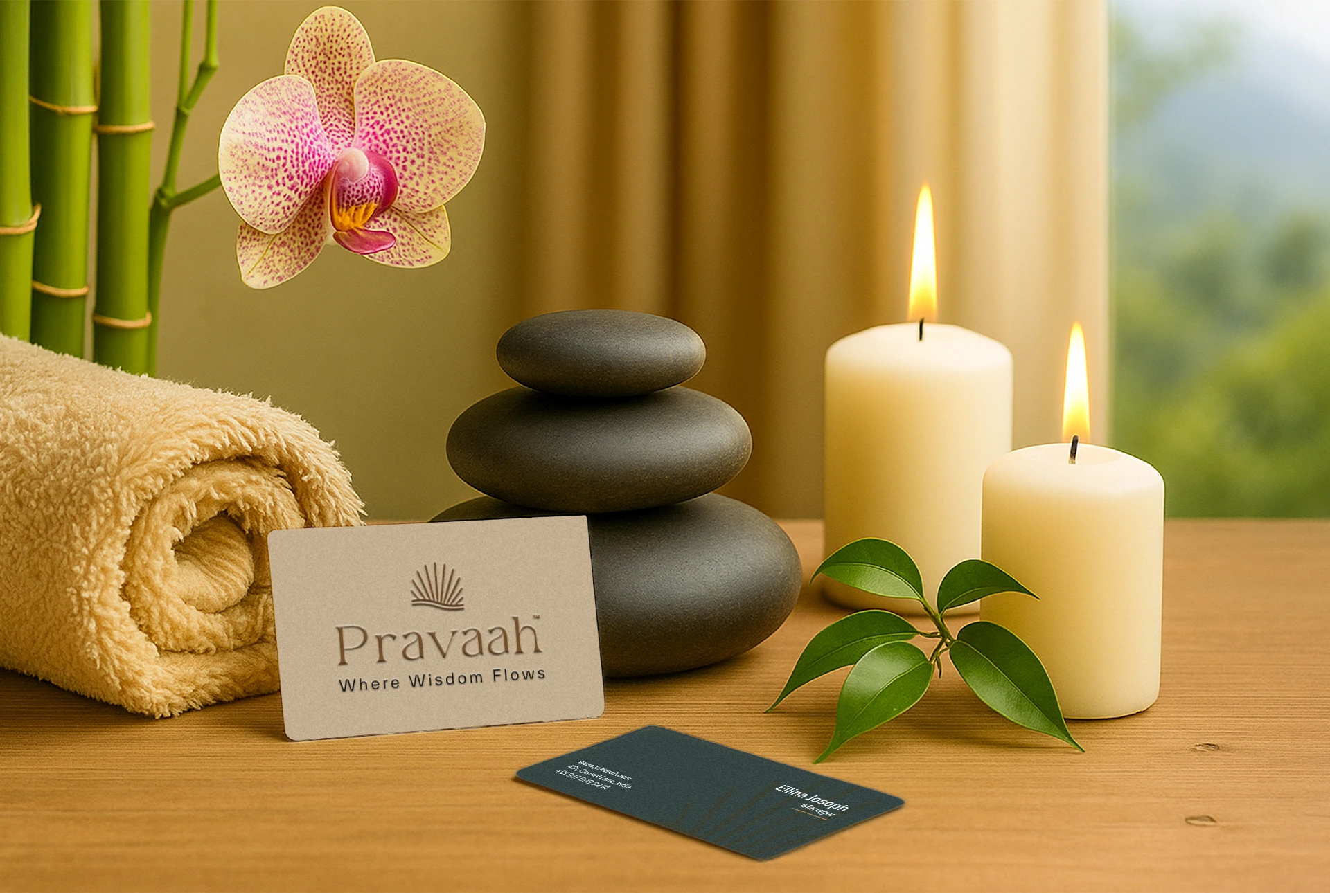
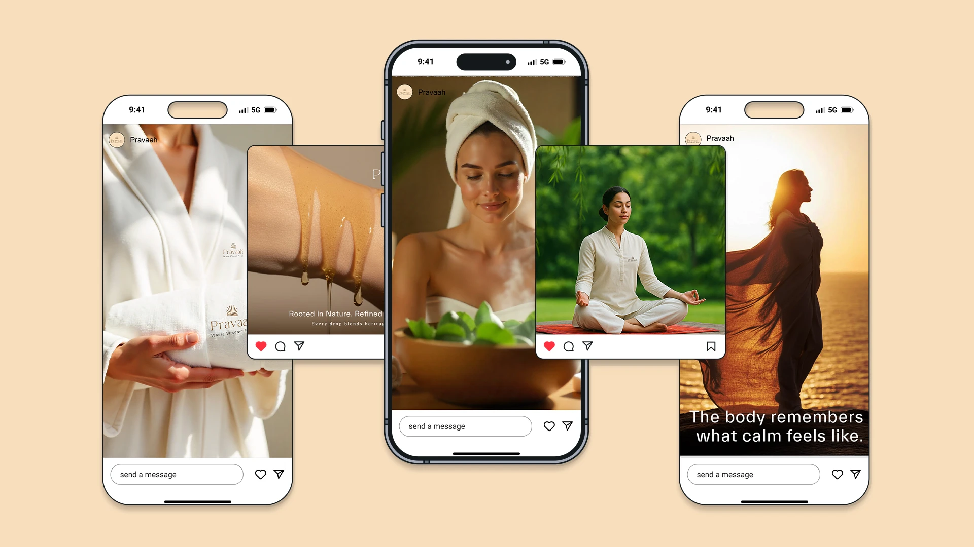
Color palette: Himalayan beige, muted neutrals, misty jade: grounded and clean
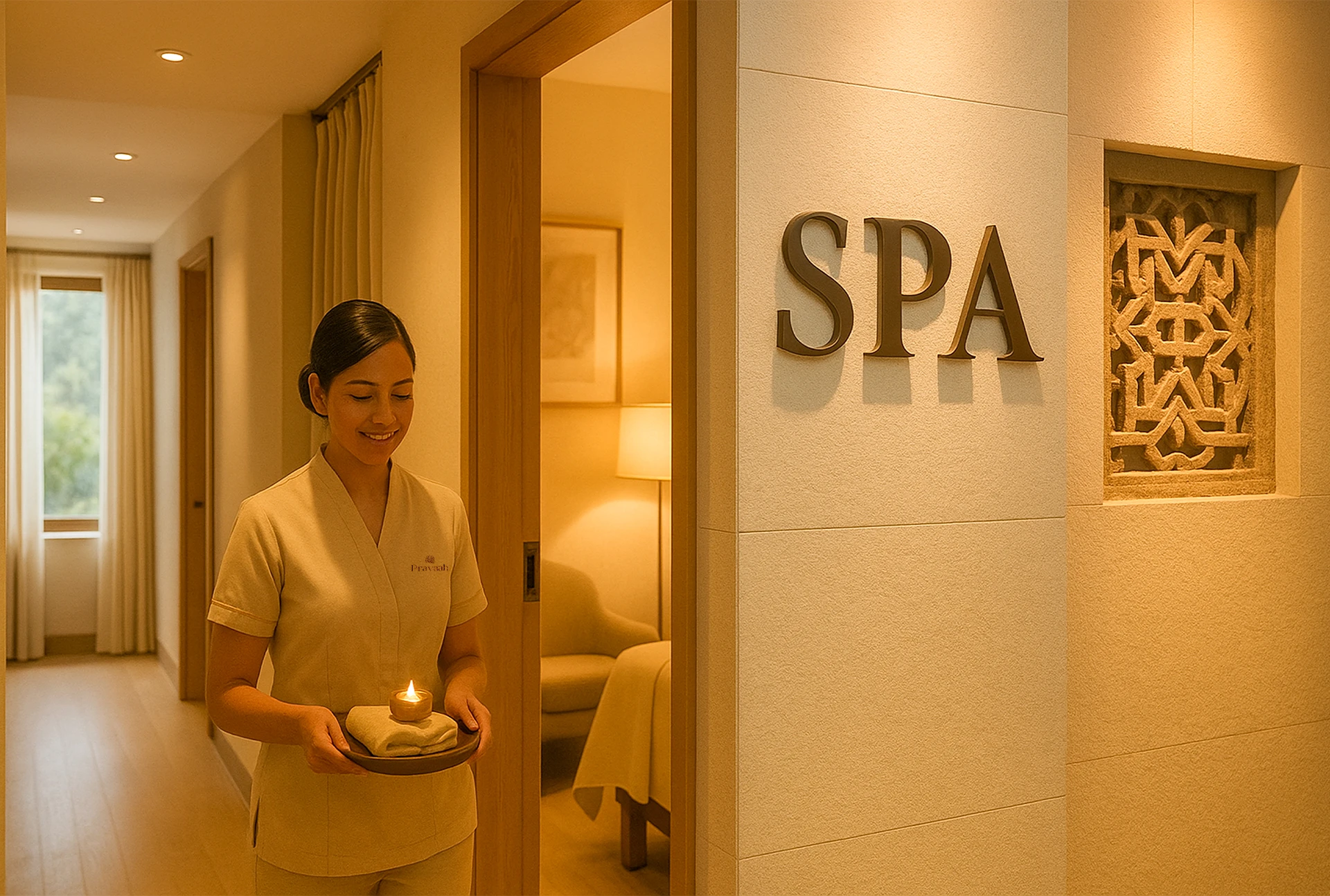
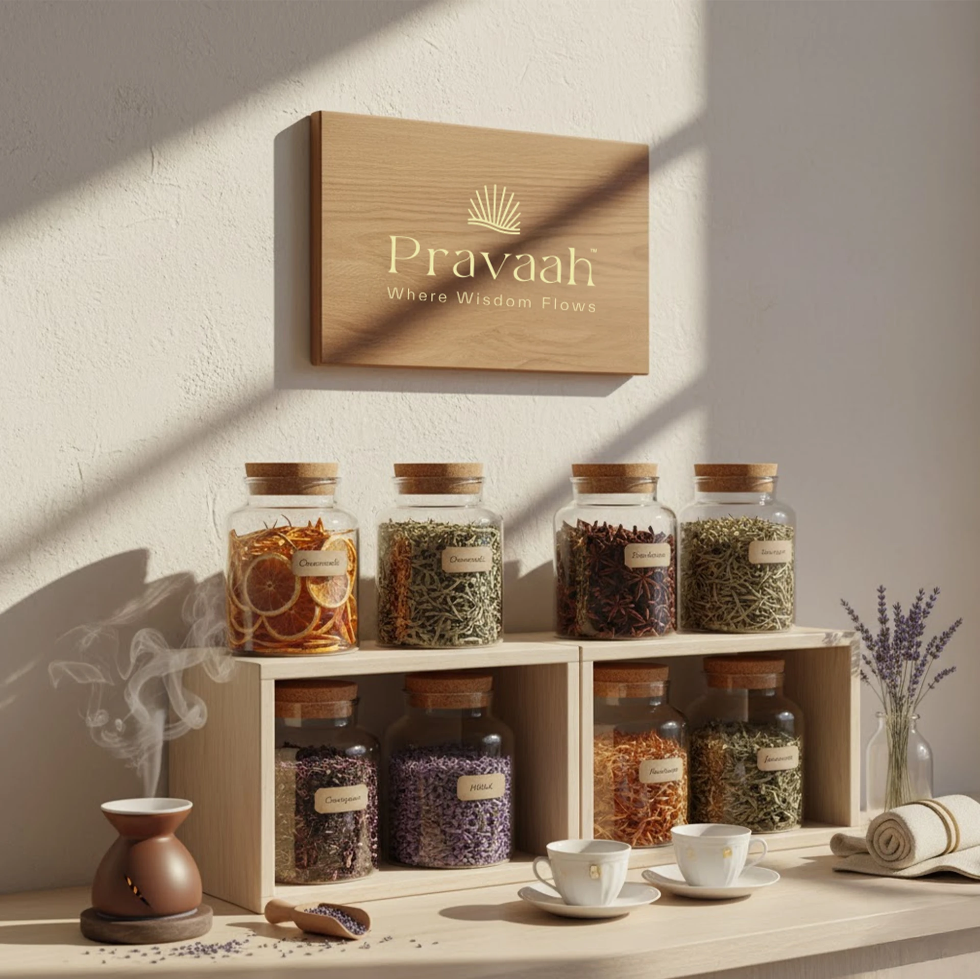
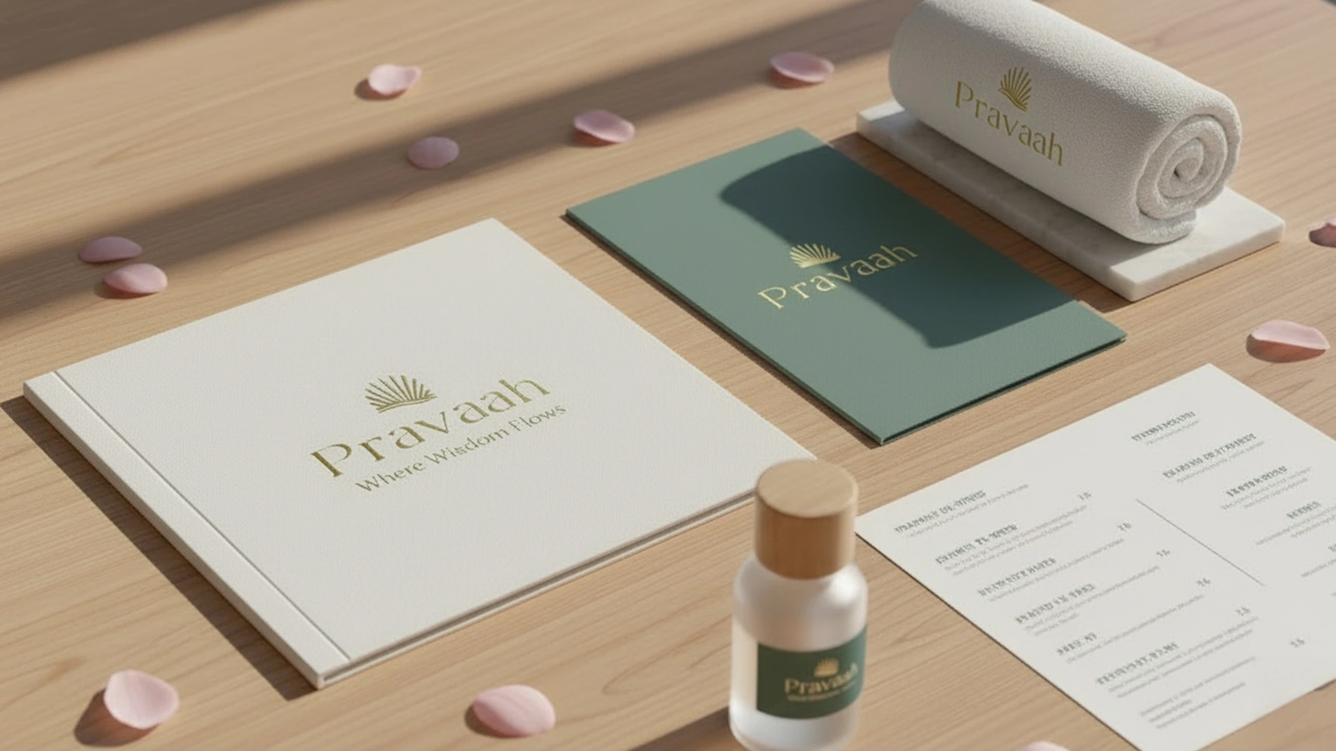
A full system built to scale across packaging, spa interiors, digital, and collateral
The result is an identity that feels quiet and intentional: premium without performing luxury.
Like this project
Posted Apr 24, 2026
Brand identity for a luxury spa rooted in Himalayan calm: logo, typography, color, and packaging built around the concept of flow.