Kudos Architects Brand Identity Design
Durgesh Anand
Kudos Architects needed an identity that felt as precise as their work: structured, confident, and modern without being cold.
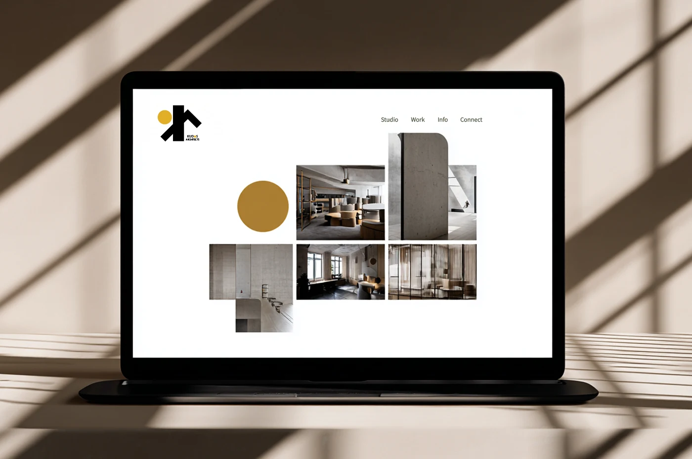
The design system was built around architectural geometry: bold forms, warm materiality, and clean spatial logic.
What was delivered:
Primary logo + variants
Color system, warm neutrals anchored by a strong accent
Typography pairing built for hierarchy and clarity
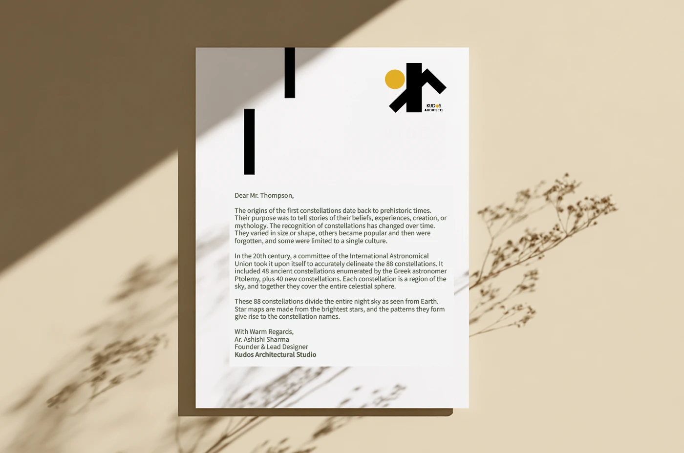
Brand guidelines for consistent application across print and digital
The result is an identity that looks like it belongs on a building, not just a business card.
Like this project
Posted Apr 24, 2026
Brand identity for a modern architecture firm: logo, color system, typography, and guidelines built around structural geometry and warm materiality.