Evira - Brand Identity & Package Design for Dry Fruits
Durgesh Anand
Evira - Dry Fruits Brand Identity & Packaging Design
Brand Identity
We began by understanding the cultural and emotional value behind traditional food products. Evira’s identity was built to feel soulful, earthy, and premium—bridging old-world wisdom with new-age clarity. The result is a brand that feels personal yet scalable.
Vision & Mission
We articulated a bold vision to make Evira a globally trusted name in premium natural foods and spices. The mission centers around preserving tradition through clean, authentic, and high-quality ingredients—bringing health and heritage to every home.
Target Audience
Evira appeals to modern families, mindful eaters, and premium grocery shoppers who seek authenticity, trust, and quality in what they consume.
Market Research & Competitor Study
Analyzing both legacy spice brands and new D2C players, we uncovered gaps in positioning and visual language—allowing Evira to confidently claim a niche between traditional familiarity and elevated design.
Brand Values & Positioning
Evira stands for purity, intentionality, and connection to culture. The brand positioning celebrates “Precious and quality material, timeless taste.” It’s not just what you eat—but what it represents.
Tone of Voice & Brand Keywords
The tone is warm, refined, and honest. Keywords include: Timeless, Premium, Trust, Natural, Soulful. This defined how we wrote copy and created content for packaging, social media, and marketing.
Moodboard & Visual Direction
We curated a color-rich, ingredient-focused visual moodboard capturing inspiration from heritage patterns, earthy textures, and premium organic labels—laying the groundwork for visual storytelling.
Colour Palette
We created a blend of beige, earthy greens, and muted black as primary brand tones—offering both cost-effective flexibility and visual premium-ness across retail packaging.
Typography
A balanced combination of a classic serif for elegance and a minimal sans-serif for clarity—perfectly aligning tradition with modernity.
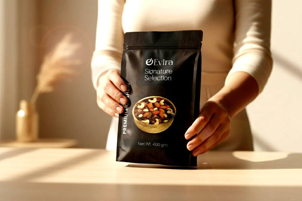
Brand Assets & Packaging Ideation
From multiple logo explorations to final packaging variants (including premium jars, pouches, and gifting boxes), we established a strong visual architecture. Each element—layout, hierarchy, and materials—was refined to align with Evira’s promise of authenticity and quality.
Evira now possesses a strong and versatile brand foundation that not only commands shelf appeal but also builds long-term emotional resonance with its audience. Every design decision echoes the brand's core philosophy: Taste rooted in tradition. Quality that speaks.
Contact Us:
Like this project
Posted Apr 24, 2026
We've crafted Brand Identity for Premium Dry Fruits Brand. Also have designed packaging for the brand.