Brand Identity Guidelines for D2C Brand Optodex
Durgesh Anand
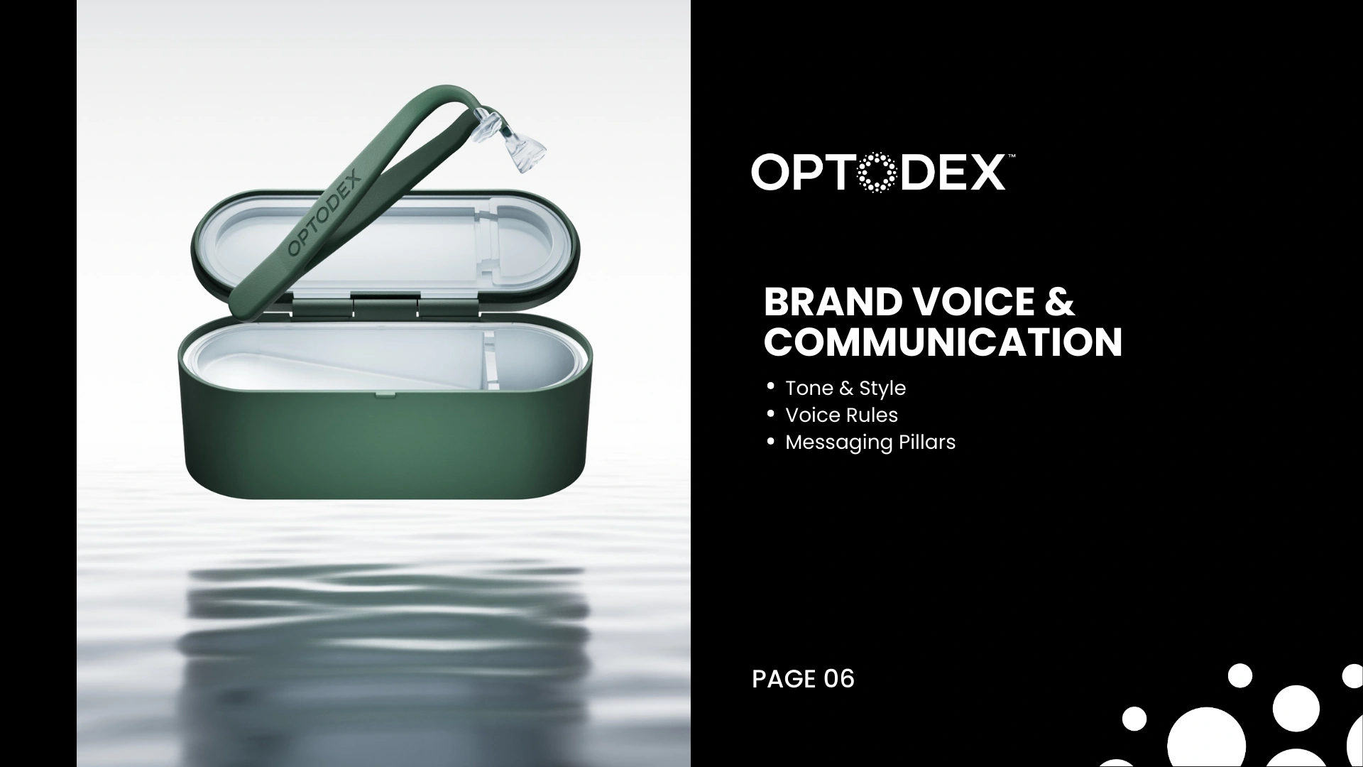


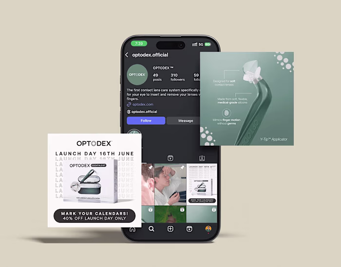
Optodex is a modern D2C eye care brand that needed more than a logo, they needed a system their team could actually use.
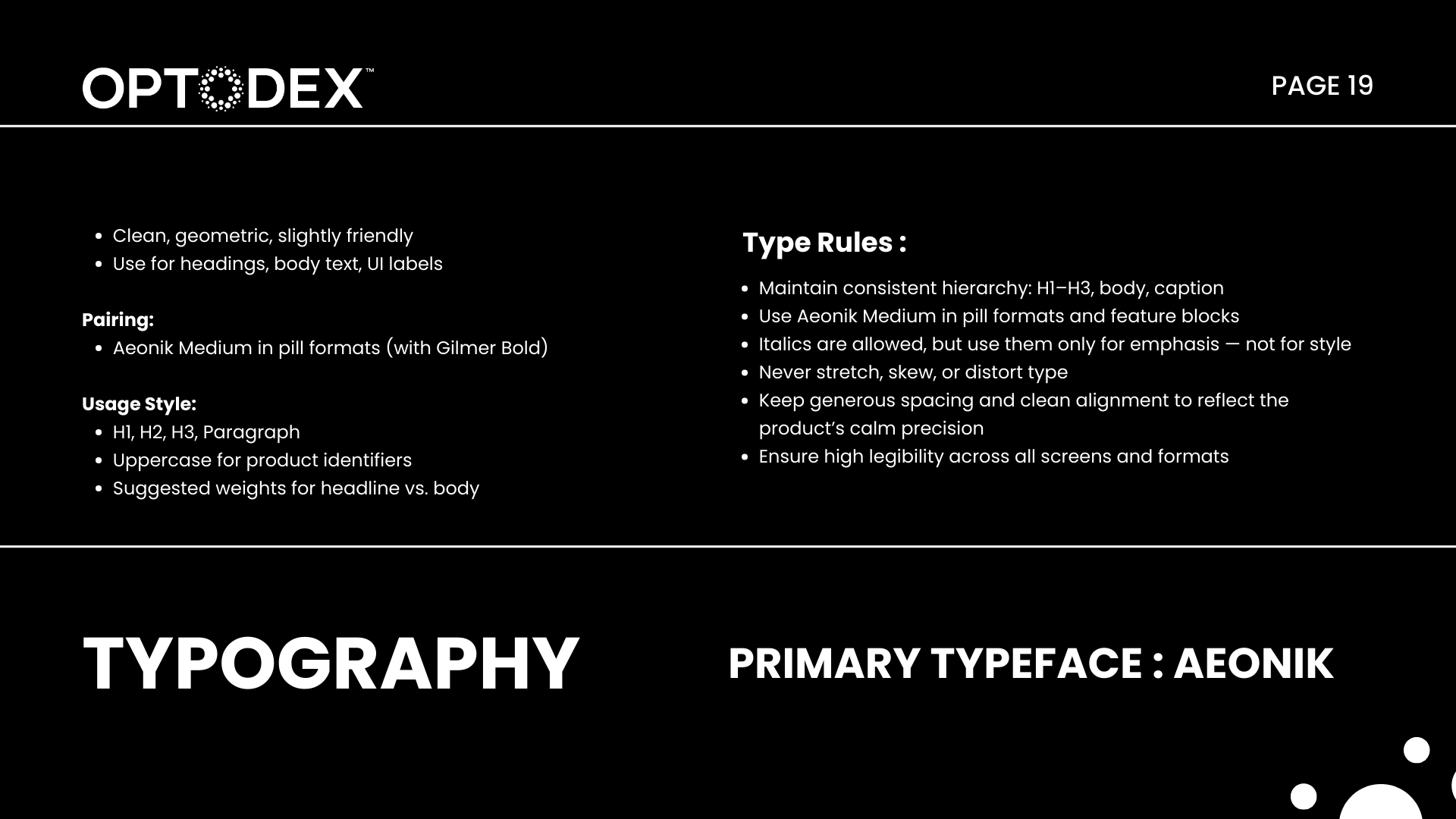
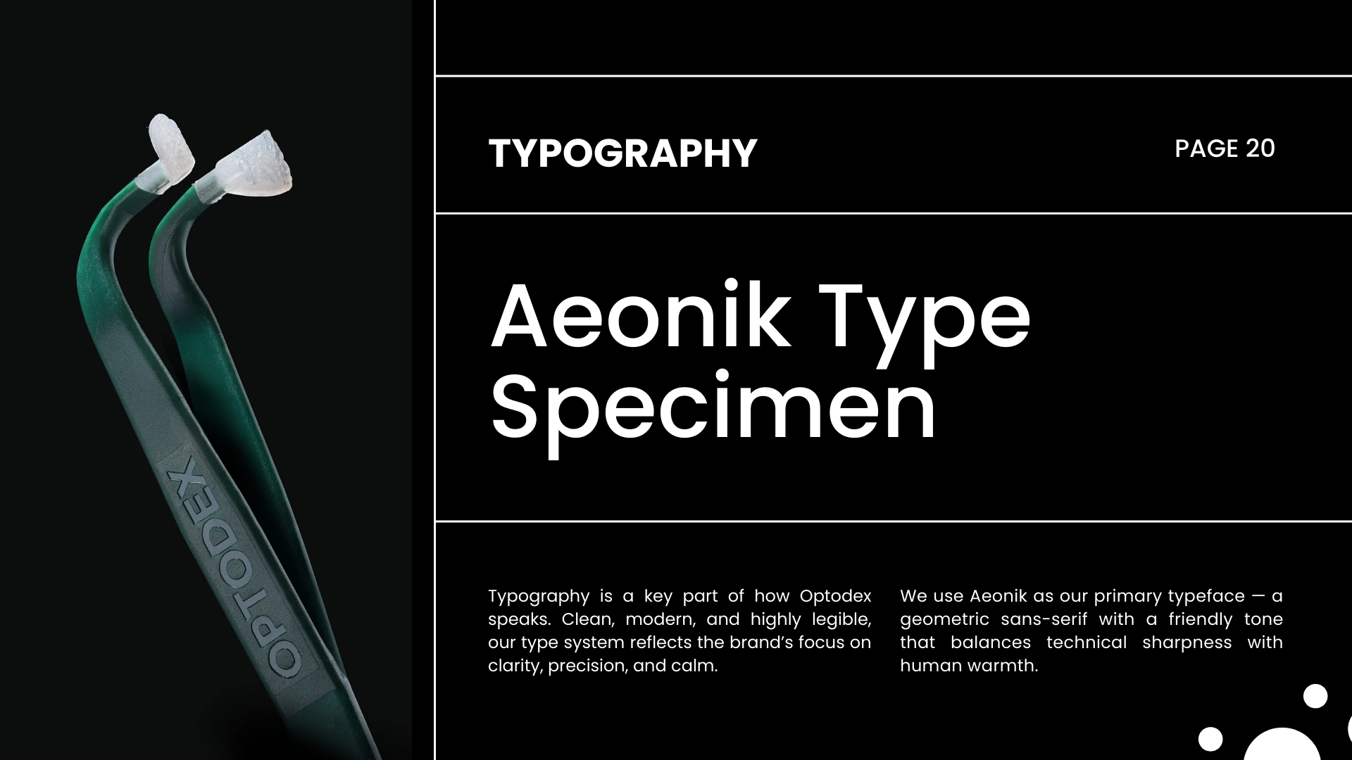
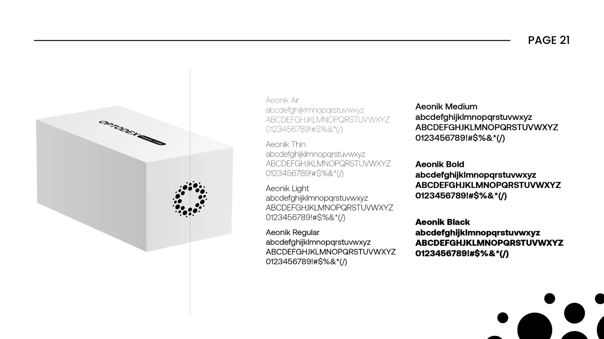
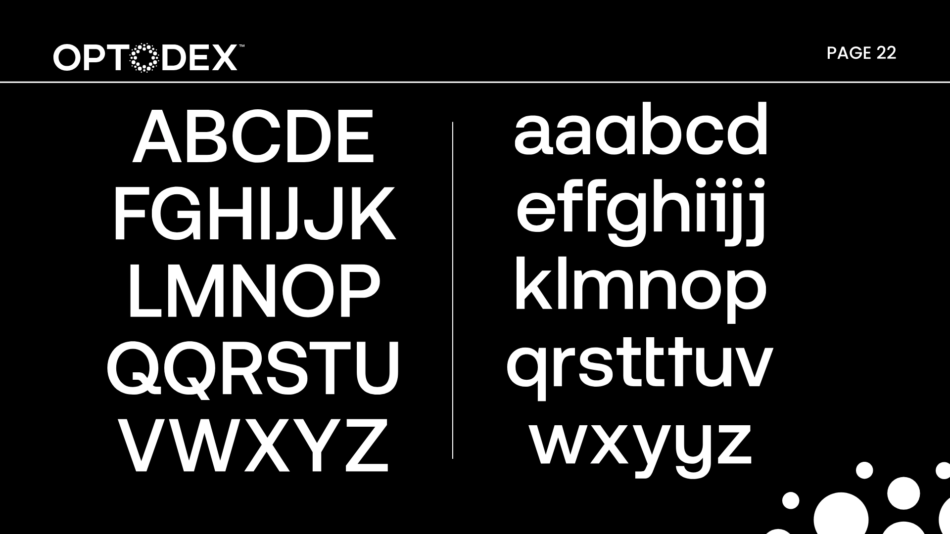
I developed a comprehensive brand guidelines document covering every layer of the identity: how the logo lives across surfaces, the color system, typography hierarchy, tone of voice, and real-world application rules.
The goal was to make consistency effortless, so whether it's a product label, a social post, or a pitch deck, Optodex always looks like Optodex.
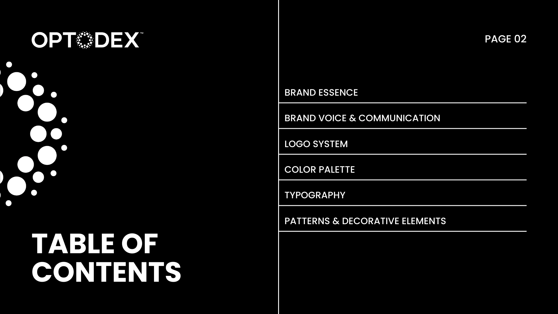
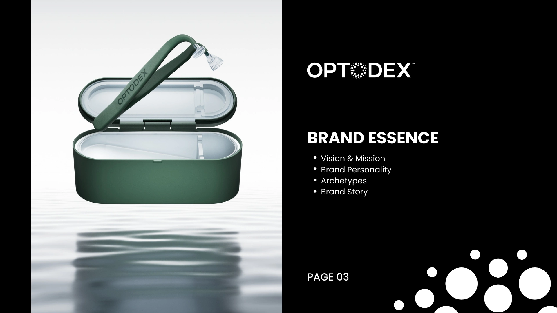
What was delivered:
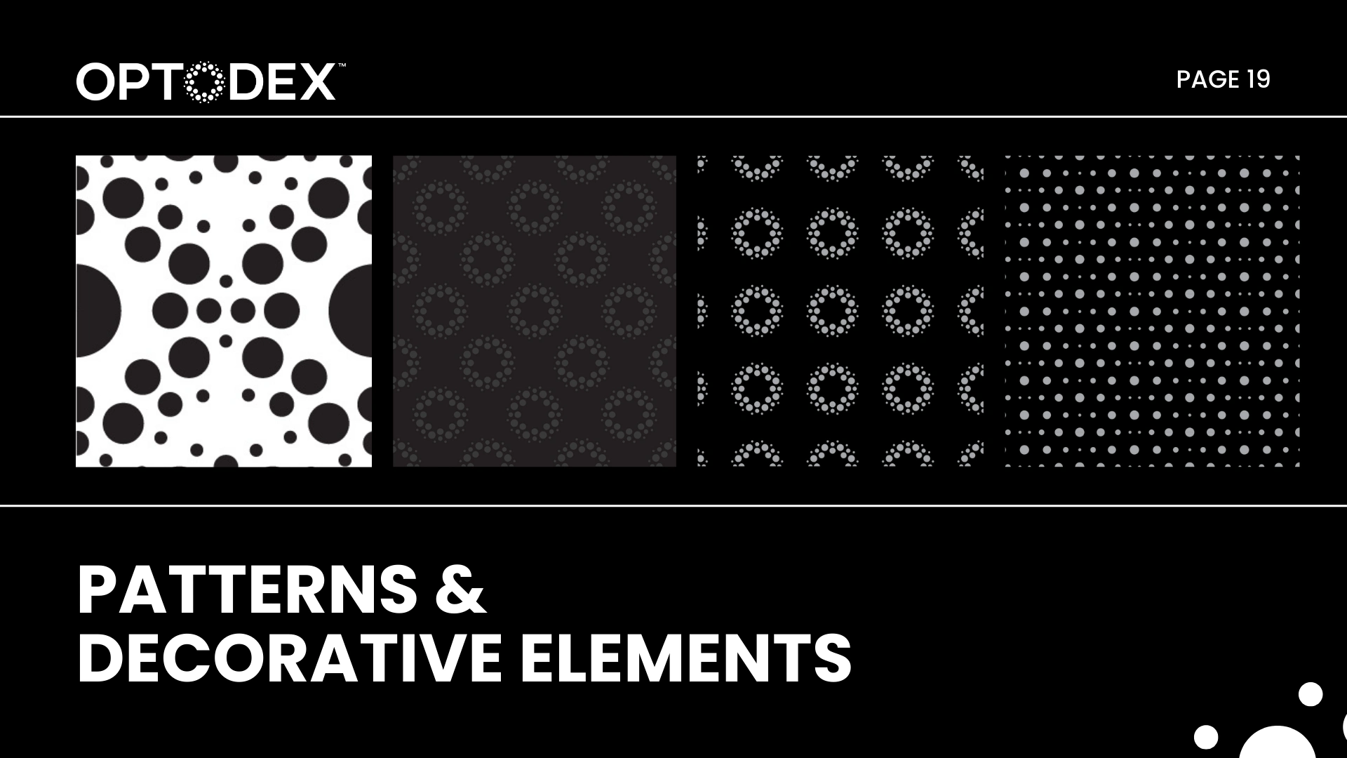
Full brand guidelines document
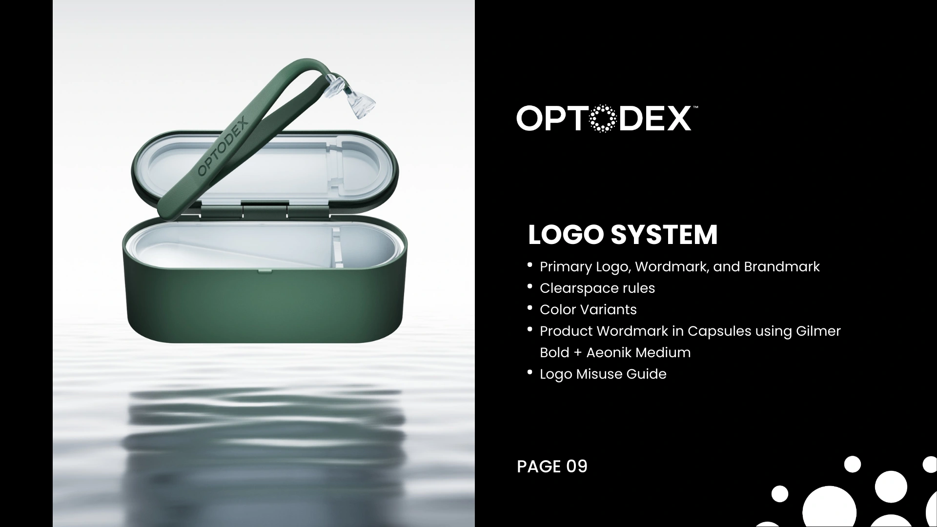
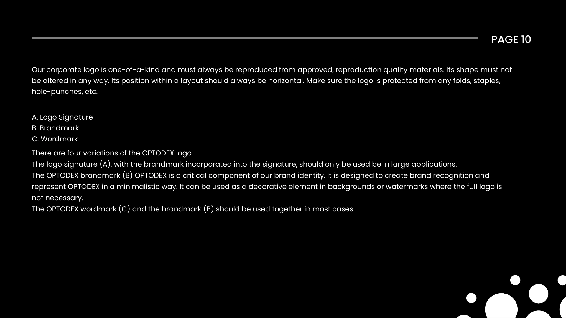
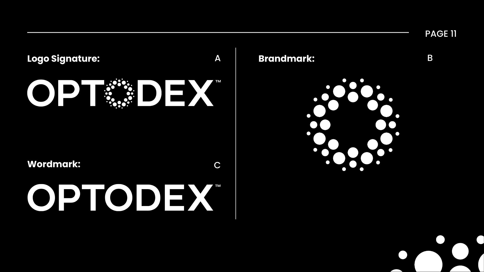
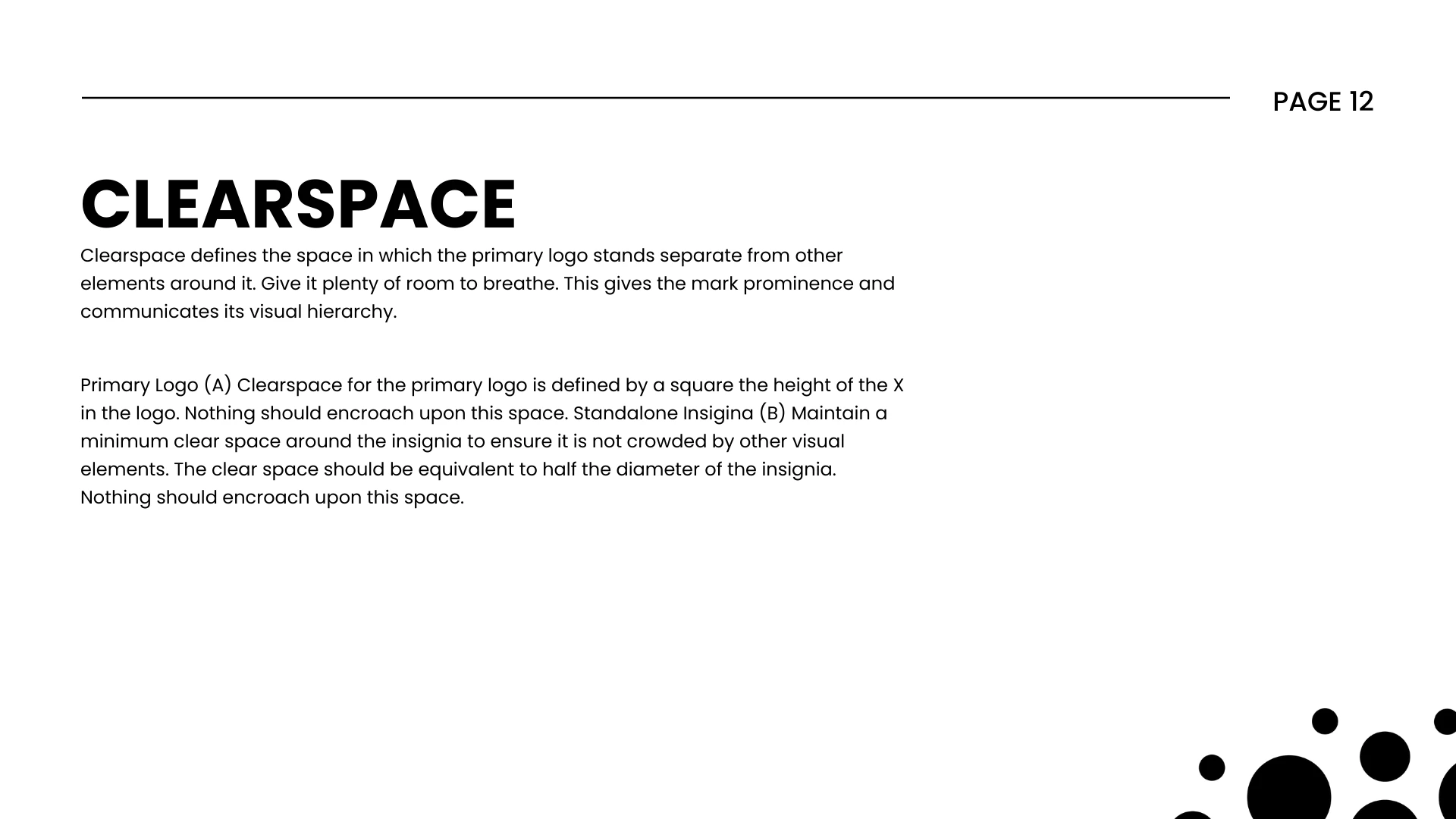
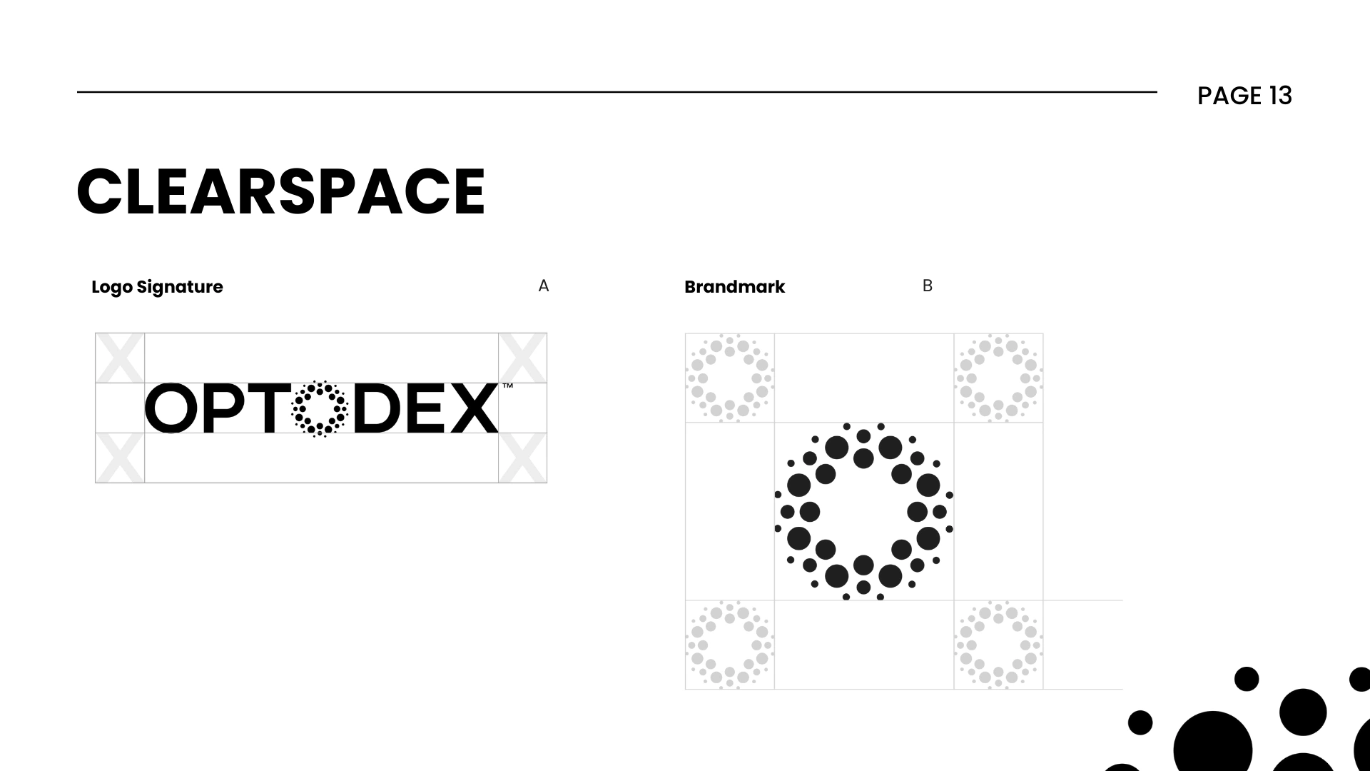
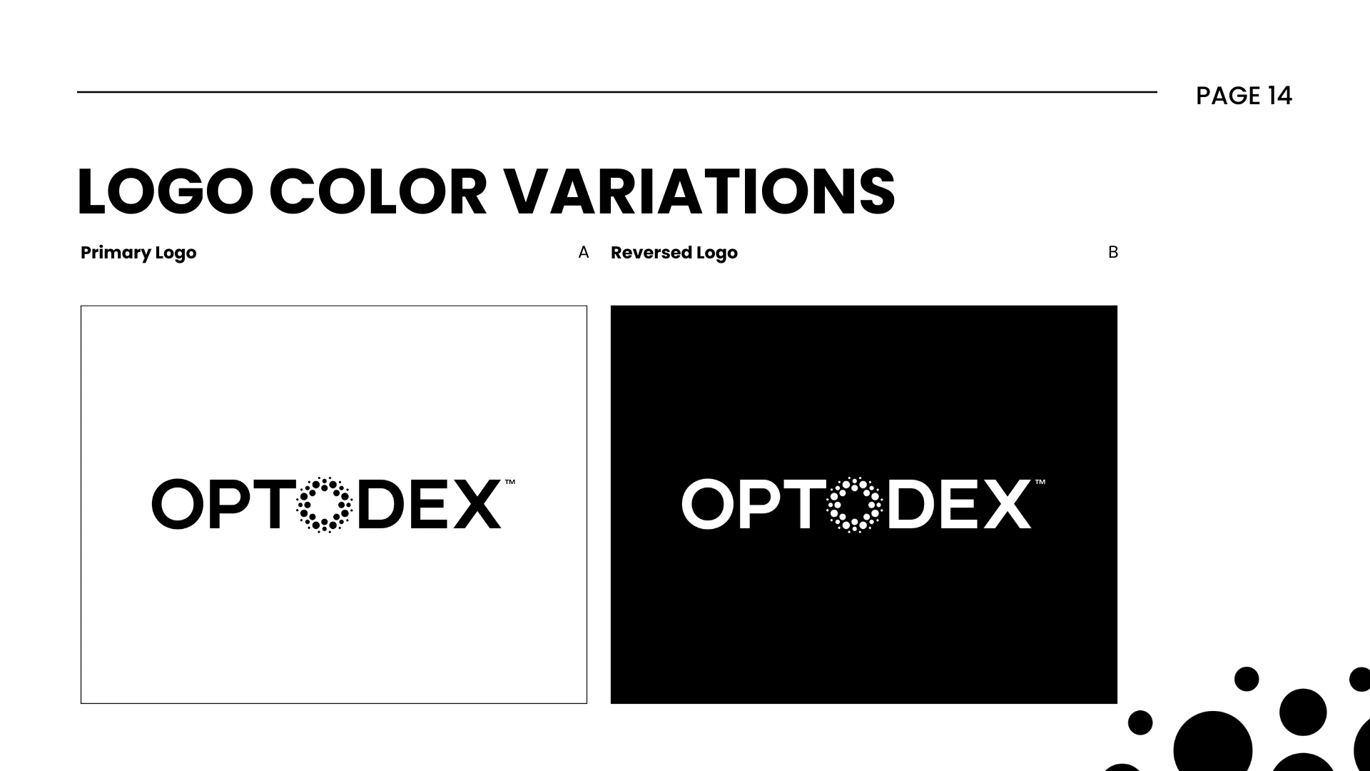
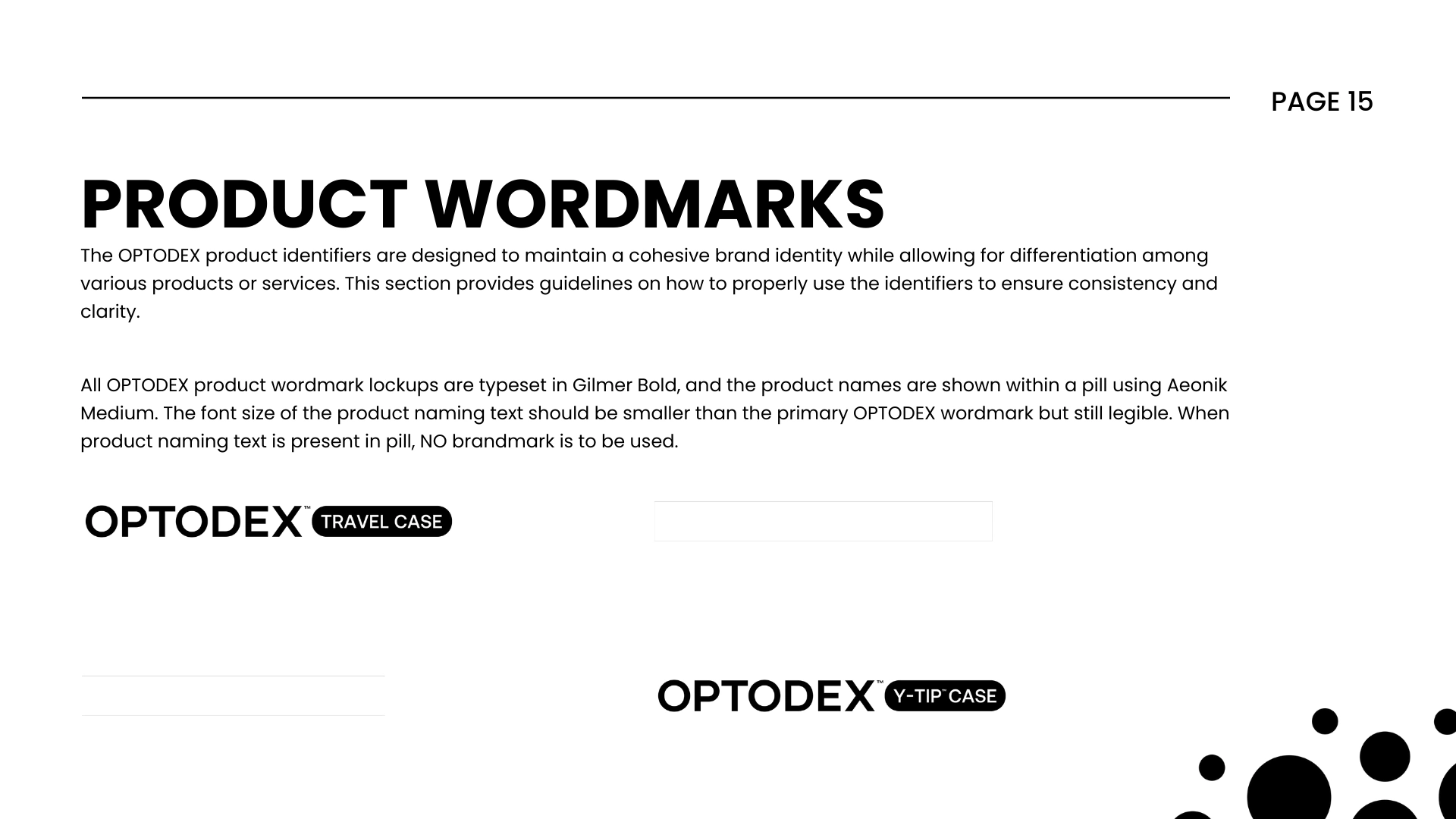
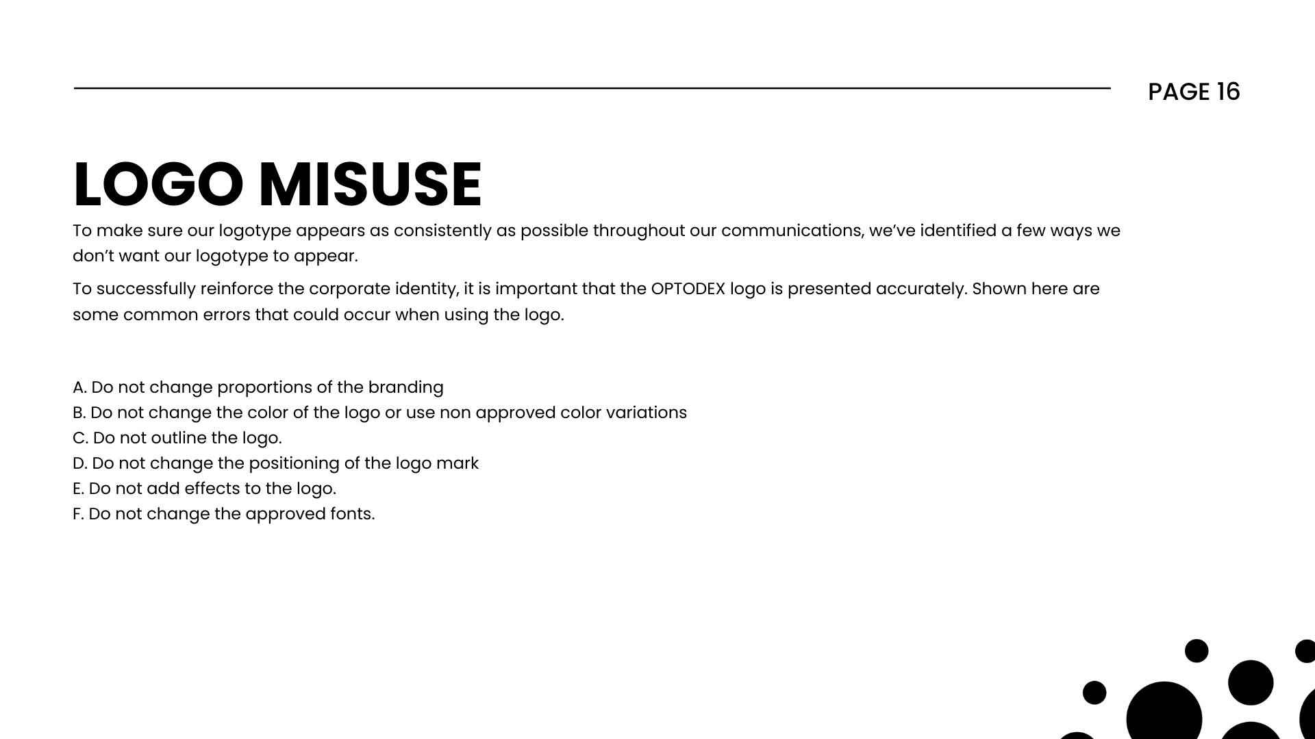
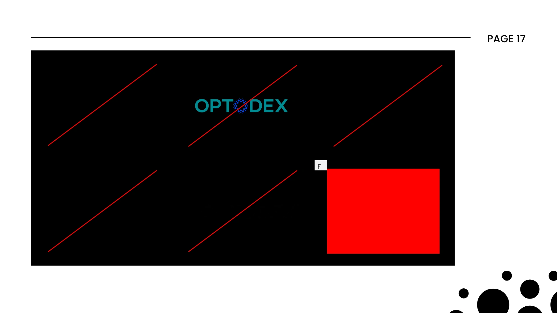
Logo usage rules + variants
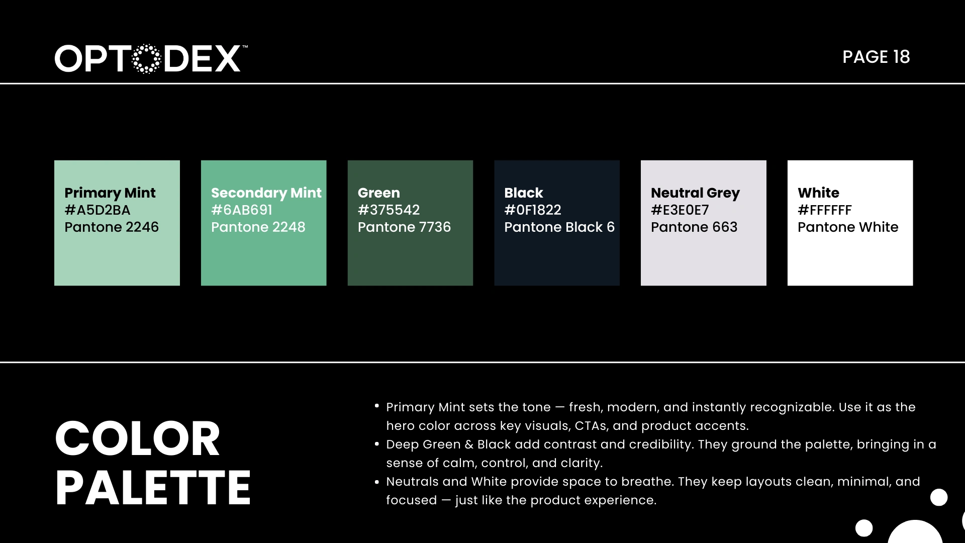
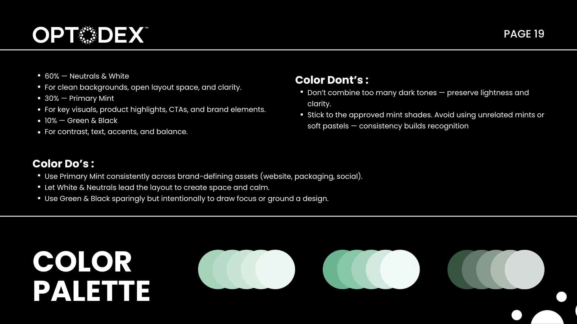
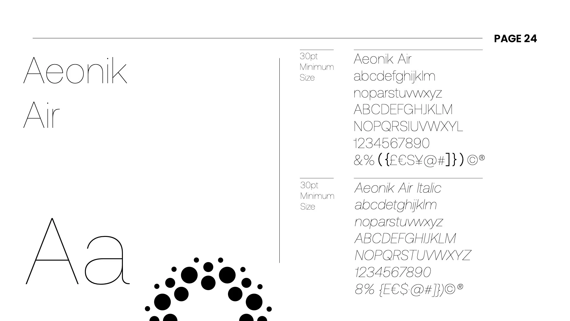
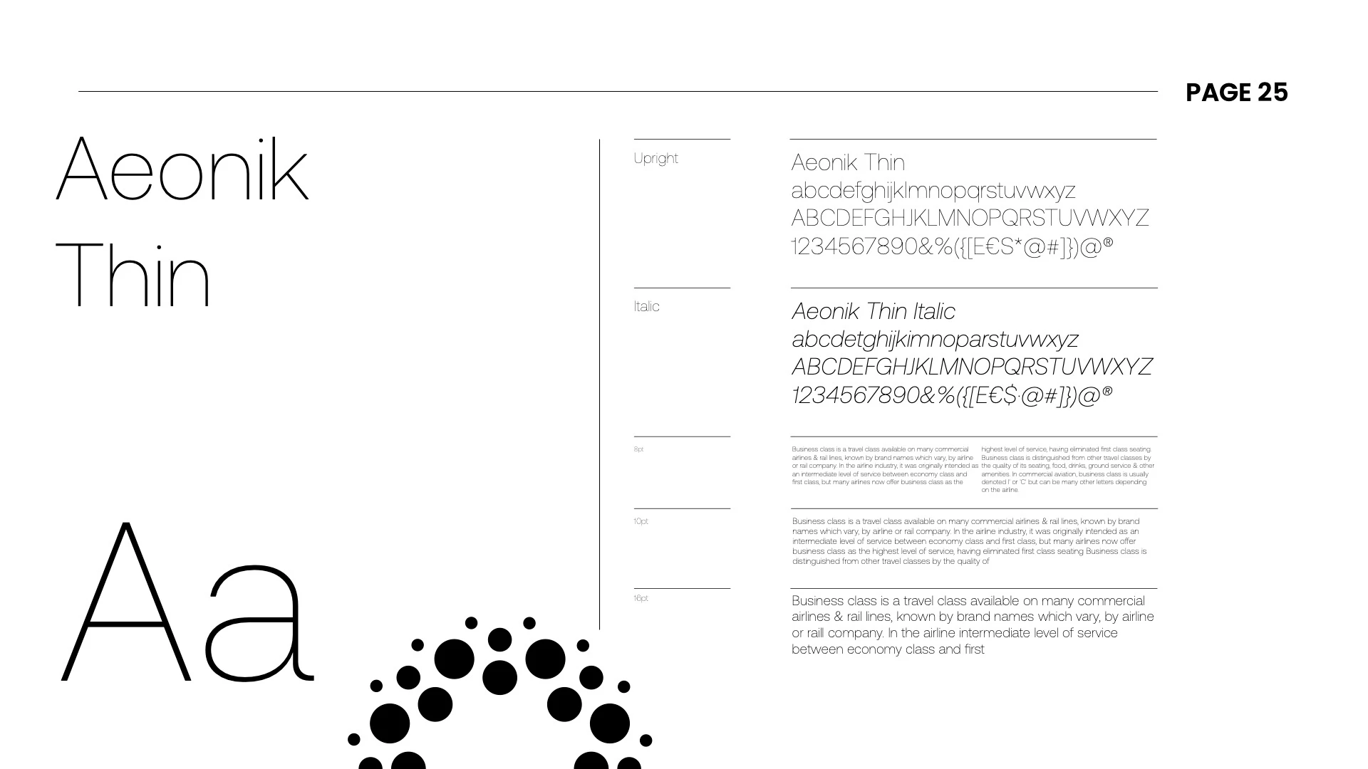
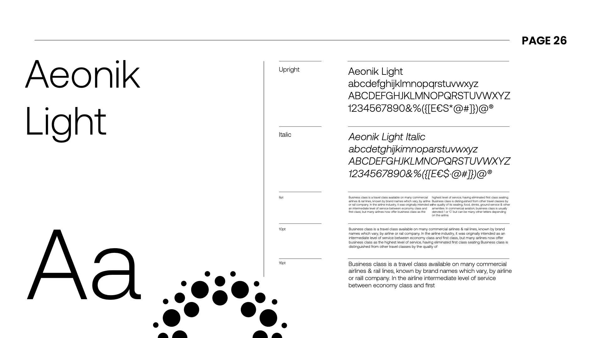
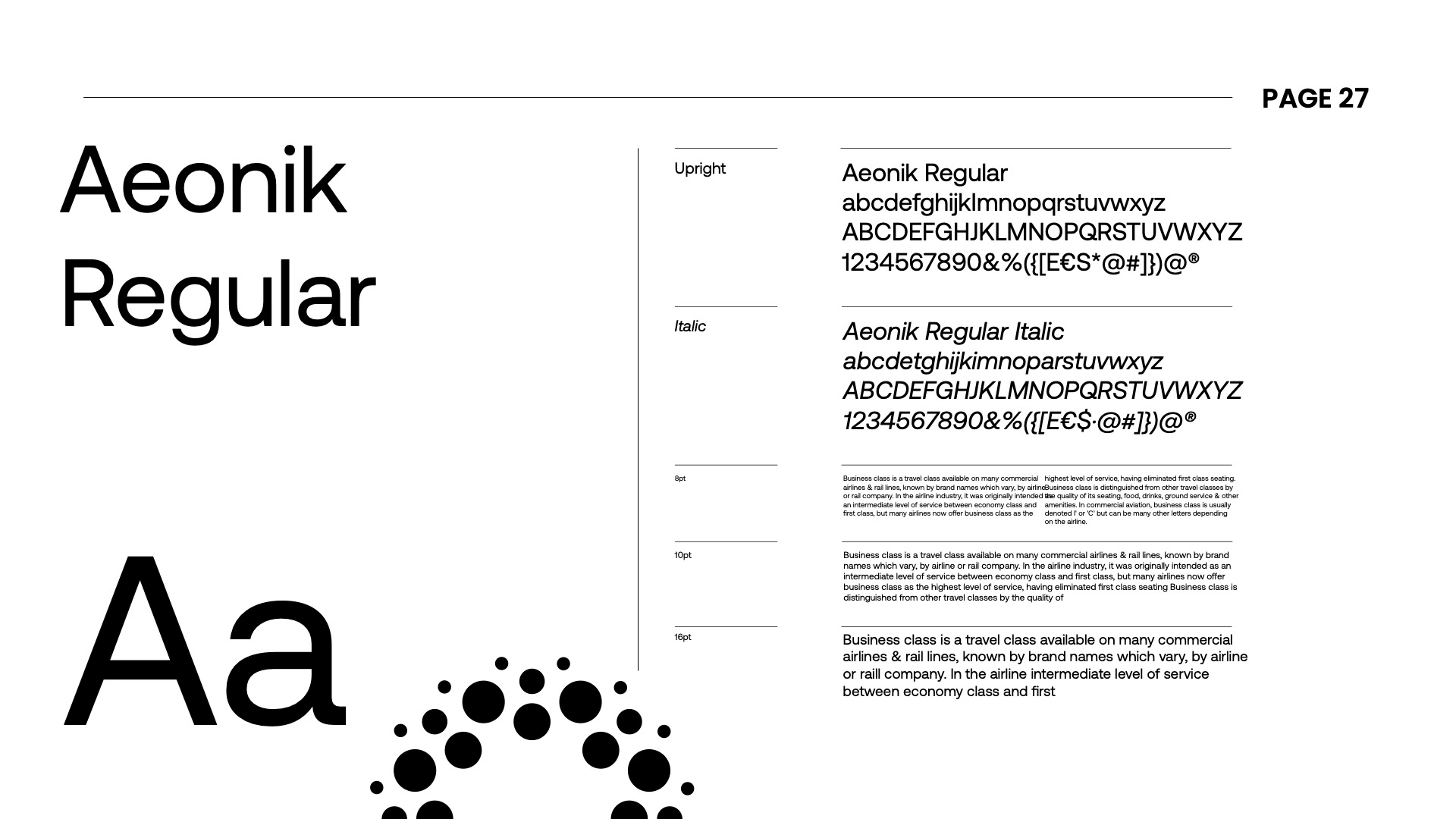
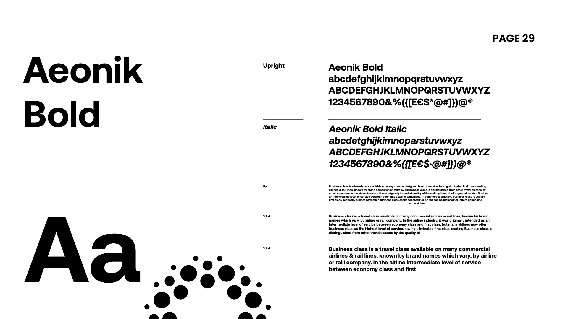
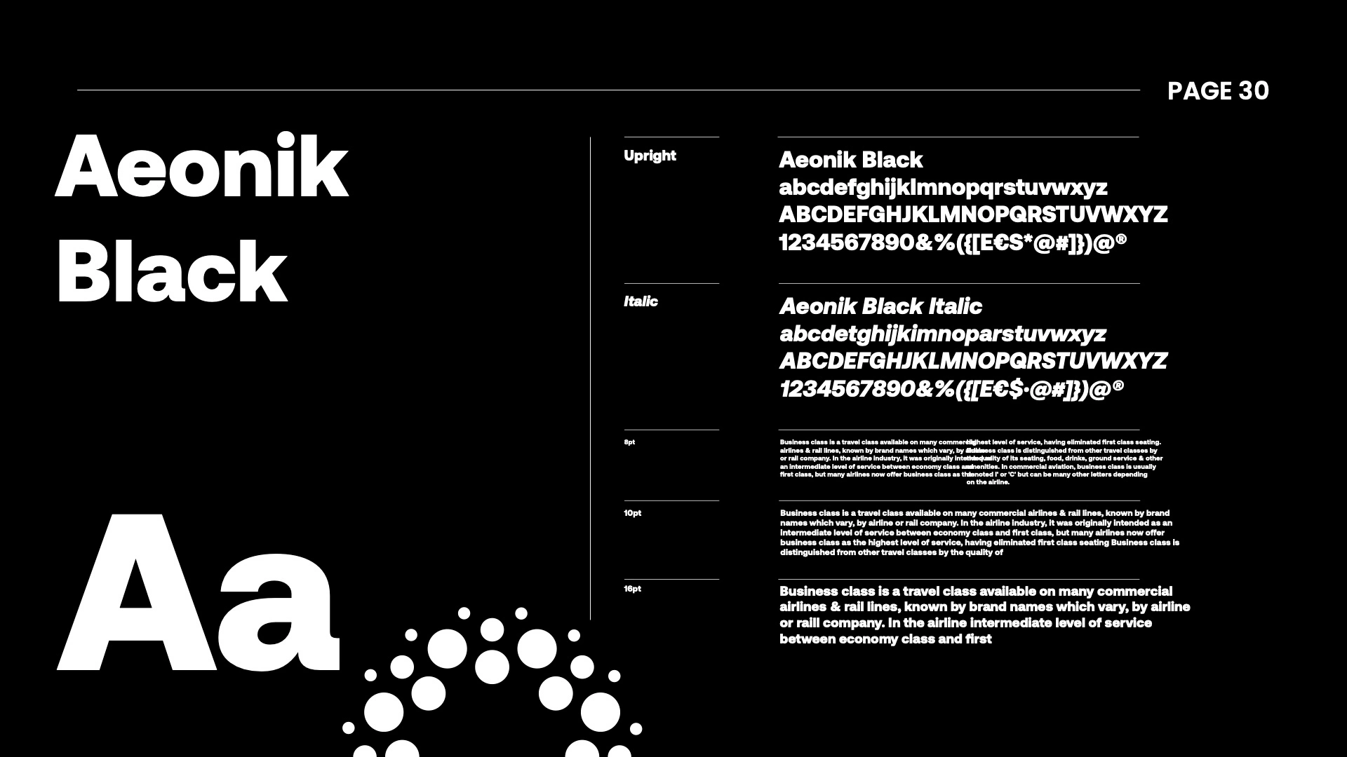
Color and typography system
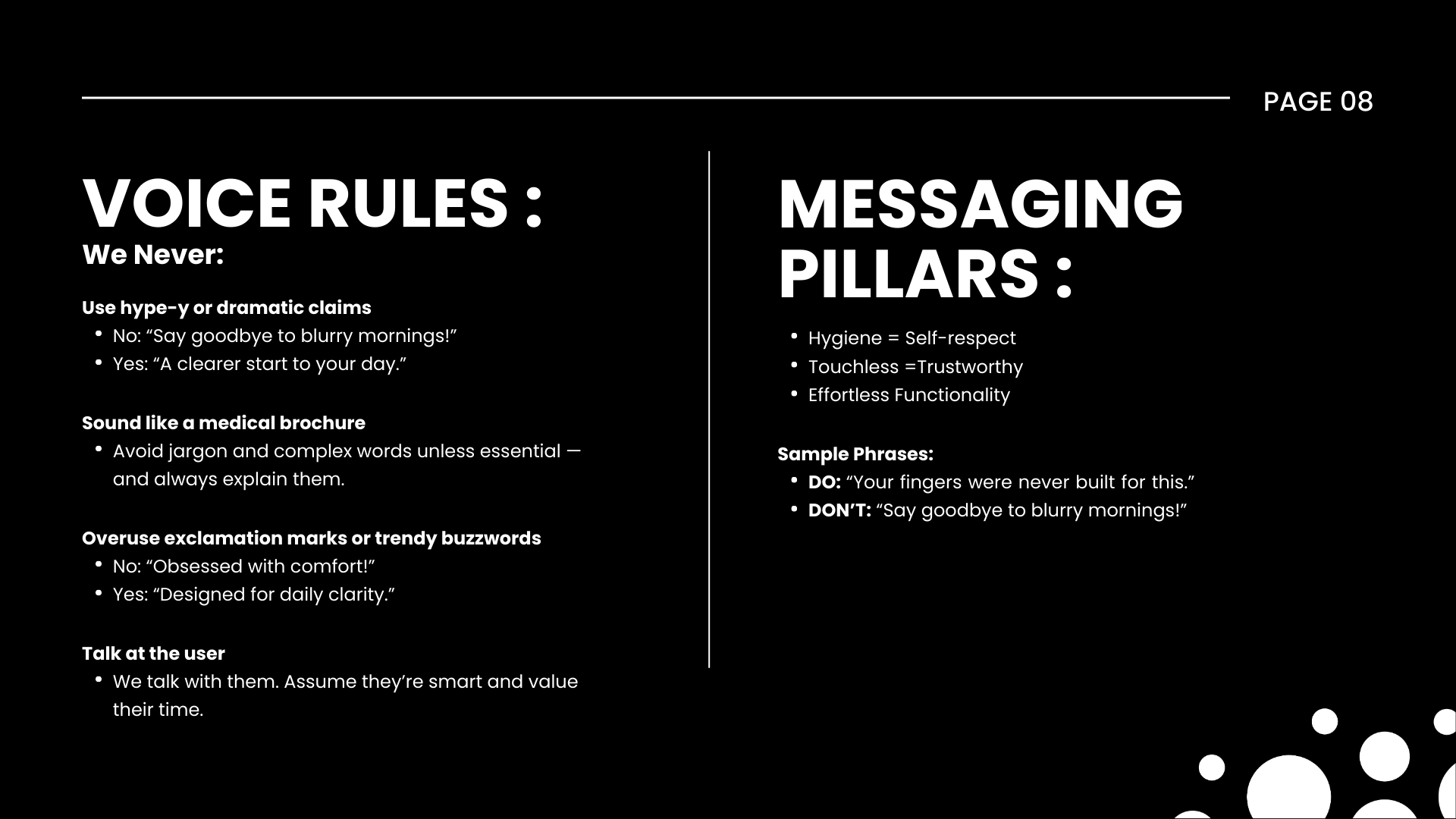
Voice and messaging direction
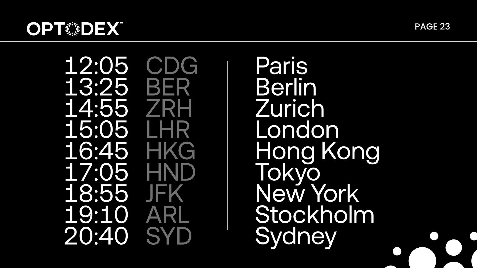
Application examples across touchpoints
Contact Us:
Like this project
Posted Apr 24, 2026
Complete brand guidelines for Optodex, a modern D2C eye care brand. Covers logo system, color, typography, voice, and application rules.