NŌMU - Matcha Mascot Brand Identity & Packaging Design

Raghav Goyal


NŌMU · Evening Ritual Matcha Brand Identity + Brand Collaterals
Keywords: Calm, Grounded, Ritualistic, Intentional
NŌMU is a matcha brand designed around the quiet end of the day. Taking the tradition of ceremonial matcha and repositioning it entirely, not as a morning habit, but as an evening ritual.
The Concept
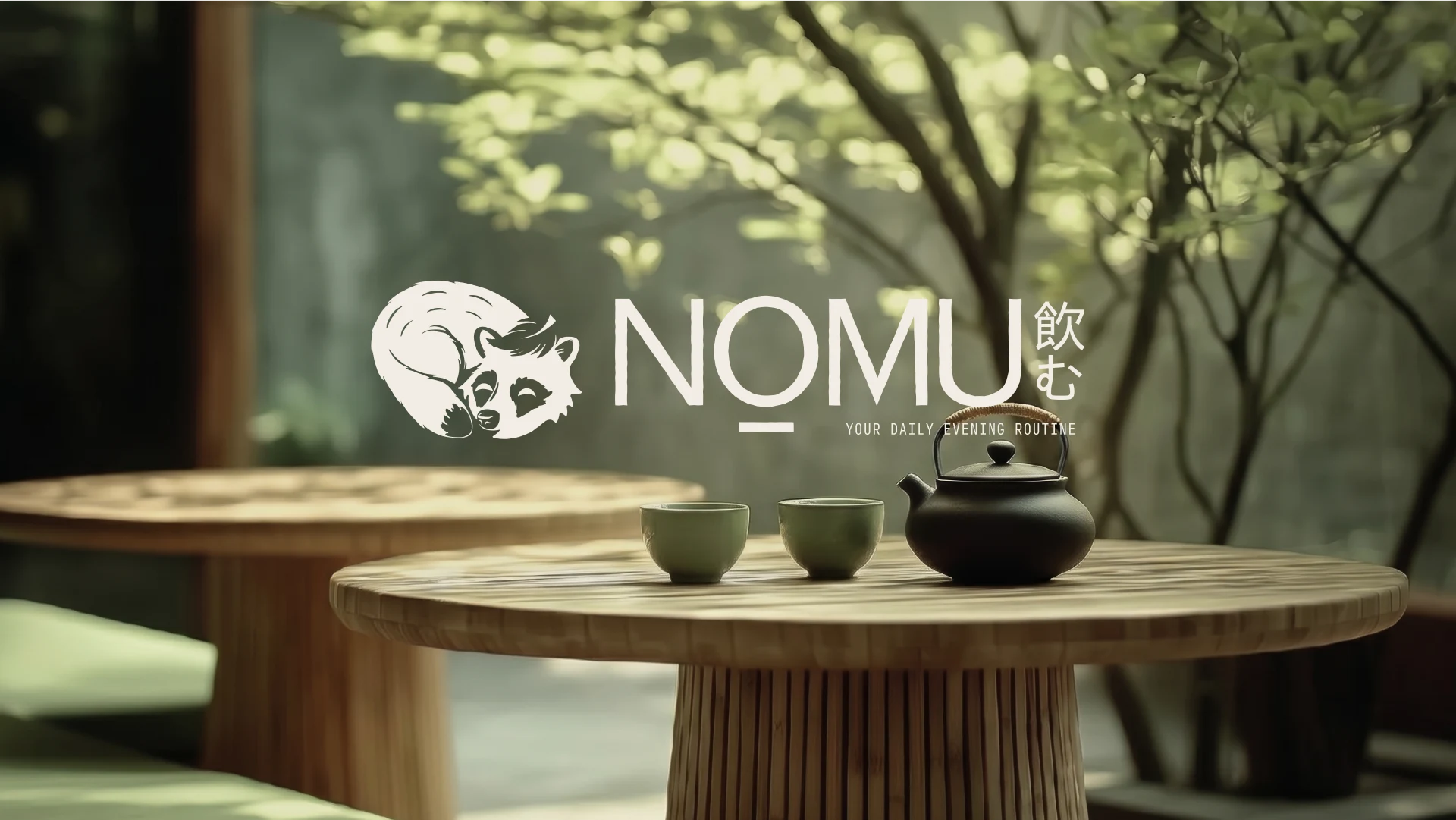
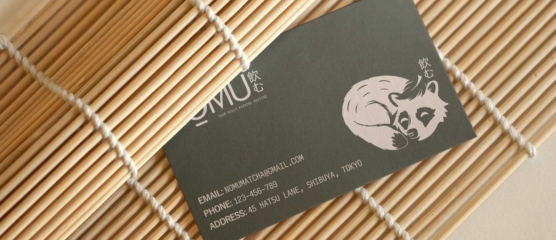
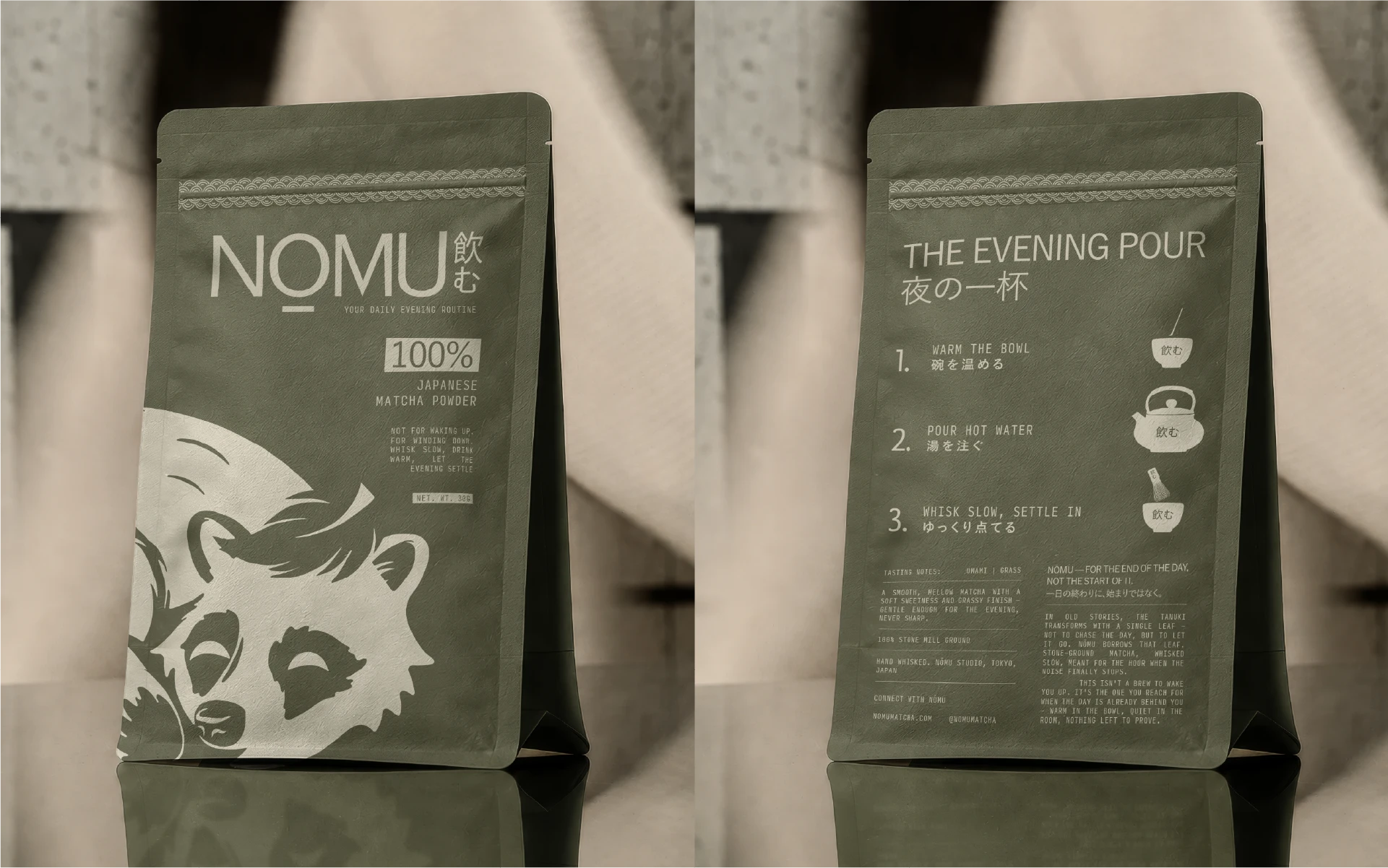
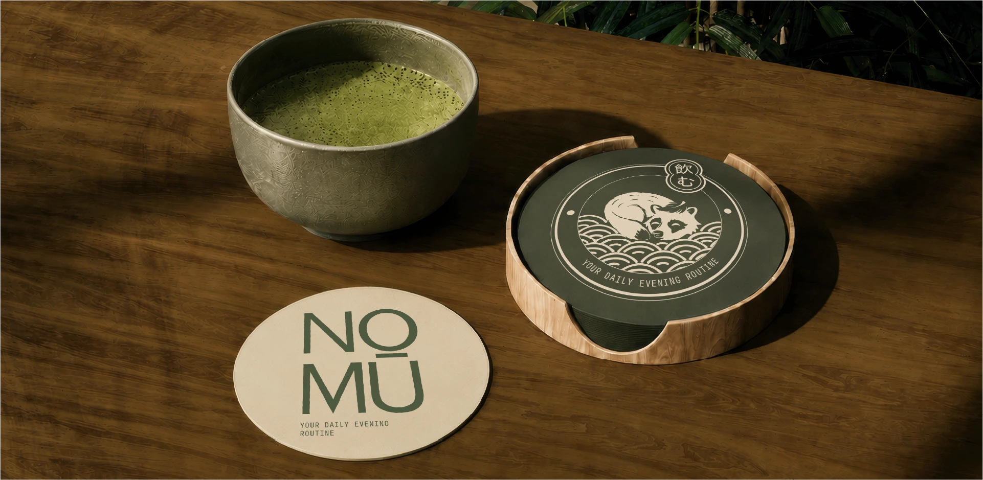
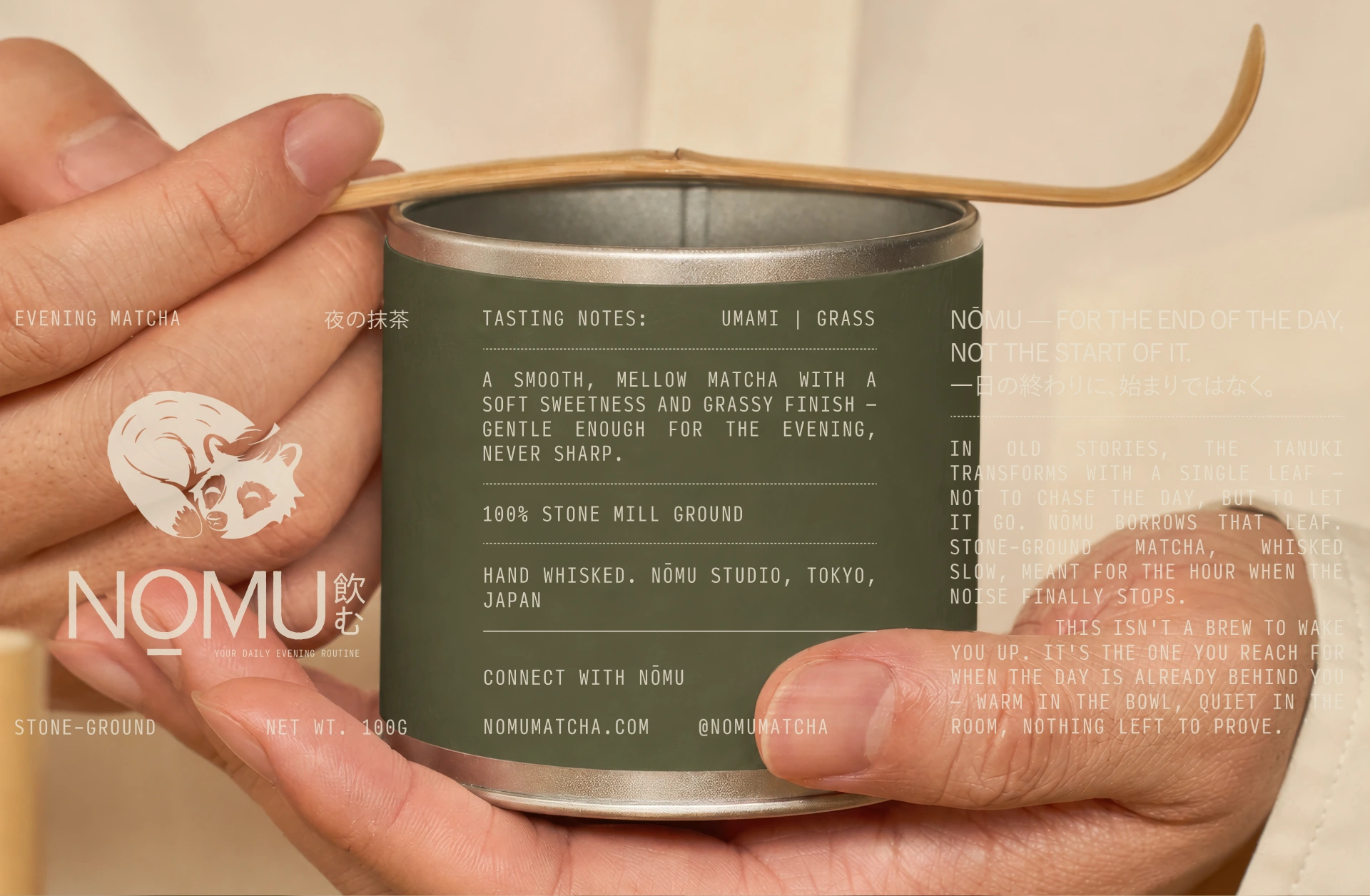
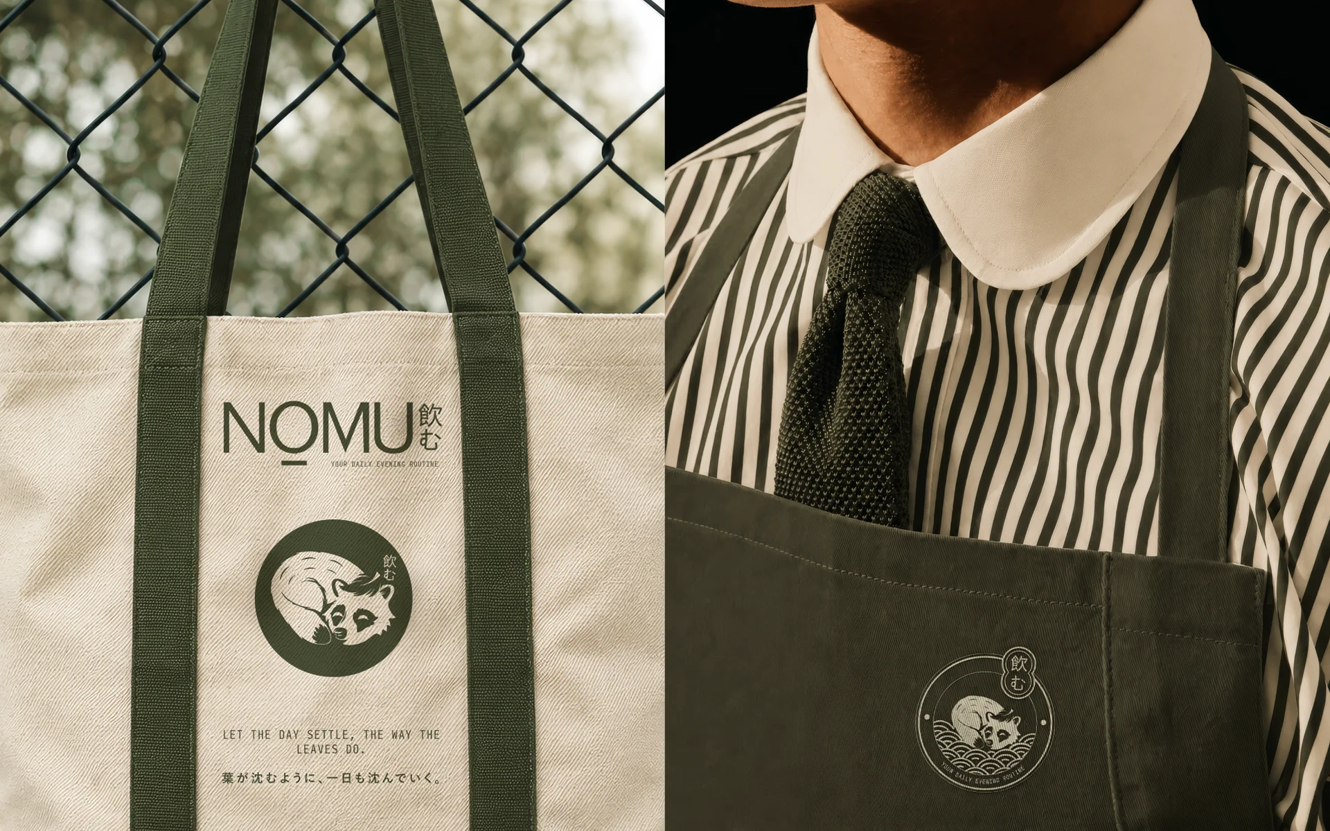
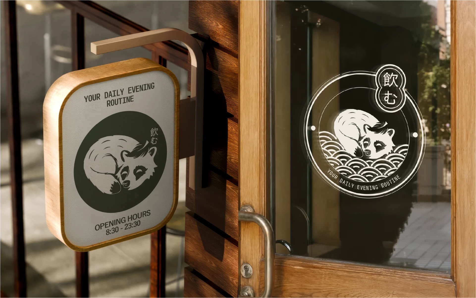
NŌMU draws from Japanese folklore. The tanuki shapeshifts with a single leaf — not into action, but into rest. The curled tanuki mark became the heart of the brand, a quiet symbol of a day well closed.
The Challenge
Most matcha brands compete for the same morning slot, using the same language. The space is crowded and the positioning is predictable. NŌMU needed an identity that carved out a completely different moment in the day.

The Solution
Rather than fighting for mornings, NŌMU claims the evening. Calm without being precious, ritualistic without being performative. Every design decision reinforces that single positioning.
The Identity
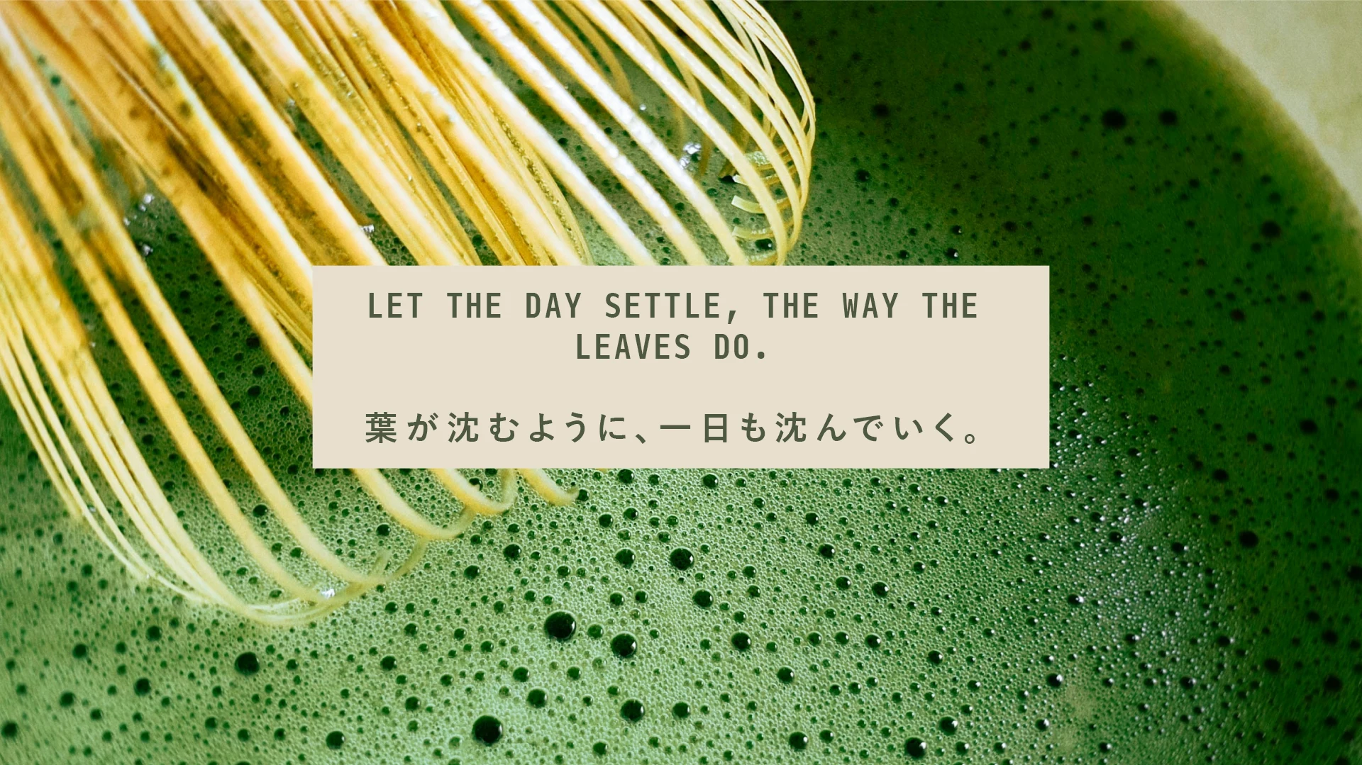
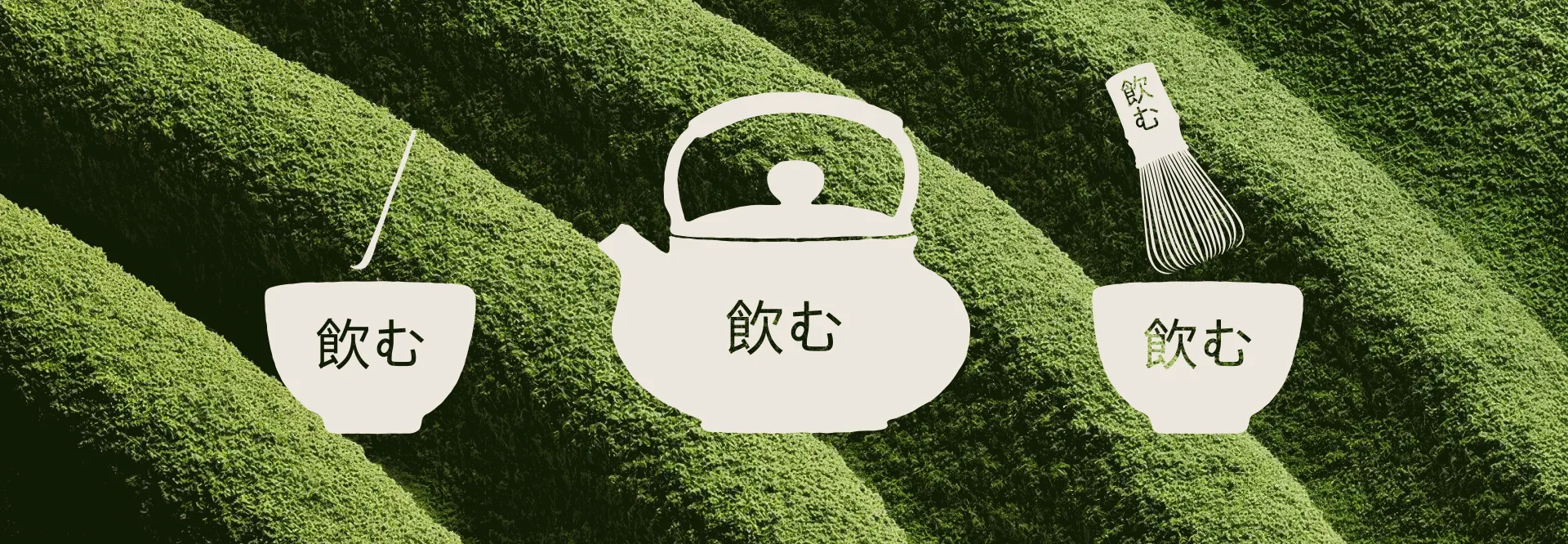
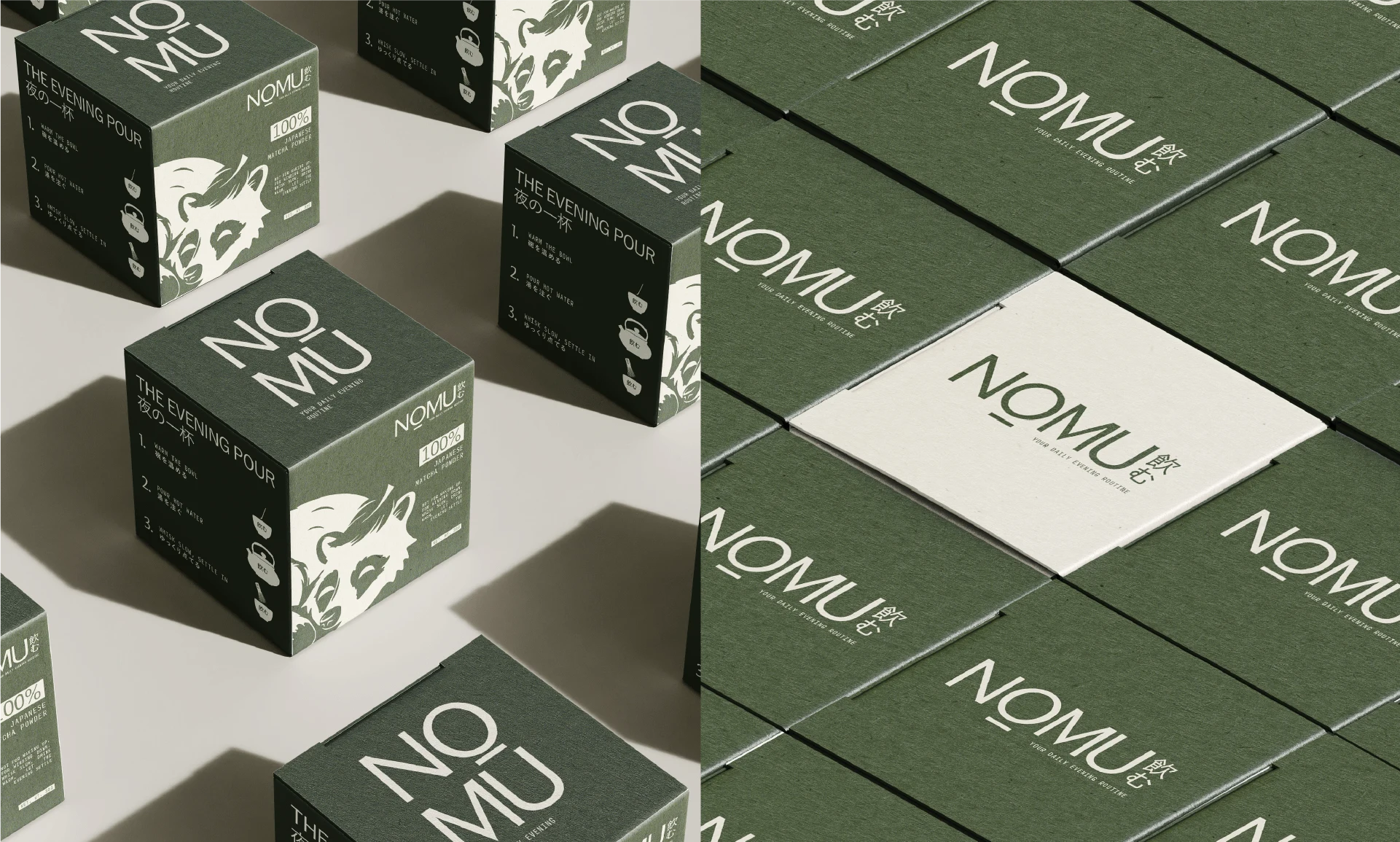
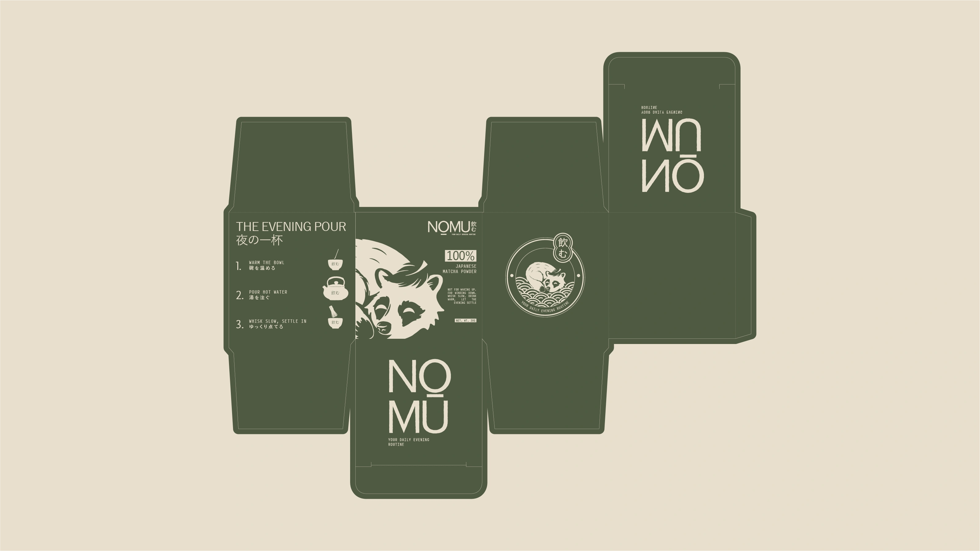
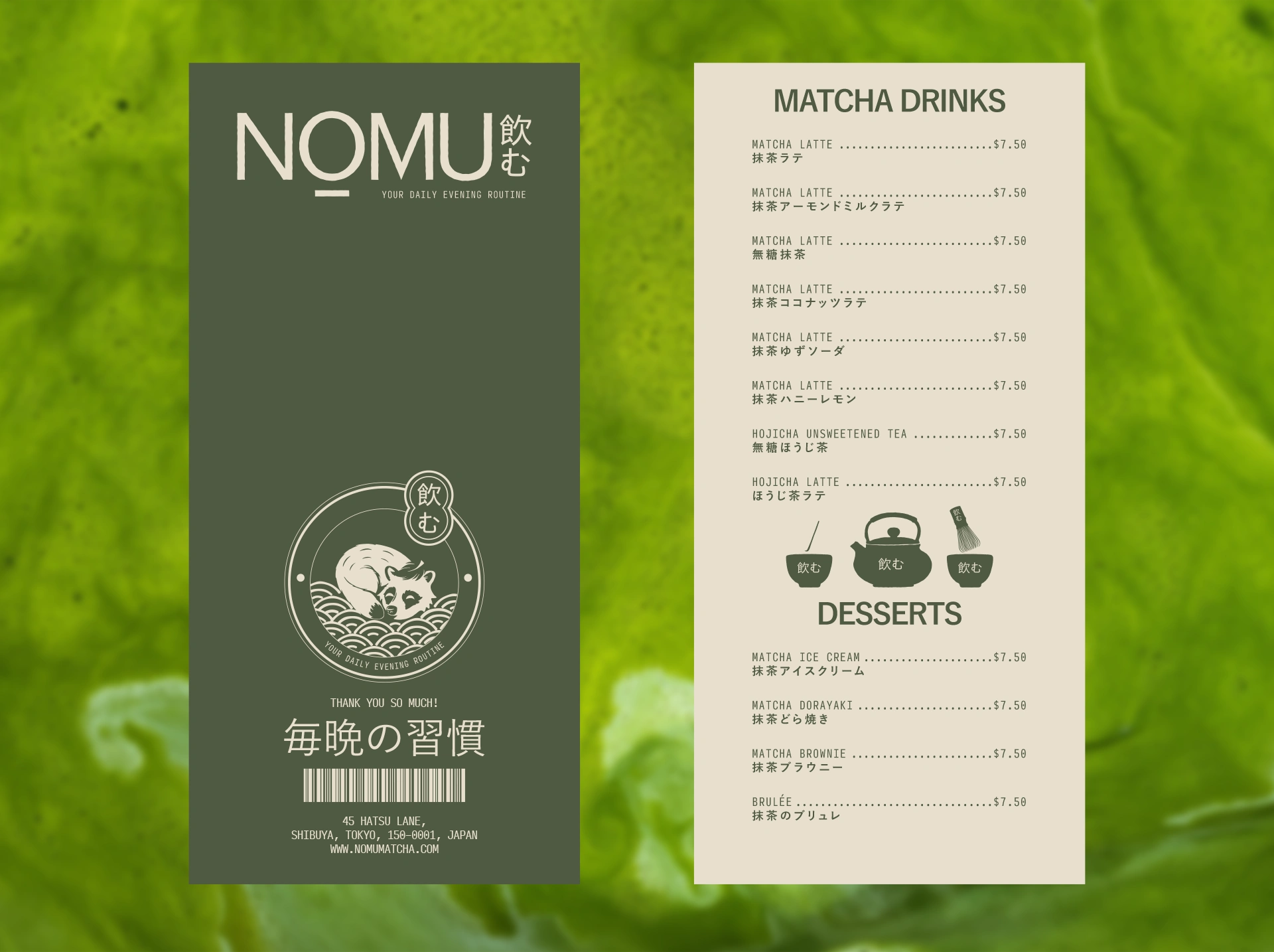
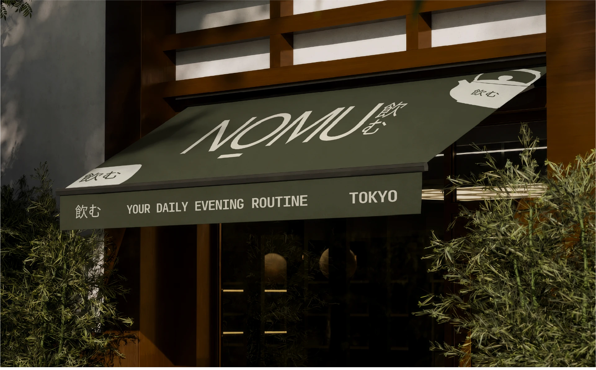
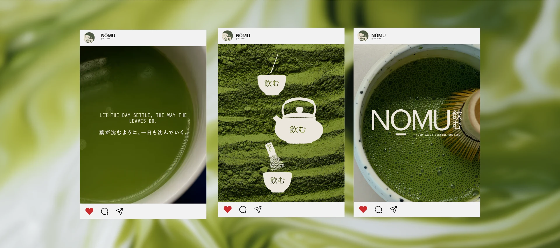
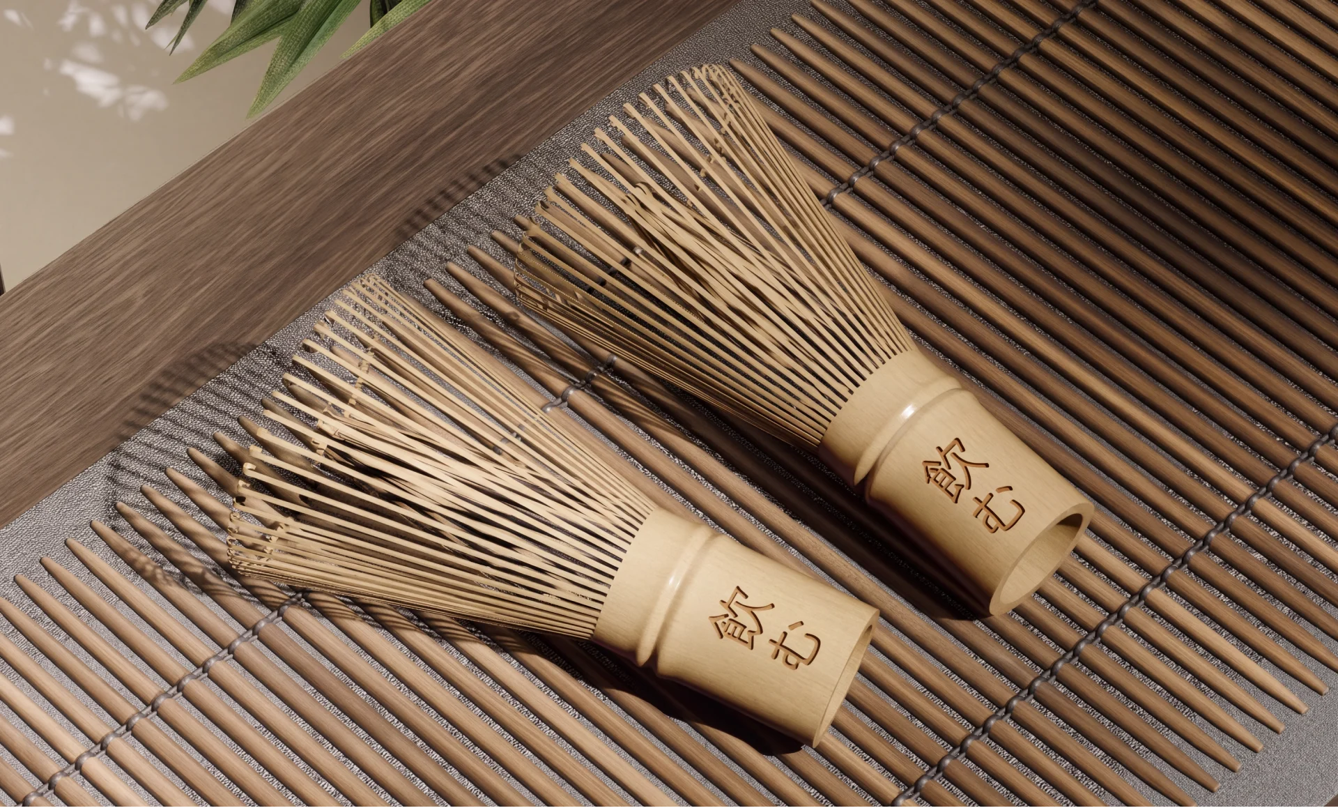
Deep matcha green paired with warm cream, anchored by a hand-drawn tanuki mascot and a soft lowercase wordmark. Every touchpoint designed to feel like something worth slowing down for.
Thank You!
Looking to build a brand with a point of view? Let's build it together.
Like this project
Posted Jul 9, 2026
Created a unique evening-focused Brand Identity & Packaging Design for NŌMU matcha.
Likes
2
Views
13
Timeline
Jun 8, 2026 - Jul 6, 2026