Wash Ave | Historic Street Brand Identity
Kajal Baliyan
Overview :
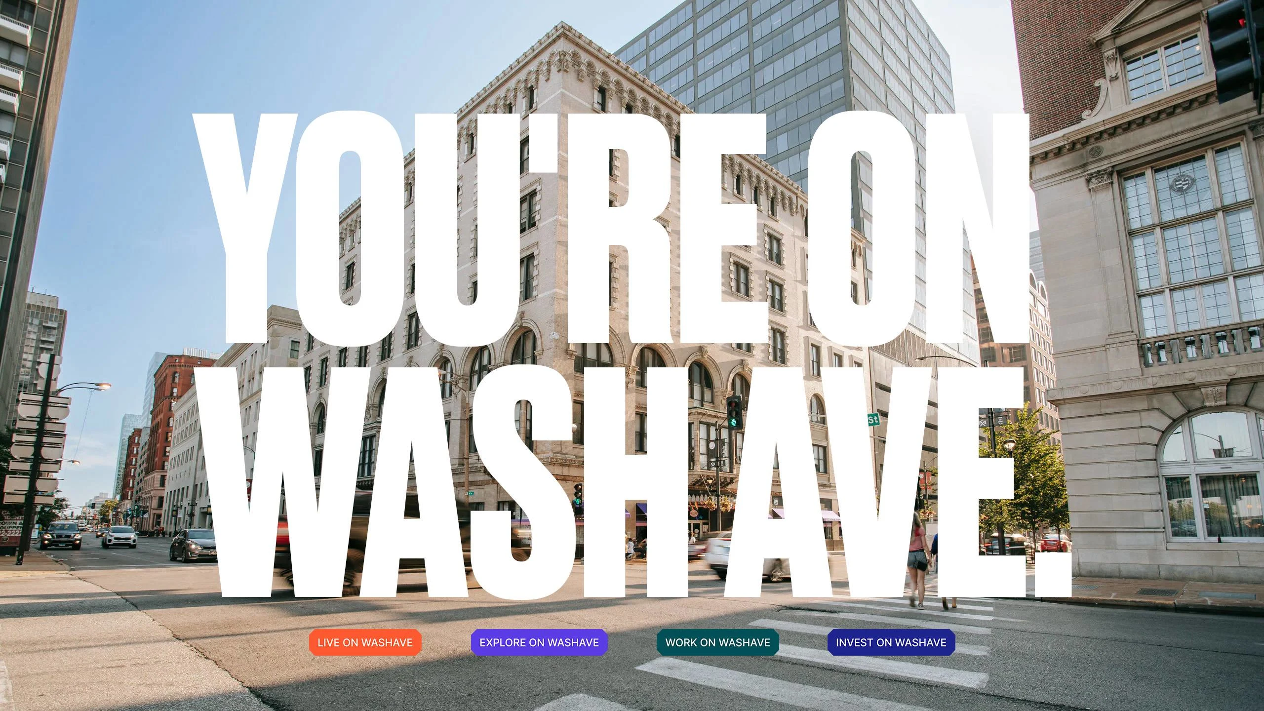
Wash Ave (formerly Washington Avenue) is a historic street in downtown St. Louis, known for its rich architecture and proximity to major city landmarks like the Convention Center, CityPark Soccer Stadium, and the Gateway Arch National Park. Despite the prime location, it lacked cohesion. Businesses operated in silos, and visitors experienced it as a scattered mix of venues rather than a unified destination.
The challenge was to reposition Wash Ave from a pass-through corridor into a must-visit district, one with a clear identity locals could rally around, investors could believe in, and visitors would remember.
Brand Approach:
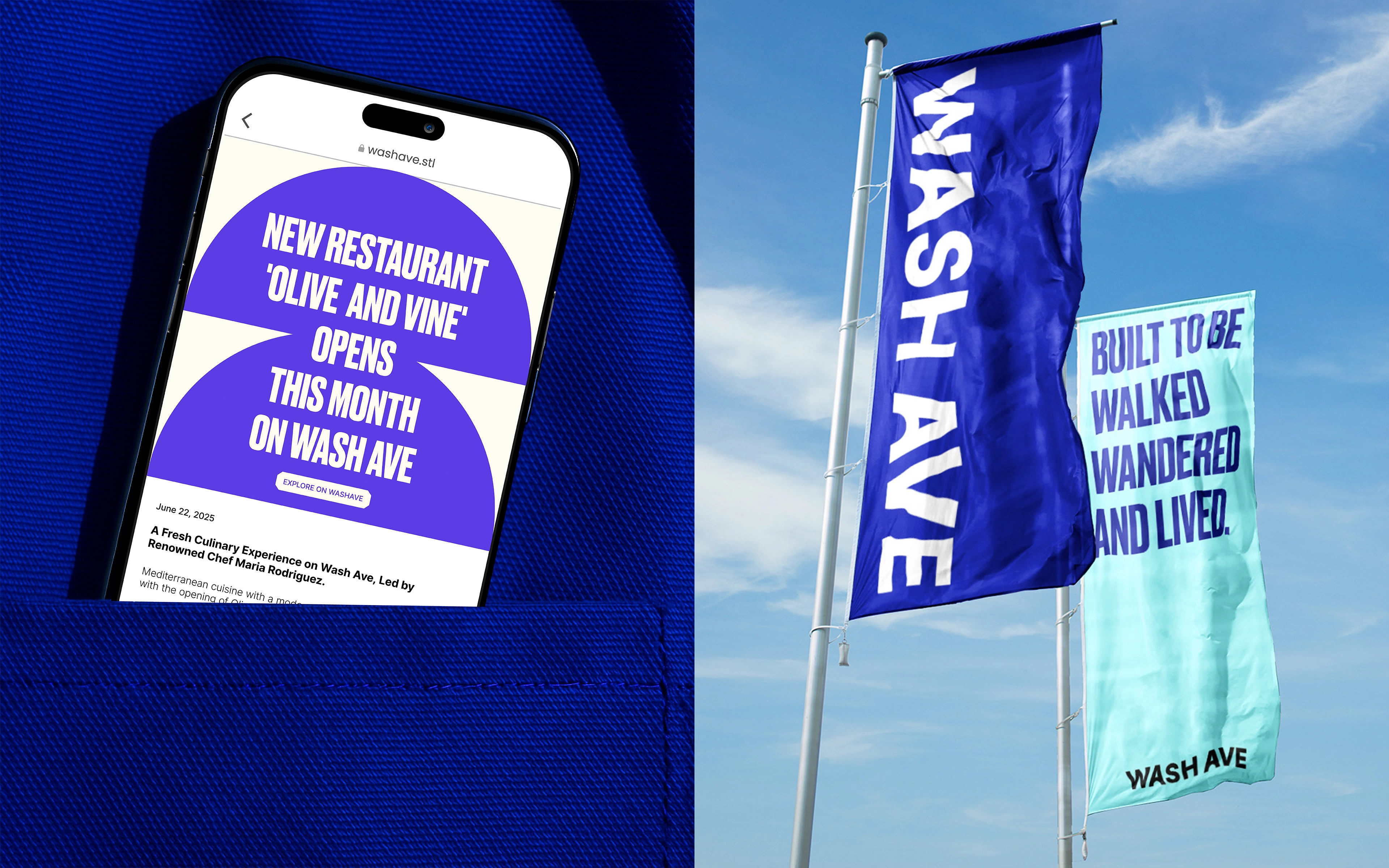
This wasn’t about adding a logo or fresh signage. The brand had to capture the momentum of an evolving city, alive with energy, discovery, and connection. And to do that we focused on building an identity that sparks curiosity, invites exploration, and creates a sense of belonging in the urban fabric.
We began by shaping the mood and visual language, built around three core themes:
Urban & Edgy – A raw, high-energy aesthetic that mirrors the pulse of city life.
Ultra-Modern & Sleek – Clean, sharp visuals that feel contemporary and timeless.
Vibrant & Inviting – A balance of bold colors and warm accents that draw people in.
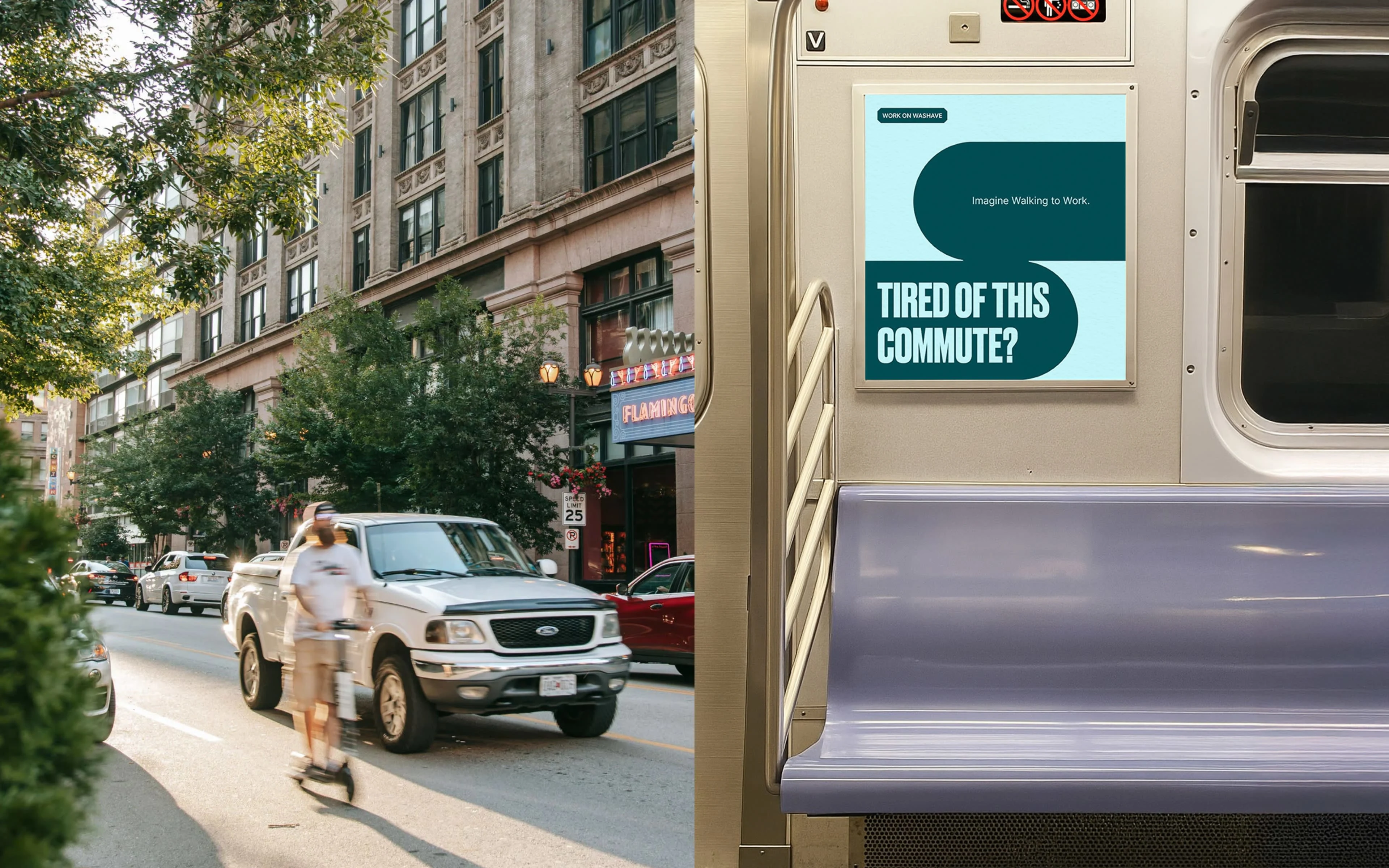
This direction set the tone for every design choice, from typography and color to imagery and graphic elements. The result was a brand with presence, one that positions Wash Ave not just as a location, but as a destination with character, clarity, and purpose.

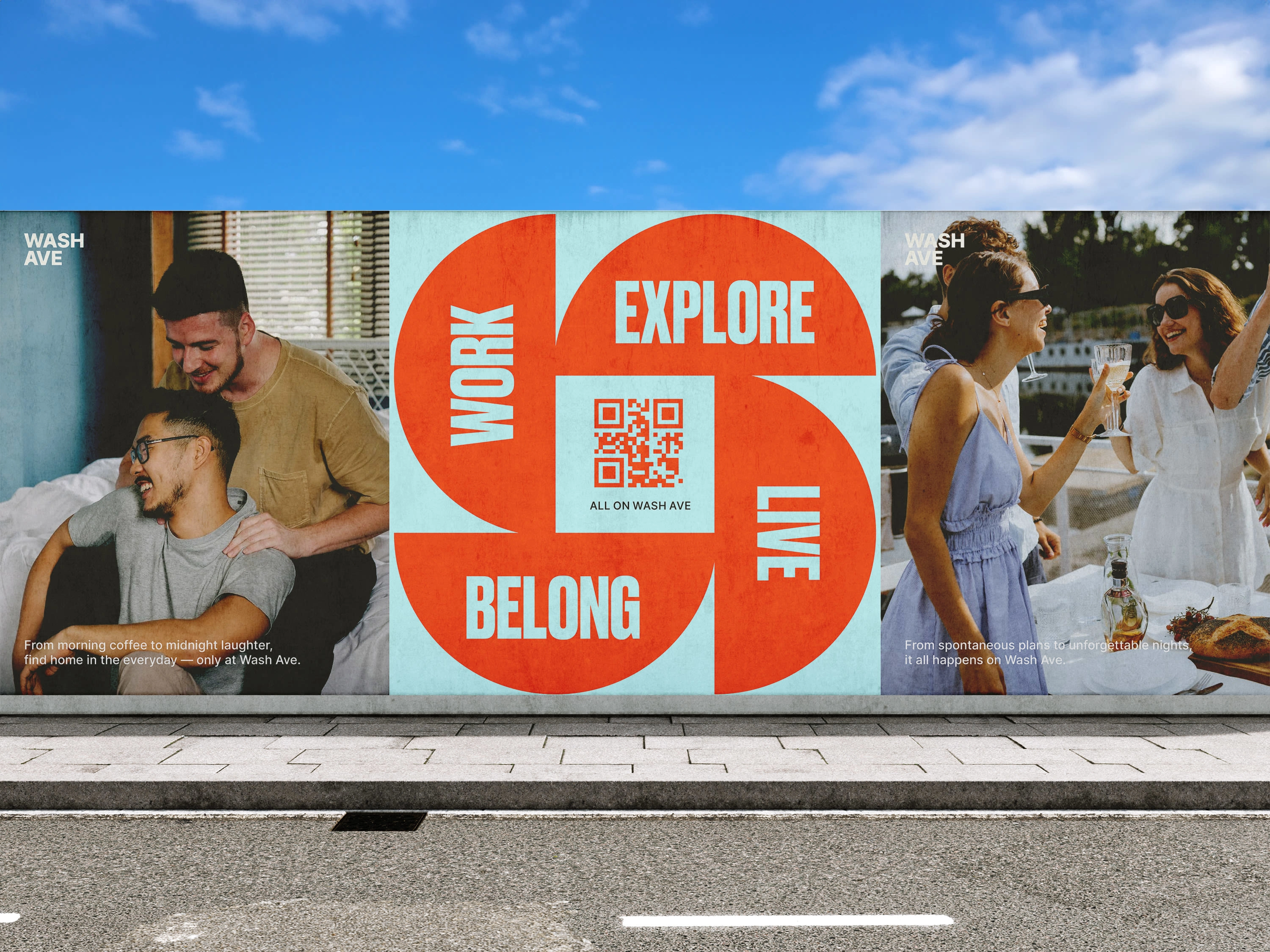
Because of the multifaceted nature and diversity of Wash Ave, the color palette had to carry a lot of weight. It needed to express variety without feeling fragmented. The solution was a strategic system: each color was assigned a clear role, allowing the brand to speak to different audiences and contexts while still holding together as one cohesive, vibrant identity.
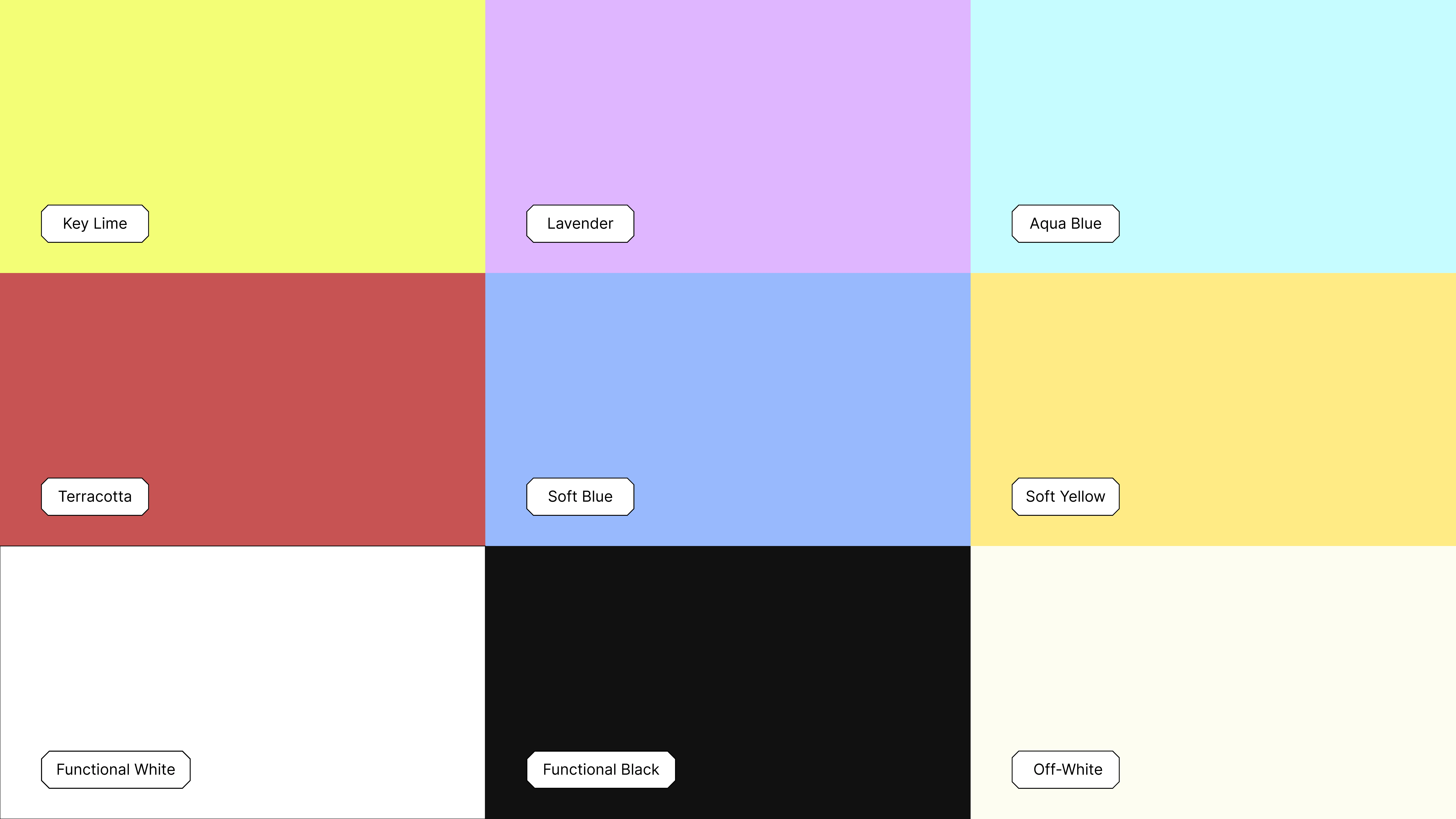
secondary color palette
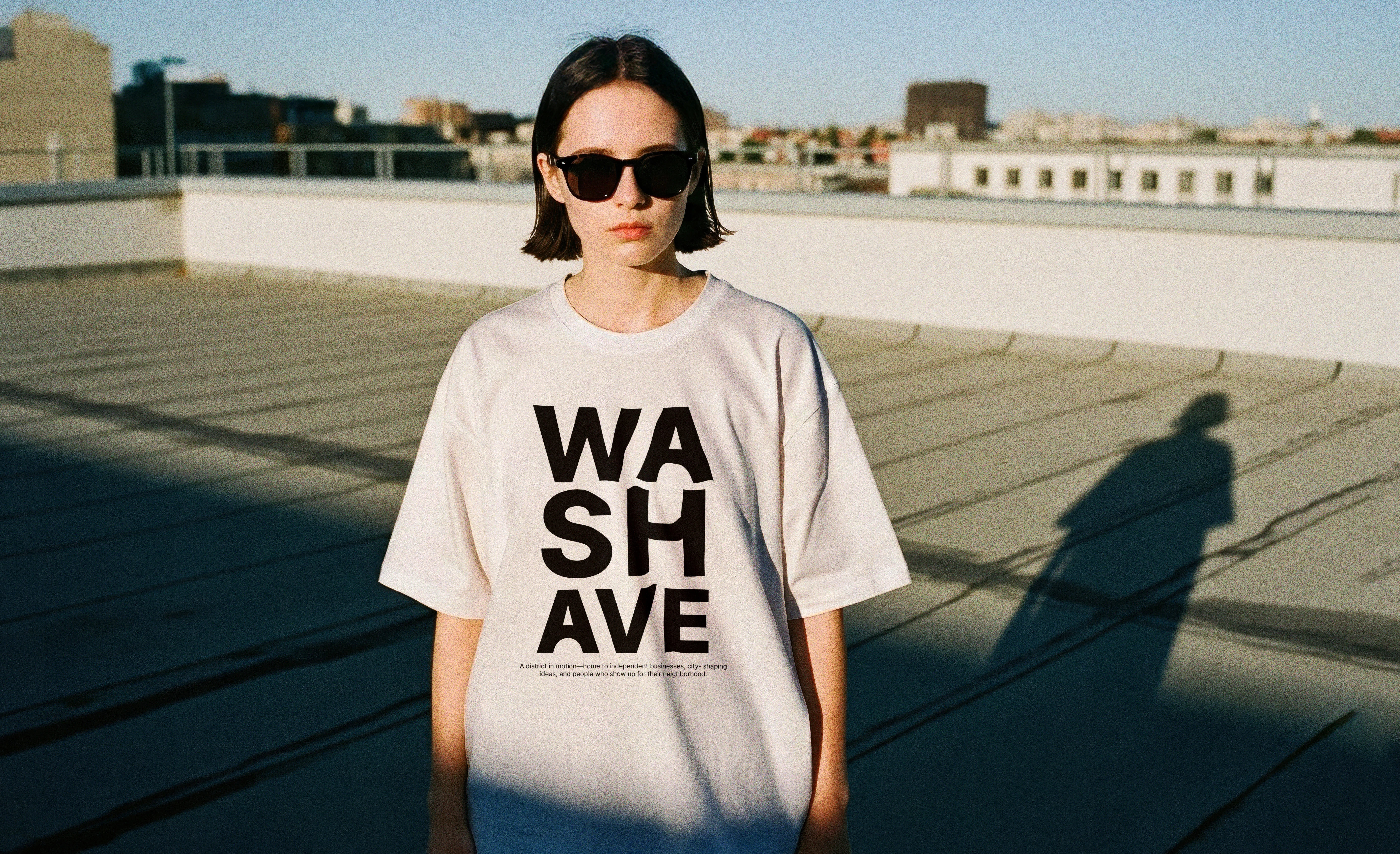
Wash Ave uses Druk for its display type, bold, condensed, and unapologetically proud. It reflects the street’s energy: modern, high-impact, and impossible to ignore. Perfect for grabbing attention in tight urban spaces.
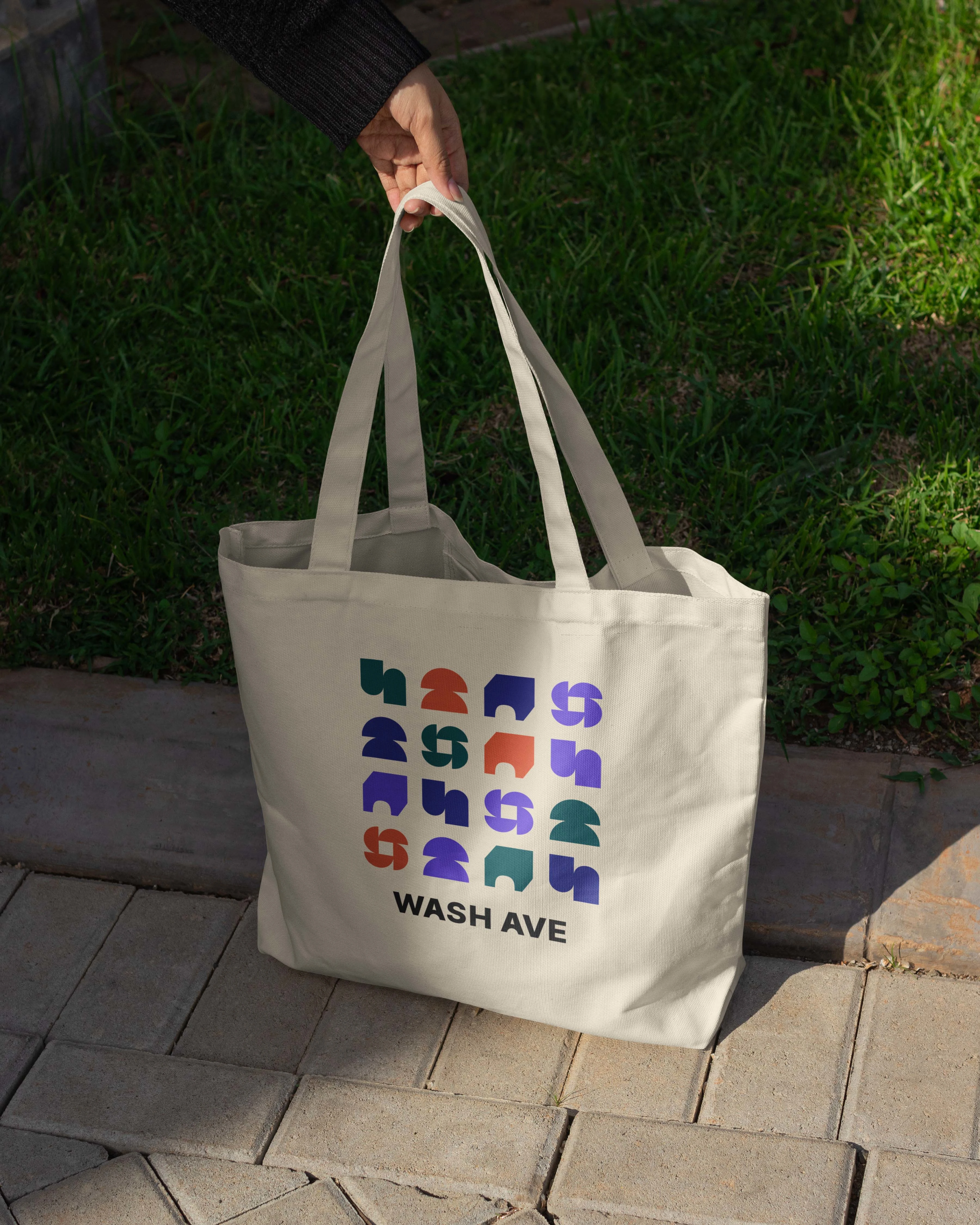
The brand leans on clean geometry to strike a balance between structure and expression.
Its core shapes take loose inspiration from architectural forms like arches, windows, entryways, and intersections, without being too literal.
Together, they form a modular visual language that reflects what Wash Ave is at its core: a collection of spaces that are unique on their own and connected in experience, including homes, storefronts, offices, and venues.
Through a considered approach to typography, color, and form, the brand reflects the energy of its environment while solving key challenges around recognition, engagement, and business attraction. It’s a brand built not just for now, but for the evolving future of the street: a bold, welcoming, and enduring presence in the urban landscape.
Like this project
Posted Jul 23, 2025
A modular brand identity for a historic downtown street in St. Louis, turning it into a bold, curated destination for work, food, and culture.
Likes
103
Views
2.4K
Timeline
Jan 10, 2024 - Mar 12, 2024
Clients
Oliver Properties