Premium Lifestyle Brand | Brand Identity Design
Kajal Baliyan
Make sleeping an art 💭
Truewake is dedicated to curative sleepwear and helping people achieve a deeper, more relaxed, and restorative night's sleep. They are on a mission to help people live healthy lives. Sleeping is a core component of that, which is why they make the best sleepwear on the planet with innovative fabrics and designs.
Service: Brand Essentials Sprint 🔗
Creative Direction & Strategy
My collaboration with Truewake began with an in-depth discovery process to align the brand’s visual identity with its mission. The goal was to craft an aesthetic that immediately evokes a sense of calm and rejuvenation while reinforcing the brand’s premium positioning. Drawing inspiration from research in sleep psychology, TrueWake’s identity was designed to feel soft, inviting, and effortlessly elegant—bridging the gap between science-backed wellness and high-end loungewear. A curated moodboard helped establish this direction, ensuring every visual touchpoint contributes to a seamless and relaxing brand experience.
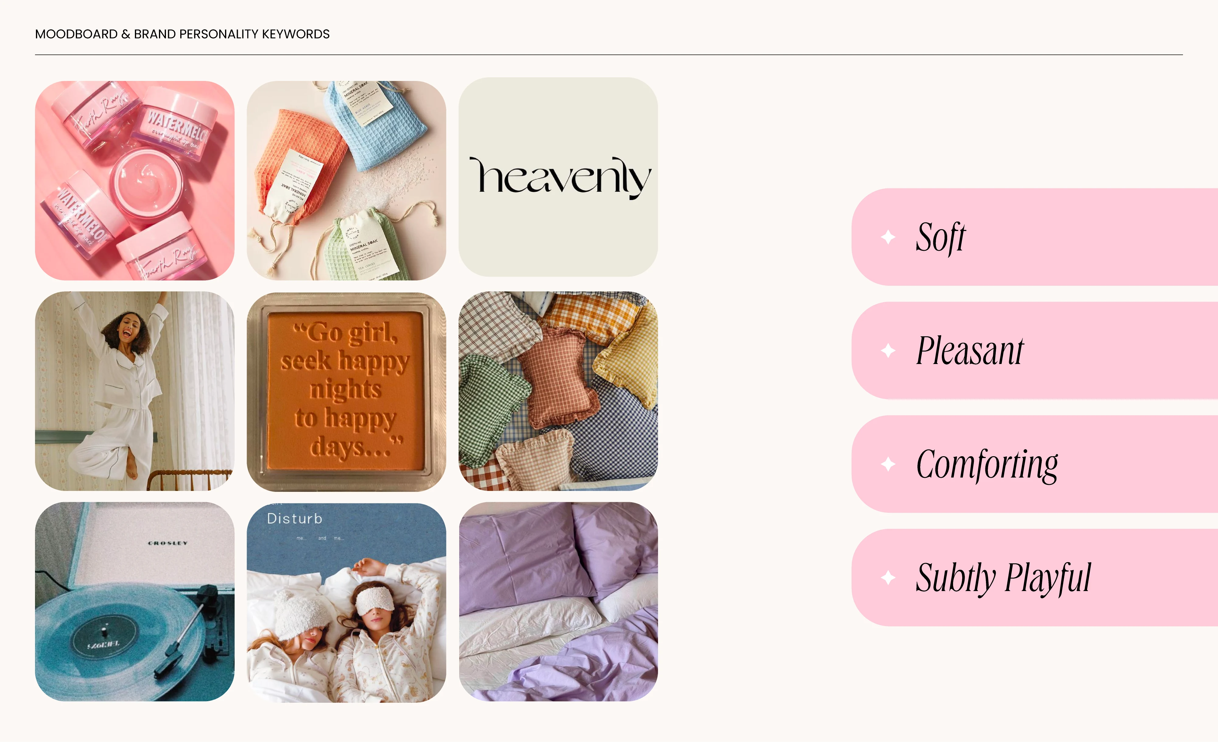
Brand Moodboard
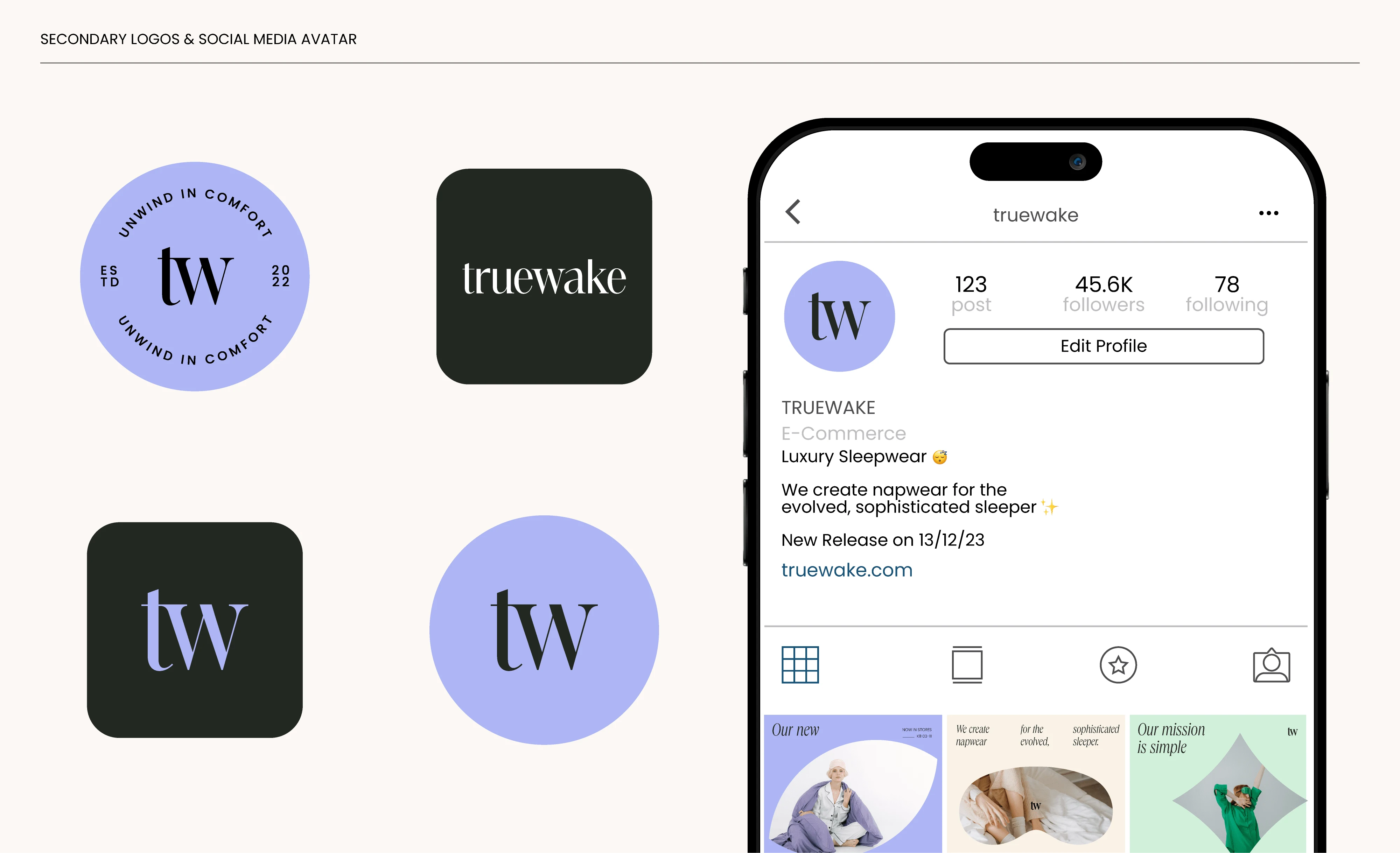
Primary & Secondary Logos
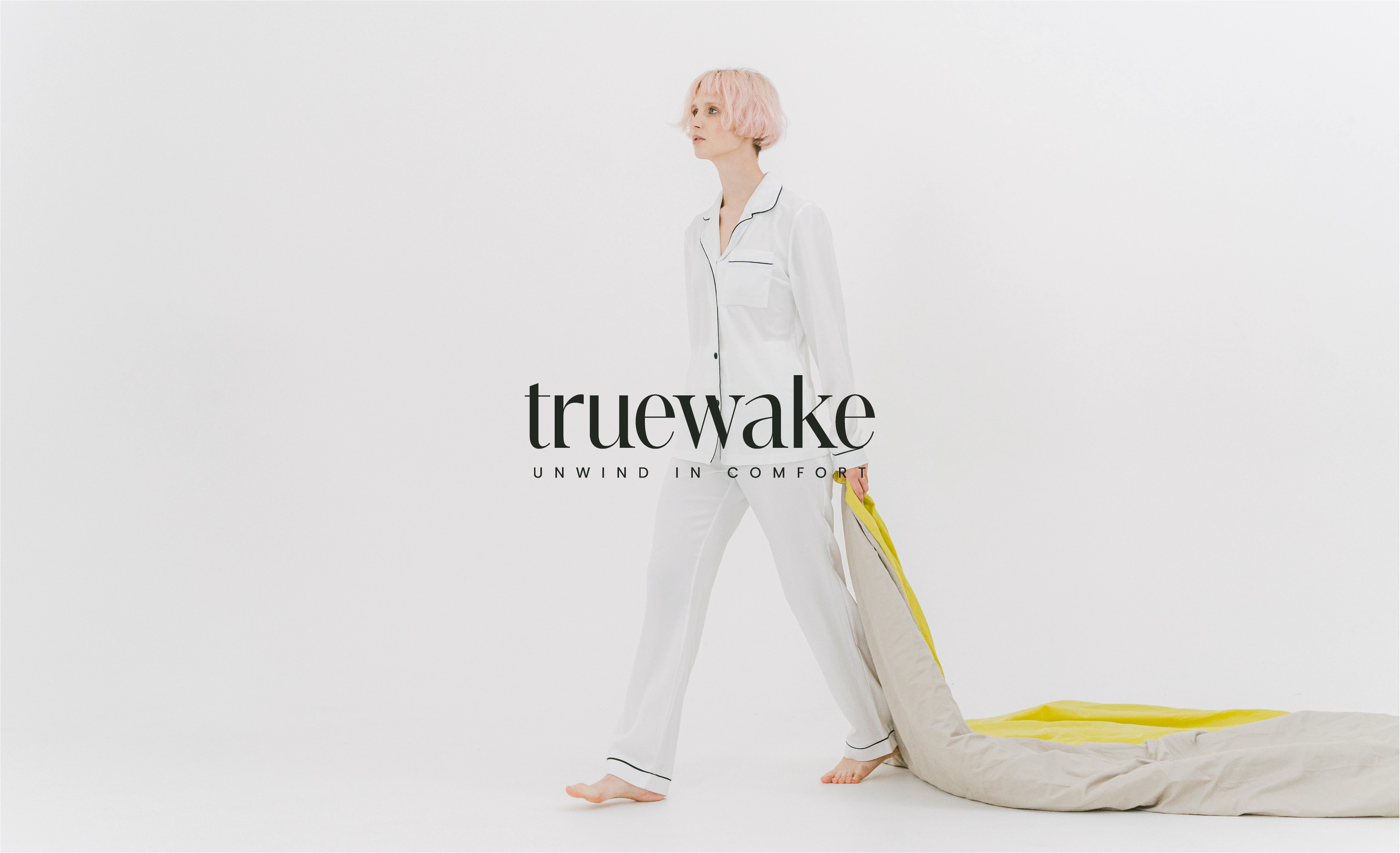
The primary logo for Truewake is a minimal custom wordmark thoughtfully created to evoke a luxurious lifestyle. In tandem, the secondary logo suite was meticulously tailored to elevate diverse brand touchpoints such as packaging, social media, and merchandise. This guarantees a uniform and memorable brand representation across all channels, fostering a harmonized and cohesive visual identity.
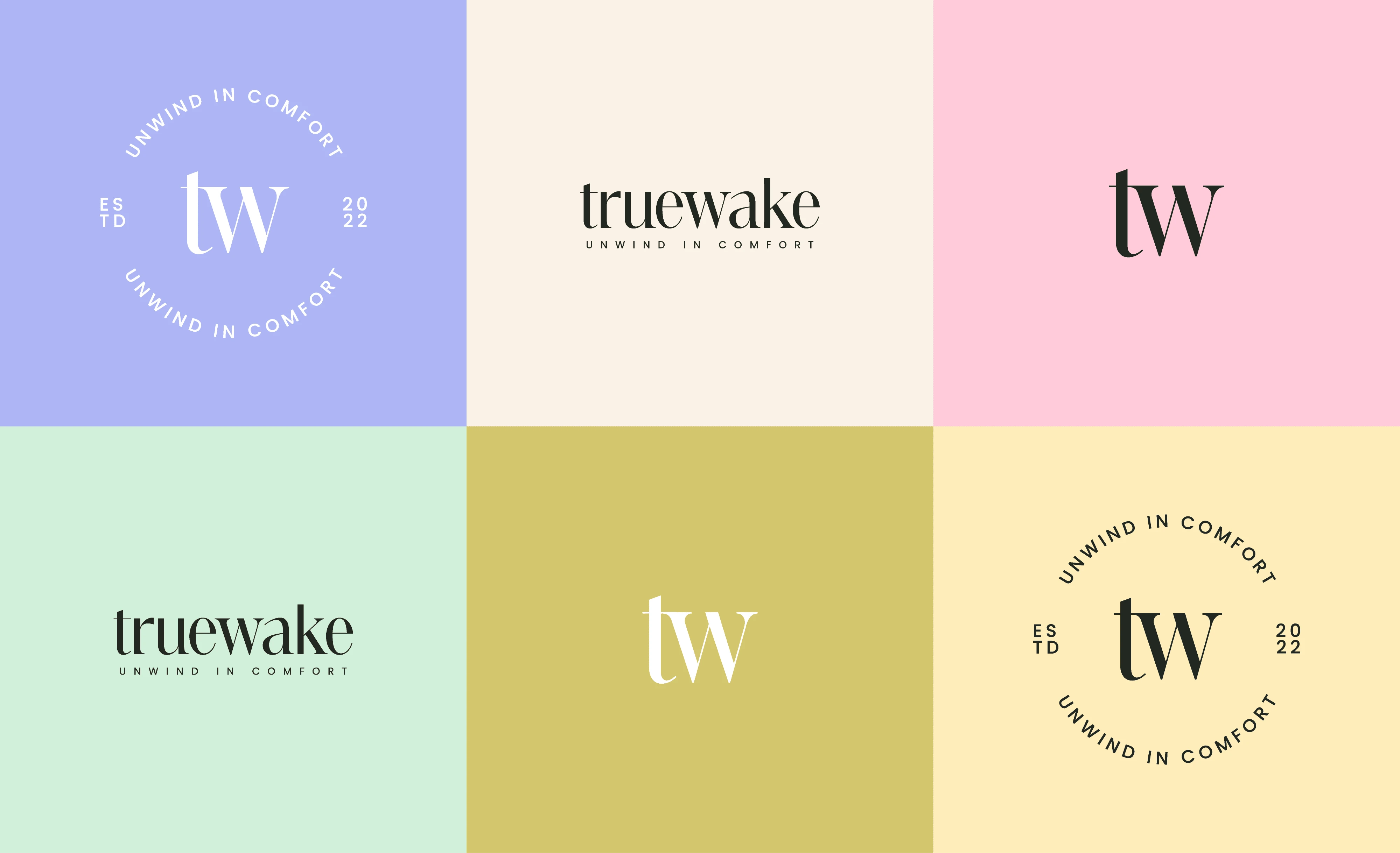
Brand Logos & Color Interaction
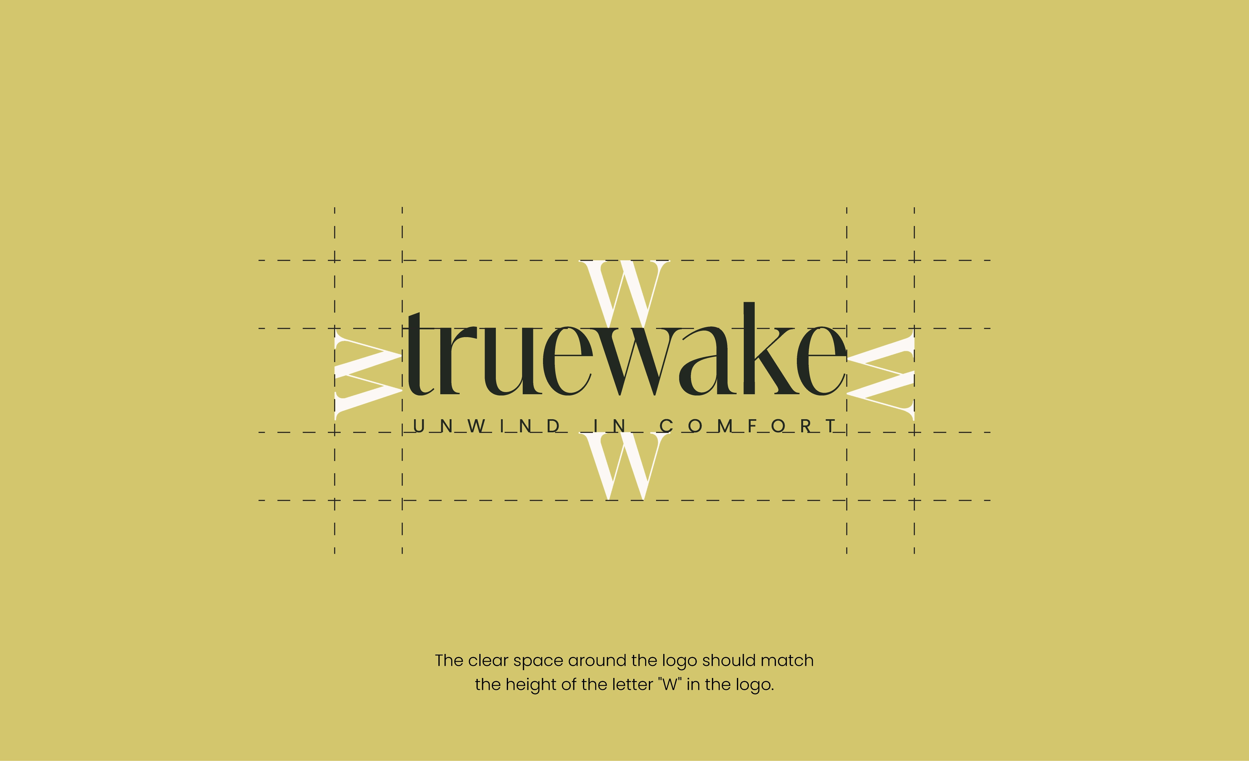
Clear Space Around The Logo
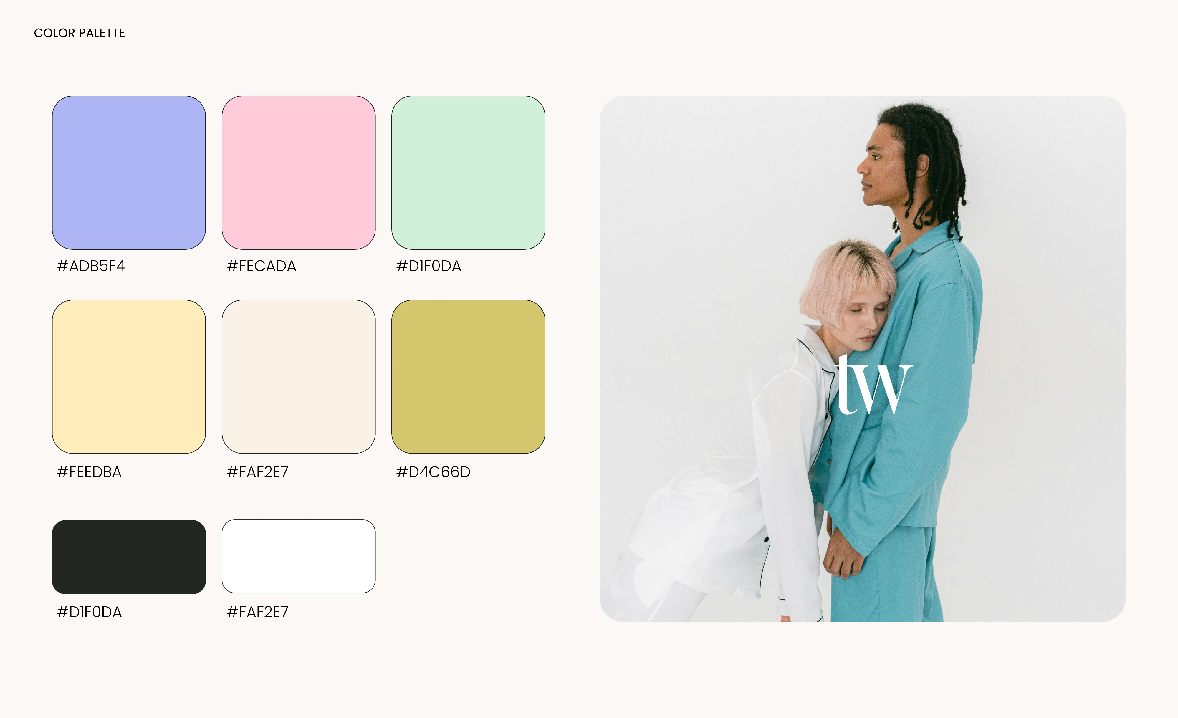
Brand Colors
The color palette was carefully selected based on the psychology of sleep and relaxation. Soft pastels and muted tones were chosen for their ability to calm the nervous system and promote a sense of tranquility. These hues are scientifically associated with reducing stress and enhancing sleep quality, reinforcing TrueWake’s commitment to curative rest.
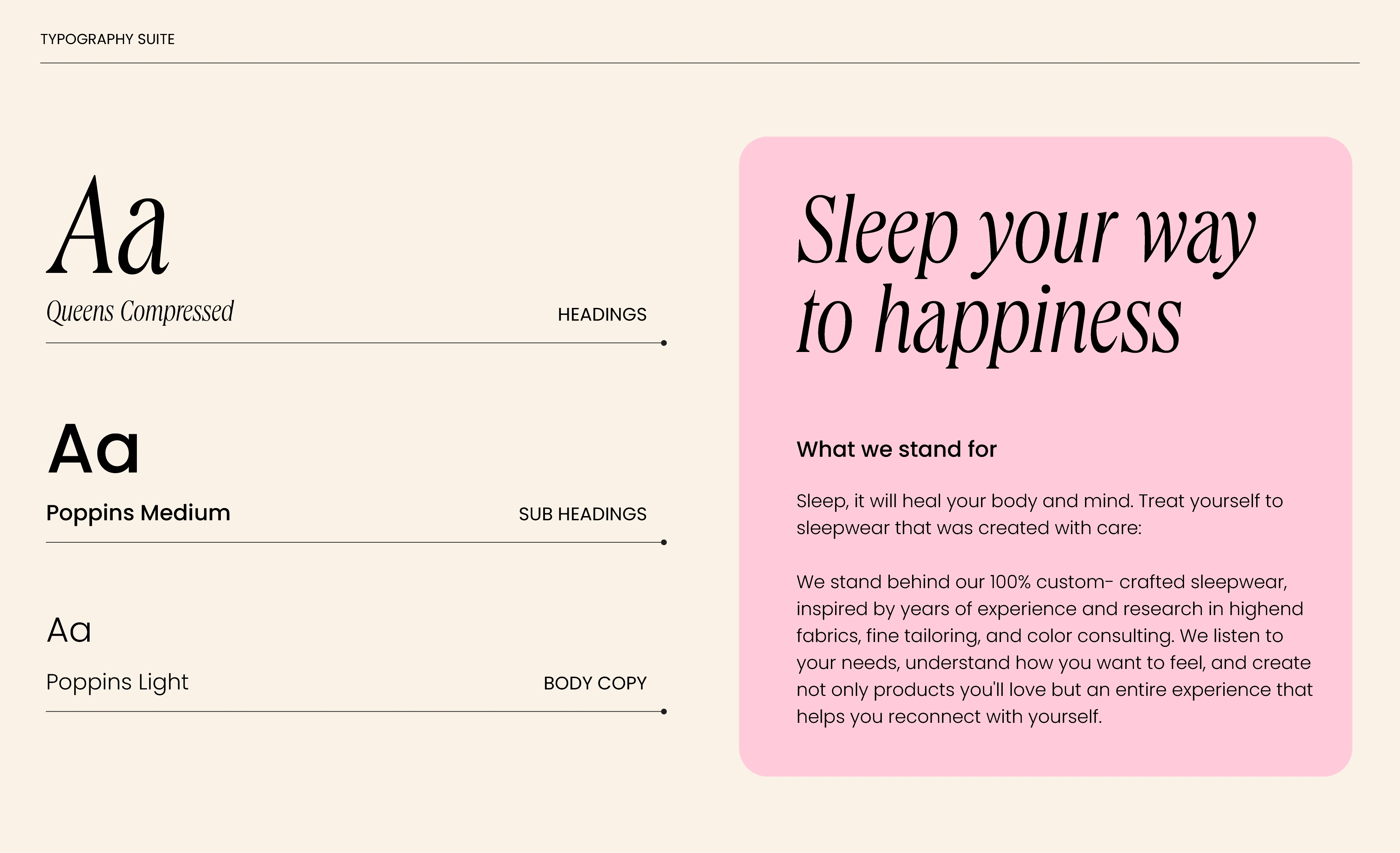
Typography Suite
For Truewake's typography suite, we selected a blend of Queen-compressed for headings and Poppins for body copy. The Queen-compressed font exudes sophistication, perfectly matching the brand's premium lifestyle vibe. It brings an elegant touch, and its subtly playful nature keeps the brand approachable and relatable. Poppins, on the other hand, adds a layer of cleanliness, contributing to a well-balanced and cohesive visual aesthetic.
Fonts In Use
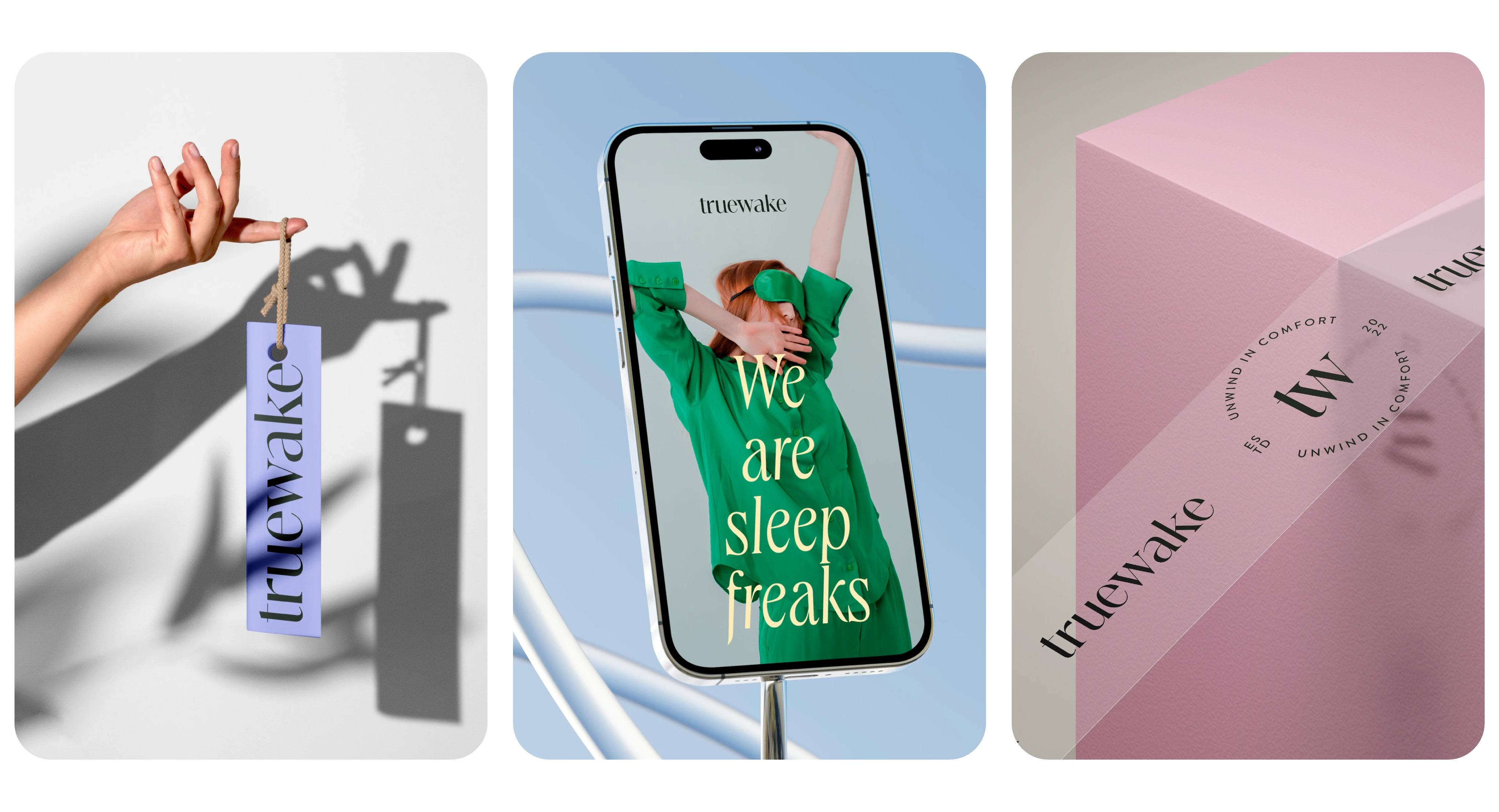
Brand In Action ✨
Like this project
Posted Dec 27, 2023
Truewake is a curative sleepwear brand. We crafted a cohesive design system that reflects their vision & creates a seamless brand experience for their audience.