YohoStay (Real Estate)| Brand Identity Design

Kajal Baliyan


👉 About the Brand
YohoStay is an all-inclusive co-living platform providing fully furnished shared or private apartments. Team YohoStay partnered with me to create a branding system that speaks to their key demographics
👉 The Brief
To launch their new brand, YohoStay needed a branding system that spoke to their key demographics: young professionals, and nomads, while also feeling authentic to their brand values.
👉 The Solution
After extensive research on the target audience of the brand, I designed a brand identity that is in line with their brand values. The brand identity feels more authentic to their customer base and feels sustainable, and comfortable. I created a simple icon that represents their values as well as a color palette that reflects the calmness of being at home. The result was a simple but effective visual language that communicated who they are and what they stand for in just one look.
The brand identity has been well received by their customer base and has helped increase bookings.
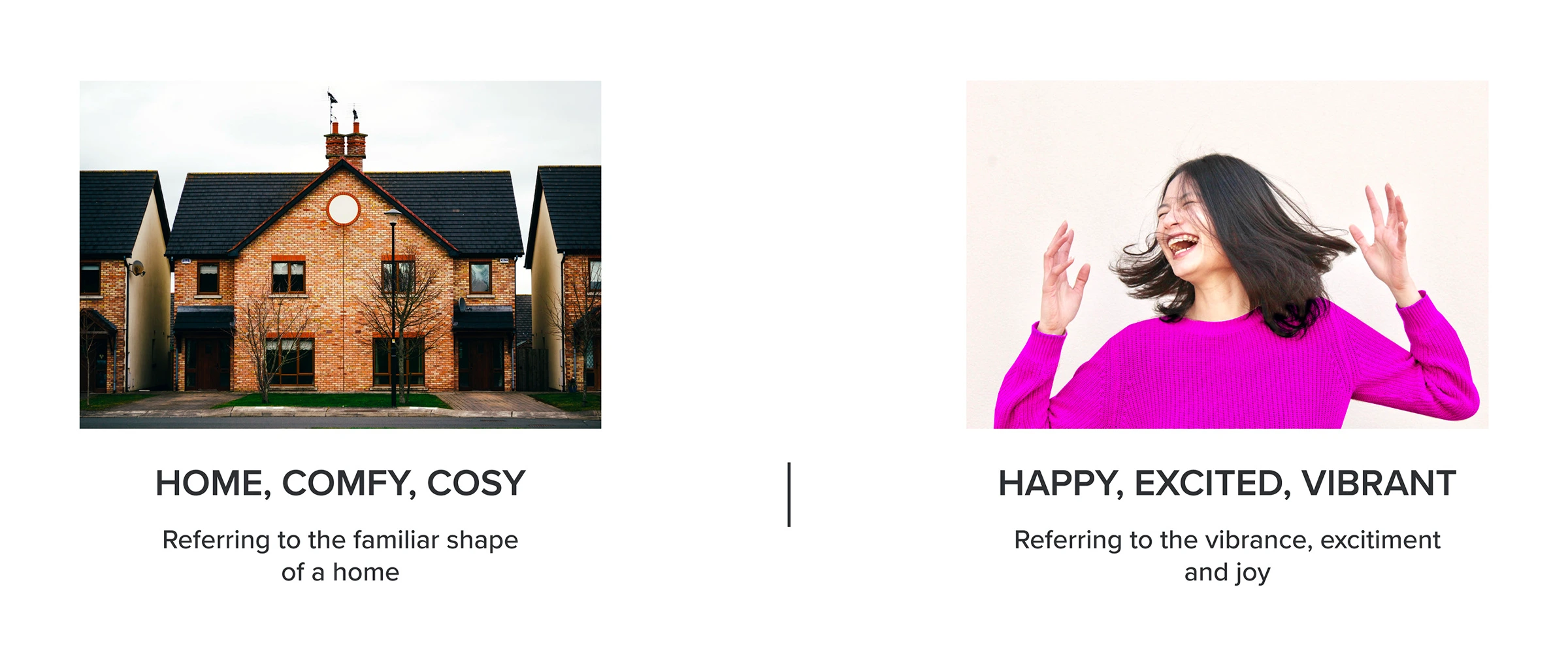
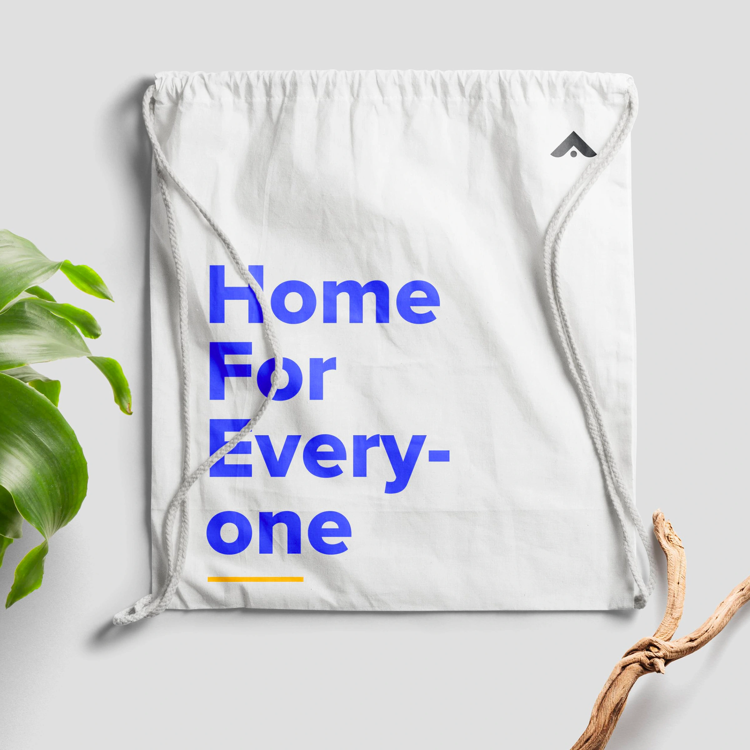
👉 Brand Keywords - Vibrant, Affordable, Cozy, Sustainable
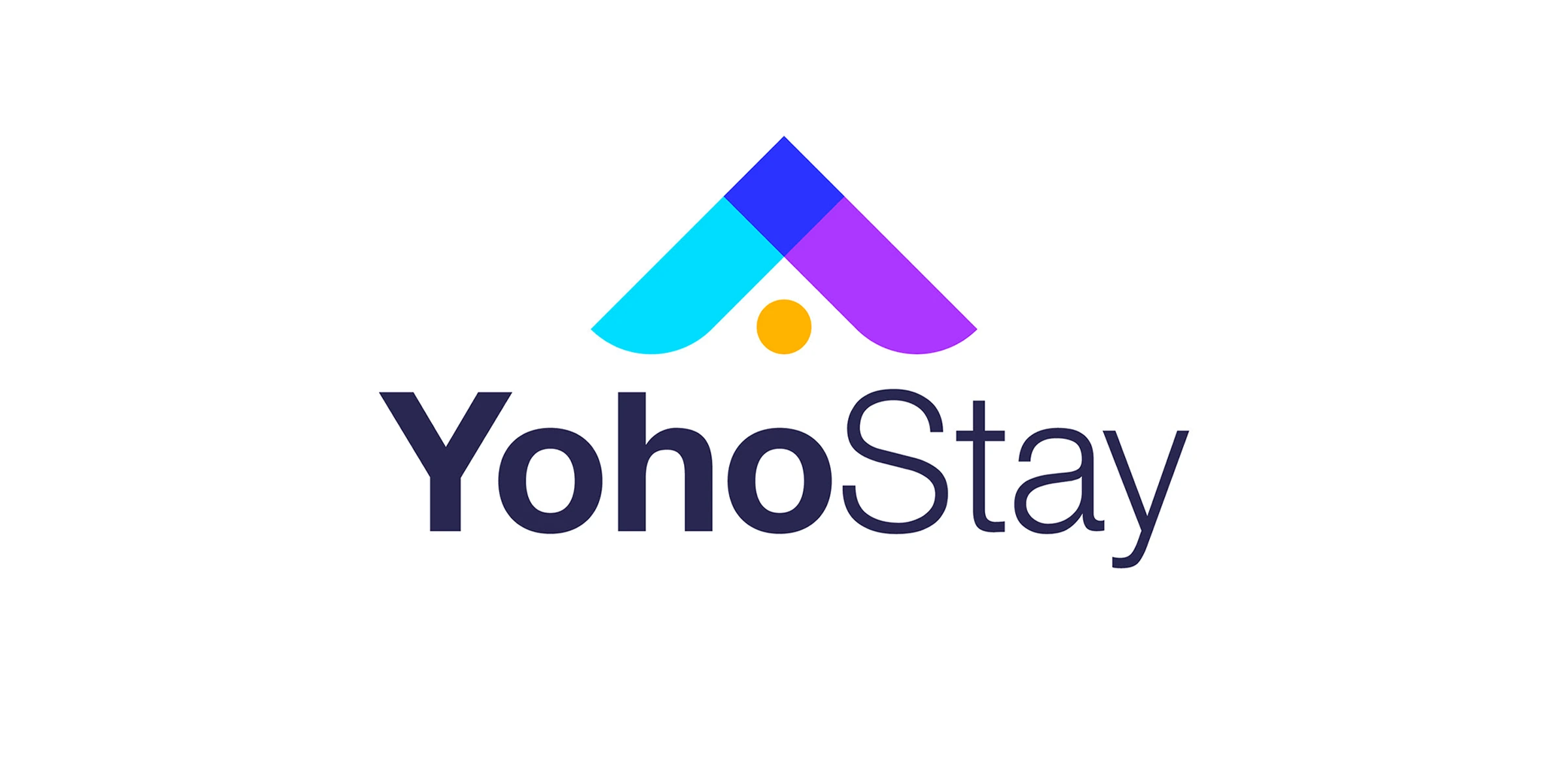
PRIMARY LOGO
When I was designing the logo, I wanted to make sure that it served as a reminder of what YohoStay was all about: finding a home. This is why the logo is designed in the familiar shape of a home, which when seen inverted also represents an abstract form of a human, who is excited and joyous at the prospect of their new home. This mark serves to remind users that when you search with YohoStay, you aren’t looking for a house – you’re finding a home 🏠
👉 Brand Identity Touch Points
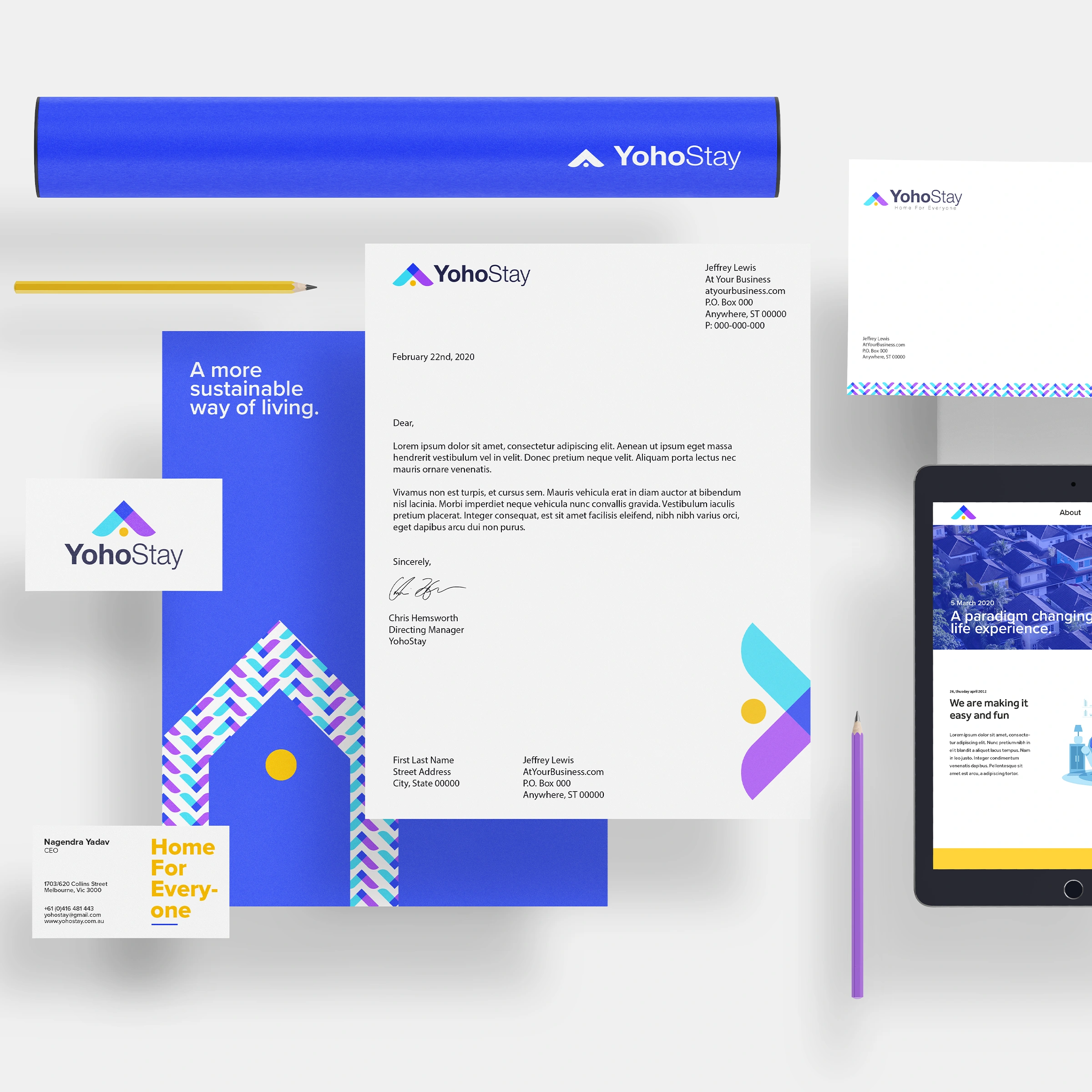
BRANDED STATIONERY (LETTERHEAD, BUSINESS CARDS, ENVELOPS, ETC)
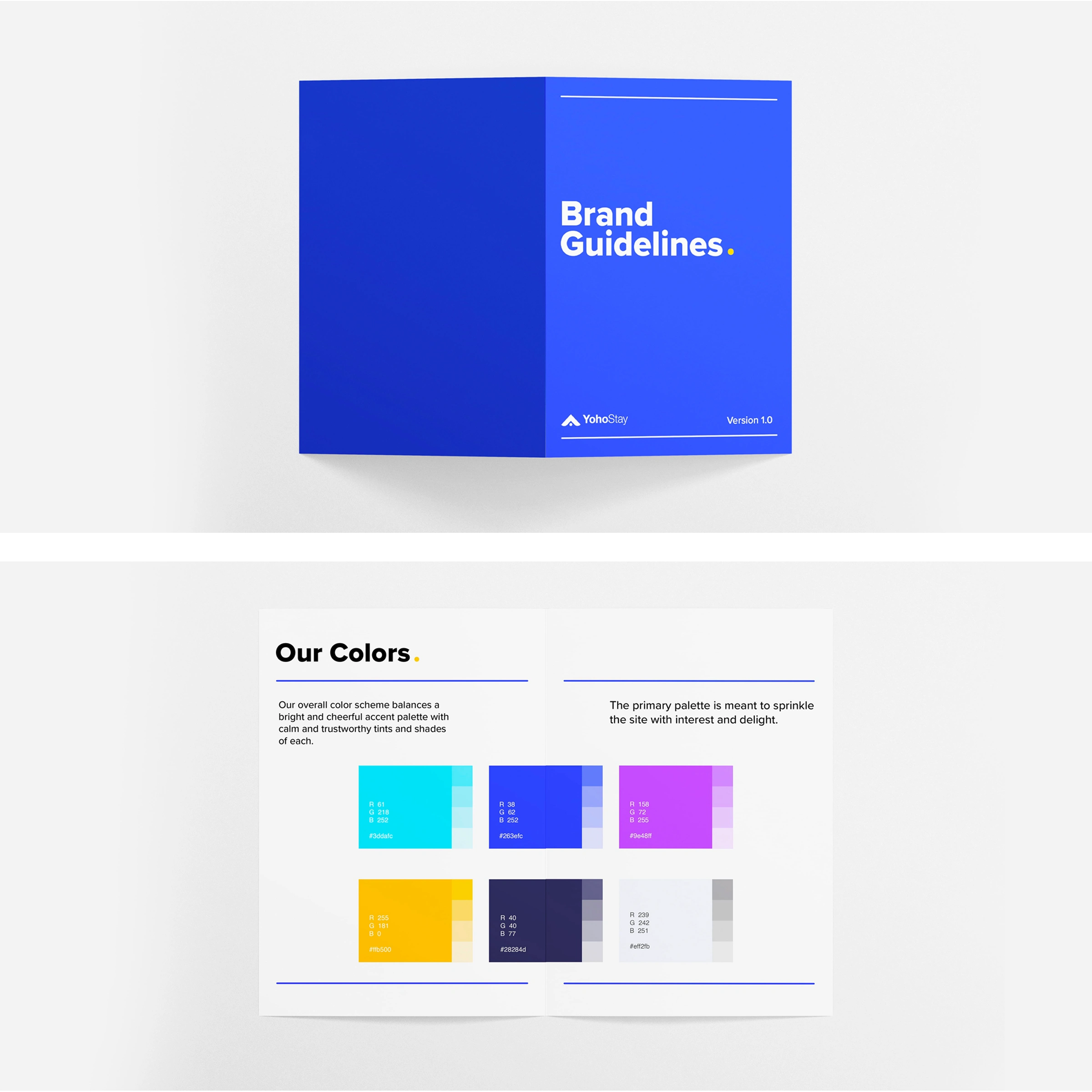
BRAND GUIDELINES
BRAND APPLICATION
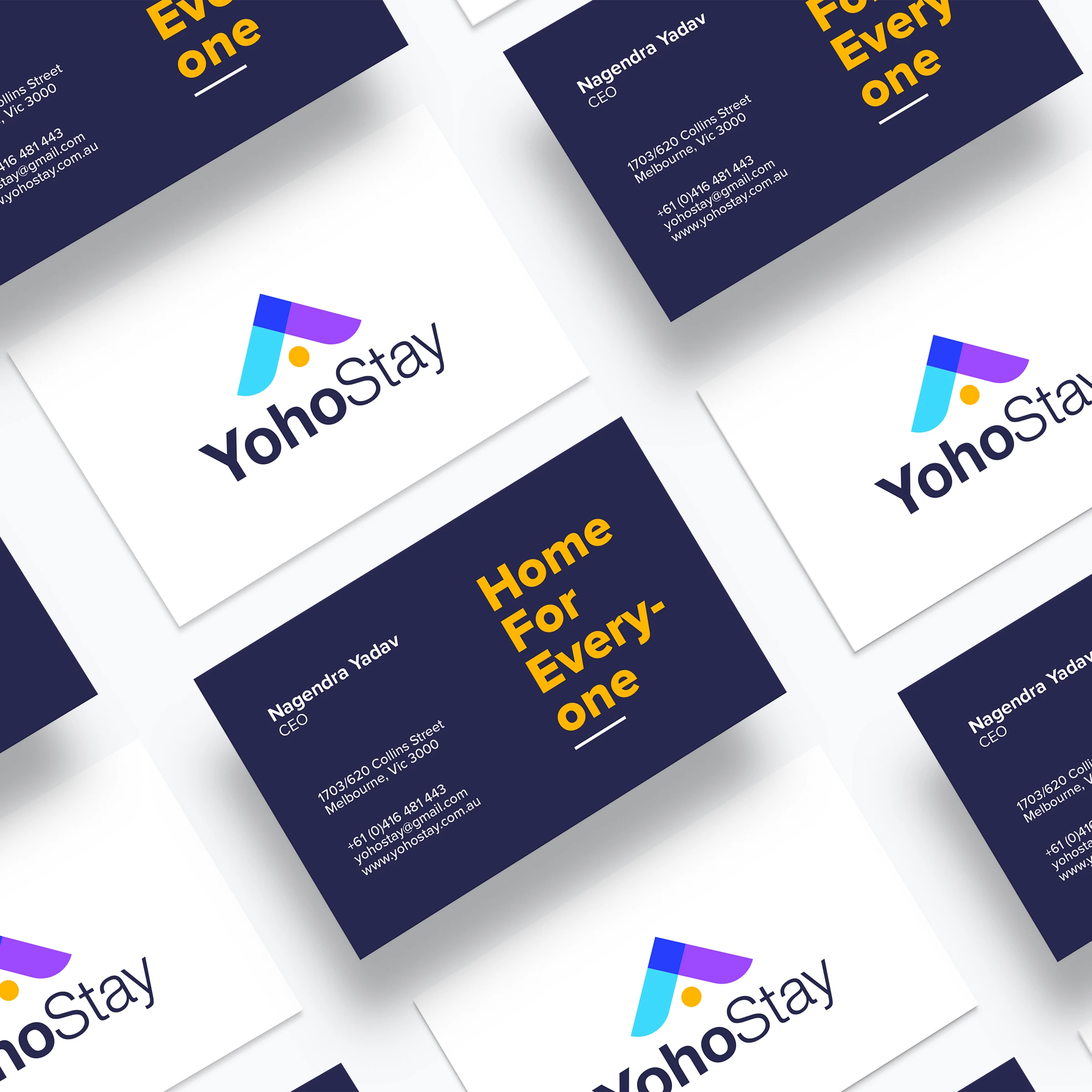
BRANDED VISITING CARDS
Like this project
Posted Mar 5, 2021
Branding for an all-inclusive, co-living platform that helps you find homes and apartments best suited to your nomad lifestyle.
Likes
0
Views
347
Clients
Pilih hotel murah apps


Wash Ave | Historic Street Brand Identity
Swirl | Pop-UP Event | Brand Identity
Sustainable Fashion | Brand Identity & Strategy
CRO Agency | Brand Identity