Ayurvedagram Bali • Rebranding

Sidharth Singh


Ayurvedagram carries over 75 years of Ayurvedic heritage through its parent brand, Kerala Ayurveda. The brief was to make sure the design finally matched that depth.
Wellness is one of the most overcrowded visual categories in the world right now. Every retreat has a lotus, a muted palette, and a sans-serif that whispers calm at you. Most of them look interchangeable. Ayurvedagram had something most of them do not: genuine lineage, real clinical tradition, and two distinct locations, one rooted in Bengaluru and one opening fresh in Ubud, Bali.
The old identity was not keeping up. Dated typography, overly intricate elements, and a visual register that had fallen behind both the brand's ambition and its audience's expectations. The rebranding needed to do two things at once: honour what the brand actually is, and build a system modern enough to carry it forward.
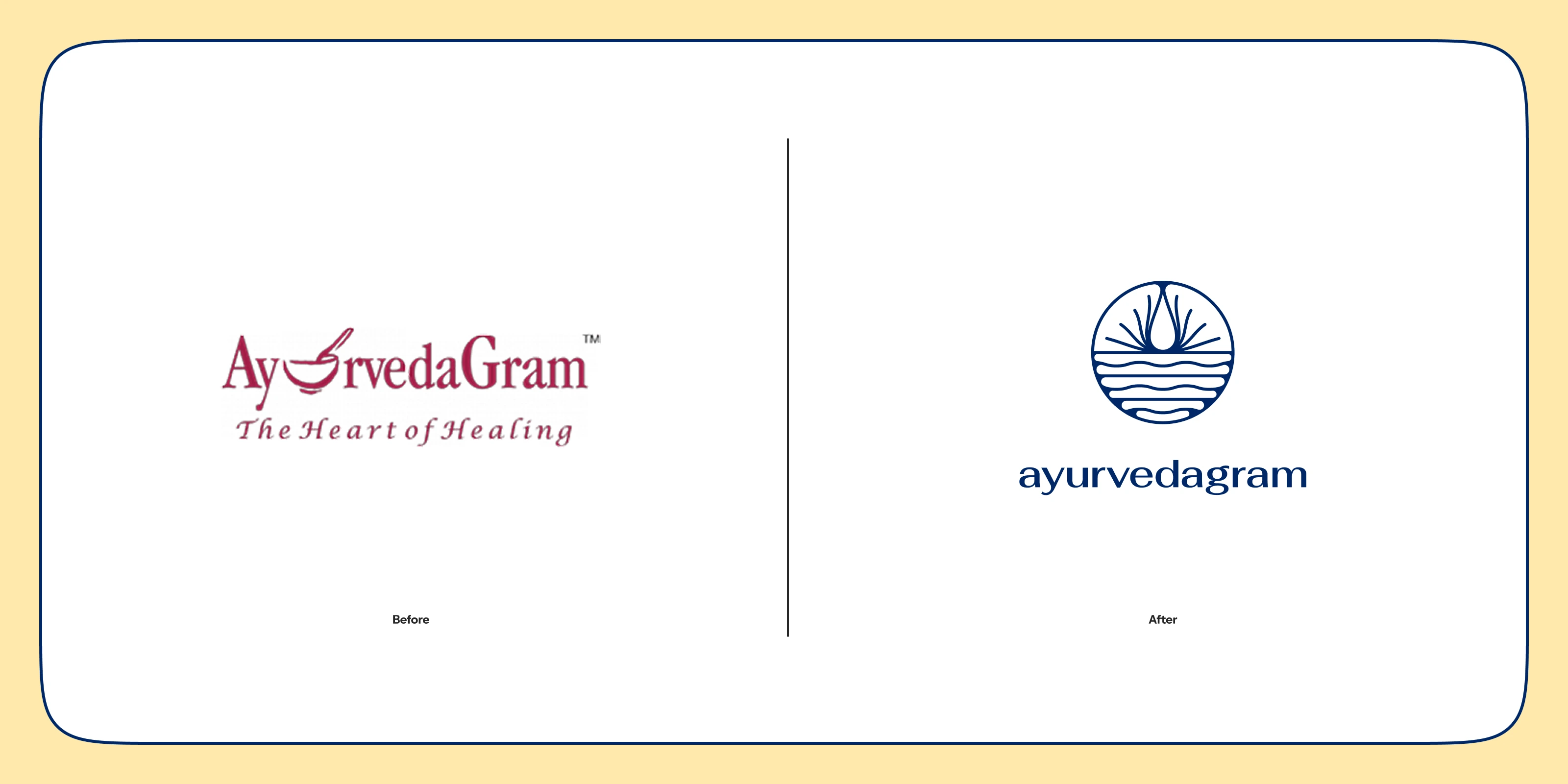
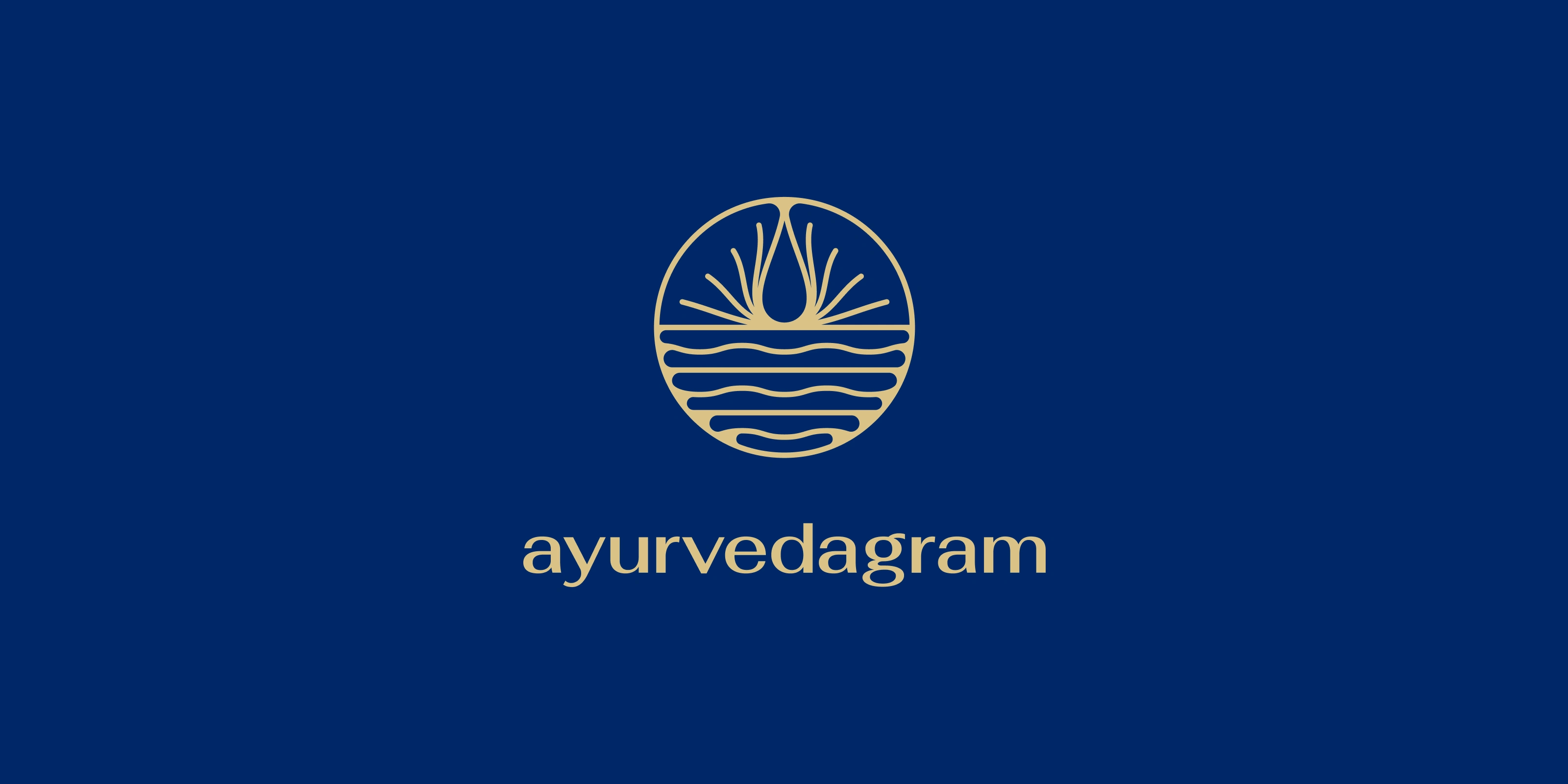
New Logo for Ayurvedagram
The hardest thing about designing for a wellness brand is resisting the obvious. The category has a visual language so well-worn that it has become a cliche: soft greens, serif type, a leaf or a drop of water, and an aspirational lifestyle photograph. It signals wellness without communicating anything specific about the brand behind it.
Ayurvedagram is not a generic wellness retreat. It is a clinical Ayurvedic practice with a 75-year lineage behind it, offering Panchakarma, yoga, and personalised therapeutic programmes. It had earned something most wellness brands are still performing. The design needed to reflect that distinction without losing accessibility for a global audience encountering Ayurveda for the first time.
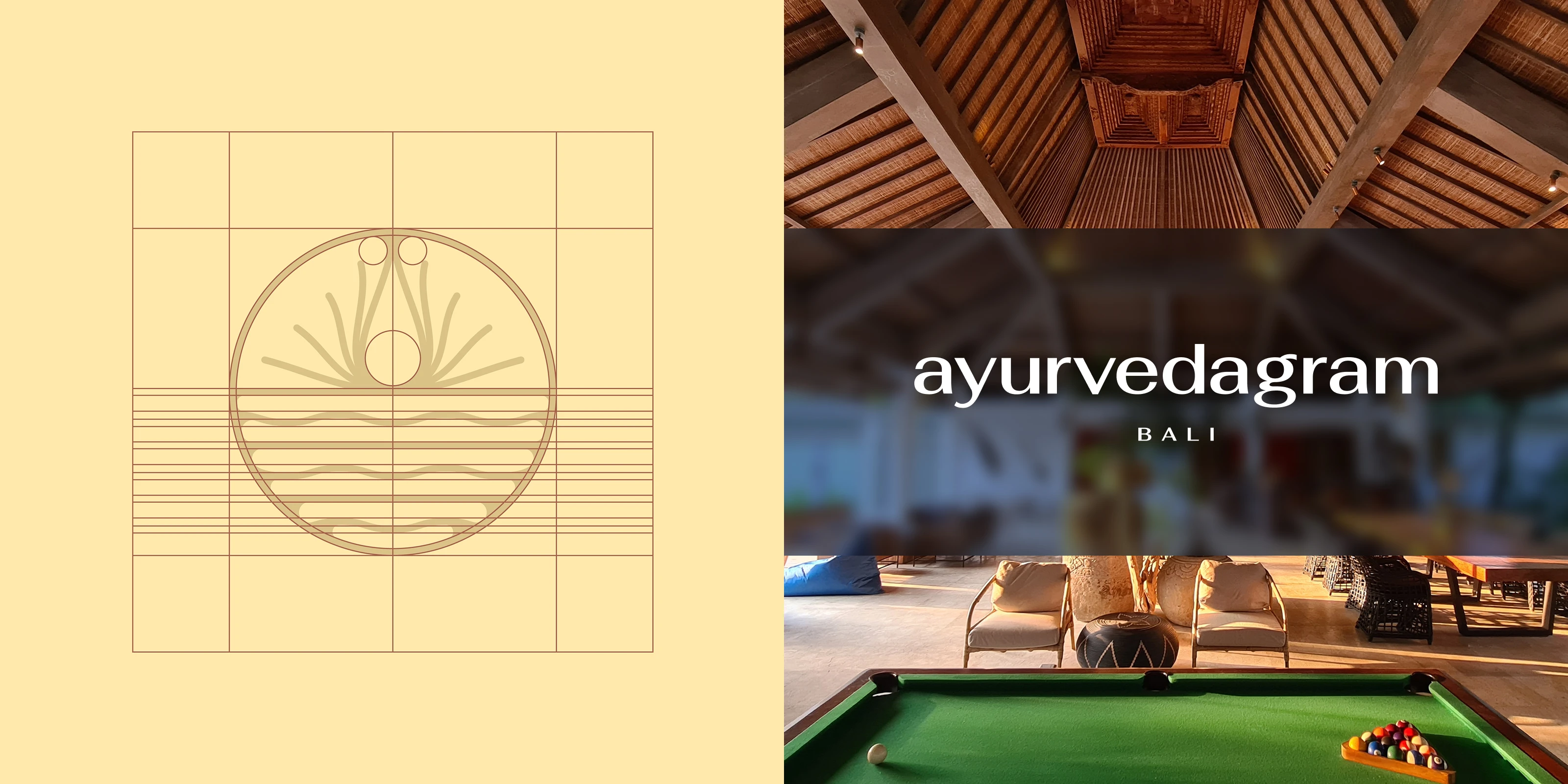
The new logo draws its primary reference from the lotus, reinterpreted through a modern, refined lens. The lotus in Ayurvedic tradition is not merely decorative. It carries meaning around purity, renewal, and the idea of something beautiful that grows from the most grounded of conditions.
The flowing curved lines within the mark reference water and coastal origins, connecting the brand to Kerala's geography and the rhythms of healing that come from that landscape. The typography shifted to lowercase, a deliberate choice that softened the brand's register without undercutting its authority. Warm, approachable, and grounded.
The visual language takes its cues from Kerala Ayurveda, the parent brand, maintaining a family relationship while giving Ayurvedagram its own distinct identity. For a brand expanding into a new cultural geography in Bali, that balance of heritage and independence was not optional. It was the whole brief.
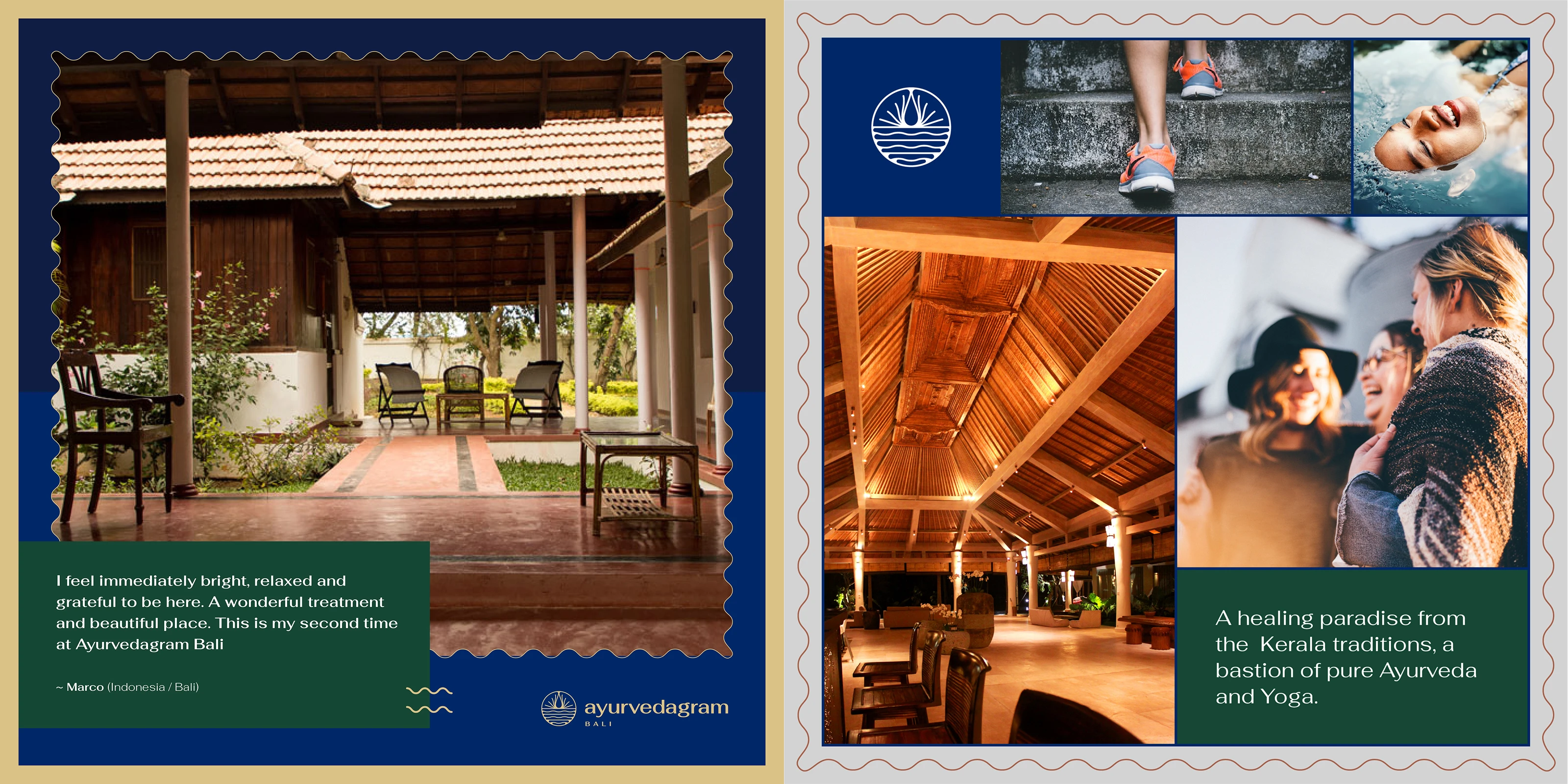
Social Media Post Template
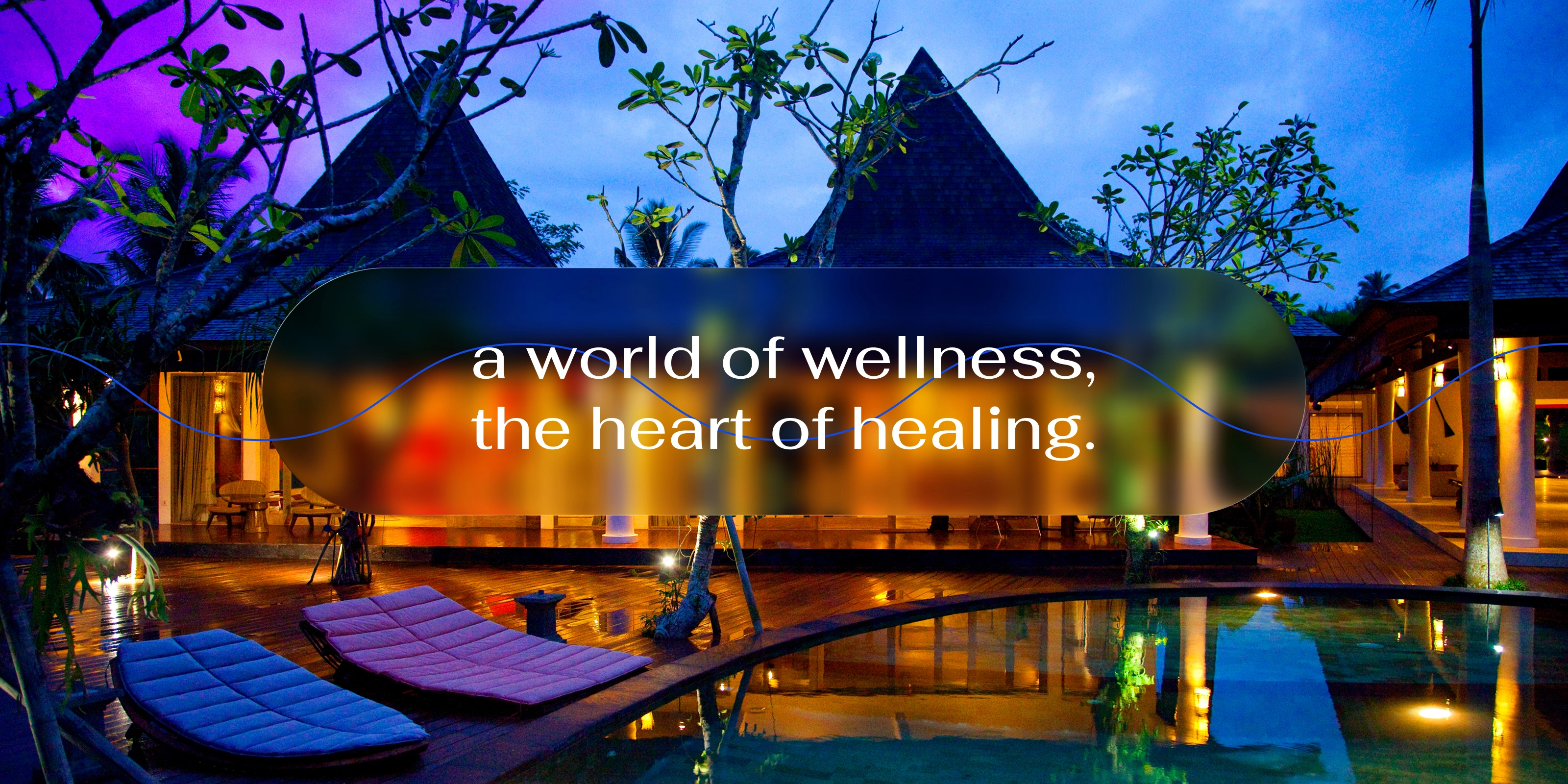
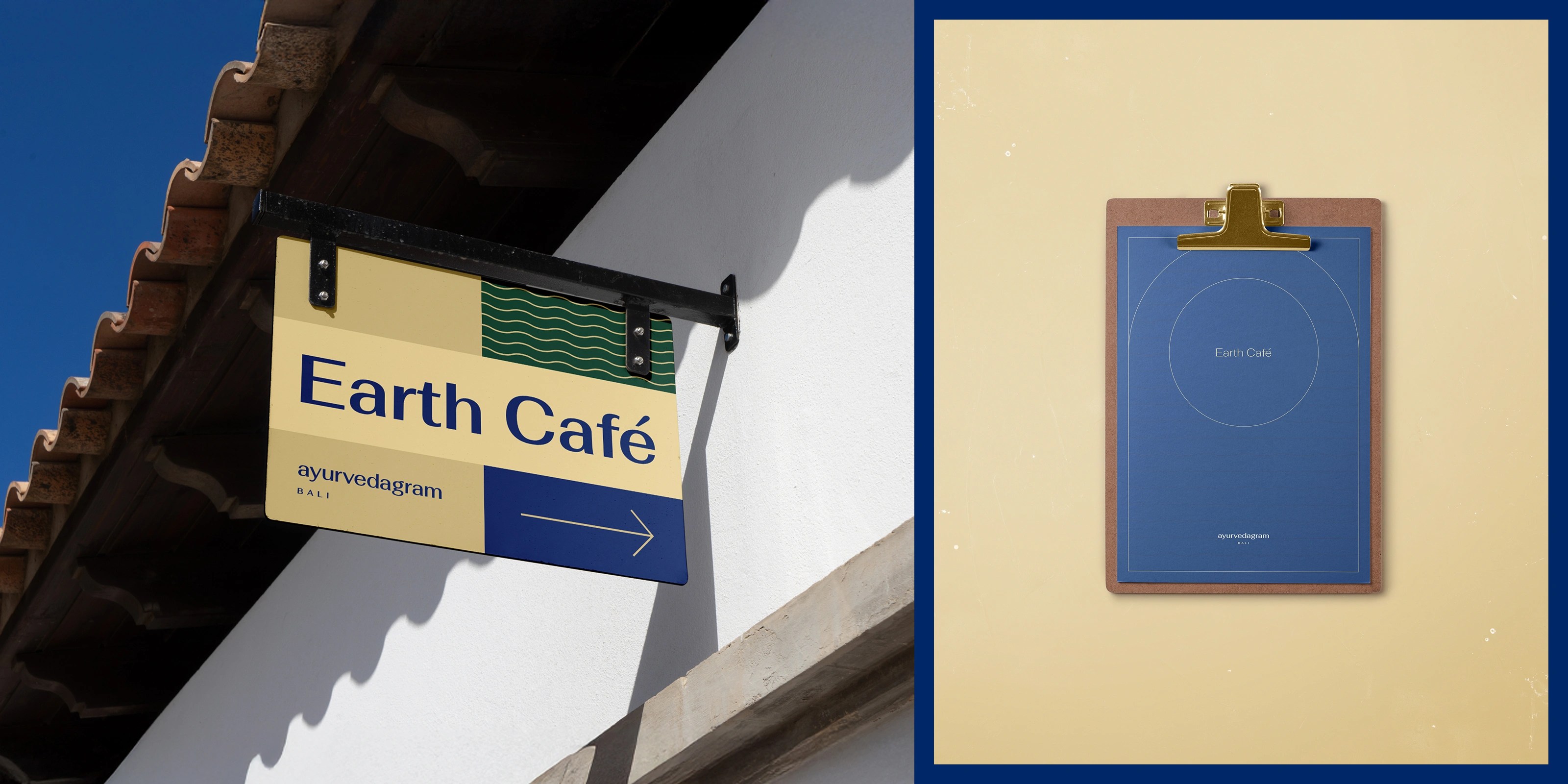
Earth Cafe at Ayurvedagram Bali
A single logo for a brand operating across two very different cultural contexts is almost always the wrong answer. Ayurvedagram needed a versatile logo system that could represent the Bengaluru centre and the Bali centre without contradiction, and could scale to accommodate future locations as the brand grew.
The system was built with that adaptability from the start. Each application of the mark follows the same visual logic, the same spatial relationships, the same typographic rules, while the framework allows for contextual flexibility. A guest at the Bali retreat and a guest at the Bengaluru centre should feel they are in the same brand world, even if the landscape outside looks completely different.
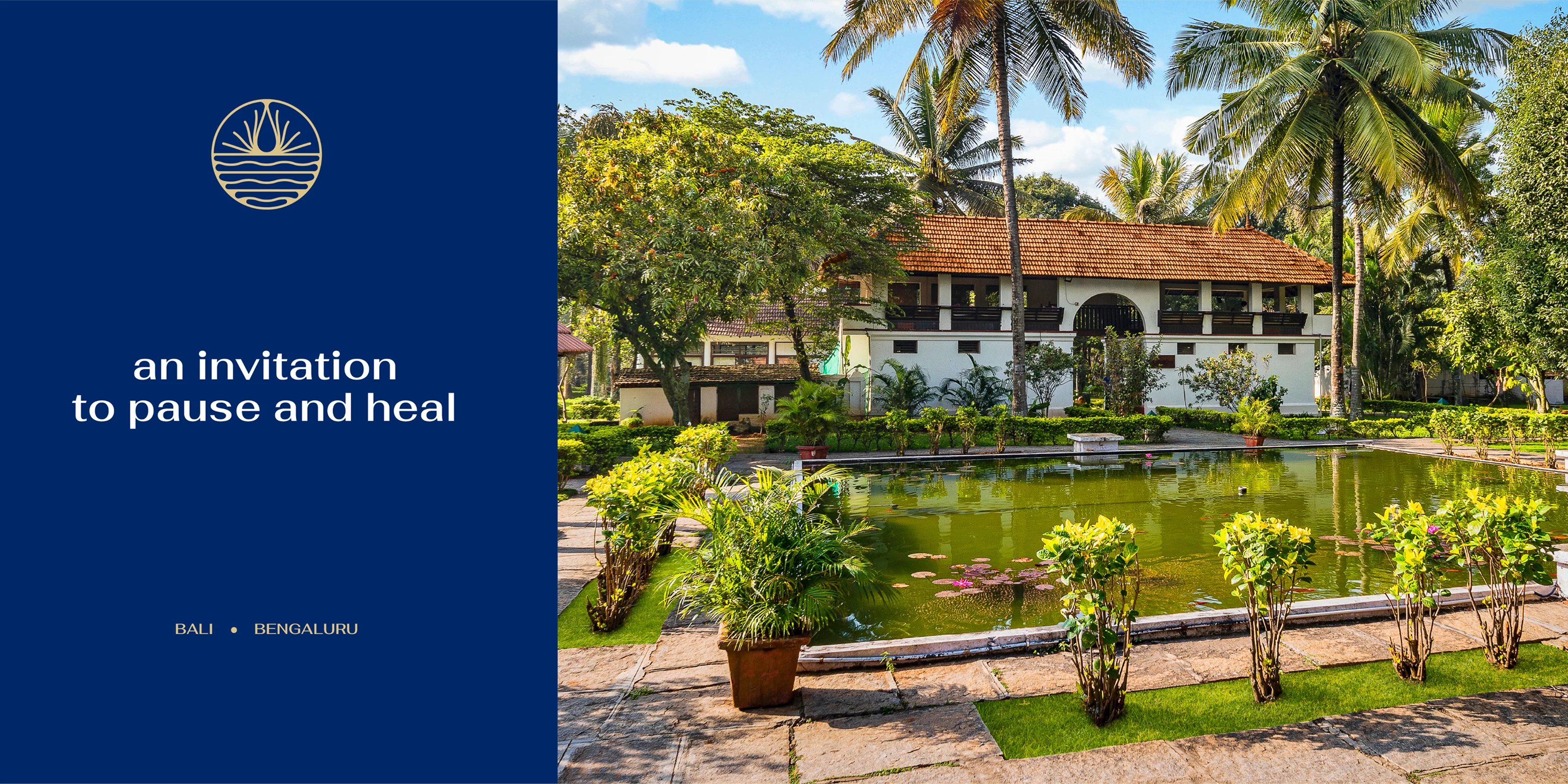

The colour palette was drawn directly from Kerala's natural environment. The greens, the earthy ochres, the warmth of light through plantation foliage. These are not colours chosen because they look calm on a mood board. They are colours that belong to the geography the brand comes from.
This grounding gave the palette authenticity that a more generic wellness palette would not have had. It also gave the system range, allowing different brand applications to breathe differently depending on context while remaining unmistakably Ayurvedagram.
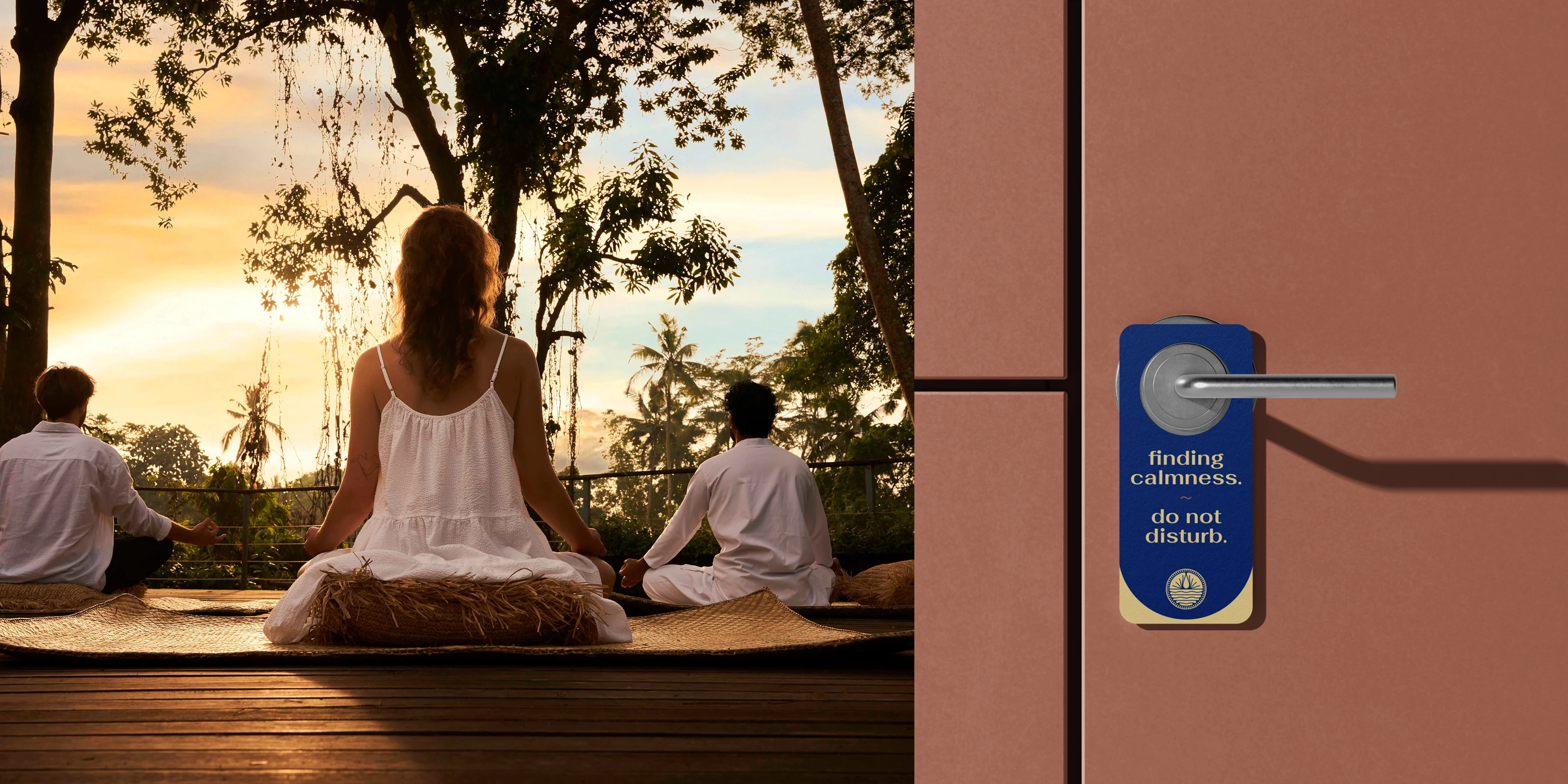
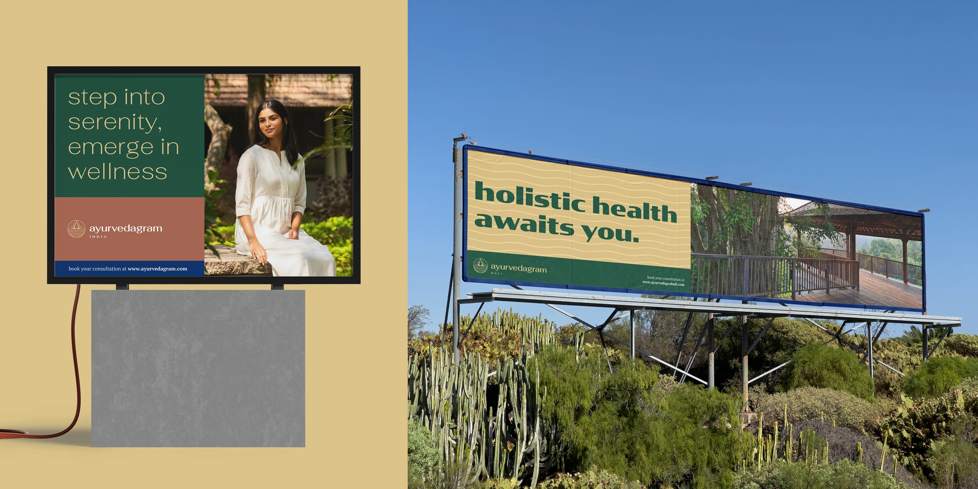
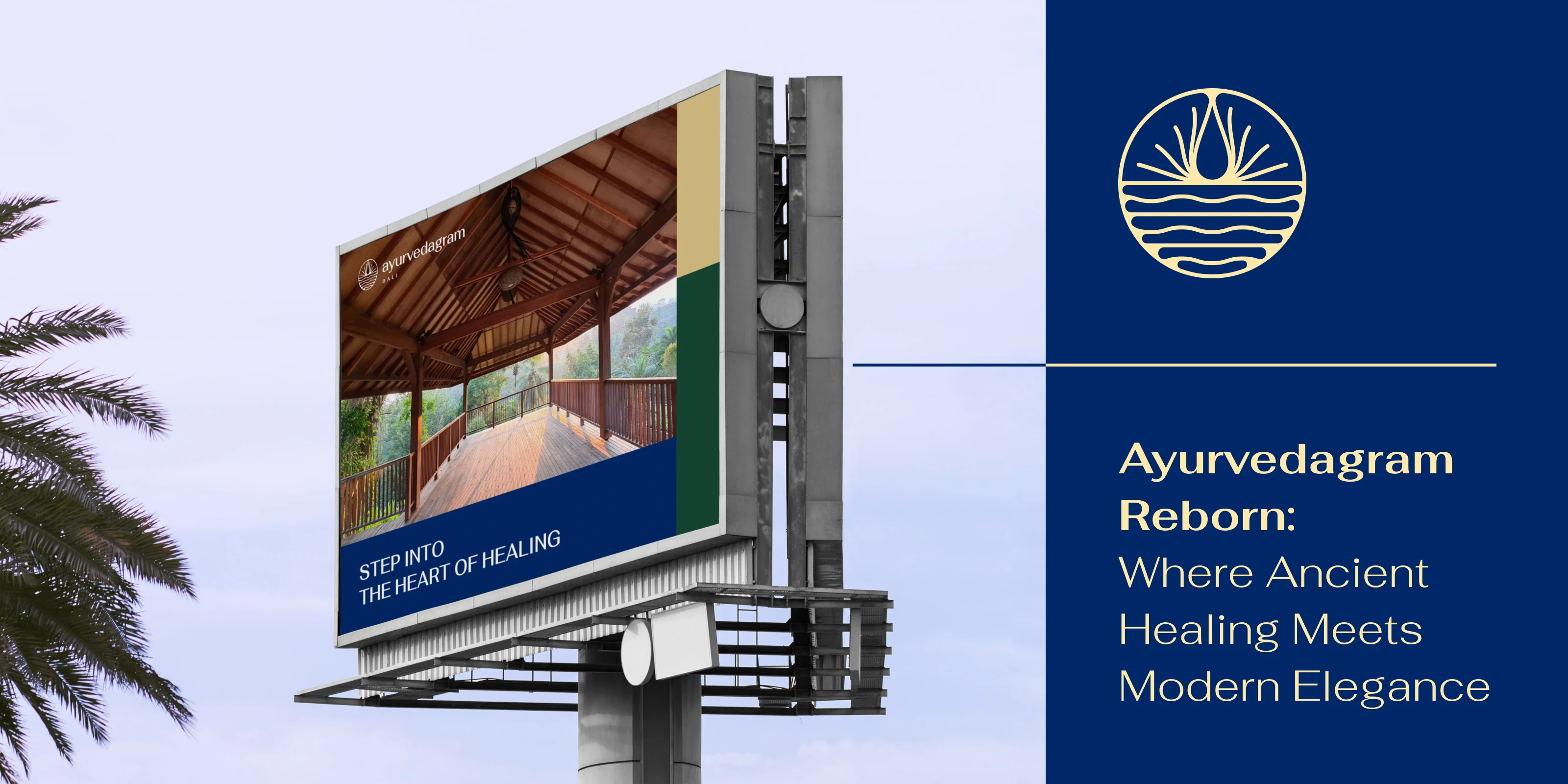
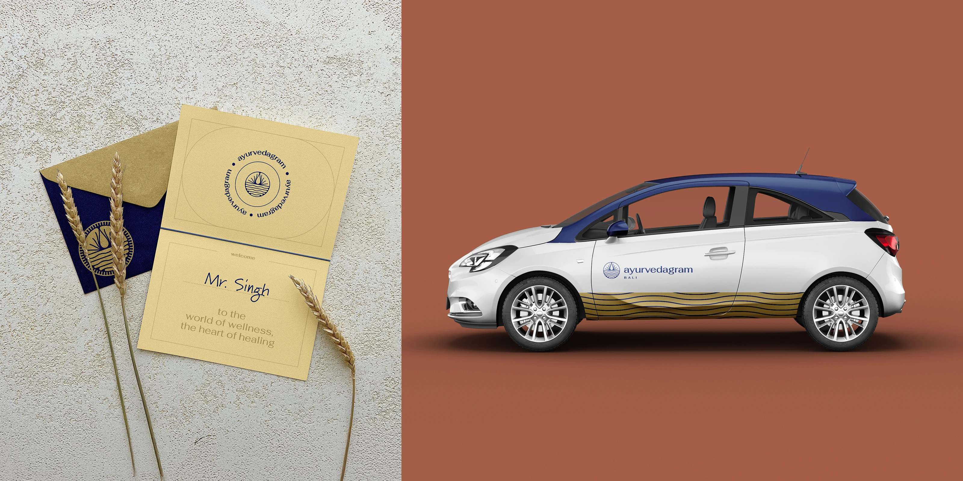
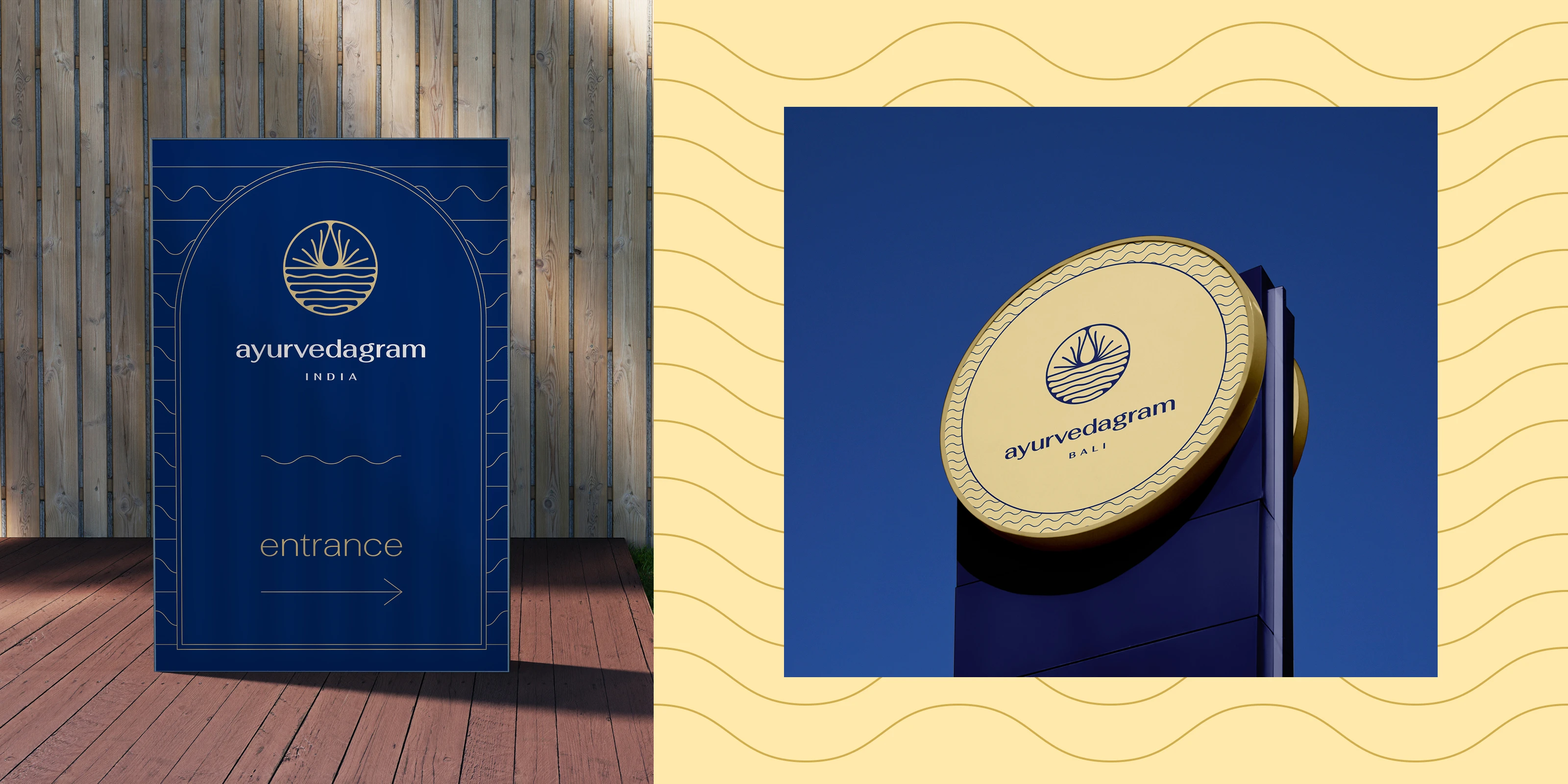
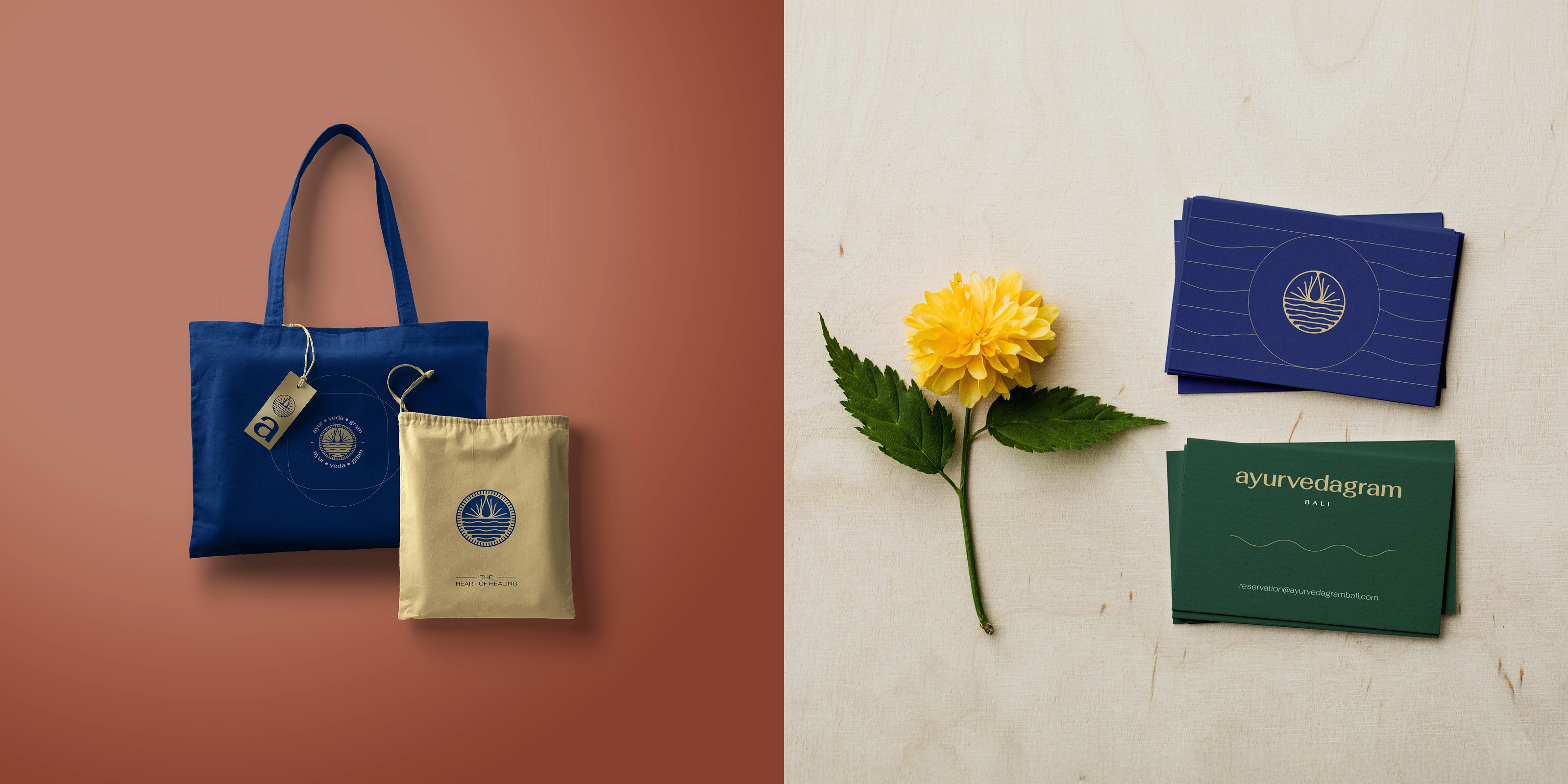
The rebrand did not stop at the logo. New design elements were introduced within and around the resort itself, blending with the existing environment rather than imposing a new visual layer on top of it. Signage, print collateral, treatment materials, and in-resort communication all followed the updated brand framework.
This is where a rebrand either holds together or falls apart. When the identity only lives in a PDF and a social media template, it has not really been implemented. When it lives on the walls, the menus, the linen tags, and the environmental details of the physical space, it becomes something a guest actually experiences rather than reads about.
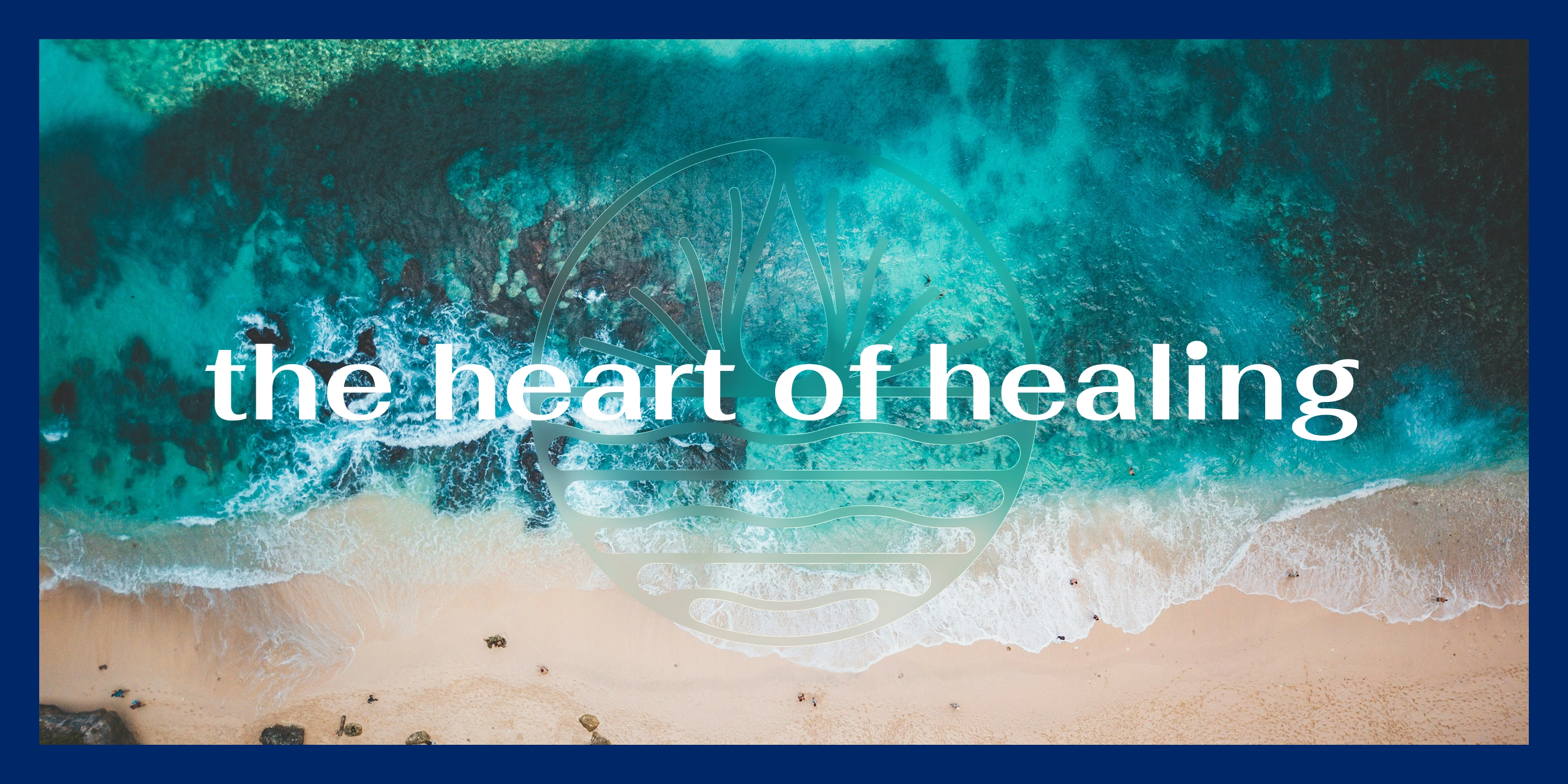
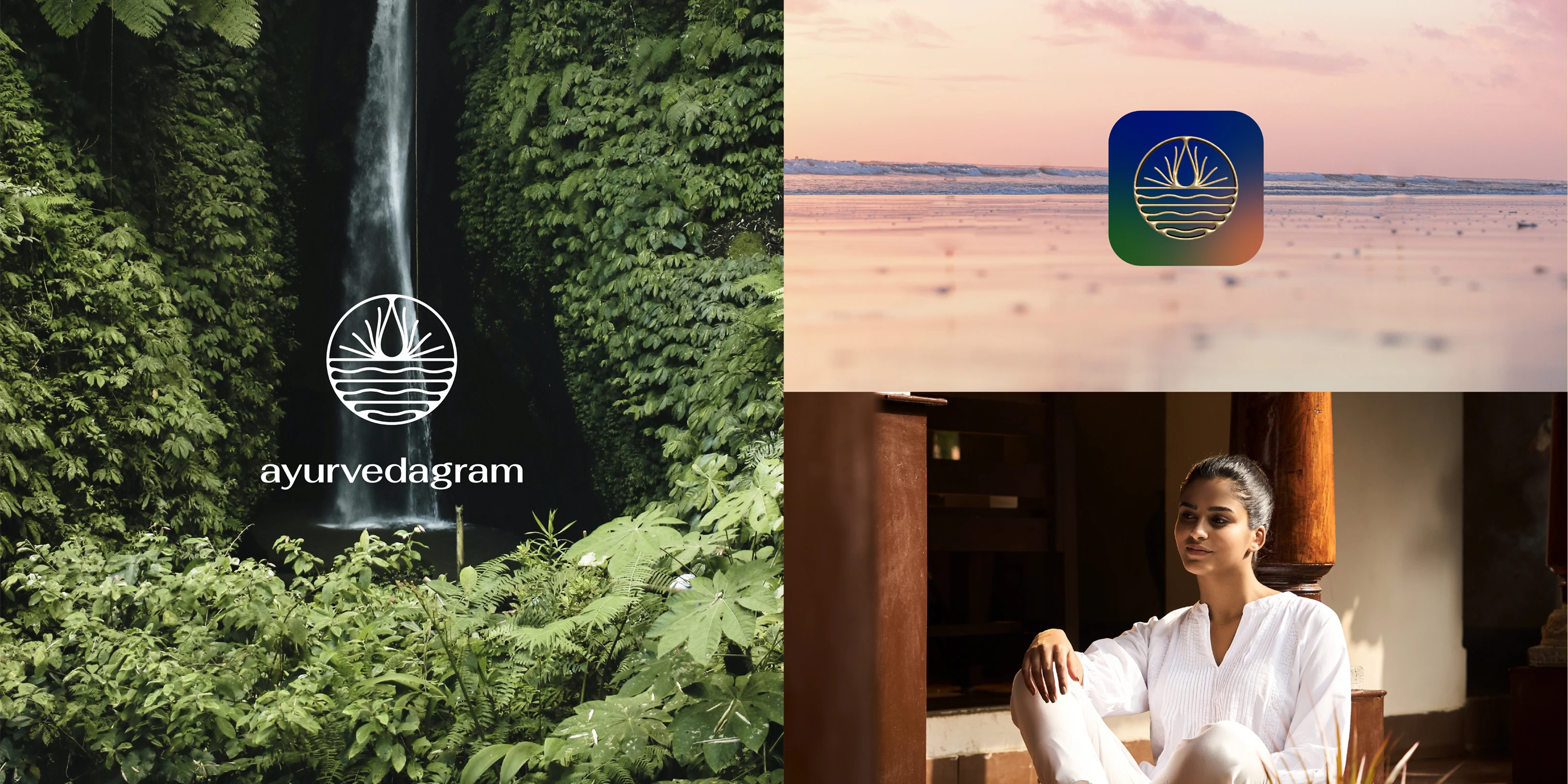
The rebrand created an opportunity that the team took seriously. Rather than simply applying the new visual identity to existing photography, the rebranding effort inspired a full photography exercise, a fresh visual narrative shot specifically to align with the new brand direction.
New photography gave the brand images that actually belonged to the identity rather than images the identity had to work around. The warmth of the palette, the quality of light, the framing of people and spaces, all of it was shot with the new brand in mind. The difference between a brand that looks consistent and one that feels consistent often comes down to exactly this. Whether the photography was briefed by the same thinking that briefed the design.
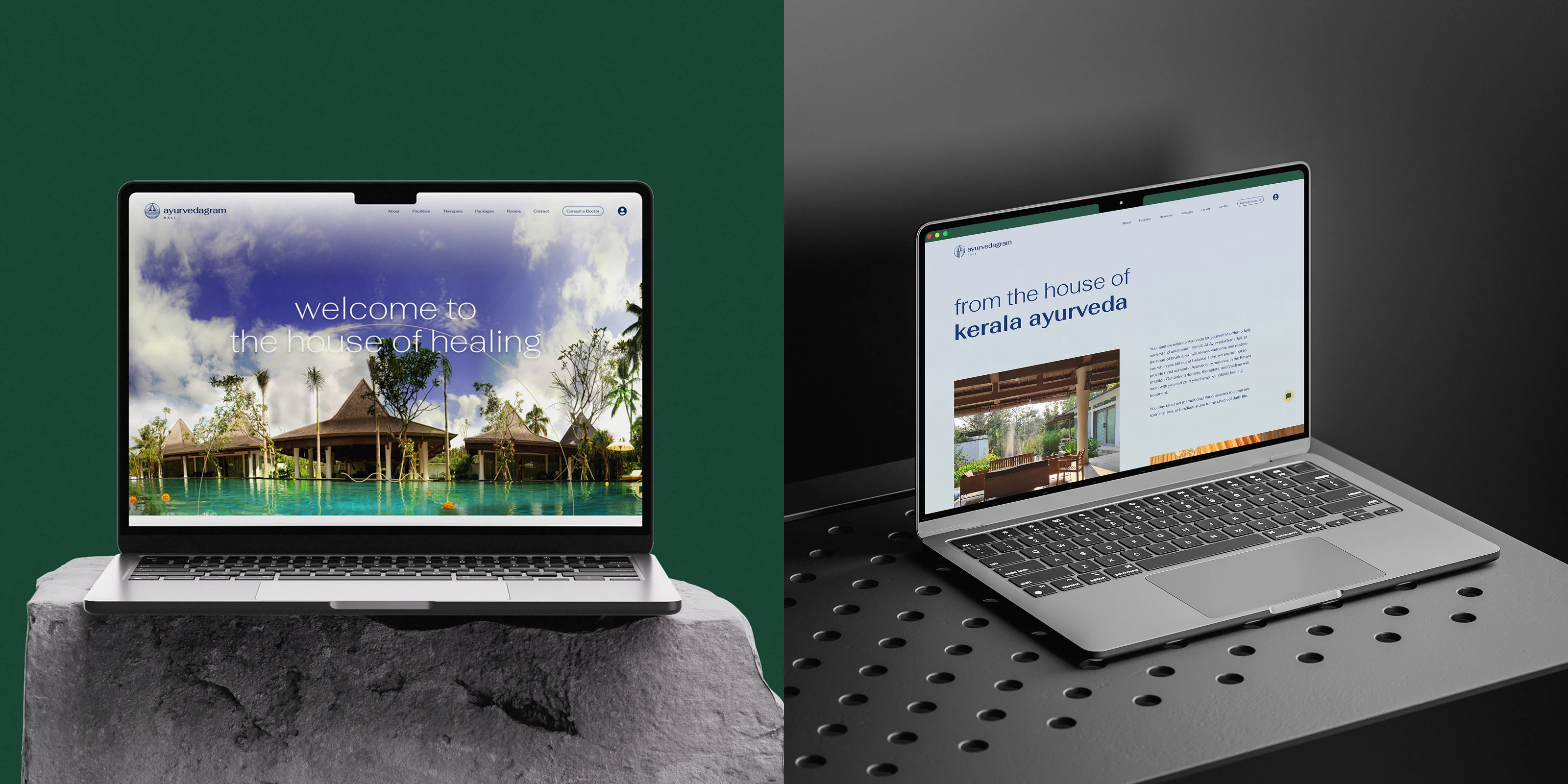
The digital touchpoint was rebuilt from the ground up for the Bali centre, and it was designed to set a new standard for how the brand showed up online. Cleaner, more interactive, and more considered than the existing Indian centre's website, it became the first full expression of the new design system in a digital environment.
The redesign was developed in collaboration with Taknik Bharti, who led web development and UX research. Every page was rebuilt to reflect the updated brand language. The integration of the new photography, the updated typographic system, and the refined layout logic gave the Bali site a coherence that extended the quality of the rebrand into the online medium without compromise.
The result was measurable. The improved clarity and presentation of the brand's offerings contributed to an increase in bookings and inquiries from the Bali centre.
A visual rebrand that runs ahead of the brand's verbal identity is always going to feel slightly incomplete. The content for the new website was provided by the in-house content team and was carefully aligned with the brand's updated tone of voice, ensuring the browsing experience felt coherent from the first headline to the last paragraph of a treatment description.
Strategically curated and well-focused information across the site made it easy for new and returning guests to understand what Ayurvedagram is, what it offers, and why it is different from the wellness retreat they looked at last week. Clarity at that level is a design problem as much as a content problem. Both needed to be solved together.

The numbers matter but they are not the whole story. Beyond the increase in bookings, the rebrand gave Ayurvedagram something harder to measure and more valuable in the long run: a design system it can actually grow into.
A brand opening a new centre in a new country, in a market as visually sophisticated as Bali's wellness tourism segment, needs more than a refreshed logo. It needs a framework that new team members can apply, that photographers can be briefed against, that architects and interior designers can reference when making decisions about the physical environment. That is what was built here.
The rebrand did not just make Ayurvedagram look better. It gave the brand the tools to keep looking right as it grows.
He truly immersed himself in our roots and traditions, expertly guiding us through a transformation that has positioned us as a contemporary company focused on enhancing customer experience. For anyone in search of a brilliant creative mind, Sidharth is undoubtedly the person to turn to. The trust and mutual respect we've cultivated together not only empower our team but also inspire us every day.
~
Tania Caruso
Art Director, Kerala Ayurveda Limited
Like this project
Posted Aug 12, 2026
Any wellness retreat can look luxurious. Making one feel genuinely rooted in Ayurvedic tradition is harder. We rebranded Ayurvedagram Bali to earn it.