Blend Art Teas • Brand Identity and Packaging

Sidharth Singh


Blend Art Teas positions itself as a collector's piece for the discerning tea drinker, rooted in India's artisan heritage and built for a global audience that knows the difference.
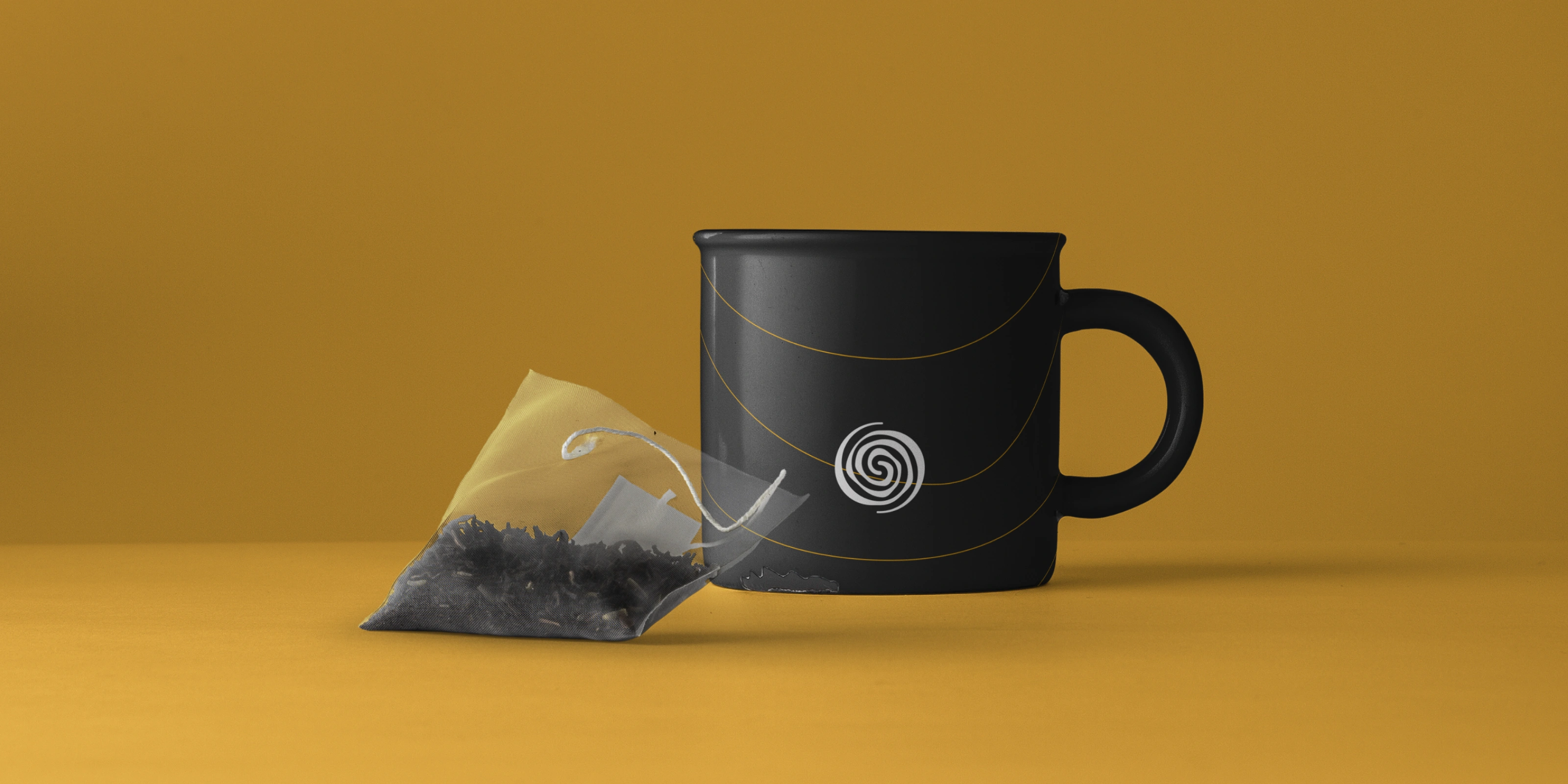
India has no shortage of tea brands. Most of them look like commodity, not craft. Blend Art came in with a different brief: introduce a direct-from-producer range of artisan green teas sourced from the gardens of Northeast India, and make the brand feel like it belongs there, in the hands of someone who actually cares what they're drinking. The answer was not another minimal tea box with a leaf illustration. It was a brand built with the same care and intention as the teas inside it.
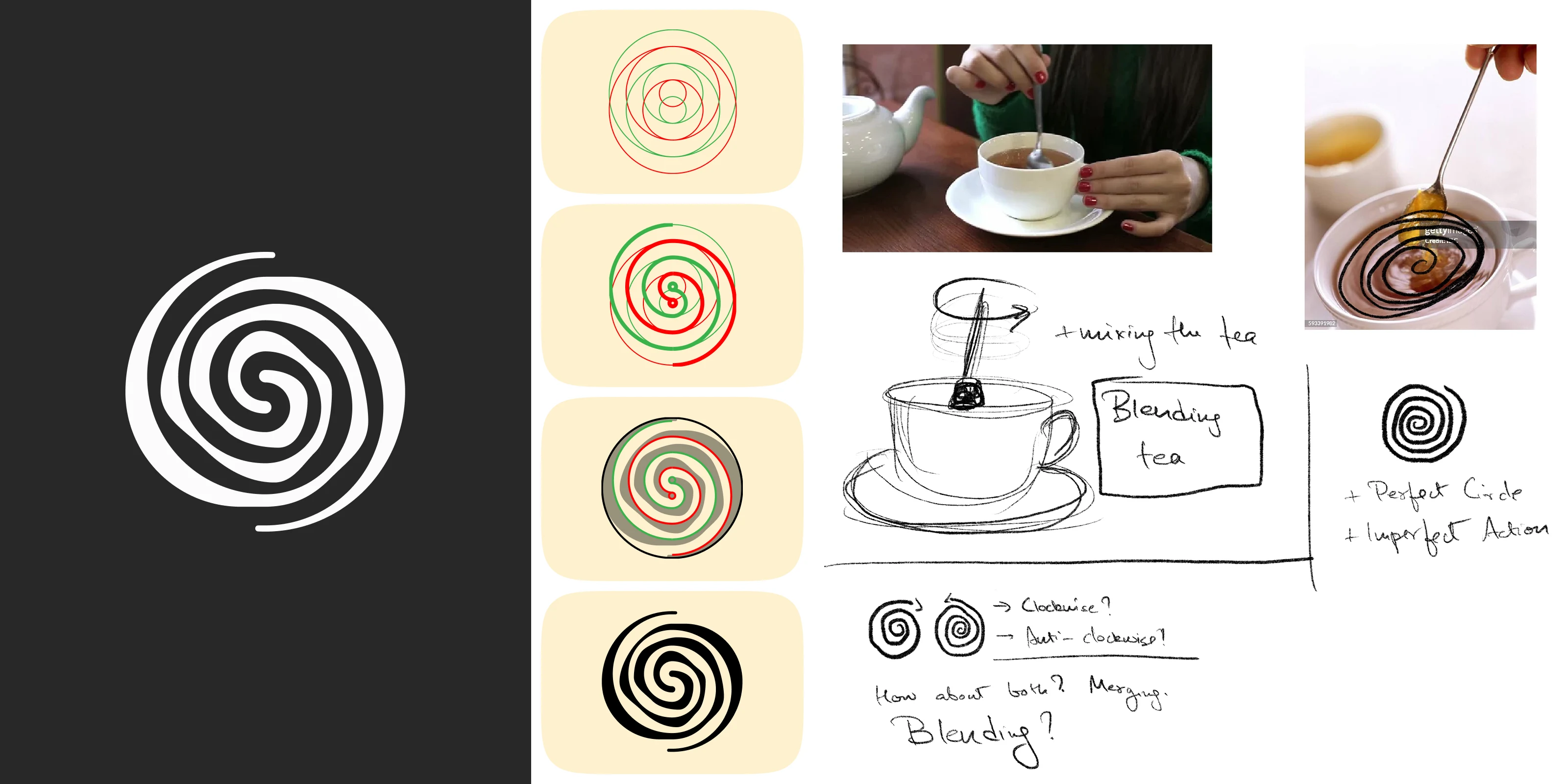
The Blended Logo Construction
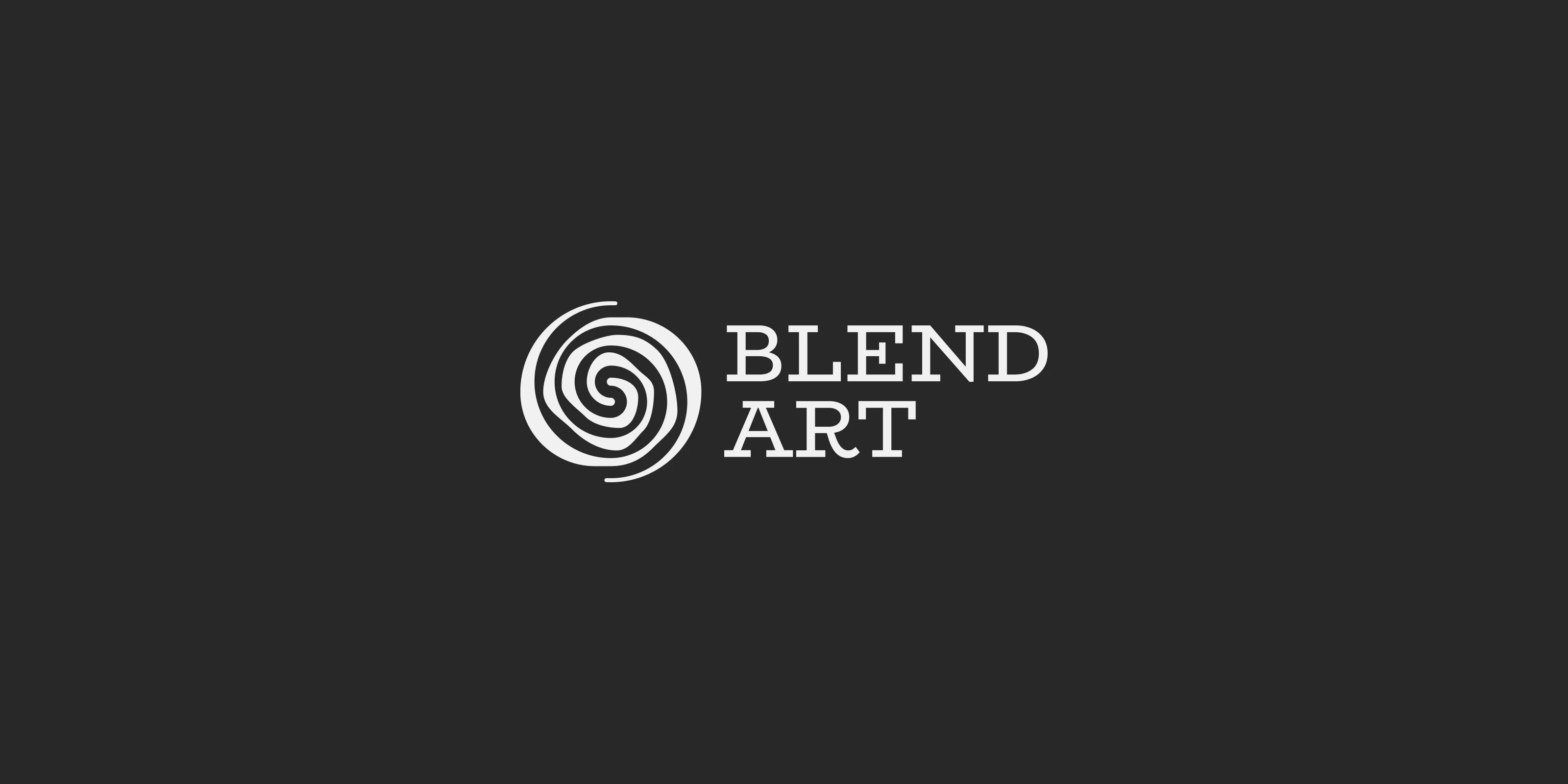
The Blend Art logo started with a very simple observation: what does blending actually look like?
Not the metaphor. The physical act. A spoon in a cup, the motion of stirring, the spiral that forms when two things come together. The early sketches asked an honest question: clockwise or anti-clockwise? And then a better one: how about both? That tension between a perfect circle and an imperfect action became the conceptual anchor for the mark. The final swirl is not a tidy geometric spiral. It carries the energy of something in motion, something being made. The initials B and A are woven into the form without announcing themselves, there if you look, invisible if you don't.
What it needed to communicate was not just a name but a ritual. Tea is not grabbed off a shelf and forgotten. It is made, stirred, waited on, and returned to. The logo needed to carry that quality, that sense of a process with intention behind it. The swirl does that without a single word of explanation.
From four directions of exploration through to a final mark that works in one colour, at any size, on a tin, a tag, or a screen, the process behind it is visible in the work. The best logos usually have that quality. You can feel that someone actually figured something out rather than just arrived at a shape.
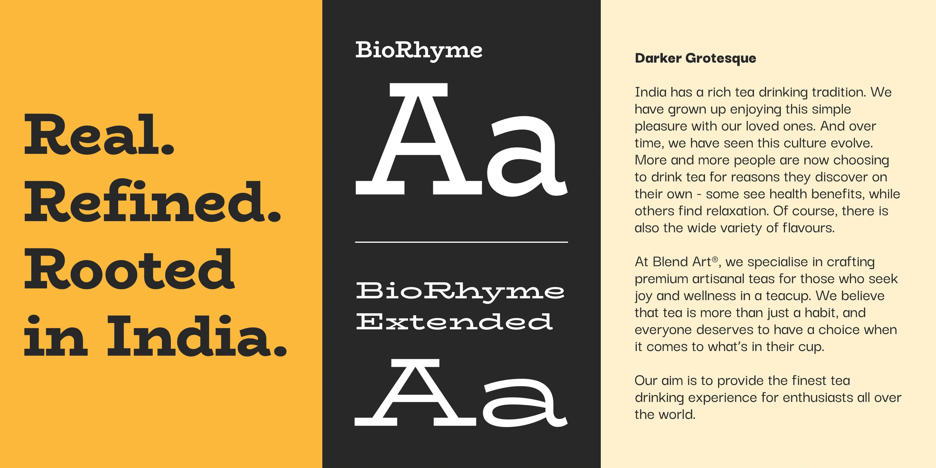
Brand Typeface
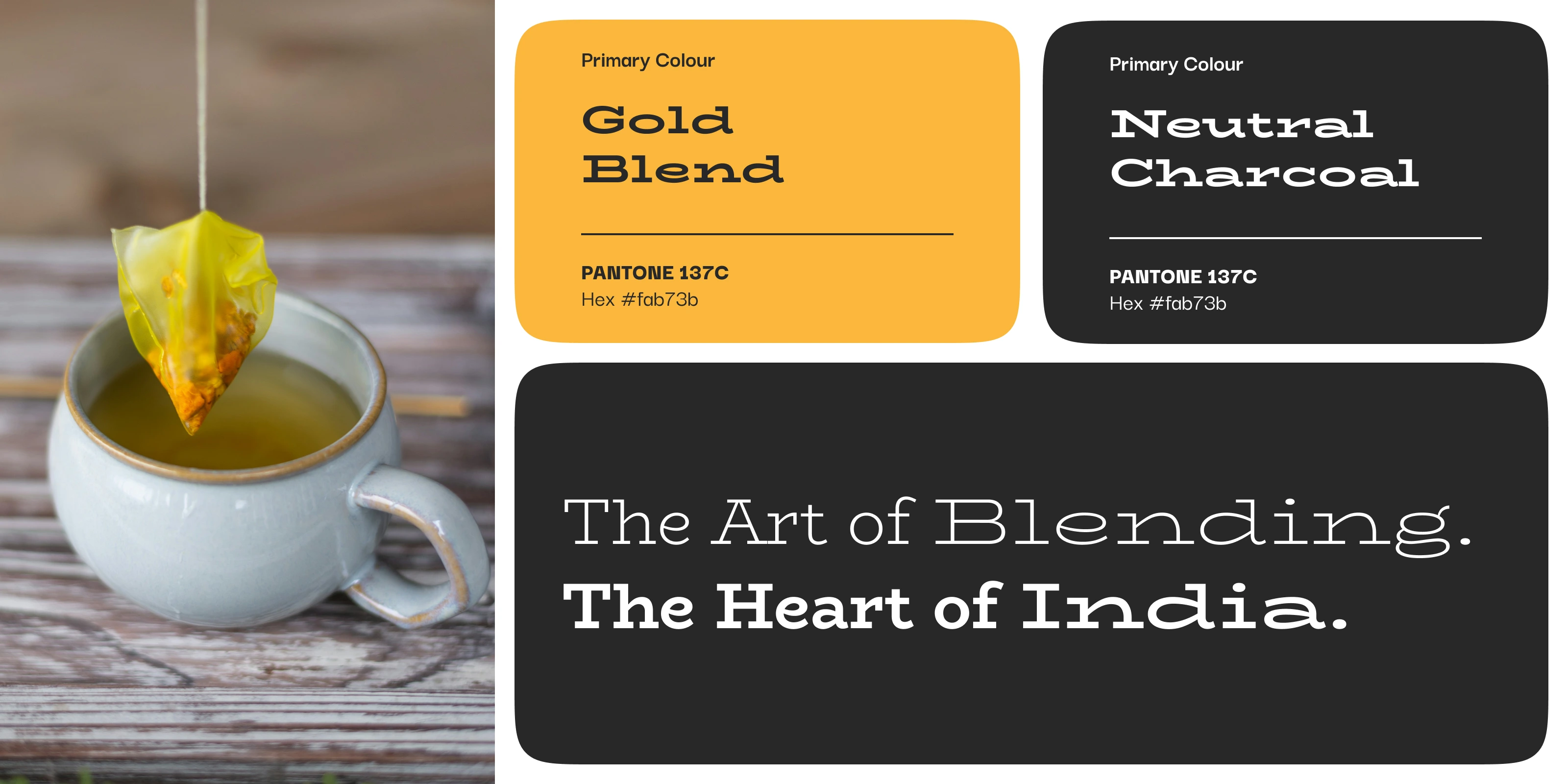
The Brand Colour Palette
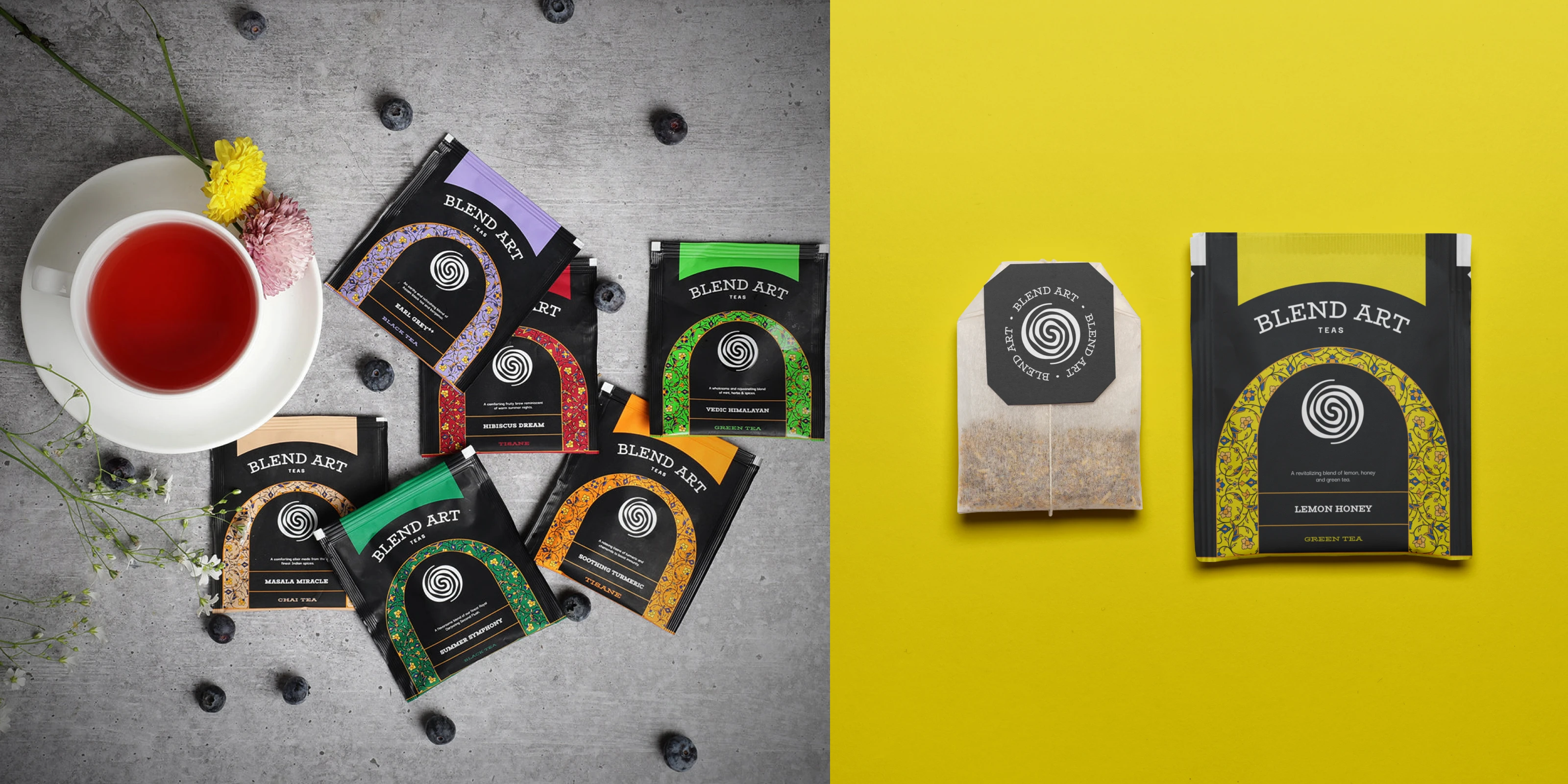
Charcoal served as the neutral anchor across the entire range. From there, each flavour carried its own distinct colour palette drawn directly from the ingredients themselves. Green, earthy, warm, floral. Every variant got its own personality while still reading as part of the same family.
The result is a packaging system that holds together on a shelf as a collection but lets each tea breathe and be found quickly. For a brand with a growing range of blends, that kind of scalability was not a nice-to-have. It was the whole point of the system.
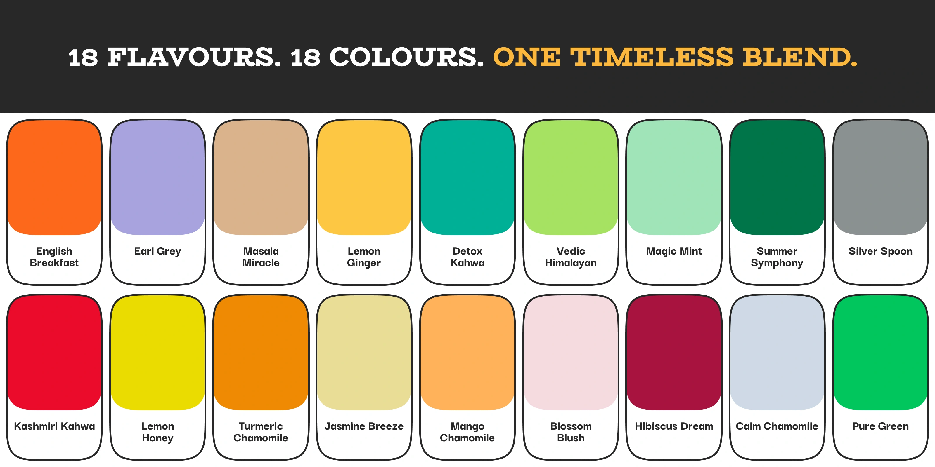
The colour selection for the tea products. Each colour was assigned to particular flavours.
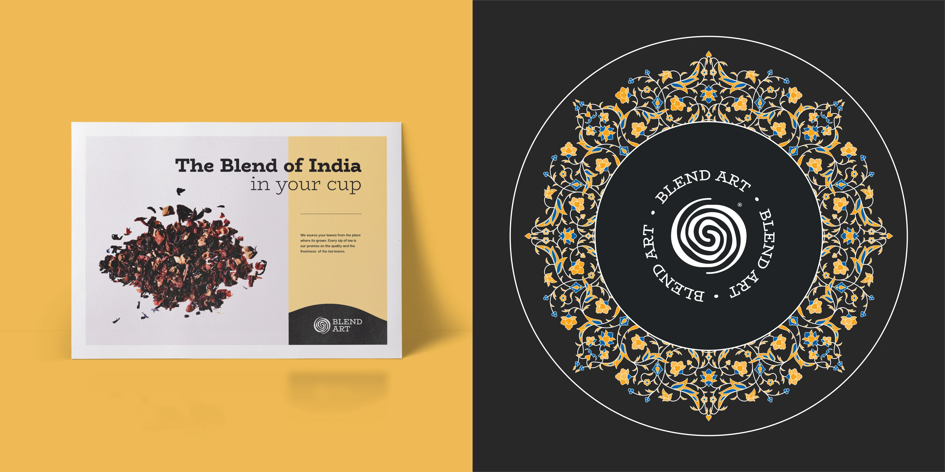
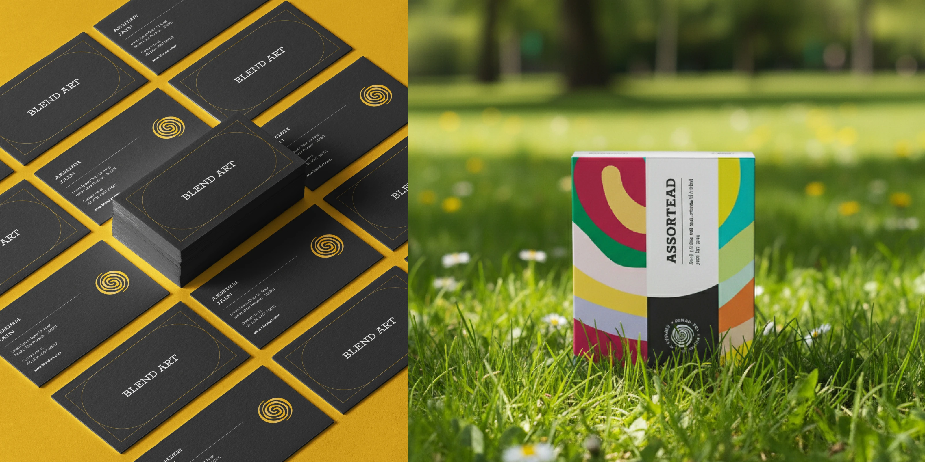
The packaging system drew from Mughal and Rajputana architectural traditions, specifically the detailing of windows, arches, and doorways, interwoven with floral motifs that carry the handcraft sensibility of the brand. This was not heritage for heritage's sake. It was a deliberate choice to give a modern Indian tea brand a visual language that felt genuinely rooted rather than assembled from a mood board of vague Indian references.
The architectural framing gave each pack a sense of place. Something that made you feel like the tea inside came from somewhere real, not a factory floor with a romantic story pasted on top.
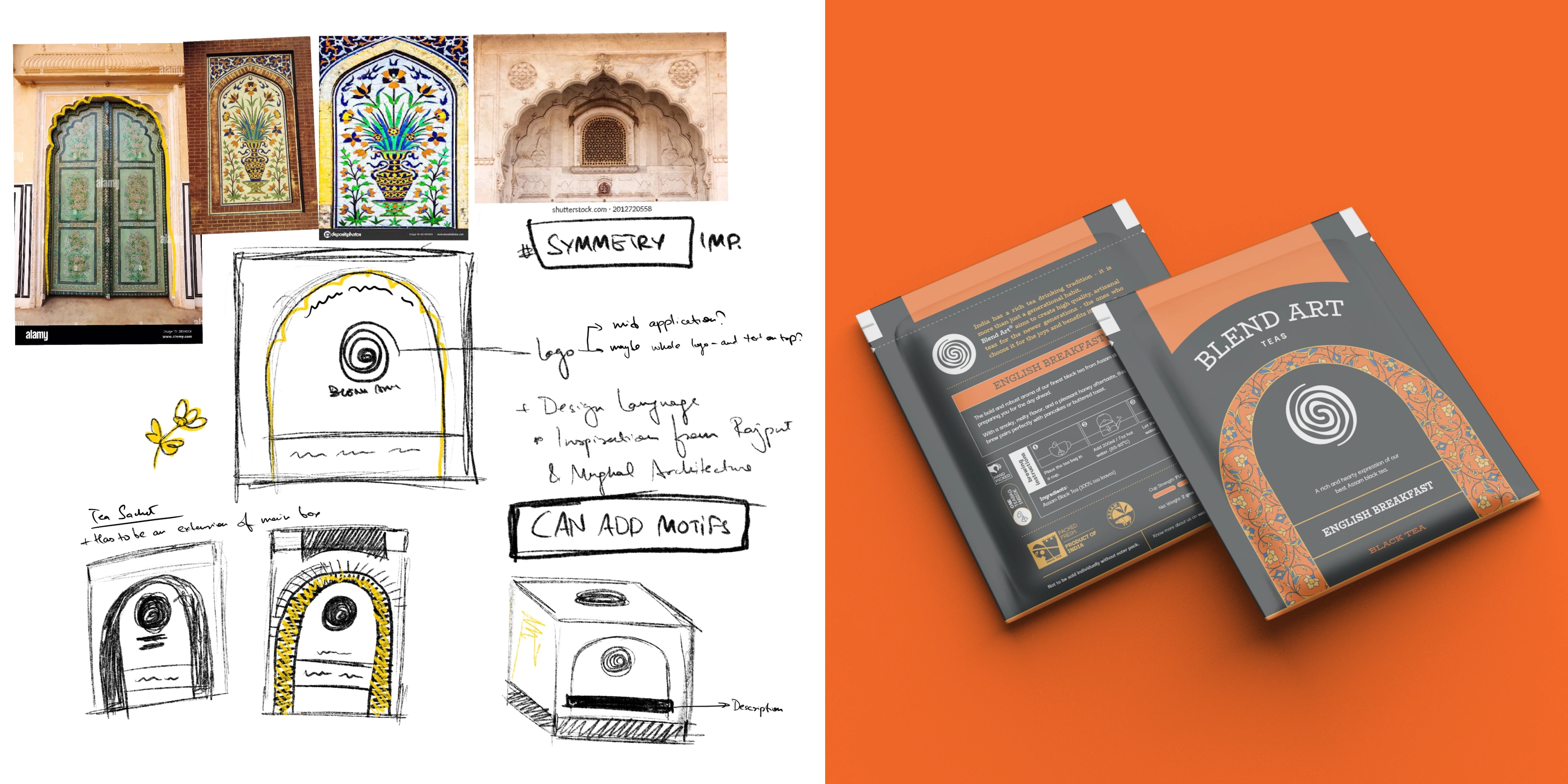
Concept sketches and tea sachet explorations
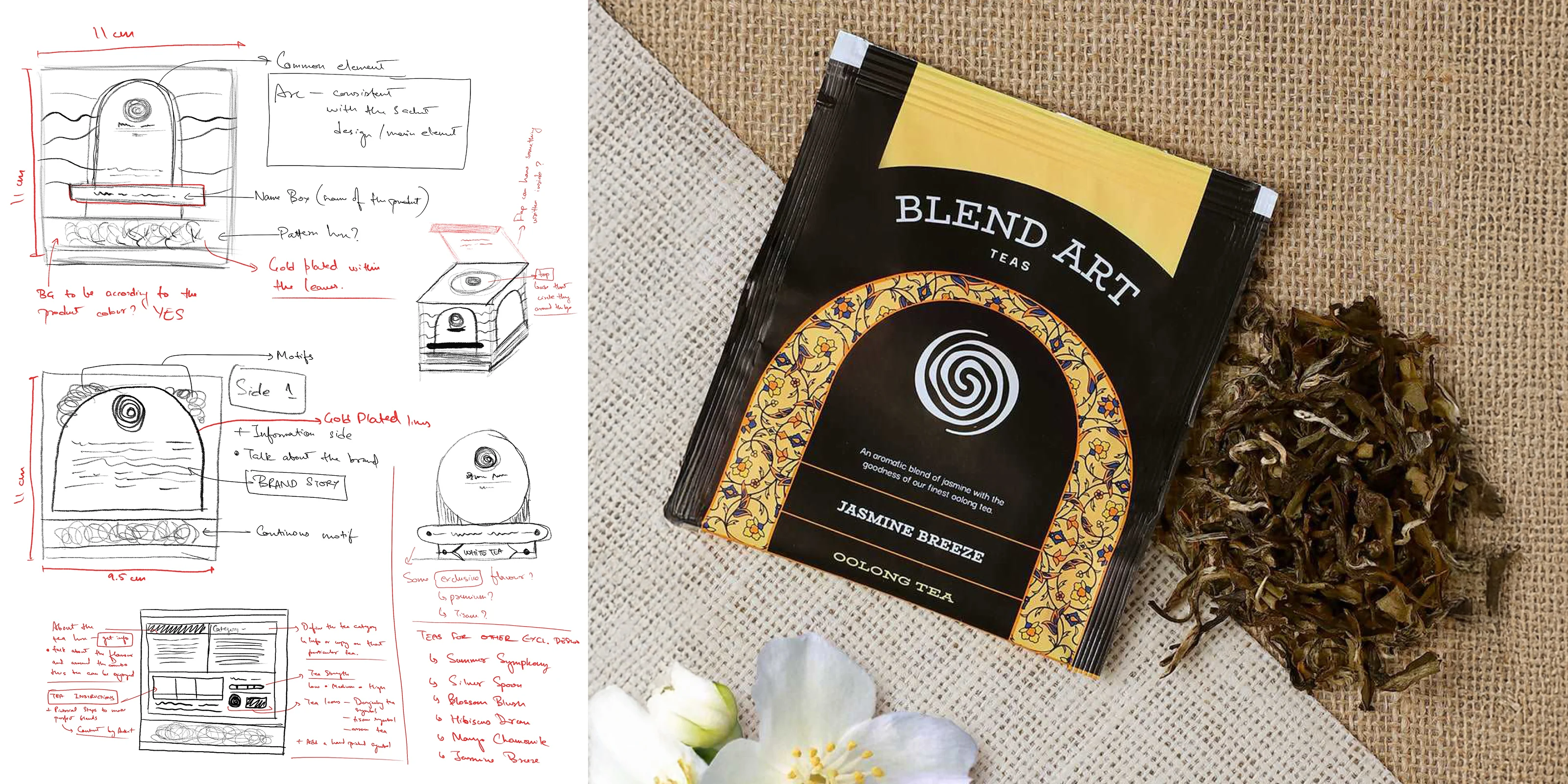
Duplex box concept sketch
The primary packaging format for Blend Art was a duplex box with individual sachets inside. This is where the visual language had to work hardest, because this is what the customer actually holds, opens, and lives with on their kitchen shelf or office desk.
The duplex construction gave the packaging a weight and rigidity that immediately communicated premium without needing to shout about it. The architectural motifs from the visual system translated onto the box surfaces with enough detail to reward a close look but enough restraint to not feel cluttered. Each sachet inside followed the same colour logic as its outer box, so the experience of opening the pack felt intentional all the way through, not just surface deep.
The brief was clear that this needed to feel like something worth keeping, not something you recycle the moment the tea is gone. That shaped every decision about print finish, panel layout, and how much breathing room the design was given across each face of the box.
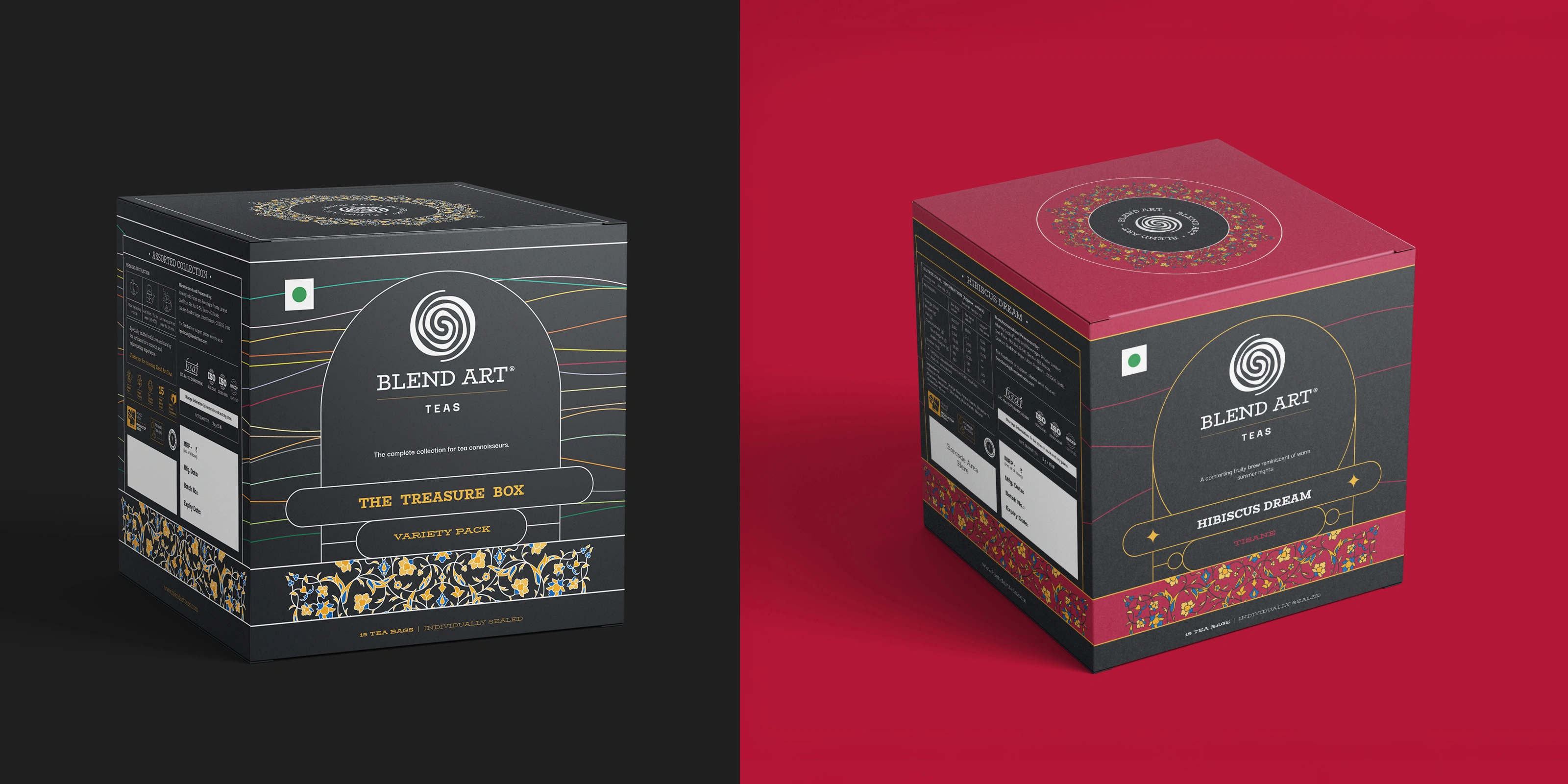
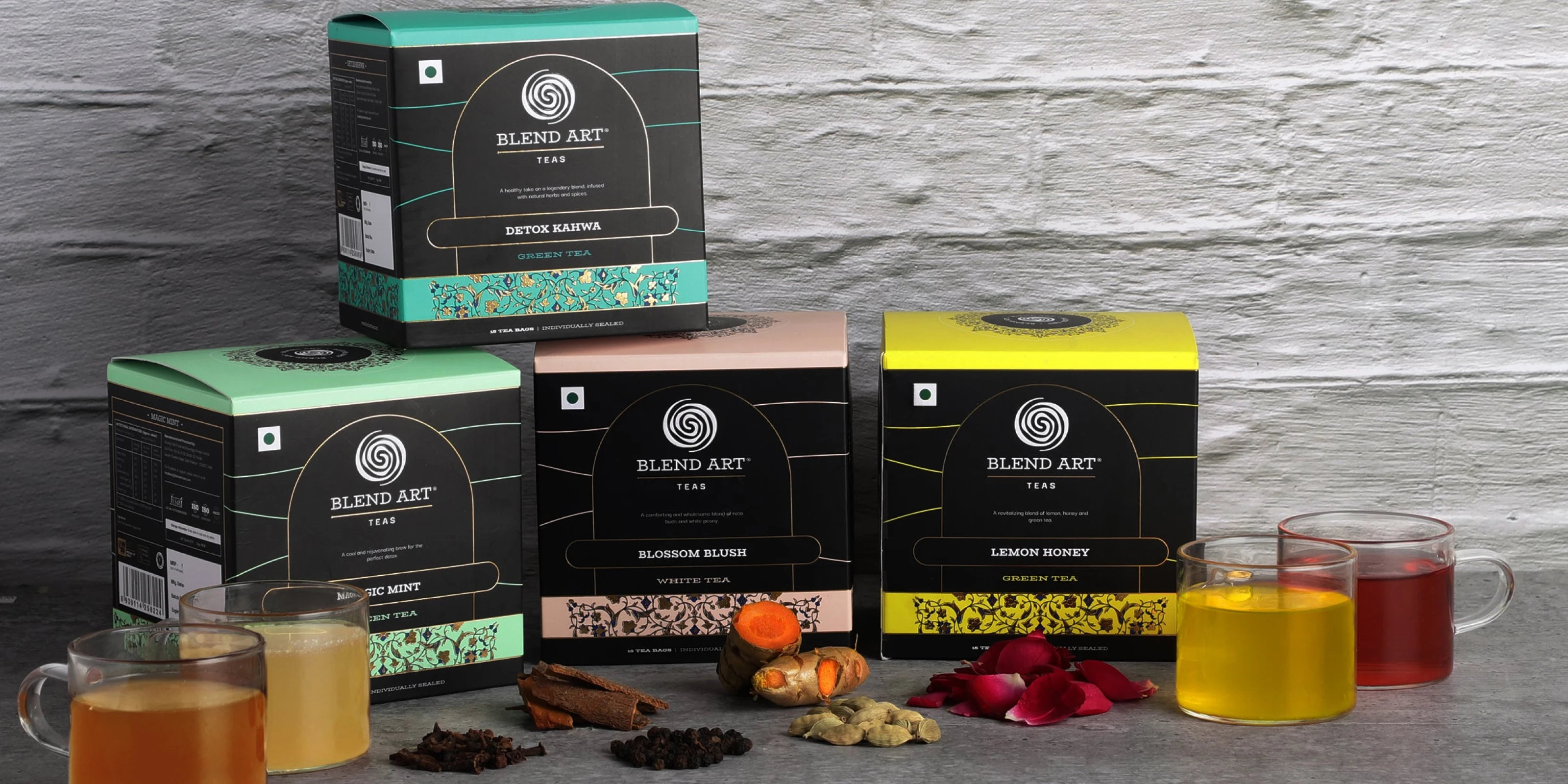
A brand that only works on one format is not a brand system. It is a one-off.
Blend Art needed to live across tea bags, loose leaf tins, duplex boxes, and gift packaging, each with different surface areas, different production constraints, and different contexts of use. The design system had to be flexible enough to adapt to all of them without losing what made it recognisable.
The architectural framing device, the colour coding per variant, the consistent typographic treatment, and the floral motif language all translated across formats without needing to be reinvented each time. A loose leaf tin reads like a Blend Art tin. A sachet reads like a Blend Art sachet. The system did its job.
This kind of consistency is not accidental. It requires deciding early what the non-negotiables are and then being disciplined about carrying them through every size, every substrate, and every production budget that reality throws at a growing brand.

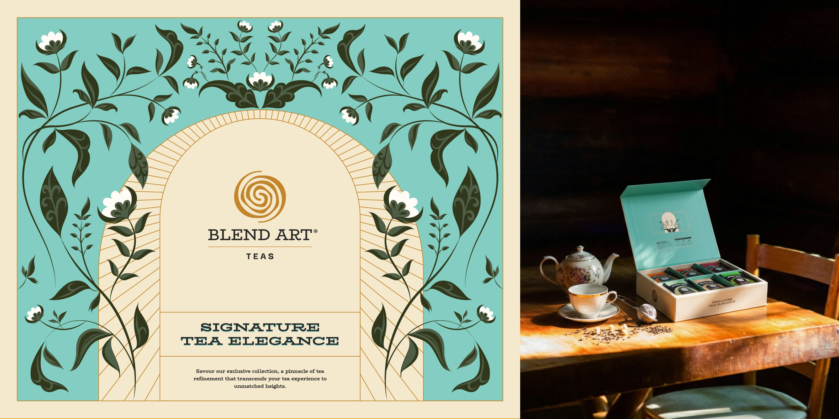
Gift Packaging - Blend Art Signature Tea Elegance
The gift box range extended the identity into a premium gifting experience, developed in collaboration with Shilpa Dwivedi. This was where the visual language got to stretch a little. The architectural motifs, the colour system, and the overall craft sensibility translated into something that felt genuinely giftable without losing what made the brand itself. Not a product dressed up in a box. The brand, expressed in its fullest form.
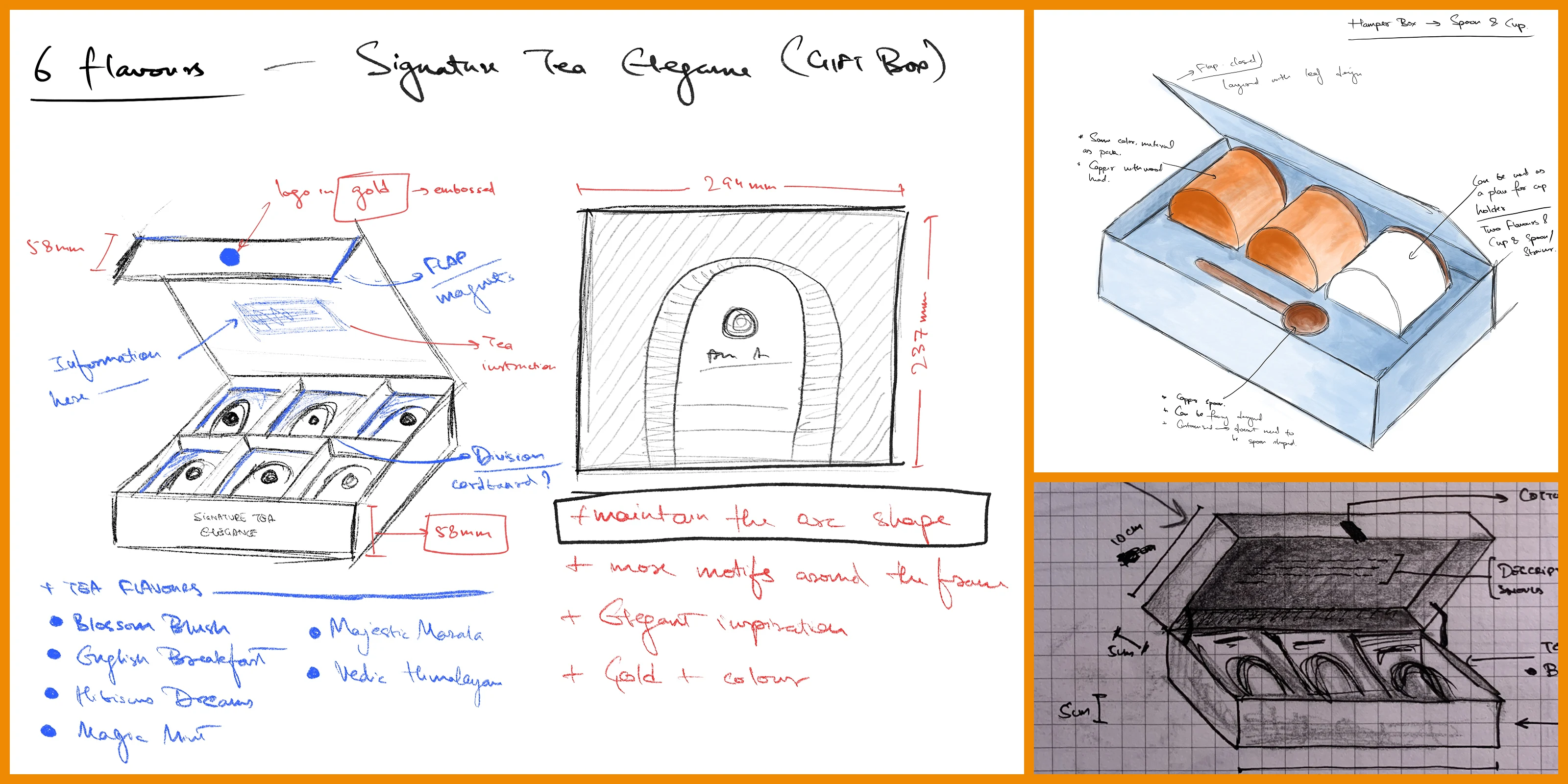
One of the concept sketches for Blend Art's Gifting series
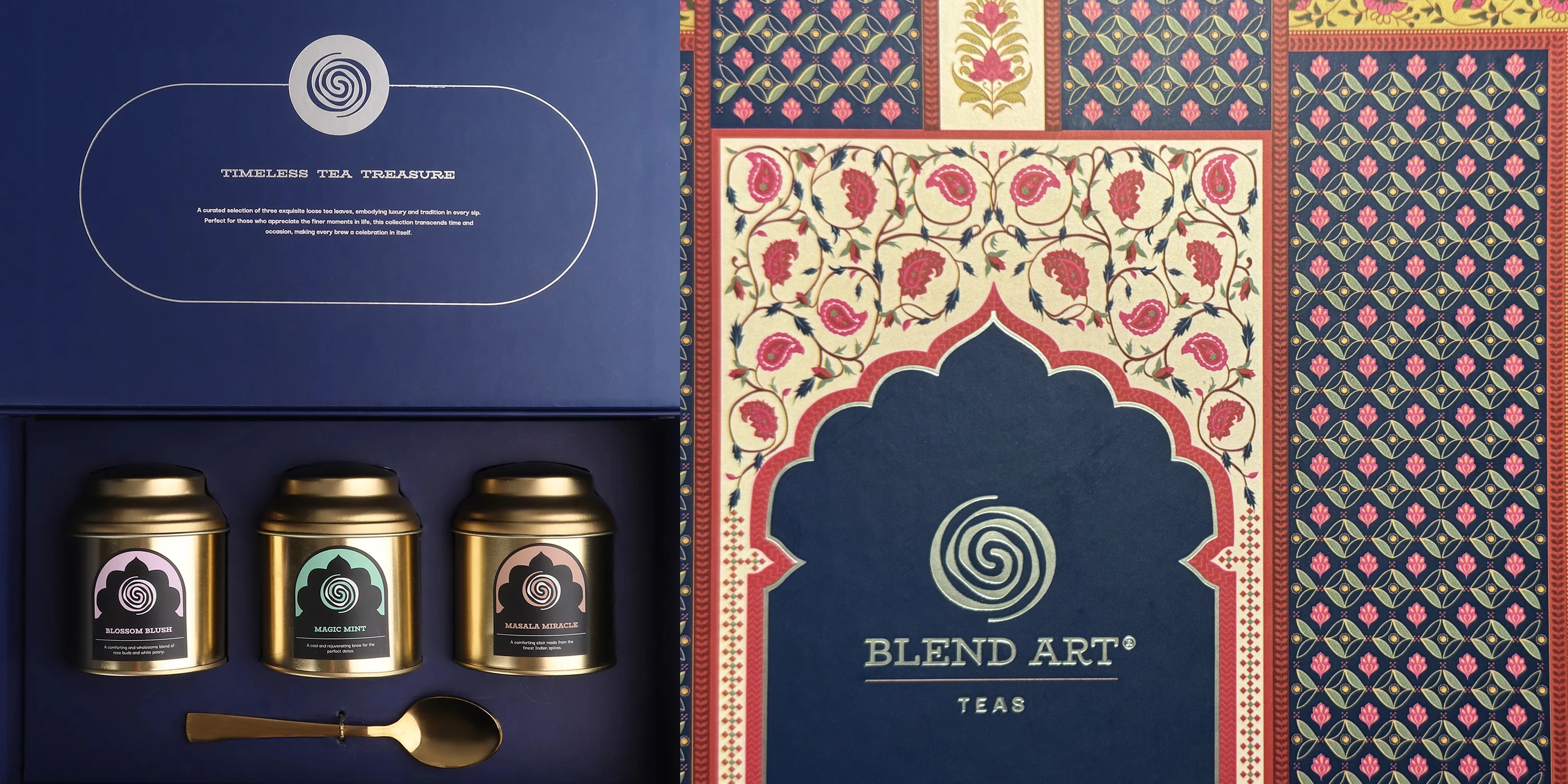
Gift Packaging - Blend Art Timeless Tea Treasure
A brand that looks this considered needs to sound the part too. Verbal identity for Blend Art was developed in collaboration with Ankit Mudgil, giving the brand a consistent tone of voice to carry alongside the visuals. Together the two systems, visual and verbal, gave Blend Art the foundation to show up with clarity whether it was on a shelf, in a gift bag, or on a screen.
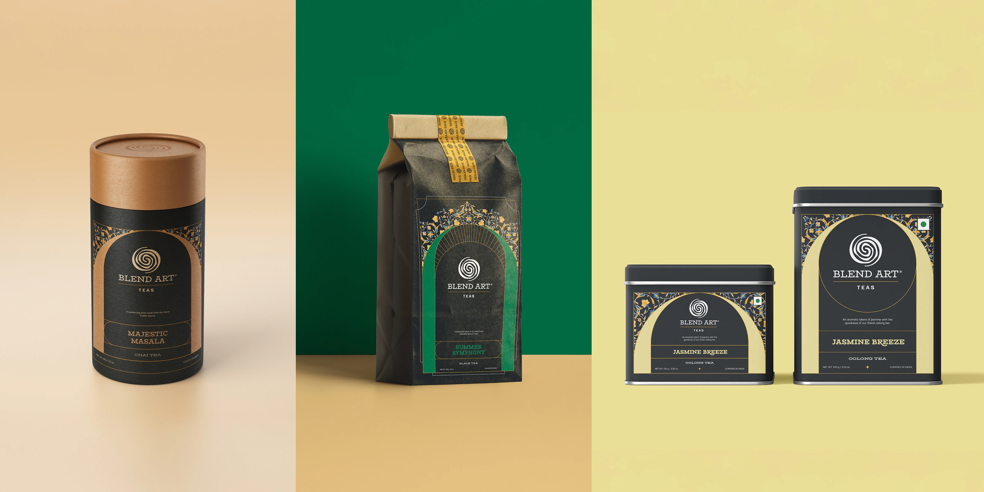
The brief was to make Indian tea look as good as it tastes. That felt like a fair challenge to take on.
Like this project
Posted Aug 11, 2026
India grows some of the finest tea in the world. Most brands don't look like it. Blend Art was built to change that.