Raisina Dialogue 2021
Sidharth Singh
The Problem
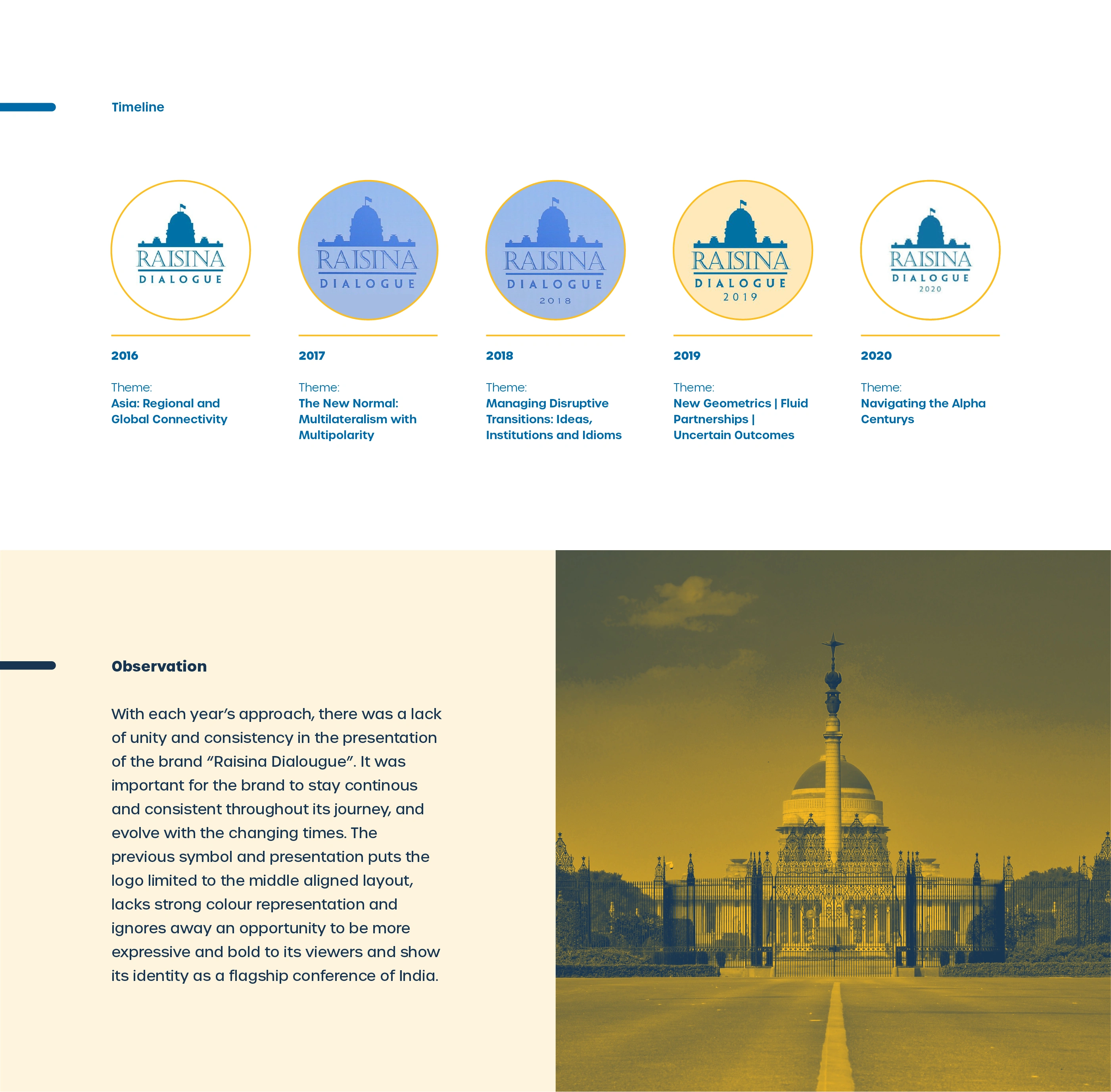
Five editions. Five different visual interpretations of the same brand.
Looking at the timeline from 2016 to 2020, the pattern was clear. Each year had been treated as a fresh creative exercise rather than a chapter in a continuing story. The colour changed. The logo's presentation shifted. The typographic relationship between "Raisina" and "Dialogue" was handled differently depending on who was working on it that year.
A conference of this scale, one that hosts prime ministers and shapes global policy conversations, deserved more than a new outfit every January. It needed a visual language that could grow with it. One that could absorb the energy of each year's theme while keeping the brand itself stable, recognisable, and authoritative.
The work started there.
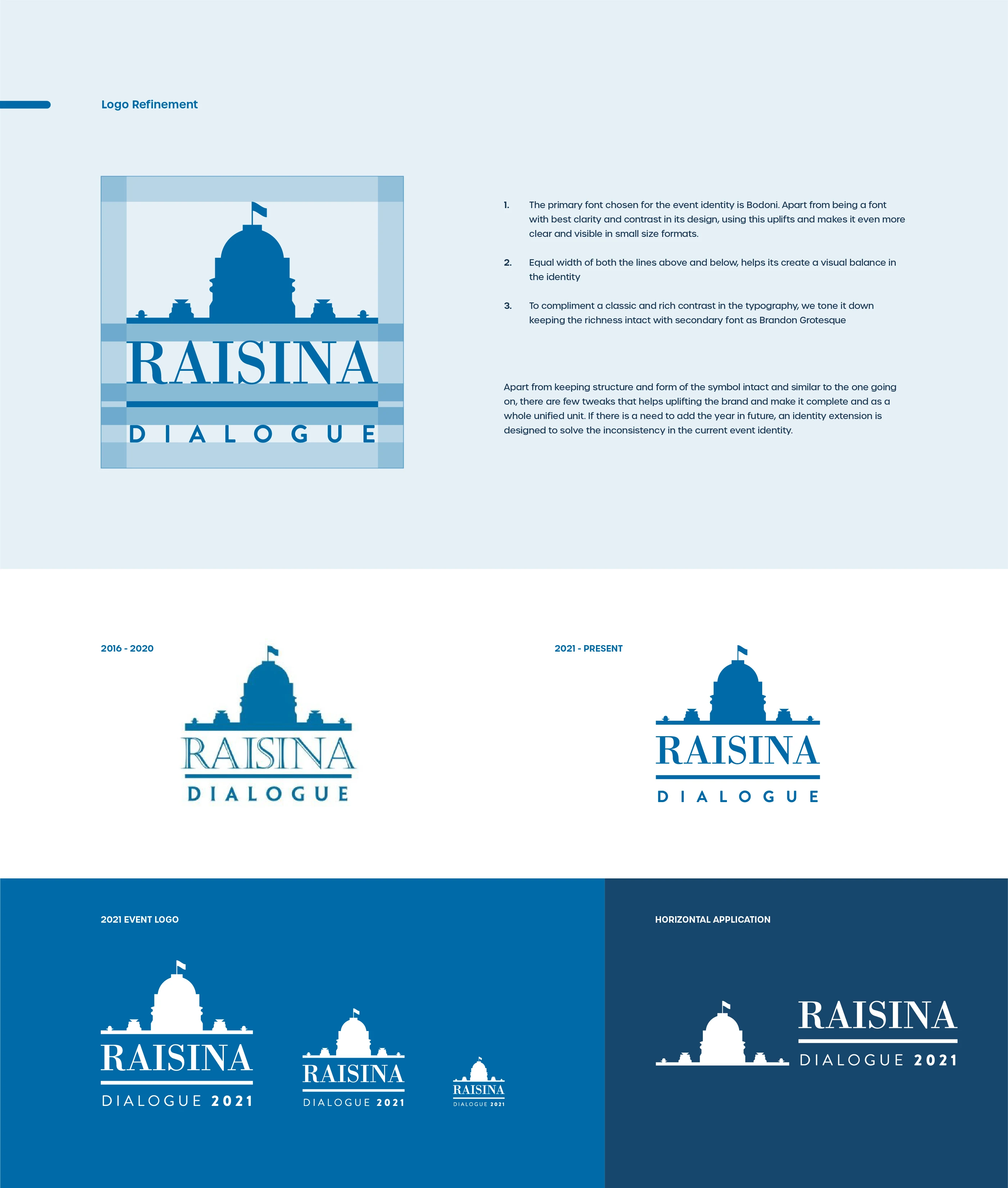
Logo Refinement
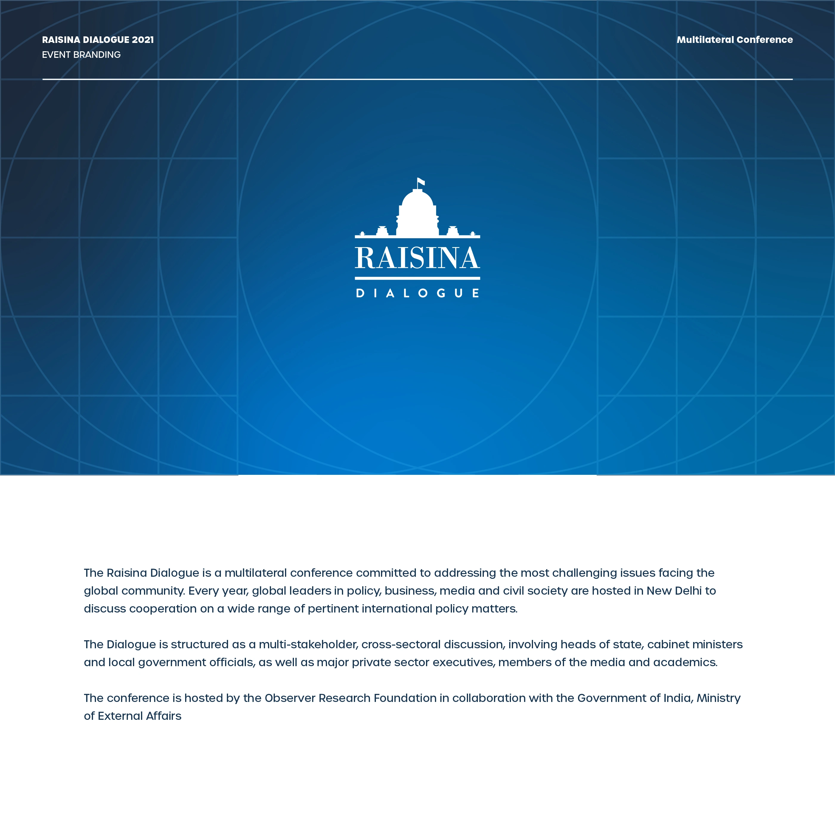
The existing symbol had good bones. The Rashtrapati Bhavan silhouette was the right anchor for a conference rooted in Indian statecraft and global dialogue. The decision was not to replace it but to refine it into something that could actually work as a system.
Bodoni was chosen as the primary typeface. The clarity, contrast, and authority it brings to display settings made it the natural fit for an identity that needed to hold up at event scale. Brandon Grotesque balanced it as the secondary, keeping the richness in check without letting the whole thing tip into formality.
Equal-weight rules above and below the wordmark created structural balance. The result was a logo that could accept the year as a natural extension, making each edition feel connected to the last rather than independent of it.

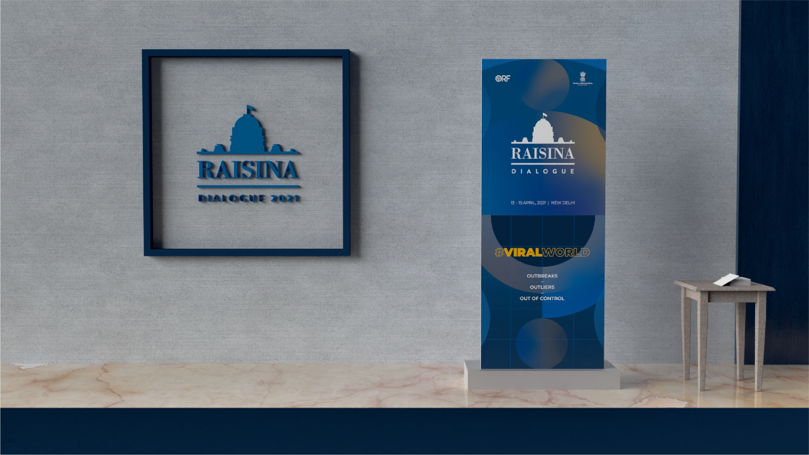
Execution Across Touchpoints
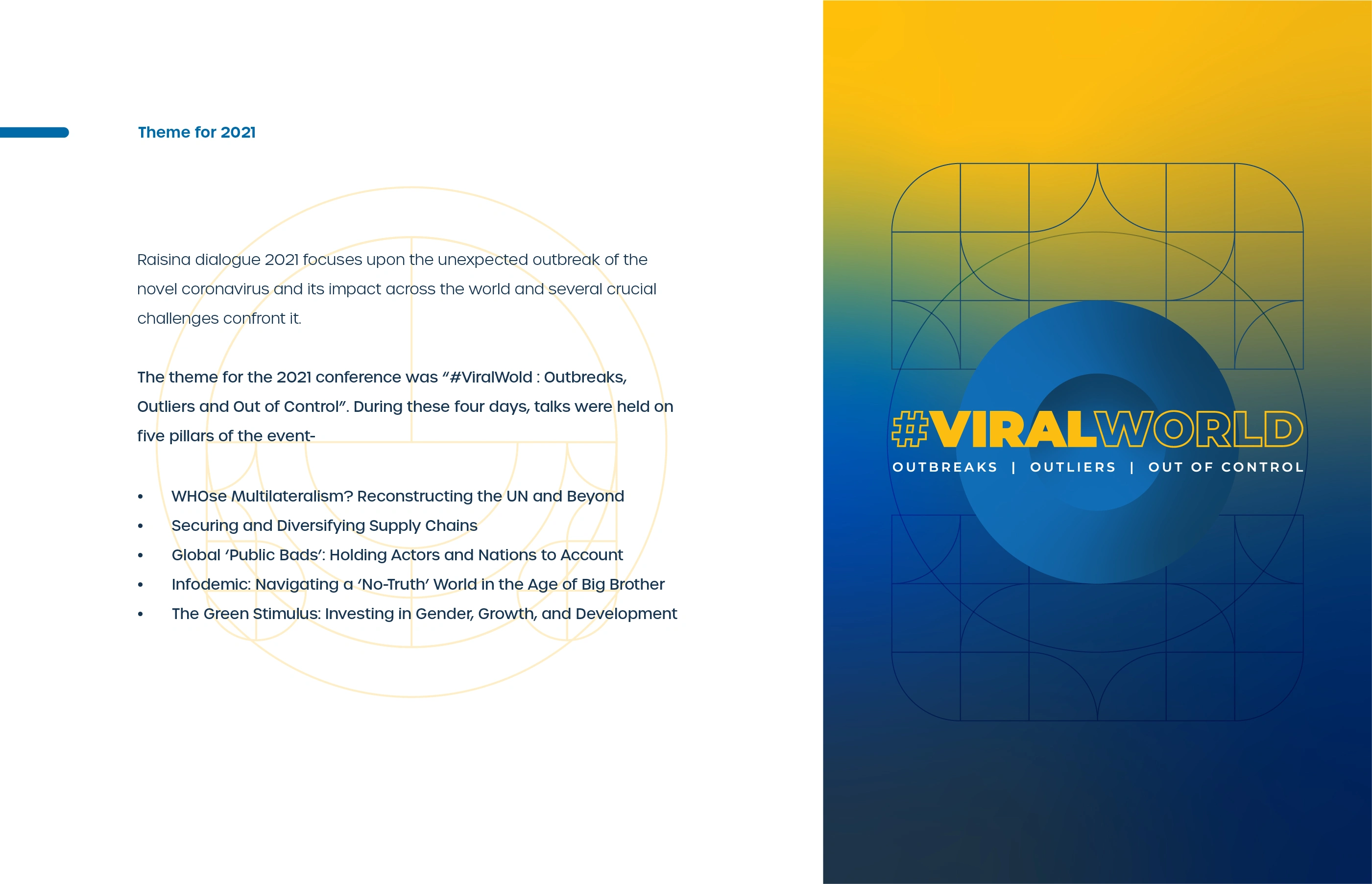
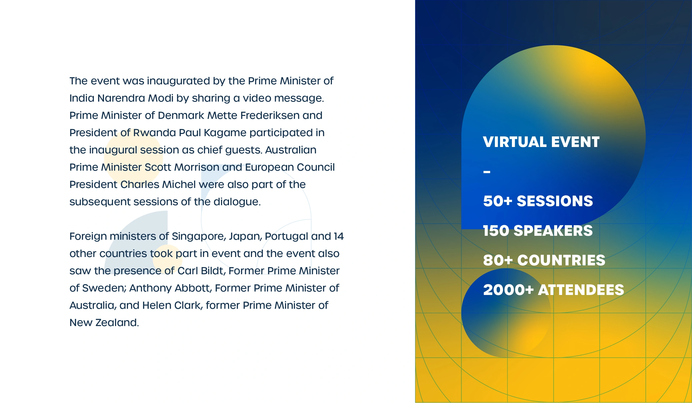
The 2021 edition moved entirely online, which made the visual design carry even more responsibility than usual. Without a physical venue to anchor the experience, every screen, every template, every piece of printed collateral had to do the work that architecture usually handles.
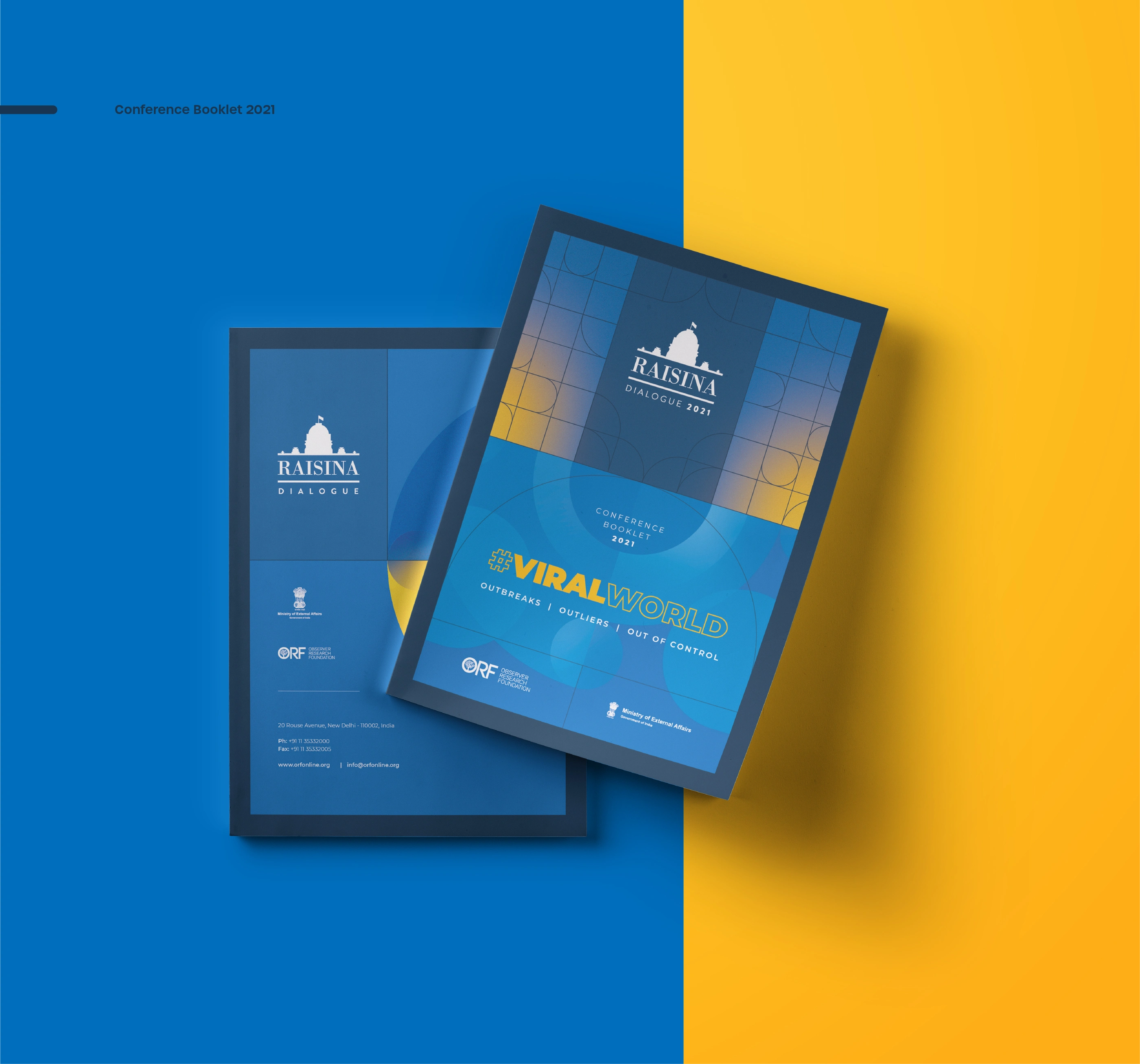
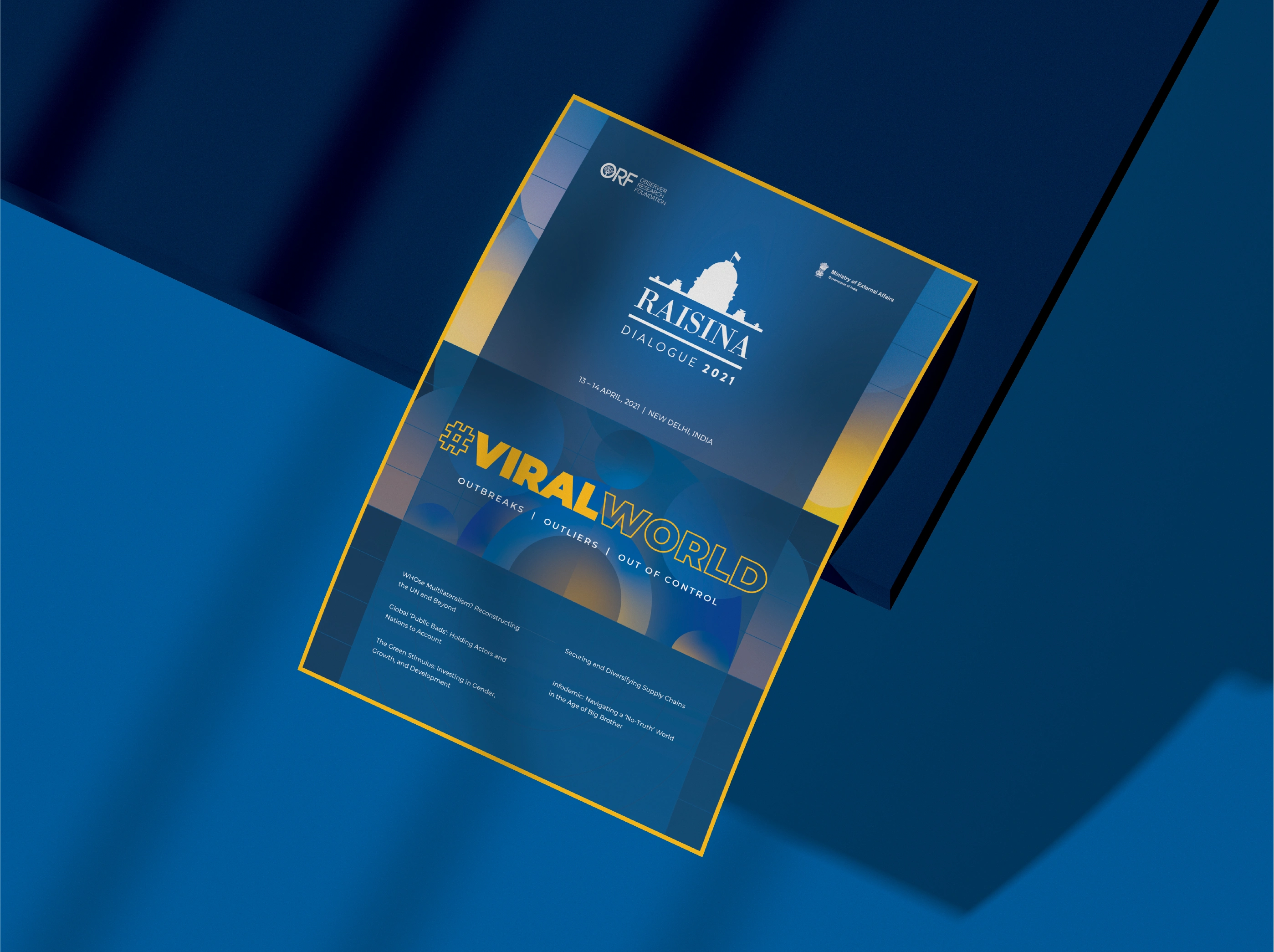
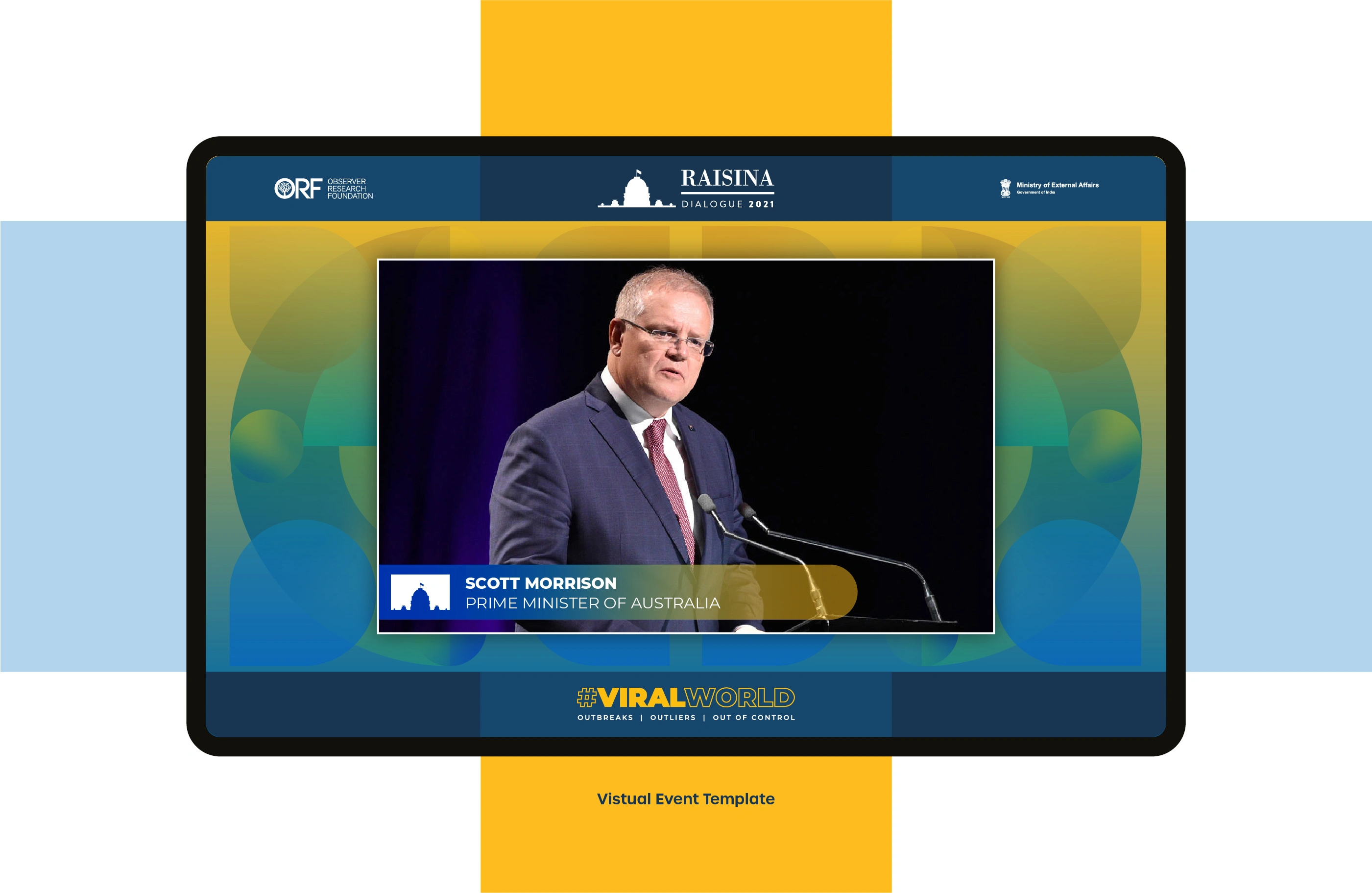
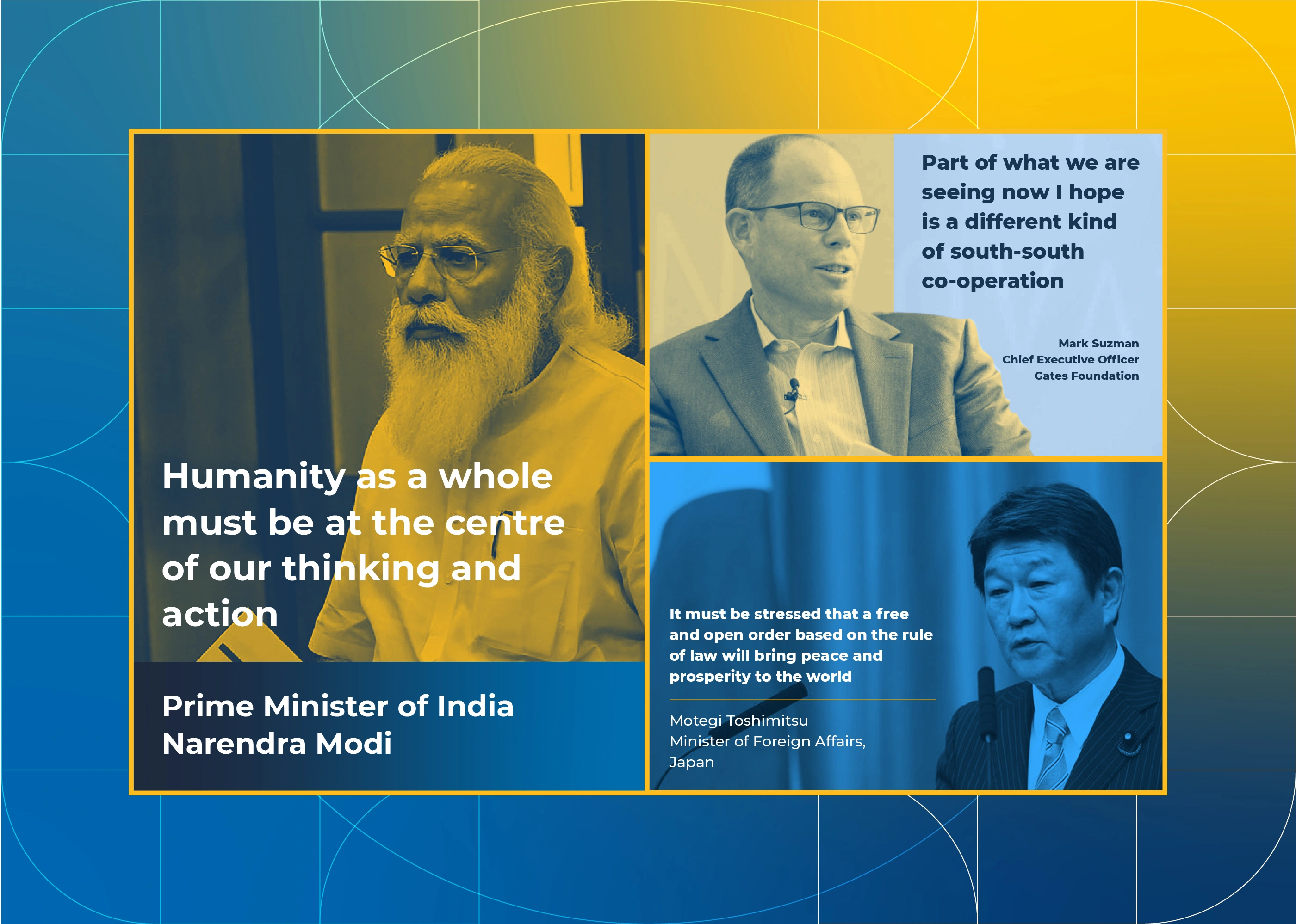
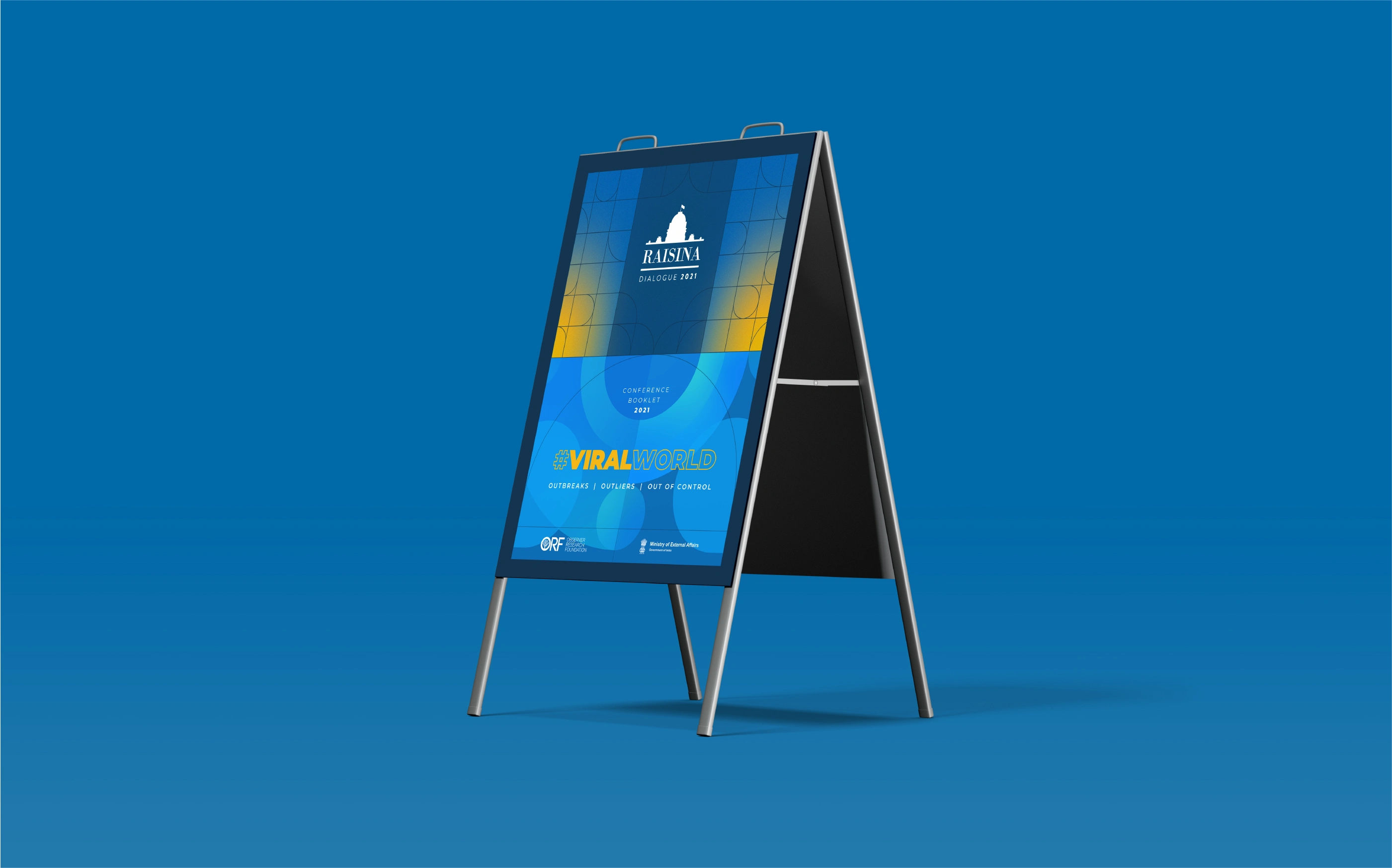
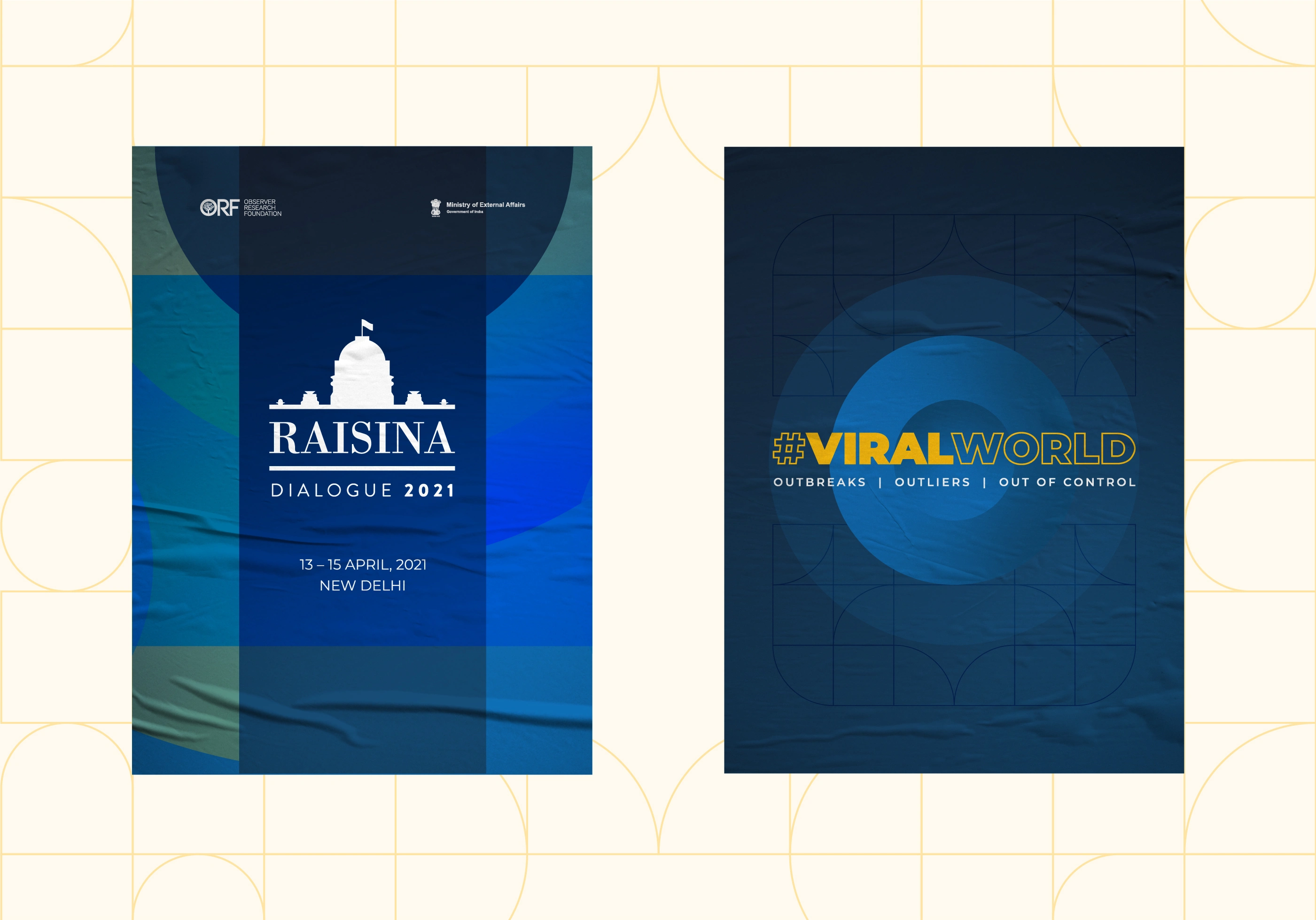
The virtual event template brought the identity into broadcast format, framing speakers within the #ViralWorld visual system. The conference booklet gave the year its physical artefact, with the front cover treating the theme as a visual centrepiece rather than an afterthought. The speaker collage extended the language into social and editorial contexts, putting words from world leaders inside a design system that could hold them.
When the Prime Minister of India, the Prime Minister of Denmark, and the CEO of the Gates Foundation are all speaking inside your layout, the design either holds up or it does not.
It held up.
Raisina Dialogue 2021 was not a rebrand. It was a rescue and a refinement. Taking something with five years of inconsistency and giving it a system it could actually use going forward.
The work required understanding the weight of what the conference represents, a platform where global policy is shaped, and designing something that could carry that without getting in the way of it. Clean, structured, authoritative, and flexible enough to absorb a new theme every year without losing its core identity.
That balance is where the craft lives.
Project Details:
––
Awesome collab with: Made of Us
Sector: Event, Geopolitical
Services: Event branding, Social Media, Publication, Brand Collaterals
Year: 2021
Like this project
Posted Jun 5, 2026
Logo refinement, theme identity, and event collateral for Raisina Dialogue 2021. A conference that hosts world leaders, finally looking like it knows that.
Likes
0
Views
0
Timeline
Feb 21, 2021 - Apr 12, 2021
Clients
Observer Research Foundation