October Restaurant • Brand Identity

Sidharth Singh


October is built on a chef's conviction that food, done right, is its own form of art. The brand needed to show up with the same belief.
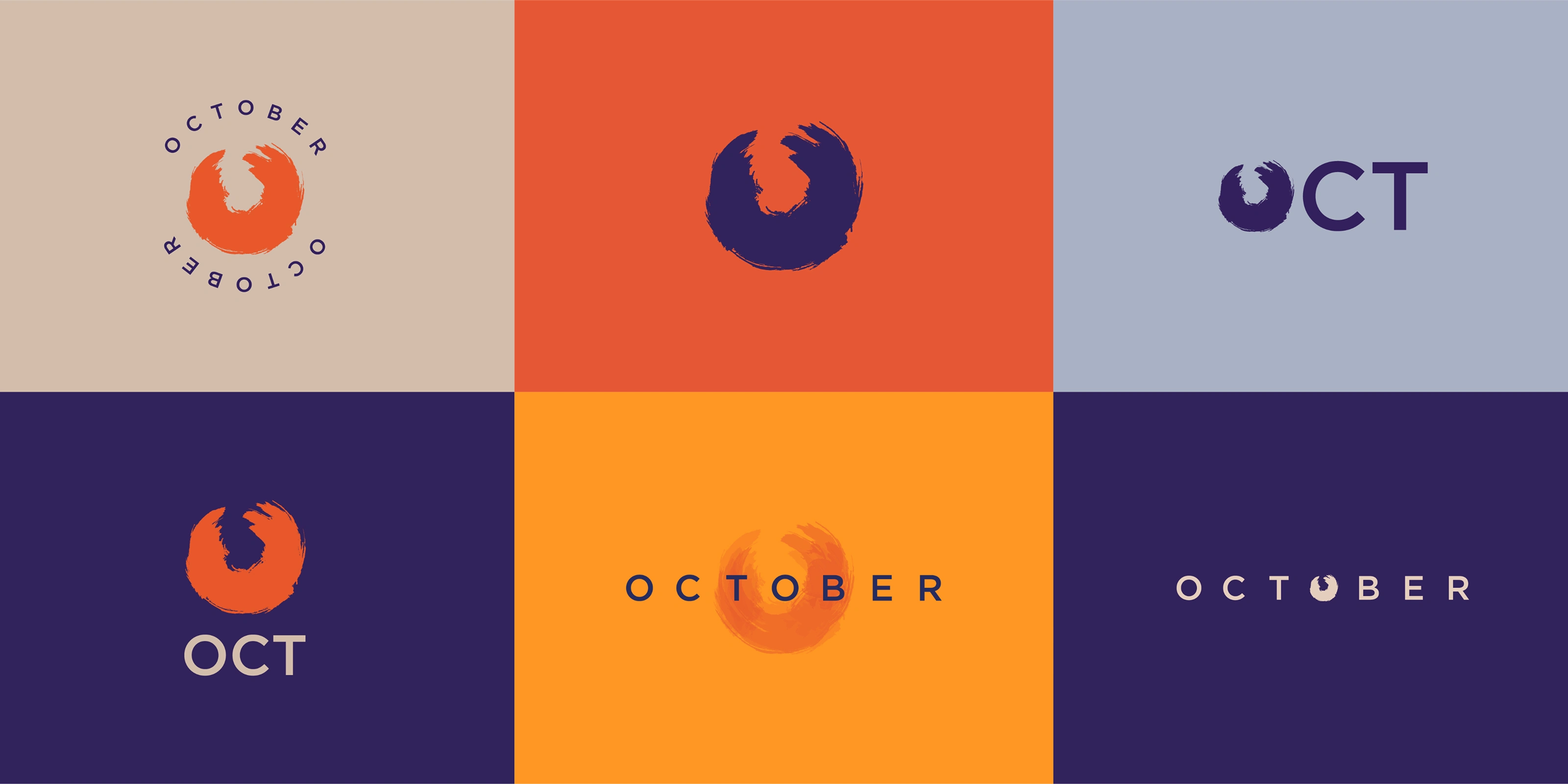
October Logo and variations
October came from a founder who had spent years in Delhi NCR's finest five-star kitchens before deciding to build something of their own. The brief was not just to design a logo for a new restaurant. It was to create a brand that could hold the weight of that conviction, something warm enough to welcome families in for a celebration, distinctive enough to hold its own in a crowded fine dining market, and flexible enough to live across every surface the brand would eventually touch.
From a coaster to a building facade.
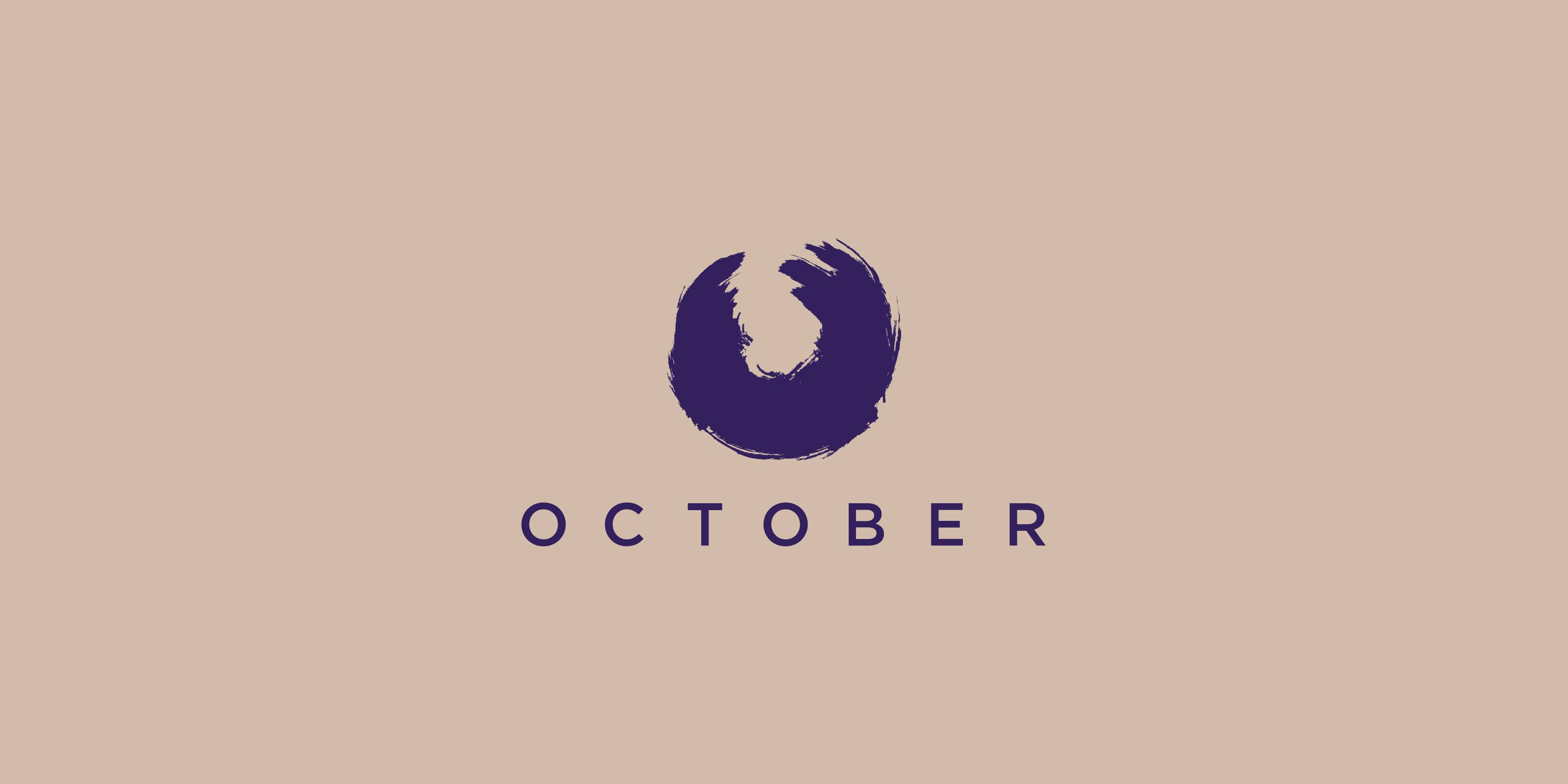
The logo for October starts with one of the oldest shapes in food: the circle. Plates, rotis, pizzas, the rim of a glass, the cross-section of a lemon. Food has always been circular in some way, and so has the experience of eating together, the gathering around a table, the returning to a place you trust.
The mark takes that circle and makes it imperfect on purpose. A bold, hand-brushed stroke forms an abstract O, the brand's initial, without being precious about it. The imperfection is the point. October is not chasing the clinical precision of a fine dining brand that takes itself too seriously. It is celebrating authenticity, the warmth of a kitchen where someone actually cares what lands on your plate.
The brushstroke quality gives the mark energy. It moves. It feels made rather than manufactured, which is exactly what a chef-founded restaurant should feel like.
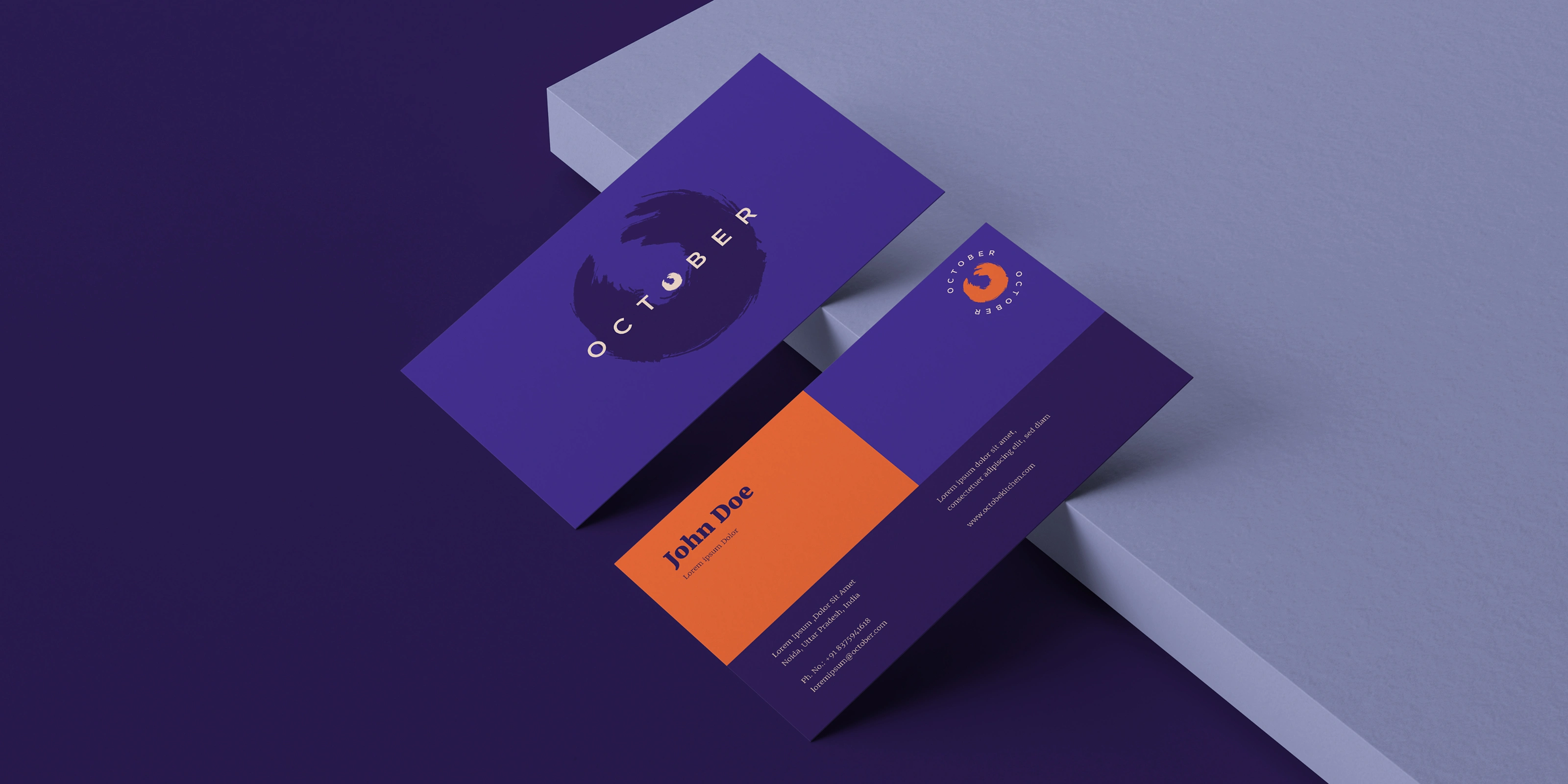
Deep purple and a warm, saturated orange. It is a combination that has no business working as well as it does for a restaurant brand, and yet it works completely. The purple carries the premium register, the sense of an evening out, of something considered and special. The orange brings the heat, the appetite, the energy of a kitchen in full service.
Together they create a brand that feels celebratory without being loud, sophisticated without being cold. The palette was carried consistently across every application from the most intimate touchpoint, a coaster, to the most visible one, an outdoor building facade, and it held its own at every scale.
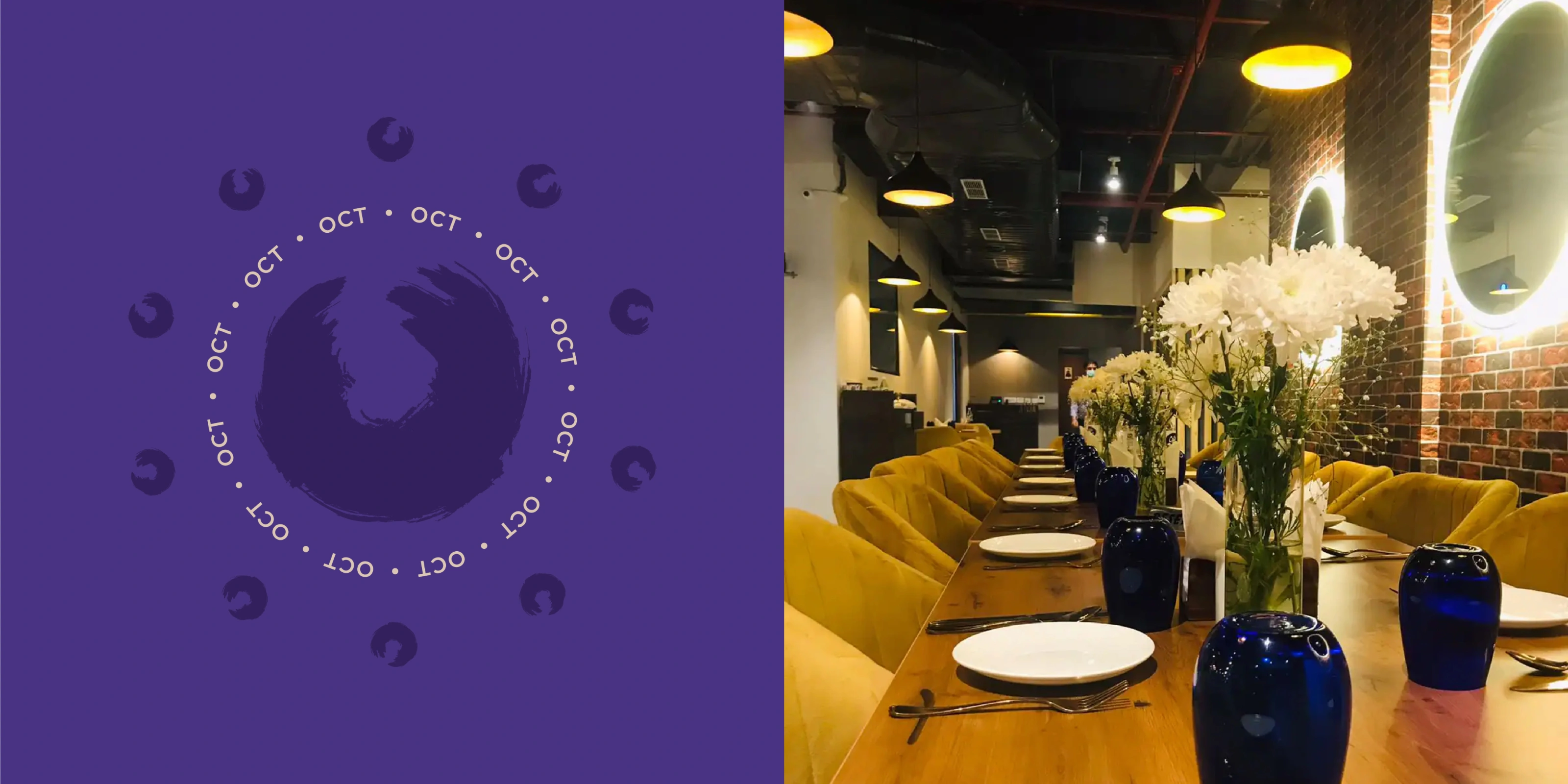
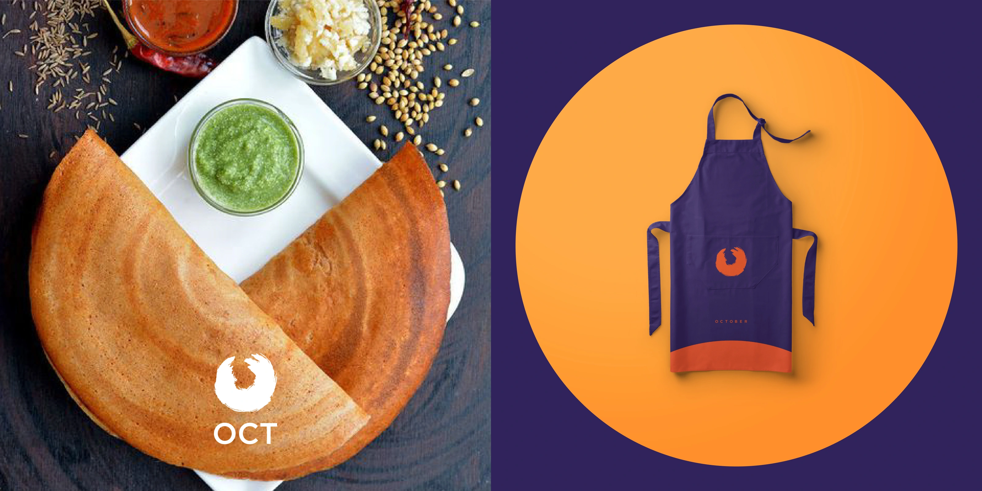
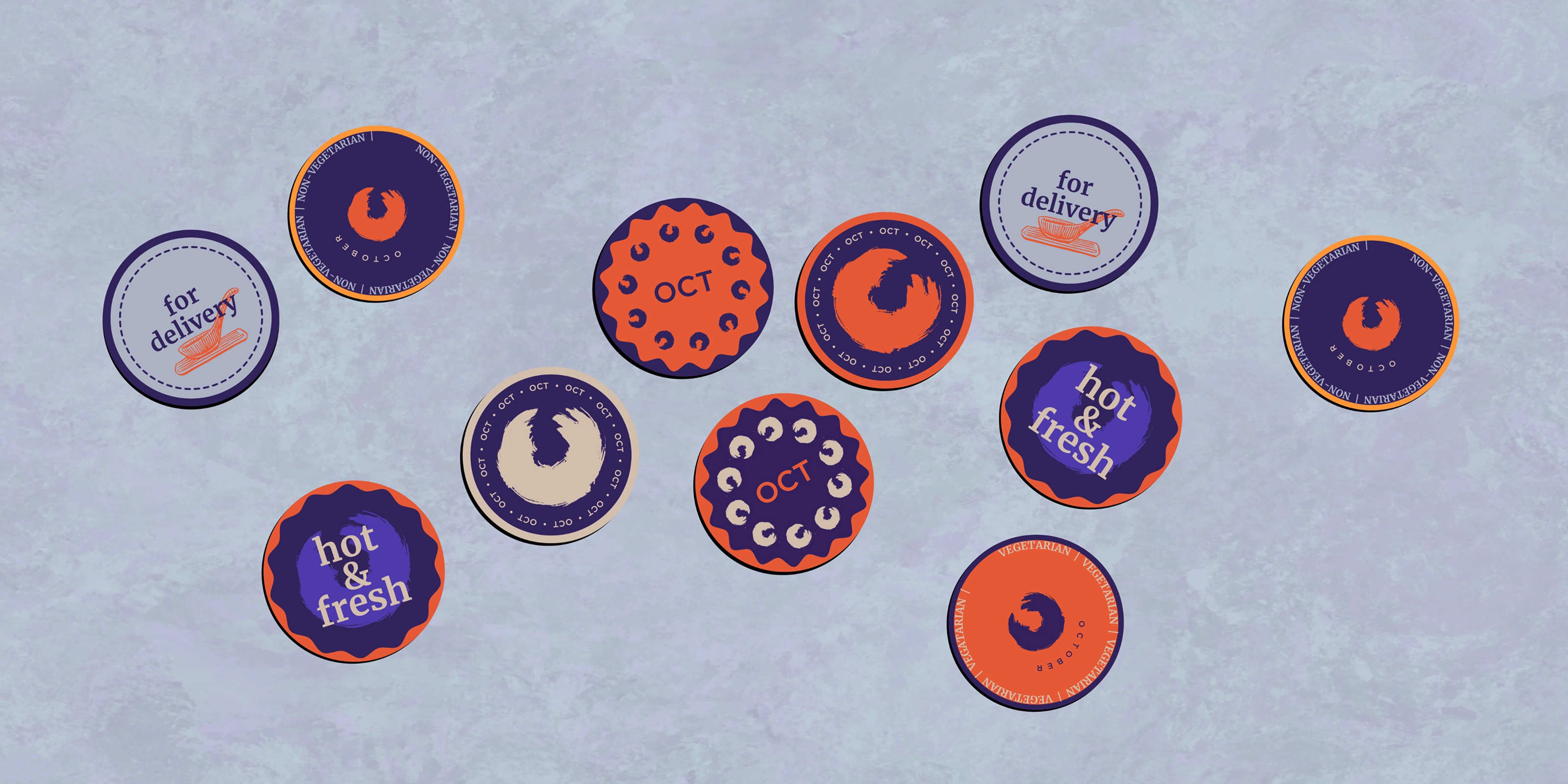
A single mark is rarely enough for a brand that needs to move across formats and contexts. October's identity was built as a system from the start, with the full wordmark, an abbreviated OCT lockup, and the standalone circular emblem each serving a distinct role depending on where the brand was showing up.
The abbreviation gave the brand a shorthand that felt confident rather than compressed. OCT on a coaster or a uniform badge reads differently than the full wordmark on a menu cover, but both come from the same visual logic. That flexibility was built in deliberately, not figured out later when someone needed it.
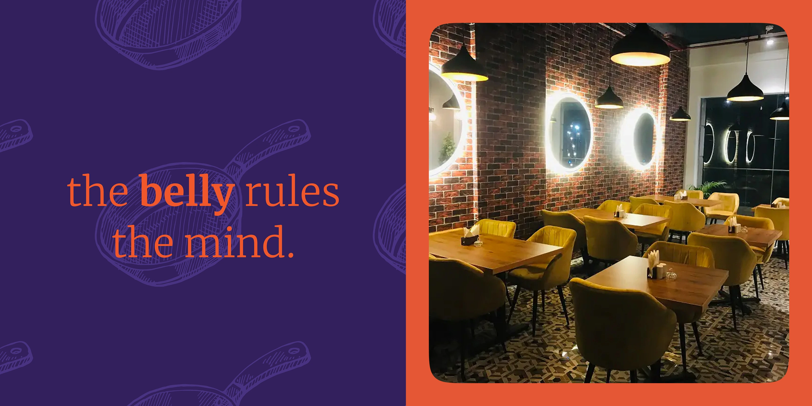
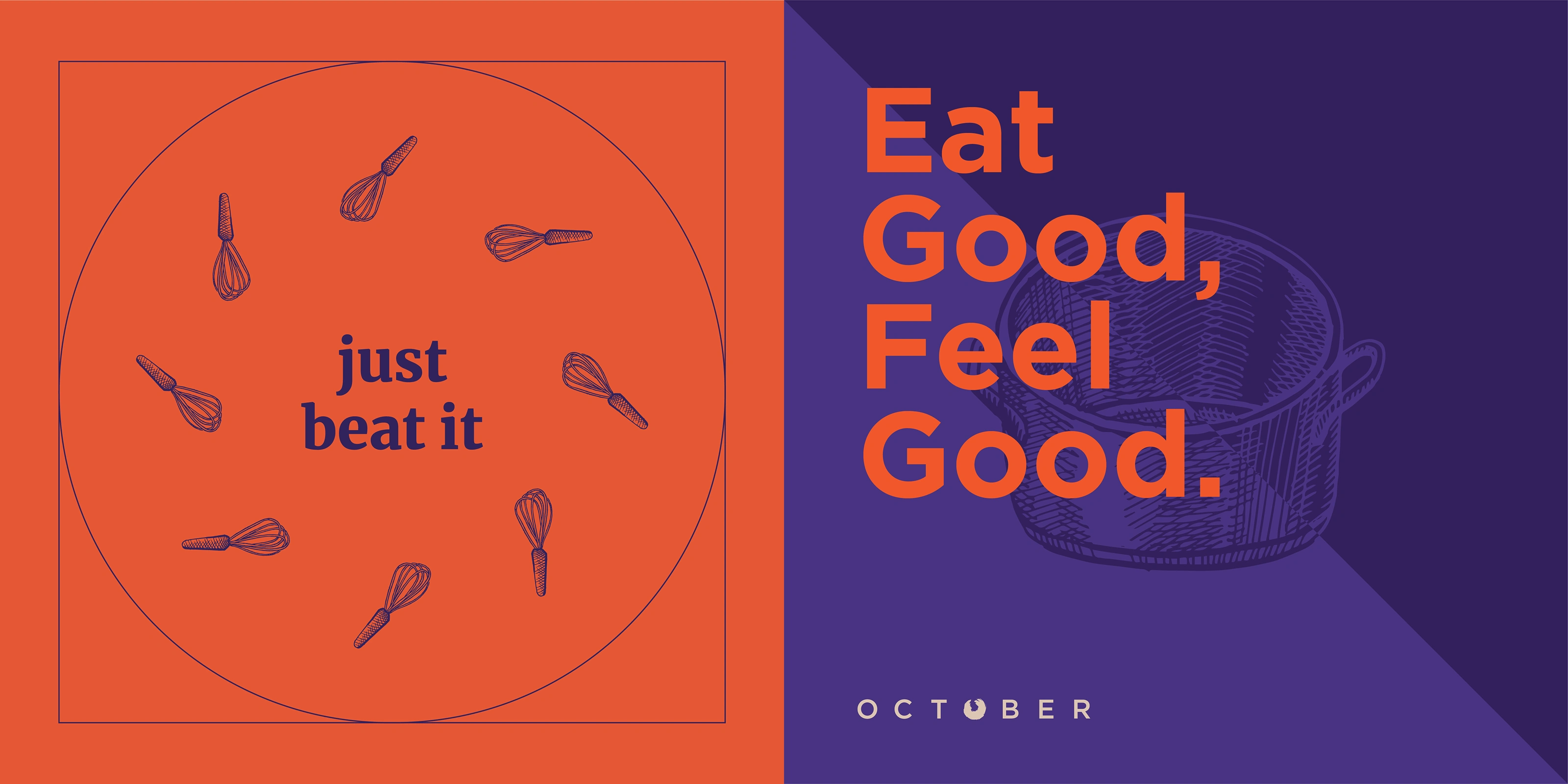
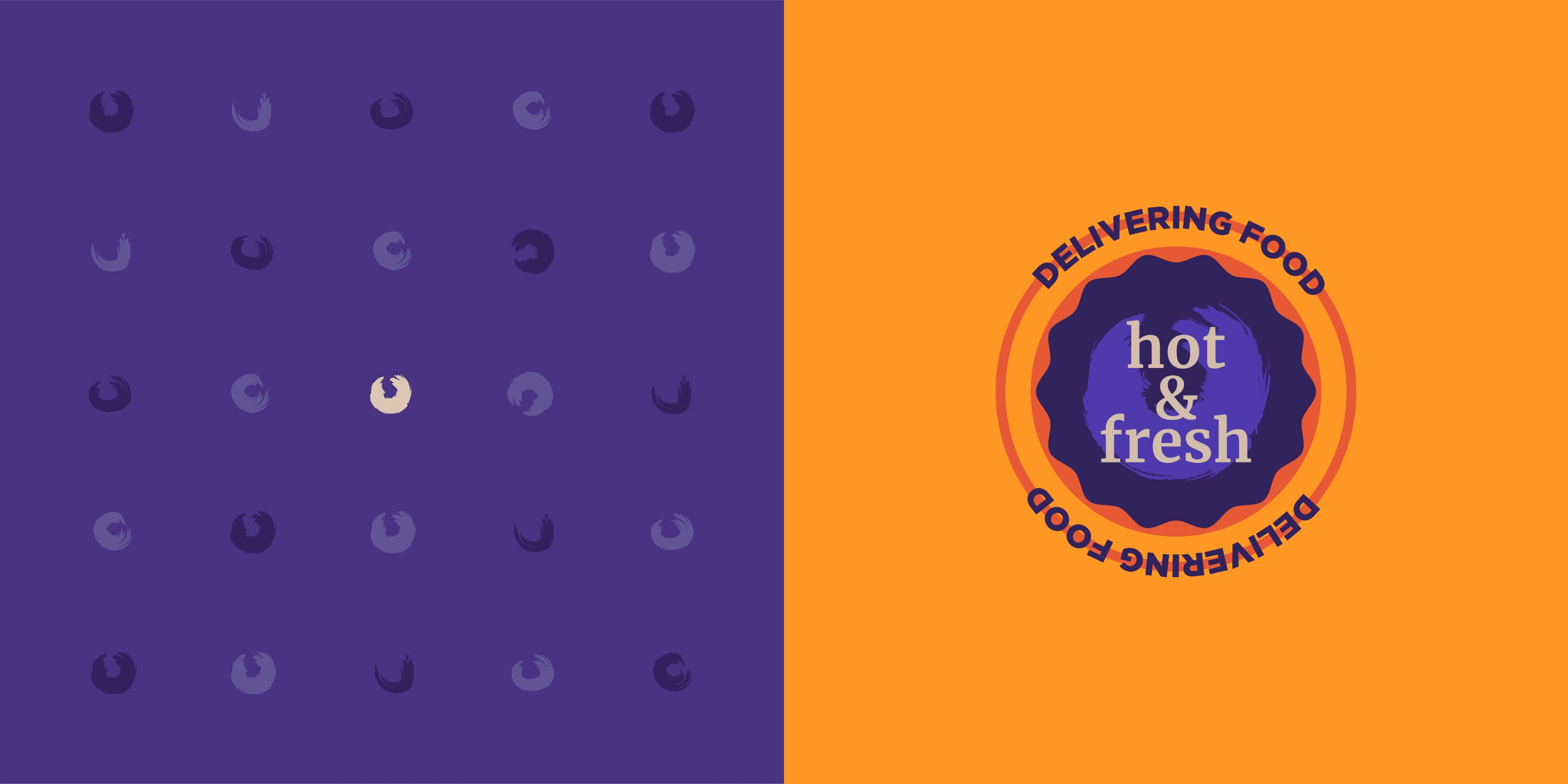
A brand that only communicates visually is only half built. October's identity included a set of brand voice lines that gave the restaurant something to say across every surface that carried text. "Eat Good, Feel Good." "Hot and Fresh." "The belly rules the mind." "Celebrate Food, Life, Family."
These are not taglines designed by committee. They are lines that sound like someone who actually loves food wrote them. Direct, warm, a little bit irreverent, and completely in keeping with the founder's conviction about what October was for. The voice and the visual identity were developed together so that neither one was doing more work than the other.
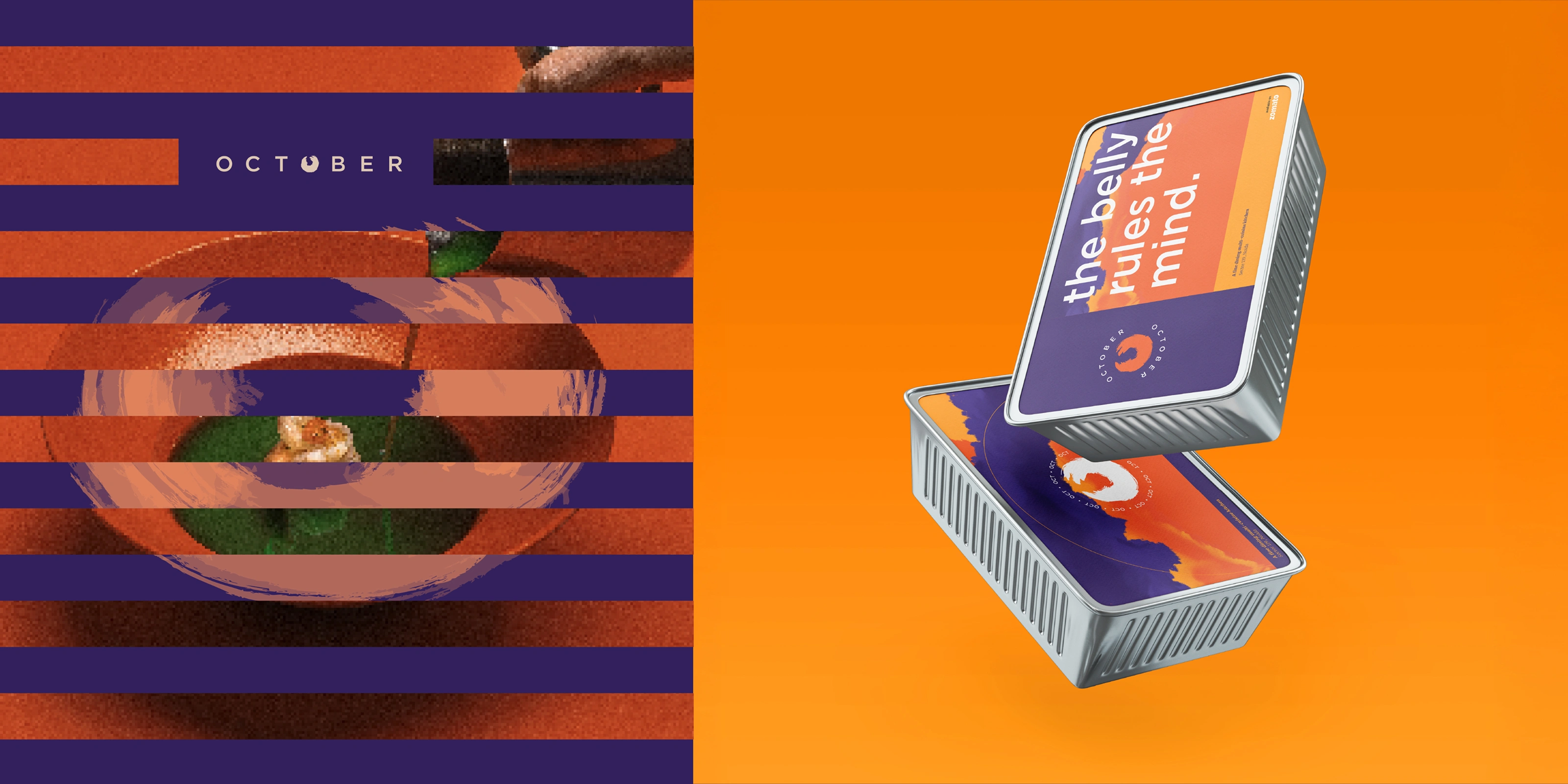
The packaging system carried the brand's colour world into three dimensions. Deep purple boxes with orange detailing, built for the kind of meal that gets taken home or sent as a gift, not just consumed and forgotten.
Getting packaging right for a restaurant brand is a specific challenge because the box is the last thing a customer holds before the food itself. If it feels considered, it extends the experience. If it feels generic, it undercuts everything the brand has built up to that point. October's packaging felt like it belonged to the same world as the dining room.
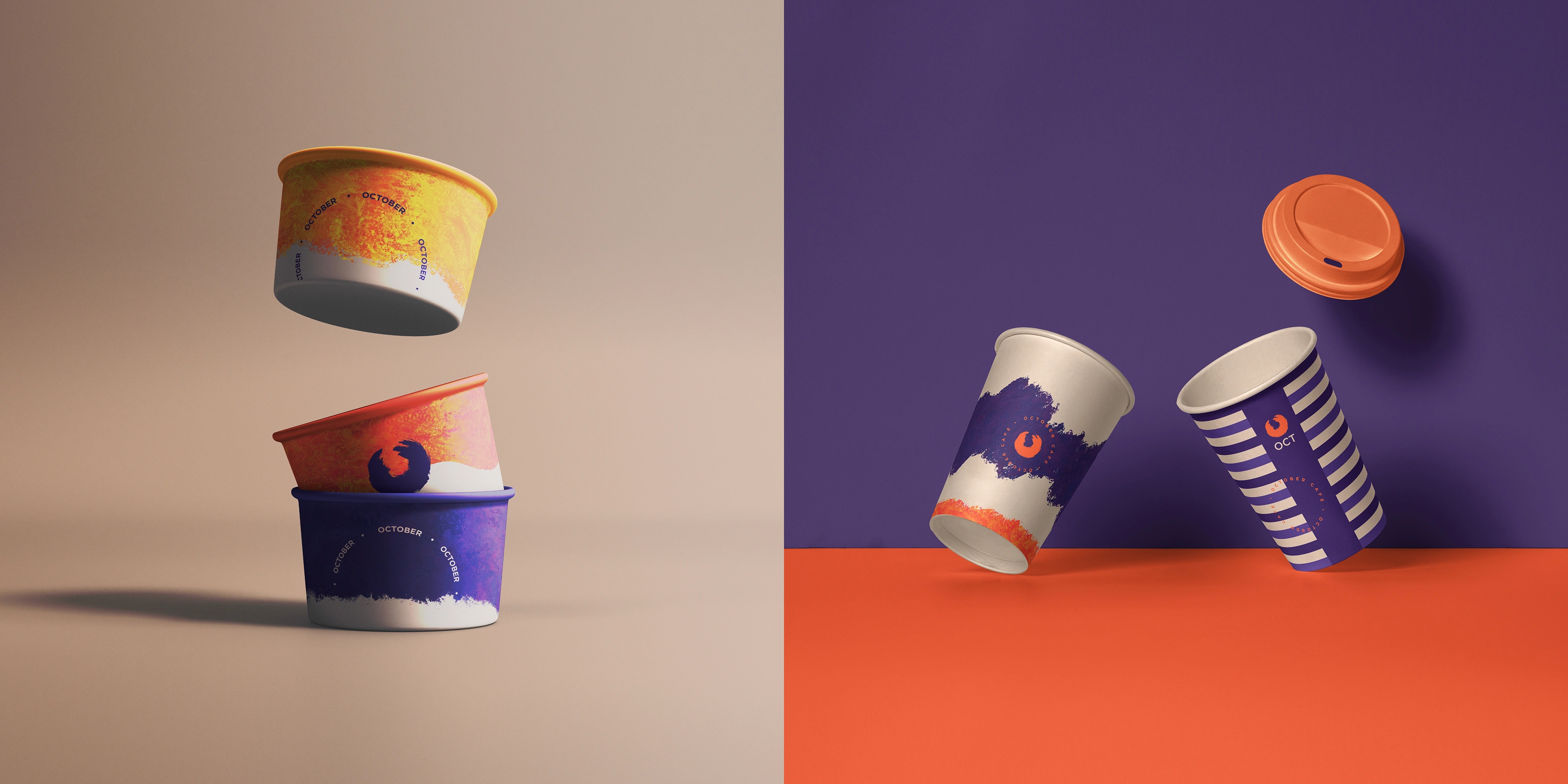
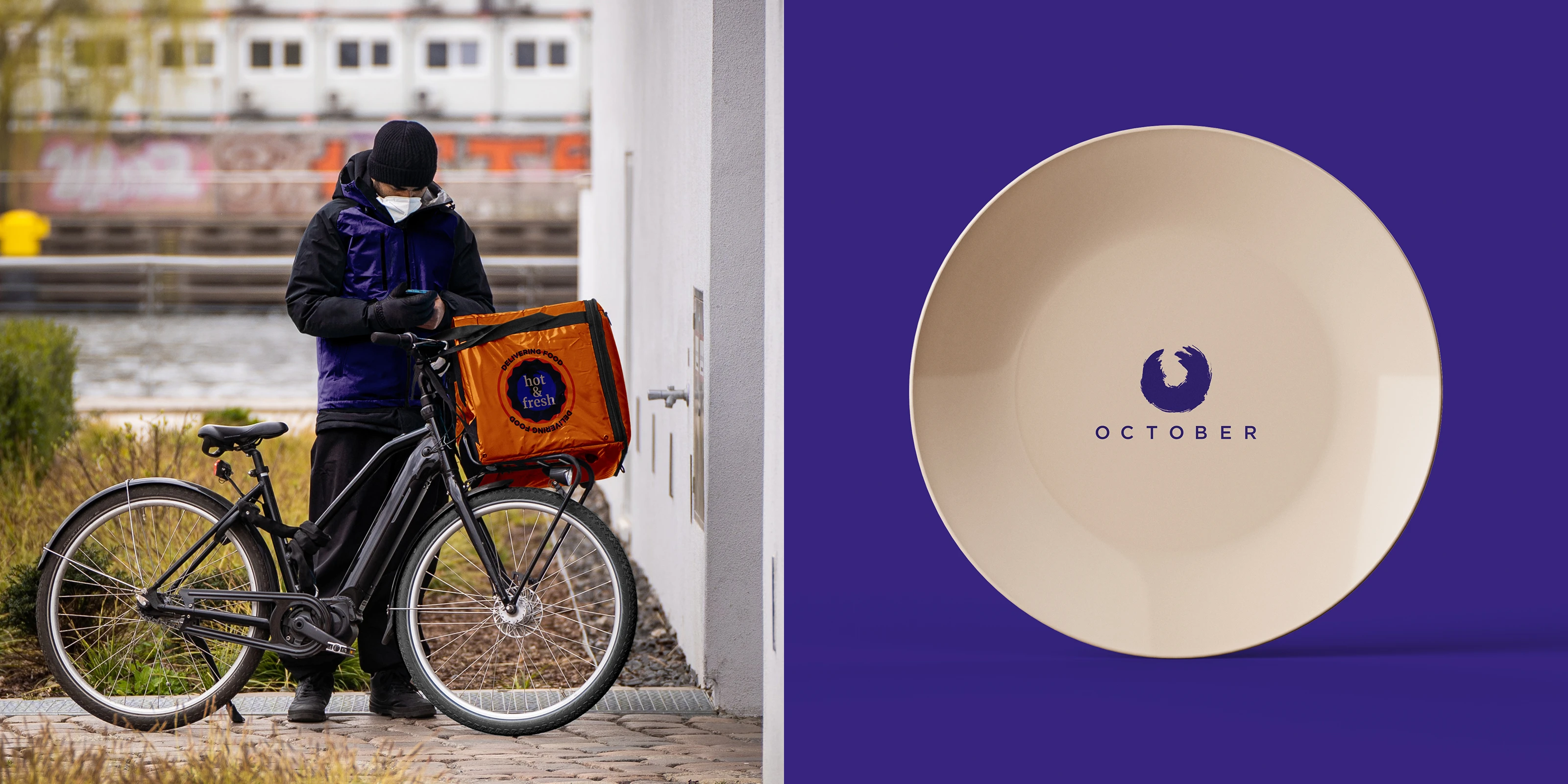
The brand lived inside the restaurant as much as it did outside it. The circular emblem translated onto crockery, coasters, cups, and condiment bottles with the same quiet confidence it had in the logo. These are the details that most restaurant brands skip or hand off to a supplier's stock catalogue.
Getting the in-restaurant touchpoints right matters because they are what a guest actually interacts with during the meal. The plate they eat from, the coaster under their glass, the cup their coffee arrives in. Each one is a moment where the brand either shows up or disappears. October showed up.
The identity extended to the people who represent the brand on the floor every day. Staff aprons carried the October mark cleanly, giving the team a visual presence that matched the quality of the space around them. Delivery riders wore the brand too, taking it out into the city and making it visible well beyond the restaurant's walls.
A brand that stops at the door of the dining room has not really been implemented. When the person taking your order and the person delivering your takeaway are both carrying the same identity, the brand becomes something the guest encounters consistently rather than intermittently.
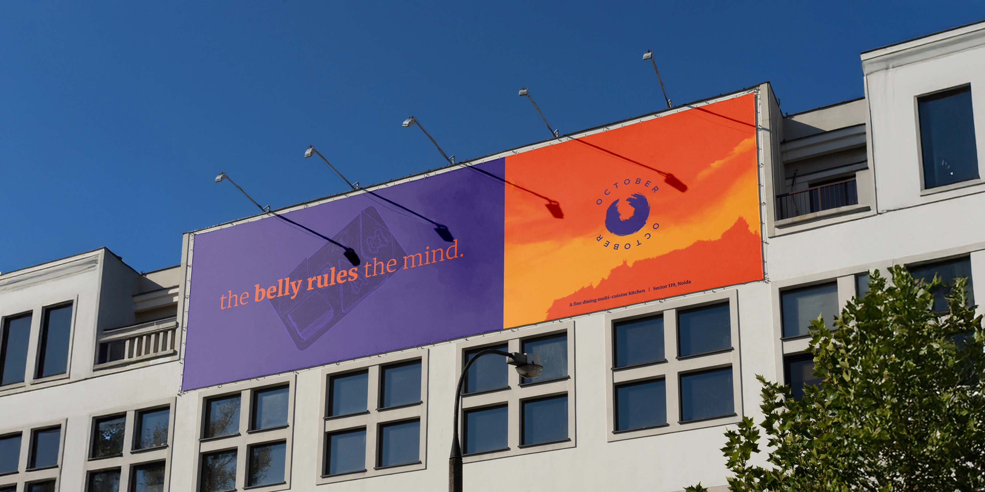
The outdoor signage application is where the brand's colour confidence paid off most visibly. Orange and purple across a building facade, banner flags carrying the October identity at scale, visible from a distance and impossible to confuse with anything else on the street.
Environmental design is where a lot of restaurant brands either lose their nerve and go generic or overcomplicate things and lose legibility. October stayed true to the palette and the mark, scaled it up without diluting it, and the result is a presence that makes the location itself part of the brand experience.
Beyond the core identity applications, the brand system extended into print collateral including a calendar that carried the visual language into a format guests could take home and live with. These are the extensions that build familiarity over time, the brand showing up in unexpected places and reinforcing itself without demanding attention.
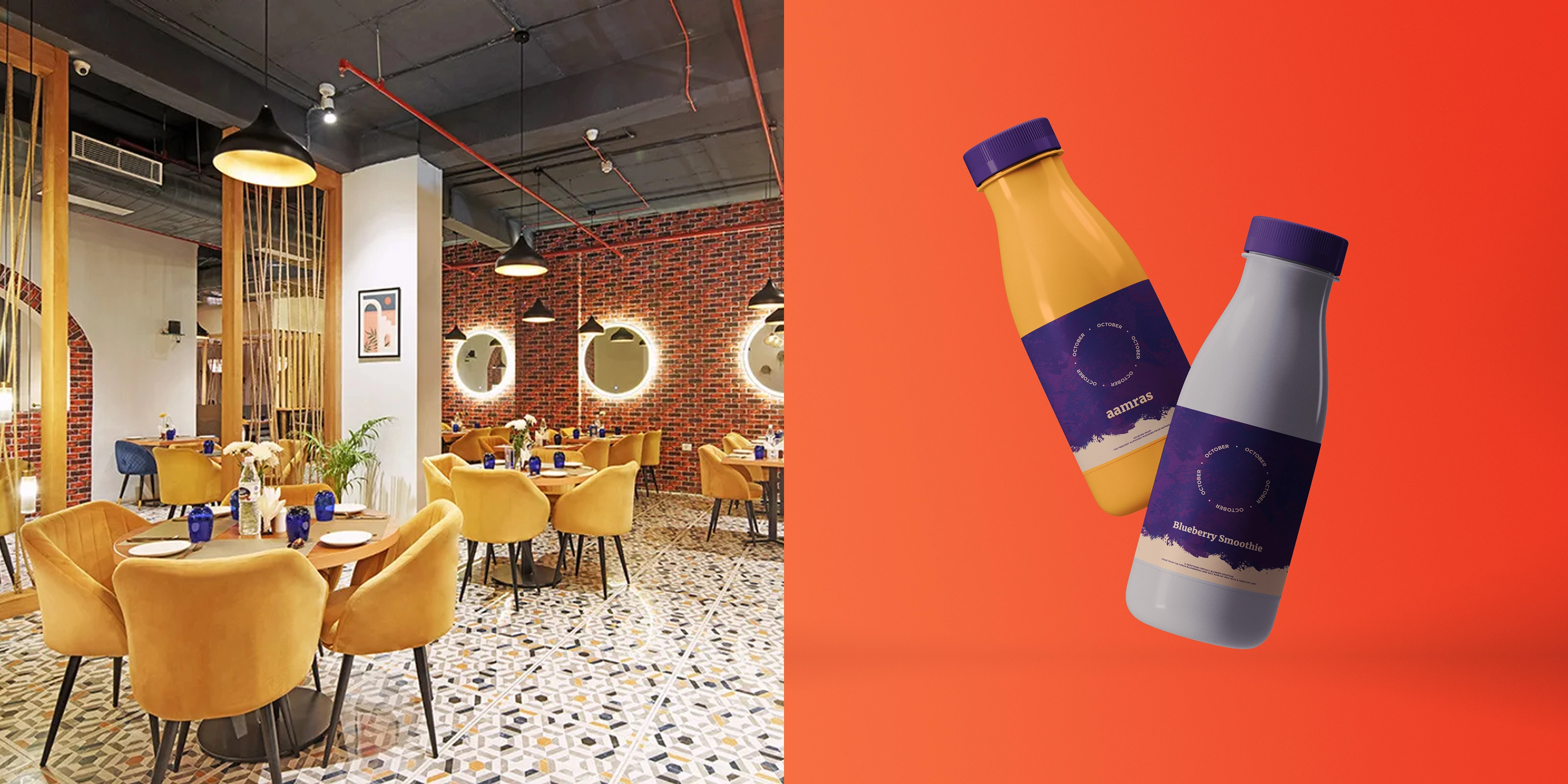
The beverage bottle identity, the salt and pepper set, the interior details of the dining space: each one was an opportunity for the brand to be consistent, and each one was treated as such.
The measure of a well-built brand identity is not how good the logo looks in isolation. It is whether someone walking into the restaurant for the first time, sitting down, picking up a menu, ordering, eating, paying, and leaving, experienced something that felt like it all came from the same place.
October was built to pass that test. From the brushstroke mark to the building facade to the delivery bag on a rider's back, every touchpoint was part of the same conversation. That is what brand design is actually for.
Some of the best briefs come from people who have spent years getting good at something before deciding to build something of their own. October was that kind of brief. The conviction was already there. The job was just to make sure the design matched it.
Like this project
Posted Aug 18, 2026
Fine dining lives or dies on how people feel before the first course lands. October needed an identity that carried that. We designed the feeling.