Notato ✦ Branding & Packaging

Pranjal Kins


Overview
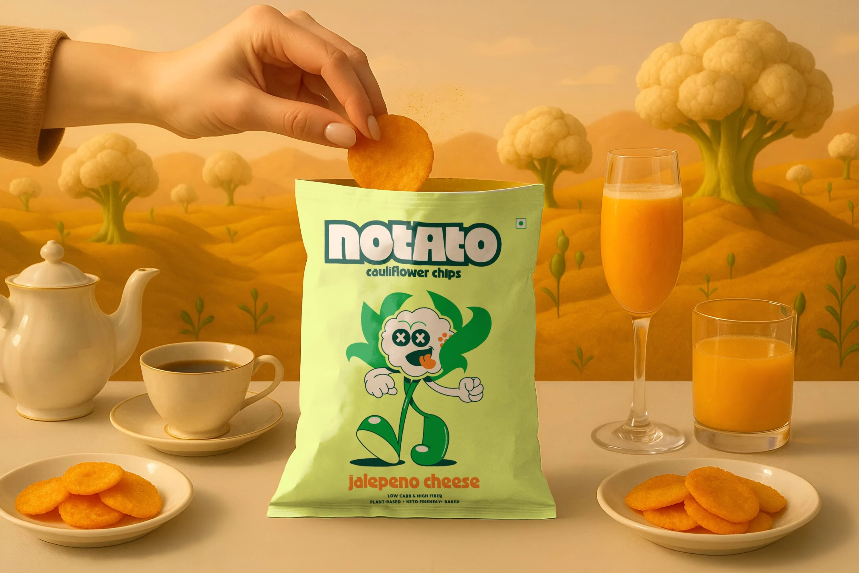
How do you make cauliflower the belle of the ball in a world dominated by potato chip heavyweights?
Notato, the new kid on the snack block, was ready to shake up the chip aisle with their cauliflower chips. They needed a brand identity and packaging design that could turn heads and tickle taste buds.
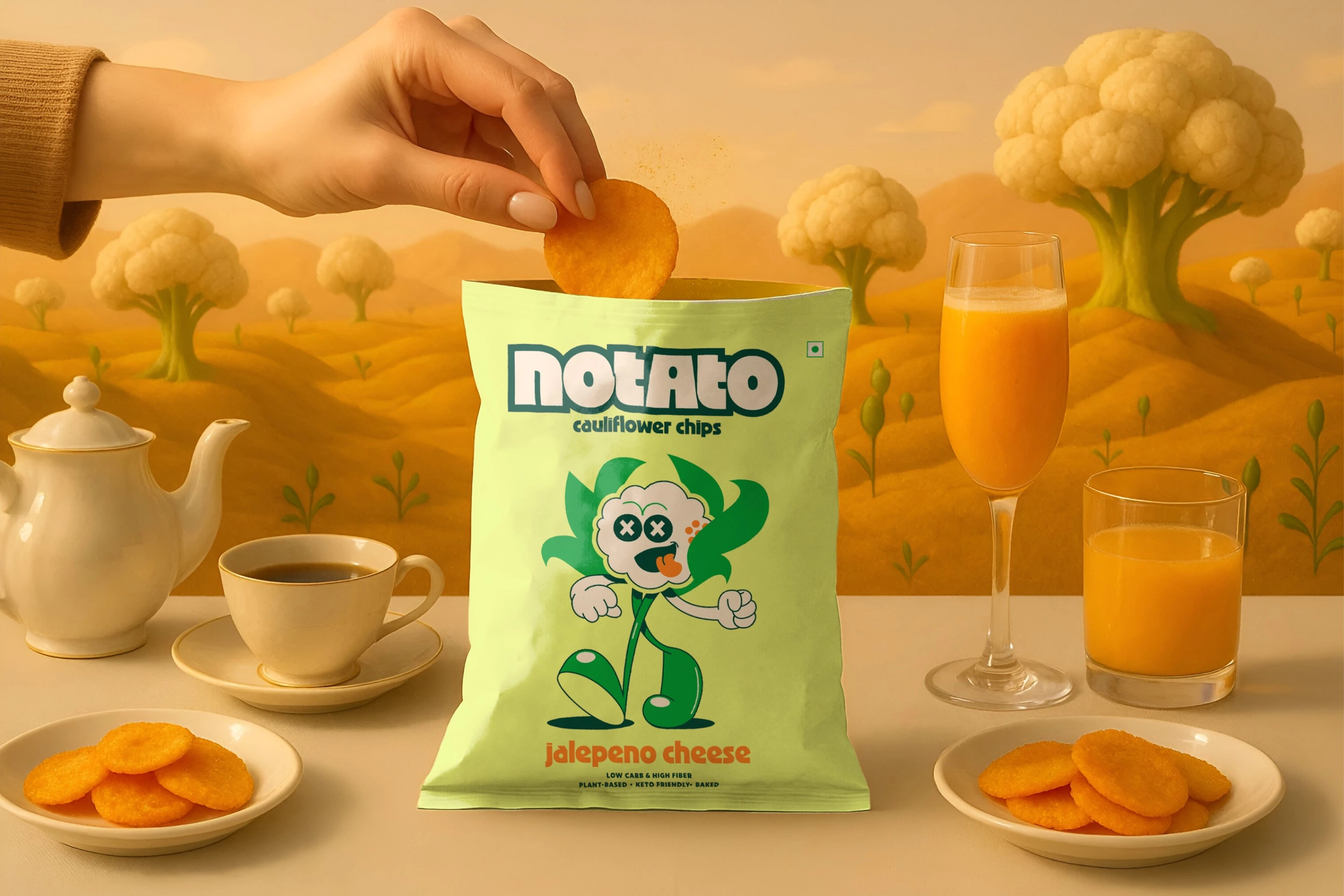
Notato product lineup
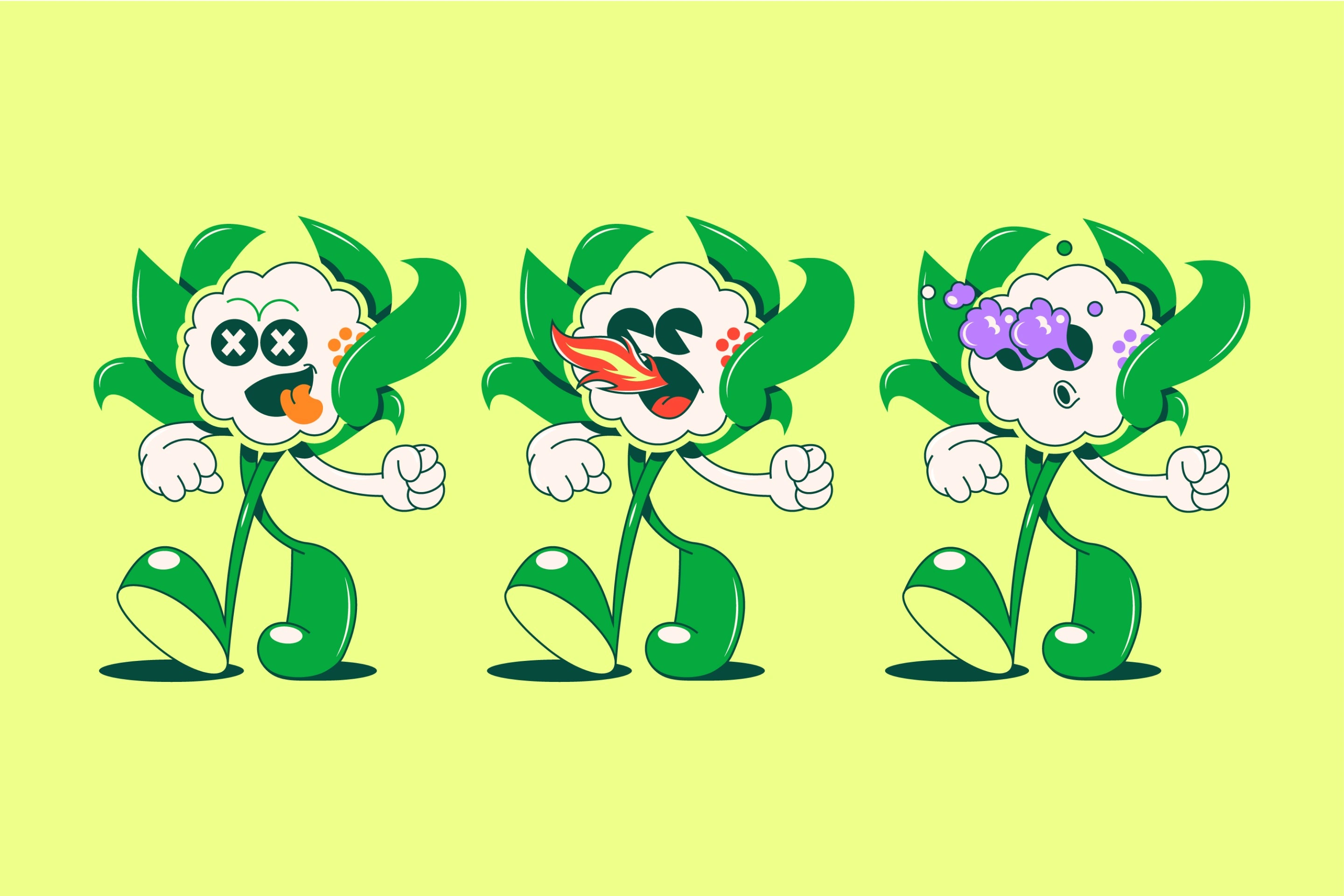
Notato brand overview
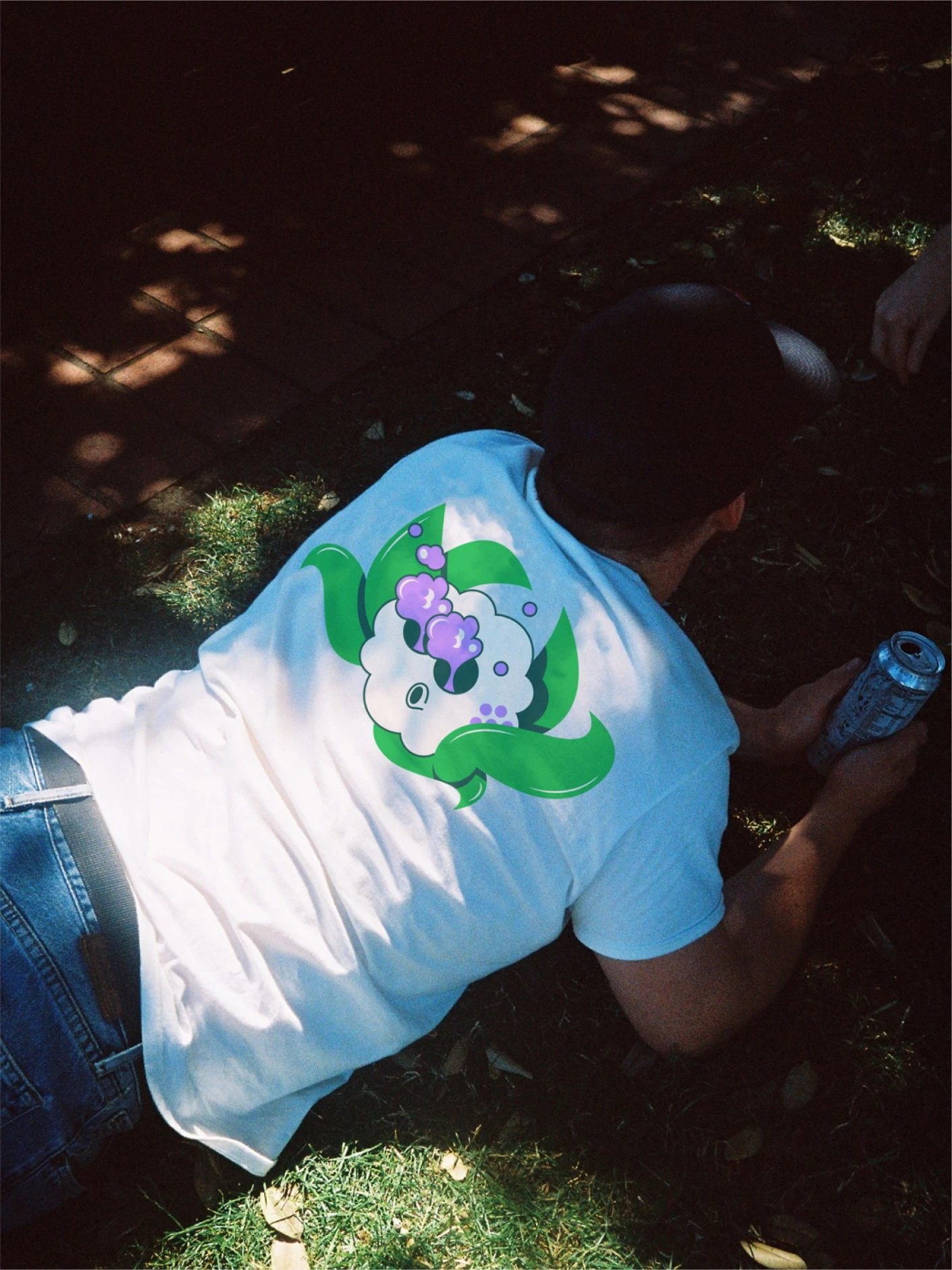
Packaging detail, front A
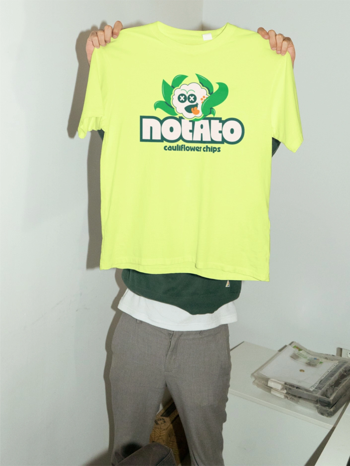
Packaging detail, front B
Our Approach
We built a playful yet powerful brand identity anchored by a bold mascot and dynamic visuals that clearly communicated health benefits without compromising on snack-time appeal.
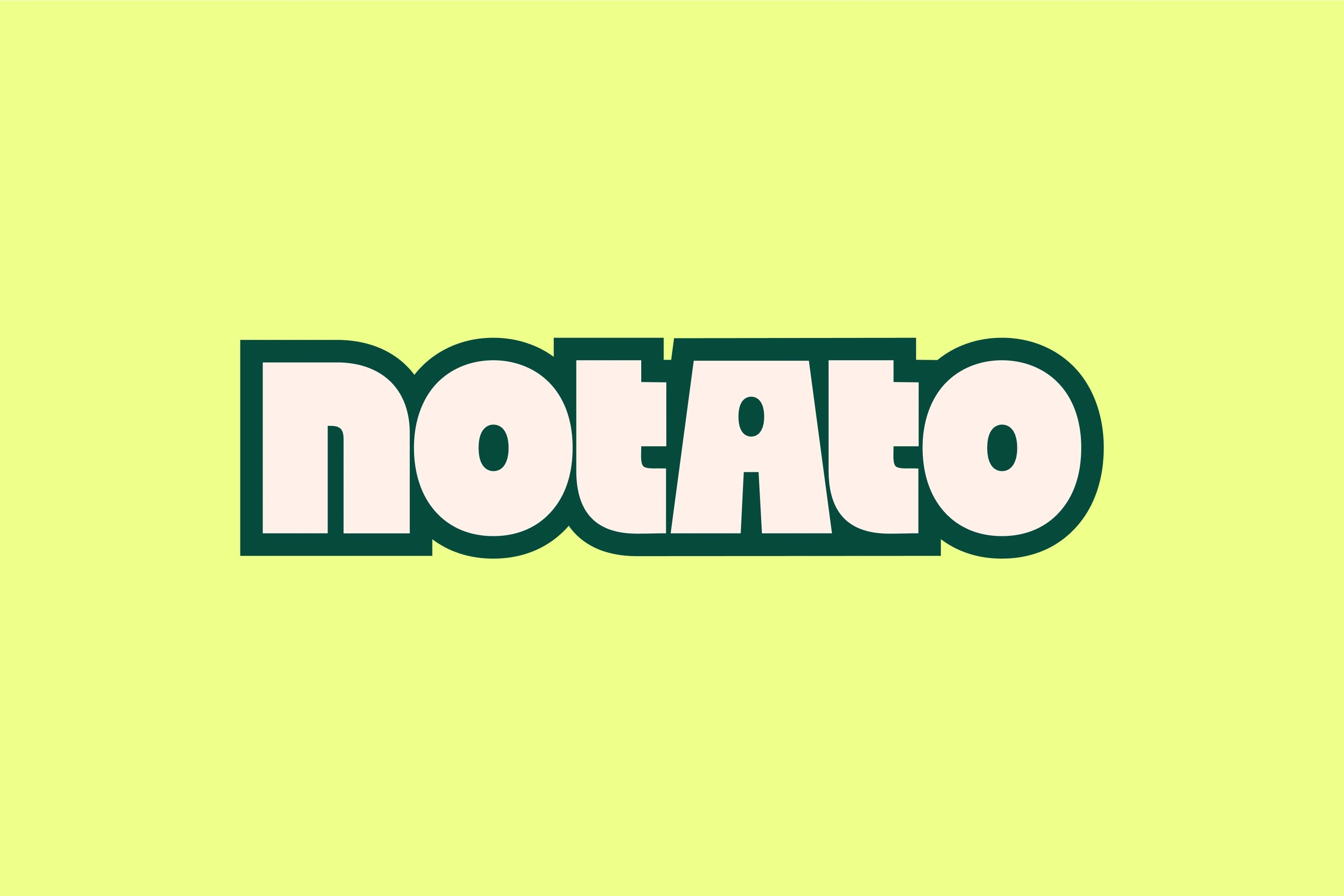
Mascot and logo system
A memorable logo featuring a stylized cauliflower character set an engaging tone, highlighting the snack's playful personality while subtly nodding to its health-driven roots.
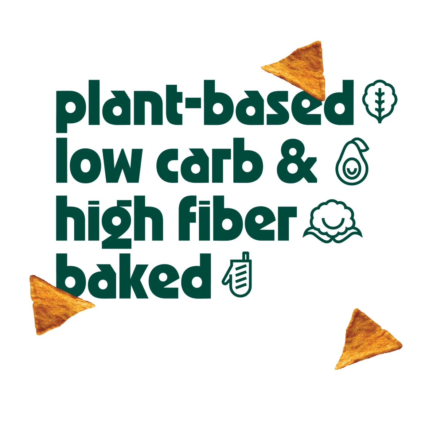
Mascot detail, square A
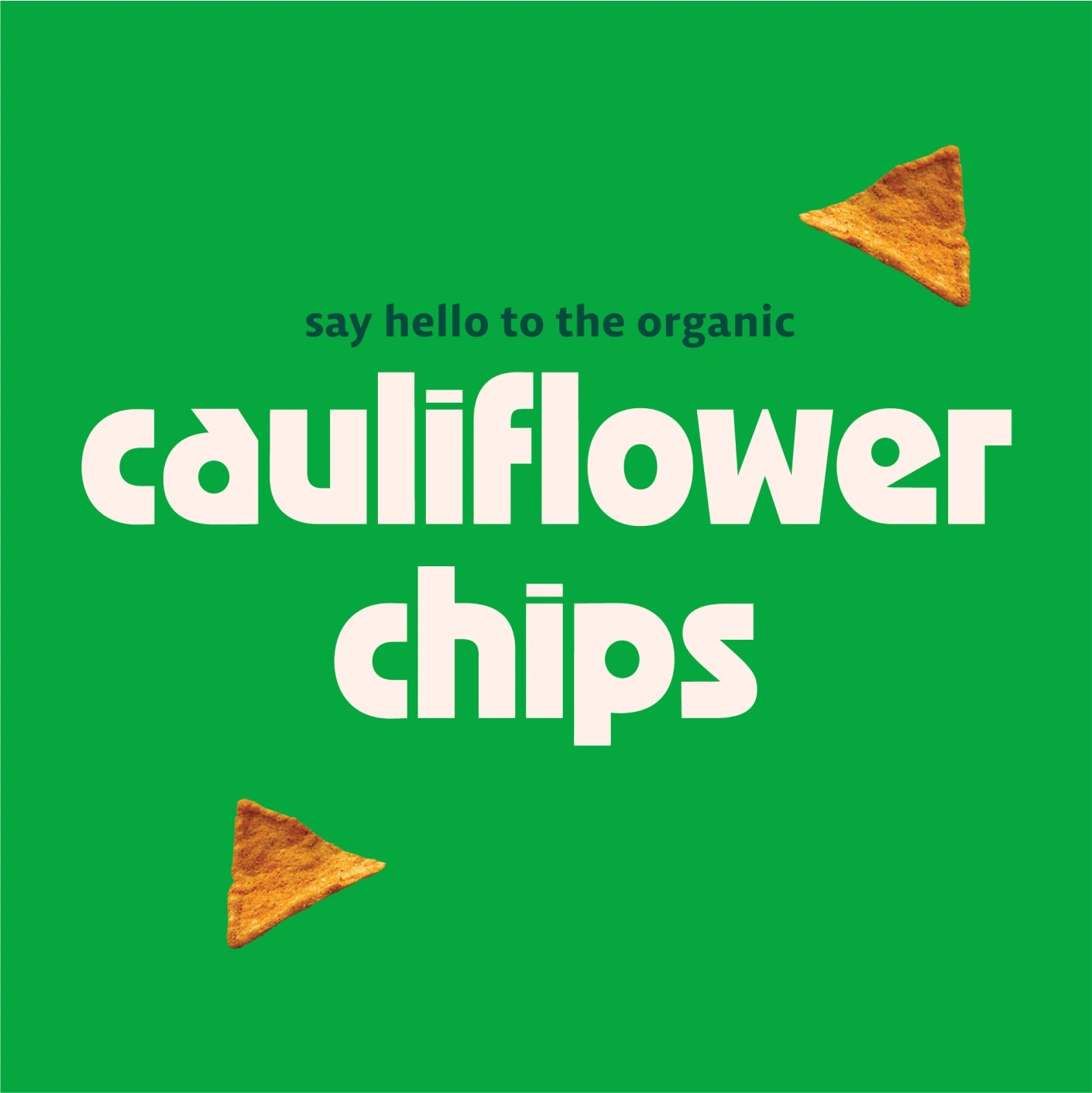
Mascot detail, square B
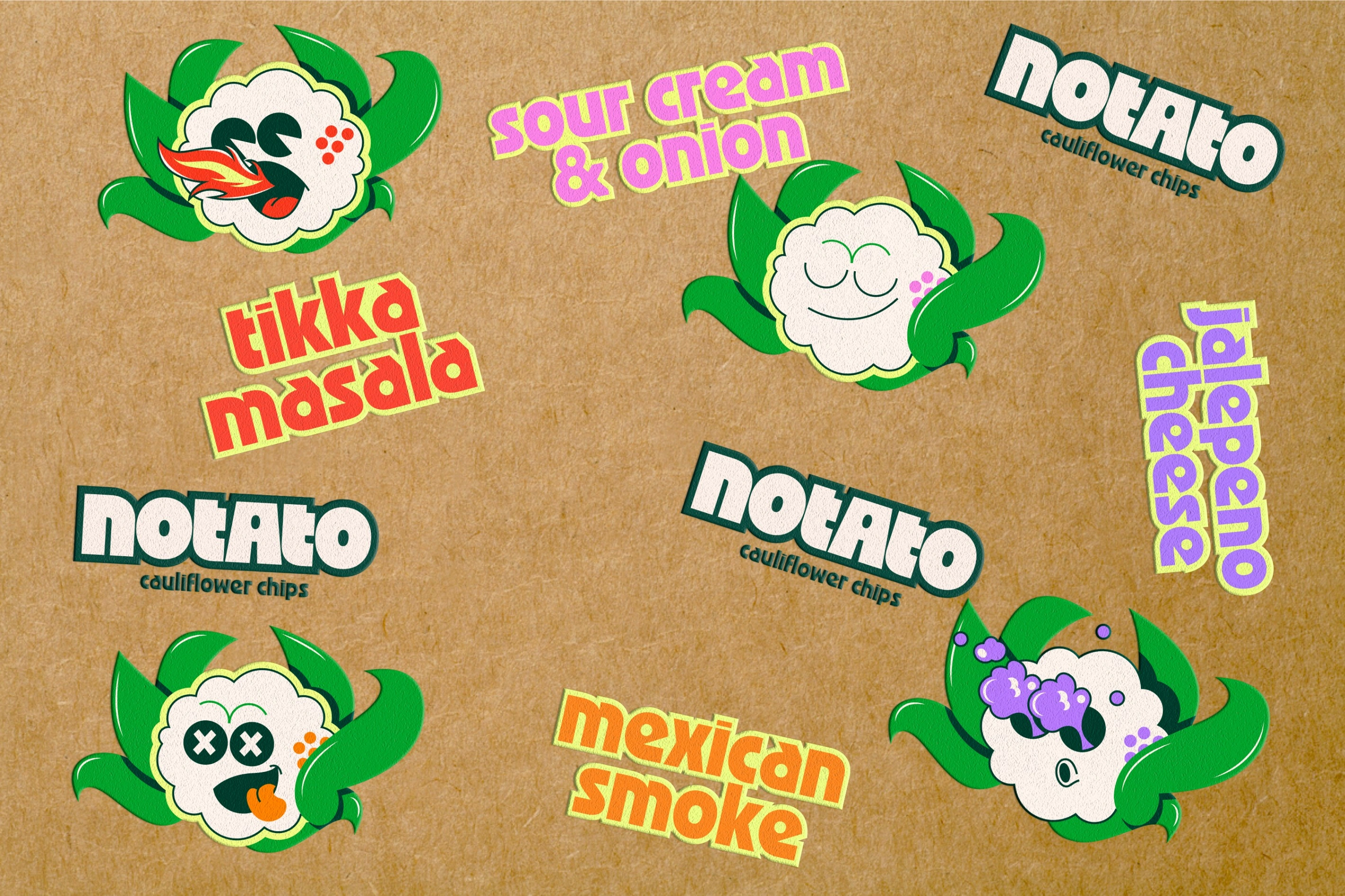
Packaging spread
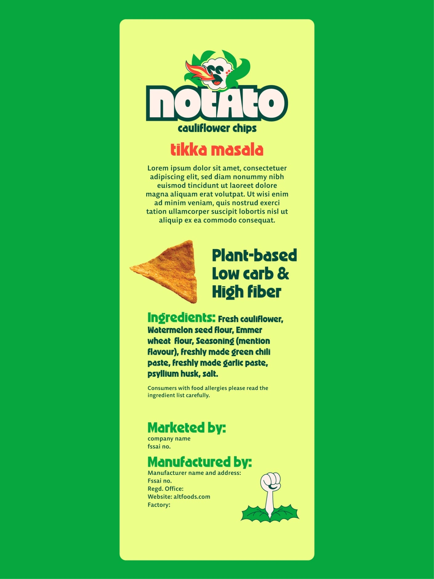
Packaging variant, vertical A
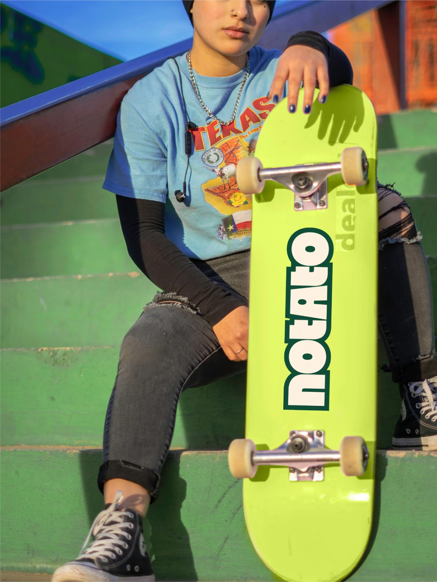
Packaging variant, vertical B
Brand Identity
The new identity positioned Notato prominently within a competitive market, creating instant recognition and capturing consumer attention. Cauliflower chips are no longer the underdog, they're the unexpected favorite.
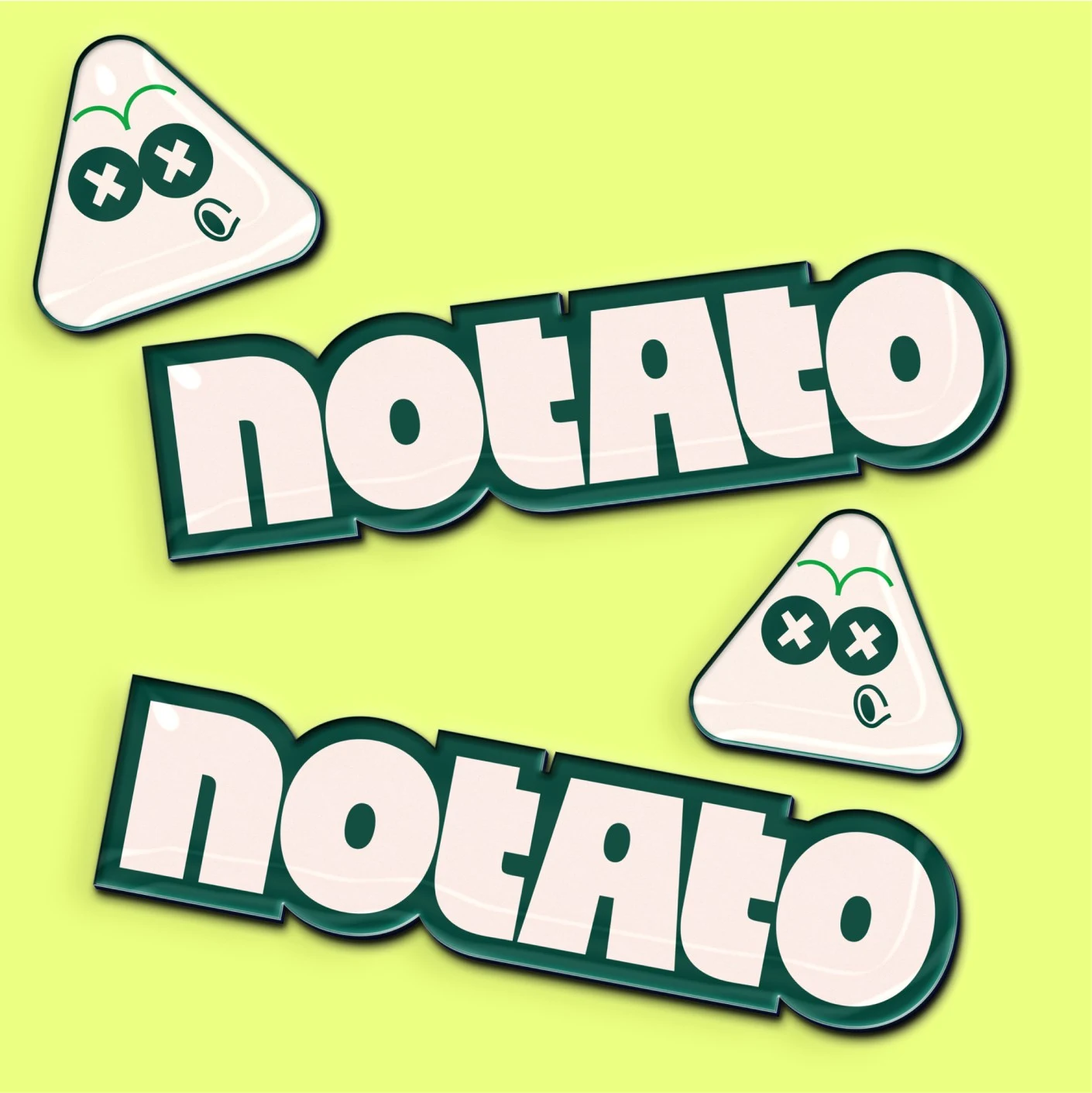
Brand application, square A
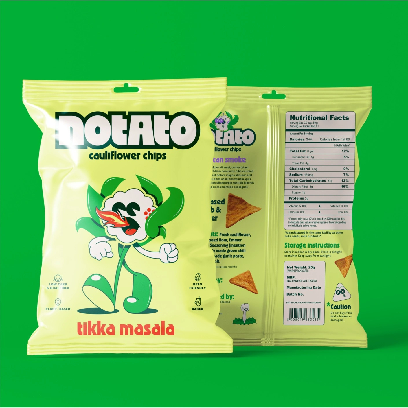
Brand application, square B
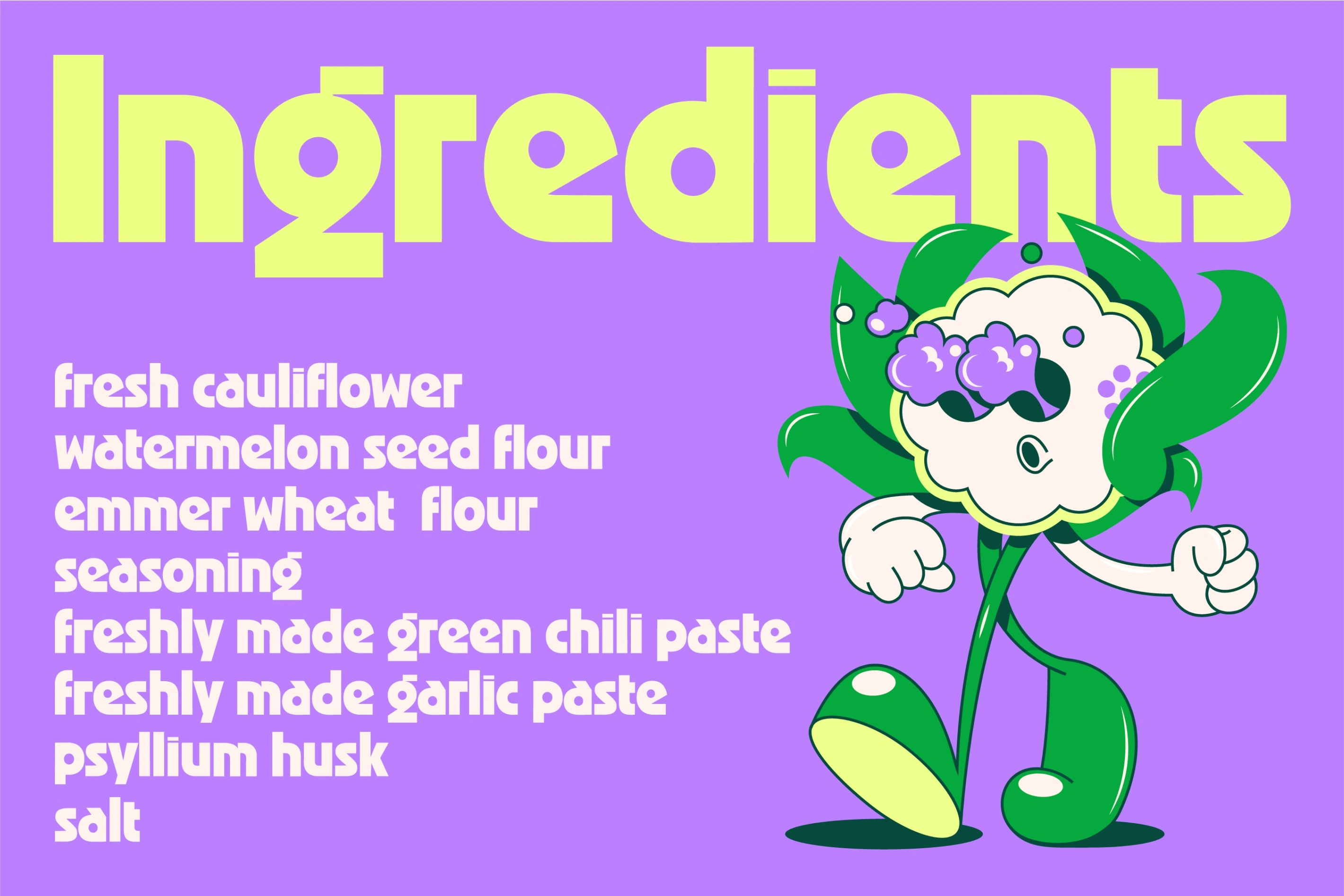
Brand system, horizontal
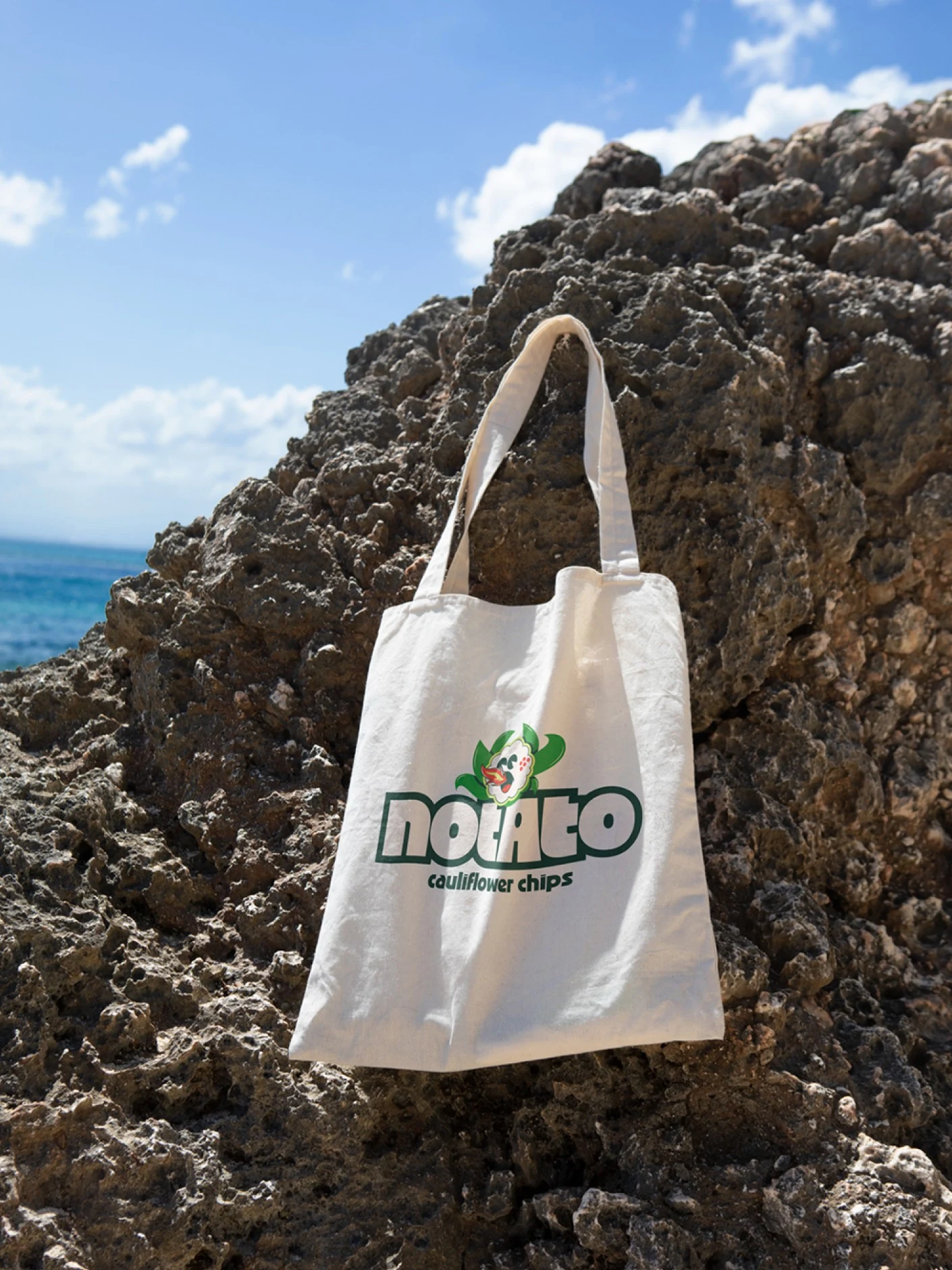
Brand application, vertical
Flavorful Storytelling
Distinctive identities for each flavor variant were crafted to amplify Notato's brand personality, transforming the experience of selecting chips into a fun, flavorful exploration.
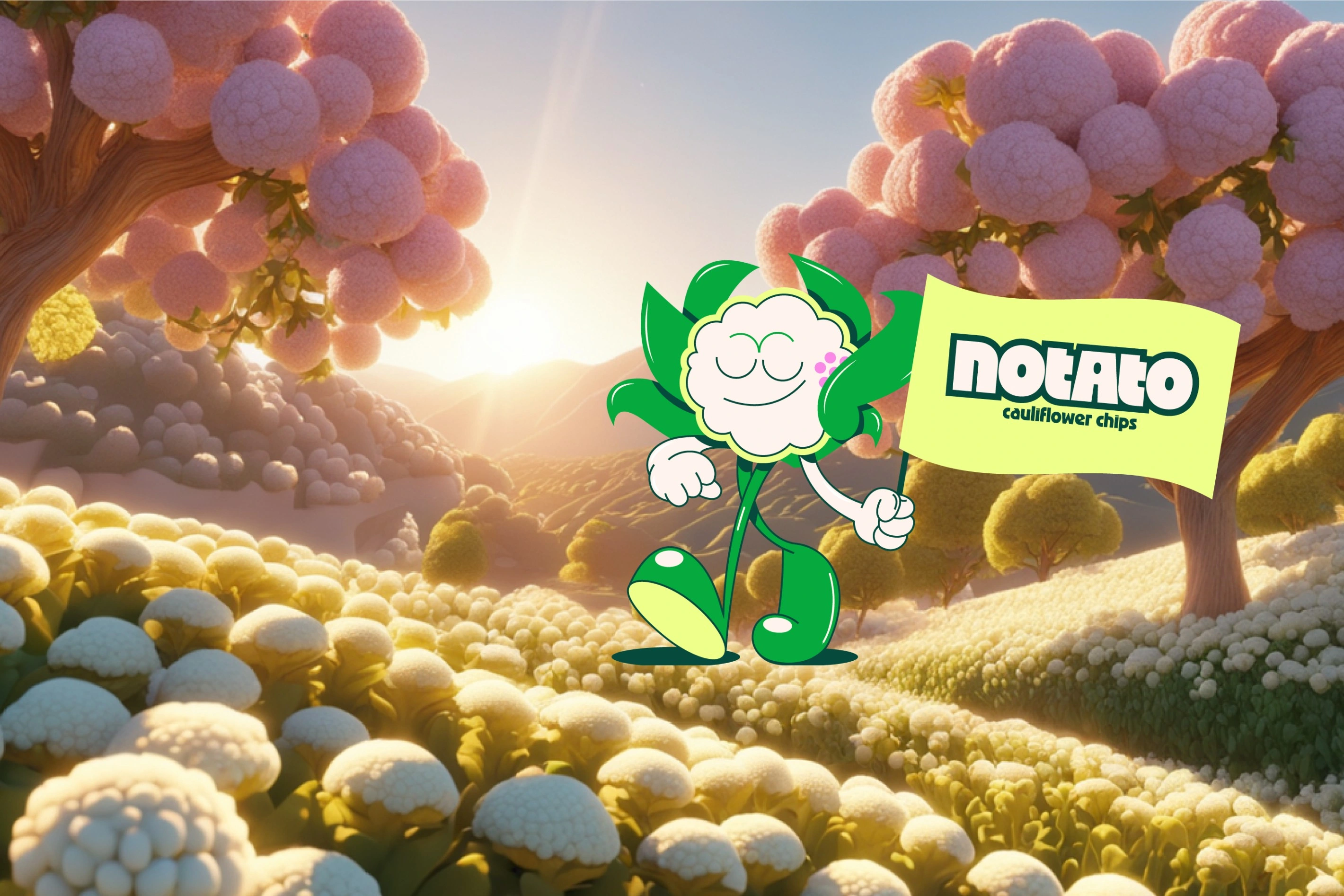
Flavor variants, full spread
See more work at bykins.com
Like this project
Posted Jul 31, 2026
Brand identity, mascot design, and packaging for Notato, a cauliflower chip brand built to stand out on shelf and online.