Waxen Wines | Branding & Packaging

Overview
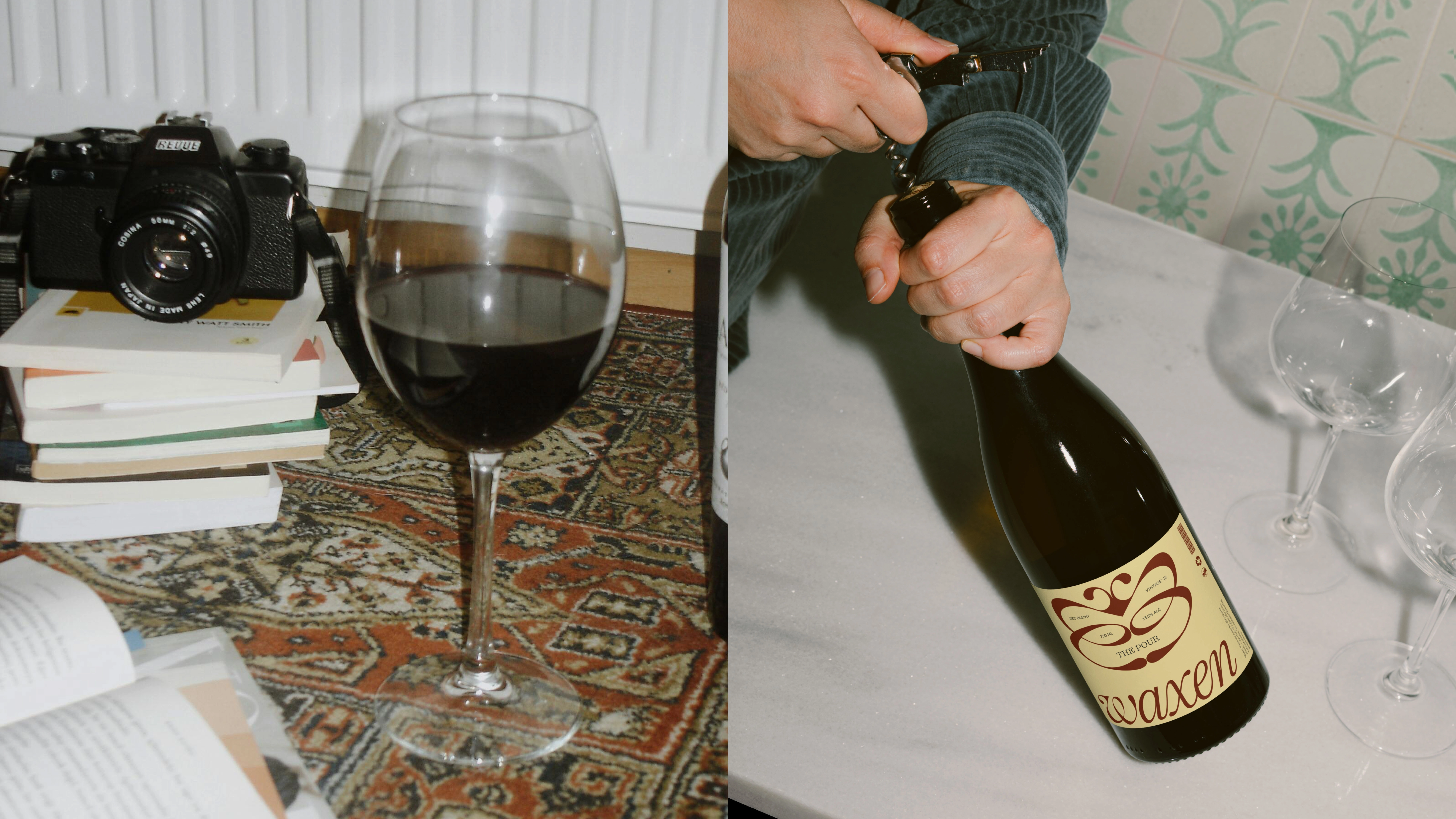
Waxen is a wine brand built around the idea of ritual. Instead of chasing prestige or hiding behind tasting jargon, Waxen focuses on the simple acts that make wine meaningful, the clink of glasses, the pause between stories, the presence of people around a table.
This concept project reimagines wine branding as something modern, elegant, and human. With a design system rooted in consistency and small moments of distinction, Waxen invites people to see wine not as a status symbol, but as a shared rhythm of life.
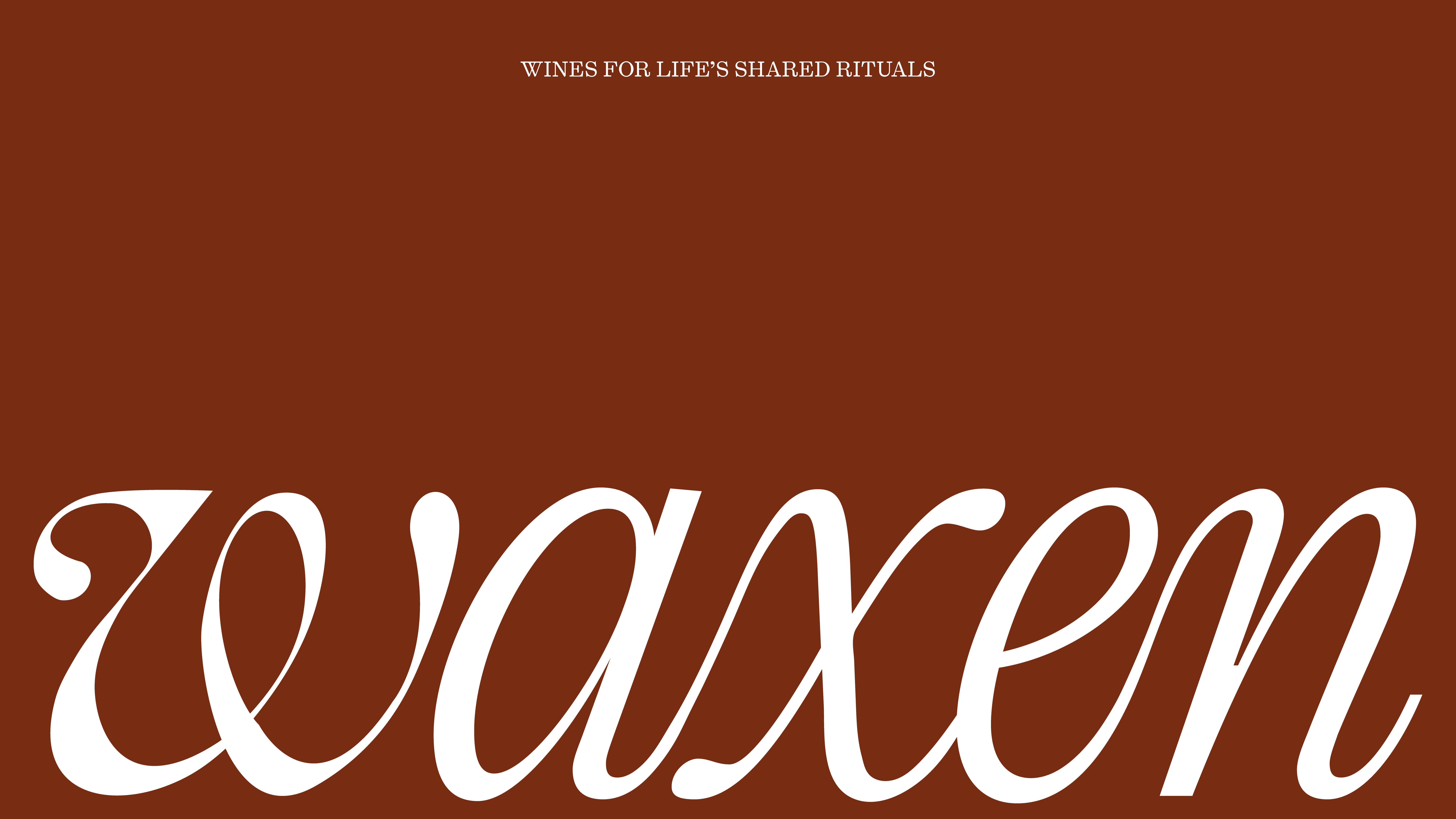
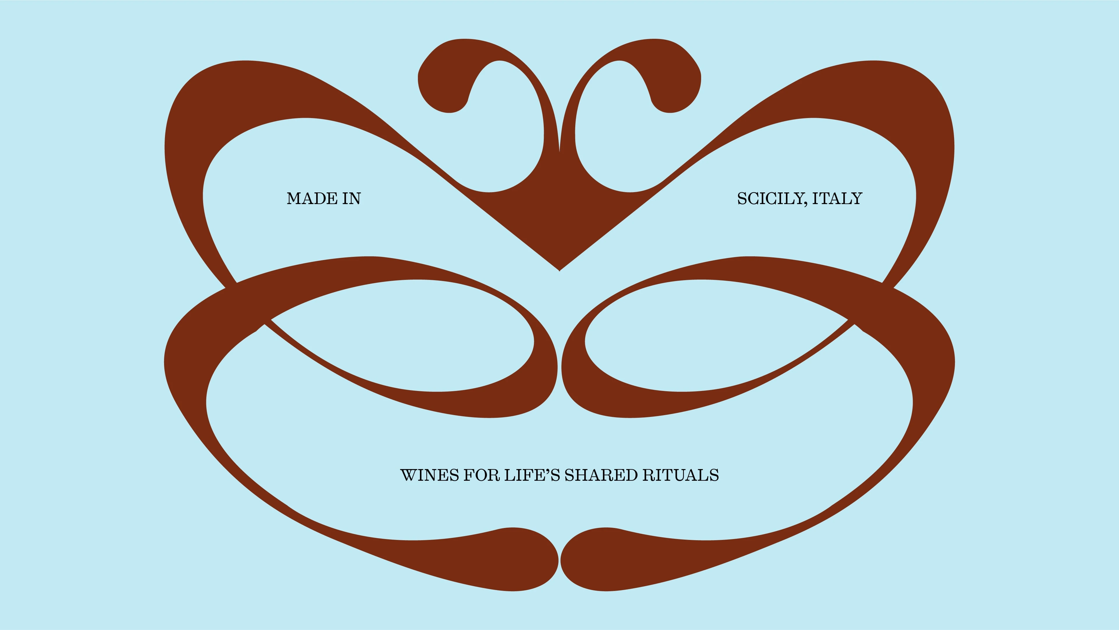
WORDMARK
The Waxen wordmark was custom designed to feel both elegant and modern, delicate letterforms with enough weight to carry presence on their own. It sets the tone for a brand that values clarity and connection over ornamentation
LOGOMARK
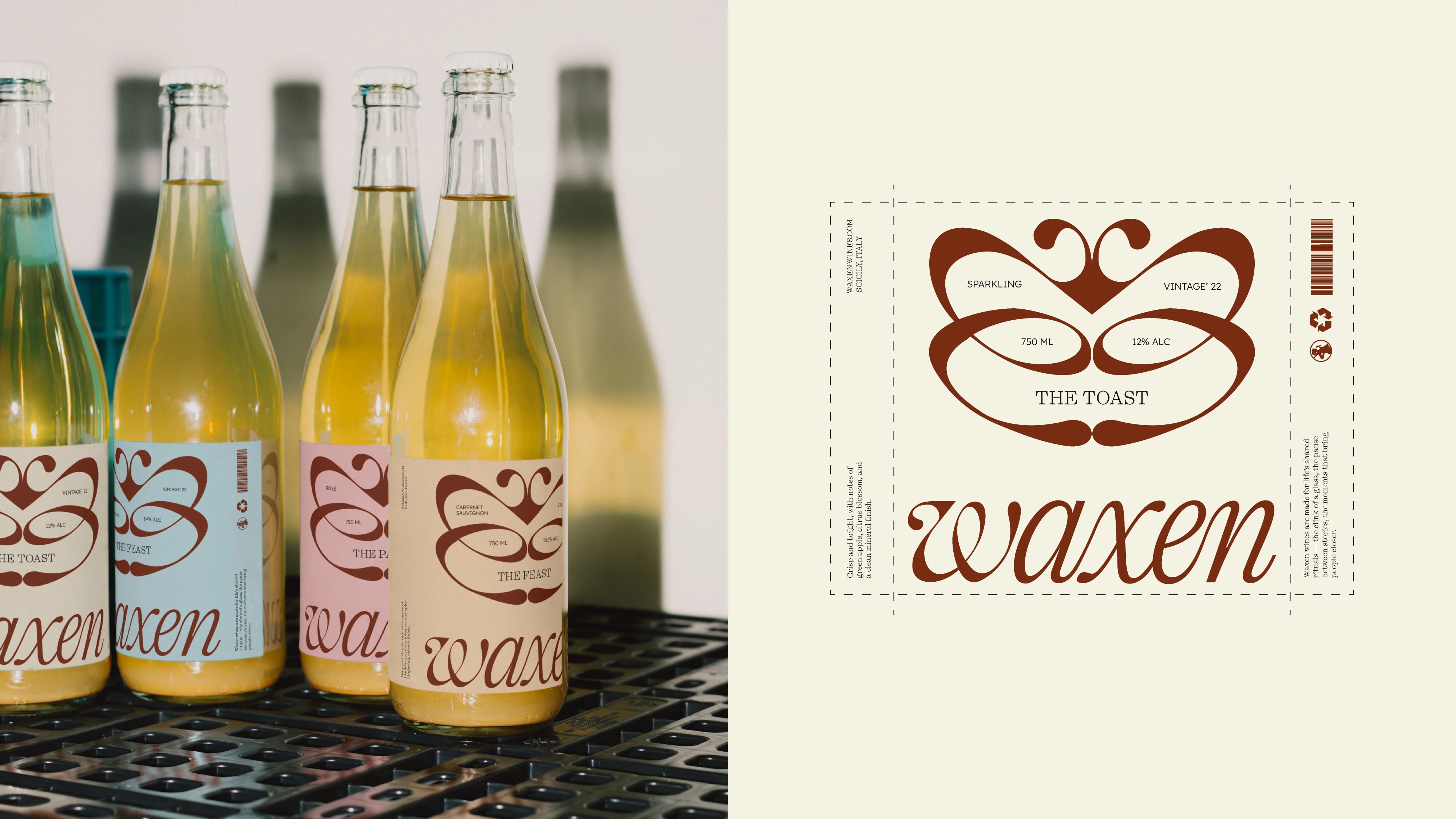
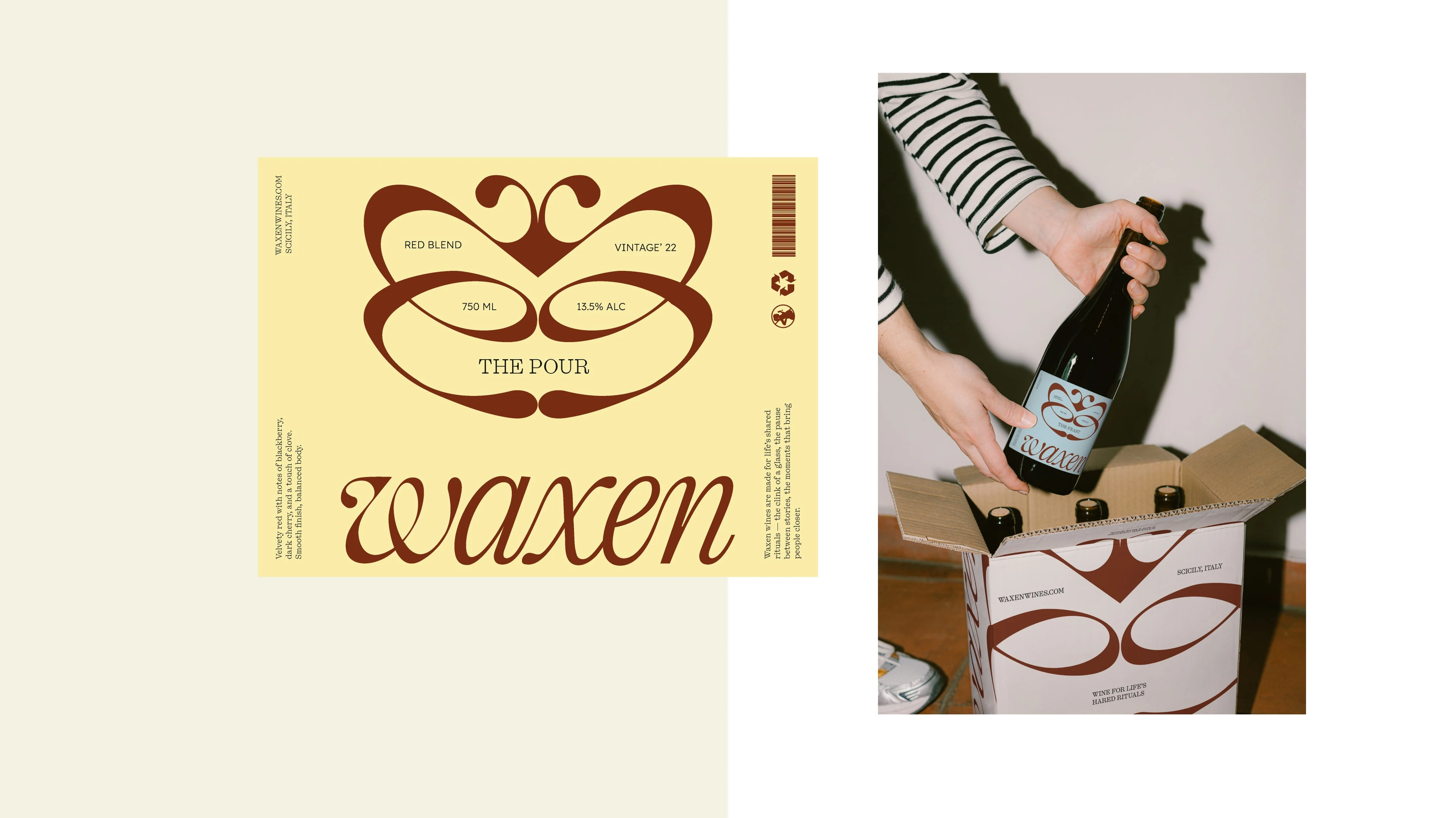
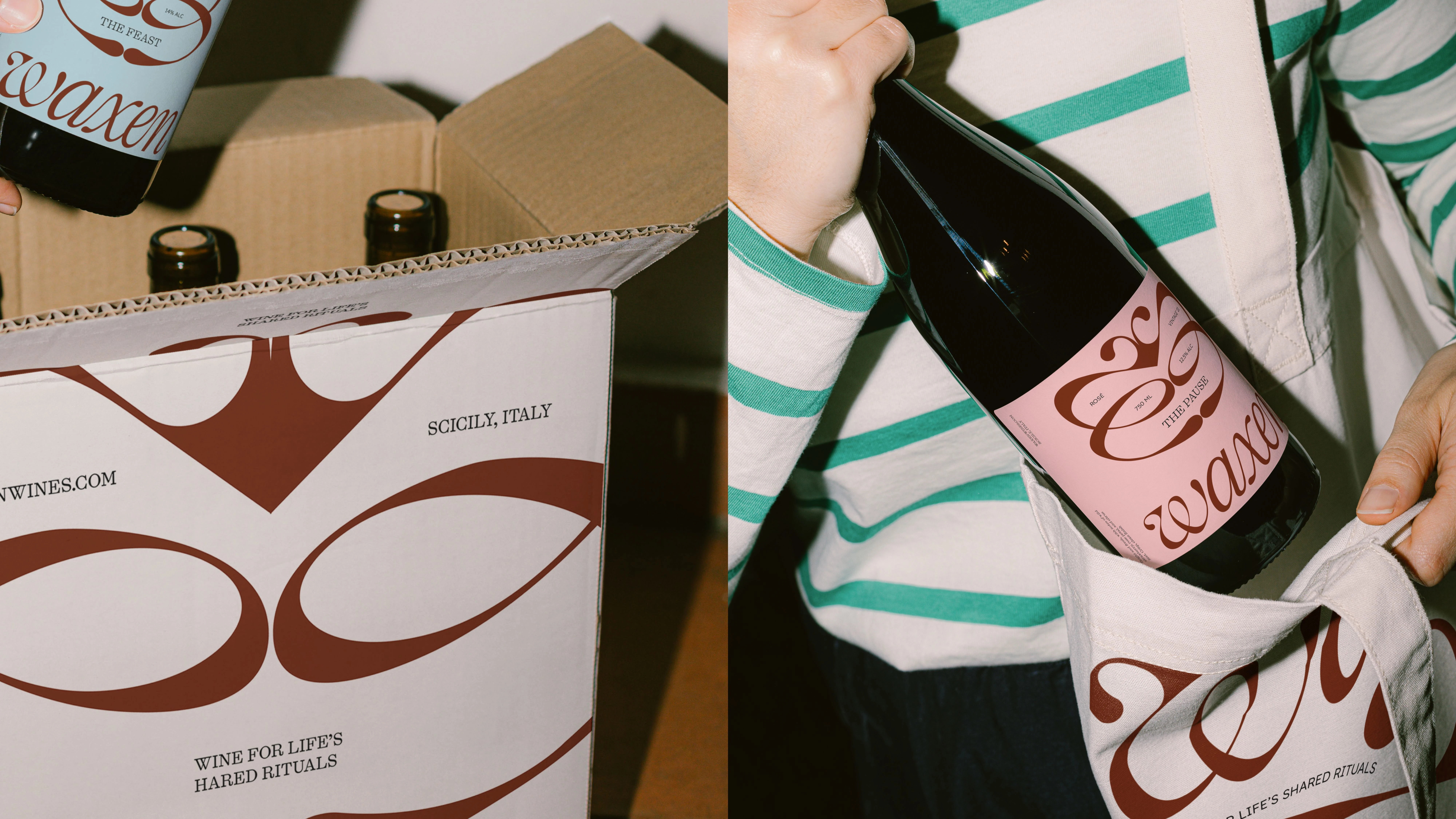
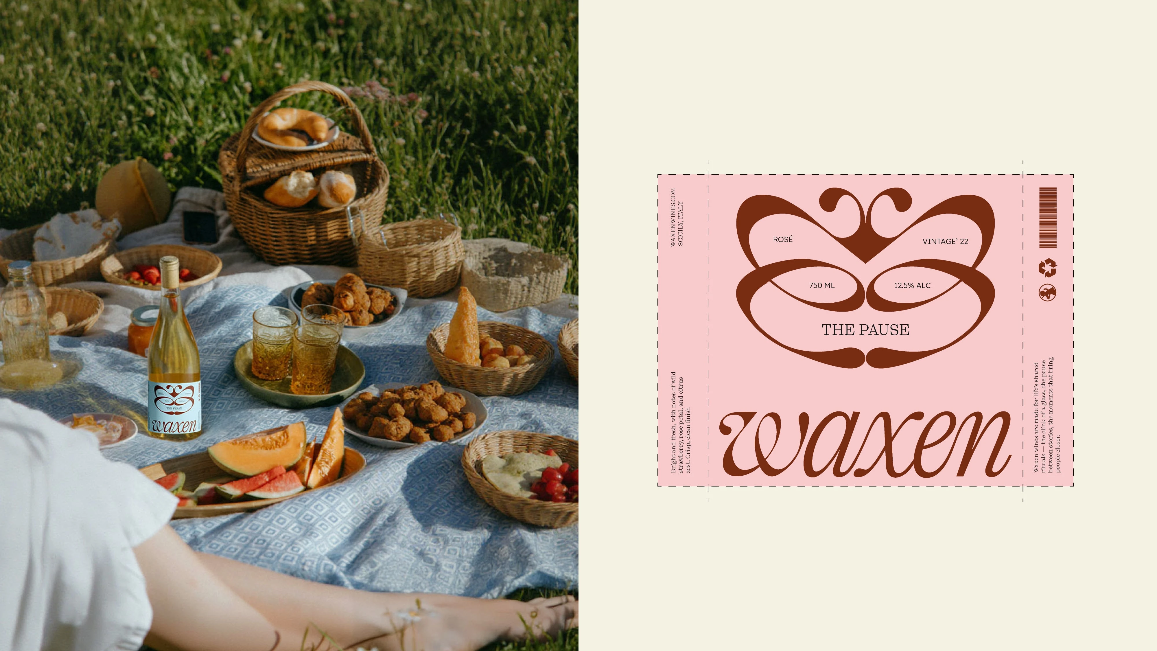
Waxen’s labels use a bold, unconventional layout designed to feel modern and distinct from traditional wine cues. Instead of ornate crests and crowded information, the design is stripped back: a large emblem wrapping the label, the wordmark anchoring the composition, and details set with clarity and restraint.
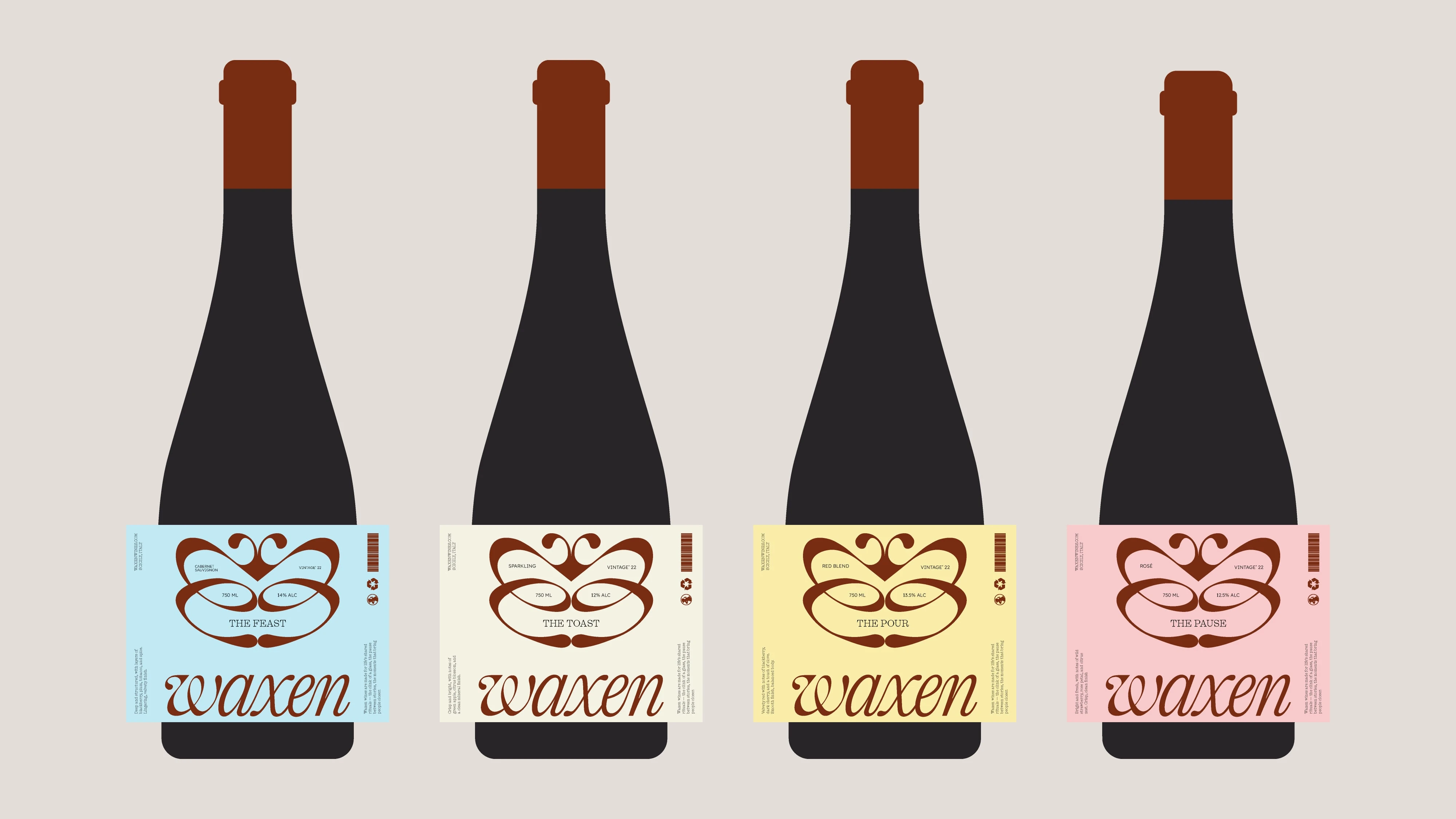
The structure is consistent across all bottles, but small shifts in copy and accents give each ritual its own voice : The Pour, The Toast, The Feast, The Pause. This creates a system that feels both experimental and disciplined: playful in scale and placement, yet reliable in its rhythm.
Like this project
Posted Sep 22, 2025
An experimental concept where I reimagined wine branding and packaging through layout, storytelling, and a ritual-driven design system.

