
SLICE SIN® — Brand Identity & Packaging
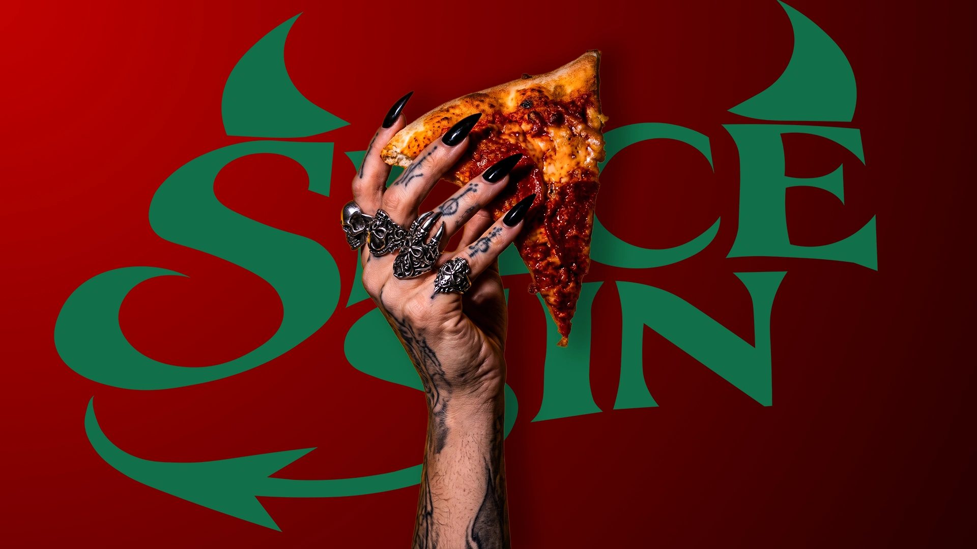
SLICE SIN is a bold, rebellious pizzeria brand concept designed to challenge the ordinary pizza experience.
Inspired by gothic aesthetics, vintage American culture, dark humour and indulgent food experiences, the identity combines expressive typography, striking illustrations and a distinctive red, cream and black colour palette.
THE BRAND
The idea was to create a pizza brand that feels unapologetic, memorable and instantly recognizable. Every touchpoint reflects its rebellious personality while maintaining a premium visual language.
VISUAL IDENTITY
A distinctive visual system built around:
Custom expressive logo design
Gothic-inspired typography
Vintage engraving-style illustrations
Bold flame graphics and signature patterns
A striking red, cream and black colour palette
PACKAGING DESIGN
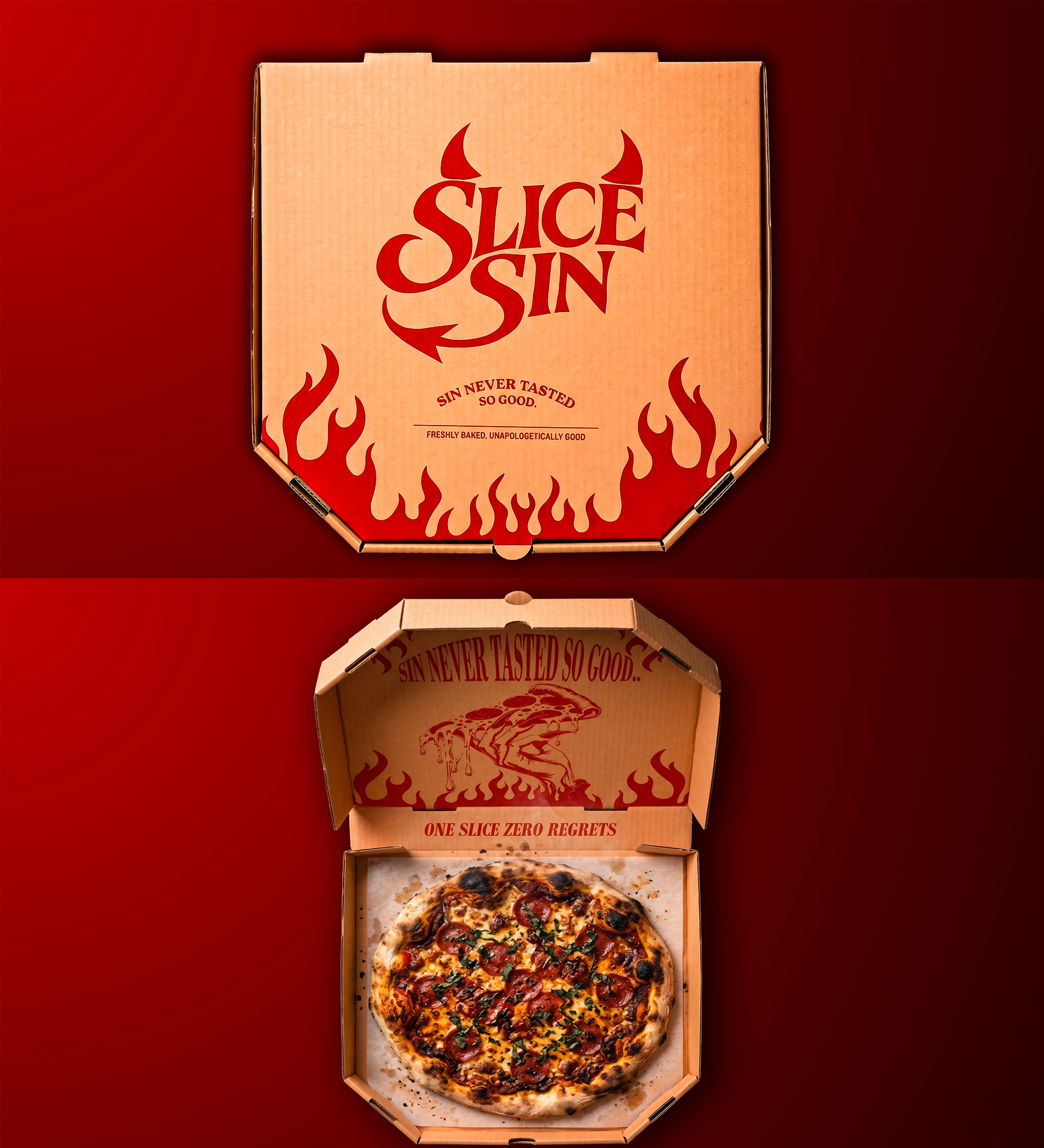
The packaging translates the brand's personality into a physical experience through custom pizza box concepts, illustrated surfaces, bold messaging and distinctive structural details.
MENU DESIGN
The menu follows the same visual language, introducing signature pizzas and creatively named cold drinks under the category POTIONS.
THE EXPERIENCE
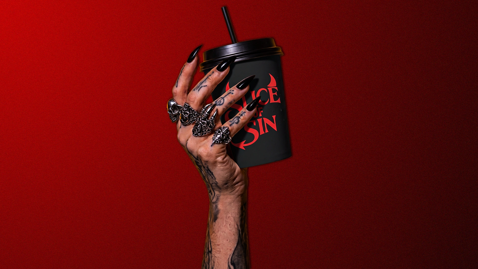
From the pizza box to the drink cup, every detail is designed to make SLICE SIN more than just another pizza brand.
A little rebellion. A lot of flavour.
An independent conceptual branding and packaging design project.
0 likes · 0 views · Nov 9, 2026
SLICE SIN® — Brand Identity & Packaging SLICE SIN is a bold, rebellious pizzeria brand concept designed to challenge the ordinary pizza experience. Inspired ...


