
0→1 Product Designer & No-Code Builder


0→1 Product Designer & No-Code Builder


Built "SoundTrek" in early 2024, when Replit AI was still finding its footing.
It mapped your favorite sounds and found similar artists, a fun little experiment powered by last.fm
Crazy to think how quickly these tools have come since then, you can build production-ready apps at lightning speed. ⚡
2
25
1.5K


Results-Driven Web & Product Design | Framer & Figma Expert
Results-Driven Web & Product Design | Framer & Figma Expert


Web & mobile app developer

Web & mobile app developer



Webflow Developer | Premium, High-Performing Websites
- 1x
- Hired
- 5.0
- Rating
- 33
- Followers
Webflow Developer | Premium, High-Performing Websites
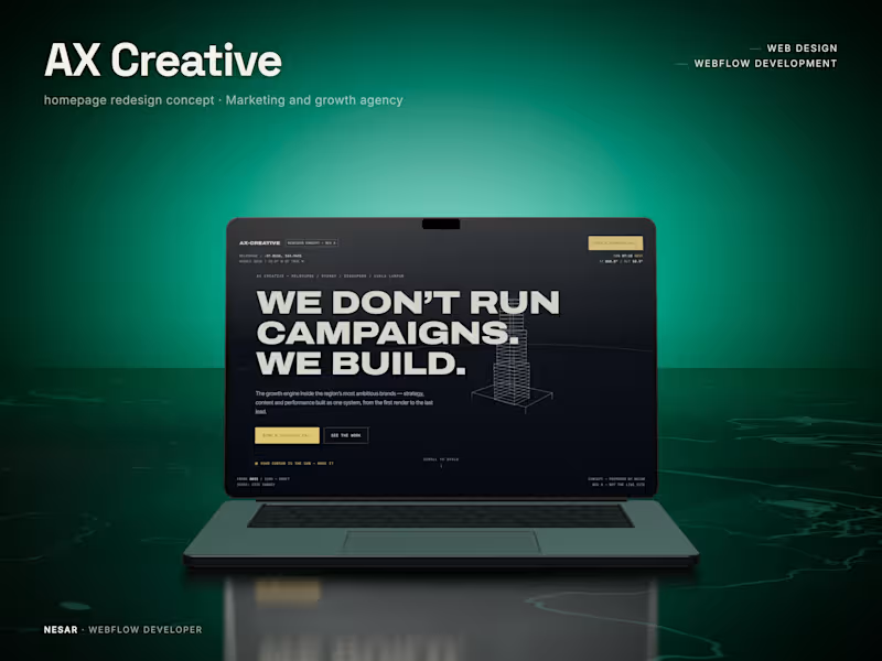
AX Creative | A city that builds itself as you scroll.
What if an agency website didn't just talk about building, but actually built something?
A homepage redesign concept for AX Creative, a growth agency operating across Melbourne, Sydney, Singapore, and Kuala Lumpur.
Their philosophy is simple: "We don't run campaigns. We build."
I took that literally.
As you scroll, a wireframe Melbourne rises into view. The sun moves from dawn to golden hour. Each section unfolds like an architectural drawing, turning the homepage into a living blueprint.
Designed and developed in Webflow with GSAP. Oversized Archivo typography, IBM Plex Mono annotations, a single sun-yellow accent, a live solar HUD, and a glowing masterplan bring the concept together.
The idea was to make the agency's positioning something visitors experience, not just read.
#Webflow #GSAP #WebDesign #CreativeDirection #ScrollAnimation #InteractionDesign
8
8
470

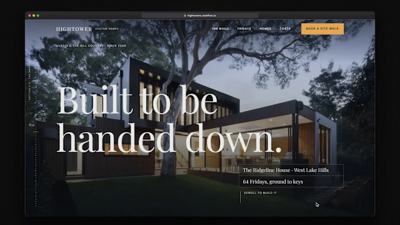
A website for Hightower Custom Homes, a custom-home builder in Austin and the Texas Hill Country.
Instead of a services page, it follows one house from lot walk to keys in dated chapters: the fixed contract price set huge in Playfair, a section drawing that rises floor by floor as you scroll beside the Friday reports, and a row of ochre ticks for the track record.
Designed and built in Webflow: Finsweet Client-first , a drawing-sheet rule down the margin, charcoal and stone chapters with one ochre accent, a sticky scroll-driven drawing and a site-walk booking form.
#webflow (https://www.linkedin.com/search/results/all/?keywords=%23webflow&origin=HASH_TAG_FROM_FEED) #webdesign (https://www.linkedin.com/search/results/all/?keywords=%23webdesign&origin=HASH_TAG_FROM_FEED) #webflowdeveloper (https://www.linkedin.com/search/results/all/?keywords=%23webflowdeveloper&origin=HASH_TAG_FROM_FEED) #customhomes (https://www.linkedin.com/search/results/all/?keywords=%23customhomes&origin=HASH_TAG_FROM_FEED) #homebuilder (https://www.linkedin.com/search/results/all/?keywords=%23homebuilder&origin=HASH_TAG_FROM_FEED) #clientfirst (https://www.linkedin.com/search/results/all/?keywords=%23clientfirst&origin=HASH_TAG_FROM_FEED) #hillcountry (https://www.linkedin.com/search/results/all/?keywords=%23hillcountry&origin=HASH_TAG_FROM_FEED) #architecture (https://www.linkedin.com/search/results/all/?keywords=%23architecture&origin=HASH_TAG_FROM_FEED) #editorialdesign (https://www.linkedin.com/search/results/all/?keywords=%23editorialdesign&origin=HASH_TAG_FROM_FEED) #scrollytelling (https://www.linkedin.com/search/results/all/?keywords=%23scrollytelling&origin=HASH_TAG_FROM_FEED) #uidesign (https://www.linkedin.com/search/results/all/?keywords=%23uidesign&origin=HASH_TAG_FROM_FEED) #websitedesign (https://www.linkedin.com/search/results/all/?keywords=%23websitedesign&origin=HASH_TAG_FROM_FEED) #constructionmarketing (https://www.linkedin.com/search/results/all/?keywords=%23constructionmarketing&origin=HASH_TAG_FROM_FEED)
4
4
387
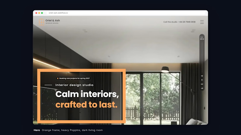
Oriel & Ash designs calm, characterful homes, hotels, restaurants and workplaces in London.
The site had to feel as considered as the rooms: a heavy Poppins headline inside a thick orange frame over a dark living room, charcoal and white sections in turn, outlined ghost words behind each heading, and the second half of every headline picked out in orange.
Built in Webflow as one page: a project slider with orange badges, numbered service cards, a four-stage process ending in signed-off decisions, team, testimonials and a contact form, with GSAP scroll reveals and a responsive layout.
link : https://lnkd.in/evA7zK4H
(https://lnkd.in/evA7zK4H)#webflow (https://www.linkedin.com/search/results/all/?keywords=%23webflow&origin=HASH_TAG_FROM_FEED) #webdesign (https://www.linkedin.com/search/results/all/?keywords=%23webdesign&origin=HASH_TAG_FROM_FEED) #interiordesign (https://www.linkedin.com/search/results/all/?keywords=%23interiordesign&origin=HASH_TAG_FROM_FEED) #gsap (https://www.linkedin.com/search/results/all/?keywords=%23gsap&origin=HASH_TAG_FROM_FEED) #responsive (https://www.linkedin.com/search/results/all/?keywords=%23responsive&origin=HASH_TAG_FROM_FEED) #studiowebsite (https://www.linkedin.com/search/results/all/?keywords=%23studiowebsite&origin=HASH_TAG_FROM_FEED) #clientfirst (https://www.linkedin.com/search/results/all/?keywords=%23clientfirst&origin=HASH_TAG_FROM_FEED)
1
284

Senior Product Designer | AI & Enterprise SaaS
- $1k+
- Earned
- 3x
- Hired
- 5.0
- Rating
- 6
- Followers
Senior Product Designer | AI & Enterprise SaaS


Web Designer & Fullstack Developer from parnii.de | Wix+Velo
- 34
- Followers
Web Designer & Fullstack Developer from parnii.de | Wix+Velo


In this web design project, I explored the possibilities and different approaches to scrolling animation, fine-tuning the timing and flow of transitions to different scenes, and engaging users in website interactions through simulating game mechanics, all while working in a style uncharacteristic of my own.
https://80s.studio-template.com/
The web design was completed in Wix Studio using the Velo API.
I love and am proud of this work—the website was showcased on the Wix Studio Inspiration Page.
https://www.wix.com/studio/inspiration/site/the-museum-of-adventures
24
571

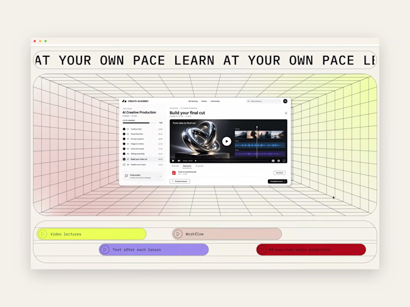
What if a landing page let you experience a little of the product before you signed up?
AI makes interactions easier to create. The human touch gives them a story, a purpose and a metaphor that feels alive.
At parnii.de (https://www.parnii.de), we love building miniature versions of a product experience into its website. They can introduce visitors to the atmosphere of a service through something they can actually explore.
Our approach starts with a core benefit or characteristic. We find a visual idea that expresses it, then develop the interaction so the message and the mechanics work together.
This section, built in Wix Studio, is an example.
The landing page introduces an online course in AI tools for content creators. Video editing is part of the curriculum, so we turned the section into a miniature editing interface.
Scrolling forwards and backwards moves visitors through the sequence at their own pace.
Several ideas come together in that one gesture:
• The editing interface previews the creative environment students will work in.
• A familiar scroll makes the experience easy to explore, supporting the course’s approachable feel.
• Controlling the sequence makes “learn at your own pace” something visitors can experience directly.
This is where storytelling and scrollytelling meet: the interaction carries part of the story.
For us, the human touch lives in those connections. Choosing the right metaphor, giving it a meaningful role and making the details feel natural.
We love this part of web design: finding an idea that brings a product to life, then letting people discover it through their own actions.
0
125

Senior Product & Web Designer | Wix Studio & Shopify
Senior Product & Web Designer | Wix Studio & Shopify

Expert Full-Stack Developer for Your Dream Project
Expert Full-Stack Developer for Your Dream Project


View more →