Senior-Friendly Learning Platform Landing Page Design

Diana Aya


What it is
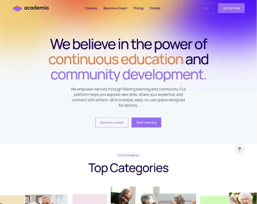
The marketing landing page for a lifelong-learning platform aimed at seniors: browse courses, join a community organized around shared interests, or become a coach and teach others. The core idea was continuous education paired with social connection, not just content consumption.
This was a freelance project, landing page design only. The client used the components and screens from the main product (covered in a separate case study) to build out the rest of the site themselves once this page was in place.
What I designed
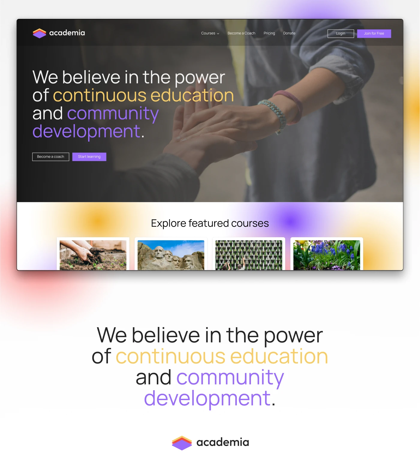
Hero: leads with the mission (continuous education and community development) and two clear paths in: start learning or become a coach.
Top categories & courses: browsable by topic (history, art, gardening, and more), with real course cards showing instructor, rating, and format.
Trainers: a "meet our top trainers" section, putting real faces and specialties front and center, since trust in the instructor matters a lot for this audience.
Testimonials: named, specific stories rather than generic quotes ("I joined a history class and ended up meeting other seniors who love the same topics").
FAQ: addressing the practical concerns this audience actually has, accessibility, affordability, and how classes work.
Donate/become a coach: two separate conversion paths beyond just signing up, supporting the free program, and joining as an instructor.
What I focused on
The biggest design consideration was tone and legibility for an older audience: warm color palette, real (not stock-feeling) photography of seniors actually engaging with each other, larger and simpler UI patterns, and copy that speaks to companionship and purpose rather than generic "upskilling" language aimed at a younger, career-driven user.
Note: usability testing was done on the core product (dashboard and main platform screens), not on this landing page specifically.
Like this project
Posted Jul 9, 2026
A landing page for a platform where seniors can take classes, connect, and become instructors themselves, built to feel warm and community-first.
Likes
0
Views
7
Timeline
Apr 2, 2024 - Apr 30, 2024