Built with Framer
Meera Knowles - Art Director Portfolio Website

Nima Zaeimzadeh
Verified


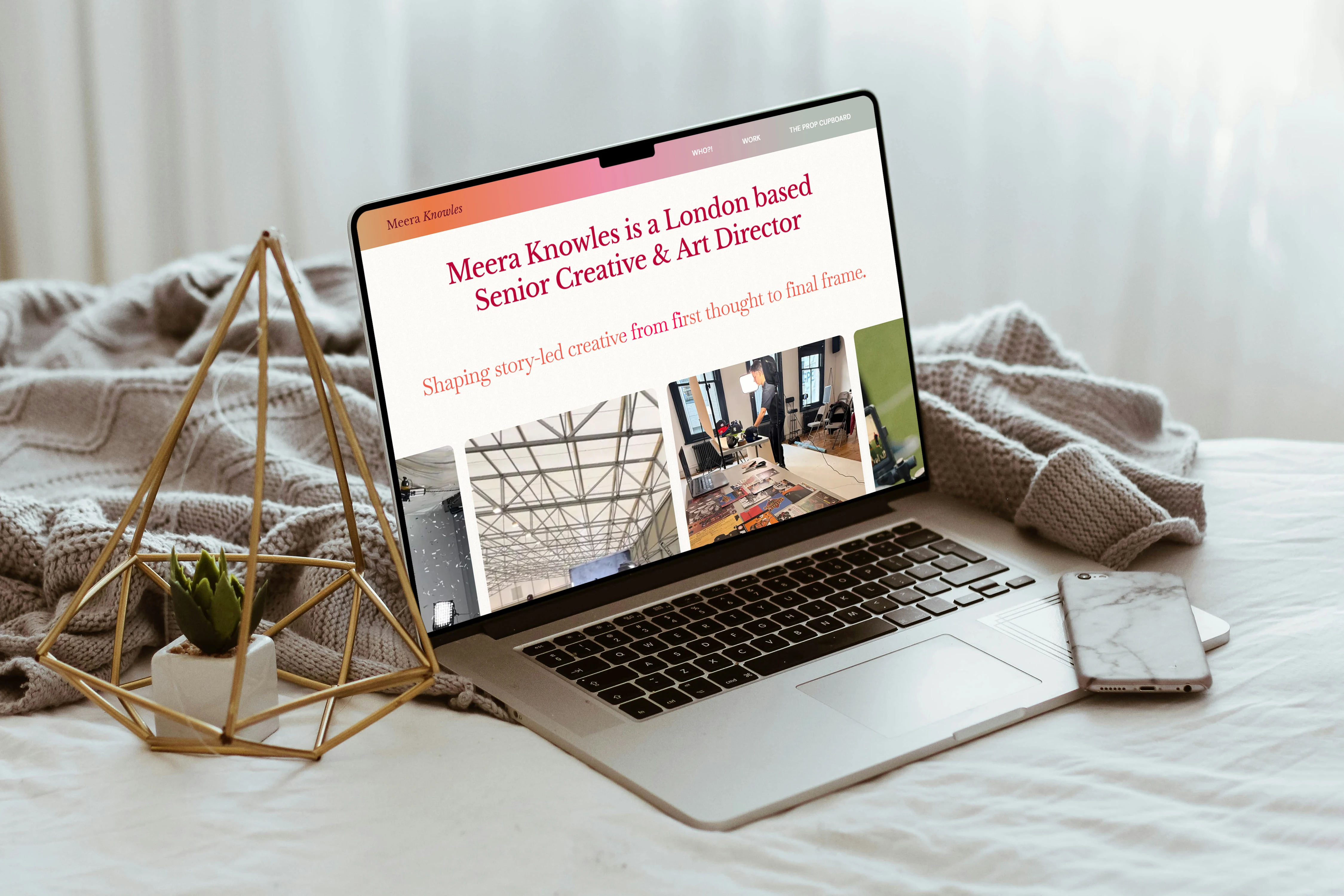
Check out the live website here 👉https://meeraknowles.com/
Introduction
Meera Knowles is an award-nominated Senior Creative and Art Director based in London, known for shaping story-led creative from first thought to final frame. Her work spans integrated campaigns, social-first storytelling, and brand activations — often using humor, heart, and "a touch of chaos" to bring brands closer to their audiences.
When Meera reached out, she had built her own portfolio website in Framer. It was a labor of love, but as she put it: "I'm just an art director" — and the site needed a seasoned web designer's eye. The goals were clear: refine the existing design, fix responsiveness, optimize video content, and make the site easy to update going forward. What started as a polish quickly became a full rebuild, but the result is a portfolio that finally matches the caliber of the work it showcases.
Meera Knowles - Homepage
Homepage
From Fixed Widths to a Fluid, Responsive Foundation
The original homepage was built almost entirely using fixed widths and heights — no stacking, no layout systems, and no proper style architecture. Everything sat outside a container, breaking on virtually every screen size except the exact one it was designed on.
The first step was a complete rebuild from the ground up. I introduced a full stack layout across the entire site, removed every fixed width and height element, and wrapped all content inside a proper container system. This immediately gave the homepage breathing room and made it adaptable to any device.
Typography and color were another major area of attention. The original site had no style system — colors and fonts were applied inconsistently across elements. Worse, the gradient colors lacked sufficient contrast against their backgrounds, which hurt accessibility and user experience. I implemented a full color system and typography system, carefully adjusting font sizes (navbar links, for example, were bumped from 13px to a readable 16px), line heights, and color contrast to meet accessibility standards while keeping the feel of Meera's original vision.
The result is a homepage that feels clean, polished, and intentional — with improved readability, subtle animations that bring sections to life, and a grain effect on the background that adds texture without distracting from the work.
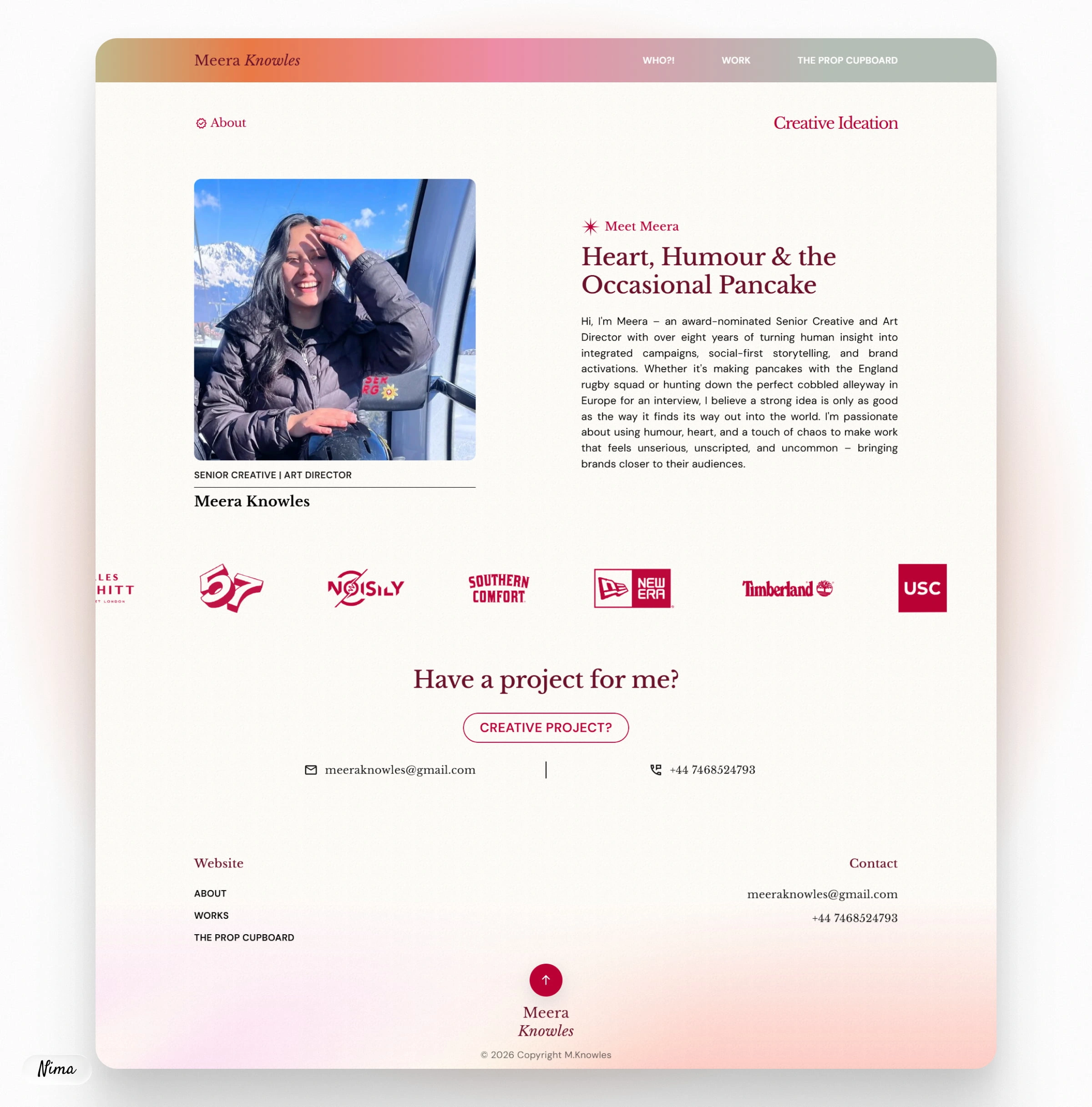
Meera Knowles - About Page
About Page
A Dynamic Refresh with Clearer Service Messaging
The original About page was static and didn't clearly communicate Meera's services. The brief was to make it feel more dynamic and to advertise her offerings in a way that resonated with potential clients.
I recreated the entire About page based on a fresh design direction, rewriting the copy to better reflect her personality and expertise. The page now opens with a warm, confident introduction: "Hi, I'm Meera – an award-nominated Senior Creative and Art Director with over eight years of turning human insight into integrated campaigns..." — immediately establishing her voice and authority.
The layout was restructured to clearly showcase her services, with improved visual hierarchy and better use of space. On mobile, alignment issues were fixed so that graphics and text sit harmoniously rather than feeling misaligned. The page now feels as dynamic as Meera herself — a proper introduction to her work and her approach.
Meera Knowles - Projects CMS
Projects Page (Work)
CMS-Powered Case Studies with Full Flexibility
This was the heart of the project. The original site had individual, hard-coded pages for each project — meaning every new case study required manual duplication and editing. Meera needed a system that would let her add new projects effortlessly.
I removed all static project pages and built a brand new CMS collection from scratch. Each case study now lives as a CMS item, and the project overview page dynamically pulls in project cards with consistent layouts. I added visibility conditions to every section and element inside the CMS — if Meera doesn't add content for a particular section, it automatically disappears. This keeps the template clean and prevents empty gaps.
One of the biggest challenges was video aspect ratios. Much of Meera's work is vertical-first (9:16), but some projects — like the Lions 2025 case study — feature landscape (16:9) video. Framer doesn't natively support per-item aspect ratio toggles in the CMS. So I built a custom-coded mixed-media grid component from scratch. It uses an advanced CSS grid that allows vertical media to fill grid tracks up to a maximum width while horizontal items span the full row. Every property — from vertical max widths to video thumbnails — is exposed in Framer's property panel for easy adjustment.
The result: a case study system that's flexible, easy to update, and displays every project's media exactly as intended. On desktop, the text animations and project navigation feel smooth and premium. On mobile, spacing and hierarchy are consistent throughout.
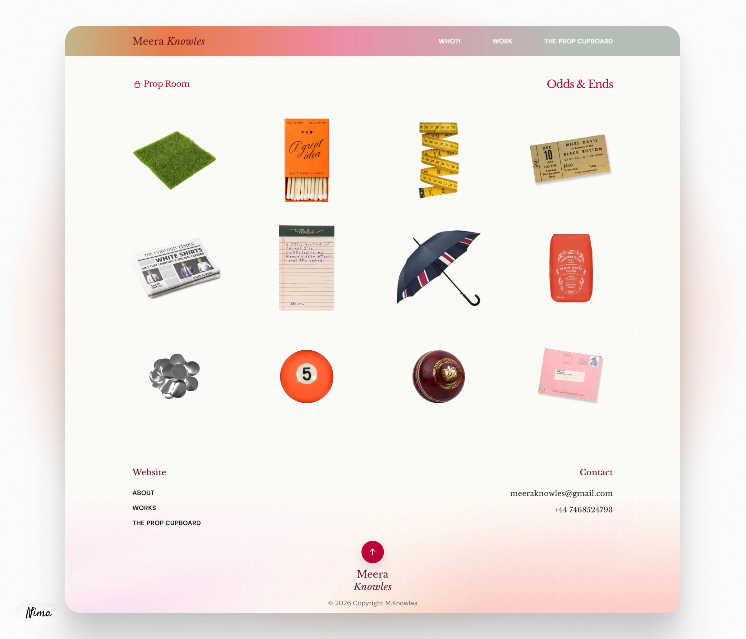
Meera Knowles - Prop Clipboard
Props Page
A Playful Showcase, Now Fully Responsive
The Prop Room page is where Meera showcases her more playful, experimental side — odds and ends, side projects, and creative curiosities. Originally, this page suffered from the same issues as the rest of the site: fixed dimensions, broken layouts, and inconsistent animations.
I reworked the entire page, fixing all item widths, heights, and animations. Every element now sits within the container system and responds properly across all breakpoints. On mobile, the "Odds & Ends" animated graphic was removed to simplify the layout and improve spacing — a decision made collaboratively to ensure the page feels clean without losing its charm.
The page now feels cohesive with the rest of the site while still retaining its distinctive, slightly mischievous personality — a perfect reflection of Meera's "serious creative with a healthy sense of humor" ethos.
Final Thoughts
This project ended up being far more extensive than originally scoped — a full rebuild disguised as a refinement. But the result is a portfolio that truly represents Meera: polished, professional, and undeniably her. The custom CMS system means she can now update her work in minutes rather than hours. The responsive foundation means her site looks stunning on any device. And the accessibility improvements mean her work can be seen and appreciated by everyone.
Sometimes the best way to honor a creative's vision is to rebuild it from the ground up — so it can stand on its own, exactly as intended.
Check out the live website here 👉https://meeraknowles.com/
Ready to elevate your brand’s storytelling?
Let’s talk! 🚀
Like this project
What the client had to say
Nima was great to work with. He optimised my Framer website and explained the edits to me with clarity so I can now implement edits myself in the new design. I highly recommend working with Nima.

Meera Knowles
Aug 23, 2026, Client
Posted Sep 6, 2026
Full Framer portfolio website rebuild with custom CMS for mixed-media videos and fully responsive with improved accessibility.
Likes
2
Views
13
Timeline
Aug 13, 2026 - Aug 23, 2026