
max
1
0
12
Edition 1: A Study in Stillness and Form
0
10
Framer + Shopify Ecommerce Site for Corbell, Built on Frameship
0
16
2
0
12
1
1
9
Minimal One-Page Portfolio Design in Framer
2
22

2
3
24
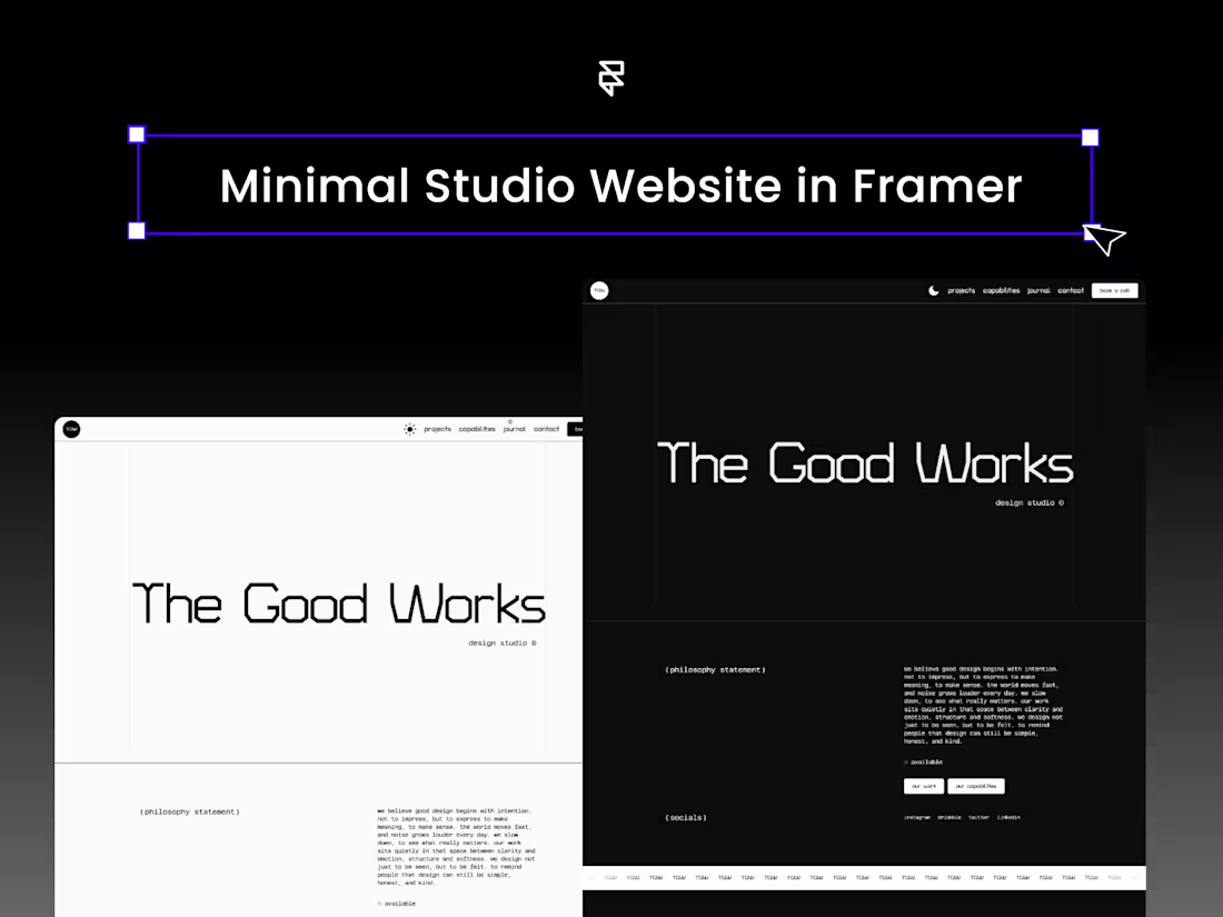
Minimal Studio Website in Framer
2
19
1
4
24
Marketing Studio Website Redesign
4
21
Wrap up always feels good, finally done wrapping up a studio build in @Framer
Here's the case (https://contra.com/p/BLbc3N7r-marketing-studio-website-redesign?referralExperimentNid=DEFAULT_REFERRAL_PROGRAM&referrerUsername=harshworks)
5
6
1.5K
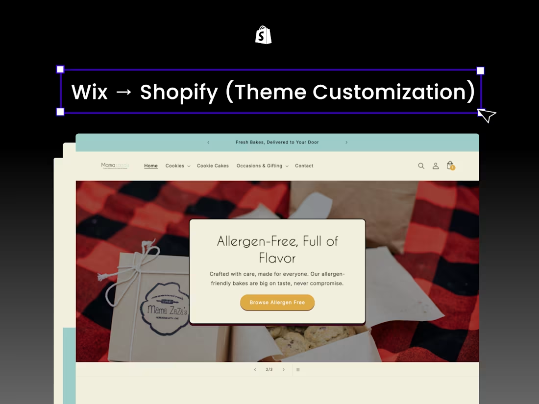
Mamazazas Migration to Shopify
3
9
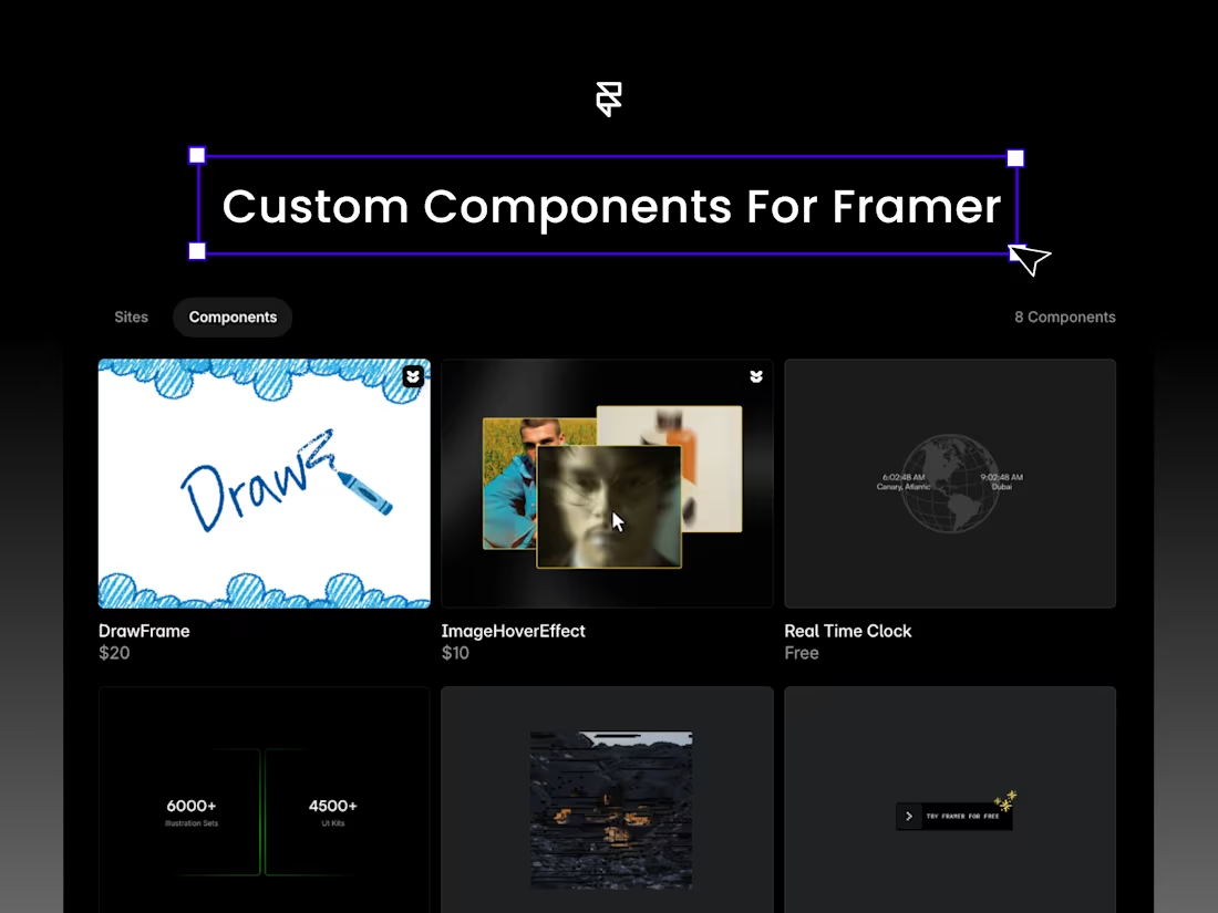
Custom Interactive Components for Framer
3
10
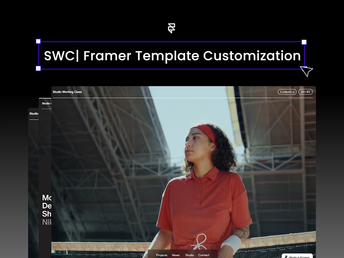
SWC | Template Customisation in Framer
2
20
Luxury Red: A Study in Warmth and Stillness
4
27
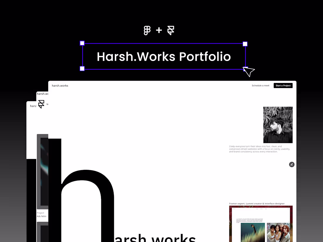
Personal Portfolio in Framer
2
13
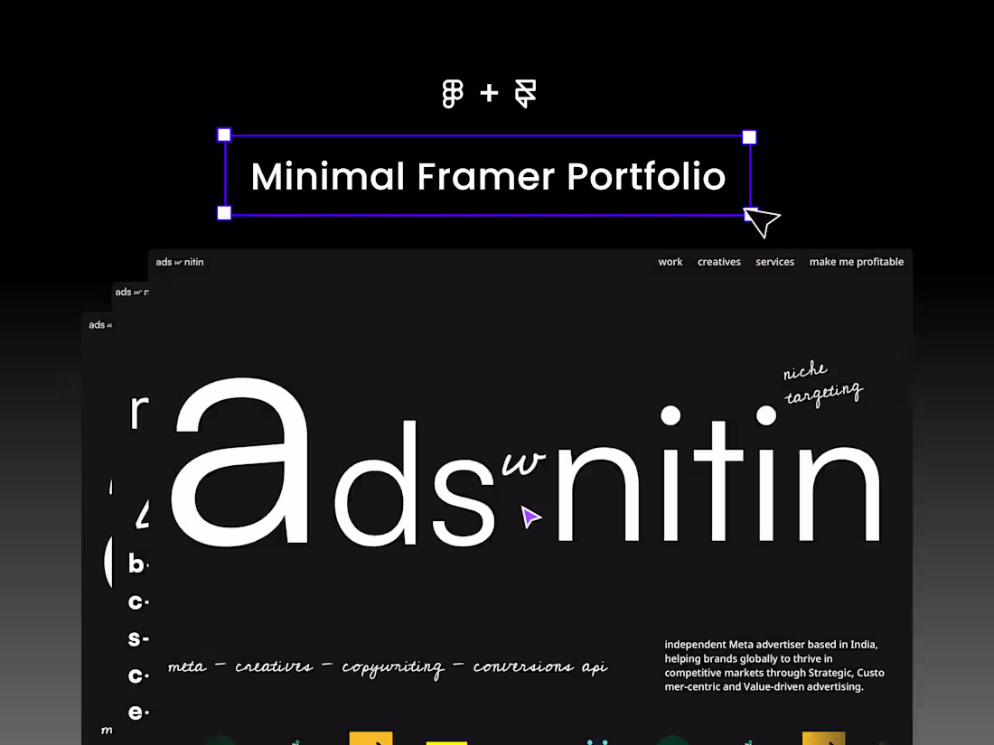
adswithnitin.com – Minimal Framer Website
2
32
$1.1K+ earned
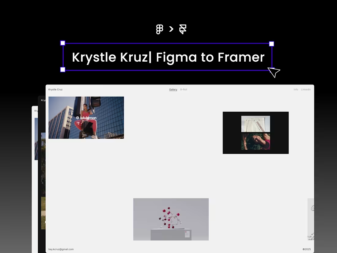
Krystle Portfolio - Figma to Framer
9
48
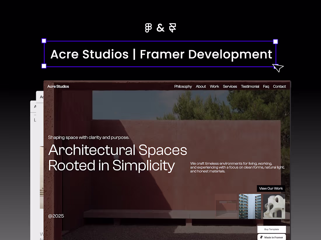
MInimal Architecture Studio Website | Designed & Built in Framer
3
23
Closeup: A Journey Through Intimacy and Light
3
22
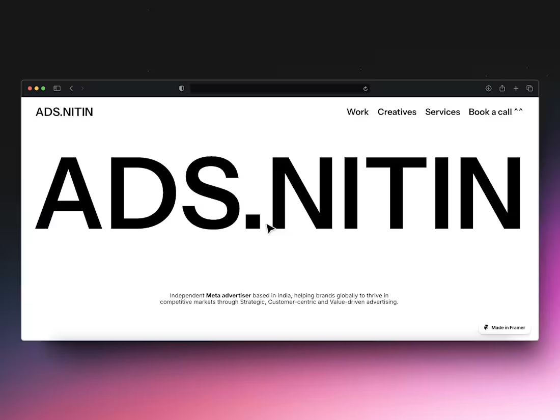
ADS.NITIN A Personal Portfolio
2
24
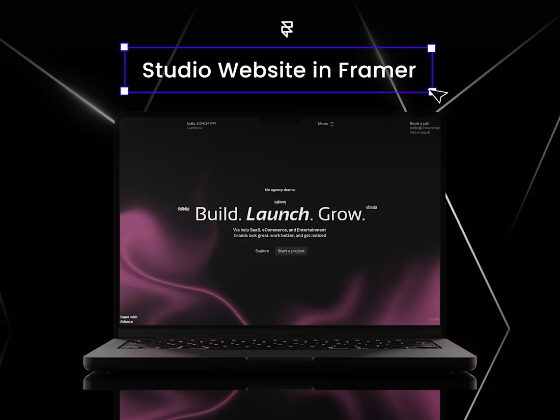
Framer Design and Development - 7seers
2
25
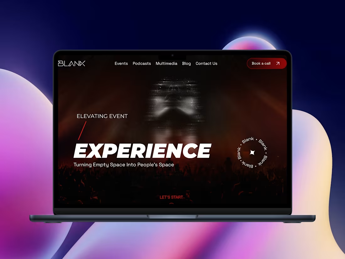
Interactive Framer Website Development for Blank
2
28
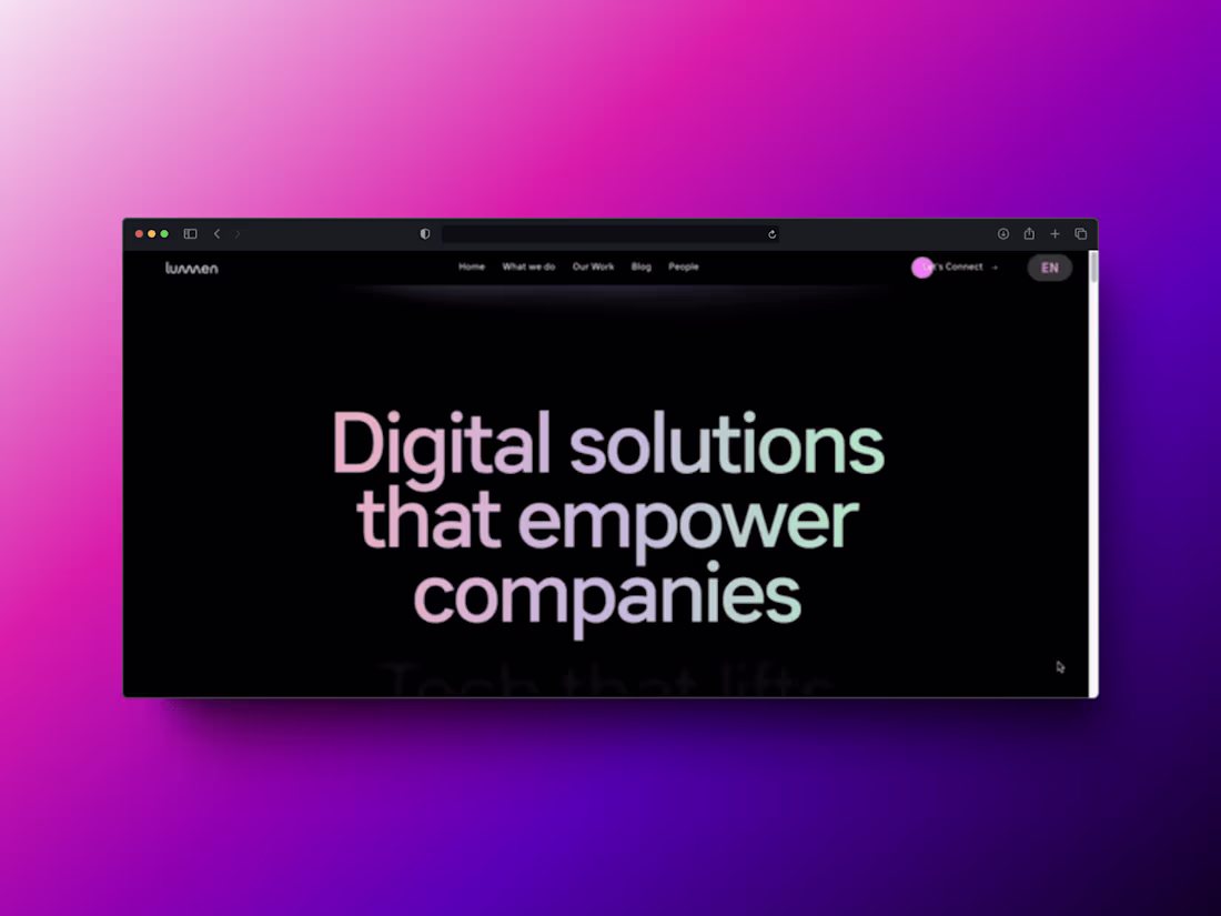
Figma to Framer - Lumen | Digital Agency Website
1
32