Built with Framer
Minimal One-Page Portfolio Design in Framer
Harsh Upadhyay
Verified
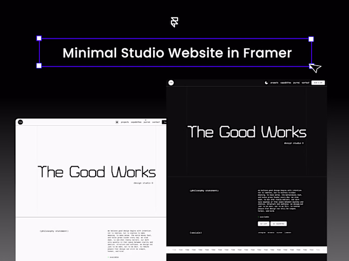
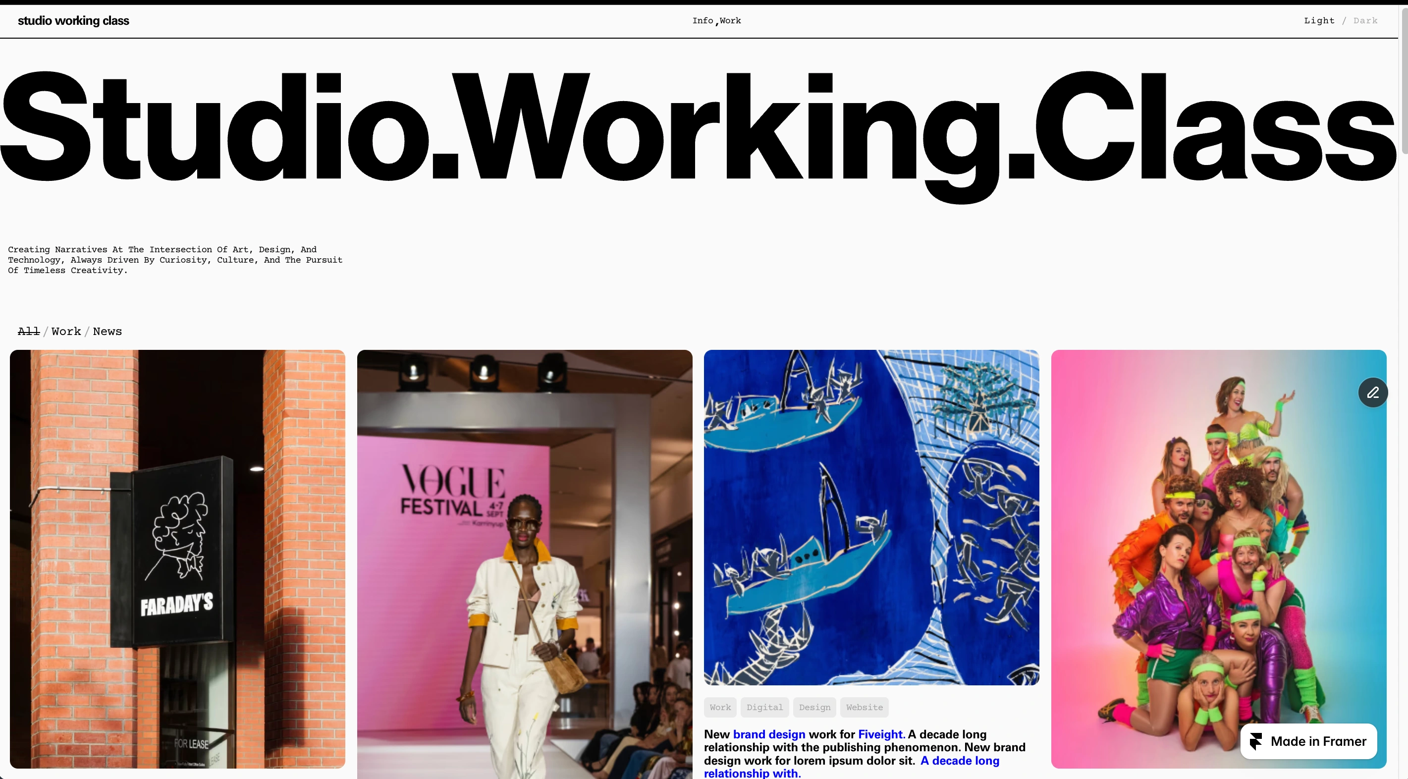
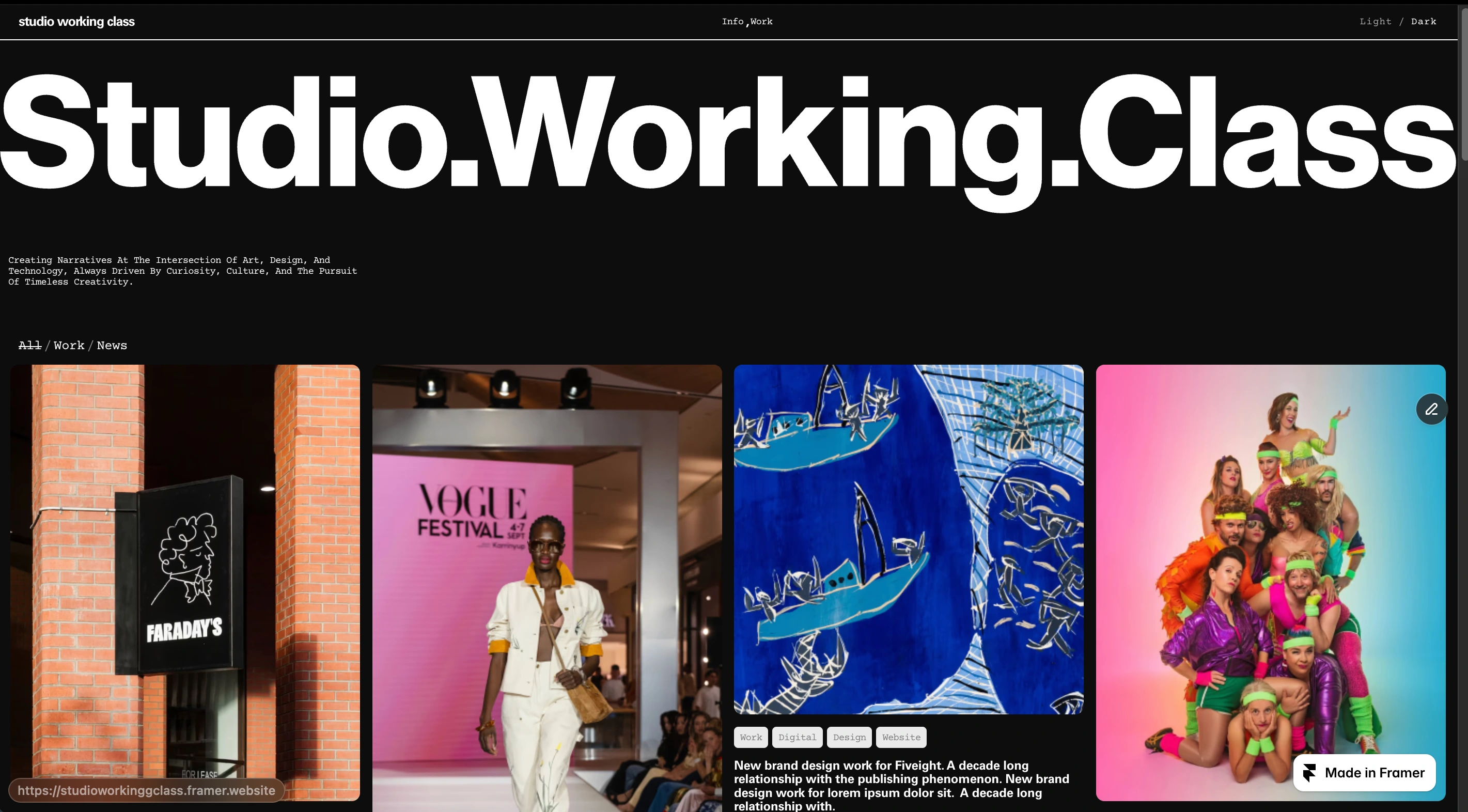
Studio.Working.Class
Designing a Brutally Minimal, System-First Portfolio in Framer
SWC
Overview
Studio.Working.Class is a radically minimal, one-page portfolio experience built entirely in Framer.
The goal was simple but demanding:
Create a brutally clean interface where interaction feels intentional, not decorative. No unnecessary transitions. No visual noise. No distraction from the work itself.
Instead of spreading content across multiple pages, everything lives within a single controlled system, powered by overlays, CMS logic, and native Framer implementation.
This project focuses on structure, clarity, and performance over embellishment.
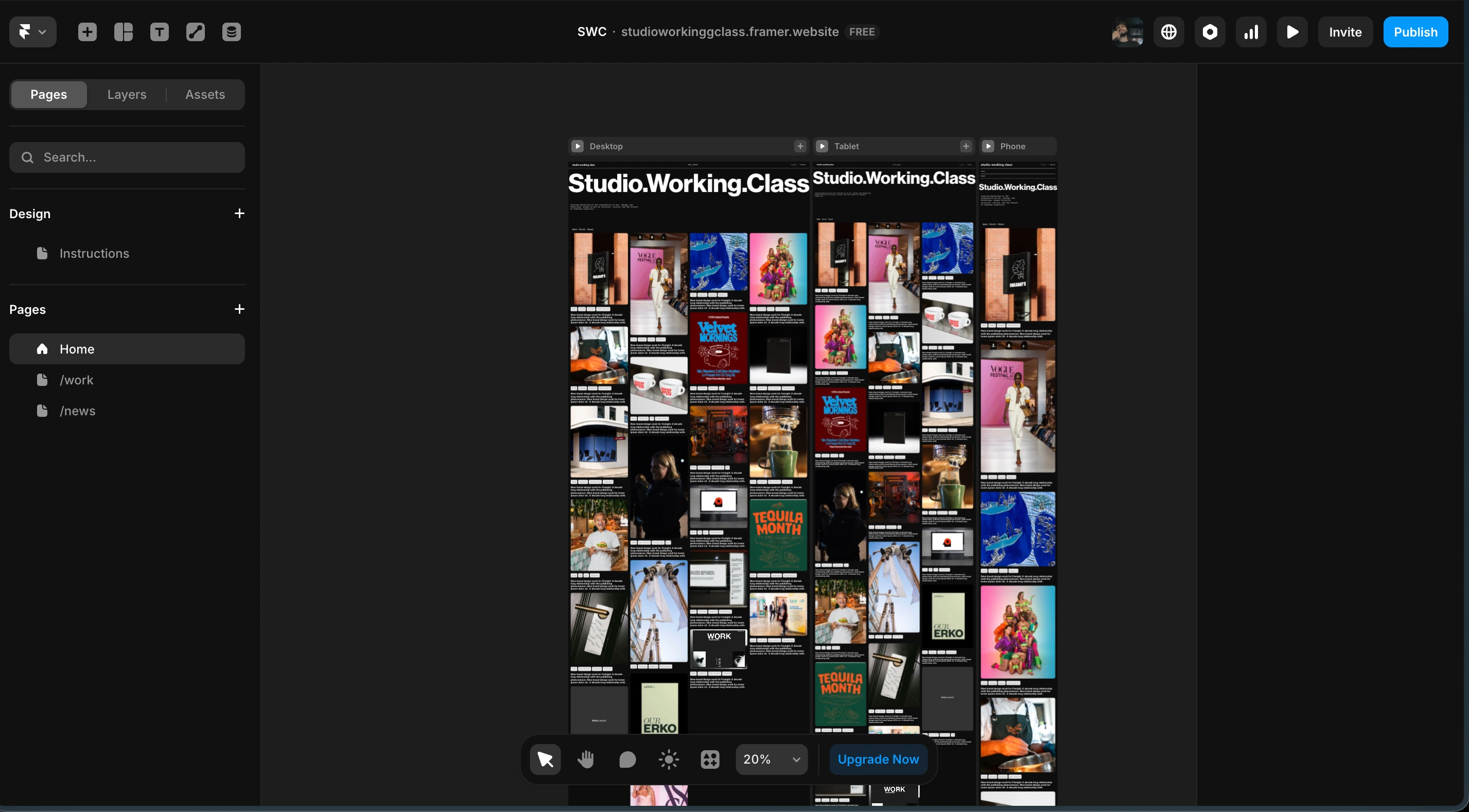
Project View
The Challenge
There were three core challenges:
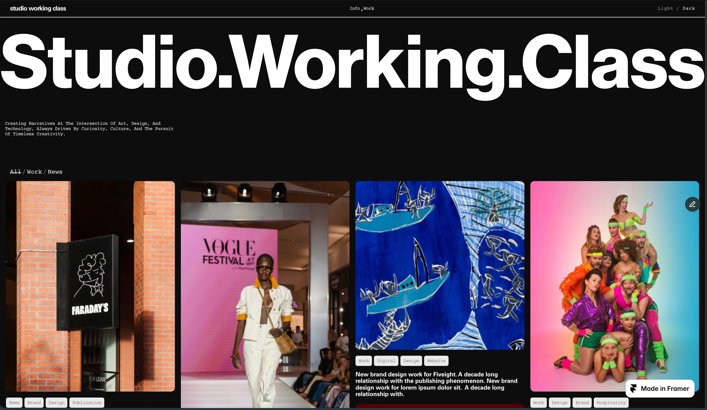
1. Single Page Architecture-
The entire website had to exist on one page, without feeling constrained or heavy.
2. CMS Slider Limitation
Home
Framer does not natively support CMS-driven sliders in the traditional way.
The requirement was to build collection overlays that include dynamic CMS content and slider functionality, without custom external hacks.
3. Minimal Interaction Philosophy
The website needed to feel almost silent.
No exaggerated animation. No trendy motion effects. Only essential open/close logic and subtle hover states.
Minimalism isn’t about removing features, it’s about removing everything unnecessary.
The Strategy
Brutalist Layout System
CMS
The homepage acts as a structured grid of CMS-powered collections.
Each item opens into an overlay rather than navigating to a new page.
This creates:
Zero context switching
No page reload experience
Continuous visual flow
Maximum focus on content
The user never “leaves” the page, they go deeper into it.
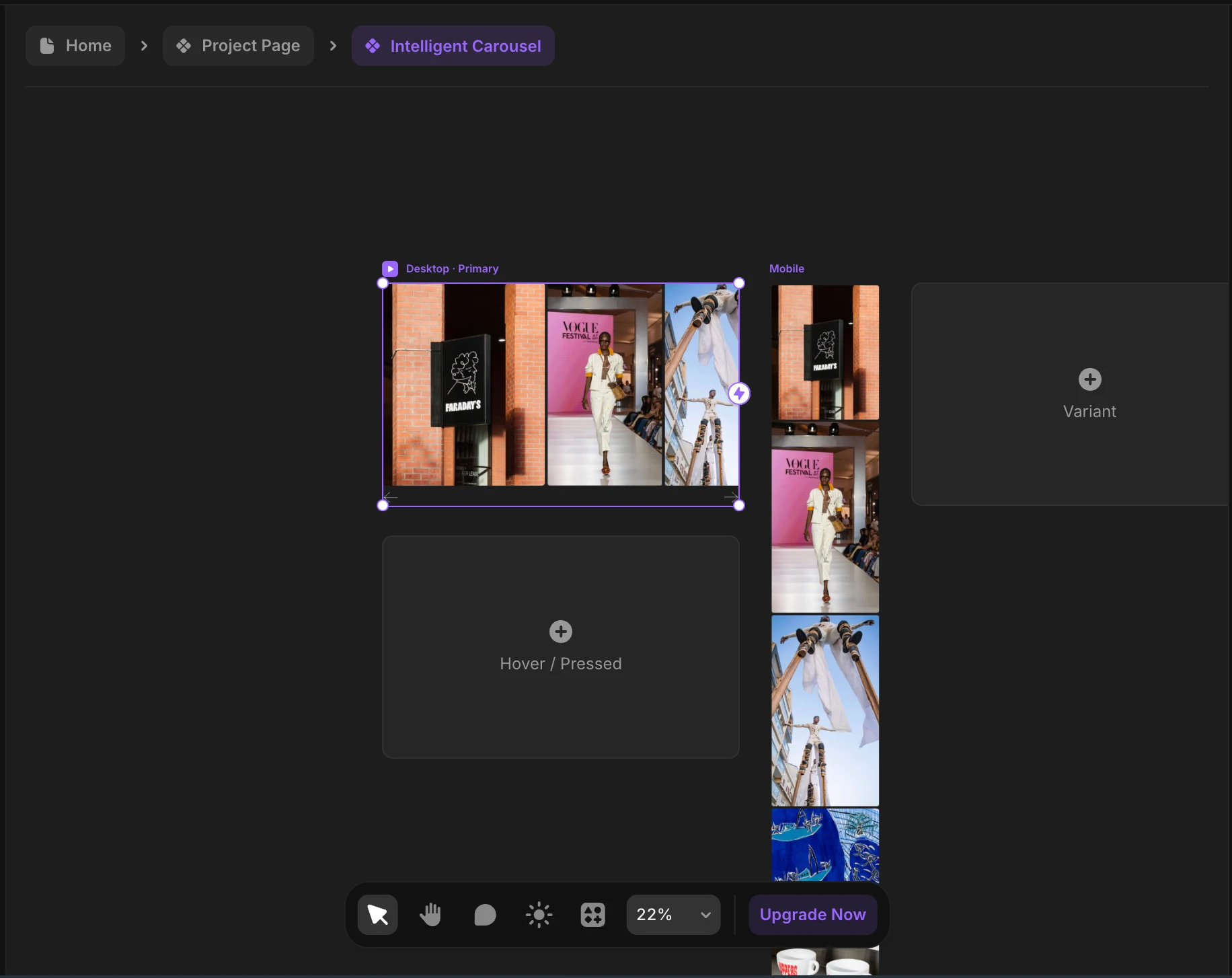
Overlay Architecture
Overlay
Every CMS collection opens as a controlled overlay containing:
Project information
Structured layout
Native CMS slider
Close interaction logic
The overlay system was built using:
Component states
Controlled variants
Minimal opacity transitions
No heavy animation curves
The open/close logic is intentionally subtle.
Native CMS Slider Implementation
CMS Slider
Framer currently does not allow direct CMS sliders in the way most platforms do.
So the solution was:
Structuring CMS items carefully
Using component nesting
Leveraging native Framer carousel behavior
Creating a dynamic content mapping system
The slider pulls live CMS data while maintaining layout consistency.
Filtering System
The website includes filters for:
All Work
News
The filtering logic dynamically updates the entire CMS grid without breaking layout alignment.
This keeps the interface:
Structured
Fast
Minimal
Distraction-free
The grid reorganizes cleanly without dramatic animation, maintaining the brutalist tone.
Information Overlay
Info
Instead of a separate “About” page, the Info section opens as an overlay.
This preserves the one-page philosophy.
Inside it:
Studio information
Structured typography
Team section with hover reveal interaction
Team members reveal on hover, again, subtle and restrained.
The experience feels editorial, not corporate.
Dark & Light Mode System
D/L
The entire website supports:
Light mode
Dark mode
Fully responsive behavior across devices
Both modes were designed intentionally not inverted as an afterthought.
Spacing, contrast, typography, and hierarchy were tuned for both visual environments.
Responsiveness was handled using:
Fluid layouts
Smart stacking logic
Preserved typographic rhythm
Interaction consistency across breakpoints
Design Philosophy
This project explores:
Reduction over decoration
Structure over animation
System over styling
Brutal clarity over aesthetic noise
The interaction design is intentionally quiet.
The user experience is linear, direct, and uninterrupted.
Results
✔ Fully responsive one-page portfolio system
✔ Native CMS overlay architecture
✔ Custom CMS slider solution inside Framer
✔ Dynamic filtering logic
✔ Light/Dark mode support
✔ Minimal interaction design without sacrificing usability
The final result is a website that feels confident.
It doesn’t try to impress, it simply works.
Closing Thought
Studio.Working.Class is an exploration in restraint. It proves that minimal doesn’t mean empty. And brutal doesn’t mean cold. It means clarity.
Like this project
Posted Feb 28, 2026
Designed a minimal, one-page portfolio with a focus on structure using Framer. This project focuses on structure, clarity, and performance over embellishment.
Likes
2
Views
22
Timeline
Mar 26, 2025 - May 6, 2025