
When I started on @Contra just over a year ago, I told myself I would treat every small project like it mattered. This week that quiet promise turned into my first $10k earned on the platform.
Honestly, ten thousand is a number, but the real story is the handful of founders who trusted...


I never thought this would ever be possible, seriously..
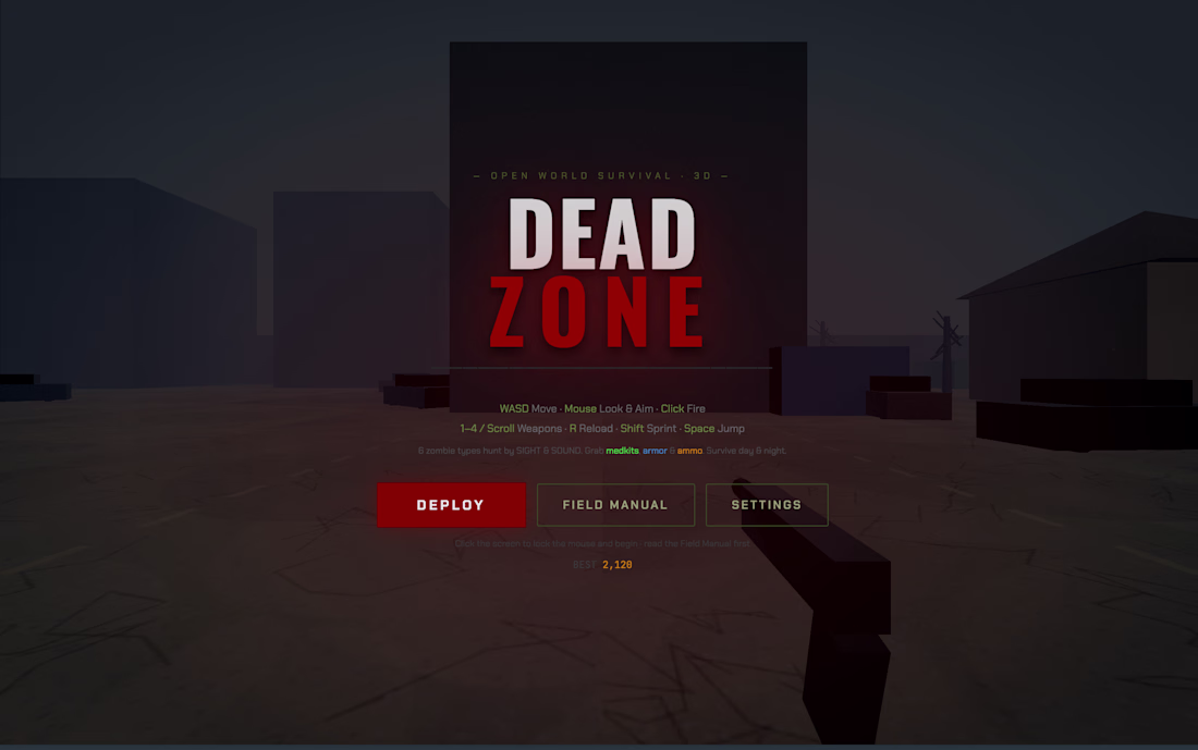
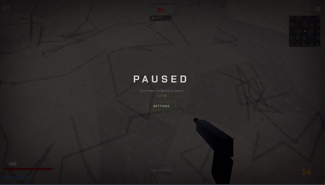
I built a 3D zombie survival shooter inside Figma Make, a tool that is meant for designing websites. It is called DEAD ZONE and it runs in the browser.
You drop into an open apocalyptic city with houses, abandoned cars, dead...
I have been refining this hero exploration over the past few days, and this is where it has landed. It started as a simple question about how much I could take away from a portfolio and still have it feel finished.
So I designed the explorations on a single grid. The oversized...