Built with Framer
Personal Portfolio in Framer
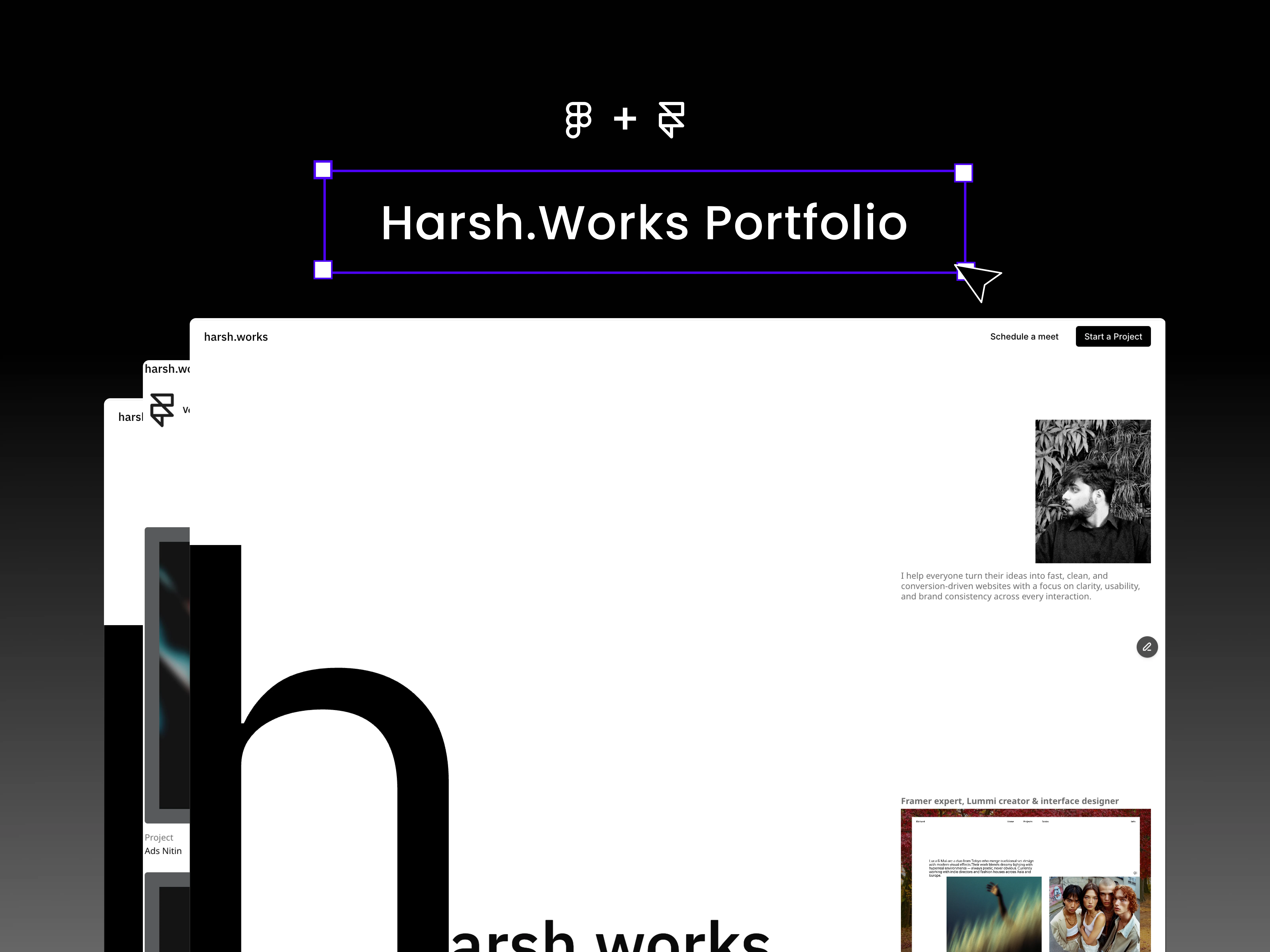
harsh.works – Personal Portfolio in Framer
Role: Designer + Framer Developer
Services: Web Design, No-Code Development, Interactions, CMS
The Challenge
As a designer and no-code developer, I needed a portfolio that didn’t just showcase my work but reflected the way I think and build. Too often, portfolio sites feel either overdesigned or underwhelming mine had to strike the right balance: minimal, professional, and quietly expressive.
The site needed to work like a business card but feel like an experience. It had to show clients that I can design, prototype, and build in Framer with a level of polish that makes every small interaction matter.
Full Website
The Vision
I wanted the portfolio to be single-page and fluid not cluttered, but structured with intent. The guiding principle was clarity: highlight my process, my work, and my services without overwhelming the visitor. Every section had to earn its place.
A key part of the vision was to integrate smooth storytelling interactions: a process section that transitions seamlessly between design and development, hover effects that reveal CTAs, and a footer that feels functional yet understated.
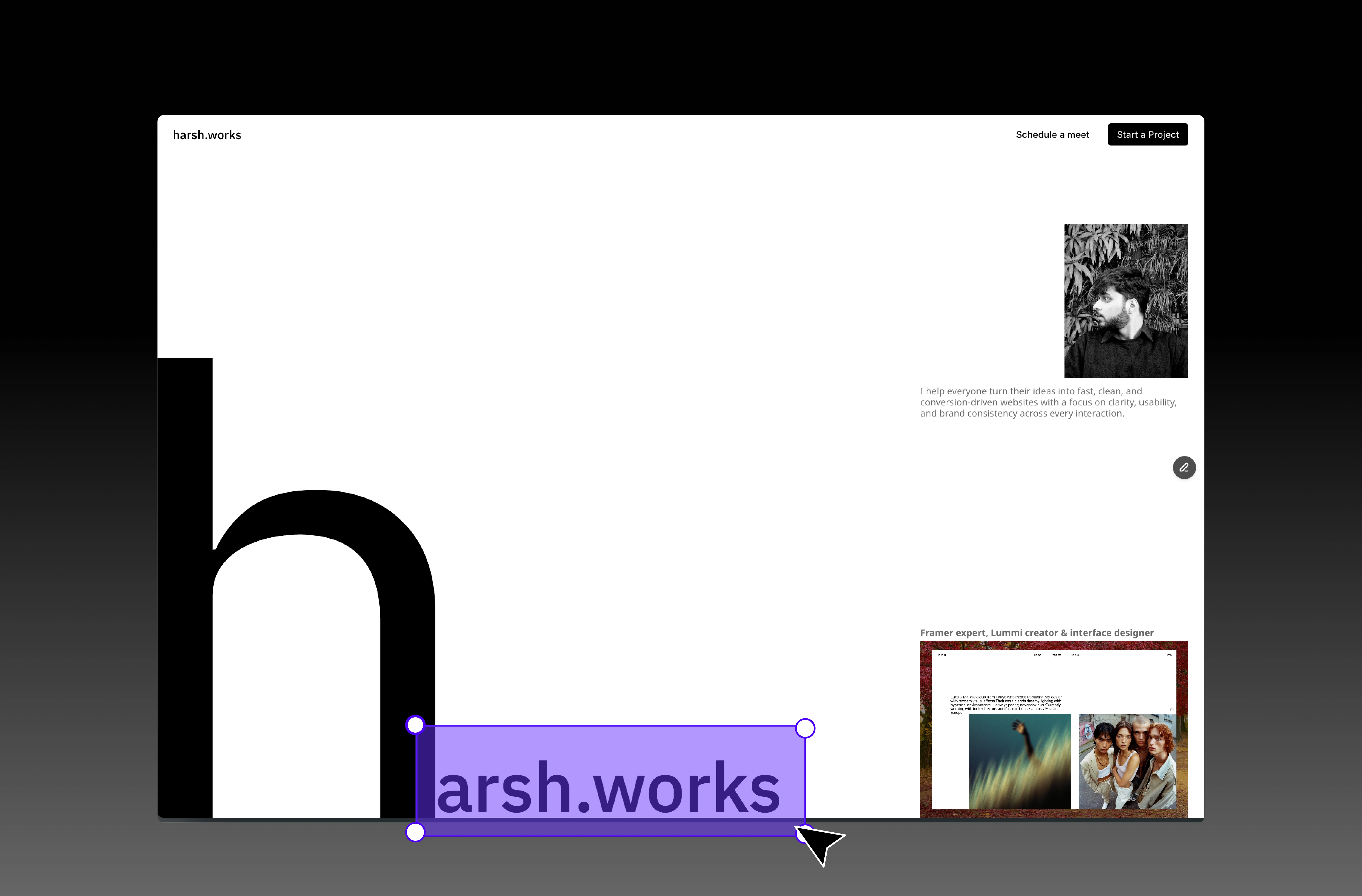
Hero
The Build in Framer
Once the layout and structure were designed, I moved to Framer to bring it alive:
Design → Development Switch – In the process section, I built a smooth scroll-based interaction where the visuals shift between “design” and “development,” reflecting how I bridge both worlds.
Switch
CTA Hover Overlay Form – I created a contact section where hovering reveals a form overlay, making the call-to-action more engaging and interactive.
Form
Clean Footer with Essentials – A minimal footer with just the right links, kept functional without visual noise.
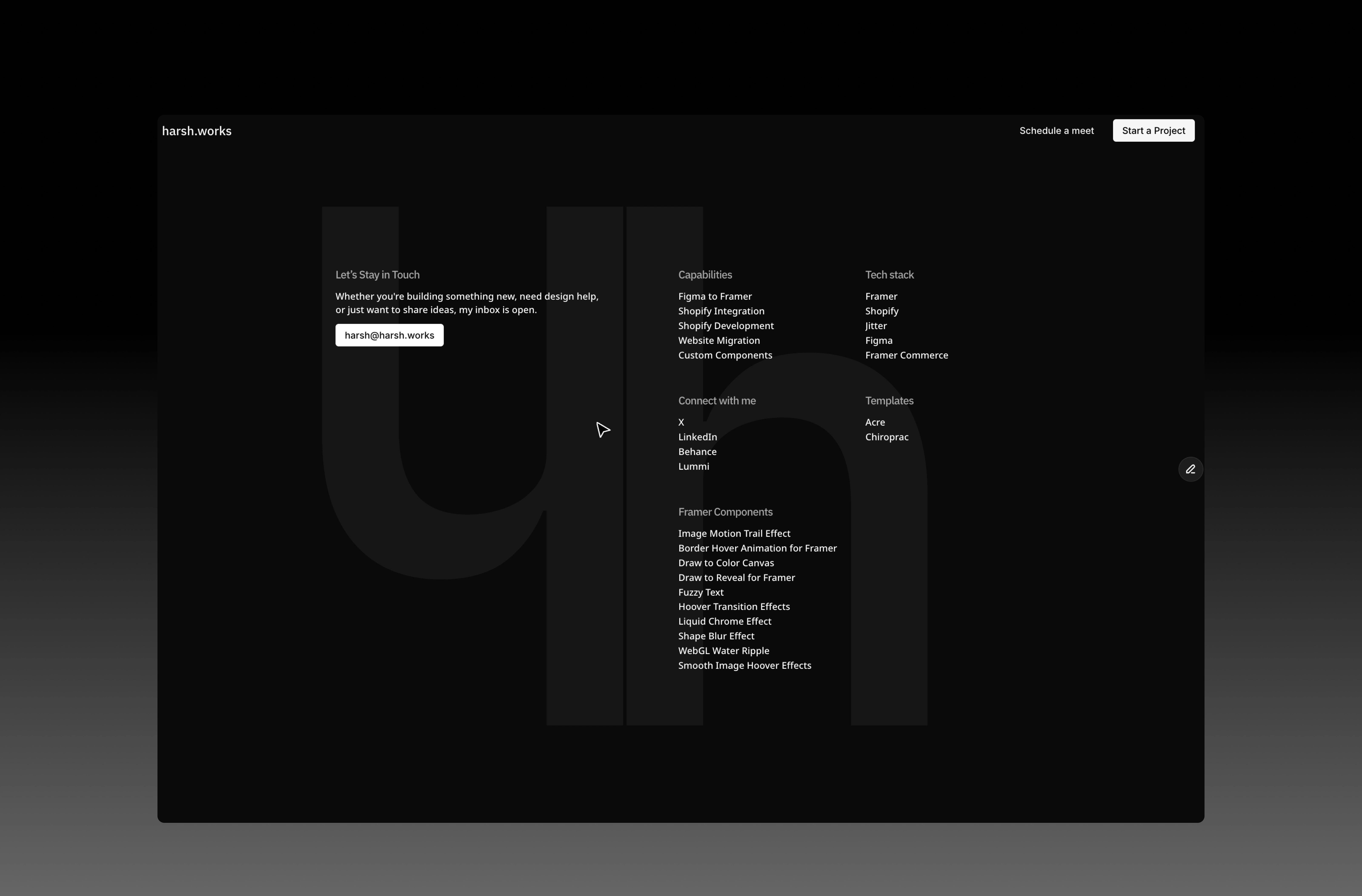
Footer
Framer-First Build – Everything was built natively inside Framer, no external code, just clean, modular, no-code development.
Smooth Micro-Interactions – Subtle animations on scroll and hover that keep the experience engaging but minimal.
The Experience
The site flows like a story:
You land on a clean introduction, simple typography, no clutter.
As you scroll, the process section animates, showing exactly how I move from design to development.
Projects are displayed with clarity, each framed to let the work speak.
The CTA feels intuitive, a hover effect draws you in, then reveals a form, keeping the design clean until the moment you’re ready to act.
Finally, the footer wraps everything up with essential links, designed to disappear into the background while still being useful.
Interactions
The Result
The portfolio is more than a showcase, it’s a working example of how I approach client projects. Minimal yet detailed, built entirely in Framer, and focused on both usability and experience.
It doesn’t just tell people I design and develop websites — it shows them.
Live Site: harsh.works
Type: Framer Design + Development
Like this project
Posted Sep 26, 2025
I designed and developed a personal portfolio in Framer, showcasing my design and development skills. It includes custom animation and interactions.
Likes
2
Views
9

