100+ websites & products built and launched in 3–5 weeks.
100+ websites & products built and launched in 3–5 weeks.
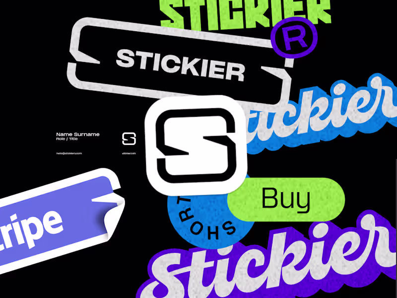
A Global Brand Designer Studio for AI Startups
A Global Brand Designer Studio for AI Startups

Framer Pro Expert & No-Code Dev | UX/UI & Product Design
Framer Pro Expert & No-Code Dev | UX/UI & Product Design

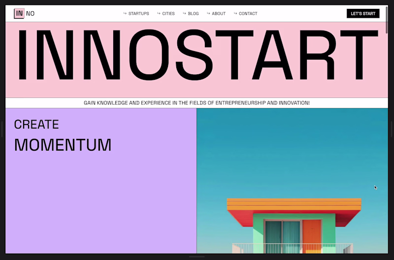

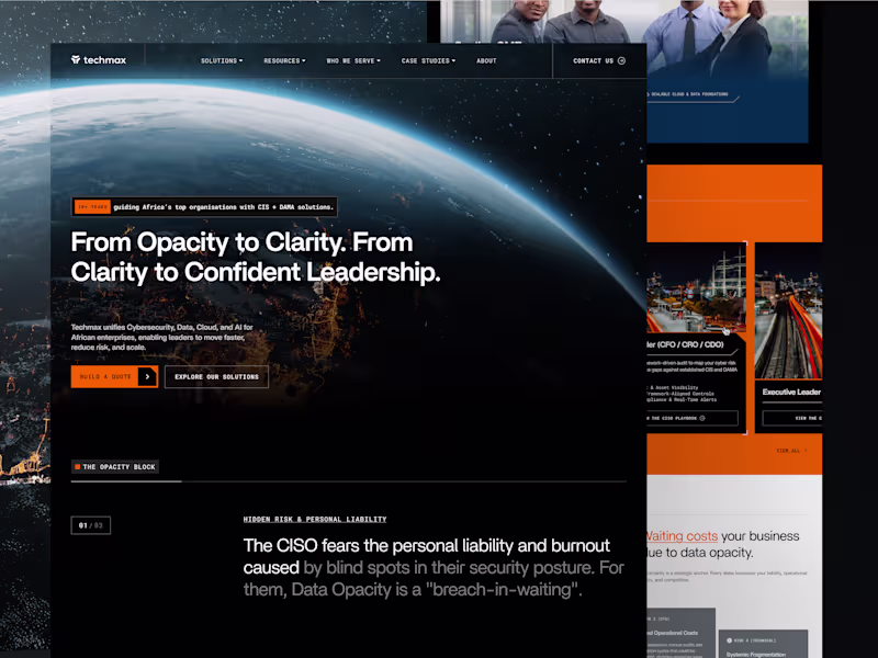
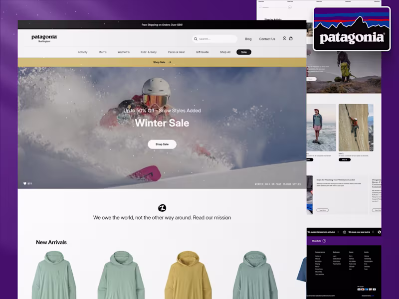
making web & mobile apps that scale
making web & mobile apps that scale
Product Design Partner, No-Code Developer
- $1k+
- Earned
- 1x
- Hired
- 5.0
- Rating
- 13
- Followers
Product Design Partner, No-Code Developer
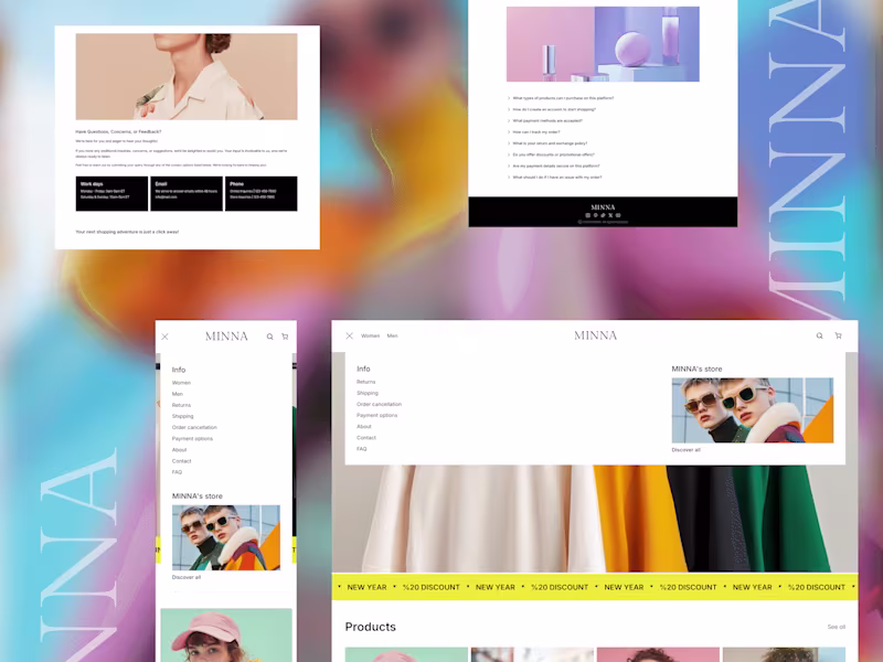
Product & Visual Designer · Brand Identity · UI/UX
- 2x
- Hired
- 5.0
- Rating
- 44
- Followers
Product & Visual Designer · Brand Identity · UI/UX
Silicon Valley Staff Software Engineer
- $10k+
- Earned
- 1x
- Hired
- 5.0
- Rating
- 14
- Followers
Silicon Valley Staff Software Engineer

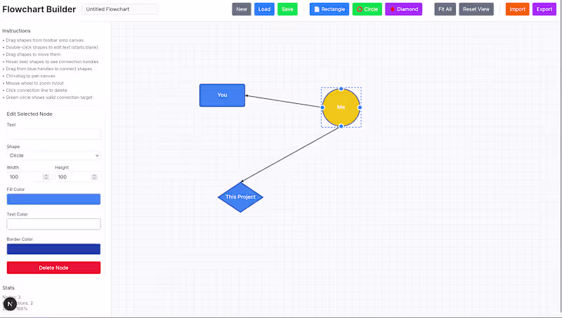
Senior UI/UX Visual Designer | Figma Expert | Ex-Apple,Adobe
- 5.0
- Rating
Senior UI/UX Visual Designer | Figma Expert | Ex-Apple,Adobe