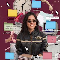
Molly Mittal
Product & Visual Designer · Brand Identity · UI/UX
- 2x
- Hired
- 5.00
- Rating
- 55
- Followers
Project title
STALL — Your farmers market, alive.
A swipe-to-shop farmers market companion that connects local vendors with regulars before Saturday ever arrives.
The problem
Every Saturday, the same thing happens.
You show up to the farmers market at 10am. The ramp vendor you wanted is sold out by 9. You forgot cash. You walk past a honey stall three times because you can't remember if you already bought some. And that new mushroom farm you heard about? Gone before you spotted them.
On the vendor side, it's just as frustrating. Small farmers wake up at 4am, load the truck, drive an hour, and have no lightweight way to tell their regulars — the people who actually want what they grow — "I have asparagus this Saturday. Come find me."
STALL fixes both sides of that problem.
What STALL does
STALL is a two-sided farmers market app built around one weekly ritual: Saturday morning.
For shoppers:
Follow vendors at your local market
Swipe through a weekly produce deck — right to add to your list, left to skip — exactly like Bumble, but for ramps and sourdough
Get a Friday evening digest: what your vendors have this week, your auto-built shopping list, and where each stall is on the map
Pre-reserve high-demand seasonal items before you leave the house
Discover first-of-season arrivals with a "what's new this week" spotlight
For vendors:
Post a weekly inventory update in 3 taps — what you're bringing, quantities, price
Reach your regulars directly before market day
Manage pre-reservations without a complicated system
The app celebrates the seasonal nature of farmers markets — ramps in April, strawberries in June, squash in October. Every week feels like something worth showing up for.
How I built this with Google Stitch
STALL was designed and prototyped entirely using Google Stitch as the primary build tool, with Figma used only for initial wireframing.
The workflow:
Day 1 — Brand and wireframes
I started by defining the brand: the name, palette (Pumpkin Spice Forest — a warm amber, fern green, mauve, and cream system), and illustration direction. I wireframed the three core flows — swipe deck, Friday digest, and vendor post — before touching Stitch.
Day 2 — Into Stitch
I imported my Figma file directly into Stitch using the .fig import feature. From there I used streaming generation to build each screen live on the canvas — watching the splash screen, onboarding flow, and homepage assemble in real time was genuinely remarkable. The HTML-native canvas meant every animation I added — card tilt on swipe, drawer slide-up, bento tile stagger — rendered exactly as it would in production.
Key Stitch prompts used:
"Add a swipe gesture to the produce card stack — right swipe shows a green Added overlay with 5° card tilt, left swipe shows a mauve Skipped overlay with -5° tilt"
"Make the shopping list items stream in one by one with 120ms stagger on page load"
"Add a bottom drawer that slides up from the vendor card with spring easing — show the farm bio, full inventory list, and two action buttons"
"Build the Friday digest screen — vendor items animate in sequentially, the seasonal spotlight card pulses gently"
"Export web assets and deploy to Netlify"
In-place edits I used:
Swapped the swipe overlay color from red to mauve to match brand
Adjusted the bento grid gap from 8px to 6px after seeing it render on canvas
Changed the CTA button from outlined to filled after in-place visual comparison
Rewrote the seasonal spotlight copy directly on the canvas without regenerating
What Stitch made possible that nothing else could:
The swipe gesture interaction, the drawer spring animation, and the staggered list streaming — all three of these would have taken days to hand-code. In Stitch, they were prompt-driven and live on the canvas within minutes. The gap between "designed" and "interactive prototype" collapsed entirely.
Screens delivered
Splash screen — farmer illustration, full-bleed cream background
Onboarding screen 1 — market basket illustration, "Your market, every Saturday"
Onboarding screen 2 — swipe mechanic explainer with card UI
Onboarding screen 3 — Friday digest bento preview
Homepage — bento grid with market header, seasonal spotlight, list, map preview, swipe deck, streak tracker
Swipe deck — card front, vendor expand drawer, swipe right (added), swipe left (skipped)
Friday digest — streaming vendor list, seasonal spotlight, auto-built shopping list
Market day map — vendor stall grid, spot numbers, live confirmation states
Vendor post flow — 3-tap inventory update screen
Design decisions worth noting
The swipe mechanic — Borrowing the Bumble swipe pattern for produce discovery was the conceptual breakthrough. It transforms a passive browse into an active, satisfying decision. Every right swipe builds your list. Every left swipe still shows you where the vendor is on the market map — skipping is never permanent.
The Friday digest as the hero feature — Most apps make you come to them. The Friday evening push notification with a personalised market brief is the one moment where STALL comes to you. It changes Saturday morning from reactive to intentional.
Bento homepage — Instead of a scrolling feed, the homepage gives you everything at a glance: your market, your list, the seasonal moment, your vendors. Seven tiles, seven pieces of information, zero scrolling.
The color system — Pumpkin (#E8872A), Fern (#728040), Mauve (#B07090), Cream (#FDFAF6), and Moss (#4A5228). Every color has one job. Pumpkin is interactive. Fern is seasonal and confirmed. Mauve is reserved and streaks. Cream is every surface. Nothing competes.
What I learned
Stitch genuinely changes the prototyping workflow. The moment I stopped thinking of it as a design tool and started thinking of it as a build tool — one where the canvas is the product, not a picture of the product — everything accelerated. The in-place edit feature is the one I'll keep coming back to: being able to change a color, rewrite copy, or swap a component without regenerating the whole screen is the difference between iteration and rework.
STALL started as a hackathon idea. After building it in Stitch, it feels like something real.
Live Prototype: https://stitch.withgoogle.com/preview/8229547464152593644?node-id=e53124995cda49808685283be978dc8c
50
44
1.2K
Boatsetter Email Marketing System
0
6
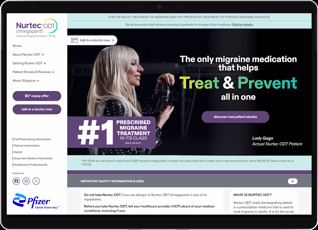
Pfizer Nurtec x Lady Gaga Campaign
3
11
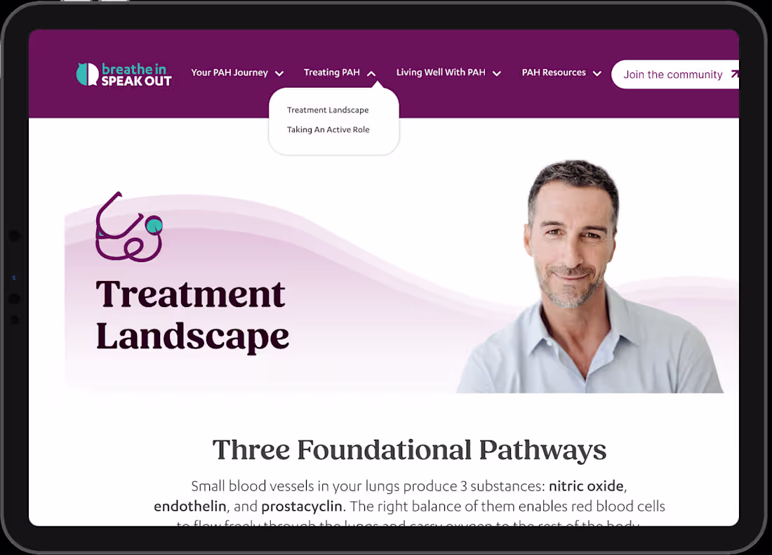
Johnson & Johnson - BISO (Breathe In Speak Out Website)
1
9
Packaging and Branding
2
338
Logo and Menu Card Design
2
303
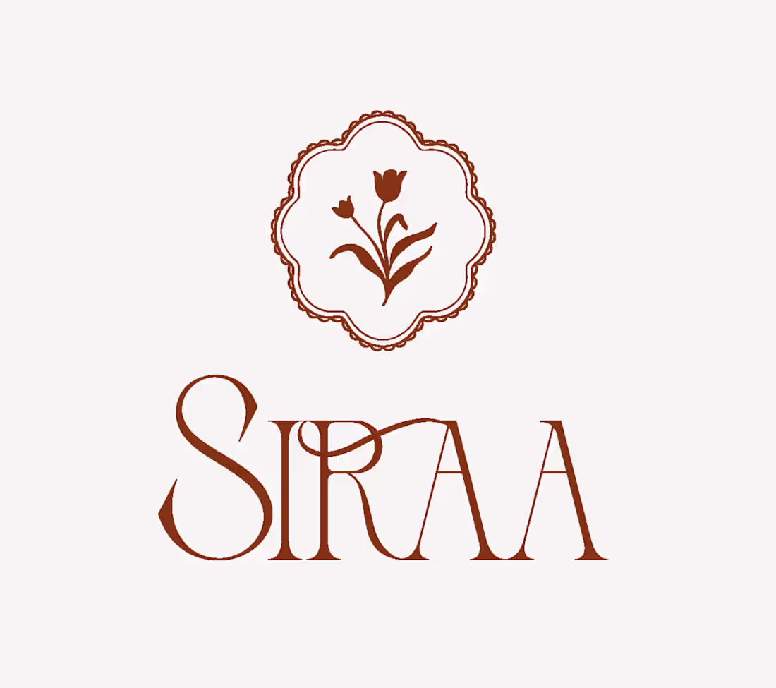
Siraa Logo/Motif Design
3
316
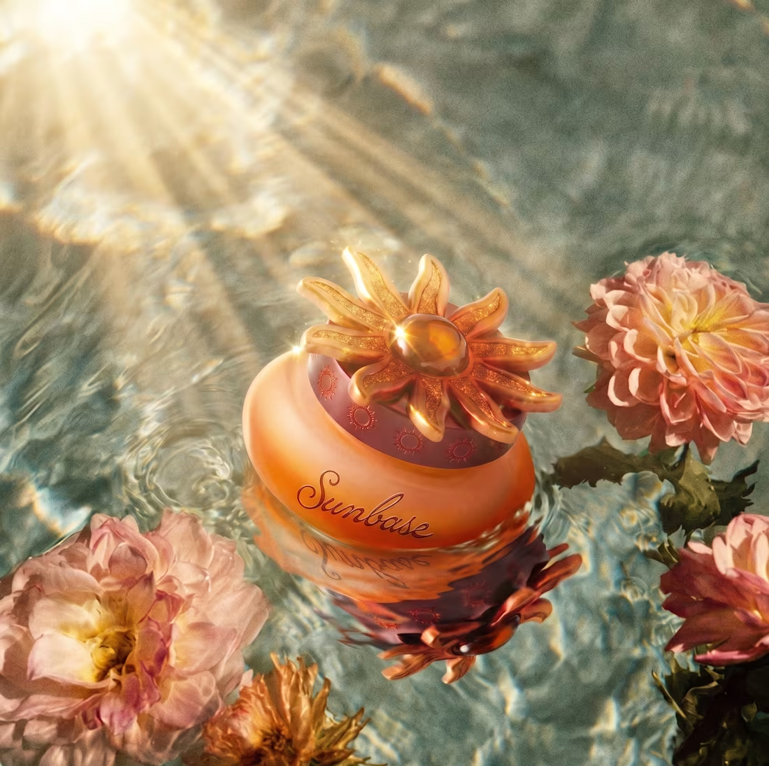
Sunbase | Packaging Design
Sunbase is a sunscreen brand built for the everyday, lightweight, effortless, and designed to feel like a natural part of your morning. The challenge wasn't just to make a beautiful product. It was to make sun protection feel like something you'd want on your shelf.
The packaging concept centers on a single sculptural gesture: a sun-petal lid cast in warm gold, sitting atop a hand-sized frosted amber jar. The form is intentional, round enough to feel held, weighted enough to feel considered. Nothing about it reads clinical. Everything about it reads ritual.
Shot across three environments, floating in water, held in sunlit hands, and staged in muted sepia — the campaign imagery was art-directed to show the product as an object worth living with, not just a formula worth using.
Sunbase doesn't protect you from the sun. It helps you meet it.
3
281
I turned a photo into a forever stamp. Here's why that matters.
Every relationship has a place. A trip that changed everything. A moment you keep going back to. A location that just means something.
But those memories live on your phone, buried under 4,000 other photos and slowly, they fade.
I built a FLORA Technique called Collectible Memory Stamps that turns any photo and location into a custom illustrated postage stamp.
The one you see here? Ojai Valley, CA. Est. 2024. A couple, a meadow, a sunset that looked exactly like that.
It took minutes to make. It looks like it took a lifetime to earn.
Who it's for: Couples. Wedding planners. Travel photographers. Anyone who believes some memories deserve more than a highlight reel.
What you put in: A photo
What you get out: A stamp that feels like it should be on the wall, not in a camera roll.
Try it → https://app.flora.ai/techniques/photo-stamp-creator
1
8
311
3D Cosmetic Container Designer turns a simple brief into a fully realized packaging concept. Choose your base form ( tube, glass bottle, spray) or any shape you're working with, upload a colour palette image, describe your decoration style, and the Technique generates a 3D rendered visualisation of your container.
No CAD. No 3D software. No briefing a specialist and waiting three days for a first draft.
Built for beauty brand designers, indie cosmetic founders, and packaging consultants who need to move fast in the ideation phase, whether you're pitching a client, exploring a new product line, or just trying to get the vision out of your head and onto a screen.
Run it once to validate a concept. Run it ten times to find the right one.
Try it -> https://app.flora.ai/techniques/3d-cosmetic-container-generator
5
20
598
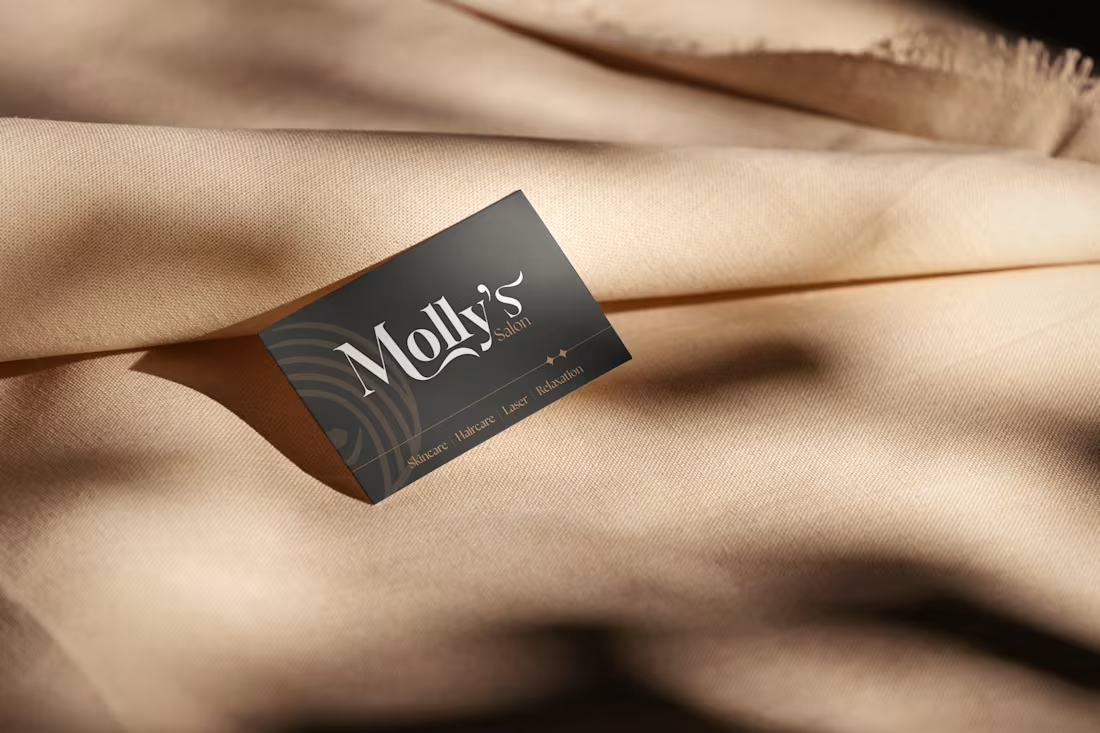
Molly’s Beauty Salon is a women-led, women-focused space built on the idea of empowerment through beauty. The brand blends modern elegance with warmth, creating a safe and welcoming environment where women can feel confident, cared for, and celebrated.
At its core, Molly’s is not just about services, it’s about community, self-care, and confidence. With a strong “For Women, By Women” philosophy, the brand emphasizes authentic beauty, personalized experiences, and emotional connection, making every visit feel uplifting and meaningful.
Visually, the brand leans towards soft, feminine aesthetics with a premium touch, think warm tones, minimal yet elegant design, and a calming, luxurious vibe that reflects both care and sophistication. ✨
2
7
305
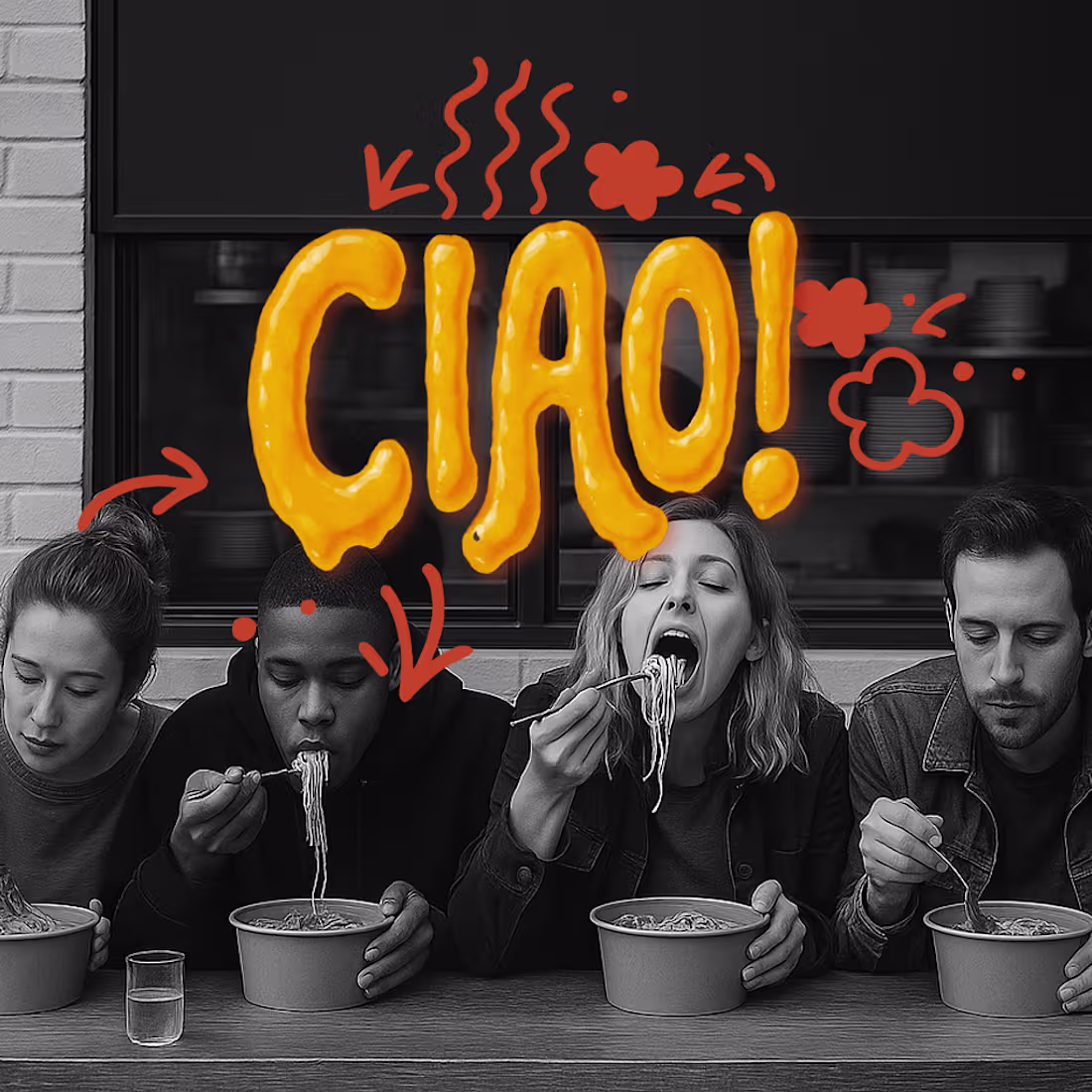
“Warning: May cause excessive slurping. And brand envy.”
We teamed up with CIAO! to stir the pot, literally. From gooey macaroni logos to slurp-happy doodles and packaging that screams “I’m not sharing,” this pasta-to-go brand doesn’t follow rules… just noodles.
Add a pop-up that looks like your childhood lunchbox collided with a street cart in Rome, and boom, you’ve got flavour with a side of FUN.
Pasta? Packaged. Branded? Bold. Vibes? Al dente.
Just another day in the kitchen. 🍝🧡
5
323
Compani is a whimsical café concept designed for people and their pets to relax, snack, and sip together. From branding to spatial storytelling, the goal was to create a cozy, colour-forward world that feels equal parts playful and premium.
This fictional project explores how branding can be immersive, emotional, and downright fun especially when it brings pets into the picture. Compani blends bold colour palettes, charming illustrations, and thoughtful customer experience design to craft a café where dogs sip Puppuccinos, cats purr over Mewcchiatos, and bunny guests nibble Croissniffs while their humans enjoy a latte and good company.
Key deliverables included:
Logo & Identity Design with a quirky, pet-inspired wordmark
Custom Doodles & Iconography featuring a cast of café-going animals
Punny Pet Menu Illustrations (Spaghootie & Meatballs, anyone?)
Loyalty Card Design with playful copywriting
3D Pop-Up Café Concept showcasing branding in space
Realistic & Stylized Café Scenes for storytelling and social use
Compani is more than a café, it’s a reminder that every moment shared with our pets is worth celebrating.
3
8
326
A 3D terrarium game where your flower grows or deflates, based on how well you care for it.
Click to water it. Give it sunlight. Watch a balloon-glass flower bloom in real time; petals inflating, colour deepening, light catching the gloss as it grows.
Terrarium is a 3D interactive game built entirely in Omma for the Omma Design Challenge. The concept is simple: care for your plant daily, watch it respond honestly. Feed it and it flourishes. Neglect it and it deflates, literally. Every plant is rendered in balloon-glass, the same inflated, high-gloss aesthetic you see in the references above.
The whole thing runs in your browser. No install. Just some soil, and something small waiting to grow.
Built with: Omma (100%); glass materials, 3D interaction states, camera animation, balloon-glass rendering.
Socials: Instagram (https://www.instagram.com/p/DW2mnMLEbza/) | LinkedIn
(https://www.linkedin.com/posts/mollymittal_molly-m-luminary-lab-on-instagram-i-activity-7447466756014501888-CJw0?utm_source=share&utm_medium=member_desktop&rcm=ACoAAC_0DC4BixouaIAU-uqpPv40e7S4CKji7g8)Try it → https://omma.build/p/terrarium-opening-scene-design-zuovgm
(https://omma.build/p/terrarium-opening-scene-design-zuovgm)
4
14
577
Here's what I built.
SENSA, a mindfulness app that actually gives you a reason to come back tomorrow.
The grainy navy background that makes the screen feel like a room with the lights dimmed. Glass buttons that don't shout. A streak that encourages instead of threatens.
Five sense paths: Breath, Sound, Focus, Body, Mind. Each one a different way of training presence.
The Breath Lab is fully built, a circle that expands and contracts in your hand, vibrating on every phase, guiding your nervous system without a single word.
And a Calm Score chart that shows you in your own numbers, that the practice is working.
Built on Vercel v0 in one weekend. Researched on Mobbin. Inspired by Duolingo's streak mechanic and Calm's visual language.
LinkedIn
(https://www.linkedin.com/posts/mollymittal_sensa-a-mindfulness-app-that-actually-gives-ugcPost-7443549326011871232-GN0q?utm_source=social_share_send&utm_medium=member_desktop_web&rcm=ACoAAC_0DC4BixouaIAU-uqpPv40e7S4CKji7g8)This one's personal. I hope it helps someone.
6
473
Most entrepreneurs have ideas. Very few have a crowd to test them on.
PitchArena: Rise of the Sharks 🦈
It's a gamified pitch competition platform where two types of people level up together.
Neither side works without the other. That's the whole point.
Categories: Education & Learning + Social & Community + Entertainment & Gaming
(Yes, all three)
Built entirely on @bubble!
8 pages. 7 data types. 12+ workflows. One genuinely new idea.
🔗 Try it here
(https://mittalmolly27-45243.bubbleapps.io/version-test/api/1.1/mobile/preview?debug_mode=true)Linkedin
(https://www.linkedin.com/posts/mollymittal_im-excited-to-share-my-submission-for-the-activity-7442079041538658304-NtL1?utm_source=social_share_send&utm_medium=member_desktop_web&rcm=ACoAAC_0DC4BixouaIAU-uqpPv40e7S4CKji7g8)#LevelUpWithBubble #BuildOnBubble
4
27
869
Loading... Please Wait. 💾
Remember the smell of a brand new computer box? The weight of a mechanical switch before everything went “slim”? I took that tactile nostalgia and turned it into a fully functional UI kit.
Heavy-duty keycaps, electric blue accents, and enough Auto Layout to keep even the most chaotic desktop organised. It’s not just a keyboard; it’s a time machine.
#80sAesthetic #PixelPerfect #contra #OldSchoolTech #FigmaMakeathon
Link
(https://mug-cel-04688624.figma.site)Figma Community
(https://#80sAesthetic #PixelPerfect #contra #OldSchoolTech #FigmaMakeathon)LinkedIn
(https://www.linkedin.com/feed/update/urn:li:ugcPost:7433060238708256769/)Instagram
(https://www.instagram.com/p/DVQQKJBEUYz/)
5
19
734
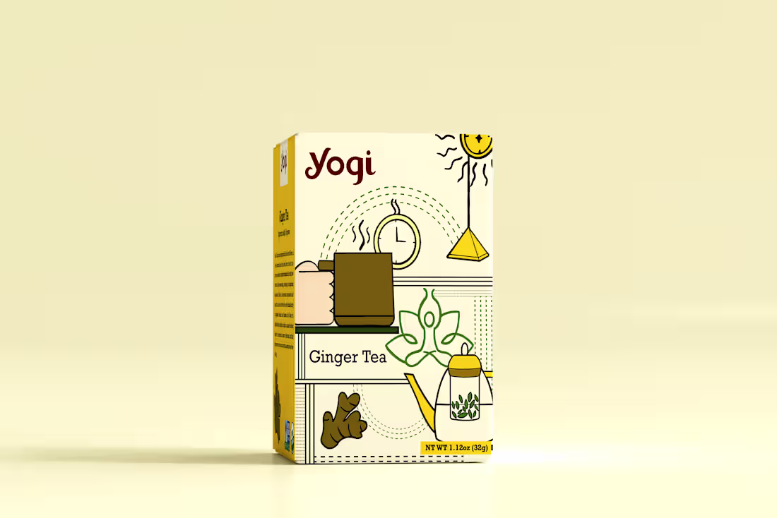
Yogi Green Tea Packaging
3
19
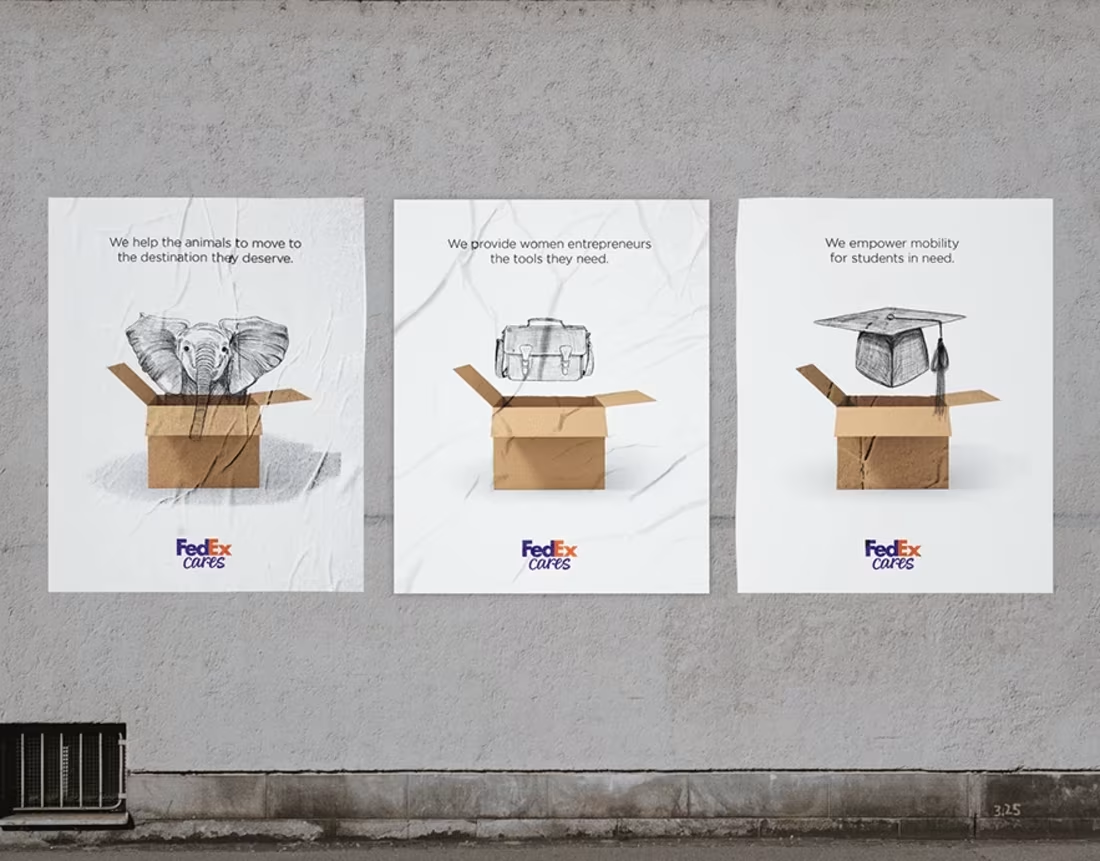
FedEx Campaign
4
14
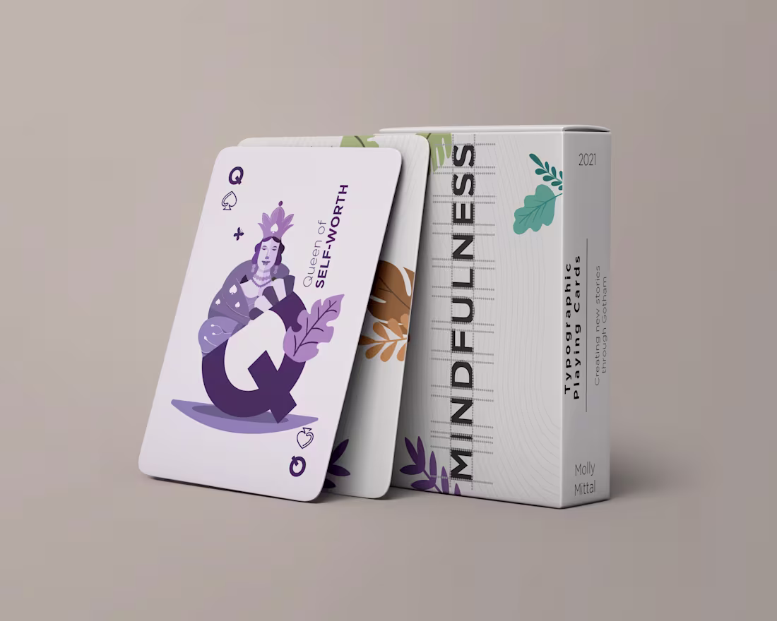
Specimen Card Deck
5
15
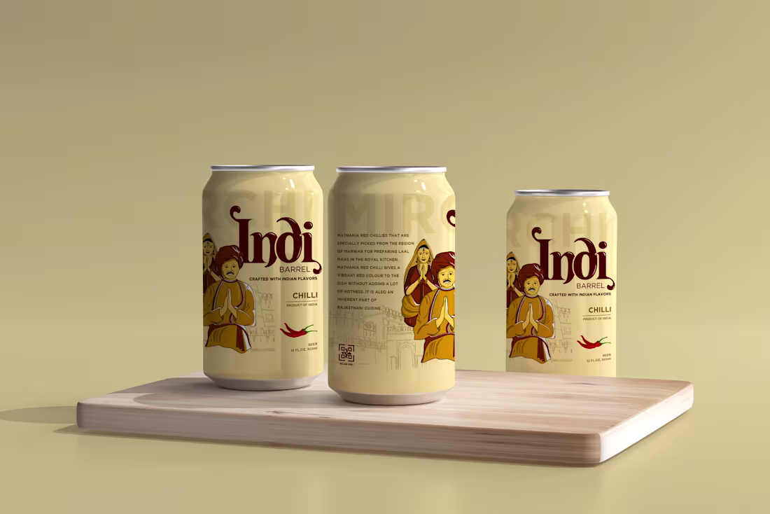
Indi Barrel – Brewed with Spice. Drawn from the Soil.
4
16
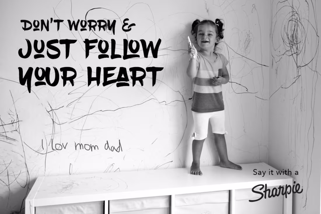
Say it with a Sharpie!
5
17
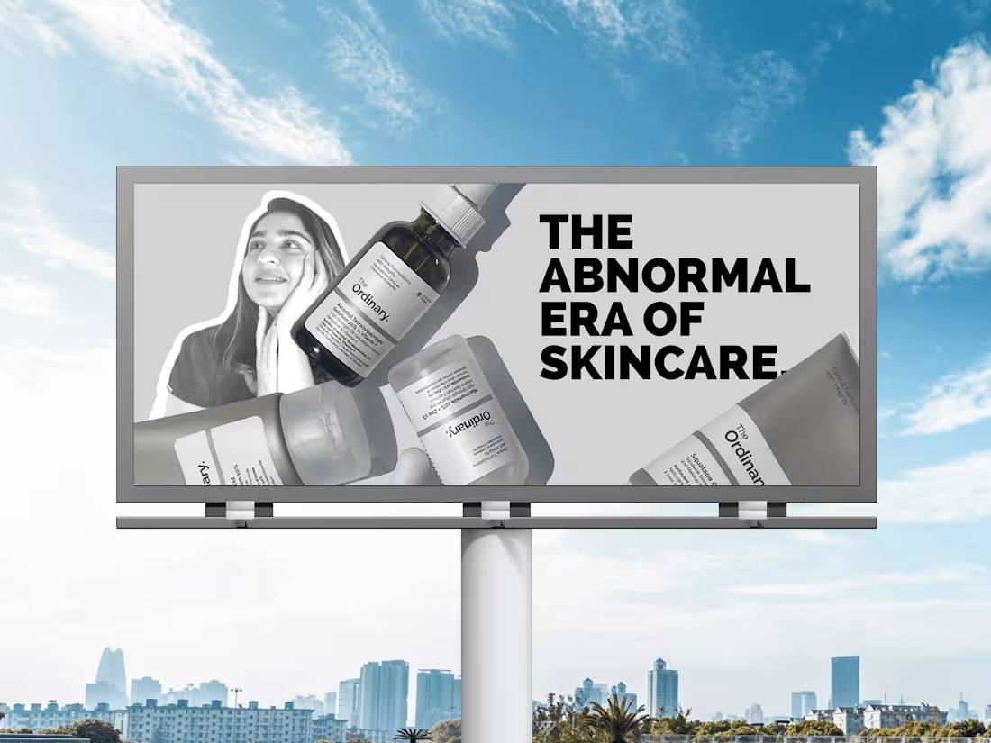
The Ordinary: The Abnormal Era of Skincare
5
9
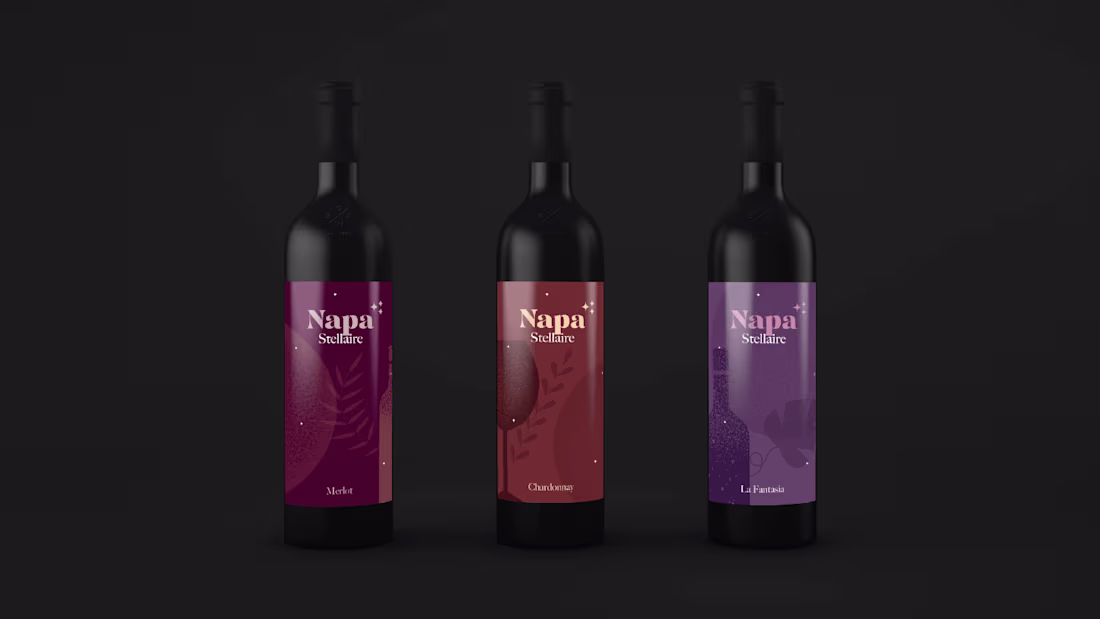
Napa Stellaire: A Celestial Wine Experience
3
8
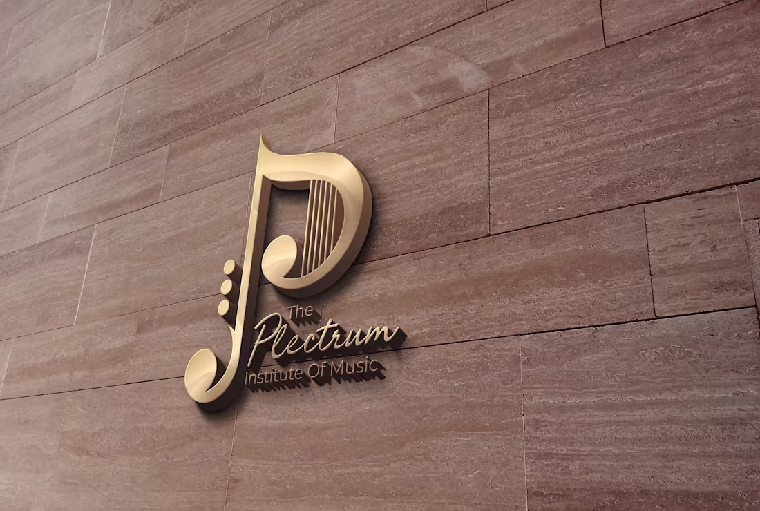
Logo Design | Branding for Plectrum Institute of Music
4
8