Indi Barrel – Brewed with Spice. Drawn from the Soil.
Molly Mittal
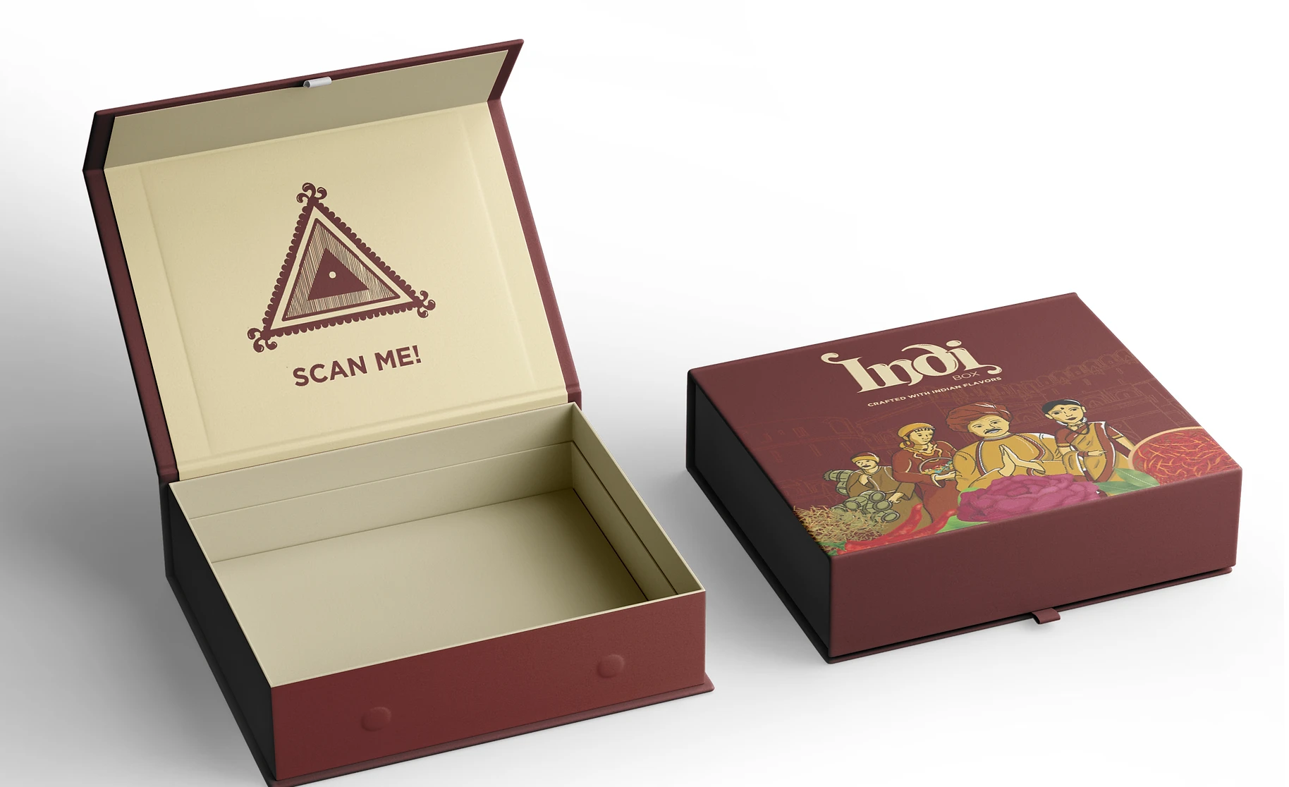
Indi Barrel: Brewed with Spice. Drawn from the Soil.
(ADDY Award Winner Project)
Design Direction:
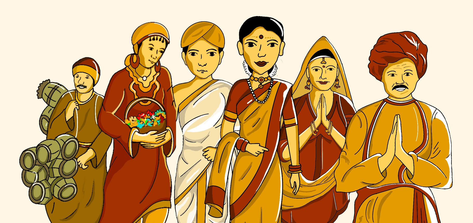
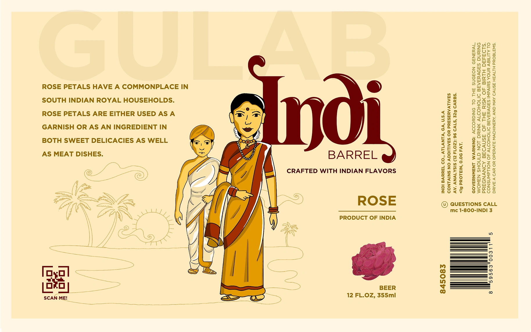
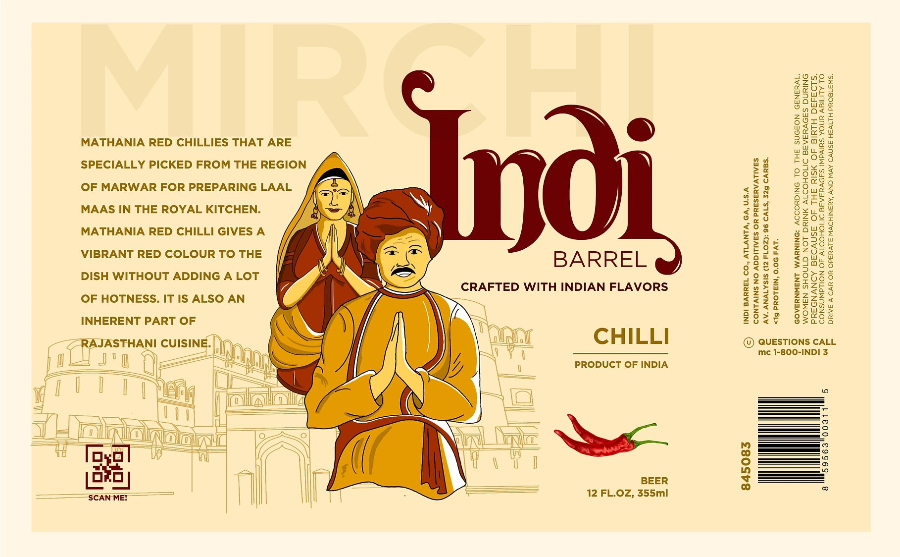
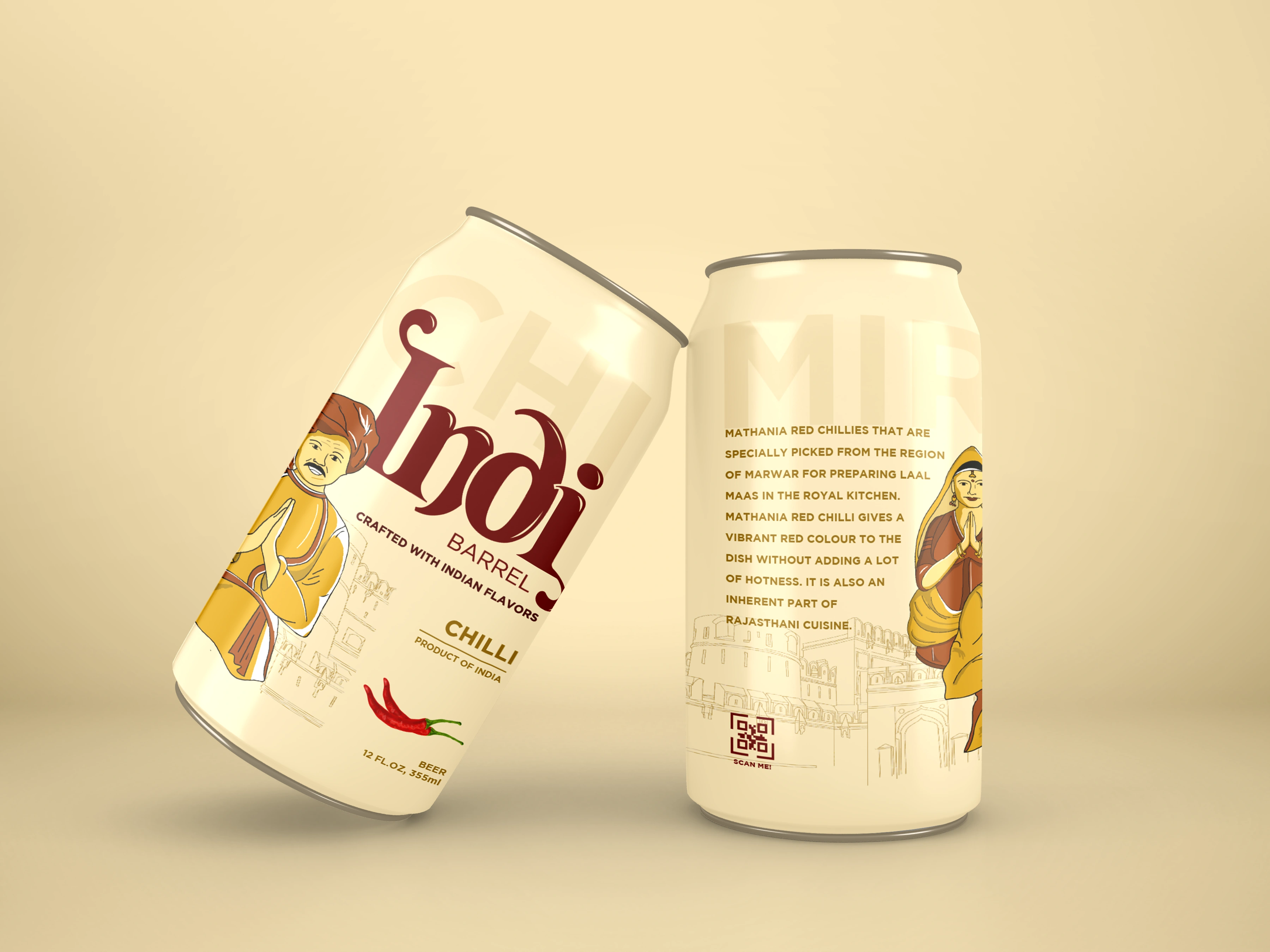
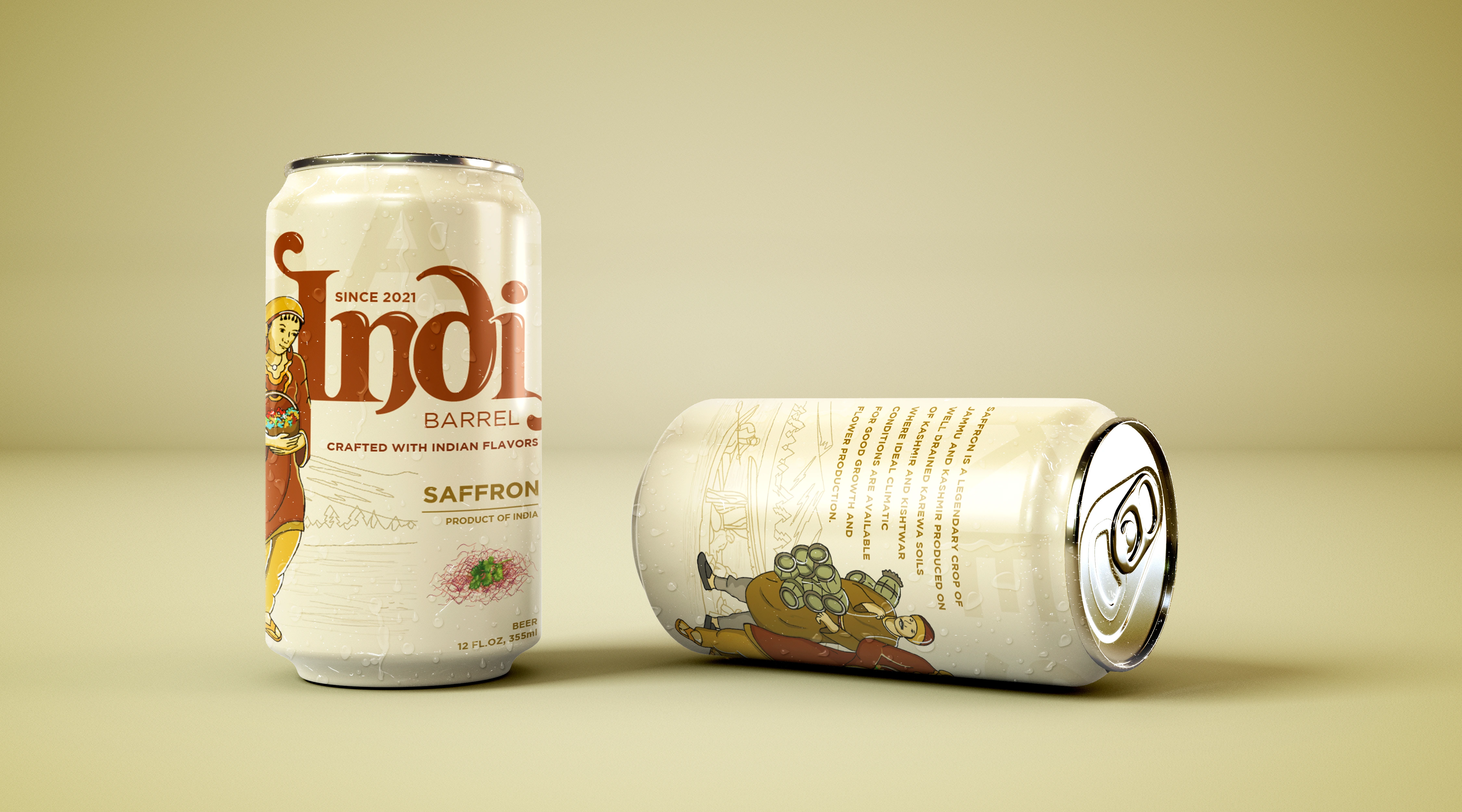
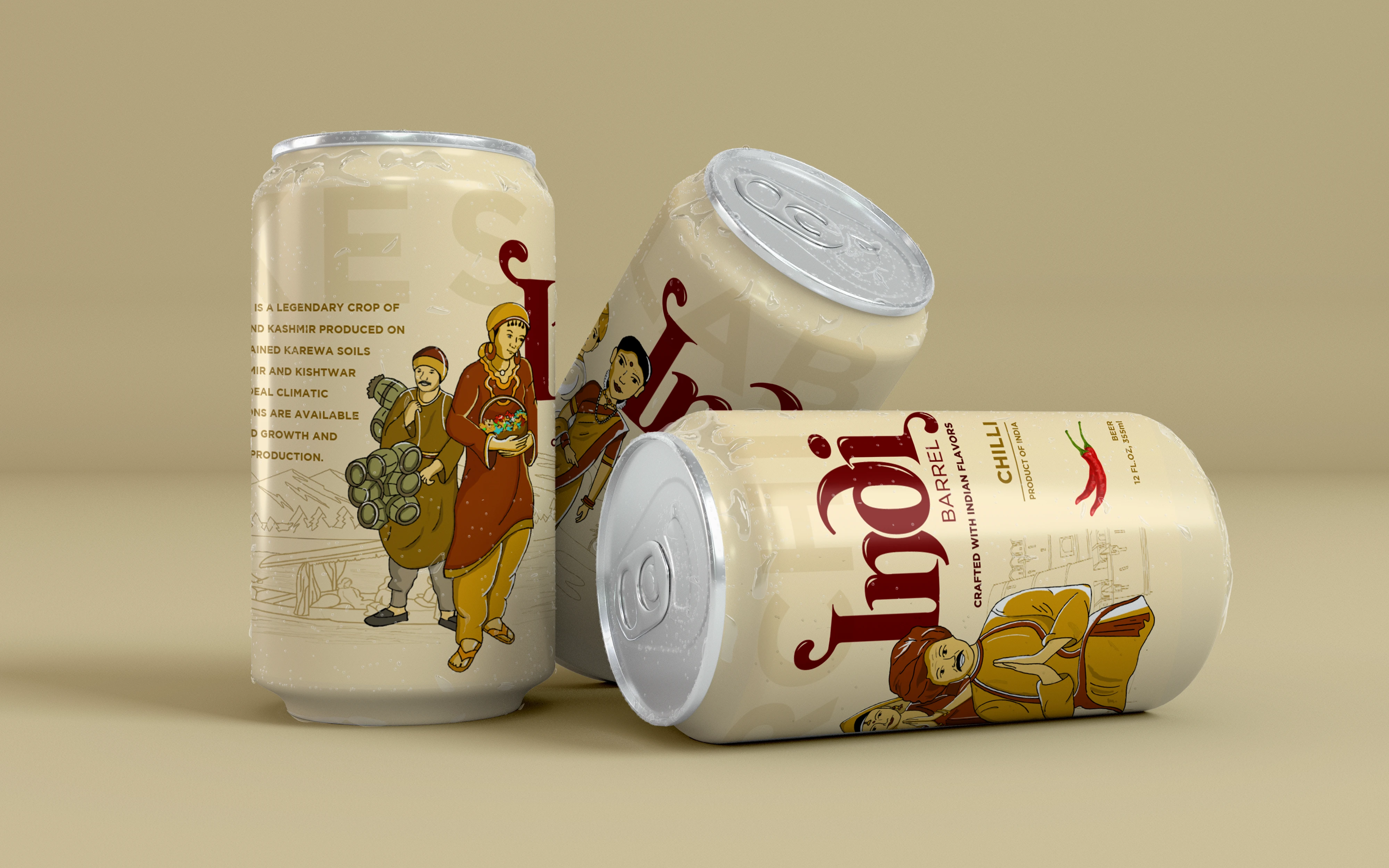
The packaging is entirely hand-illustrated, turning each bottle into a canvas of cultural storytelling. Every variant pays tribute to its region through detailed doodles, vibrant local scenes, traditional attire, spice markets, folk patterns, and architecture, all flowing organically around the bottle like a scroll of heritage.
Visual System:
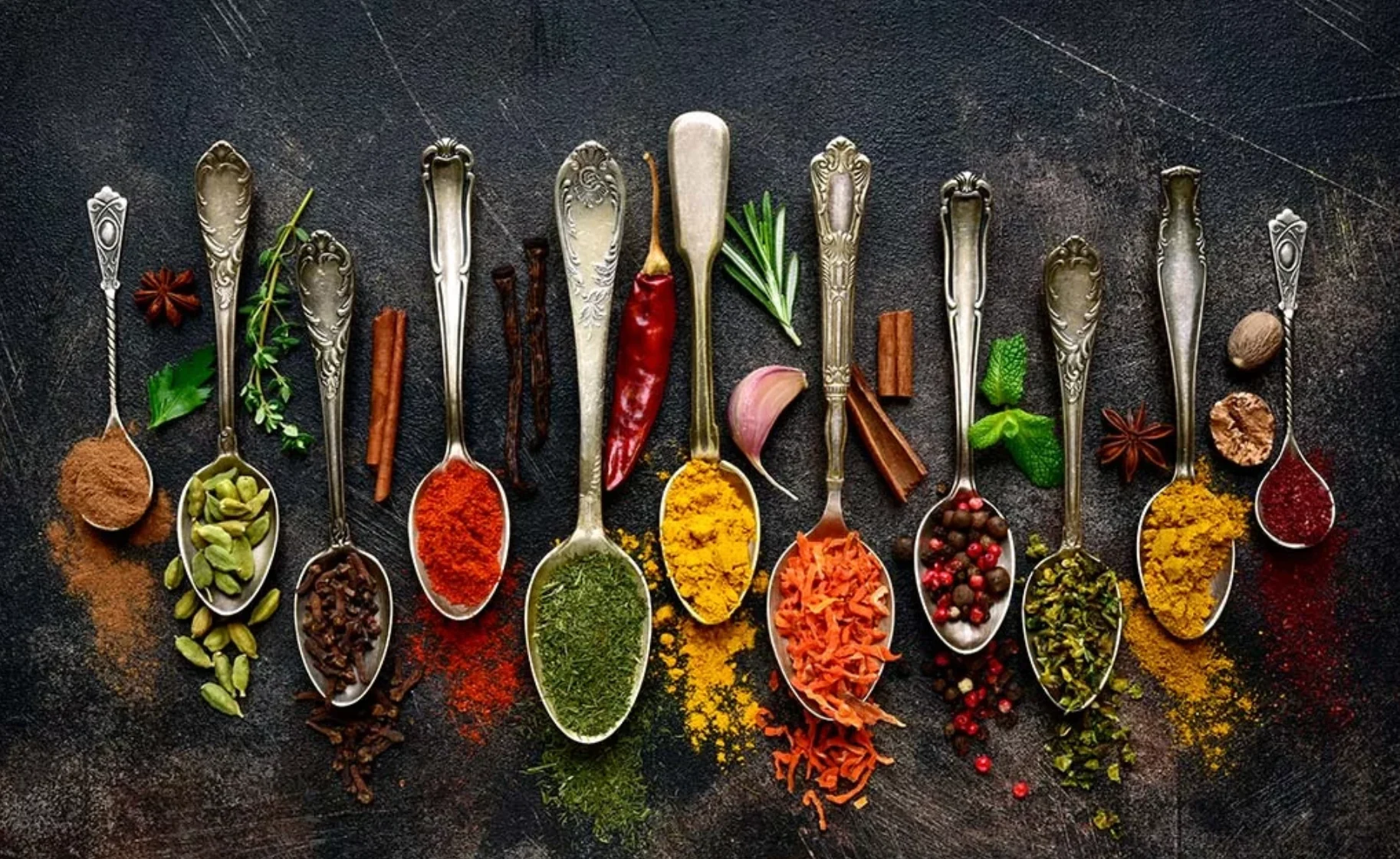
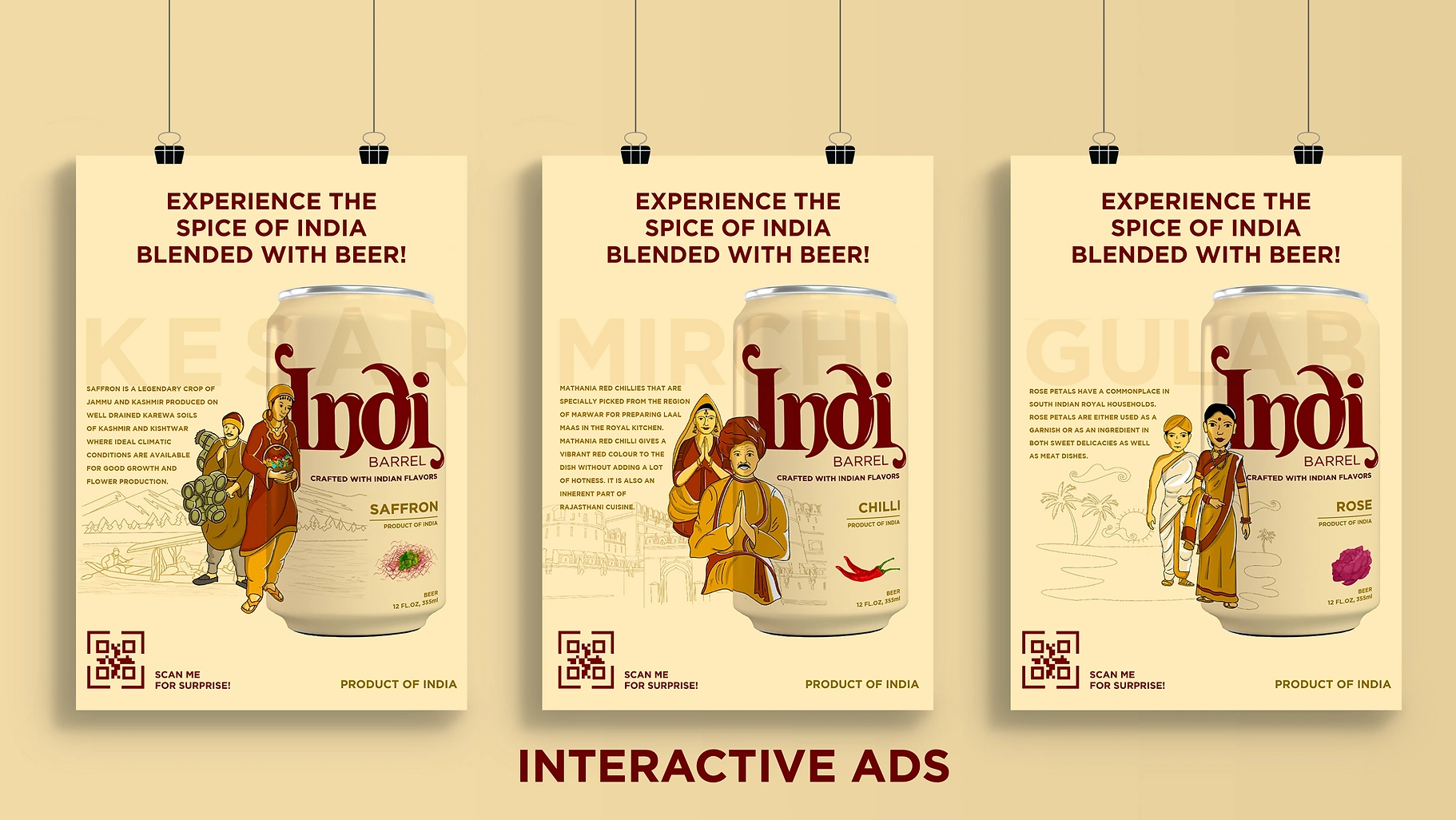
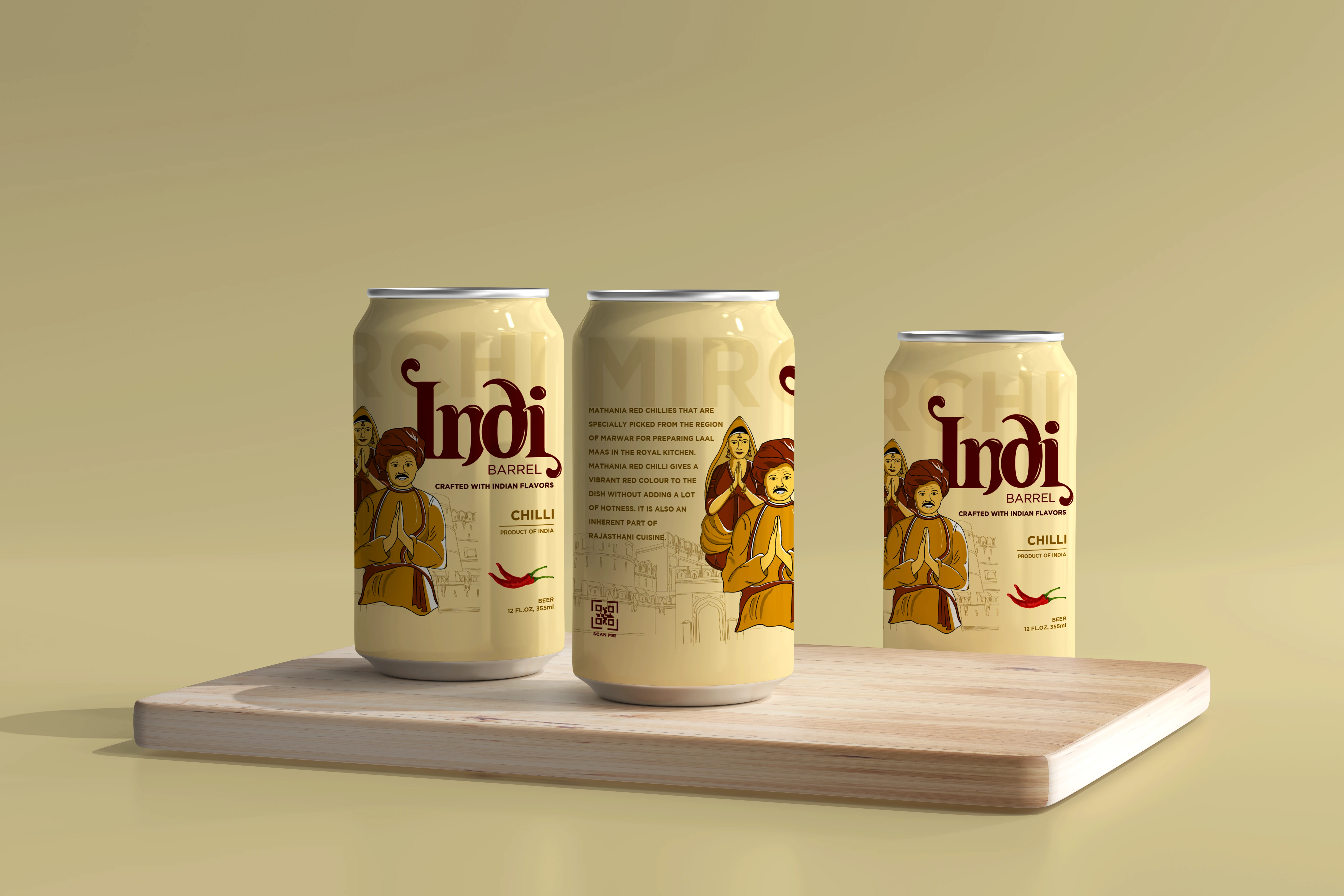
Chilli from Rajasthan: Earthy reds, desert dunes, camel caravans, mirrorwork motifs.
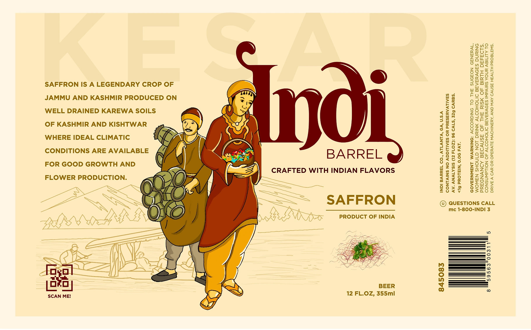
Saffron from Kashmir: Deep golds and purples, shikaras on Dal Lake, carved wooden windows, floating flowers.
Rose from the South: Lush greens, temple carvings, classical dancers, rose garlands and monsoon clouds.
Each label is designed to feel like it was drawn from memory; imperfect, raw, and soulful: echoing the handcrafted nature of both the brew and the culture behind it.
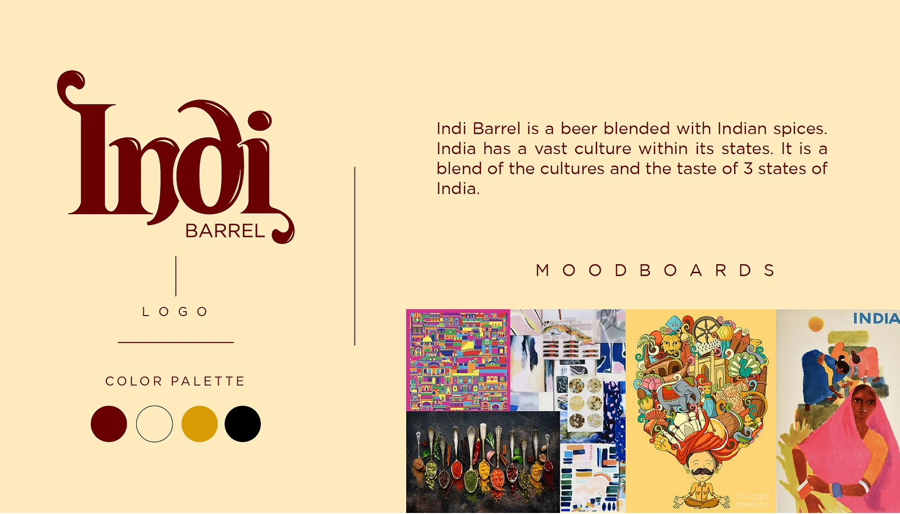
Color & Texture:
A rich, regional palette unique to each spice variant, with layered textures and faded ink lines to give a sun-worn, artisanal charm. Matte finishes meet embossed detailing to invite touch as much as taste.
Tone of Voice:
Indi Barrel doesn’t shout. It simmers. It tells you where your drink comes from, why it matters, and invites you to sip slowly, like chai with a story.
Outcome:
A beer that doesn’t just taste Indian, it feels Indian. Indi Barrel brings regional identity, sensory storytelling, and spice-laden soul to every pour. Packaging becomes passport. Drink becomes destination.
Like this project
Posted Jul 16, 2025
Indi Barrel brings regional identity, sensory storytelling, and spice-laden soul to every pour. Packaging becomes passport. Drink becomes destination.
Likes
4
Views
16
Timeline
Sep 1, 2021 - Nov 30, 2021