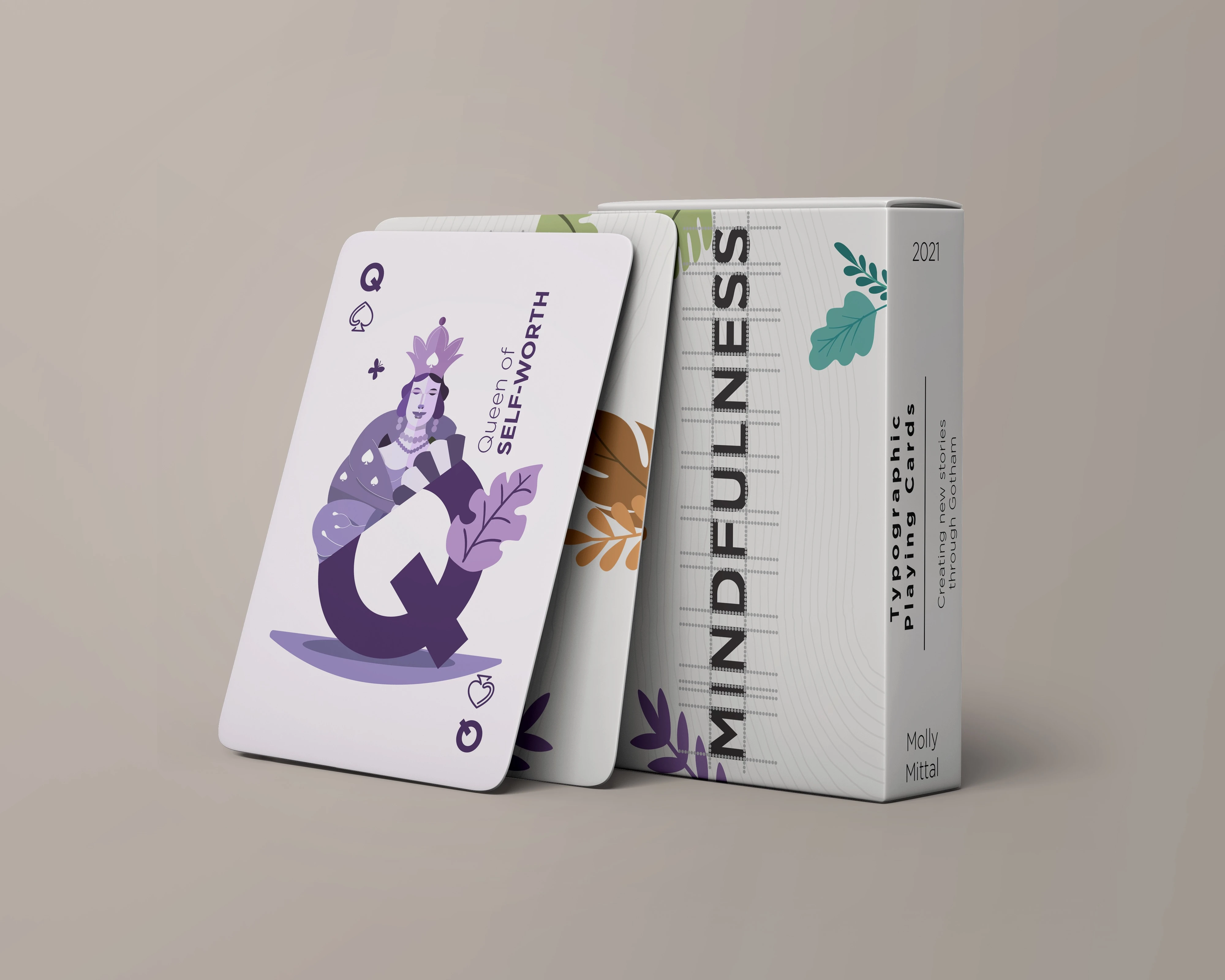
Specimen Card Deck
Molly Mittal
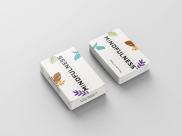
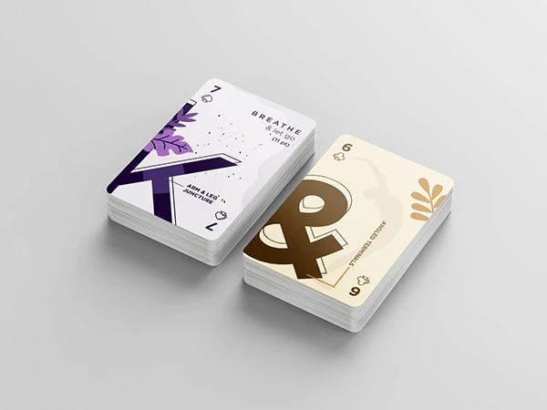
MINDFULNESS X GOTHAM
Wellness Meets Bold Design
Client: Mindfulness Studio (Concept Collaboration)
Studio: Luminary Lab
Scope: Brand Identity • Visual Exploration • Typography Play • Wellness Concept Design
Description:
What happens when calm meets chaos — and they fall in love?
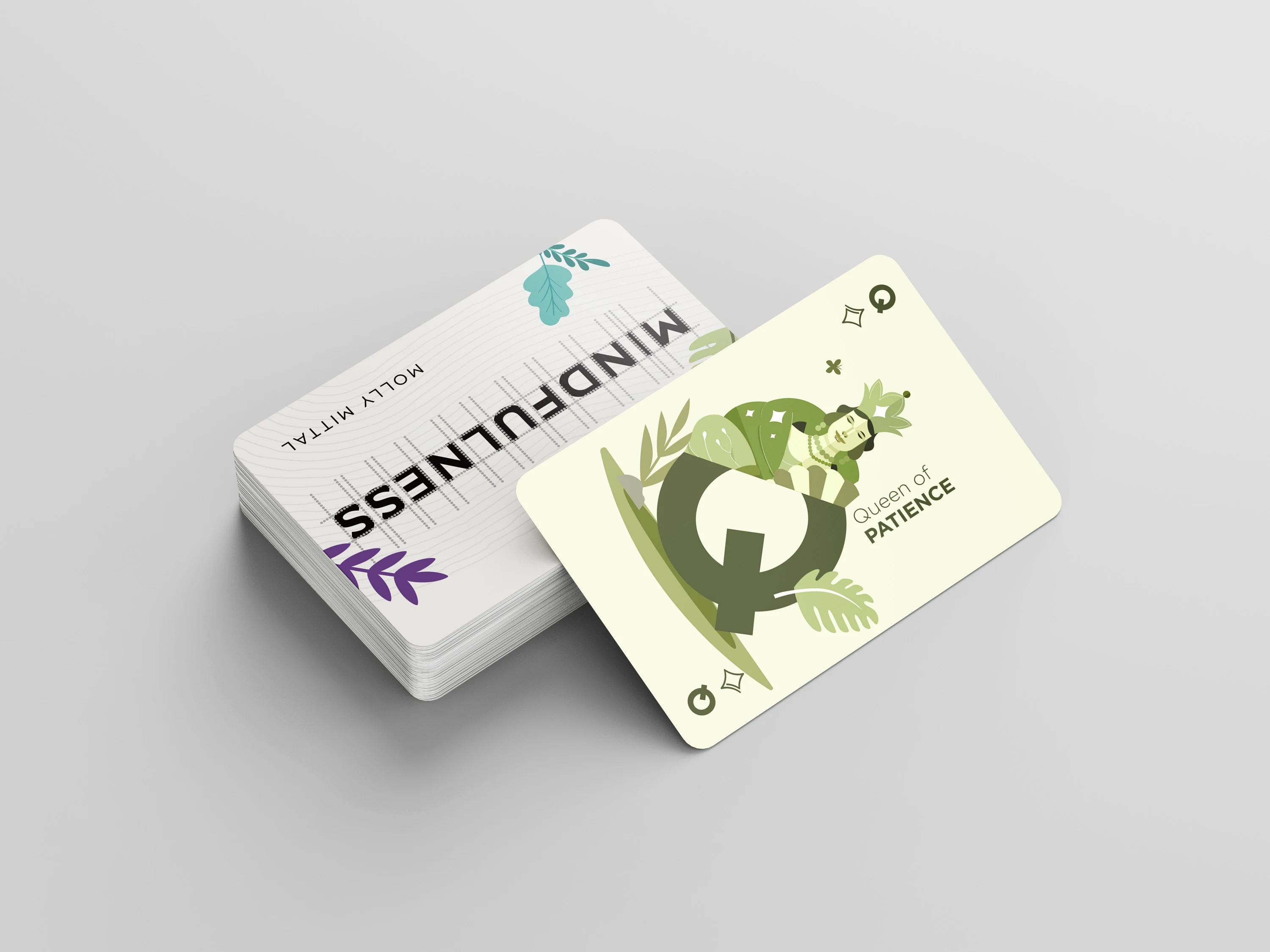
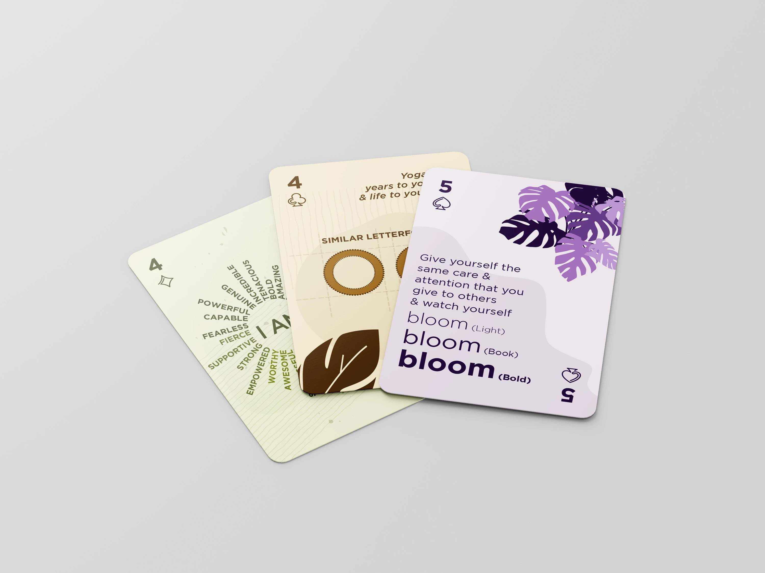
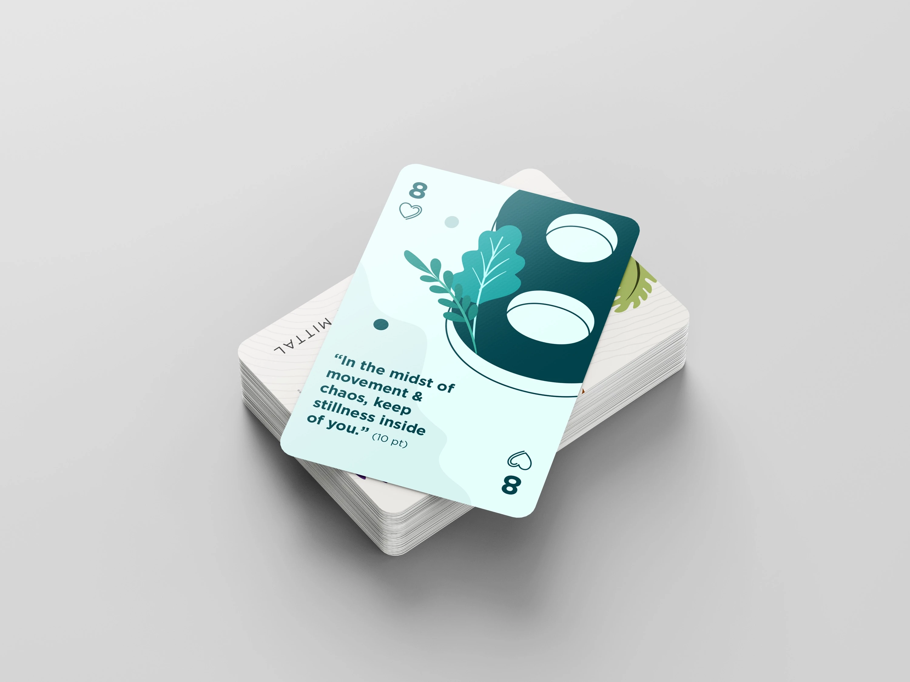
The Mindfulness × Gotham project was born from that tension: a visual experiment blending the serene world of wellness with the striking, no-nonsense geometry of Gotham typeface.
We reimagined how mindfulness could be communicated — not just softly, but confidently. The result is a brand aesthetic that’s modern, grounded, and unexpectedly bold. Clean shapes, stark contrast, and intentional whitespace serve as a reminder: peace doesn’t have to whisper.
Delivered:
✔ Visual Identity Concept
✔ Typography-Led Exploration
✔ Branded Color Palette & Layout System
✔ Social Templates & Mood Assets
✔ Art Direction for Wellness-Driven Brands
This project challenges the cliché softness of self-care.
It’s mindfulness — but make it Gotham.
Like this project
Posted Jul 8, 2025
The concept sparked strong engagement, received recognition for its typographic contrast, opened new conversations around modern identity systems for brands.
Likes
5
Views
15
Timeline
Sep 3, 2021 - Oct 11, 2021