Built with Framer
Dialer.io SaaS Website Revamp | Product UX & Conversion Strategy
Anush | Foundrline
Verified
Brand, Positioning, Website & Conversion Transformation
Repositioning Dialer.io from a functional sales tool into a premium outbound platform built for high-performance teams.
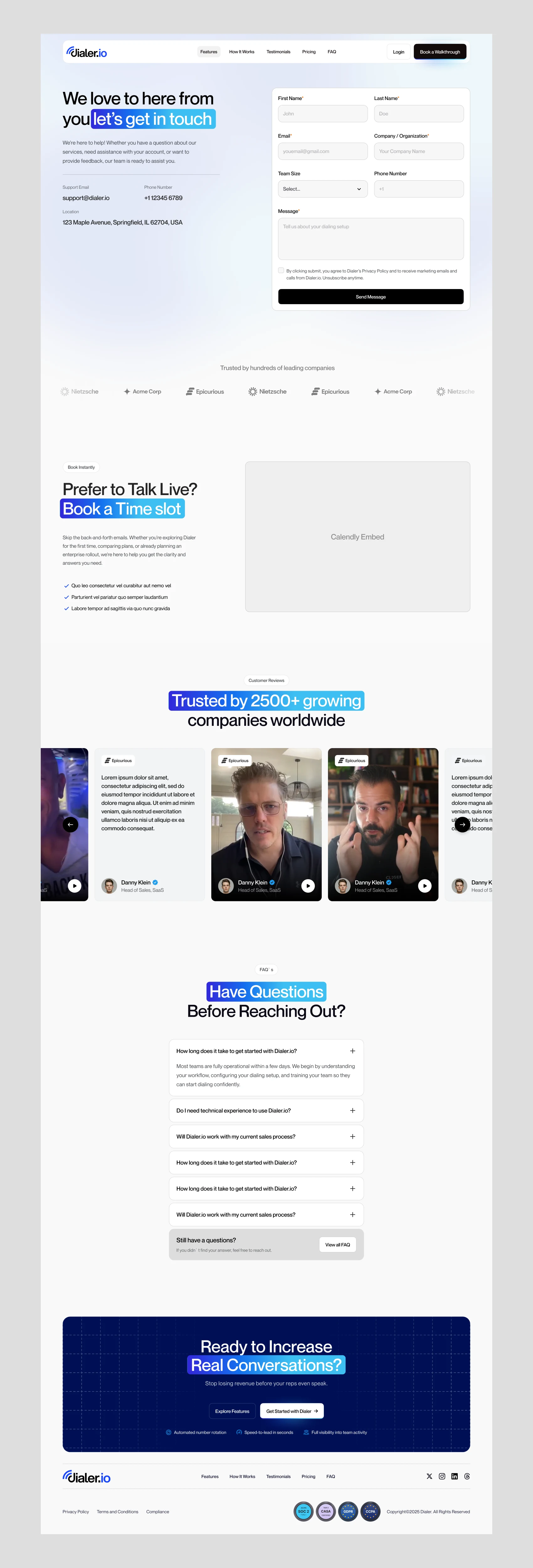
Snapshot
Moved Dialer.io from product utility messaging to premium category positioning.
Client
Dialer.io Sales engagement software company (Sales Tech / Outbound Platform)
Audience
Sales teams, agencies, appointment setters, high-ticket closers, revenue operators
Scope
Brand Direction
Positioning Strategy
Website Copywriting
Messaging Architecture
UI/UX Design
Custom Visual Design
Motion / Animation Design
Web Development (Framer)
Challenge
Fix broken messaging, weak positioning, and a leaky funnel while elevating the product to feel credible for premium buyers.
Outcome
Delivered a full-funnel website revamp that repositioned the product around performance, authority, and premium trust.
The Challenge
Dialer.io had a capable product.
The website wasn’t communicating that.
The core problems weren’t feature gaps.
They were perception gaps.
The site was underperforming because:
Messaging sounded generic
Positioning looked crowded and undifferentiated
Funnel flow created drop-off
Visual language didn’t match premium buyer expectations
The product felt tactical when it needed to feel category-defining
For a platform selling into aggressive growth and sales audiences,
that creates trust erosion fast.
Especially when your aspirational customer references people like
Alex Hormozi and Grant Cardone
Those audiences are calibrated to performance signals.
They can feel weak positioning instantly.
This wasn’t a cosmetic redesign.
It was brand, positioning, and conversion infrastructure.
It was a market perception problem.
Where Things Were Breaking
The previous experience had friction across multiple layers.
Messaging
It talked about features.
Not outcomes.
More software than sales leverage
More tool language than authority language
More explanation than persuasion
Positioning
The product looked adjacent to commodity dialers.
Instead of:
premium revenue infrastructure
it risked reading as:
just another outbound tool.
That was dangerous.
Funnel
Conversion flow was fragmented.
Value wasn’t escalating properly
Proof was underleveraged
CTAs lacked momentum
Narrative wasn’t moving users toward action
Traffic had places to leak.
Visual Perception
The product needed to feel closer to elite performance brands.
It didn’t.
And for this audience,
design is interpreted as credibility.
Strategic Reframing
The revamp centered on one shift:
Move from “sales software website”
to
“premium revenue brand and operating system.”
The objective:
Increase perceived product authority
Clarify differentiation
Repair conversion flow
Create messaging aligned to high-performance buyers
Make the brand feel premium enough for aspirational operators
Not prettier.
Higher signal.
The Shift In Approach
1. Rebuilt the messaging around outcomes, not mechanics
Rather than lead with dialing features,
we positioned around what buyers actually care about:
More conversations
More appointments
Faster pipeline velocity
Higher operator performance
The language moved from software descriptors
into growth language.
That changed the energy of the product.
2. Repositioned the product up-market
We deliberately pushed the product into premium territory.
Not “affordable dialer software.”
But performance infrastructure for serious outbound teams.
That affected:
Headline hierarchy
Value propositions
Proof sequencing
Offer framing
Tone of voice
The goal was category elevation.
3. Rebuilt the funnel narrative
The website was redesigned as a persuasion flow:
Attention
Problem agitation
Differentiation
Proof
Offer momentum
Conversion
Not stacked sections.
A sales narrative.
That was critical.
Because broken funnels are often broken sequencing.
4. Built custom visuals to reinforce premium perception
Visuals weren’t decorative.
They were positioning assets.
Included:
Custom product visuals
Premium UI framing
Conversion-supportive graphics
Motion and interaction systems
Animation used to reinforce sophistication
The visuals had to feel aligned with the kind of brands this audience already admires.
5. Matched the product to its aspirational buyer psychology
This was important.
We didn’t design for generic SaaS buyers.
We designed for people influenced by:
Performance culture
Authority signaling
Competitive identity
Revenue-driven positioning
That shaped the whole system.
What Was Delivered
Included end-to-end:
Brand direction refinement
Premium product positioning
Full website messaging and copywriting
UI/UX redesign
Custom visual system creation
Bespoke animations and motion language
Framer development and implementation
The engagement spanned strategy through execution.
What Was Delivered
Included:
Full website messaging overhaul
Conversion-focused copywriting
Positioning strategy
Complete UI/UX redesign
Custom visual direction
Motion and animation system
Framer development implementation
This wasn’t a website refresh.
It was a brand, positioning, design, and funnel rebuild.
Before → After
Before
Generic SaaS messaging
Weak category positioning
Funnel leakage
Product felt tactical, not premium
Visual system under-signaled value
After
Premium performance-led positioning
Clearer differentiation
Stronger funnel logic
Brand aligned with high-ticket audiences
Website functions as both authority asset and conversion asset
Why This Mattered Commercially
The work improved more than aesthetics.
It helped:
Increase premium perception
Strengthen trust before demos
Better align messaging with higher-value buyers
Turn the site into a sales asset instead of product brochure
Strategic Takeaways
1. Weak messaging can make strong products feel ordinary
Often the product isn’t underpowered.
Its positioning is.
That was true here.
2. Premium buyers respond to signal density
Not just features.
They read:
language
design
proof
sequencing
as trust indicators.
3. Funnel problems are often narrative problems
Conversion doesn’t usually break because of one CTA.
It breaks because belief isn’t being built.
That was central to this revamp.
4. Visual systems can raise perceived product value
Good visuals don’t just support usability.
They can reposition a product.
That happened here.
If your product works — but your positioning feels smaller than what you’ve built
That’s usually not a product problem.
It’s a perception problem.
That’s often where I help.
Book a call
Like this project
Posted Mar 9, 2026
A SaaS website revamp for Dialer.io focused on communicating outbound sales workflows, onboarding process, and platform capabilities with clarity and authority.