Built with Framer
Web Design for Financial & Advisory Firms | Foundrline.com

Anush | Foundrline
Verified


Statera Asset Management
Brand, Content Strategy, Website & Trust Transformation
Merging two legacy firms into one fiduciary advisory brand built to feel human, not financial.
Snapshot
Moved Statera from two disconnected legacy sites to one unified, story-led advisory brand.
Client : Statera Asset Management (Signature Resources Capital Management, LLC) — Fee-only fiduciary RIA
Audience: Individuals and families seeking long-term financial planning and investment guidance
Scope: Brand Direction · Content Strategy & Site Architecture · Copywriting (7 pages) · Visual Design · Custom Illustration & Photography Direction · UI/UX Design · Web Development
Challenge: Merge two legacy brands left over from a prior merger into one coherent site, without the result feeling like a typical finance or advisory firm
Outcome: Delivered a fully merged 7-page site — strategy, copy, and design locked and approved; development underway — repositioning the firm around relationship and trust instead of credentials and category convention
Two Brands, One Firm
Statera came to me running two live websites at once —
statera-am.com and srcmadvisors.com — left over from a prior merger that had
combined the businesses but never combined the story. Each site had its own
content, its own tone, its own implicit claim about who the firm was, and no
shared logic for which brand said what to whom.
That's a different problem than a tired design. A visitor
landing on either site had no clean way to tell if they'd found the right firm,
let alone a reason to trust it. Any redesign that started with visuals would
have just made two incoherent brands look prettier next to each other. The
actual job was deciding what one firm sounds like, before deciding what it
looks like.
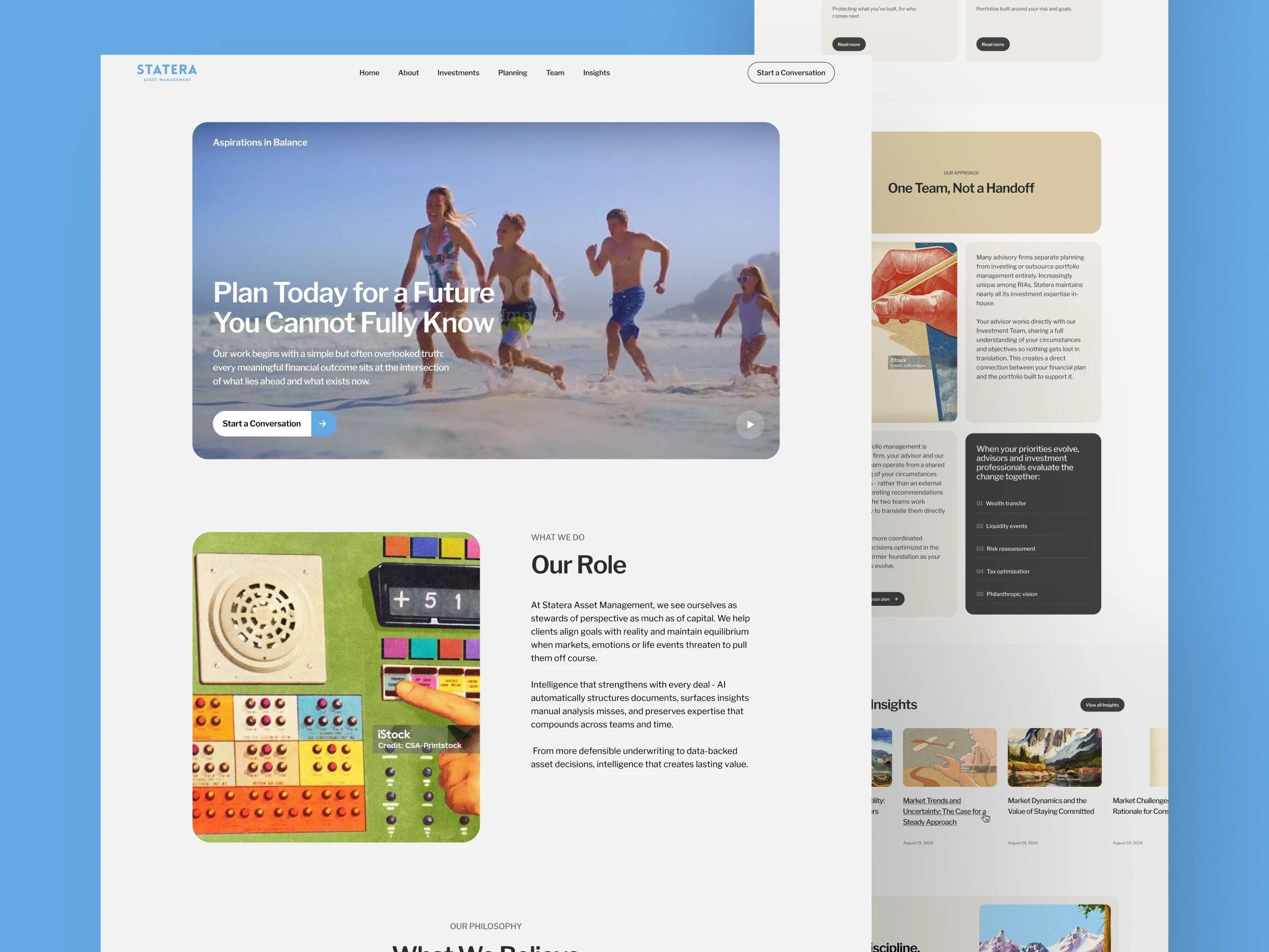

Phase 1: Strategy —
Merging Two Brands Into One Structure
I didn't open a design file first. I mapped both legacy sites
page by page, cut every piece of overlapping or contradicting content, and
assigned every remaining message a single owning page across the seven the new
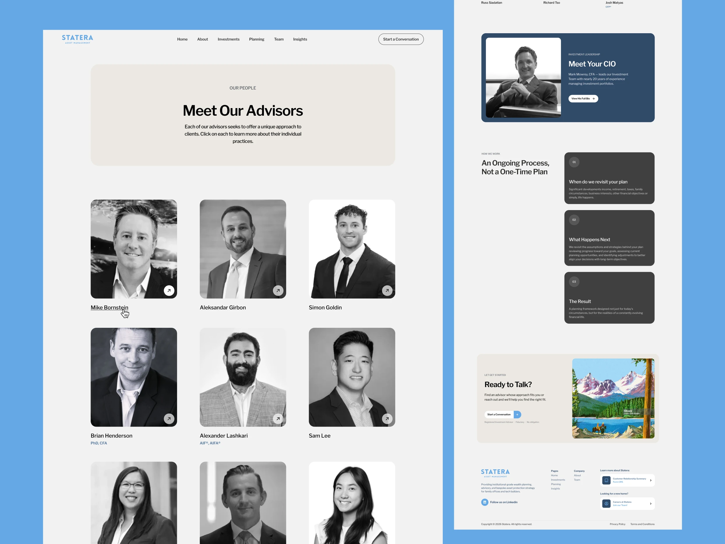
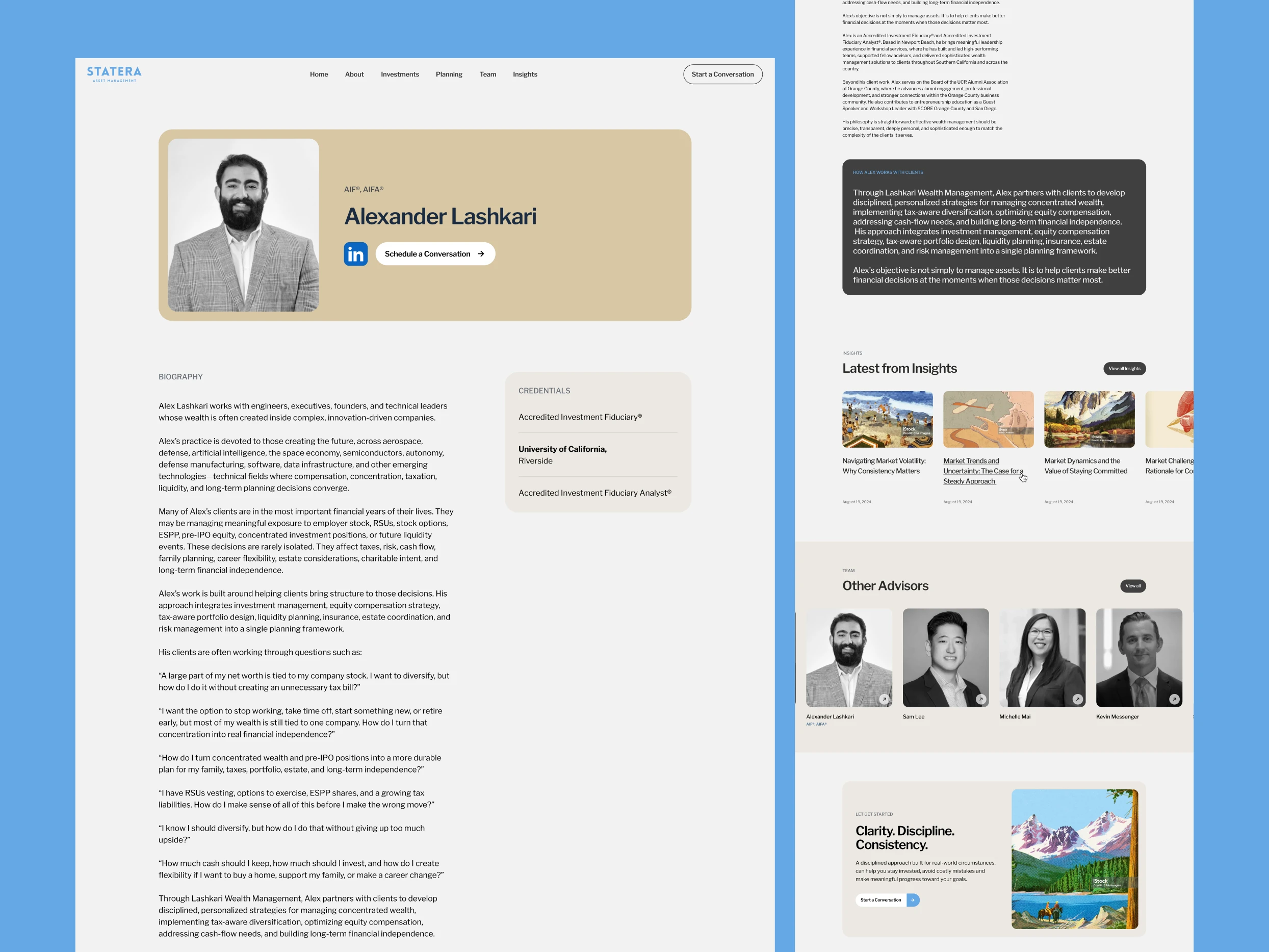
site needed — Home, About, Team, Planning, Investments, Insights, and Contact.
That became a locked blueprint: one structure, one set of calls to action, one
rule for which page said what, so nothing from either legacy site could quietly
resurface twice and argue with itself.
One idea got cut in that process: a B2B path that would have
opened the platform to other advisors, not just individual clients. It was a
real option — a second audience, potentially a second revenue line — surfaced
directly from content already living on one of the legacy sites. But the
client's actual buyers are individuals and families, and a second audience
would have re-fractured the exact thing I was there to fix. I dropped it and
kept all seven pages pointed at one buyer.
The client was also explicit, from that very first strategy
conversation, about what the merged firm should not sound like: no navy-suit
fiduciary language, no corporate distance. They wanted one firm that led with
story and relationship, with credentials sitting quietly in the background
instead of leading. That instruction became the test every later decision had
to pass.
Phase 2: Copy — Locking
the Voice Before Any Visual Work
With structure locked, I wrote full page-by-page copy for all
seven pages and got it approved before any design work started. That sequencing
mattered here specifically because of the merger: copy was the first place the
two brands actually became one voice, not just one layout. If the writing still
sounded like it was patched together from two sources, no amount of visual
polish later would have fixed it.
Approving copy first also meant every design decision downstream
was serving an already-settled story, instead of design and writing pulling
against each other mid-project.
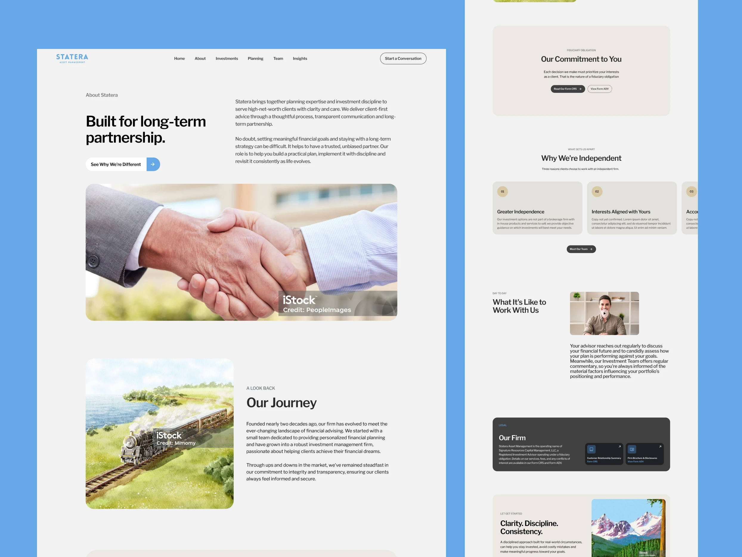
Phase 3: Design — The
Reversal That Told Me What the Audience Actually Needed
The homepage went through a real reversal once design started,
not just a polish pass, and it's the part of this project I'd point to first if
someone asked what I actually do differently.
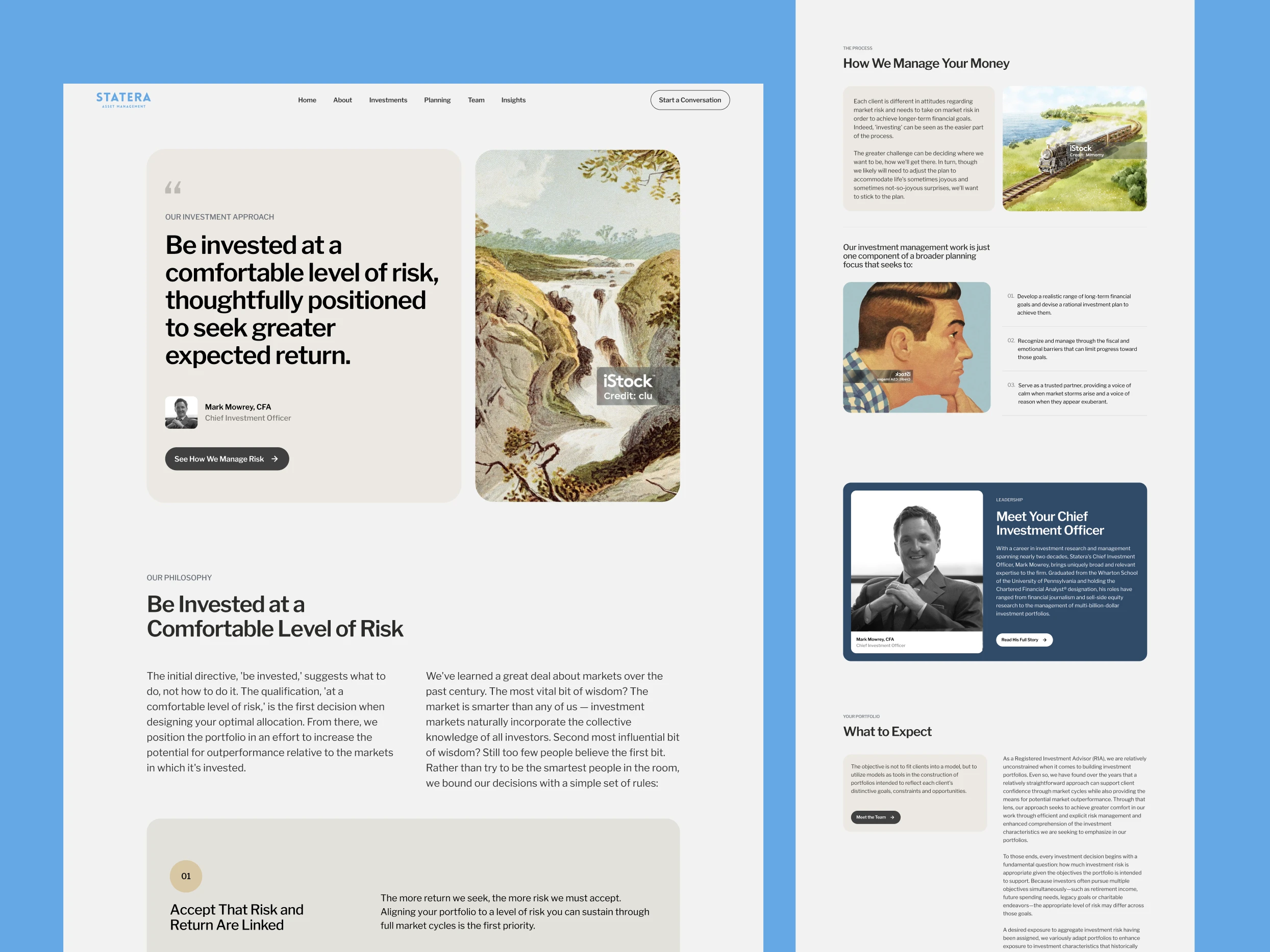
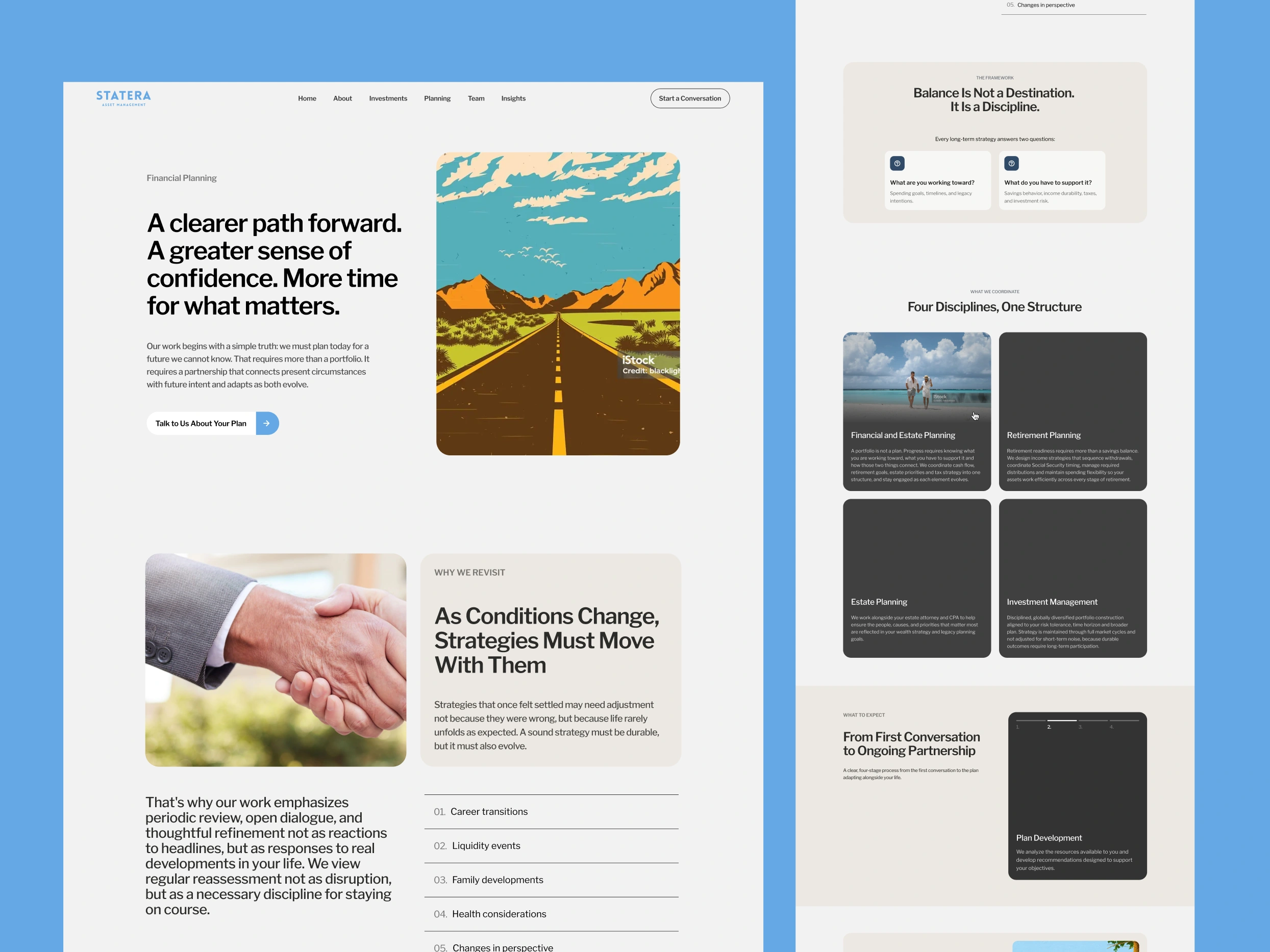
The earliest direction leaned on vintage-style illustration for
warmth — a reasonable instinct, since illustration usually reads as more
approachable than stock photography. For this audience it worked against the
brief. A compliance-conscious client evaluating who to trust with their money
responds to evidence they can verify is real, and stylized illustration put a
layer of style between the firm and the people reading about it — the opposite
of the human, relationship-first feeling the client had asked for from day one.
I replaced it with real family and lifestyle photography the client already
owned. Actual people did more trust-building work in five seconds than
illustration was doing across the whole page.
That same audience logic showed up everywhere else once I
started looking for it. Every dark, corporate section came out of the layout —
dark blocks read as agency portfolio, not advisory relationship, so the site
stays light and soft-cornered throughout. The hero went from full-bleed to
something smaller and framed, because a contained hero feels considered and
personal, where full-bleed video reads more like a media brand performing scale
it doesn't need. Anything that looked like a dashboard, a chart, or a
decorative finance icon got cut outright. And red — the easiest accent color to
reach for in almost any brand system — was banned from decoration entirely,
because in a financial context red doesn't read as playful, it reads as a
market going down. It's held in reserve strictly for form errors now, nowhere
near the brand.
Even the calls to action changed register, from "get
started" to language that invites a conversation instead of a transaction
— because the firm isn't selling a single decision, it's opening an ongoing
one. And the belief statements anchoring the homepage got rebuilt as
scroll-stacking cards instead of static text, so the philosophy underneath —
how the firm actually thinks about risk and discipline — gets read slowly
instead of skimmed past as boilerplate.
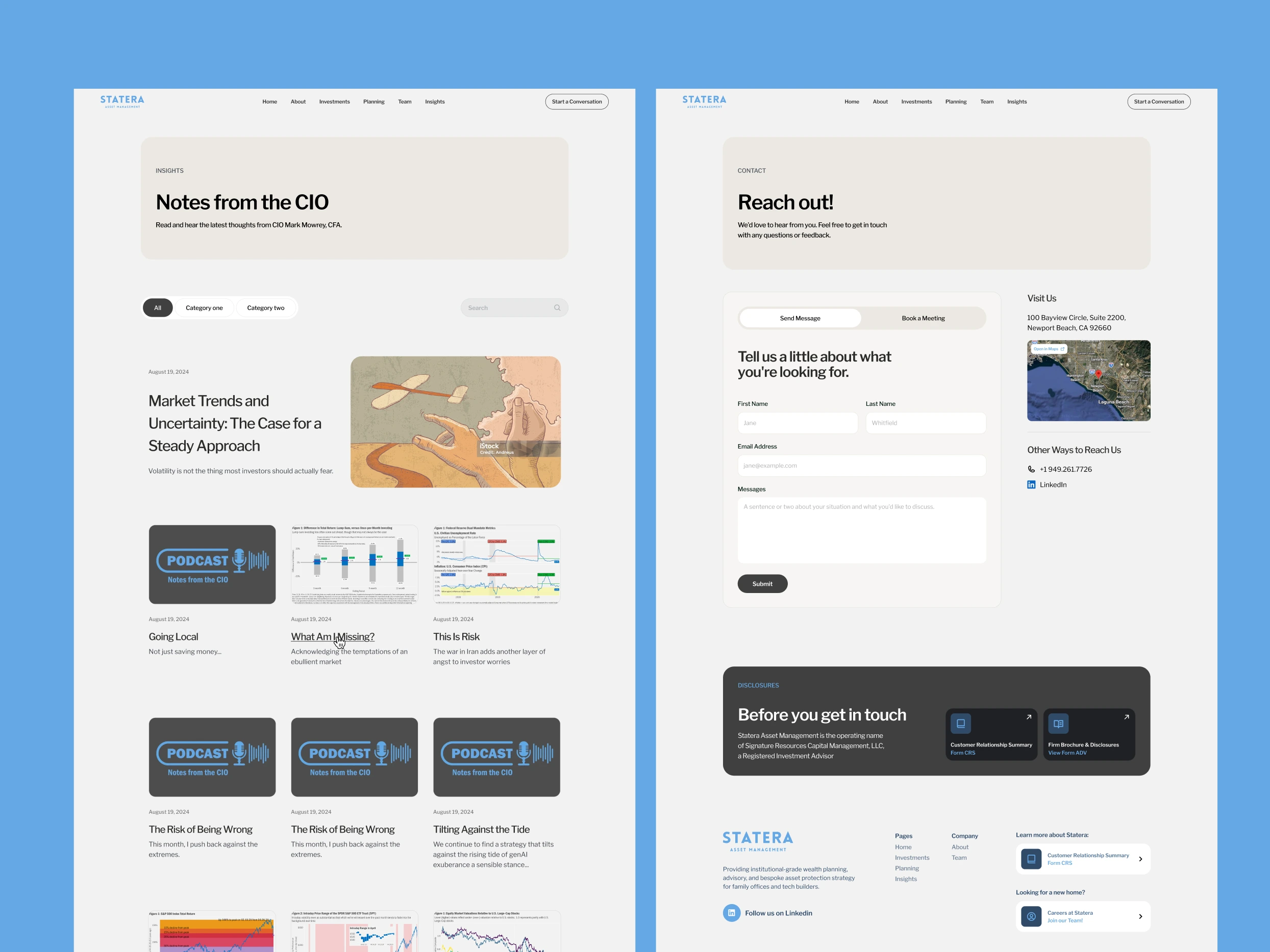
Phase 4: Development —
Design and Development is complete and approved in full by the client's CIO,
across all seven pages. It carries that same
structure, that same copy, and that same discipline about what a finance site
is allowed to look like into a single, live site — replacing the two
disconnected properties this project started with.
What This Actually Proves
Anyone can apply a locked style guide consistently once it
exists. The harder, less obvious skill is knowing which stylistic instincts to
override for a specific audience — illustration, dark sections, chart-heavy
visuals, transactional language — because the client said, in plain terms, that
they didn't want to feel like a finance site at all. That instruction doesn't
design itself into seven pages, and it doesn't survive a
strategy-copy-design-development pipeline on its own either. Someone has to keep
checking every decision against it, all the way from merging two brands' worth
of content down to a single accent color, and be willing to reverse a direction
that's already been built once it stops answering the actual brief. That's the
discipline this project was built on, from the first structural audit through
the seventh page.
If your firm is legitimate — but your website makes you feel like every other institution
That's usually not a trust problem.
It's a distance problem.
That's often where I help.
Book a call
Like this project
Posted Jul 30, 2026
I help financial & advisory firms shed the corporate, institutional feel and build brands clients actually connect with. Strategy, copy, design, & development.
Likes
0
Views
28
Timeline
Jul 2, 2026 - Sep 18, 2026
Clients
Statera Asset Management