
Brand & packaging designer for cosmetic & lifestyle brands

Brand & packaging designer for cosmetic & lifestyle brands
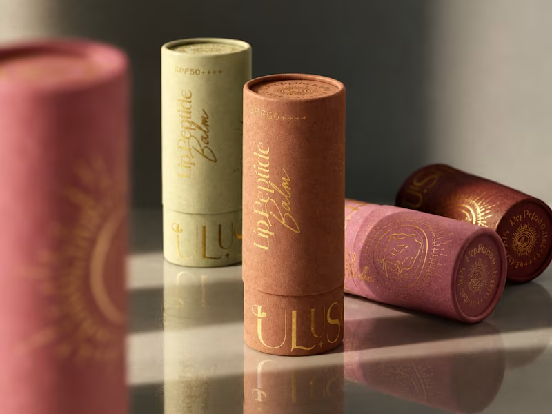
A little packaging design appreciation 🌞
UluSoleil was one of my first big clients, and over time, I helped bring four of their products to life through packaging design.
This lip balm tube was all about balancing a delicate, feminine aesthetic with clear product communication, thoughtful typography, and functional packaging.
I’m still working on the full case study, but I wanted to share a little peek at the process!
More to come ✨
62
110
4.6K
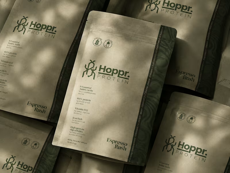
Not every client comes to me for a brand identity and not all my clients are skincare or cosmetic brands.
That was the case with Hoppr, a protein powder brand made from crickets. 🦗 YES, CRICKETS!
Sometimes the logo, colors, and visual system are already there and my job is to bring them to life on packaging and see how far I can push them.
I love projects like this because I get to play with typography, layout, and materials while working within an existing identity.
How much freedom do you think a designer should have when working with an established brand?
17
53
3.7K
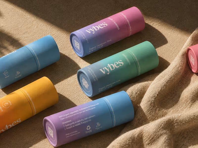
Have you ever designed packaging for a brand that never launched? 👀
Surprisingly, it’s happened to me more times than I expected.
Vybes was an organic deodorant brand from Australia I worked on, designing packaging for a product that, in the end, never made it to market.
It’s a weird feeling putting so much thought into packaging for a product that people will never see on a shelf.
How many unreleased projects are hiding in your folders? 😂
34
84
4K


Brand & Motion design for tech startups
- $50k+
- Earned
- 22x
- Hired
- 5.0
- Rating
- 672
- Followers
Brand & Motion design for tech startups


Brand Designer & Webflow Developer

Brand Designer & Webflow Developer


Versatile Filmmaker. Jack of all trades.

Versatile Filmmaker. Jack of all trades.
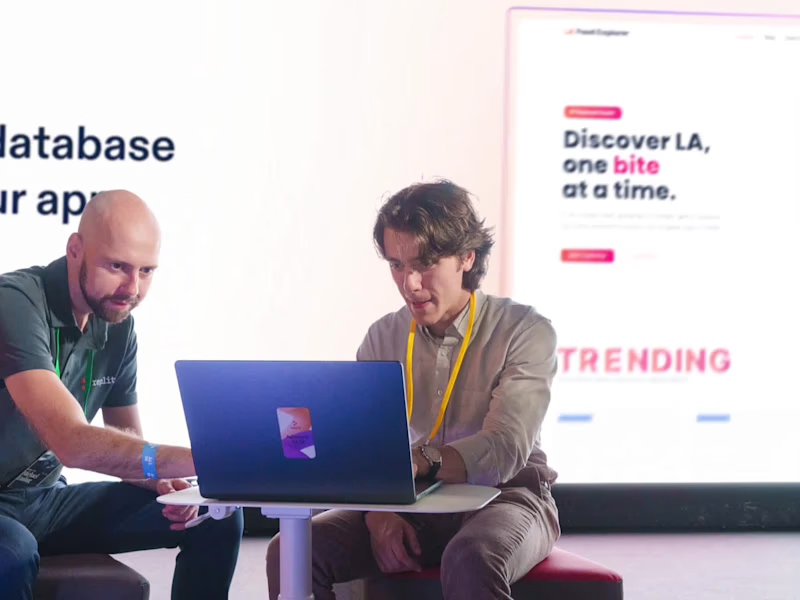
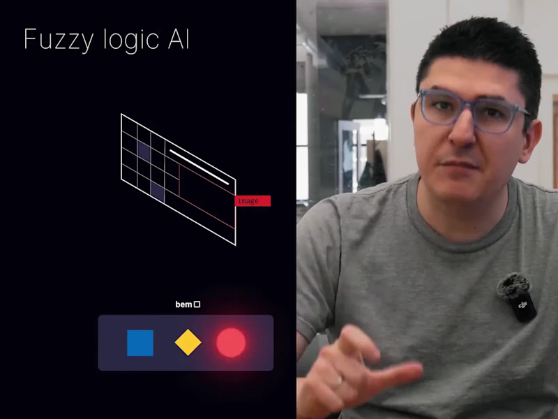
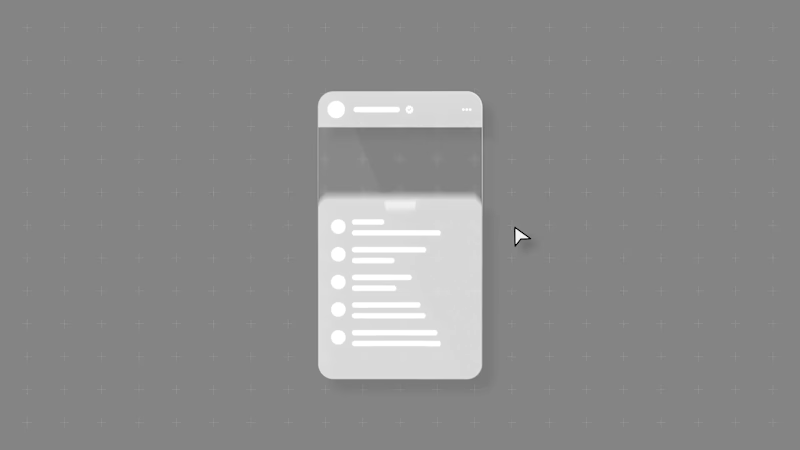
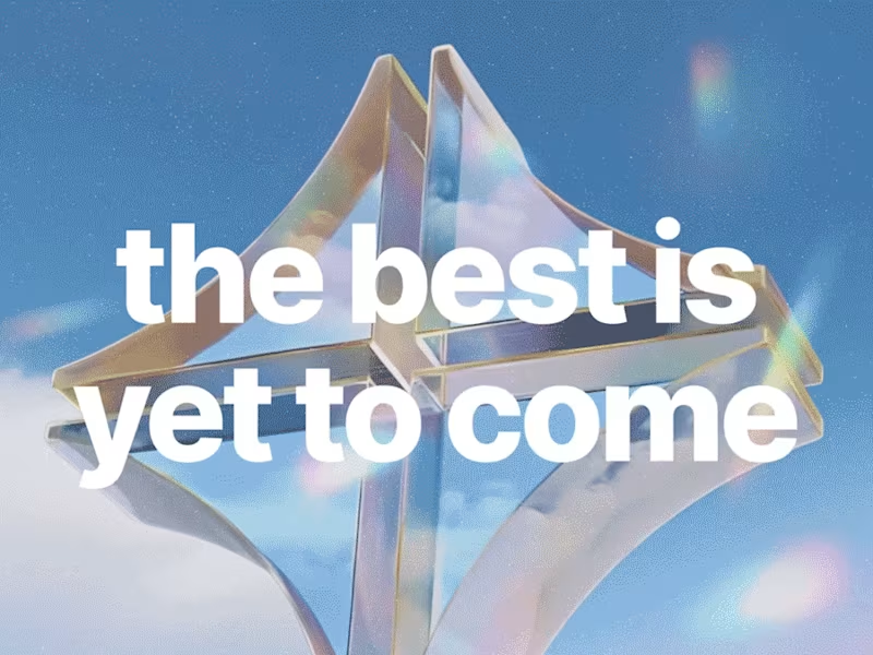

Connecting Brands with Creative Design 🔥
Connecting Brands with Creative Design 🔥
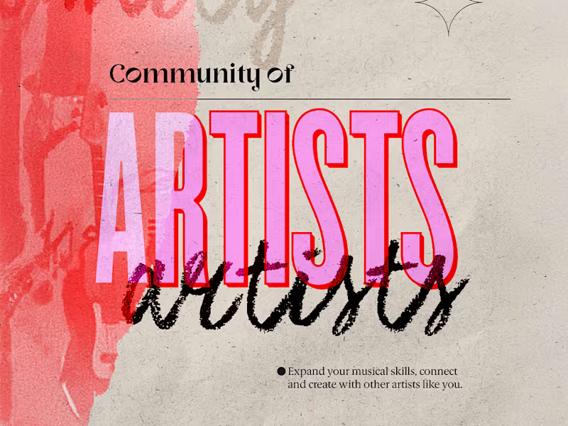
So excited to share my very first post here on Contra!
It's honestly so inspiring to be part of such an amazing community filled with talented creatives and professionals 🔥
I wanted to kick things off by sharing one of my favorite projects, a piece I truly loved working on and that represents so much of what I enjoy creating.
Can't wait to connect, get inspired, and see all the beautiful work everyone's doing here! 😍
2
33
2.6K
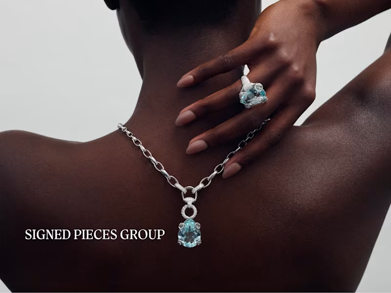

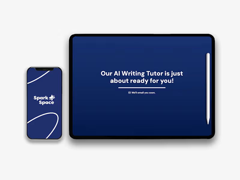

Graphic Designer | Presentations | Social & Brand Assets
- $10k+
- Earned
- 11x
- Hired
- 5.0
- Rating
- 53
- Followers
Graphic Designer | Presentations | Social & Brand Assets


Motion Designer & Rive Animator

Motion Designer & Rive Animator


Motion for Design Studios.


