B2B Diagram for SignedPieces
Belén Alonso
Verified

B2B Diagram for SignedPieces
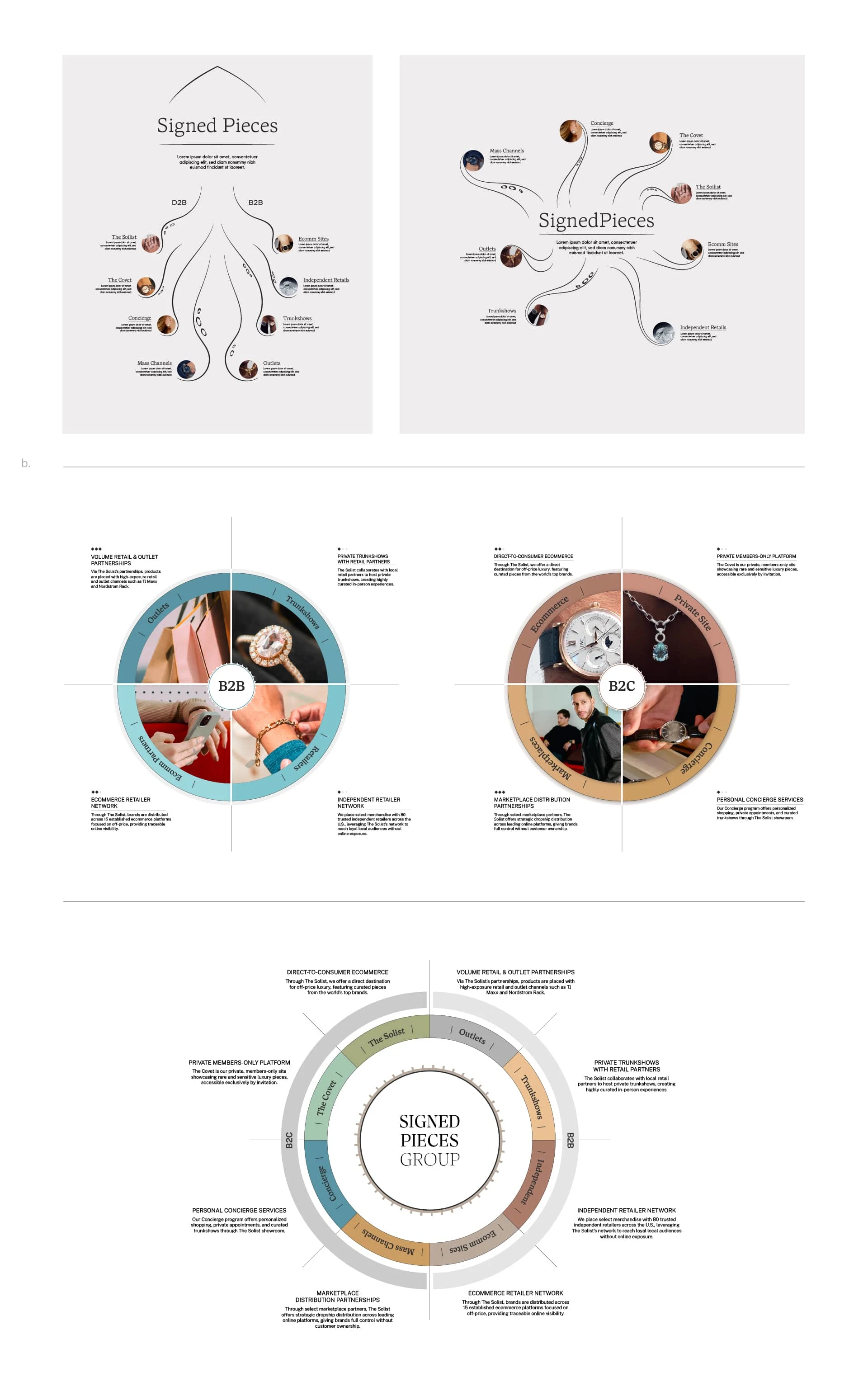
A clean, conceptual diagram to organize complexity.
The Client needed a visual to make their full service offering easier to understand. The ask: create something that shows who they are, who they help, the pain points they solve, and how their 8 core services fit into it all.
The metaphor? An octopus. Smart, adaptive, far-reaching.
Multiple directions were explored, including different interpretations of the octopus concept as well as alternative layouts that tested other ways of organizing the information. The process focused on finding the right balance between structure and abstraction, making sure the diagram felt modern, intentional, and easy to follow.
Process
Throughout the design phase, sketches and visual tests helped shape the final direction, which was refined into a subtle but recognizable octopus form: a centered identity, tentacle-like flows for each service, and clean iconography to support the message.
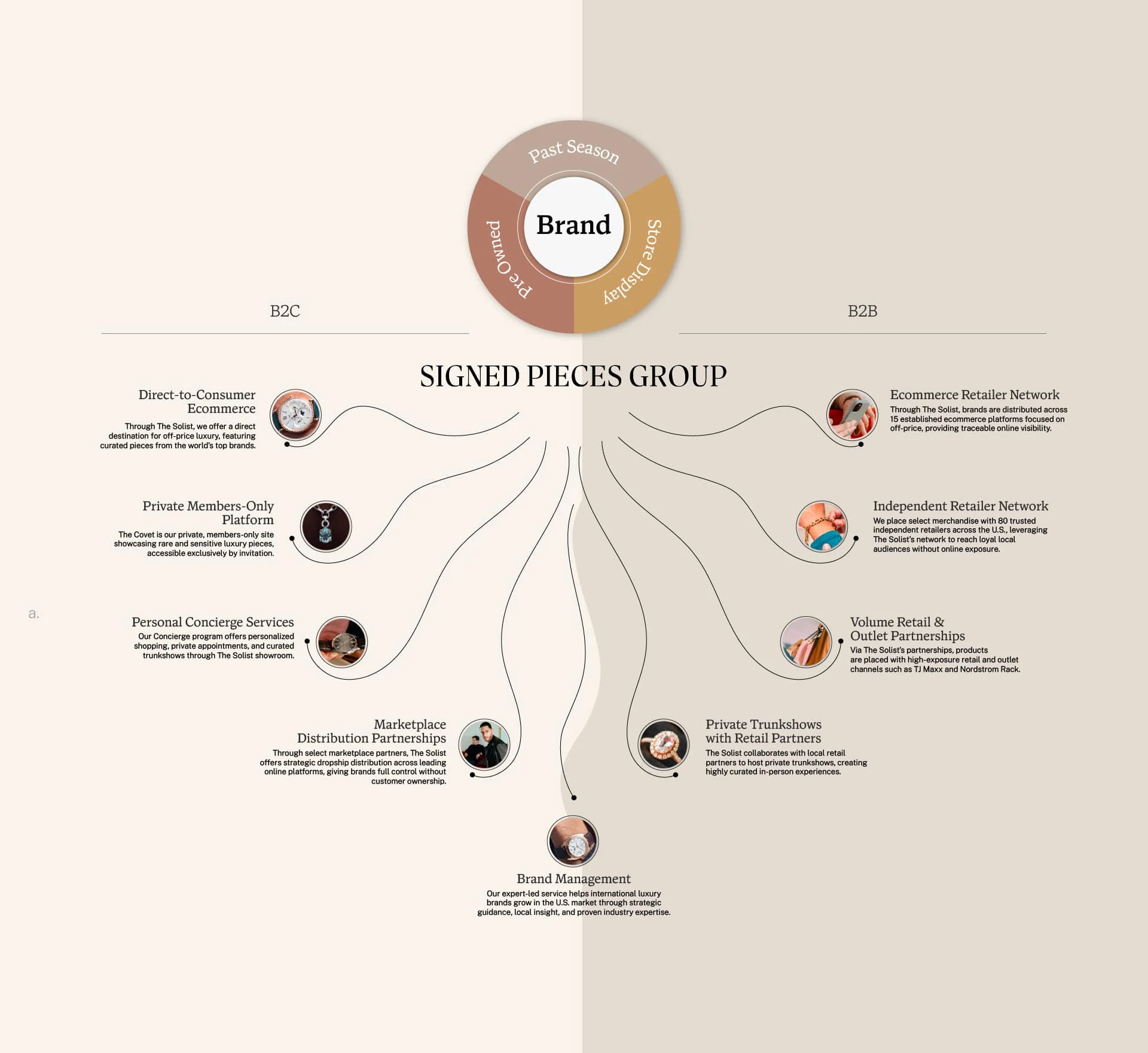
The final direction
The chosen version brings it all together, a soft, conceptual octopus form that holds eight custom image, with each tentacle acting as a pathway to a key service.
The result is a system that simplifies complexity without oversimplifying it.
A visual that feels fresh and considered, made to grow with the brand.
Note: All imagery used in this project was provided by the client.
Like this project
Posted Jun 29, 2025
Created a conceptual octopus diagram for SignedPieces to simplify and visualize their B2B and B2C services in a clear, engaging, and structured way.
Likes
8
Views
198
Timeline
Apr 17, 2025 - May 13, 2025
Clients
The Solist