Branding para Fragua

Belén Alonso

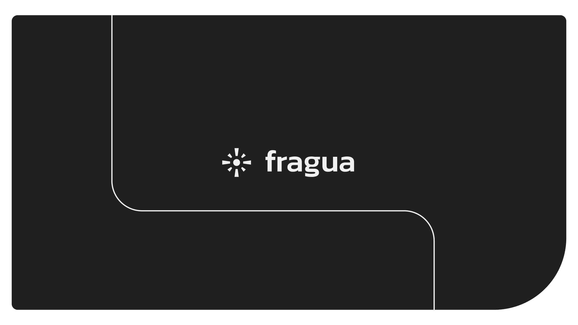
Fraguahttps://www.fraguadesign.com fraguadesign.com fraguadesign.com is a brand built for SaaS marketers who manage their company’s Webflow site but lack the development skills or internal resources to do so efficiently. Inspired by the craft of blacksmithing, Fragua represents the mastery of both tools and technique, just as a blacksmith learns to forge metal, marketers can learn to shape their digital presence without breaking their site.
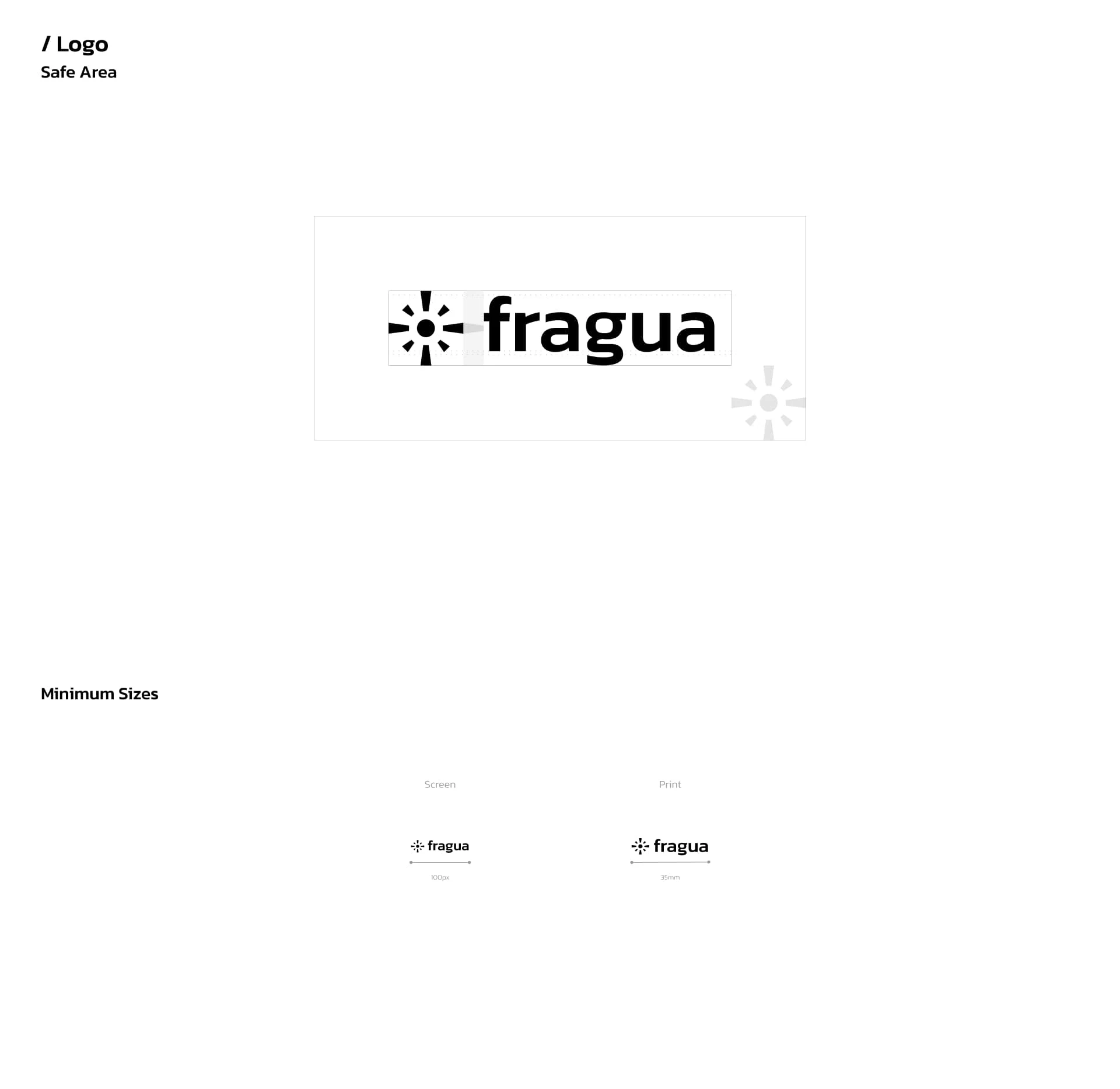
Primary logo & minimun sizes
The brand identity reflects this philosophy through a strong, modern, and functional visual system. The primary and secondary logos maintain clarity and adaptability, ensuring consistency across different applications. A carefully selected color palette reinforces trust and innovation, while typography choices balance professionalism with approachability.
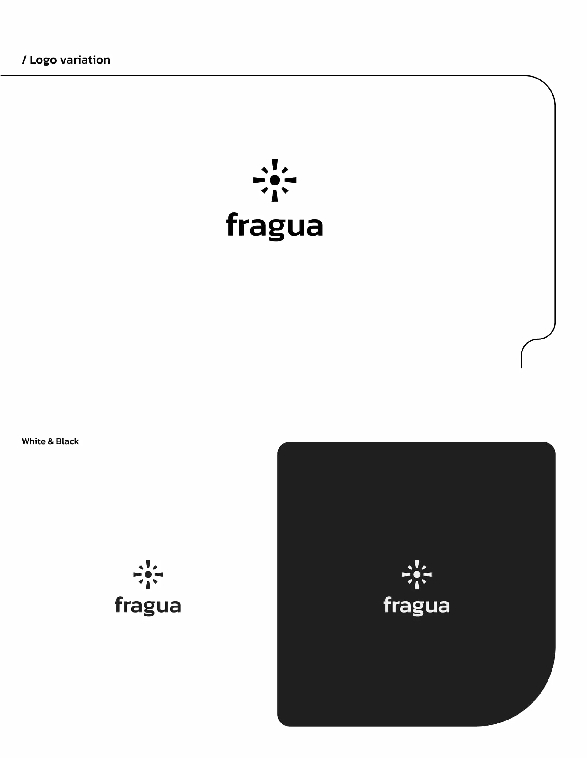
Logo variable / black & white version.
Typography
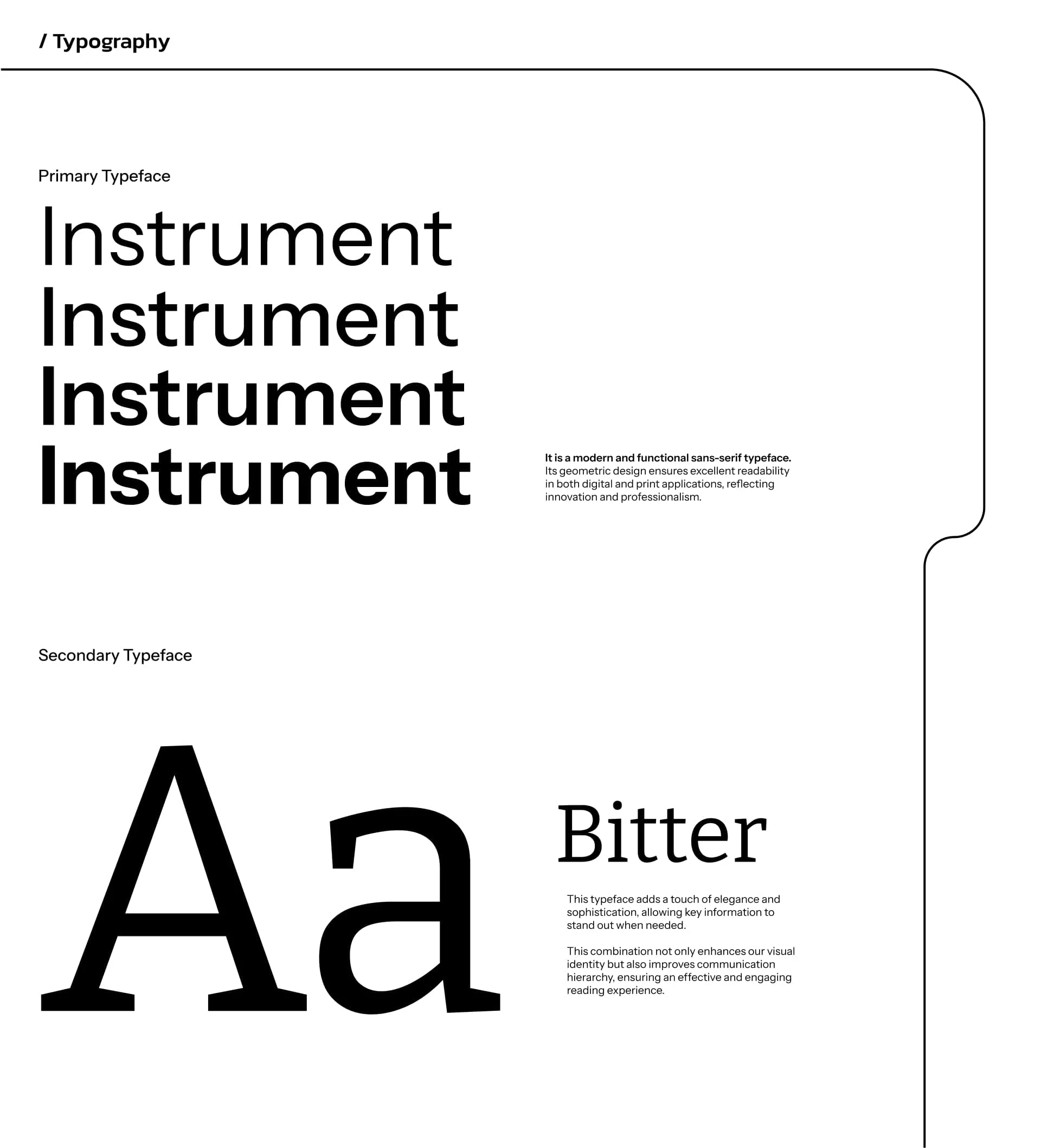
Instrument: It is a modern and functional sans-serif typeface.
Its geometric design ensures excellent readability in both digital and print applications, reflecting innovation and professionalism.
Bitter: This typeface adds a touch of elegance and sophistication, allowing key information to stand out when needed.
This combination not only enhances our visual identity but also improves communication hierarchy, ensuring an effective and engaging reading experience.
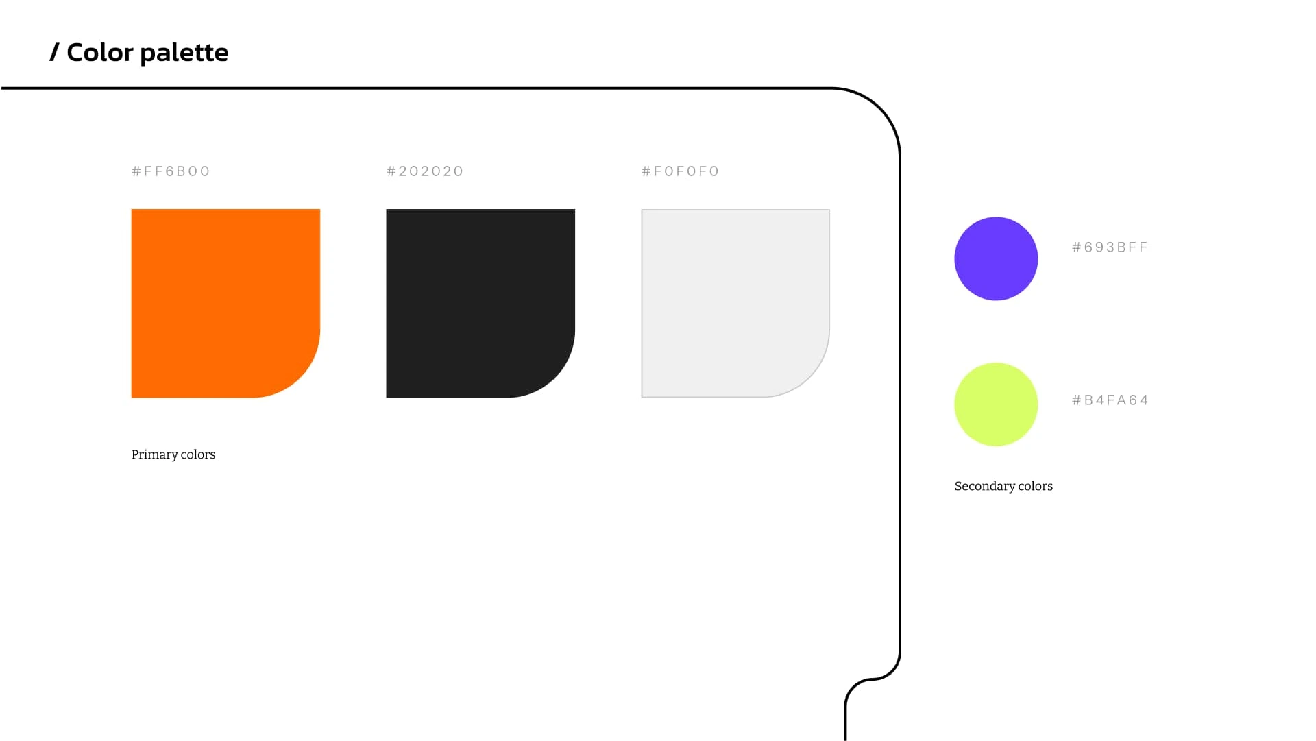
Orange: the energy and creativity that drive our solutions.
Black: symbolizes the strength and professionalism with which we approach each project.
White: clarity and simplicity, the clean focus of our design.
www.fraguadesign.com
Like this project
Posted Mar 16, 2025
Redesigned the Fragua logo and crafted versatile templates, giving the brand a fresh, cohesive look that’s ready to shine across all platforms.
Likes
2
Views
59
Timeline
Sep 2, 2024 - Oct 22, 2024
Clients
Fragua