Libro del Sentido | Book Cover Design
Martina Drebnica
Case Study: Libro del Sentido — Editorial Design
Visualizing the Intangible: A Study in Meaning and Form.
Project Summary
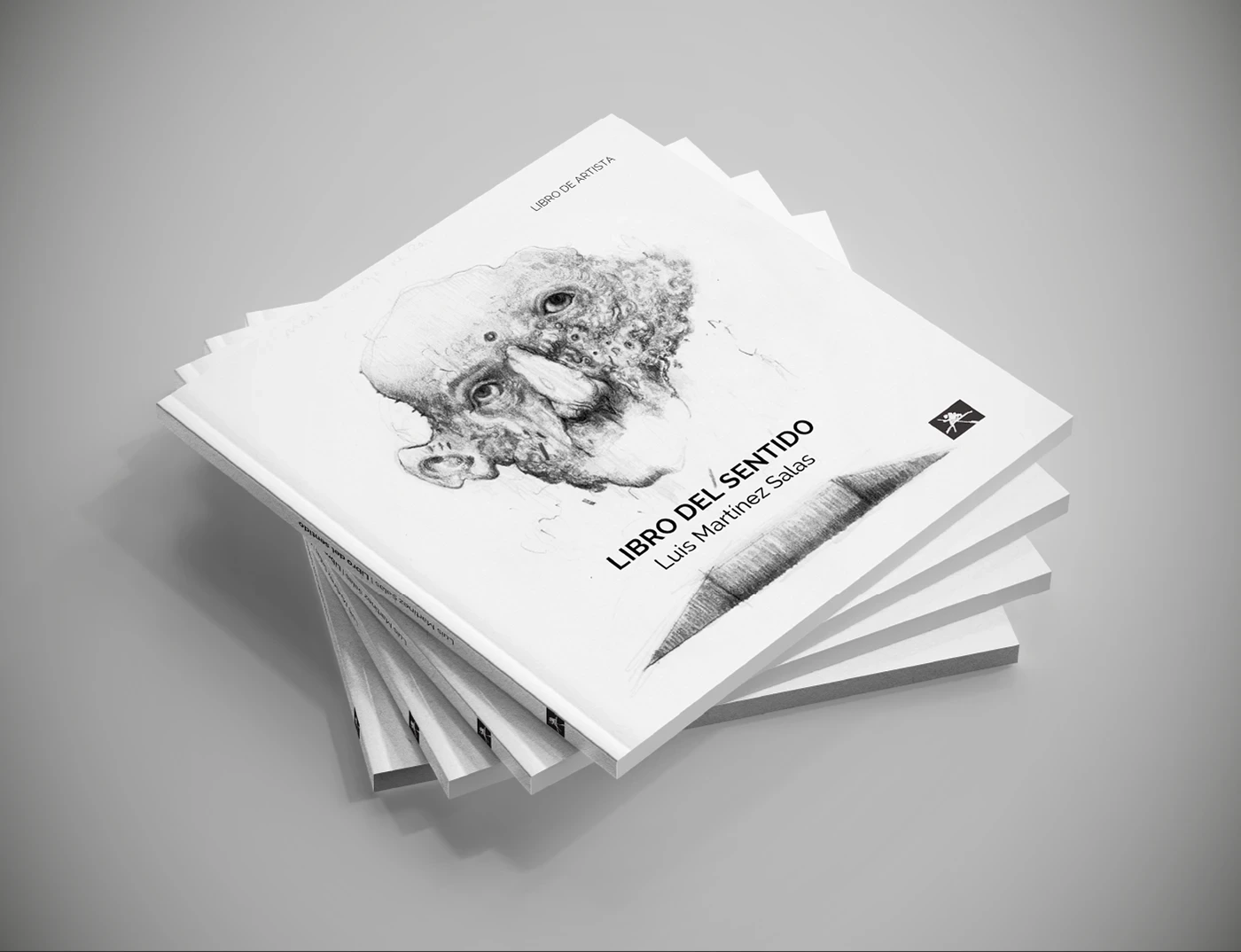
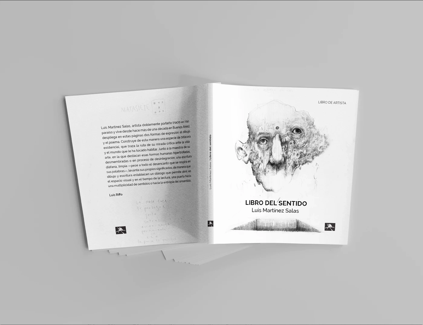
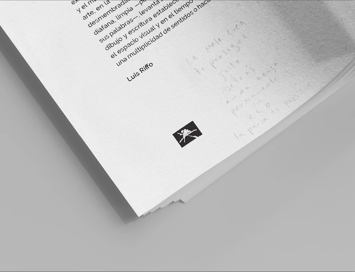
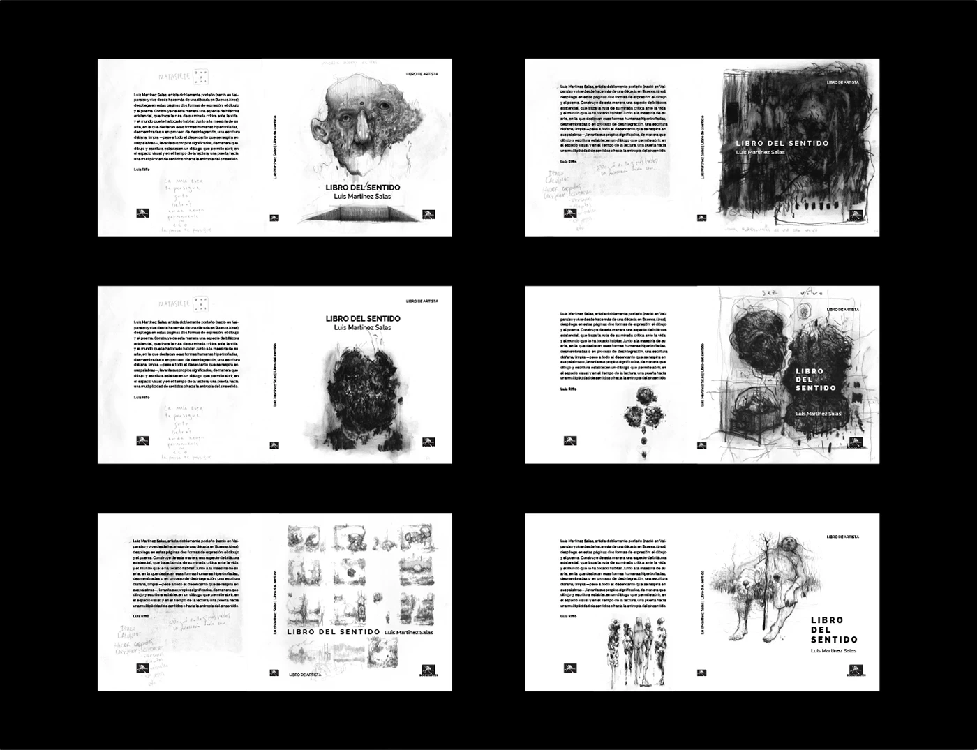
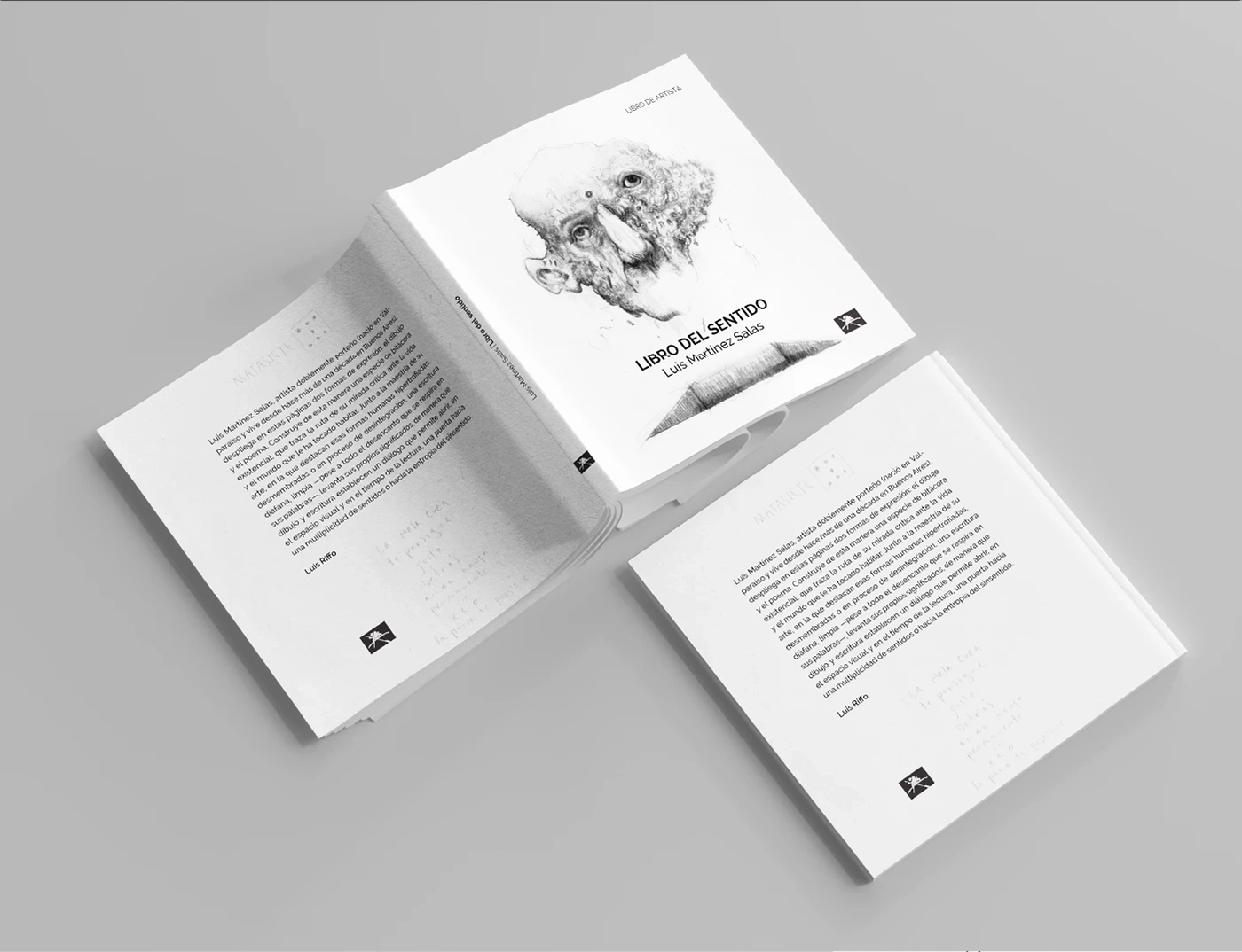
Libro del Sentido (The Book of Meaning) is a profound exploration of human existence and the search for purpose. I was brought on to design a cover that acts as a visual gateway to the book’s core philosophy. The goal was to take abstract, heavy themes—sense, existence, and the "human soul"—and translate them into a singular, high-impact visual that commands attention on a shelf while remaining deeply personal.
By prioritizing a "less is more" approach, I led the creative direction of the jacket design, typography, and materiality. The result is a sophisticated editorial piece that balances the weight of the subject matter with a modern, clean aesthetic, positioning the book as a timeless piece of literature in a crowded market.
Art Direction: "The Human Grid"
The art direction was rooted in "Poetic Precision." I leaned into a high-contrast, monochromatic-leaning palette to keep the focus on the form and the word. By utilizing a "centered" and symmetrical layout, I ensured that the book felt grounded and authoritative.
To bridge the gap between abstract philosophy and physical product, I focused on the "tension" of the typography—adjusting the kerning and weight to make the word "SENTIDO" feel like a permanent, structural object. Every detail, from the negative space to the placement of the author's name, was meticulously chosen to ensure the transition from a "physical object" to a "philosophical journey" felt seamless and intentional.
The Challenge
The primary challenge was "The Complexity of Silence." How do you design a cover for a concept as vast as "Meaning" without it feeling empty or over-designed? We needed to bridge a series of nuanced tensions—abstract vs. accessible, heavy vs. light, and classic vs. contemporary.
Visually, the design had to stand out in a saturated bookstore environment by being the "quietest" and most confident voice in the room. The goal was to create a tool that didn't just label the book, but evoked a feeling of introspection and curiosity before the reader even opened the first page.
My Role
As the Lead Graphic Designer, I managed the end-to-end editorial process:
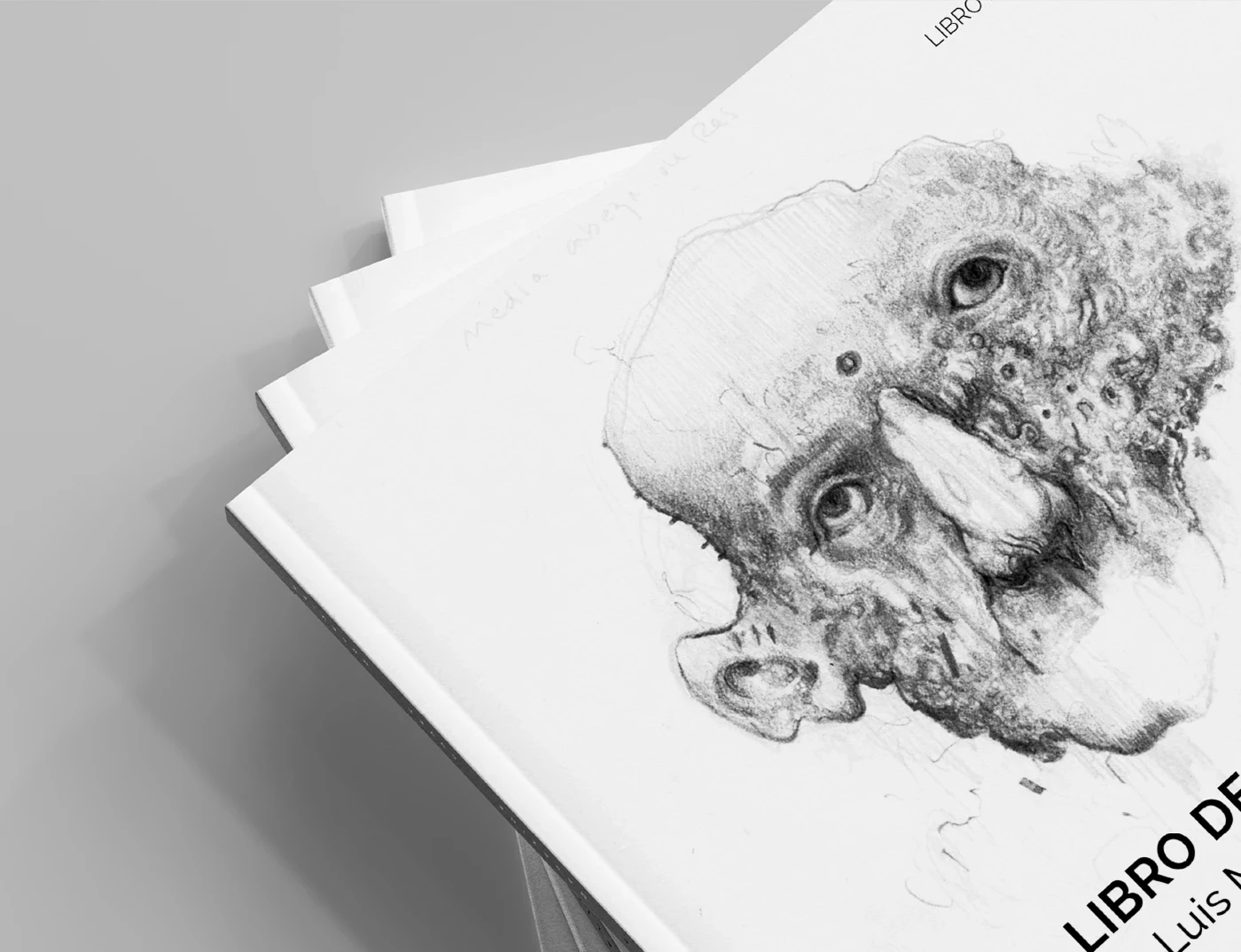
Conceptual Illustration: Developing abstract visual metaphors that represent the "search for meaning" without leaning into clichés.
Typographic Architecture: Creating a bold, centered hierarchy where the title acts as the anchor for the entire composition.
Jacket Layout Design: Managing the relationship between the front cover, spine, and back cover to ensure a cohesive 360-degree narrative.
Production & Materiality: Advising on finishes (such as matte textures and paper weights) to ensure the physical book feels as "human" and grounded as the text inside.
Results & Impact
The final design provides the author with a powerful, high-performance branding tool that positions the book as an essential read. With a visual system that balances refined editorial design with a "human" edge, the book now clearly stands apart from traditional, "stiff" philosophical texts.
The design has sharpened the book's positioning, allowing it to capture the attention of a modern, design-conscious audience. By merging professional expertise with a sophisticated, modern interface, the project has deepened the connection between the author’s message and the reader’s first impression.
Project Credits
Graphic Design: Martina Drebnica
Artist: Luis Martínez Salas
Note: All imagery and core brand elements used in this project were provided by the client.
Like this project
Posted Feb 24, 2026
Artist’s Book: Libro del Sentido. Cover design based on artist drawings and the core concept of meaning.
Likes
0
Views
13