Ebook Design & Layout: TechSquads
Martina Drebnica
Ebook Design & Layout: TechSquads
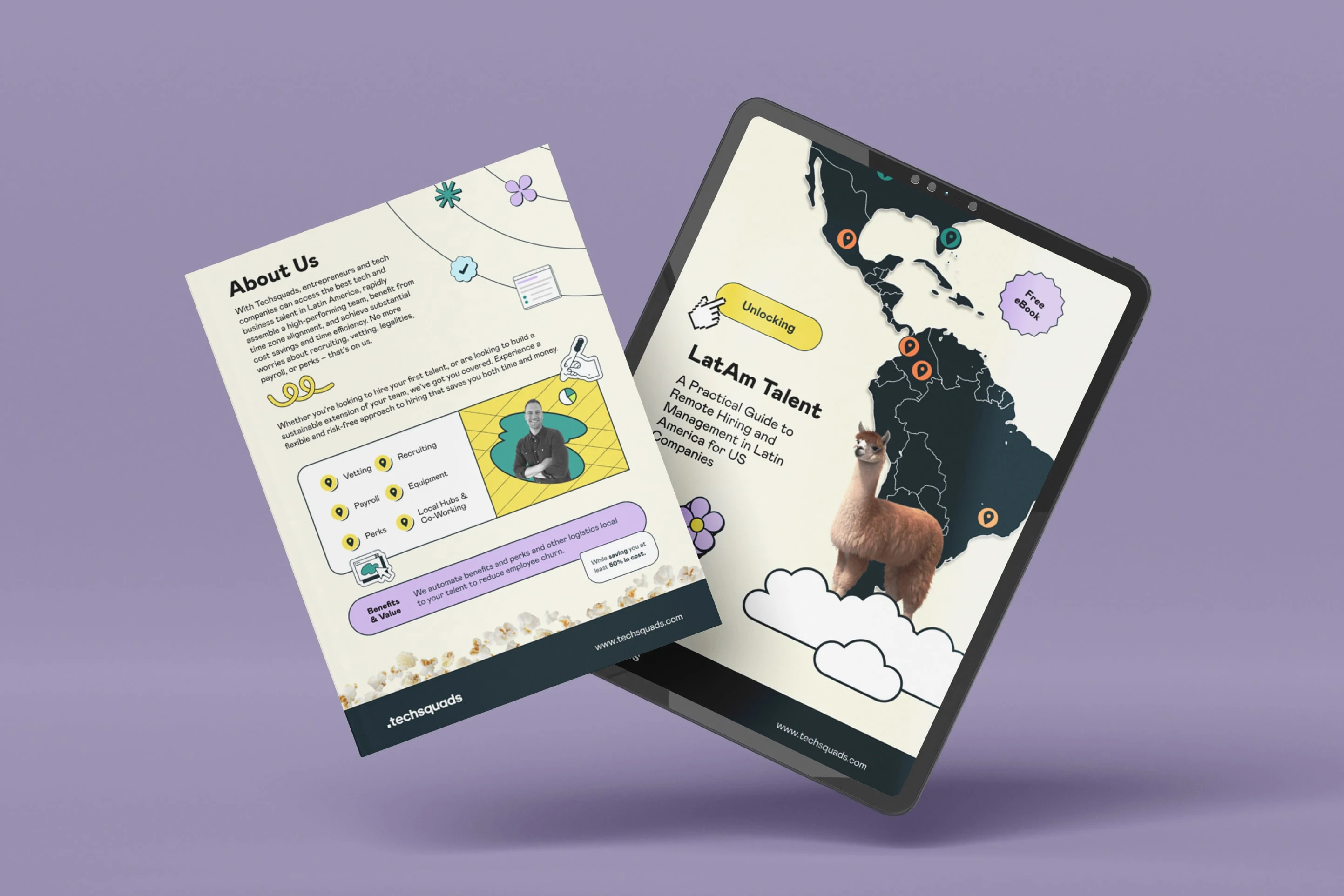
A Practical Guide to Remote Hiring and Management in Latin America.
Project Summary
TechSquads is a specialized recruitment platform connecting US companies with top-tier talent in Latin America. I was brought on to design a comprehensive 10-page ebook that serves as both a strategic guide and a lead magnet for the brand. The goal was to take complex logistical information—from labor laws to cultural nuances—and transform it into a visually engaging, digestible experience for US-based founders and hiring managers.
Working with brand elements provided by the TechSquads team, I led the creative direction of the layout, editorial design, and information architecture. By blending playful, illustrative elements with a structured, professional framework, I translated their vision into a high-value digital asset that establishes TechSquads as a thought leader in the LatAm hiring space.
My Role
As the Lead Graphic Designer, I managed the end-to-end design process of the ebook. My responsibilities included:
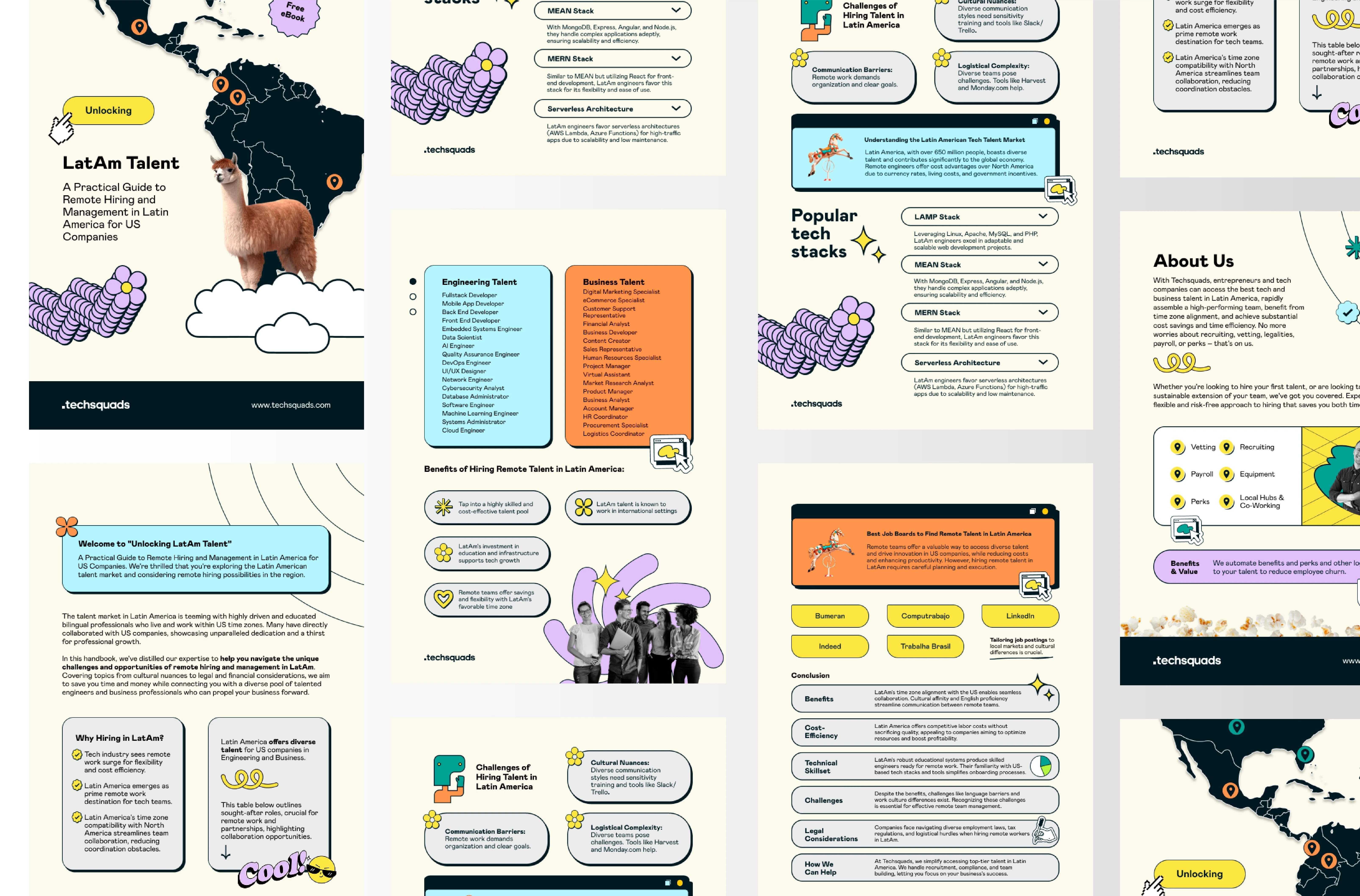
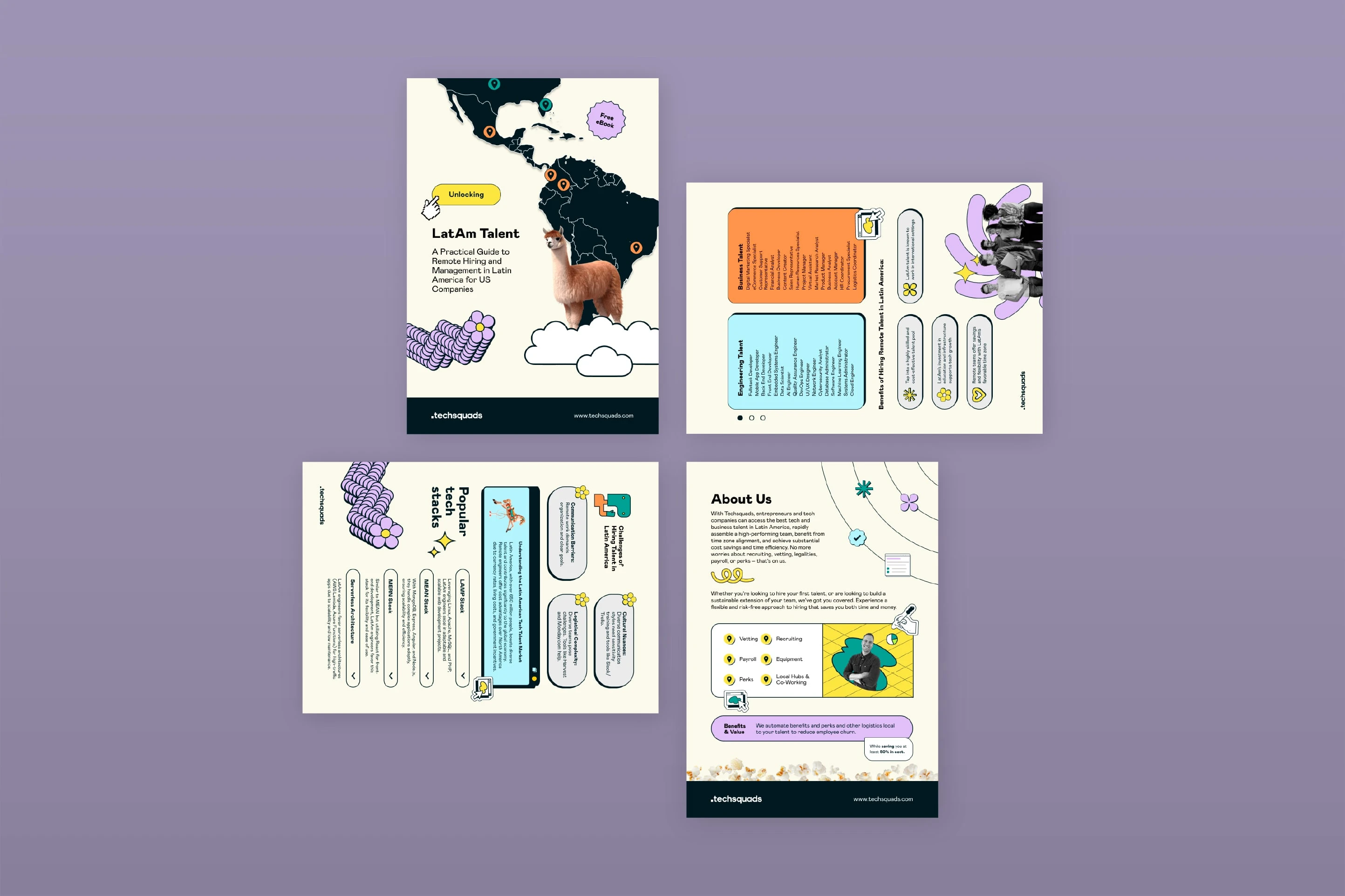
Editorial Layout Design: Creating a rhythmic, 10-page flow that keeps the reader engaged through dense subject matter.
Information Architecture: Organizing complex chapters on tech stacks, cultural differences, and hiring challenges into scannable, intuitive sections.
Data Visualization & Infographics: Designing custom tables and visual breakdowns to compare market trends and communication styles.
Visual Asset Integration: Seamlessly incorporating TechSquads' brand colors, character illustrations (like the signature alpaca), and iconography into a cohesive narrative.
Art Direction: Establishing the typographic hierarchy and "approachable-professional" aesthetic that balances tech-savvy energy with corporate reliability.
The Challenge
The primary challenge was balancing a playful, vibrant brand identity with the "serious" nature of international hiring and management. The ebook needed to be visually stimulating enough to stand out in a saturated market, but clear and authoritative enough to build trust with high-level executives.
Visually, the design had to bridge a series of nuanced tensions—illustrative warmth and data-driven precision, playfulness and professionalism. We needed to highlight the vibrancy of the Latin American talent market without leaning into clichés, striking a balance between an inviting, friendly tone and a sophisticated, expert-led guide. Ultimately, the goal was to create a tool that didn't just provide information, but evoked a feeling of ease and partnership in the hiring process.
Art Direction
The art direction was rooted in "Engaging Technicality." I leaned into a bold, high-contrast palette—using vibrant yellows and teals against clean, grounded backgrounds. By prioritizing a "modular" layout, I ensured that even the most information-dense pages (like the "Popular Tech Stacks" or "About Us" sections) remained easy to navigate.
To bridge the gap between human connection and technical services, I utilized a mix of authentic photography and playful vector illustrations. Every detail—from the weight of the rounded containers to the rhythmic placement of custom icons—was meticulously chosen to ensure the transition from a "how-to guide" to a "brand pitch" felt seamless and intentional. The result is a system that feels fresh, considered, and meticulously organized.
Results & Impact
The final ebook provides TechSquads with a powerful, scalable branding tool that positions them as an essential partner for US companies looking southward. With a visual system that balances refined layout design with creative edge, the brand now clearly stands apart from traditional, "stiff" recruitment firms.
The design has sharpened their positioning, allowing them to capture leads with a high-performance asset that delivers immediate value. By merging professional expertise with a sophisticated, modern interface, the project has deepened audience connection and set the stage for aligned, intentional growth in the remote work sector.
Key Takeaways
Visual Rhythm is Key: In long-form digital content, changing the layout "tempo" between pages prevents reader fatigue and highlights key data points.
Brand Personality as Trust: A friendly, illustrative approach can actually increase professional trust by making complex, intimidating topics feel manageable.
Data as Design: When logistical information is designed into a clear hierarchy, it transforms from "fine print" into a valuable decision-making tool.
Project Credits
Graphic Design: Martina Drebnica
Brand Assets & Content: TechSquads Internal Team
Note: All imagery and core brand elements used in this project were provided by the client.
Like this project
Posted Jul 31, 2024
Remote Hiring Guide. I transformed complex international hiring logistics into a premium 10-page ebook and lead magnet.