Lijo Gin :: Branding & Packaging Identity
Emmanuel Cagossi
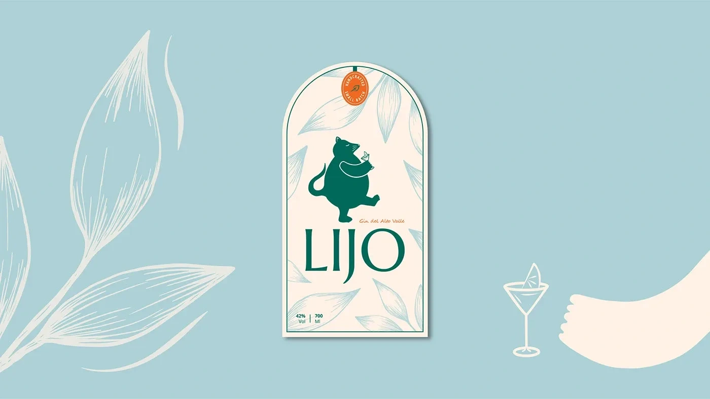
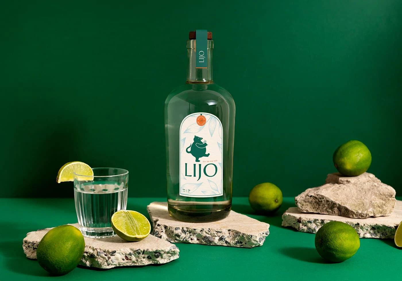
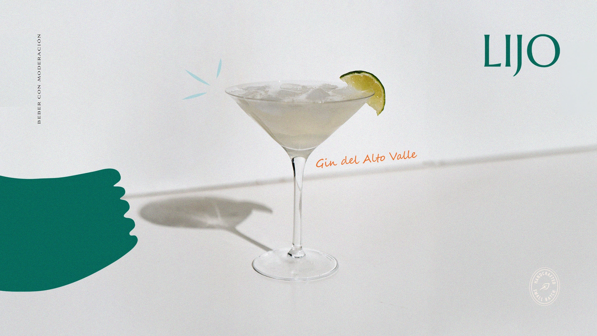
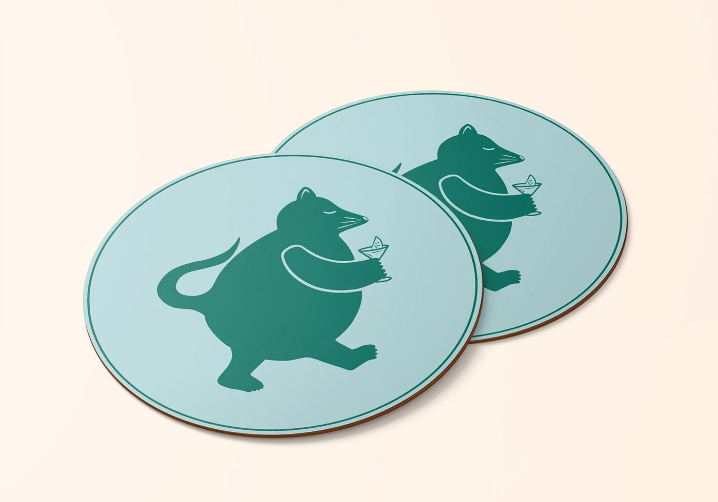
Gin Lijo | Herbal Craft Gin
A toast to time, roots and ritual.
Logo Design · Brand Storytelling · Concept Development · 2024
Gin Lijo isn’t just a spirit — it’s a tribute. Born from a family nickname that bridges generations, Gin Lijo celebrates the enduring bond between grandparents and grandchildren. Every bottle carries the memory of shared moments, laughter, wisdom, and warmth — distilled into a complex, herbal gin crafted in Patagonia.
We were invited to design a visual identity that would reflect this story — a modern, heartfelt brand that honors tradition, nature, and the quiet magic of time spent together.
The 4C Brand Foundation
CLARITY
More than flavor — it’s a feeling.
Gin Lijo stands apart from typical dry gins. Infused with nine botanicals including thyme, muña muña and elderflower, its herbal character is bold, aromatic, and easy to love. But what makes Lijo unique isn’t just the recipe — it’s the intention behind it.
This is a product that exists to evoke emotion:
The comfort of rituals passed down.
The strength of familial bonds.
The joy of discovering a new favorite drink that feels instantly familiar.
Positioning statement:
A handcrafted gin that tastes like home, but finishes with something new.
CONNECTION
Made for curious drinkers who care about the details.
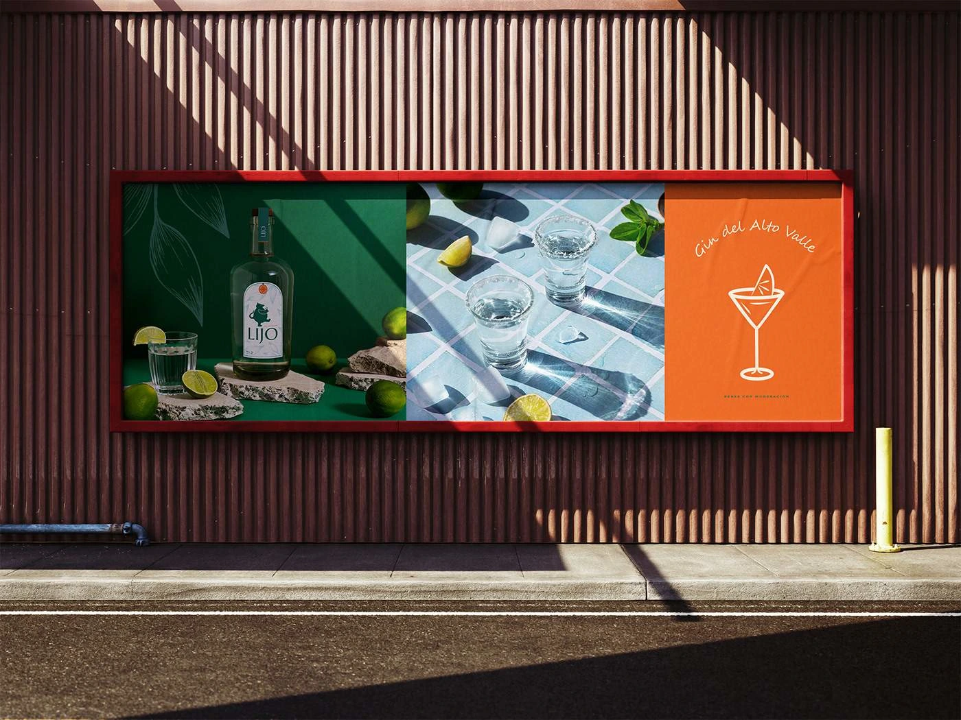
Gin Lijo is designed for a discerning yet down-to-earth audience — people between 35 and 50 who see preparation as part of the pleasure. They value quality, ritual, and storytelling. They’re not chasing trends — they’re looking for something with a soul.
Audience traits:
Lovers of well-made cocktails
Curious about botanicals and craft spirits
Appreciate products with authentic backstories
Tone of voice:
Warm, sincere, and inviting
Slightly playful, but always refined
More about connection than exclusivity
CHARACTER
Where Patagonia meets purpose.
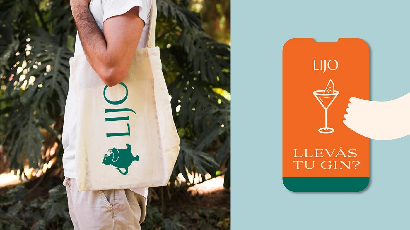
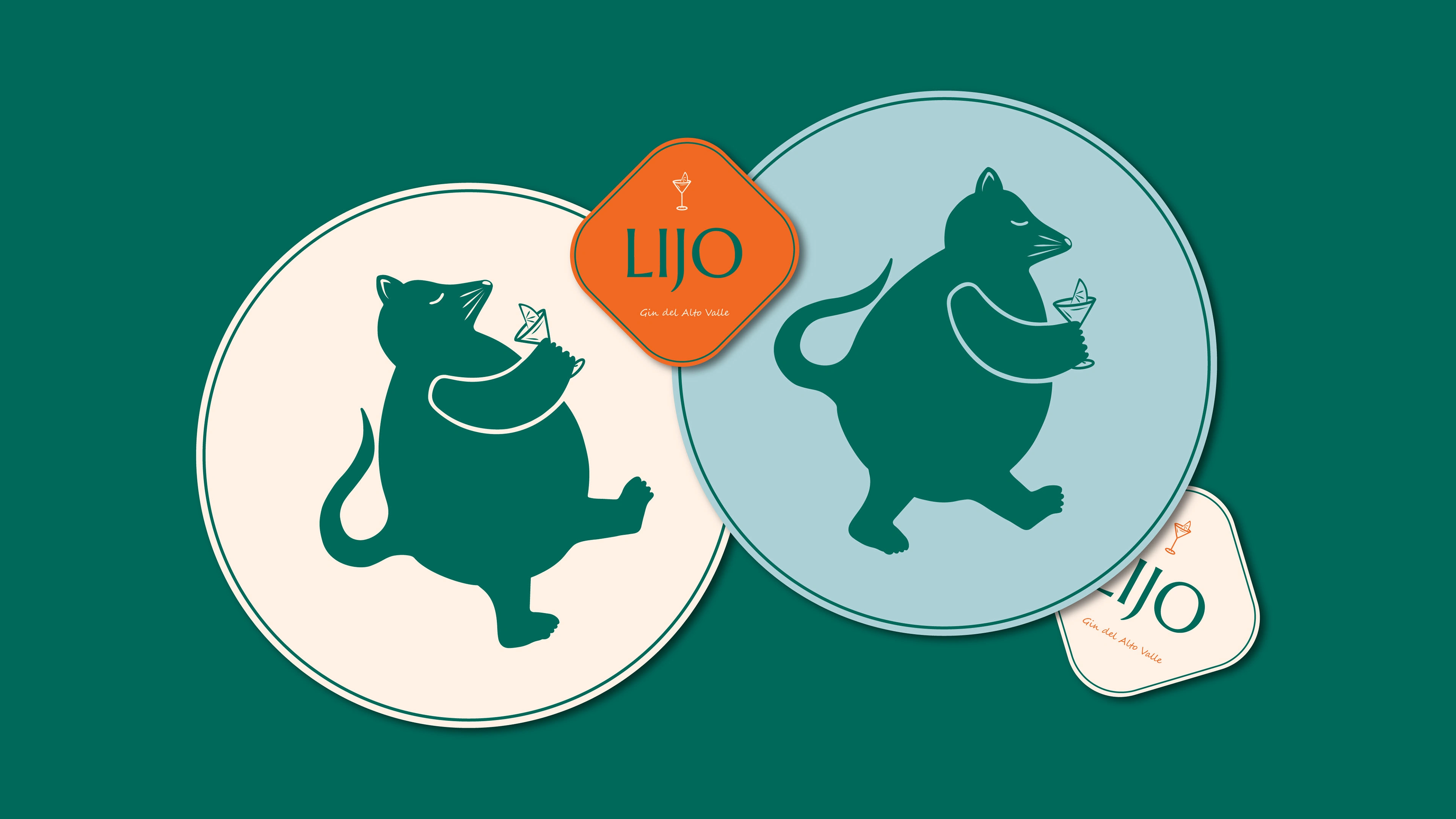
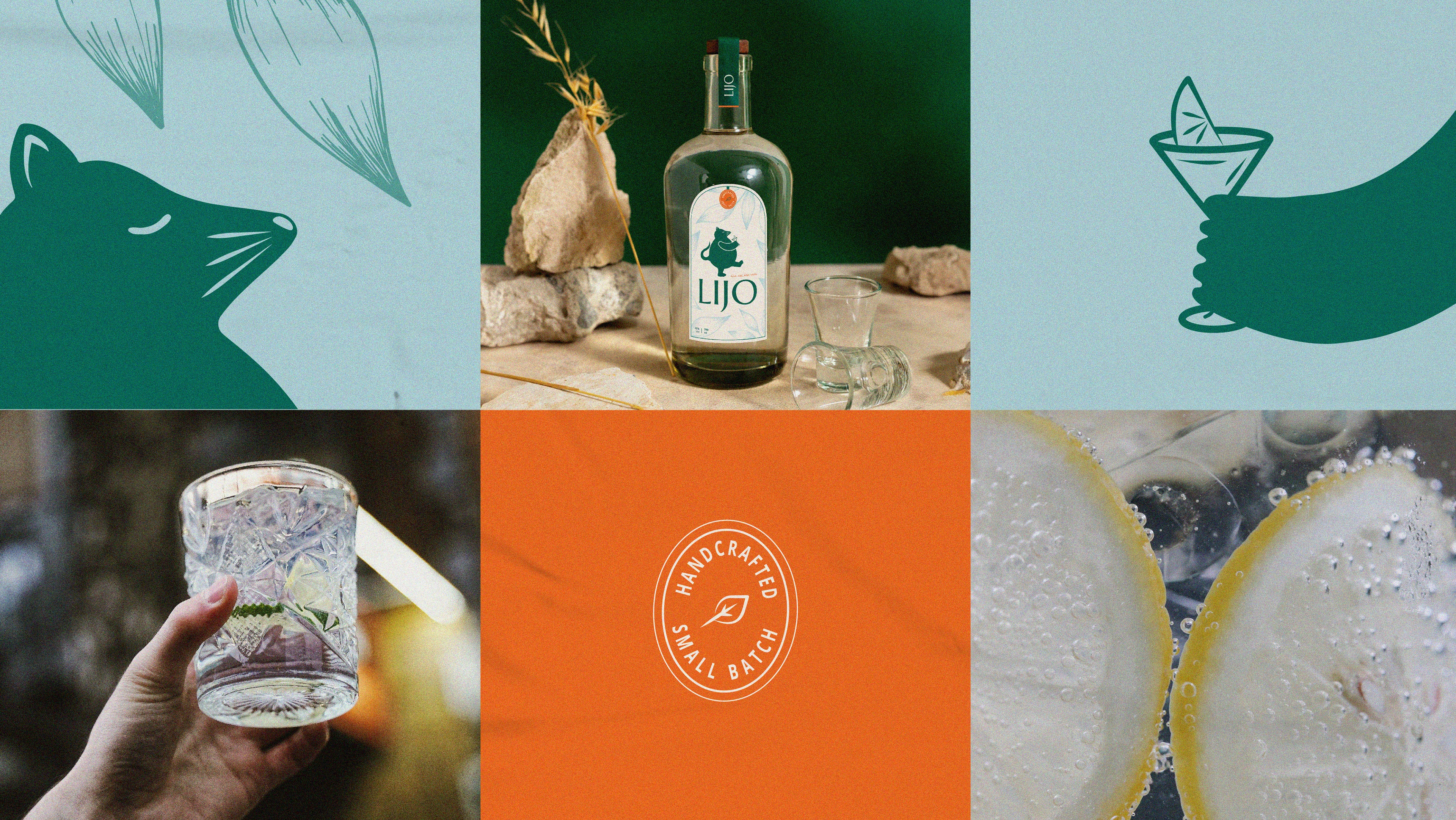
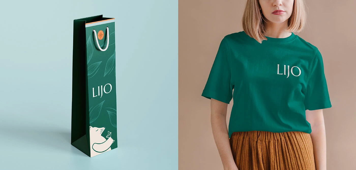
The visual identity of Gin Lijo was created to feel grounded, timeless, and quietly modern. Neutral tones, delicate typography and subtle detailing reflect the balance between craft and elegance. The brand draws from natural Patagonia: fresh air, herbs, mountains, stories shared by the fire.
Visual influences:
Herbal textures and soft color palettes
Minimal but rich design language
Natural materials and soft shadows
Keywords:
Craft. Connection. Patagonia. Legacy.
CONTRIBUTION
A brand that distills love, nature and time.
Gin Lijo seeks not only to produce a high-quality product — but to contribute to the culture of craft gin in Patagonia. It aims to become a regional reference, rooted in passion, feedback, and continuous refinement.
Long-term vision:
Promote the culture of artisanal gin
Create a community around slow, intentional enjoyment
Expand locally while staying true to its roots
Core values:
Quality as a promise
Authenticity in every drop
Passion as fuel
Excellence through feedback
Creative Outcome
The Gin Lijo identity was born from a deeply personal story — and that intimacy guided every design decision. From the logo composition to the narrative voice, the goal was to reflect the emotional depth of a handcrafted gin that feels like a legacy.
A product that connects the past with the present. And every pour, with a story.
Looking for building or relaunch your brand or website?
Let´s connect!
Like this project
Posted Feb 15, 2024
Lijo is a Gin brand from Patagonia, Argentina. It is a brand that seeks to transcend the passage of time, love, wisdom, and complicity.