Freelancers using FigJam in Brooklyn
Sign Up
Post a job
Sign Up
Log In
Filters
2
Projects
People
Anush | Foundrline
max
New York, USA
Websites, Stores & Funnels • Framer, Shopify, Kajabi,Webflow
$100k+
Earned
53x
Hired
4.9
Rating
778
Followers
expert
expert
+7
Follow
Message
Websites, Stores & Funnels • Framer, Shopify, Kajabi,Webflow
0
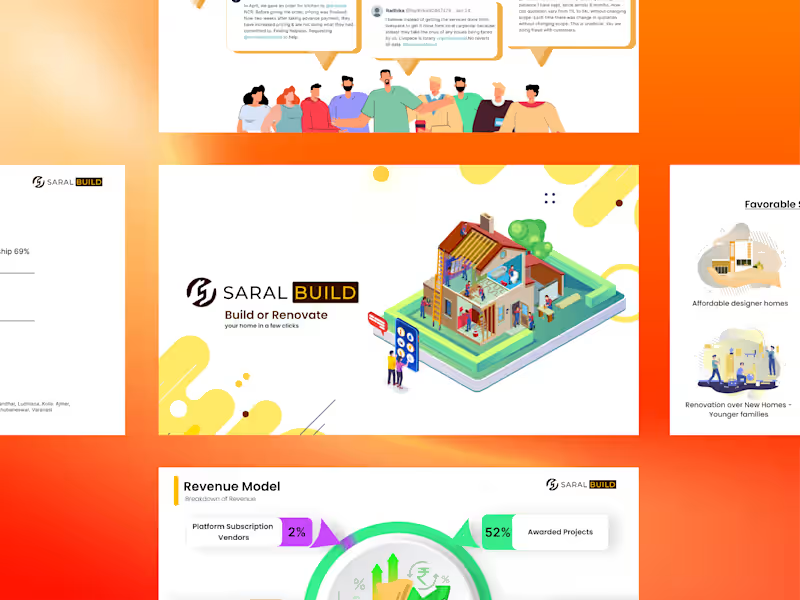
Investor Pitch Deck — Home Construction & Renovation Platform
0
16
0
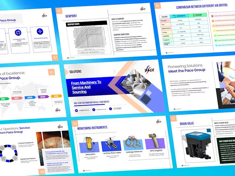
Product & Solutions Deck — Industrial Equipment
0
9
0
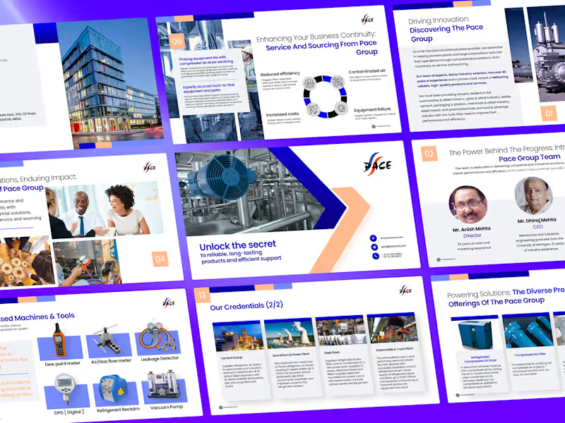
Company Profile Deck — Industrial Solutions Provider
0
13
9
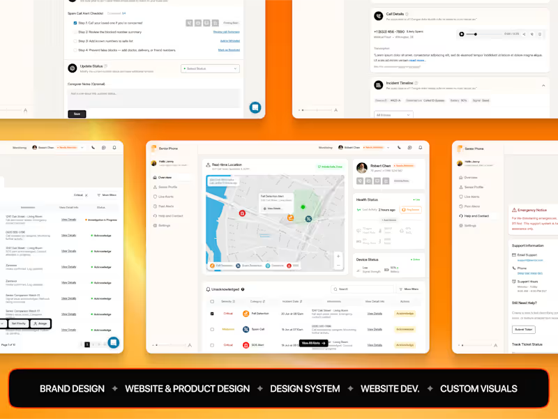
AI-Powered Phone & Caregiver Dashboard for Safer Senior Living
9
361
FigJam
(3)
Follow
Message
Leonel Duran
New York, USA
Taking your brand from 0→1
$10k+
Earned
14x
Hired
5.0
Rating
121
Followers
expert
Club
Follow
Message
Taking your brand from 0→1
14
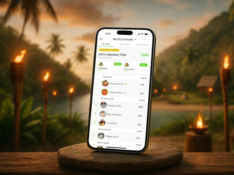
Fantasy Tribes – Mobile UI/UX Design
14
243
1
Jim app icon 🏋🏽♂️
1
1
280
61
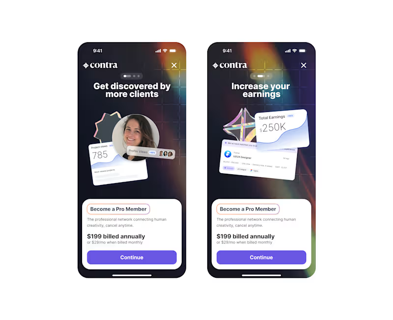
Old Contra paywall concepts ✨ Who else is waiting for a Contra mobile app?
20
61
922
62
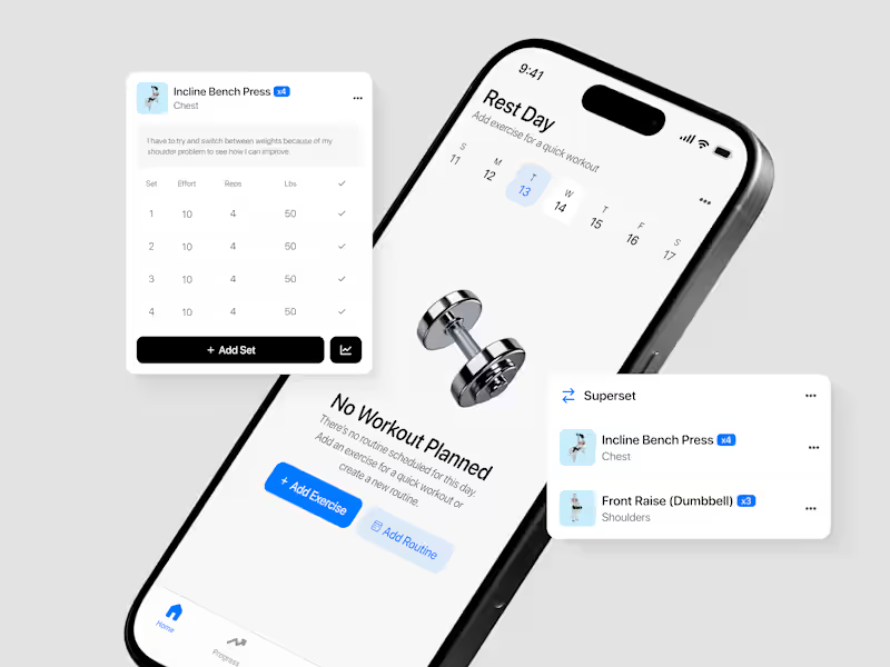
Empty States 🏋🏽♂️
15
62
857
FigJam
(1)
Follow
Message
James Fortier
pro
New York, USA
Visual Designer & Framer Expert
$10k+
Earned
5x
Hired
5.0
Rating
36
Followers
Follow
Message
Visual Designer & Framer Expert
26
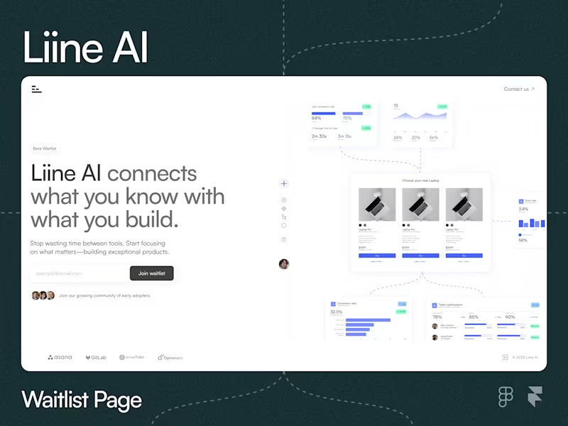
Liine.ai Waitlist Page Design
26
372
0
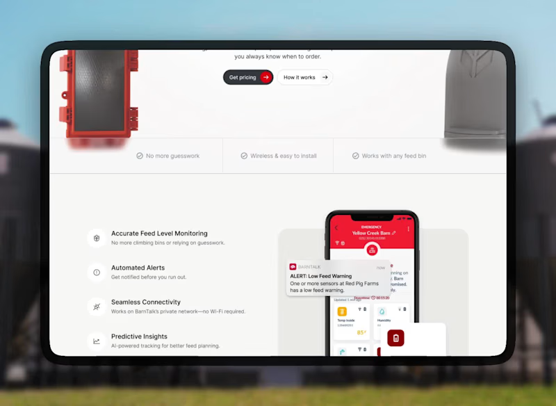
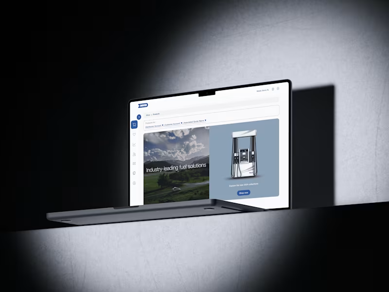
Barntools Website and Brand Redesign
1
0
13
0
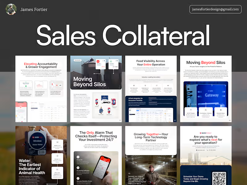
BarnTools Brochure & One Pager Design
0
7
0
Koreo Solutions Brand Identity & Framer Template
0
18
FigJam
(1)
Follow
Message
Ammara K
Brooklyn, USA
UX/UI for Web & Mobile | Figma, Framer, Wix, Squarespace
5.0
Rating
13
Followers
Follow
Message
UX/UI for Web & Mobile | Figma, Framer, Wix, Squarespace
0
Landing Page Design | Figma
0
15
0
Responsive Marketing Site UI – Figma Design
0
15
0
E-Commerce Landing Page – Crafted in Figma
0
18
16
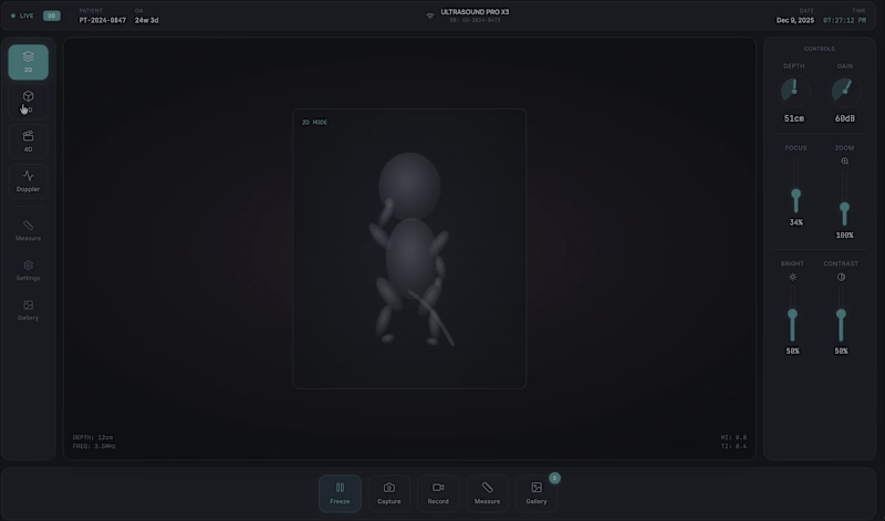
NexGen Ultrasound UI – Redesigning 3D/4D Fetal Imaging Current 3D/4D ultrasound UIs can be cluttered, dark, and sometimes show distorted fetal visuals. I redesigned NexGen Ultrasound UI with a cleaner layout, an anatomically correct fetus (one head, two arms, two legs), soft womb lighting, clear navigation, and an accessible Gallery. Technical limits prevented further refinement, but the screens are now lighter, intuitive, and more reassuring. https://18f603cf-ceef-4f48-b25c-109e93e4b2e8.canvases.tempo.build
16
285
FigJam
(3)
Follow
Message
Parinaz Kassemi
New York, USA
Product Designer · Websites + Digital Products
$1k+
Earned
2x
Hired
5.0
Rating
24
Followers
Follow
Message
Product Designer · Websites + Digital Products
0
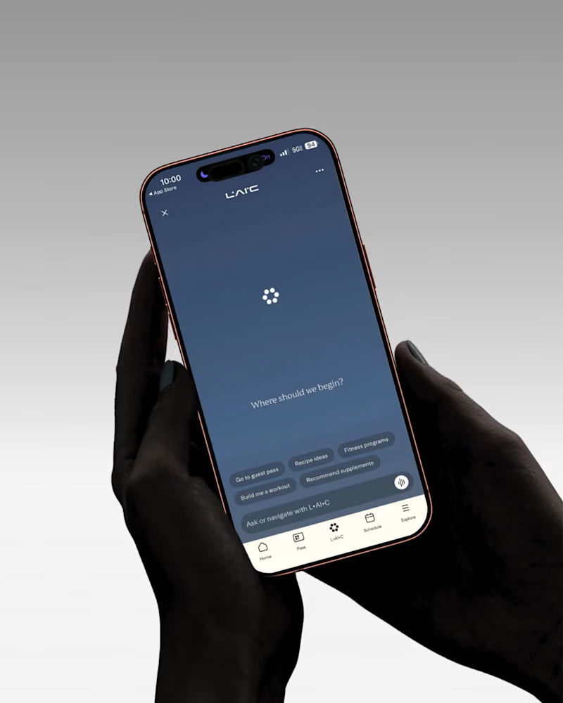
l.ai.c. was already being built when I joined. Engineering had moved fast — but no one had defined what the AI should say, how it should think, or why members would use it. I went back to the beginning. Interviewed the concierge team, mapped the most repeated questions, and designed the full conversation routing — what l.ai.c. could answer, what it couldn't, and where to send users when it hit its limit. Every dead end became a pathway. Every question became a conversion opportunity. Concierge load reduced, 800K+ members, live in the LT app
0
225
2
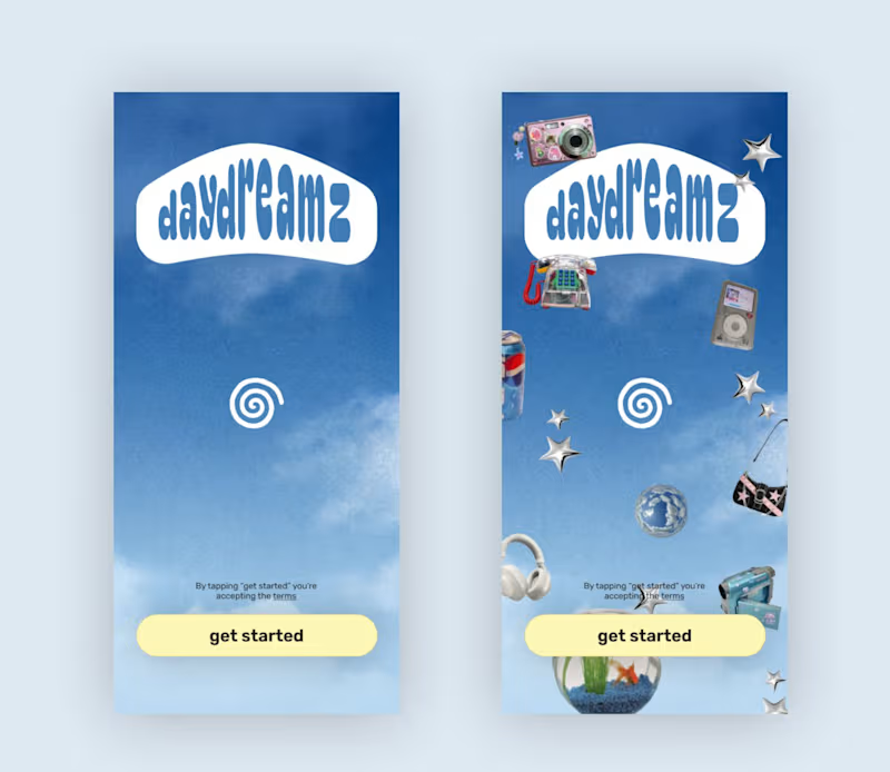
Using Lovable to build the daydreamz app! Here's the splash screen
2
2
101
39
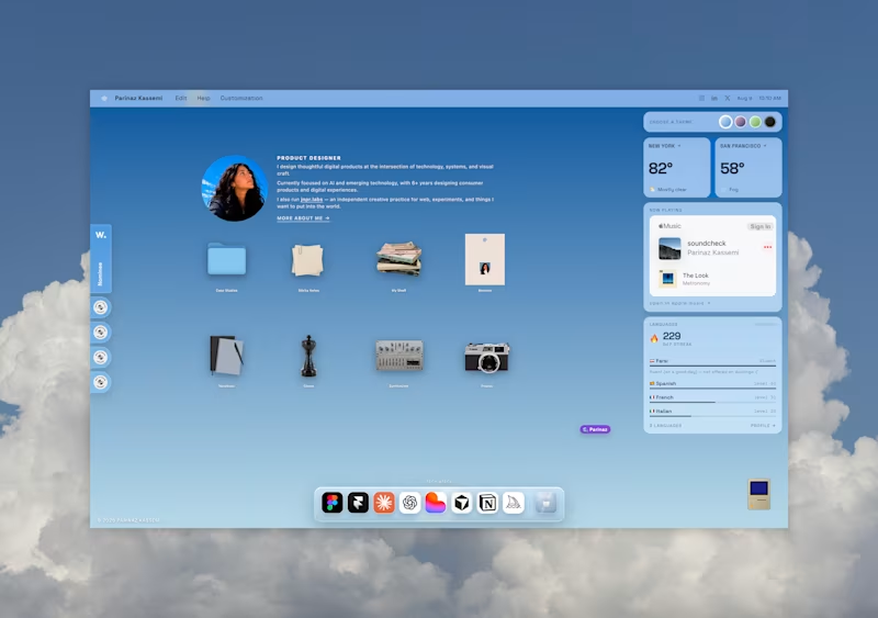
Built my new portfolio (https://www.parinazkassemi.com) with Figma and Lovable. I wanted it to feel very internet-native, so I added things like personalized cursors and the ability to see other people in the shared file — leaning into that chronically-online, always-in-a-design-tool feeling 🙃 I also wanted the site to share a little more of who I am beyond the work, with personal photos, a notebook for thoughts, and a running list of things I’m reading and watching.
30
39
1.5K
1
midjourney photo collection
1
62
FigJam
(1)
Follow
Message
Shekh Al Raihan
pro
New York, USA
Senior Product Designer with 8+ years of experience
1x
Hired
4.4
Rating
41
Followers
Follow
Message
Senior Product Designer with 8+ years of experience
1
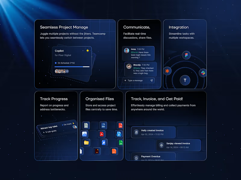
A set of elegant and versatile feature cards designed specifically for SaaS platforms and modern web applications. These cards showcase key product features with clean layouts, subtle depth, meaningful icons, and engaging micro-interactions. Built for dashboards, marketing pages, and pricing sections, they deliver a premium, trustworthy feel while making complex SaaS offerings instantly scannable and appealing. These feature cards stand out through their refined balance of minimalism and visual hierarchy. Thoughtful use of whitespace, soft shadows, and smooth hover animations creates delightful user engagement without overwhelming the interface. The design feels premium yet approachable, helping SaaS products communicate value quickly and effectively while maintaining consistency across the entire product ecosystem. Problem Solved & Solution: Many SaaS feature sections suffer from cluttered, boring, or inconsistent card designs that fail to capture attention or clearly communicate benefits, resulting in lower engagement and conversion rates. This solution provides a polished, conversion-focused card system that improves scannability, boosts visual appeal, and guides users toward key actions — ultimately helping SaaS platforms increase user understanding, interest, and sign-ups.
1
240
0
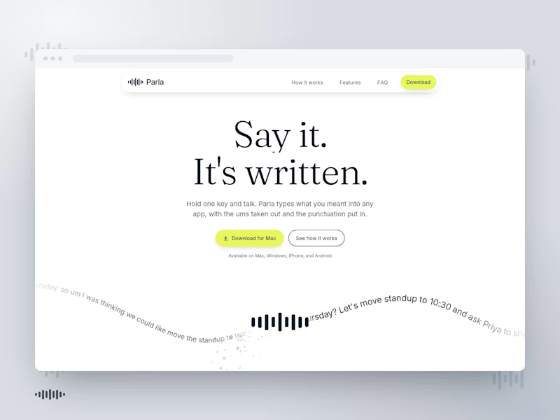
Parla: AI Voice Writing Landing Page I designed a clean, modern landing page with clear storytelling, thoughtful visual hierarchy, and soft visuals to communicate how AI voice can make writing faster and easier. I added smooth transitions, subtle motion, and simple interactions to guide users through the experience, keeping the design polished, engaging, and easy to navigate without overwhelming the content.
0
13
7
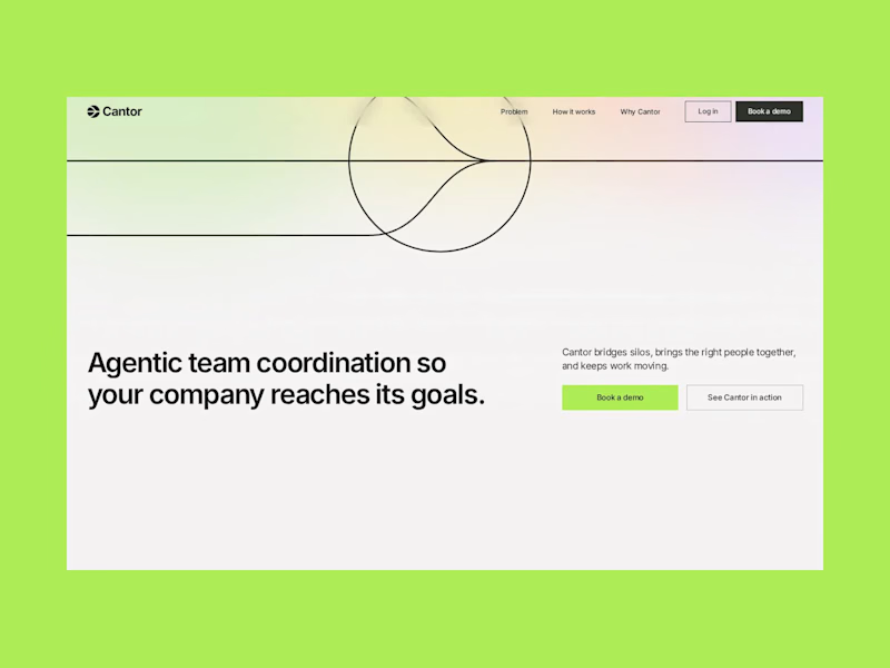
Cantor: AI Coordination Landing Page:- I designed a clean, modern landing page with a strong layout, clear hierarchy, and focused visual elements. I added smooth scrolling, section transitions, and subtle motion to guide users through the experience. I kept the animation simple and purposeful, making the website feel polished, interactive, and easy to navigate without overwhelming the content.
6
7
203
2
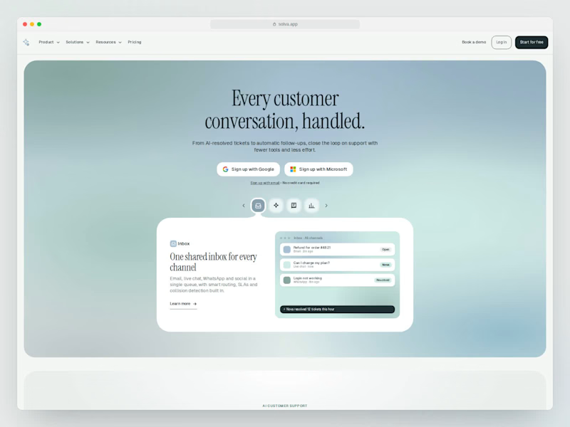
AI Support Platform A landing page concept for an AI-powered customer support platform. The goal was to create a SaaS experience that feels simple, clear, and product-focused without falling into the usual overly technical AI aesthetic. I focused on: Clear product storytelling Strong visual hierarchy Minimal, modern UI Product-focused sections Clean interactions and spacing A calm visual language that keeps the product at the center Designed to make AI support feel less complicated and more approachable.
1
2
231
FigJam
(1)
Follow
Message
Shane Jeffers
pro
New York, USA
Product Designer | AI & Automation
19
Followers
Follow
Message
Product Designer | AI & Automation
0
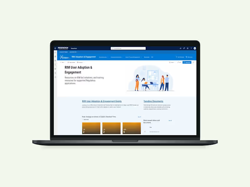
Regulatory SharePoint Redesign
0
7
0
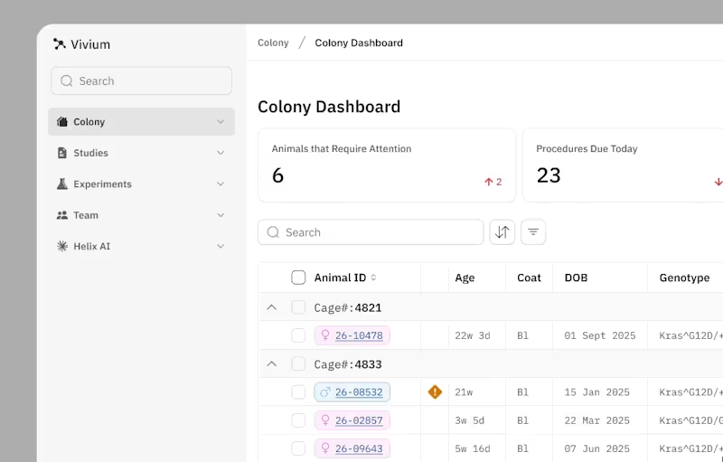
I've been working with scientists that are tracking genetic data across animal colonies. Currently, the data is on spreadsheets and disconnected tools to make critical research decisions. It got me thinking what if the dashboard itself could think with you? Imagine a preclinical research dashboard with Claude embedded as your research assistant. It helps you catch issues, plan experiments, and pull data together for you.
0
212
0
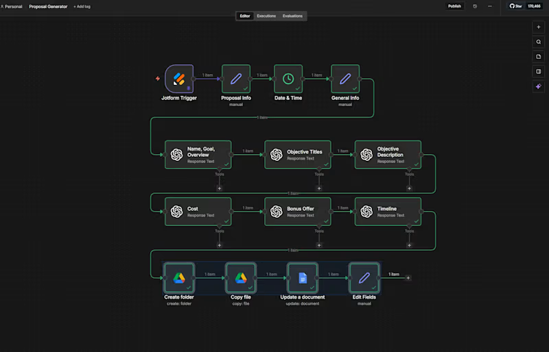
AI-Powered Proposal Generator
0
12
0
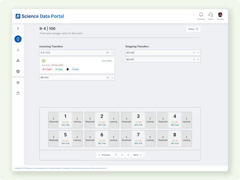
Animal Transfer & Space Availability Management
0
9
FigJam
(1)
Follow
Message
Archna Dosija
New York, USA
🌟Product Designer | SaaS, AI & Consumer Apps
5.0
Rating
5
Followers
Follow
Message
🌟Product Designer | SaaS, AI & Consumer Apps
1
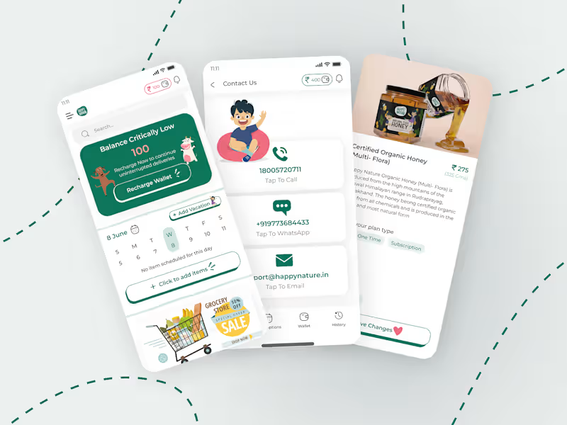
App Redesign: 88% MoM revenue growth after checkout rework
1
8
1
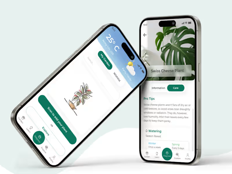
PlantLife – Smart Plant Care App Product Design
1
6
0
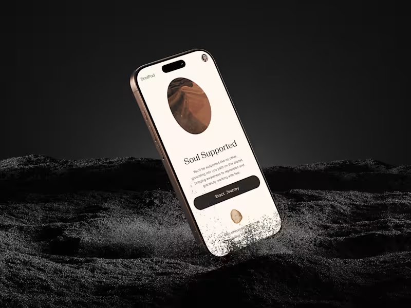
SoulPod — Founding Product Designer · Faster Onboarding Flow
0
14
0
SaaS Dashboard Redesign - Improved Sales Workflow Clarity
0
11
FigJam
(2)
Follow
Message
Explore people