The network for creativity
Join 1.25M professional creatives like you
Connect with clients, get discovered, and run your business 100% commission-free
Creatives on Contra have earned over $150M and we are just getting started
Back to feedPost

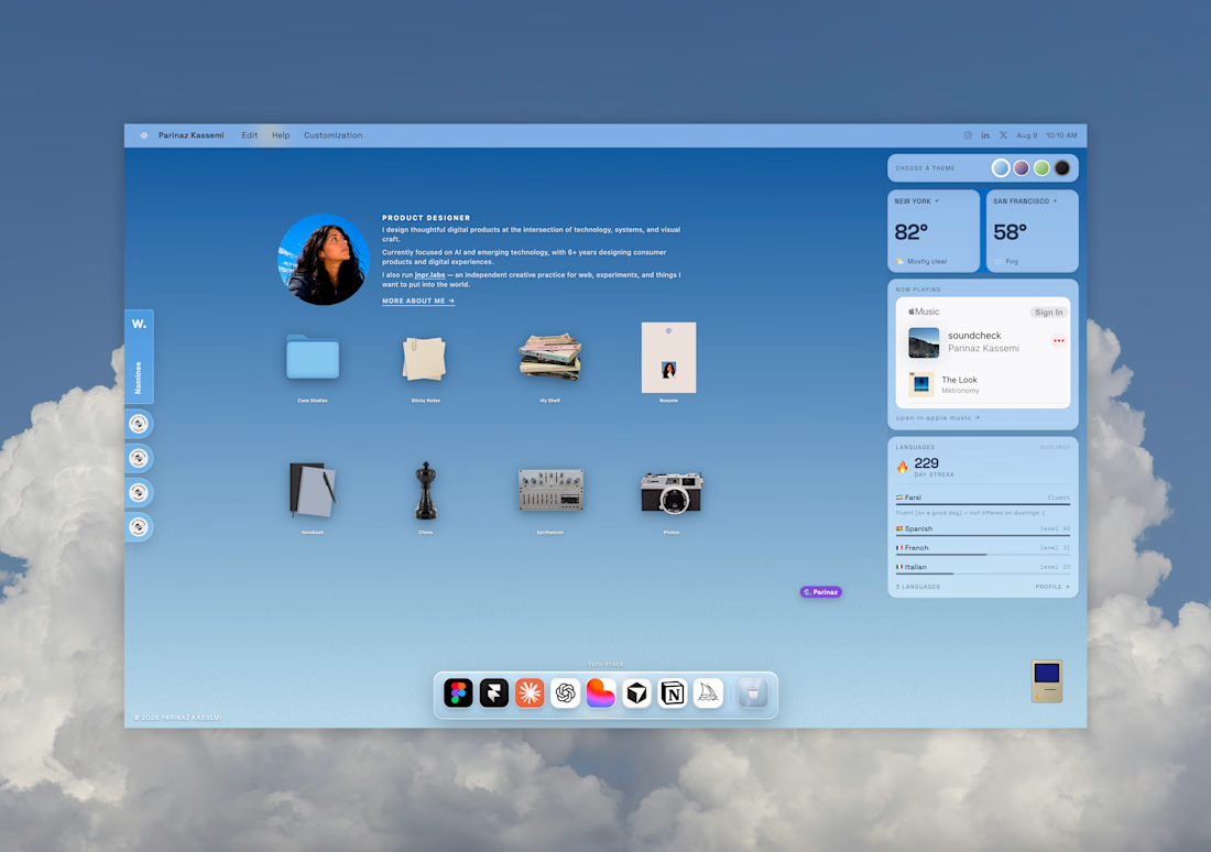
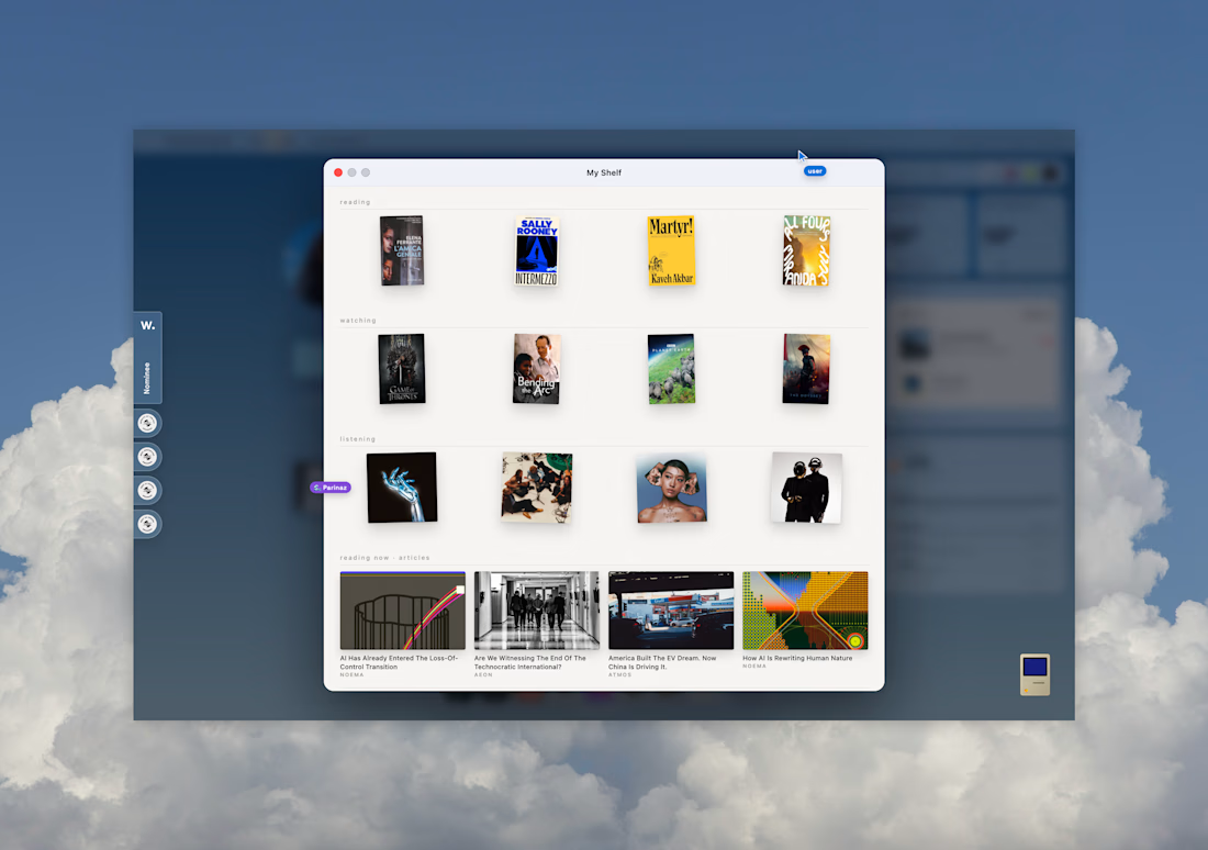
Built my new portfolio with Figma and Lovable.
I wanted it to feel very internet-native, so I added things like personalized cursors and the ability to see other people in the shared file — leaning into that chronically-online, always-in-a-design-tool feeling 🙃
I also wanted the site to share a little more of who I am beyond the work, with personal photos, a notebook for thoughts, and a running list of things I’m reading and watching.



Obsessed!
Ty!!! 😊

Nice work
Thx!! 🙏

girl, this is BRILLIANT. what an incredible layout, so unique!
tysm ! 🤗

Sky blue always hit my dopamine button.🔼 They way you've used 💖
TY!
YW, mate! 💖


Love the direction. The shared file idea is such a fun touch and makes the portfolio feel genuinely personal.
Tysm!


seeing other cursors on a portfolio is a fun idea
i was inspired by figma! ty 😃

Such a unique experience, amazing work!


too good!!
TY!!!

Love it
TY!!!

Nicee
tysm!

Nice
thx :)

thanks!

What a unique work👍 👍 👍
thank you :)

Beautiful design
The network for creativity
Join 1.25M professional creatives like you
Connect with clients, get discovered, and run your business 100% commission-free
Creatives on Contra have earned over $150M and we are just getting started











Related posts

AI can build the UI in minutes.
Bringing it up to a good standard, still needs a designer. Agree or disagree?

I see some of your work and honestly your work is really premium 🎉🎉
Great job Alex🎉🎉🔥🔥

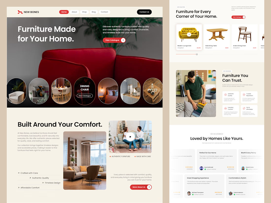
Excited to share my latest design project: New Bones 🛋️
New Bones is a furniture e-commerce landing page designed to make discovering home items and exploring decor trends completely seamless. The main focus was to break down complex online shopping layouts into a clean, minimal, and frictionless user journey.
From smooth product slider discovery to a transparent trust badge flow, every section is crafted with close attention to clear visual hierarchy and layout consistency.
Check out the full UI/UX case study here! 👇

Nice focus on simplifying furniture discovery!


✈️ What if booking a flight was actually fun?
I wanted to make the whole experience feel less like filling out a form and more like playing with an interface.
Turn your sound ON and give it a watch 🎧🔊.

THIS IS GREAT