SaaS Dashboard Redesign - Improved Sales Workflow Clarity
Archna Dosija
My role was to simplify Dover’s complex CPQ flows into wireframes that made sense to both users and developers. After establishing a clear foundation, I collaborated with their in-house design team, who extended the work into final UI.
Dover Fueling Solutions® (DFS), part of Dover Corporation, is a global leader in fueling and convenience retail technology. Their portfolio spans advanced energy dispensing equipment, electronic automation, POS and payment systems, tank gauging, and subscription solutions used by fueling and convenience retail operators worldwide.
Dover Fueling Solutions® (DFS) operates a highly complex quoting and ordering platform used by both internal teams and external distributors. The system is role-based, with more than seven distinct user profiles—from sales reps, analysts, and CSRs to distributors and purchasing agents—each carrying unique permissions around quoting, approvals, dataset management, and administration.
A distributor selects a customer and raises an opportunity with customer details.
An quote is generated with shipping, billing, and product information.
This triggers a backend workflow that tracks progress and flags errors (e.g., missing shipping instructions, expired dates, incomplete T&Cs, or missing products).
Products and subscriptions must be added before a proposal or order can move forward. Subscription add-ons also required signing agreements, which were often missed.
Finally, a proposal had to be created before any order submission could take place.
This multi-layered process, spread across many personas and checkpoints, created significant friction—users repeated inputs, critical status updates were buried, and missed steps blocked workflows.
The Challenge & My Role
For distributors and sales reps, the quoting process was frustratingly complex. They couldn’t easily track where a quote stood, and often discovered workflow errors too late in a process that had far too many steps. There was also no clear place to see everything pending on their end — they had to dig into the workflow status screen and search for specific quotes or opportunities. As a result, follow-ups were often missed, leading to costly delays.
I was brought in to simplify this experience at the flow level. My role included:
Auditing the current user journey to uncover redundancies and blockers
Mapping pain points such as hidden workflow errors, scattered status visibility, and an overly complicated product selection flow (the core task users came to complete)
Redesigning the process into clear, annotated wireframes that:
Integrated subscription agreements directly into the flow
While the deliverables were wireframes, the impact was larger: a scalable UX foundation that clarified tasks, reduced delays, and set the stage for Dover’s future quoting dashboards.
The DFS CPQ system had to support a wide ecosystem of users - from internal sales reps and CSRs to external distributors and purchasing agents. Each role came with different goals, permissions, and levels of technical expertise.
To design effective workflows, we first mapped out the personas that represented these users.
To design for clarity and scalability, I mapped out the key user personas interacting with the CPQ system. These included both internal DFS employees and external distributor roles. Each persona had different responsibilities, access levels, and pain points.
CSR (Customer Service Rep, e.g. Daniel) → Managed quotes and regional approvals.
NA E-commerce CSR → Similar to CSR with extended subscription controls.
DFS Administrator → Super user with system-level control.
Distributor Quoter→ Could configure and create quotes, but not approve.
Distributor Purchasing Agent→ Full quoting privileges including approvals.
While multiple personas were defined, Daniel, the CSR (Customer Service Representative), emerged as the primary focus. His daily quoting workflows exposed the most critical pain points, making him the centerpiece of the redesign.
To understand where users struggled, I mapped Daniel’s journey as a CSR through Dover’s quoting process.
These gaps made it clear that the redesign had to simplify input redundancy, centralize workflow status, and clarify the hierarchy between opportunities and quotes. That became the foundation for my proposed new flow.
In the redesigned flow, I centralized quote status, surfaced workflow errors at the point of action, and integrated subscriptions within product configuration. This reduced redundant steps and gave CSRs a clear, actionable view of their quoting tasks.
After mapping the CSR’s workflow and identifying key breakdowns across the quoting process, I redesigned the experience at the UX and wireframe level to make complex actions simple and intuitive.
While every screen was restructured, the examples below highlight four areas that best show how the redesign improved usability and flow.
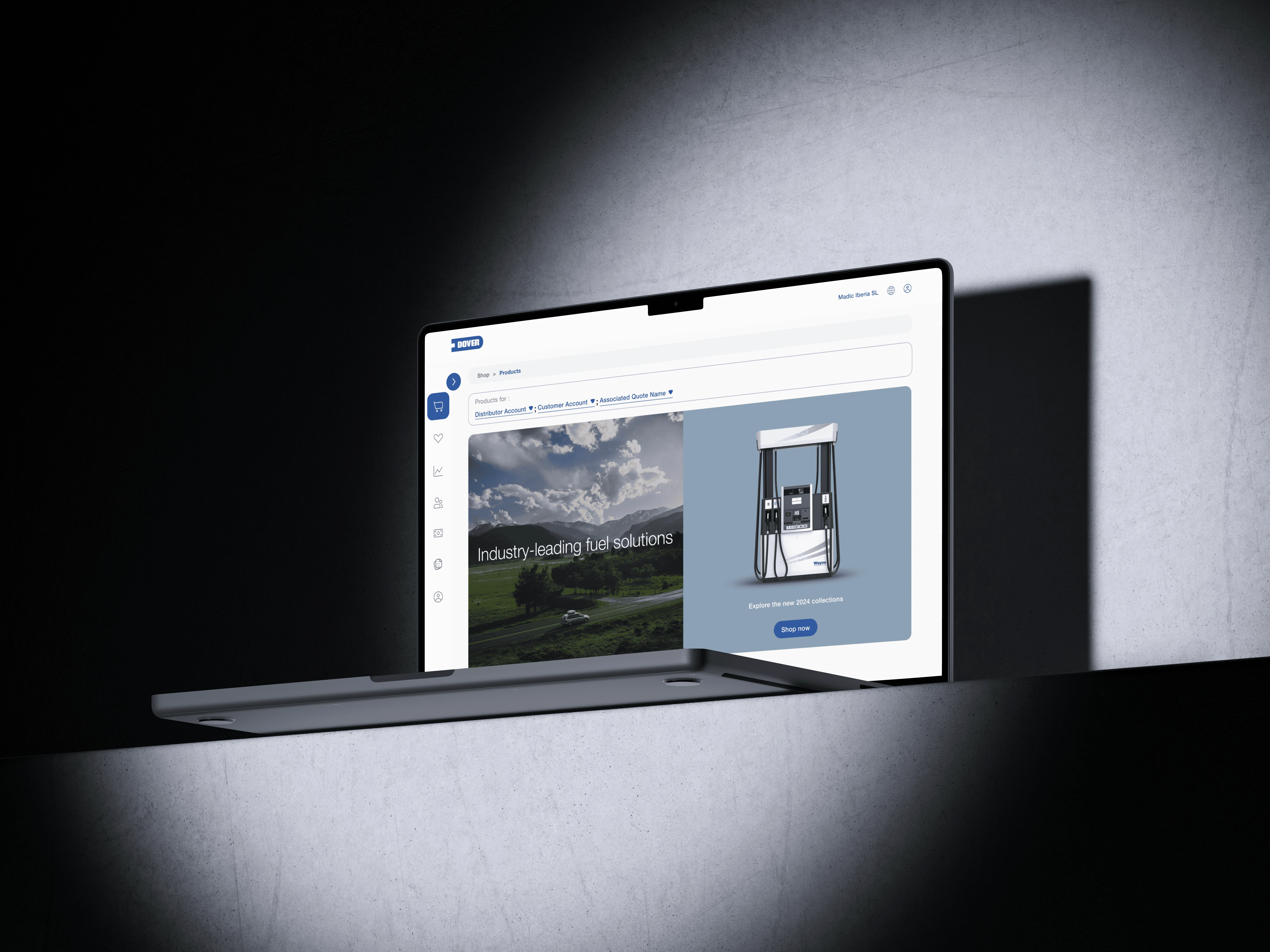
The earlier landing page was identical for every user and added little value in terms of the next steps the users should take hereon.
Internal users (CSRs, Sales Analysts) get redirected to the dashboard with active opportunities, pending quotes, and quick workflow actions as soon as they log into the app.
They can quickly switch to a data view to access key statistics or create their own custom dashboard by selecting modules and setting a preferred landing view. This flexibility gives each user control over how they start their day inside the app.
External users (Distributors) land on a product-driven view that supports quote creation directly.
This role-based approach reduces clicks and immediately presents the tasks that matter most.
Impact: Each user now begins in a context that supports their goals — eliminating the need to dig through multiple menus.
In the old flow, opportunities and quotes were technically linked, but the experience didn’t hold up in practice. Creating an opportunity felt like a drawn-out, multi-step process with no clear sense of progress. Users often lost track of where they were in the flow and had to click back and forth between screens just to confirm which customer or quote (In case of viewing opportunities) they were working on. What seemed like a structured hierarchy on paper turned out to be a time-consuming, disjointed experience in reality. Even though the opportunity name was visible, it wasn’t enough - users still felt lost in context.
In the redesign, I focused on solving this issue for quotes and opportunities, and then extended the same logic across the entire system. I made opportunities and quotes visually separate yet contextually linked, and applied this approach to connect customers → opportunities → quotes seamlessly. This allowed users to view all related details on one screen, making the experience more linear and intuitive.
A key improvement was the workflow tracker, placed right at the top to surface progress, pending steps, and ownership at a glance. The tab-based structure further unified all quote-related data- products, revisions, proposals, and subscriptions - into one place, reducing friction and restoring a sense of control.
TThe redesigned flow laid the groundwork for Dover’s quoting platform to scale- adding an entirely new layer of clarity and insight while bringing an e-commerce-like experience to a traditionally rigid enterprise tool.
By untangling dense workflows and restructuring information hierarchy, opportunity and quote creation became noticeably faster and easier to navigate.
Workflow visibility at the point of action reduced back-and-forth between teams, while the new dashboard and tab-based navigation gave internal users a clear sense of control: they could now see, decide, and act without switching contexts.
Although the project wrapped at the wireframe stage, these deliverables became the backbone for Vokal’s in-house design and engineering teams to build on. The structure proved scalable, adaptable, and clear enough to carry forward into full UI and future product iterations.
This project taught me how critical information architecture is in enterprise systems- simplifying logic for one persona often improves efficiency across the board. Balancing business rules, data dependencies, and user workflows reinforced the importance of designing with both context and hierarchy in mind.
If I revisited this project today, I’d validate the redesigned flow through usability testing focused on task completion time and error reduction — turning qualitative improvements into measurable outcomes.
Like this project
Posted Oct 26, 2025
Redesigned Dover’s CPQ flows into structured wireframes that streamlined sales logic and improved cross-team alignment.
Likes
0
Views
8