

Product Design for Founders. From Zero to Launch.
- $10k+
- Earned
- 6x
- Hired
- 5.0
- Rating
- 843
- Followers
Product Design for Founders. From Zero to Launch.


Web Designer · Framer websites for consultants & studios

Web Designer · Framer websites for consultants & studios




I find and fix what's confusing your customers.

I find and fix what's confusing your customers.
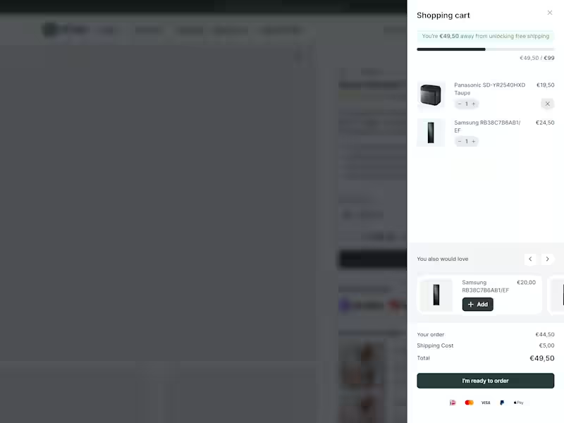
Most e-commerce stores leave money in the cart.
Not because their products are wrong.
Because their cart experience is lazy.
New research from Baymard Institute:
52% of shoppers will actively hunt for more items if they see they're close to free shipping.
Half your customers want to spend more.
They just need to see how close they are.
That's what a cart drawer with a dynamic progress bar does.
Takes about 2 hours to implement. Results show within days. Here's what it looks like.
The bar moves as they add items.
Shows exactly how much more to hit the threshold.
No guessing. No math. Just visual motivation.
23% will checkout anyway. Fine.
But 52% will add more to their order.
If your average order is €80...
Can push 52% of customers to add one more item at €20?
26
496

I guess you know all about the terrors of working on your own website right?
Well, last week I locked myself up. Outside the office. Away from home. To do what needed to be done.
And man, am I happy how it turned out!
3
25
539
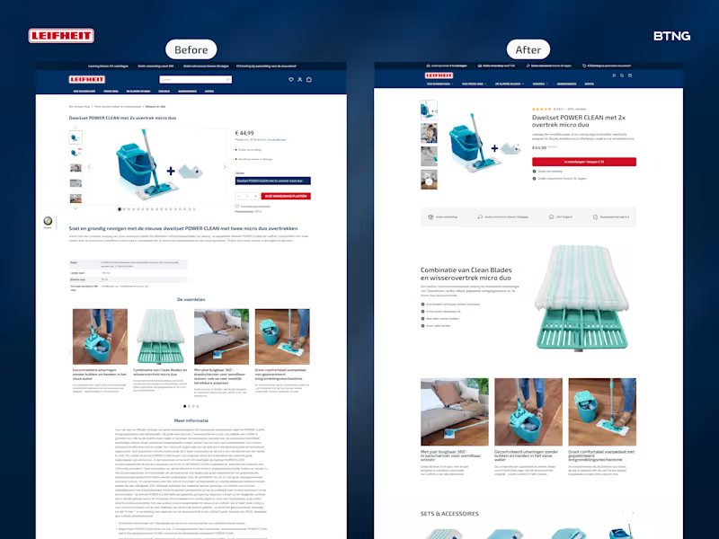
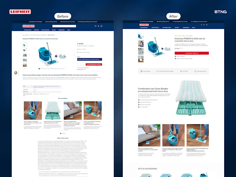
I redesigned Leifheit's product page. Then built it in Instant (link in comments).
Most product pages scatter info everywhere. Title here. Price there. Reviews floating.
What changed:
Product title was above the gallery. Everything felt disconnected.
I grouped critical info on the right. Title, reviews, price, add to cart, USPs. One clear block.
Specs are boring for a mop. Nobody cares about dimensions first.
Started with USP bar. Big zoom showing fibers and tech. Three benefit sections showing it in use.
Not what it is. What it does.
Result? Cleaner experience. (No pun intended.)
Scattered to structured. Specs to benefits. Product page to sales page.
What's one thing you'd test first on your product pages?
4
21
284

Creative webdeveloper and webdesigner from the Netherlands
- 5.0
- Rating
- 7
- Followers
Creative webdeveloper and webdesigner from the Netherlands


Strategic creative brand & web designs ✨

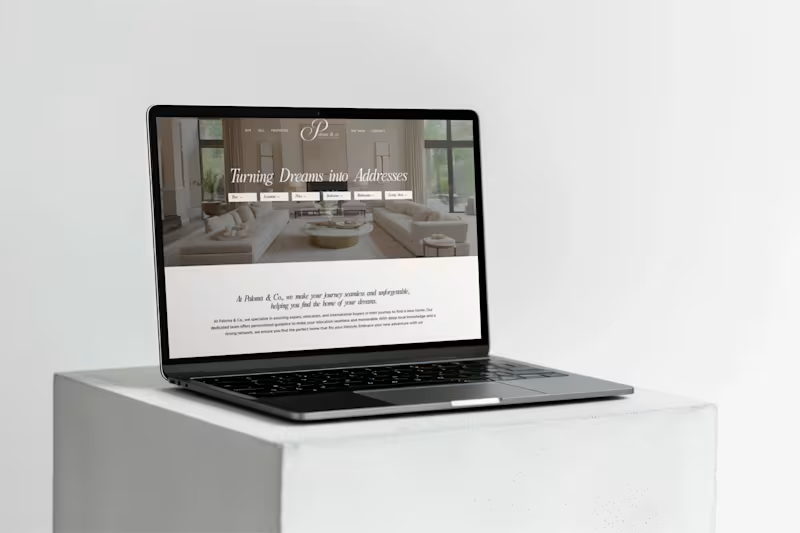
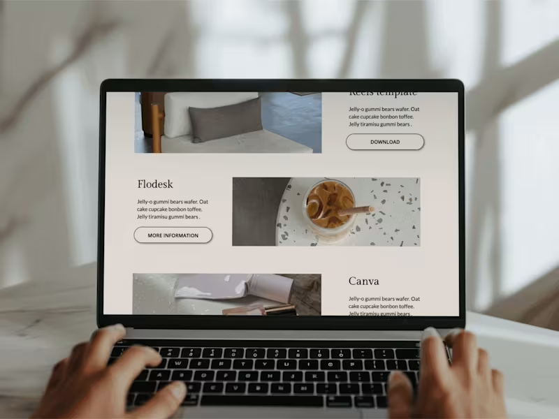


Webflow Developer & Brand Designer for Your Success
Webflow Developer & Brand Designer for Your Success
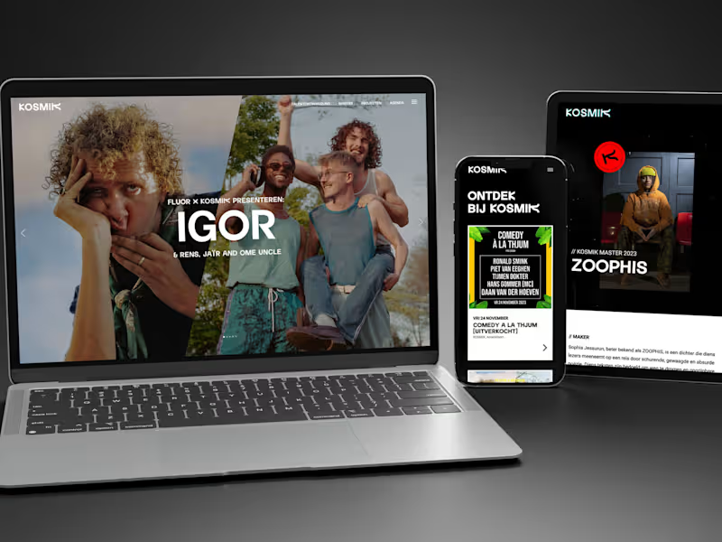


View more →

Social Media Manager & Web Designer
Social Media Manager & Web Designer


Freelance Full Stack Design Partner, Developer

Building something new in Framer! Racket Club is a bold and colorful template for local sports clubs, aimed at building a community of beginners and skilled players.
I've been really enjoying the process of bringing this idea together and I feel like it's really getting there!
2
1
100


