Bastiaansen Modestad | Custom e-commerce design
Thomas Meijer
Bastiaansen Modestad
Showreel of mobile designs for Bastiaansen Modestad
From friction to flow with a mobile-first fashion store
Bastiaansen Modestad is a Dutch fashion department store with a strong identity and loyal customer base. But their online store didn’t match the brand’s quality. The design felt outdated, and the shopping experience lacked the clarity and style customers expect from a high-end fashion retailer.
They needed a fresh platform that worked flawlessly on mobile, looked clean and modern, and helped users browse and buy with ease.
My role
I was responsible for the full UX and UI design of the new store. From first sketches to final designs, I shaped every screen with one goal in mind. Make shopping smooth, stylish, and easy.
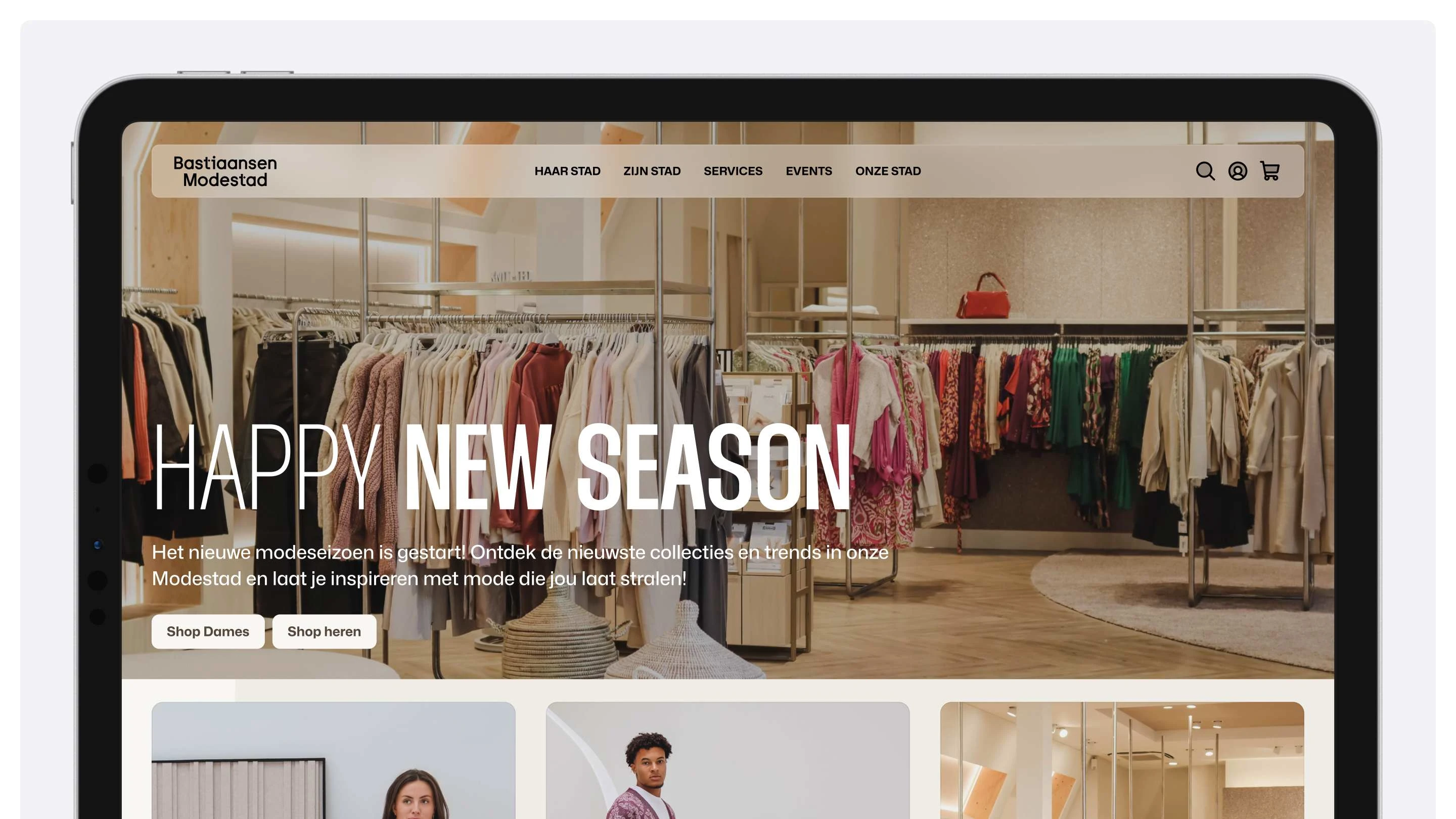
Bastiaansen Modestad's new homepage on desktop
Where we started
We started with mobile. That’s where most fashion shoppers begin. I focused on simple navigation, clear product info, and strong visuals. Once the mobile experience felt right, I adapted it for desktop, using the extra space to enhance flow and layout.
Together with the team, we explored what features mattered most. We studied user behavior, reviewed best practices, and refined the structure based on how people really shop.
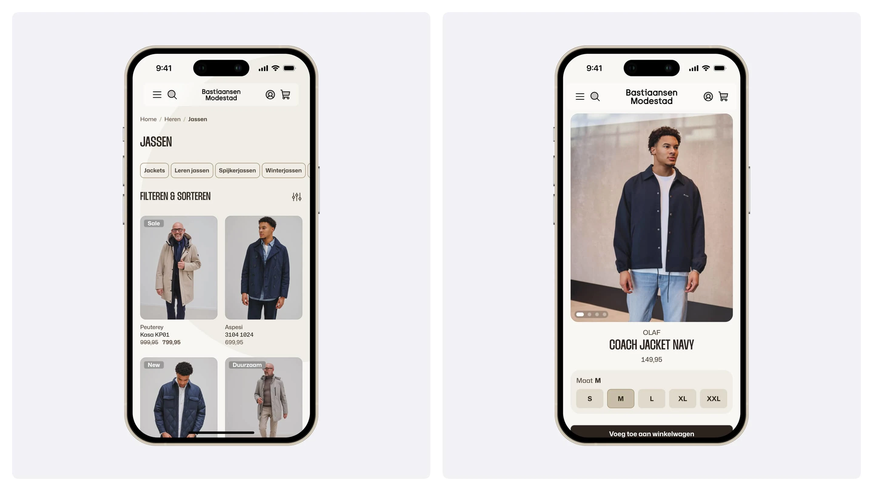
Product listing and product display pages on Mobile
What changed
Product listing pages got a clean layout with large visuals and quick-scan details. Filters and sorting tools became easier to use, helping people find what they need fast.
Product detail pages were rebuilt with collapsible sections, a smooth image carousel, and subtle interaction cues.
The checkout was redesigned from scratch. Fewer steps, less friction, and clear guidance from start to finish. I also introduced a "Shop the Look" feature, making it easy to buy complete outfits directly from inspiration photos.
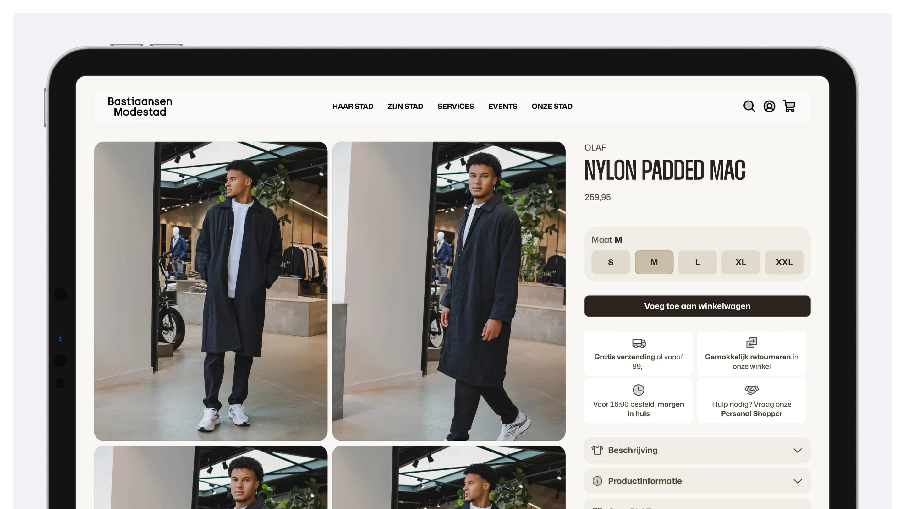
Product display page for Bastiaansen Modestad
The result
The result is a modern fashion store that feels simple, fast, and made for mobile. It looks sharper. It moves quicker. And it supports the brand Bastiaansen Modestad wants to be.
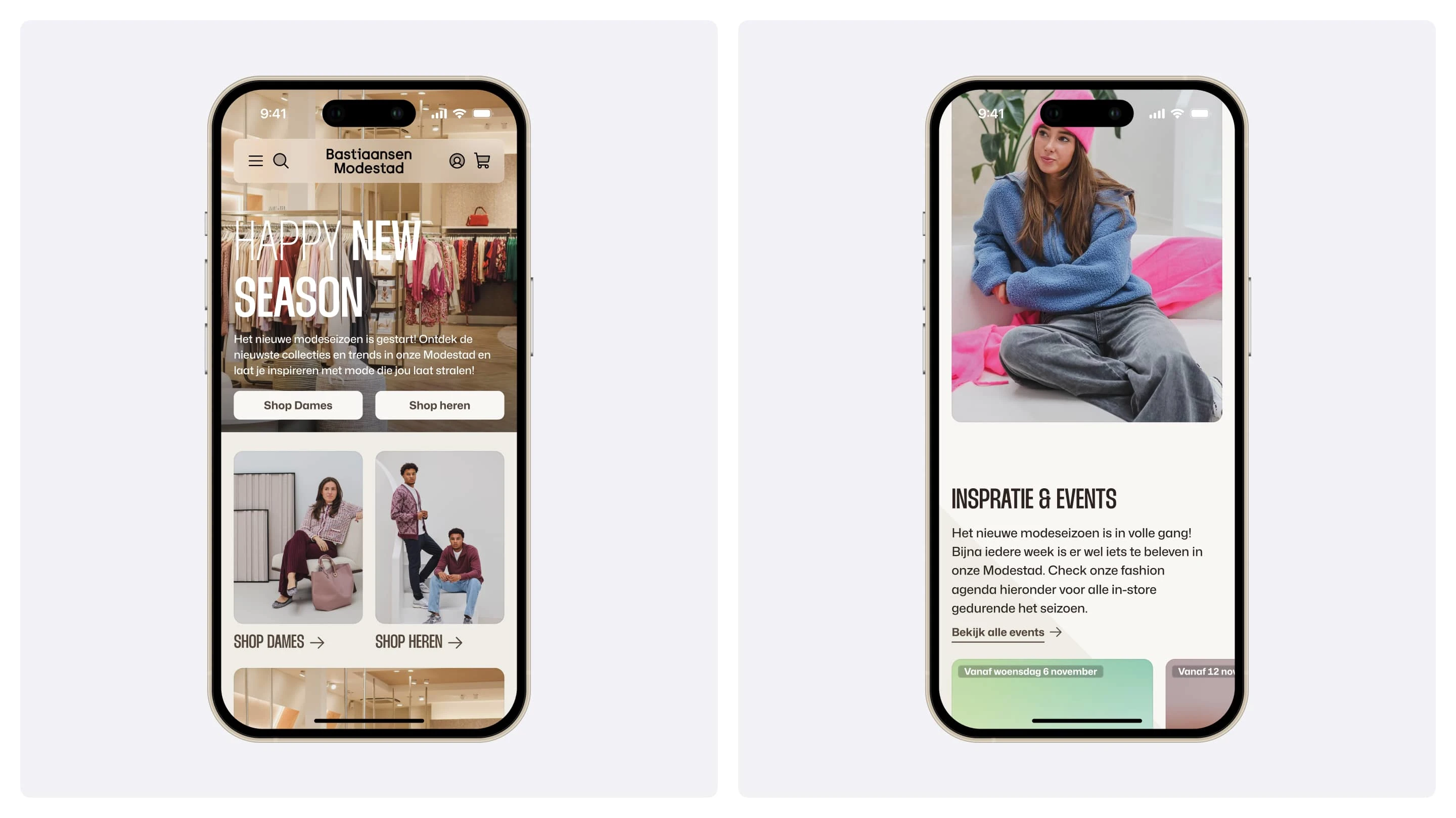
Bastiaansen Modestad's homepage on mobile
Why it matters
This project shows what thoughtful design can do. Starting with user needs. Backed by research. And built with care. It’s a clear example of how small changes in flow and feel can make a big difference in how people shop.
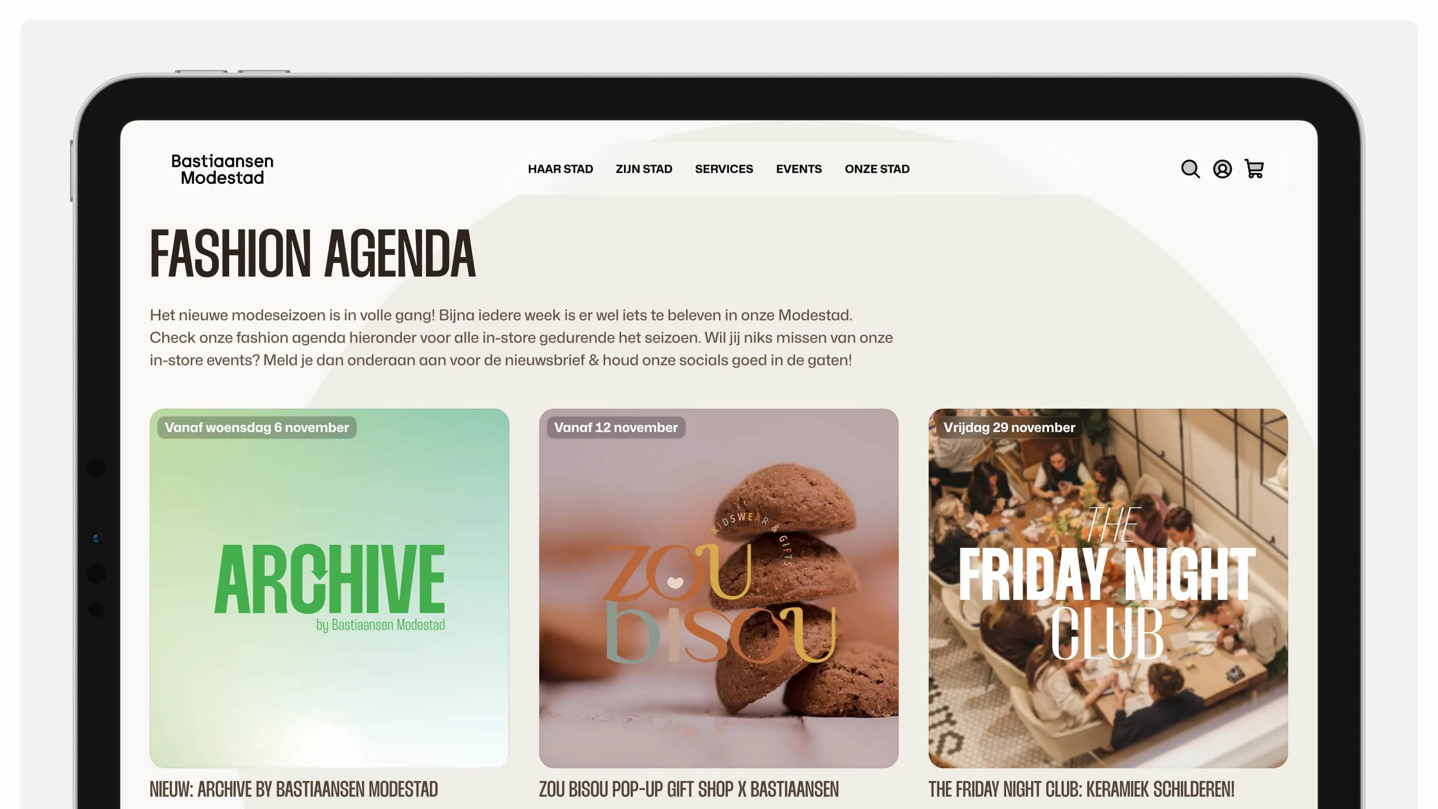
Bastiaansen Modestad fashion agenda on desktop
Like this project
Posted Jan 15, 2025
Designed a fully custom, mobile-first e-commerce platform for Bastiaansen Modestad, a Dutch fashion retailer. Built a tailored checkout flow and product pages from scratch, prioritizing conversion and a browsing experience that feels native on phone.
Likes
6
Views
169